Nonprofit Website Design: 6 Full-Page Teardowns
See six nonprofit websites analyzed section by section, with practical lessons for mission clarity, audience routes, donations, programs, impact proof, stories, and trust.
 Anvisha Pai, Co-founder & CEO, Moda
A nonprofit website rarely has one audience or one conversion. The same homepage may need to help a donor understand impact, a participant find a program, a volunteer take action, a journalist verify facts, and a community member access a service. Strong nonprofit design does not force those people into one generic "learn more" funnel.
This guide examines six complete nonprofit homepages with different operating models: direct giving, youth programs, a project marketplace, environmental restoration, public education, and justice advocacy. The analysis focuses on information architecture, proof, participation, and the ethics of presenting impact.
A framework for nonprofit websites
Use six questions:
- Mission: Can a first-time visitor name the problem, population, and intervention?
- Audience: Can donors, participants, partners, and people seeking help find distinct paths?
- Action: Is the primary ask appropriate to the visitor's level of understanding?
- Proof: Are impact claims defined, dated, sourced, and connected to the organization's role?
- Dignity: Do stories give people agency and context instead of reducing them to fundraising material?
- Continuity: Does the site explain what happens after a donation, application, referral, or signup?
The key fork is operational model. A direct-service organization needs eligibility and access. A grant or marketplace model needs project discovery and transaction trust. An advocacy organization needs issue education, current developments, and ways to act. A membership or program nonprofit needs dates, applications, and participant expectations.
Six nonprofit websites at a glance
- charity: water: impact, donation trust, and project-level proof.
- Kode With Klossy: participant, instructor, alumni, and donor paths.
- DonorsChoose: a searchable marketplace for classroom projects.
- One Tree Planted: giving presented through locations, projects, gifts, and business partnerships.
- Equal Justice Initiative: education, current work, archives, and physical legacy sites.
- The Bail Project: direct service, systems advocacy, stories, and urgent support.
1. charity: water: make proof part of the product
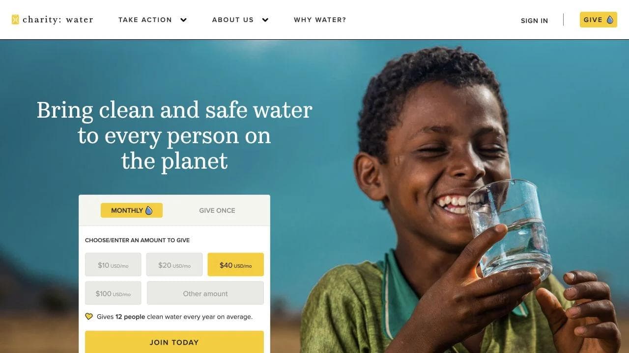
charity: water opens with the water crisis, a direct giving route, and a clear explanation of the human outcomes connected to clean water.
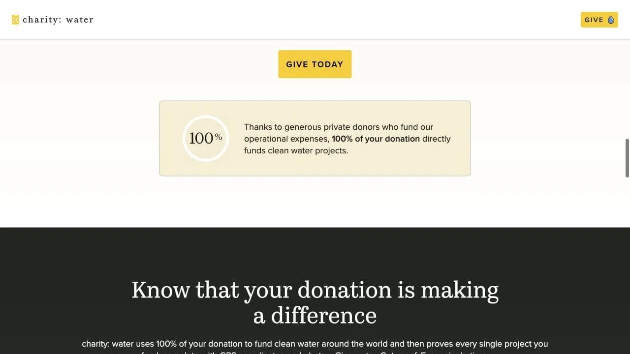
The middle page connects water access to health, education, women, and economic opportunity. It also explains the organization's operating model and separates program funding from privately funded operating expenses.
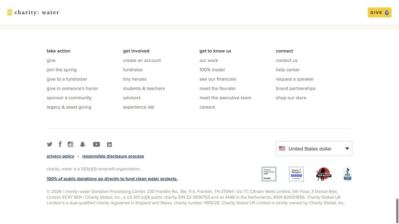
The lower page turns accountability into a visible experience with project counts, countries, GPS coordinates, photos, and updated impact data.
What to borrow
- Explain the intervention and the downstream human effect.
- Put the funding model next to the donation decision.
- Let donors see what happens after the gift.
What not to copy blindly
The "100 percent" model depends on a separate source of operating support. Another nonprofit should not imitate the headline unless its finances and disclosures support the same claim.
2. Kode With Klossy: design for a living community
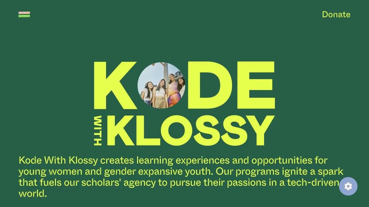
Kode With Klossy opens with a precise audience and outcome: free learning experiences for young women and gender-expansive youth pursuing interests in a technology-driven world.
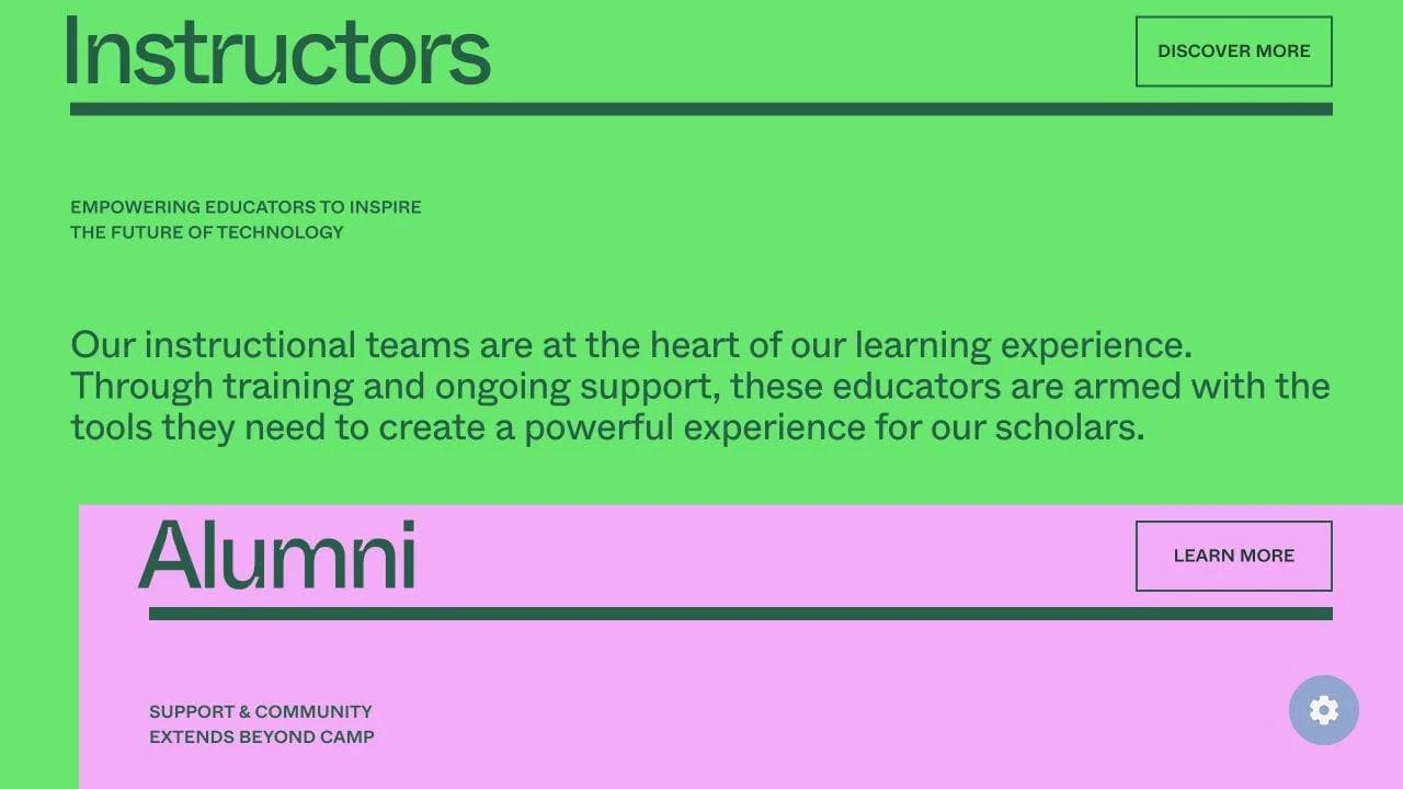
The middle gives scholars, instructors, and alumni distinct narratives. Programs are not presented as isolated events but as an ongoing community with support before, during, and after camp.
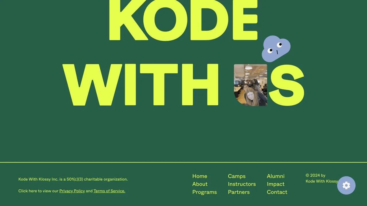
The closing brings together upcoming events, applications, donations, and an interest form. Each action maps to a different level of readiness.
What to borrow
- Name the participant audience with enough precision to create recognition.
- Treat instructors and alumni as core constituencies.
- Place dates and application status near program interest.
What not to copy blindly
A youth-focused brand can be expressive without making logistics hard to find. Eligibility, cost, format, dates, accessibility, and safeguarding information still need direct paths.
3. DonorsChoose: make the mission browsable
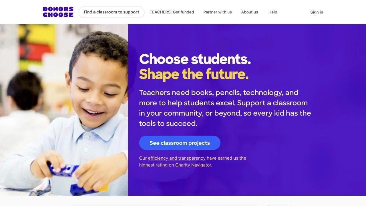
DonorsChoose opens with a direct proposition and a search experience. Donors can support a classroom nearby or browse beyond their location.
The middle displays real teacher requests with amount remaining, school, location, and the specific items or learning goal. The unit of impact is concrete enough to compare without turning the page into a generic catalog.
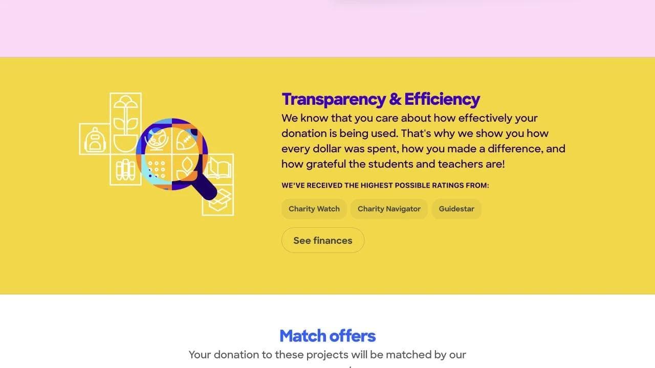
The closing adds requested supply categories, transparency, match offers, underfunded projects, and alternate giving methods.
What to borrow
- Turn a broad mission into small, inspectable units of action.
- Show the remaining gap and the person closest to the need.
- Let geography and interest guide discovery.
What not to copy blindly
A marketplace needs moderation, transaction trust, fulfillment, privacy, and clear responsibility. The interface is only the visible layer of a demanding operational system.
4. One Tree Planted: support several motivations without losing the mission
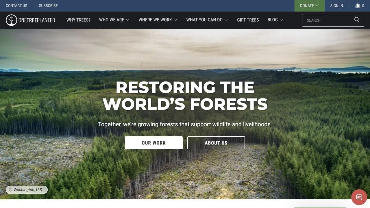
One Tree Planted opens with forest restoration and routes visitors to the work, the organization, and donation.
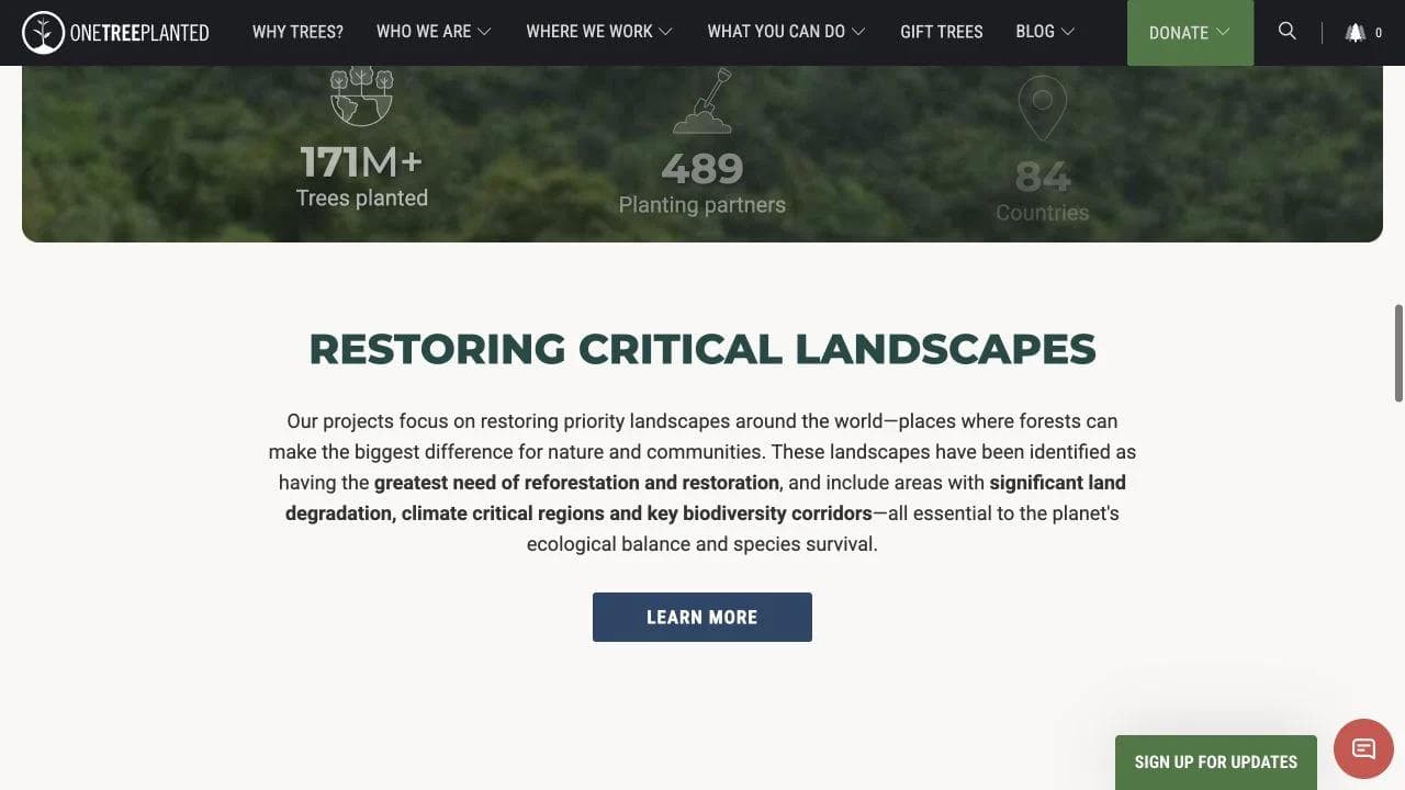
The middle combines global scale, locations, project categories, and ways to participate. It gives an individual donor, gift buyer, fundraiser, and business partner different reasons to continue.
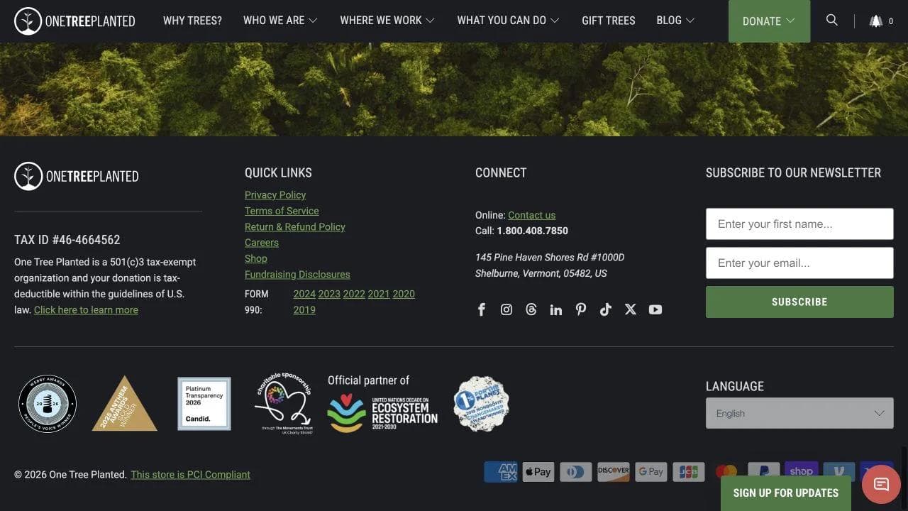
The closing expands into business solutions, education about why trees matter, disclosures, and another place-based action.
What to borrow
- Organize action around distinct supporter motivations.
- Connect global scale to specific landscapes.
- Keep corporate partnership information separate from individual giving.
What not to copy blindly
Simple units such as "one dollar, one tree" are memorable but can compress ecological complexity. Explain geography, partners, survival, monitoring, and what the donation actually funds.
5. Equal Justice Initiative: treat education as core work
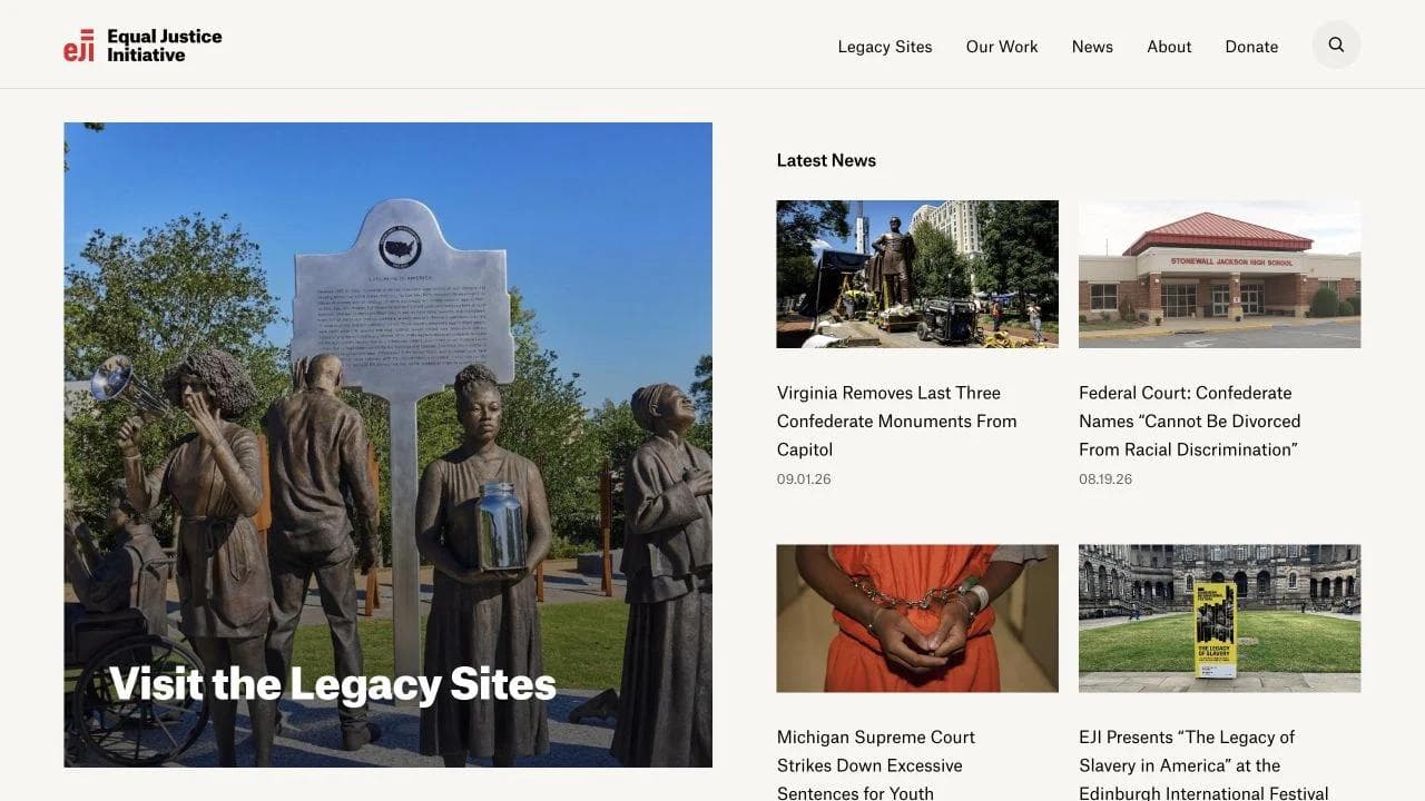
Equal Justice Initiative opens with current news and access to its Legacy Sites, immediately showing that the organization works through litigation, research, public education, and physical institutions.
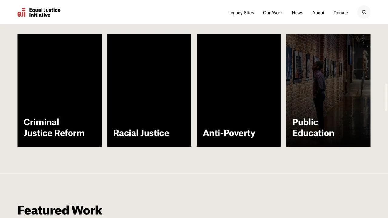
The middle organizes criminal justice reform, racial justice, anti-poverty work, and public education, then points to featured projects and historical resources.
The closing connects digital education to museums, memorials, reports, videos, and support. The page acts as an institutional index rather than a single campaign funnel.
What to borrow
- Let the information architecture reflect the real theory of change.
- Keep current developments close to evergreen educational resources.
- Treat reports, archives, and physical experiences as program surfaces.
What not to copy blindly
An institution with deep public recognition can ask visitors to navigate a broad archive. A smaller nonprofit should offer more explicit audience routes and a shorter explanation of where to begin.
6. The Bail Project: connect individual stories to systems work
The Bail Project presents cash bail as both an immediate human problem and a system to change. The opening offers education, stories, and action rather than relying on a donation button alone.
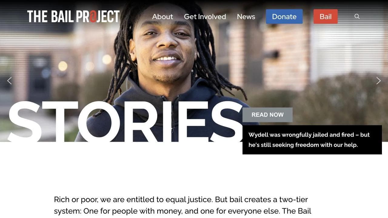
The middle explains direct assistance, the broader policy case, and the organization's national work. Personal stories provide stakes while the surrounding copy restores institutional context.
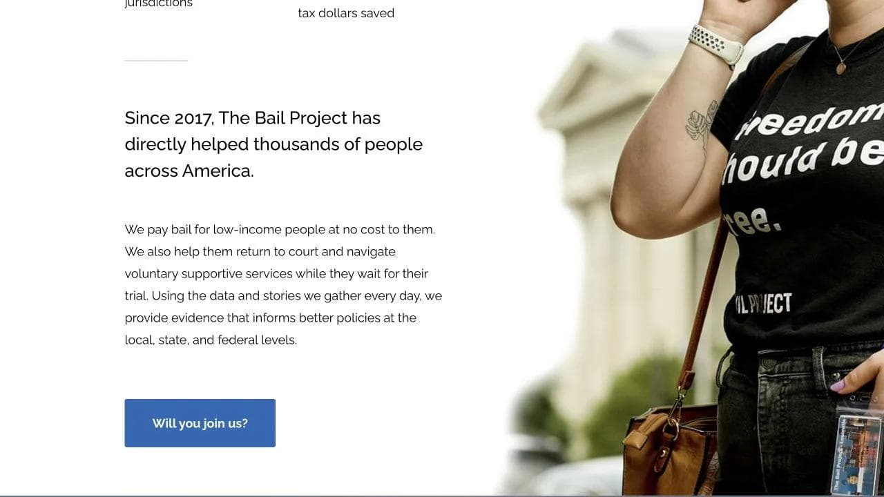
The closing adds recent work, ways to support, and organizational information. The page keeps the immediate intervention and long-term reform visible together.
What to borrow
- Explain how direct service relates to systems change.
- Put stories inside context, not in a disconnected testimonial carousel.
- Offer action paths beyond donation when the mission includes advocacy.
What not to copy blindly
Urgency should not erase consent, privacy, or complexity. Organizations working with vulnerable people need editorial standards for names, images, legal status, and story ownership.
What all six sites have in common
Strong nonprofit sites make the mission concrete, present several audience routes, and place action near evidence. Their differences follow their operating models:
- Direct giving sites need financial and project transparency.
- Program organizations need eligibility, dates, applications, and participant continuity.
- Marketplaces need search, comparison, transaction trust, and fulfillment clarity.
- Advocacy organizations need issue education, current developments, and non-donation actions.
- Institutions need a navigable archive and clear entry points for first-time visitors.
The best homepage is not the one with the biggest donation button. It is the one that helps a visitor understand the work well enough to choose the right relationship.
A recommended nonprofit homepage sequence
- State the problem, population, intervention, and primary action.
- Route donors, participants, volunteers, partners, and people seeking help.
- Explain the operating model in plain language.
- Show defined, dated impact evidence.
- Use stories with consent and context.
- Explain what happens after each major action.
- Surface governance, financials, policies, and contact information.
- End with several relevant next steps, not one universal button.
Common nonprofit website mistakes
- Using emotional imagery without explaining the intervention.
- Publishing large impact numbers without definitions or dates.
- Treating every visitor as a donor.
- Hiding eligibility and service-access information behind fundraising language.
- Using stories without enough agency, consent, or context.
- Sending donations, applications, events, and volunteer actions into disconnected systems with no expectation setting.
Where Moda fits
Moda can help a nonprofit create a public campaign or information site, plus matching social posts, reports, program PDFs, event materials, and presentations. It can connect visitors to external donation, application, ticketing, or CRM systems. It should not replace payment processing, donor management, case management, authenticated member tools, or systems holding sensitive participant data.
Frequently asked questions
What should a nonprofit website include?
Include a clear problem, population, intervention, audience-specific routes, defined impact evidence, programs or services, stories with context, financial and governance information, and clear next steps.
Should every nonprofit homepage lead with Donate?
Not necessarily. Donation can remain visible, but participants, people seeking help, volunteers, partners, and first-time learners may need more relevant primary actions.
How should nonprofits present impact numbers?
Define the unit, time period, geography, source, and organizational role. Distinguish people reached, services delivered, outputs, outcomes, and estimates.
What makes a nonprofit story ethical and useful?
Use informed consent, preserve agency, explain context, avoid unnecessary sensitive details, and state how the story relates to the organization's work without implying one experience is universal.
Can Moda replace donation or donor-management software?
No. Moda can create public campaign and information sites plus branded materials, while donations, CRM, case management, ticketing, and authenticated member systems remain external.

Real editable visuals. Real canvas. Full control.
Fly through design work