SaaS Landing Page Examples: 6 Full-Page Teardowns and What to Copy
Study six complete SaaS landing pages section by section, including positioning, product proof, social proof, adoption, pricing, and calls to action.
 Anvisha Pai, Co-founder & CEO, Moda
A SaaS landing page has a harder job than a typical marketing page. It must make an unfamiliar product understandable, make the promised outcome desirable, and reduce the perceived cost of trying or adopting the product. The visitor may need to believe all three before they will start a trial, create an account, or book a demo.
That is why the best SaaS landing pages are not simply attractive collections of sections. They are ordered arguments. Each section answers the next question in a buyer's mind.
This guide examines the full page journeys of six current SaaS homepages from Tally, beehiiv, Cal.com, Attio, Linear, and Ramp. The screenshots move from the hero through product explanation, proof, adoption, pricing, and final conversion sections. The companies represent different audiences, price points, and go-to-market motions. The goal is not to copy their visual style. It is to understand the conversion logic beneath it and use that logic to build a stronger page for your own product. We do not have access to these companies' conversion data, so the analysis focuses on observable message, evidence, and interaction choices rather than claiming which page converts best.
The short version: six pages, six different lessons
- Tally: Make the category and the first action feel effortless.
- beehiiv: Sell an economic outcome to a clearly named audience.
- Cal.com: Put the product experience in the hero when the category is familiar.
- Attio: Reframe an established category without losing basic comprehension.
- Linear: Use product specificity and restraint to attract a narrow, high-intent audience.
- Ramp: Match a broad product surface with quantified activity, customer proof, and multiple levels of commitment.
These are not six interchangeable templates. Tally can ask for an immediate self-serve action because the product is easy to understand and inexpensive to try. Ramp needs to establish a much larger promise and carry more organizational risk. A page should reflect the buying motion behind the product, not the current design fashion.
What most SaaS landing page galleries miss
Galleries such as SaaS Landing Page, Landingfolio, and Lapa Ninja are useful for visual references, but screenshots alone cannot tell you why a page is structured a certain way. A beautiful hero may be wrong for your product if it answers the wrong question, asks for too much commitment, or hides the proof your buyer needs.
Before choosing sections or a visual style, identify the sequence of questions your page must answer:
- Recognition: Is this meant for someone like me?
- Comprehension: What is the product, in language I already understand?
- Desire: What changes for me if it works?
- Mechanism: How does the product create that outcome?
- Proof: Why should I believe the claim?
- Fit: Will it work with my team, tools, and constraints?
- Risk: What could make adoption fail?
- Action: What is the sensible next step?
Every SaaS landing page answers these questions, either deliberately or accidentally. The order varies. A known category can show the interface quickly. A new category may need to explain the mechanism before feature detail means anything. A sales-led product must reduce implementation and security risk. A self-serve product should make the first useful action feel smaller than continued evaluation.
A practical framework: promise, mechanism, proof, fit, action
You can reduce the full buyer journey to five jobs. Use them as an outline before you design.
1. Promise
State the change the product creates for a specific audience. A good promise is more useful than a slogan because it helps the visitor decide whether to keep reading.
Weak: "Transform the way you work."
Stronger: "Create client-ready proposals from your CRM data in minutes."
The stronger version names the artifact, the source, and the time advantage. It gives the page something concrete to prove.
2. Mechanism
Show how the product produces the outcome. This is where interface screenshots, interactive demos, short workflow diagrams, and focused feature sections become useful. The mechanism should connect directly to the promise rather than introduce a disconnected catalog of capabilities.
3. Proof
Choose evidence that matches the size of the claim. A simple utility can use a live product preview and a low-friction free tier as proof. An enterprise platform may need customer logos, quantified usage, case studies, security information, and evidence of successful implementation.
4. Fit
Help the buyer see their own use case. Role-specific examples, templates, integrations, deployment options, and customer stories can all establish fit. Do not force visitors to infer how a generic feature applies to their situation.
5. Action
Offer the next step that matches the visitor's confidence and the product's buying motion. A free product can say "Create a form." A more complex platform may need "See a demo," "Explore the product," and "Start for free" at different points on the page.
What all six pages have in common
The visual styles differ, but the structural overlap is substantial. Every page includes five layers:
- A compact hero argument. Each page names an outcome, category, or new market frame, then gives the visitor a next step.
- Product evidence near the beginning. All six show an interface, workflow, or product surface before the visitor has scrolled very far.
- A middle that expands the initial promise. The page either deepens one mechanism or fans out into use cases and modules.
- Proof beyond a logo strip. Logos appear early, but later sections add customer stories, reviews, usage counts, or operational evidence.
- A repeated action after the argument. The final CTA gives the visitor another chance to start or speak with sales after the page has answered more questions.
Those are the closest things to must-have SaaS landing-page components. Everything else is a fork based on product and buying motion.
The real forking paths
Familiar category or new category
Tally and Cal.com can say forms and scheduling immediately. Attio wants to introduce "agentic revenue," so it must repeatedly reconnect that phrase to CRM workflows. The less familiar the category, the more often the page must explain the mechanism.
One core job or a platform
Tally deepens one job from simple forms to logic, customization, and integrations. beehiiv and Ramp must explain why many modules belong together. A platform page needs an organizing idea stronger than "all in one."
Self-serve or sales-assisted
Tally can make creation the first action. Linear and Attio support both product-led and sales paths. Ramp provides a direct start but devotes much more space to proof and organizational reassurance. CTA design should reflect the actual purchase process, not a generic conversion rule.
Product proof or business proof
Cal.com and Linear rely heavily on recognizable interfaces. Ramp uses operational scale and customer outcomes because buyers must trust the business impact and the controls, not only understand the interface. The right proof depends on the feared failure.
One audience or a maturity ladder
Linear filters for product teams. beehiiv explicitly accommodates solo creators, scaling publishers, and enterprise brands. If one page serves several levels of customer maturity, the architecture should show how the product expands without making the entry point feel oversized.
A simple test for fluff
Every section should do at least one of five things:
- Clarify who the product is for or what it changes
- Explain how the product creates the outcome
- Prove a claim
- Remove a specific adoption objection
- Route a visitor to the right next step
If a section does none of these, it is probably ornamental. Repetition is not automatically fluff: a second proof section may answer a different risk, and a repeated CTA may appear after the visitor has learned enough to act. But a second generic benefit statement with no new mechanism or evidence rarely earns its space.
1. Tally: deepen one simple promise
Section 1: make trying the product easier than evaluating it
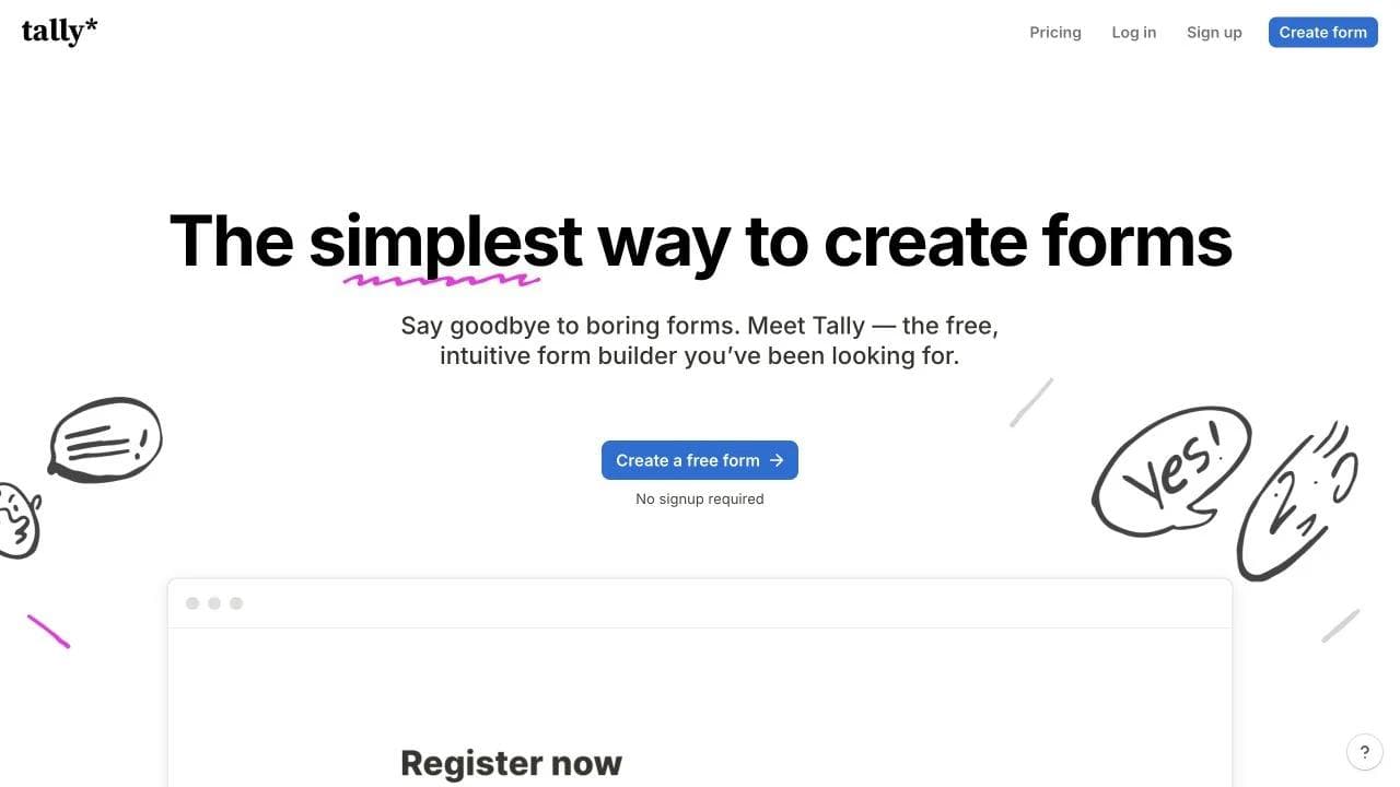
Tally's homepage begins with "The simplest way to create forms," a free-form CTA, and "No signup required." The hero promises low friction and immediately behaves that way. The large form preview below the CTA also keeps the category visible.
This is the page's governing idea: powerful forms without the ceremony associated with traditional form software.
Section 2: bridge from the claim to credible substance
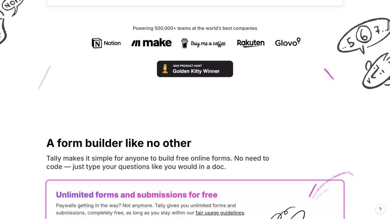
The next transition combines company logos, a Product Hunt award, the heading "A form builder like no other," and three concrete reasons to believe it: unlimited forms and submissions, document-like creation, and privacy.
This section is doing more than adding social proof. It answers three different doubts in sequence: Is this established enough to trust? What makes it easier? What hidden limit or risk should I expect?
The award and logos are useful, but the specific product and policy claims carry more decision value. If the section contained only the logos, it would be reassurance without differentiation.
Section 3: escalate from simple to capable
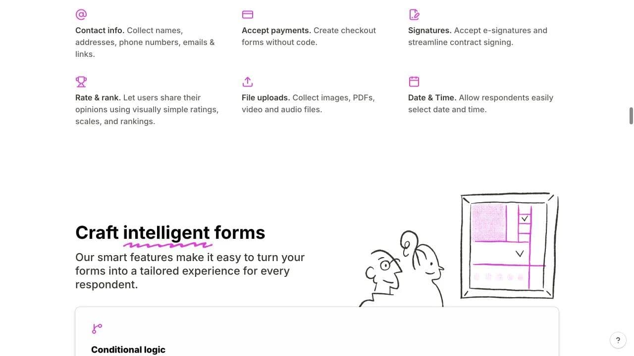
After establishing simplicity, Tally introduces input types, payments, signatures, files, conditional logic, calculations, hidden fields, and personalization. The page does not lead with these features because doing so would weaken the simple entry point.
The ordering matters. First the visitor thinks, "I can use this." Then the page answers, "Will it handle a serious form?" The advanced section prevents simplicity from being mistaken for limitation.
Section 4: show that adoption does not create a silo
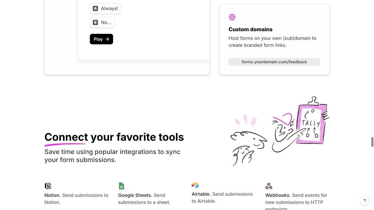
The integrations section arrives after creation and advanced capability. It shows Notion, Google Sheets, Airtable, webhooks, Slack, analytics, and automation tools. This answers the adoption question: where will the submissions go?
Tally then branches into role-based templates, repeats customer evidence, presents a final free-form CTA, and closes with FAQs. The bottom of the page shifts from explaining the product to reducing the effort of finding a first use case.
What to copy and what to skip
Copy the progression from easy entry, to capability, to ecosystem fit. Do not copy "No signup required" unless the product can actually deliver value before authentication. The hand-drawn style is memorable, but the stronger lesson is that every major section reinforces the same simplicity claim from a different angle.
2. beehiiv: turn a wide platform into a customer lifecycle
Section 1: name the audience, platform, and economic outcome
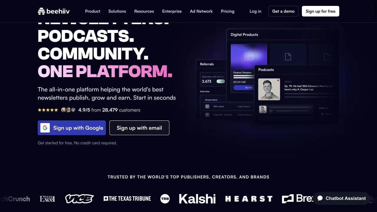
beehiiv's homepage opens with newsletters, podcasts, and community, then unifies them with "One platform." The supporting copy says the audience can publish, grow, and earn. Signup options, no-credit-card language, a rating, customer count, product surfaces, and logos all appear in or immediately below the hero.
This is a dense hero, but each piece has a job. The product list establishes scope, the outcome verbs explain why the modules belong together, and the proof reduces the risk of choosing a newer platform.
Section 2: convert breadth into an operating model
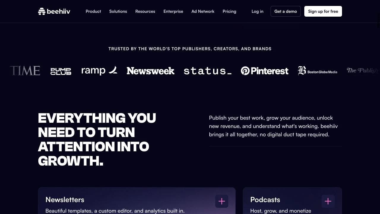
"Everything you need to turn attention into growth" is the page's real organizing sentence. Under it, the page presents newsletters, podcasts, digital products, monetization, community, and websites as expandable product areas.
This section prevents the platform from becoming a feature dump. The implied lifecycle is: create content, reach an audience, own the relationship, and monetize it. The modules are persuasive because they map to that business loop.
There is still a tradeoff. Six large product areas require substantial scrolling and interaction. A visitor interested only in newsletters may perceive some of the platform as excess. The lifecycle framing keeps that cost manageable, but a narrower SaaS product should not imitate the breadth.
Section 3: replace abstract trust with recognizable customer types
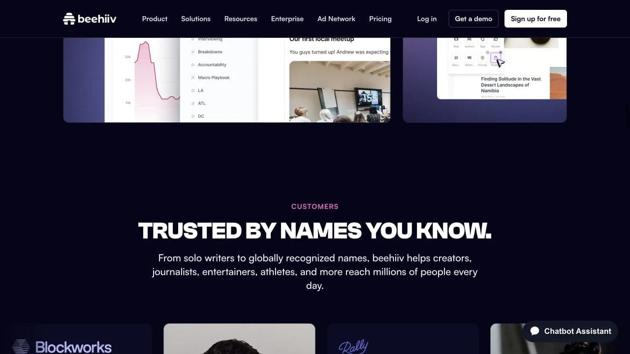
The customer section moves beyond the earlier logo marquee. It says the platform serves solo writers and globally recognized names, then shows creator and publisher stories. This is more useful than logos alone because it establishes a range of customer identities and outcomes.
The page spends a lot of space on prominent customers. Some of that is proof, and some is brand theater. The test is whether each story helps a target visitor see a relevant path. One story for a solo operator, one for a scaling media business, and one for an enterprise publisher may teach more than many celebrity cards with similar messages.
Section 4: make customer maturity visible in the pricing architecture
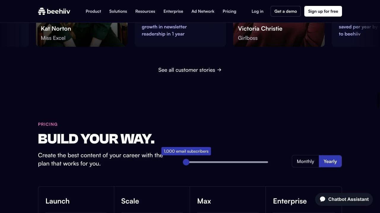
The "Build your way" section exposes a subscriber slider, monthly or yearly choice, and four plan levels: Launch, Scale, Max, and Enterprise. This is not merely pricing. It tells the reader that the platform has a deliberate path from starting to scaling.
Below pricing, beehiiv adds platform-level numbers, integrations, FAQs, and a final CTA. These sections answer increasingly practical questions: Does it work at scale? Will it connect to my stack? What will surprise me? Can I start now?
What to copy and what to skip
Copy the lifecycle that makes product breadth coherent and the maturity ladder that helps different customers locate themselves. Avoid piling on customer stories merely because recognizable names are available. Each proof block should answer a distinct fit or risk question.
3. Cal.com: explain a familiar product through visible interaction
Section 1: let the interface establish the category
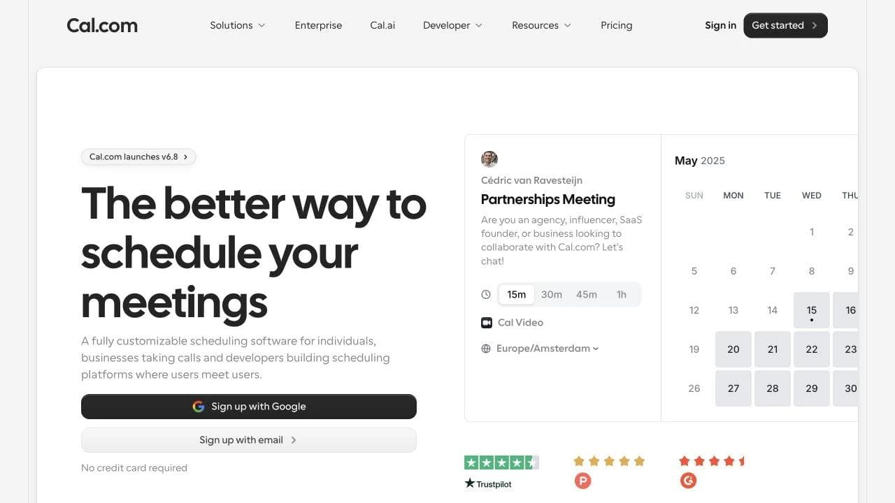
Cal.com's homepage pairs "The better way to schedule your meetings" with a large, recognizable booking interface. Meeting duration, video method, timezone, calendar dates, signup paths, and review ratings are visible together.
The page does not need to teach visitors what scheduling software is. It can spend the supporting copy on range: individuals, businesses, and developers building scheduling into their own platforms.
Section 2: reduce the workflow to three understandable actions
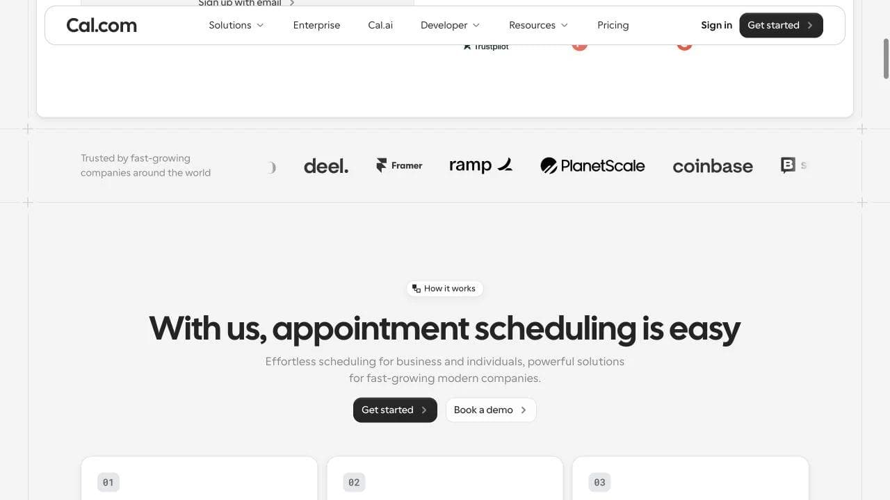
After logos, Cal.com introduces "With us, appointment scheduling is easy" and a three-step sequence: connect a calendar, set availability, and choose how to meet. This section is basic, but not fluff. It reduces setup anxiety and establishes the product's mental model.
The dual CTAs also change here. "Get started" remains primary, while "Book a demo" appears for visitors evaluating a larger deployment. The page widens the buying motion only after the self-serve product is clear.
Section 3: expand from booking link to scheduling system
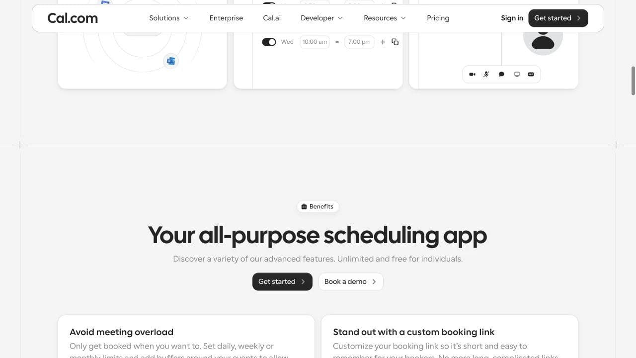
"Your all-purpose scheduling app" introduces controls for meeting load, branded links, booker experience, and reminders. These are organized around problems that appear after basic scheduling works.
This is a strong middle-page choice. Instead of repeating "easy scheduling," the page explains why a team may outgrow a simple calendar link. It converts category familiarity into reasons to switch or upgrade.
Section 4: use a compact grid for secondary requirements
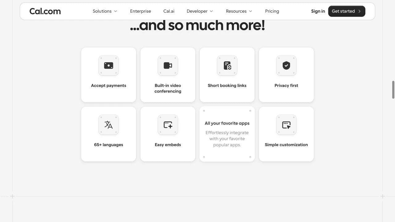
Payments, video, short links, privacy, languages, embeds, integrations, and customization appear in a compact grid. This is useful for scanning and objection checking, but it is weaker as proof than the interactive hero or workflow sections.
The page then adds testimonials, deeper integration messaging, user reviews, FAQs, and a final CTA. The grid earns its place because it catches secondary requirements without forcing eight full sections. If any one capability were the product's main differentiator, a small tile would undersell it.
What to copy and what to skip
Copy the transition from recognizable interface, to setup model, to post-adoption problems. Use a feature grid for secondary checks, not the central promise. Avoid a huge dashboard screenshot if the category is unfamiliar or the interface is unreadable at page scale.
4. Attio: use page structure to explain a new category
Section 1: introduce novelty, then restore comprehension
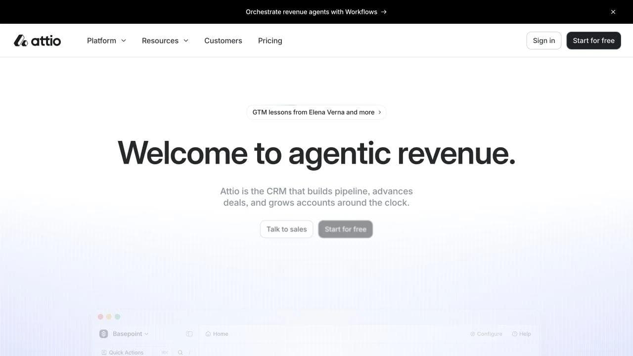
Attio's homepage leads with "Welcome to agentic revenue." The next sentence says Attio is a CRM that builds pipeline, advances deals, and grows accounts. "Talk to sales" and "Start for free" support both buying motions.
The familiar CRM anchor is essential. Without it, the visitor must decode a new category before deciding whether the product is relevant.
Section 2: organize breadth around the revenue funnel
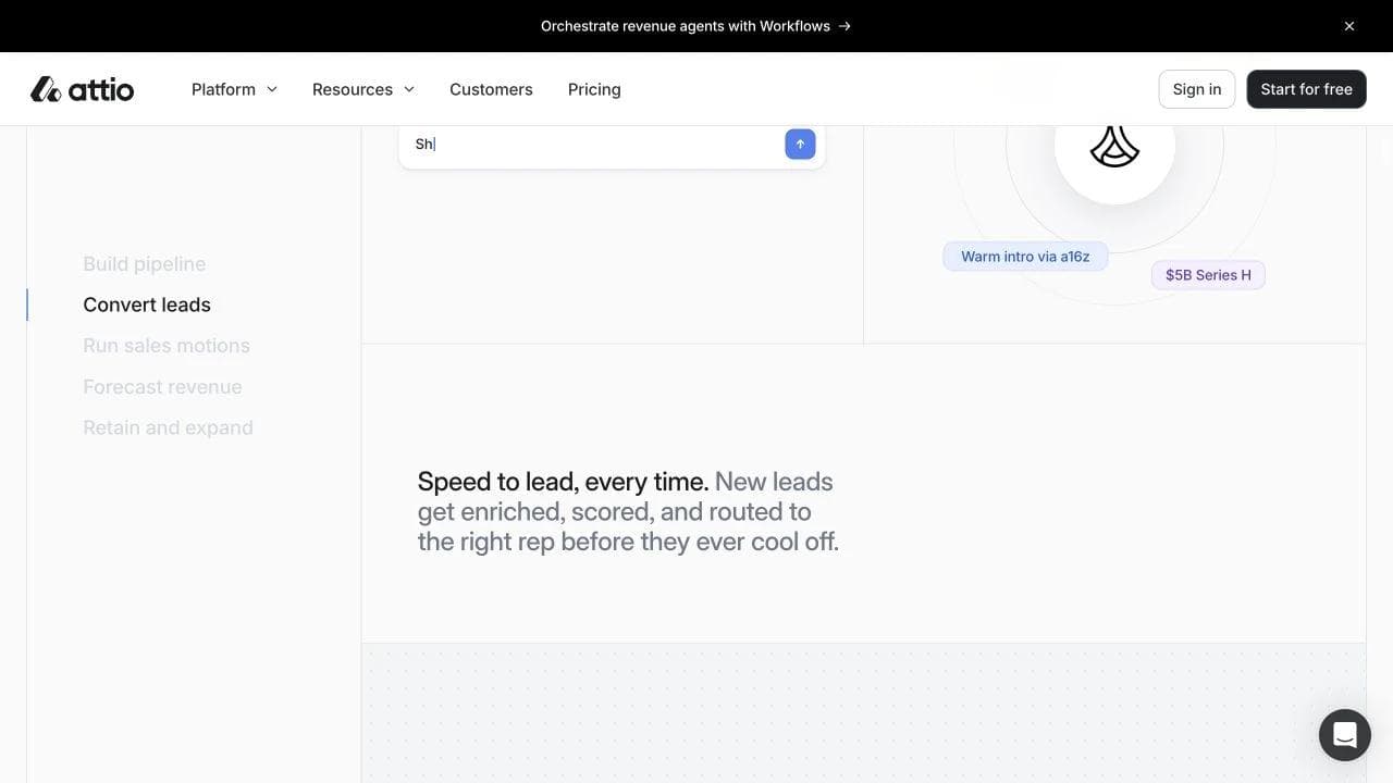
The main product area uses a persistent set of revenue jobs: build pipeline, convert leads, run sales motions, forecast revenue, and retain and expand. The lead section explains enrichment, scoring, and routing before a lead cools off.
This is stronger than a generic feature grid because it gives the page a customer-owned architecture. Buyers can locate the part of the revenue process they care about, while the page demonstrates that agents act throughout the funnel.
The cost is density. Many large workflow statements and animated product surfaces demand attention. The page works best for a visitor already interested in a new CRM model. A colder visitor may understand the promise before fully understanding the mechanism.
Section 3: address the implementation objection directly
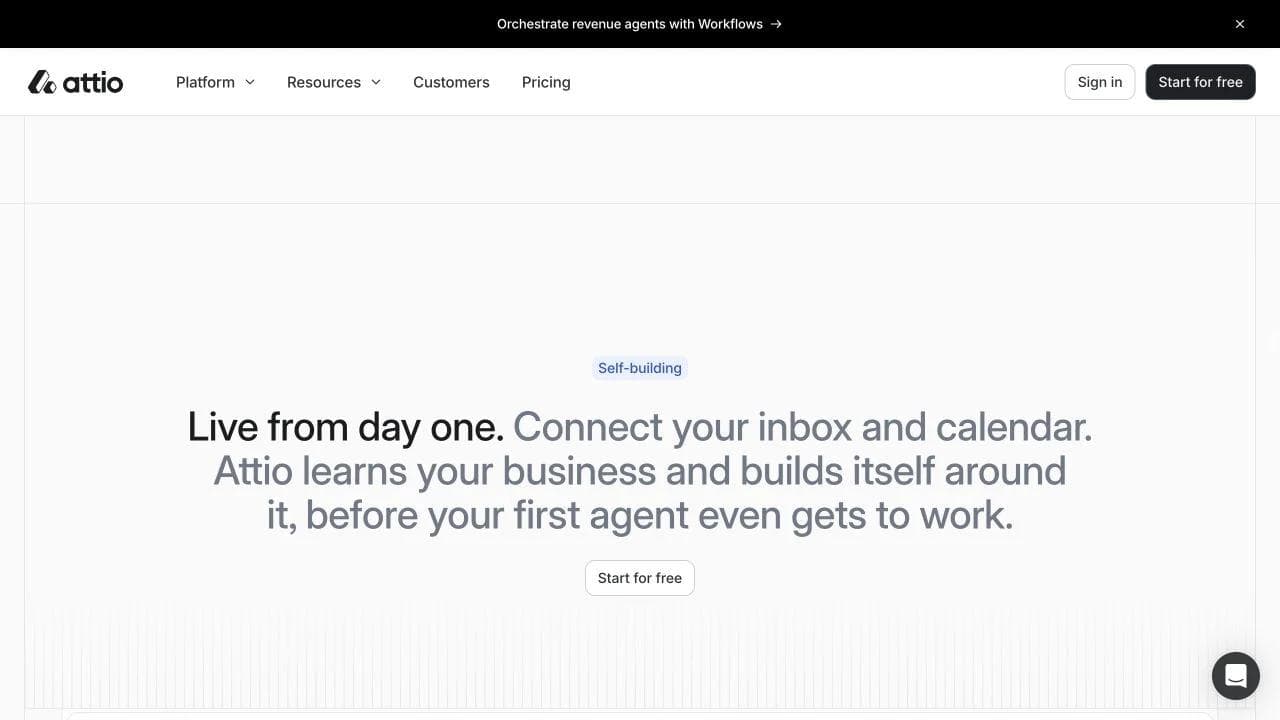
"Live from day one" says Attio connects to inbox and calendar, learns the business, and builds around it. This section changes the conversation from capability to adoption.
For an agentic CRM, onboarding is not a secondary detail. If the system needs clean context, the buyer will worry about setup quality and time. The section is valuable because it answers the objection at the point where the page's ambitious claims make that objection inevitable.
The following sections deepen the mechanism through Universal Context, connected tools, SDK, API, MCP, and production-scale claims.
Section 4: prove the product can span company stages
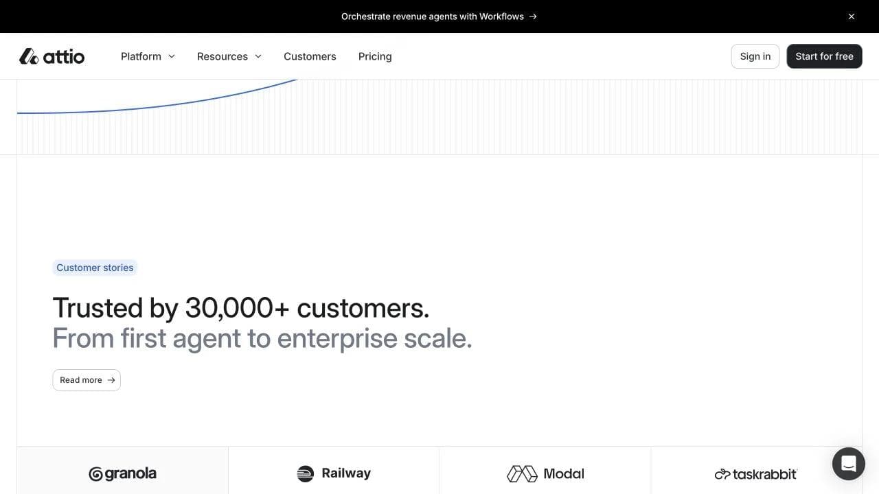
The customer section says "Trusted by 30,000+ customers" and "From first agent to enterprise scale," then shows customer logos. A changelog-style section follows, signaling product velocity, before the final "Agentic revenue runs on Attio" CTA.
The scale claim and customer evidence are useful, but the logo row alone does not prove successful enterprise deployment. Buyers with higher risk will still need case studies, security information, and implementation detail elsewhere in the journey.
What to copy and what to skip
Copy the familiar category anchor, workflow-based navigation, and explicit onboarding section. Avoid inventing a category phrase if the product does not have a different mechanism to explain. When the page makes ambitious agent claims, show enough workflow detail that "agentic" does not remain a mood.
5. Linear: let one product story carry the whole page
Section 1: show a realistic state, not a dashboard collage

Linear's homepage says "The product development system for teams and agents" and shows a detailed issue progressing from a Slack-originated report through agent work and a draft pull request.
The product visual is doing most of the explanatory work. It demonstrates the relationship between human input, issue state, agent action, code changes, and review. This is a complete micro-story, not merely evidence that the application has a polished interface.
Section 2: compress positioning into three product principles
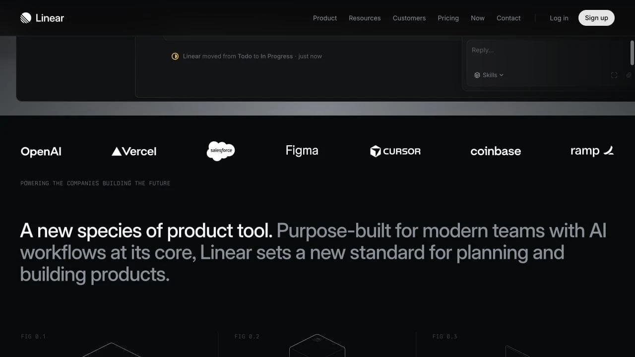
After a customer-logo band, Linear describes itself as a new species of product tool and states three principles: purpose-built, powered by agents, and designed for speed. These are not features. They are criteria the rest of the page must prove.
The section is visually sparse, but it helps the visitor interpret what comes next. It says how Linear wants to be evaluated before presenting deeper workflows.
Section 3: use four deep product chapters instead of many shallow cards

The page moves through intake and integrations, planning and monitoring, AI and automations, and build, review, and ship. Each chapter uses a large workflow-specific product demonstration.
This is the narrowest and most disciplined page architecture in the set. The sections follow product development from incoming signal to shipped work, so the initial positioning persists through the entire page.
There is little basic education or pricing discussion. Linear is filtering for visitors who already understand product-development tools. That confidence is effective for the target audience and risky for a broader one.
Section 4: close with customer breadth and two buying paths
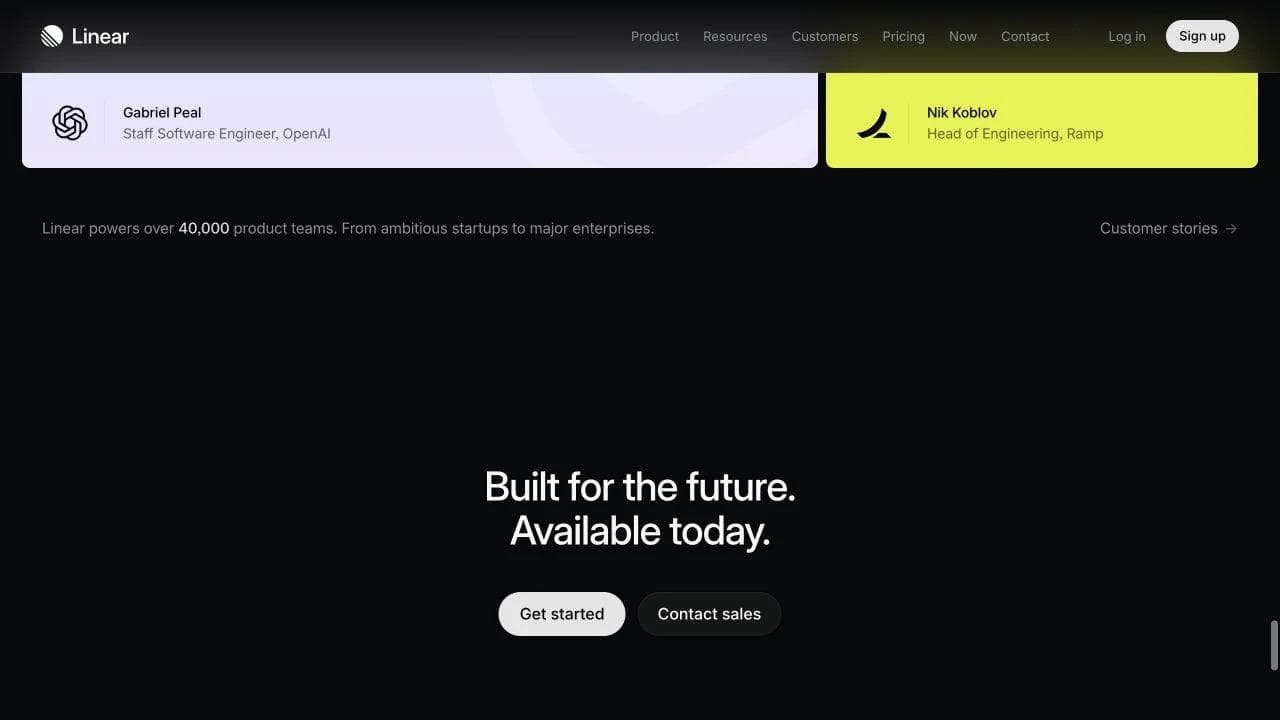
Customer quotes and a product-team count lead into "Built for the future. Available today," followed by "Get started" and "Contact sales." The page ends without introducing a new idea.
That restraint is important. A final CTA should summarize the argument, not launch a second positioning concept. The dual paths acknowledge both individual adoption and larger-team evaluation.
What to copy and what to skip
Copy the realistic product micro-story and the sequence of deep workflow chapters. Do not copy minimalism as a visual affect. It works here because the audience, category, and product evidence are unusually specific.
6. Ramp: build an enterprise argument in layers
Section 1: unite product breadth under an economic promise
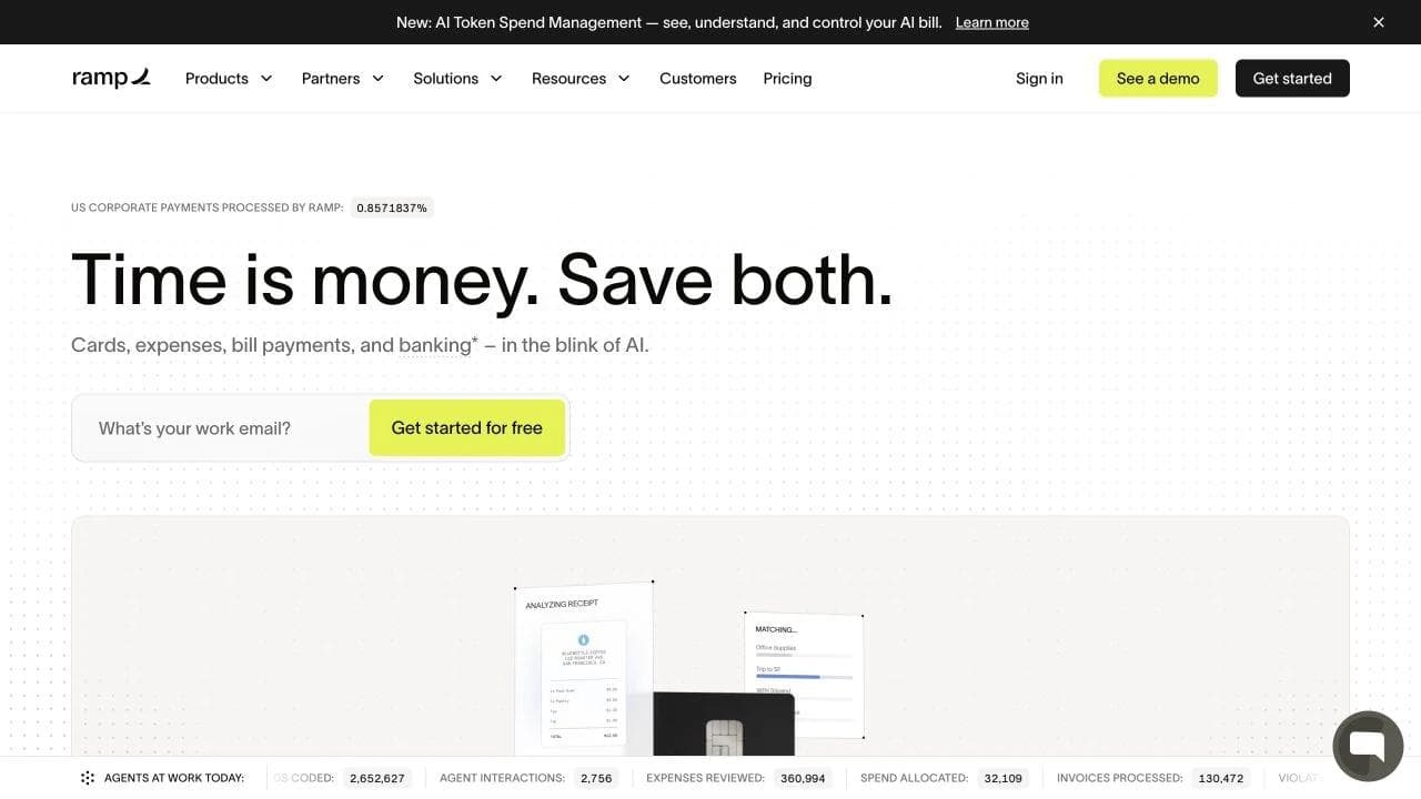
Ramp's homepage opens with "Time is money. Save both." The next line names cards, expenses, bill payments, and banking, while an email field offers a direct start. Operational counters make the AI and automation story feel active rather than hypothetical.
The hero avoids explaining every module. It gives the buyer one economic reason to care, then begins proving scale.
Section 2: move from activity to customer outcomes
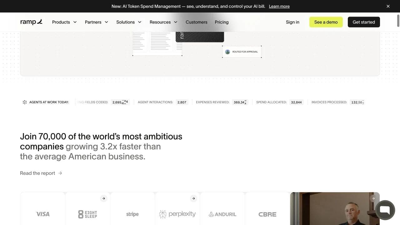
Ramp follows the hero with a claim about 70,000 companies, a linked report, recognizable organizations, and customer-story cards. This is more than generic social proof. It tries to connect adoption with business performance and financial outcomes.
The strongest elements are the case-study outcomes because they give the logos consequence. The broad growth claim is attention-grabbing, but a careful buyer will need to read the linked methodology before treating it as causal evidence.
Section 3: reveal the platform map only after earning attention
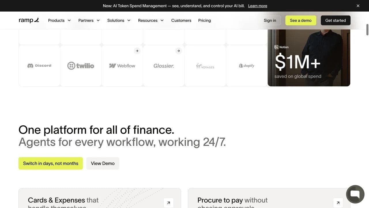
"One platform for all of finance" introduces cards and expenses, procurement, accounting automation, banking, and integrations. The section offers both "Switch in days, not months" and "View Demo."
This is the correct place for a broad product map. The hero established the economic promise, and the customer section established scale. Now the buyer has a reason to inspect modules.
The page does not pretend every visitor needs every capability. Each module is a branch into a deeper product path, which keeps the homepage from carrying all the explanation.
Section 4: turn network scale into an AI mechanism
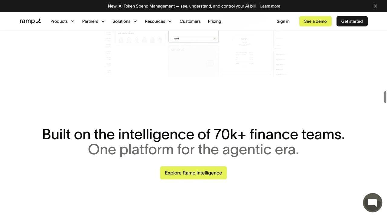
Later, Ramp says the platform is "Built on the intelligence of 70k+ finance teams" and connects that scale to an agentic product story. Subsequent sections introduce Stack, accounting workflows, automated access, global spend, customer receipts, and a final CTA.
This is a distinctive enterprise move: customer scale is presented not only as proof of adoption, but as part of the product mechanism. The claim is powerful and therefore deserves careful support. Buyers will want to know what is learned, how data is isolated, and what controls exist.
What to copy and what to skip
Copy the layering: economic promise, operational activity, customer outcomes, platform map, mechanism, and organizational reassurance. Do not import enterprise proof density into a low-risk utility. It would make a simple purchase feel larger than it is.
The anatomy of an effective SaaS landing page
There is no universal section order, but the following components cover the questions most SaaS buyers need answered.
Navigation: orient without creating an escape hatch maze
Keep the top-level choices aligned with major evaluation paths: product, solutions, pricing, customers, resources, sign in, and the primary action. A narrow campaign landing page may remove most navigation. A homepage serving several audiences usually needs it.
Avoid turning every feature into a top-level item. Navigation should reveal the product model, not reproduce the sitemap.
Hero: complete one thought
The headline, supporting copy, visual, and primary CTA should work as one unit.
- Headline: the outcome, category, or differentiated frame
- Supporting copy: audience, mechanism, scope, or constraint
- Primary CTA: the most reasonable next action
- Secondary CTA: a lower-commitment or sales-assisted path, if necessary
- Visual: evidence that makes the claim easier to believe
If each element introduces a different message, the hero becomes a collage. A visitor should be able to summarize the product after one pass.
Product proof: show a workflow, not merely an interface
The strongest product visual captures a before-and-after, an input-to-output sequence, or a meaningful state change. A generic dashboard can prove that software exists, but it rarely proves the promise.
Useful formats include:
- A realistic interface state with enough context to infer the task
- A three-step workflow from source to result
- A short interaction that demonstrates speed or simplicity
- An annotated crop focused on one differentiating capability
- A customer artifact created by the product
Social proof: answer a specific doubt
Different proof formats answer different questions:
- Logos: Do credible organizations use this?
- Testimonials: Does someone like me value it?
- Case studies: Did it produce a meaningful outcome?
- Review ratings: Is satisfaction broad rather than anecdotal?
- Usage data: Does the product operate at real scale?
- Security and compliance: Can my organization approve it?
- Community or templates: Will I have help getting started?
Do not collect proof as decoration. Place each item near the claim or decision it supports.
Workflow sections: turn features into a causal story
Organize the middle of the page by customer work, not your internal product architecture. "Collect feedback, identify patterns, and create prioritized issues" is easier to evaluate than "AI layer, analytics engine, and integrations platform."
For each workflow, connect four elements:
- The situation or problem
- The product action
- The resulting change
- The evidence that it works
Objection handling: put friction where it occurs
List the reasons a qualified buyer may hesitate. Common objections include setup time, migration, learning curve, integrations, security, price, reliability, customization, collaboration, and loss of control.
Then place the answer near the point where the objection becomes relevant. A no-credit-card note belongs beside signup. Migration support belongs near data import or switching. Security belongs before an enterprise demo CTA, not hidden in a footer.
Final CTA: summarize the decision, not just the slogan
The bottom of the page should give the reader a clean next step after the argument is complete. Restate the audience or outcome, include one short reassurance, and use the CTA appropriate to the buying motion.
Choose the page architecture that matches your SaaS motion
Self-serve utility
Best for products with a familiar category, short time to value, and low adoption risk.
Recommended sequence: clear category promise, immediate product action, lightweight proof, key capabilities, templates or use cases, pricing reassurance, final action.
Tally is the clearest example in this group.
Product-led platform
Best for products that can start self-serve but expand into teams or multiple workflows.
Recommended sequence: outcome and category, interactive product proof, customer credibility, connected workflow sections, integrations and team fit, pricing or plan path, final signup.
beehiiv, Cal.com, Attio, and Linear each use a version of this model.
Sales-led or enterprise platform
Best for products with larger contracts, multiple stakeholders, implementation work, or meaningful operational risk.
Recommended sequence: economic promise, category scope, customer proof, product mechanism, role or industry fit, case studies, integration and security reassurance, implementation story, demo CTA.
Ramp is closest to this model, while still preserving a direct start path.
New-category product
Best for products whose mechanism or market frame is genuinely unfamiliar.
Recommended sequence: recognizable problem, new frame, familiar category anchor, mechanism demonstration, proof, use cases, objections, action.
Attio's pairing of "agentic revenue" with CRM illustrates the central tension: create interest without sacrificing understanding.
How to build a SaaS landing page step by step
Step 1: define one primary visitor
Write down the role, company stage, trigger event, current workaround, desired outcome, and main adoption fear. If the page serves several audiences, choose one primary narrative and create clear branches for the others.
Step 2: collect customer language
Review sales calls, support tickets, onboarding notes, churn reasons, community posts, and search queries. Capture the words customers use for the problem, not only the vocabulary your team uses for the product.
Step 3: write the argument before the layout
Draft one sentence for each job: promise, mechanism, proof, fit, risk, and action. Arrange them in the order a skeptical visitor would need. This becomes the page outline.
Step 4: build an evidence inventory
For every important claim, list the best available evidence. Product states, customer artifacts, benchmarks, case studies, reviews, logos, integration coverage, and security documentation are all candidates. Remove or soften claims you cannot support.
Step 5: choose the hero action
Match the CTA to actual product readiness:
- "Create" or "Start free" when value can begin immediately
- "Try the demo" when interaction explains the product
- "See how it works" when education must precede signup
- "Book a demo" when qualification and implementation matter
Avoid a low-commitment label that secretly opens a high-friction form.
Step 6: design one message per section
Each section should have one conclusion. Use the heading to state it, the copy to explain it, the visual to prove it, and the CTA to continue the relevant path. If a section needs four unrelated headings, it is probably four sections.
Step 7: run the five-second and scroll tests
After five seconds, can a new visitor identify the product category, intended audience, main outcome, and next step? While scrolling without reading body copy, do the headings form a coherent argument?
Step 8: check the mobile story separately
Do not treat mobile as a smaller desktop canvas. Verify headline wrapping, CTA order, product-image legibility, tap targets, sticky elements, proof density, and section length. A detailed desktop interface may need a different crop or sequence on mobile.
Step 9: instrument the whole journey
Track more than the final conversion. Useful events include primary CTA clicks, secondary CTA clicks, pricing visits, demo starts, signup starts, signup completion, video plays, interactive demo progress, customer-story visits, and qualified pipeline creation.
Step 10: test the argument before the decoration
Start with message and evidence:
- Outcome-led headline versus category-led headline
- Product workflow versus abstract illustration
- Customer result versus logo strip
- Immediate signup versus product tour
- Role-specific section versus broad feature grid
- Short form versus multi-step qualification
Color, button shape, and minor layout changes can matter, but they rarely rescue a page whose promise or proof is wrong.
A diagnostic checklist for your SaaS landing page
Use this before launch or during a rewrite.
Message
- Can a new visitor name the category or mechanism?
- Does the page identify a real audience or situation?
- Is the promised outcome specific enough to evaluate?
- Does the supporting copy clarify rather than repeat the headline?
Product
- Does the page show a believable workflow or output?
- Can visitors connect each major capability to an outcome?
- Are product images readable at the size they render?
- Does the page explain what is genuinely different?
Proof
- Is every major claim supported by appropriate evidence?
- Does the proof resemble the target customer?
- Are quantified outcomes defined and credible?
- Is enterprise reassurance proportional to adoption risk?
Conversion
- Is one primary action visually dominant?
- Does the CTA label describe what happens next?
- Are self-serve and sales-led paths clearly separated?
- Are objections answered near the relevant action?
Experience
- Do the headings tell a coherent story on their own?
- Is the mobile version deliberately composed?
- Are animation and video helping comprehension?
- Is the page fast enough that proof arrives before attention disappears?
Common SaaS landing page mistakes
Mistaking aspiration for positioning
"Work smarter," "move faster," and "unlock growth" apply to almost every SaaS product. Add the audience, object, workflow, or mechanism that makes the promise yours.
Showing the whole product at once
A tiny dashboard with ten widgets asks the visitor to decode your information architecture. Choose the one state that best explains the promise.
Using logos as the only proof
Logos establish familiarity, not necessarily outcomes or product fit. Pair them with a relevant customer result, workflow, or artifact.
Treating feature breadth as a story
More cards do not explain why the capabilities belong together. Organize around the customer's process or business model.
Sending every visitor to the same CTA
A founder ready to try the product and an enterprise buyer checking security are at different stages. Give each a sensible route while keeping one primary action.
Hiding the hard parts
Migration, implementation, permissions, integrations, and security often determine the purchase. Addressing them can strengthen the page because it signals that the product understands real adoption.
Building a SaaS landing page with Moda
Moda is a strong fit when you want to create a polished, static SaaS marketing page with high visual control and consistent brand assets. You can prompt an agent to draft the page, refine the hierarchy and copy, edit the layout visually, and publish the result as a website. The same workspace can also create the product screenshots, social posts, launch graphics, and presentation assets around the page.
Moda is not a replacement for your SaaS application, backend, authentication system, analytics stack, or a specialized experimentation platform. It is best suited to the public-facing marketing experience, especially when design quality and brand fidelity matter and the site is mostly static or uses simple interactions and lead forms.
Building a static SaaS marketing site? Try Moda today and turn a prompt into an editable, publishable page.
Frequently asked questions
What is a SaaS landing page?
A SaaS landing page is a marketing page designed to move a software buyer toward a specific action such as starting a trial, creating an account, exploring a demo, or booking a sales call. A SaaS homepage often functions as a broad landing page for direct and organic visitors, while campaign landing pages usually focus on one audience, use case, or offer.
What should a SaaS landing page include?
Most effective pages include a clear promise, category or mechanism explanation, product proof, customer evidence, use cases or workflows, objection handling, and a primary call to action. The exact order should reflect the product's familiarity, adoption risk, and buying motion.
How long should a SaaS landing page be?
It should be long enough to answer the questions a qualified buyer needs before taking the next step. A familiar self-serve utility may need a short page. A new category or enterprise platform may require product explanation, case studies, integrations, security, and implementation detail. Section count is less important than whether every section advances the decision.
Should the hero show the product?
Usually, if the product can be understood at the displayed size. A focused workflow, realistic state, or clear output is more persuasive than a generic dashboard. If the interface is dense or the category is unfamiliar, use an annotated crop, short demonstration, or simpler mechanism visual.
What is the best call to action for a SaaS landing page?
Use the lowest-commitment action that honestly leads toward value. Start free works for a self-serve product with a fast setup. Explore the demo works when interaction creates understanding. Book a demo is appropriate when implementation, qualification, or organizational approval is part of the purchase.
How do you improve SaaS landing page conversion?
First identify where qualified visitors lose confidence. Test clearer positioning, stronger product evidence, more relevant customer proof, lower-friction next steps, and better objection handling. Measure signup or demo completion and qualified pipeline, not only button clicks.

Real editable visuals. Real canvas. Full control.
Fly through design work