How to Put Text on a Photo That Stays Readable
Put text on a photo with the right tool, then use hierarchy, contrast, safe margins, and export checks to keep every word readable.
 Anvisha Pai, Co-founder & CEO, Moda
The fastest way to put text on a photo is to use the editor you already have. Phone markup is best for a quick label. Canva, Adobe Express, Picfont, or AddText give you more control in a browser. Use a full design canvas only when the result needs careful hierarchy, reusable brand styling, or several sizes. This guide shows all three routes, then explains how to keep the words readable after the image is cropped and exported.
Choose the simplest tool that fits the job
Adding words and designing a graphic are different jobs. Decide what the finished image needs to do before choosing an app.
- Use phone markup for annotations. It is the shortest route for a name, arrow, date, or note that does not need reusable styling.
- Use a simple web tool for one-off captions. Picfont and AddText start with an upload and keep the workflow focused on adding words.
- Use Canva or Adobe Express for a composed social graphic. Both offer movable text boxes, type styling, and templates around the photo.
- Use Moda or another full canvas when the composition must remain editable. This is useful for repeated campaign assets, brand-controlled variants, or a design that will keep changing.
A built-in tool is often better than a design platform for a one-time annotation. Opening a larger editor adds unnecessary steps if all you need is “Entrance” on a photo of a building.
How to put text on a photo in seven steps
1. Set the final crop before placing the words
Start with the destination, not the font menu. A square feed post, a vertical story, a landscape thumbnail, and a printed card place the subject in different parts of the frame. Create the final aspect ratio first, then crop the photo inside it.
If the image will appear in several shapes, make a separate composition for each one. Do not assume a centered headline from a square version will survive an automatic vertical crop.
2. Find the photo’s quiet area
Look for negative space: sky, a wall, an out-of-focus corner, or another area with little detail. Place the text there before covering the subject. The reader should be able to identify both the words and the photograph without deciding which one to ignore.
When the photo has no quiet area, you have four honest options: crop differently, move the text outside the image, simplify the background behind the text, or choose another photo. A stronger shadow rarely rescues a fundamentally crowded composition.
3. Write the copy before styling it
Shorter copy gives type room to work. Use one clear message, then add only the context the viewer needs. A practical hierarchy is:
- Headline: the main idea in roughly one or two lines.
- Support line: a date, explanation, or benefit in a smaller size.
- Action or attribution: optional and visually quieter.
Keep each role in its own text box so you can control spacing and sizing independently. Two type sizes and one type family are enough for most photo graphics.
4. Place the type with safe margins
Keep essential words away from every edge. Platform controls, rounded corners, thumbnails, and downstream crops can cover or remove edge content. Use an inset working boundary, then preview the image at the actual size and in the actual placement where people will see it.
Alignment should follow the composition. Left alignment works well for multiple lines because each line begins in the same place. Center alignment is effective for a short headline in genuinely symmetrical space. Avoid forcing a centered paragraph over an off-center subject.
5. Make contrast work across the whole text area
Contrast has to hold behind every letter, not merely in an average sample of the photo. As a useful accessibility check, WCAG 2.2 specifies 4.5:1 contrast for normal text and 3:1 for large text. Those thresholds apply to text and images of text in web content. A social image also needs descriptive accompanying text, but the ratios are still a practical legibility test.
Test both the brightest and darkest area behind the letters. If one part fails, use a treatment that changes the background, not just the type:
- Move the text into quieter negative space. This preserves more of the photograph.
- Add a solid or translucent panel. This is the most dependable fix for a busy image.
- Use a gradient scrim. Fade a dark or light layer behind the type so the photograph remains visible.
- Add a restrained outline or halo. W3C guidance identifies a halo as one way to maintain local contrast over a variable background.
A blur can also reduce competing detail, but apply it deliberately. Blurring the entire photograph may weaken the subject as much as it helps the text.
6. Use effects to solve a problem
A shadow, outline, glow, or curved baseline should have a job. Shadows separate light type from a midtone photo. Outlines can preserve letter edges over changing color. Curved type can support a badge or circular composition. None of them substitutes for hierarchy, spacing, or contrast.
Avoid stacking multiple effects. A glow plus outline plus shadow often makes the letter shape harder to read, especially at thumbnail size.
7. Export once, then inspect the delivered file
Keep an editable master, then export a delivery copy at the dimensions you actually need. Zooming into the editor is not a quality check. Open the exported file, inspect the type edges, and view it at the small size where it will appear.
PNG uses lossless compression, while JPEG uses lossy compression that discards image data. Adobe’s current format guide explains the tradeoff. PNG is a safe choice when crisp type, flat color, or transparency matters. A high-quality JPEG is often smaller for a photographic image, but excessive compression can soften letters and edges. Avoid repeatedly opening and resaving the same JPEG.
Fast instructions for common tools
Add text on iPhone with Markup
- Open the photo in Photos and enter Edit, then Markup. Apple also supports Markup from other compatible apps.
- Tap the Add button, then Add Text.
- Enter the words and adjust the font, size, justification, style, and color.
- Tap outside the text box, then finish with Done.
Apple documents the current controls in its iPhone Markup guide. Markup is the right choice for speed. It is not the best place to build a reusable campaign system.
Add text on Android with Google Photos
- Open the photo in the Google Photos app and tap Edit.
- Choose Markup. On some devices the route is Edit, Tools, then Markup.
- Tap Text, enter the words, and touch and hold the text box to move it.
- Tap Done, then Save as copy so the original remains available.
The labels and route come from Google Photos Help. Google notes that editing availability can vary by device.
Add text in Canva
- Open a design in the final size and upload the photo.
- Open the Text tab and add a heading, subheading, body text, or a font combination.
- Edit the font, size, color, alignment, spacing, and effects, then move the text box into position.
- Use Share to download the image. Canva lists JPG and PNG among its output options.
These steps follow Canva’s current add-text-to-photo guide. Canva is a strong default when you want templates and familiar manual controls. Its page says an export has no watermark as long as the design does not use premium library elements, so check the assets in the specific design rather than assuming every free export is unrestricted.
Add text in Adobe Express
- Upload your image or begin with an available image.
- Select Text, add a text box, type the copy, then drag and resize it.
- Continue styling or add shapes and other elements.
- Download the finished composition as a PNG when you are done.
Adobe’s text-on-photo page documents those steps and highlights Adobe Fonts, shadows, outlines, palettes, and text animation. Adobe Express is especially sensible if your team already works in Adobe’s design ecosystem.
Use Picfont or AddText for a quick browser job
Picfont is intentionally narrow. Its current page accepts PNG, JPEG, and GIF uploads up to 6 MB, supports a canvas up to 5,000 pixels, and includes curved type, transparency, rotation, glow, gradients, and textures. AddText offers an upload-first web tool plus iOS and Android apps. Both are better fits than a large design suite when you only need to place a few words and download the result.
Where AI and Moda actually help
AI is useful when the job is more than “put these exact words here.” It can help propose copy, explore several visual directions, or arrange a fuller campaign composition. Moda is relevant when you want the AI to build a visual on a real editable canvas, then keep text, images, and other elements available for revision.
That is unnecessary for a quick caption. It is also not a reason to trust generated wording without review. Proofread names, dates, prices, claims, line breaks, and calls to action. Check the output at every required crop. Canva or Adobe Express may be the better choice when their template ecosystems or familiar manual workflows matter more than prompt-led composition.
What if the photo already contains the wrong text?
Adding new text over a clean photo is an overlay problem. Replacing words that are already baked into a JPG or PNG is a reconstruction problem. Covering the old words may work on a flat background. A textured background may require careful retouching before you add a new live text box.
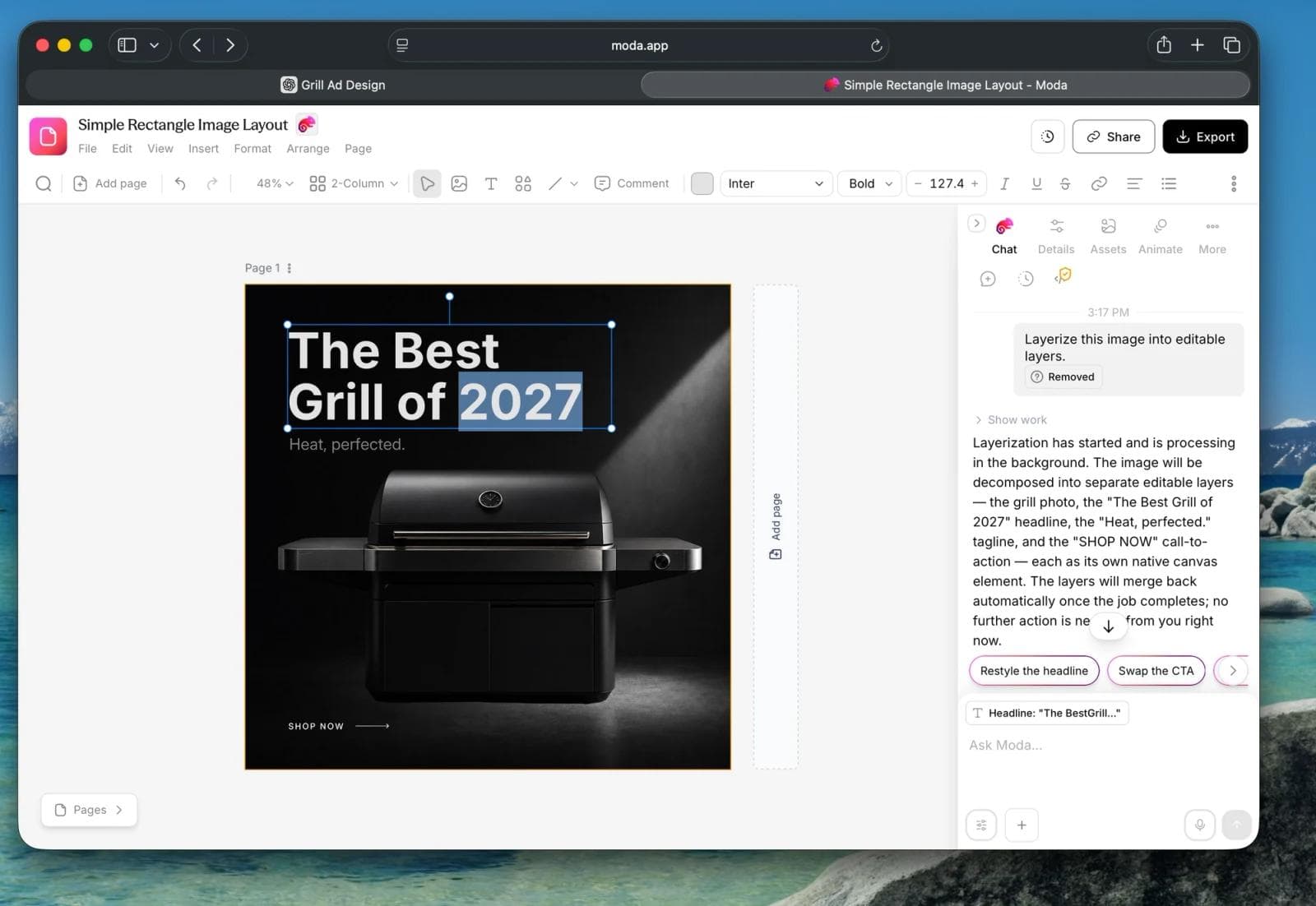
Do not assume any automatic layer or inpainting tool recovers the original source file. It creates an editable approximation or invents replacement pixels. Our separate guide explains how to change text in a flat image and where font matching and background reconstruction can fail.
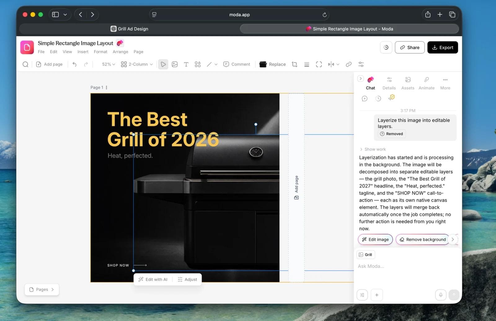
If the problem extends beyond lettering, use the broader guide to editing an AI-generated image without starting over to choose between generative editing, raster retouching, and layout reconstruction.
A final quality check before you share
- The message is understandable in one glance.
- The subject is not covered and the type sits in a deliberate area.
- Headline, support line, and action have a clear hierarchy.
- Contrast holds behind every letter, including the brightest and darkest parts of the photo.
- Essential words remain inside a safe inset in every crop.
- Names, dates, prices, and spelling have been proofread.
- The exported file is sharp at its real delivery size.
- The post or page includes a useful text alternative when the words carry information.
The best tool is the one that preserves the level of control the job needs. Use markup for a note, a focused web tool for a one-off caption, a template editor for a composed social graphic, and an editable canvas for a design you expect to revise or reuse.

Real editable visuals. Real canvas. Full control.
Fly through design work