Best Fonts for Presentations: 8 Picks That Read From the Back Row and Survive Being Sent
The best fonts for presentations pass three tests: legible from the back row, still there when the file opens elsewhere, right for the room. Measured picks for PowerPoint, Slides, Keynote and Moda.
 Anvisha Pai, Co-founder & CEO, Moda
The best fonts for presentations are the ones that pass three tests: the back row can read them, they are still there when the file opens on someone else's computer, and they suit the room. On those tests the safe defaults are Arial, Verdana and Georgia for a deck that travels, Aptos or Calibri inside a Microsoft 365 organization, Helvetica Neue for a Keynote you present yourself, and Open Sans, Lato or Montserrat when you want a more current look and can install them or work in Google Slides.
Most advice on this topic is a list of pleasant typefaces. The harder problem sits underneath: a deck is a file that leaves your laptop, and fonts are the part of the file most likely to change on the way. This guide measures the parts you can measure (x-heights, license flags, what each operating system installs) and turns them into a size recipe, a comparison table, and a default pick for each app.
What font style is best for a professional presentation
A clean sans serif with a large x-height and a real bold weight, set at a size the back row can read. That is the honest one-line answer to the question people ask, and it covers Arial, Verdana, Calibri, Aptos, Helvetica Neue, Open Sans, Lato and Inter. A serif such as Georgia is fine for an academic or editorial register, and it is installed everywhere, which most serifs are not.
"Professional" is doing two jobs in that question. One is register, which is covered below. The other is reliability: a professional deck does not turn into Arial with different line breaks when it opens on a client's machine. The reliability half is the one worth spending time on.
Test 1: can it be read from the back of the room
Legibility on a slide comes down to the height of the lowercase letters, not the nominal point size. Two fonts at 24 pt can differ by 15 percent in the height of the letters your audience actually reads. Weight matters too: light weights disappear on projectors, which wash out contrast.
X-height, measured
We read the x-height and cap height from the font files themselves (the OS/2 table, using the macOS Sequoia system copies and the current Google Fonts releases). The figure is the x-height as a fraction of the point size.
| Font | x-height / point size | Point size for a 16 pt x-height |
|---|---|---|
| Verdana, Tahoma | 0.545 | 29 pt |
| Inter | 0.546 | 29 pt |
| Open Sans | 0.535 | 30 pt |
| Roboto | 0.528 | 30 pt |
| Arial | 0.519 | 31 pt |
| Montserrat | 0.517 | 31 pt |
| Lato | 0.506 | 32 pt |
| Georgia | 0.481 | 33 pt |
| Calibri (measured via Carlito, its metric-compatible twin) | 0.478 | 34 pt |
| Source Sans 3 | 0.478 | 34 pt |
| Avenir Next | 0.468 | 34 pt |
| Times New Roman | 0.447 | 36 pt |
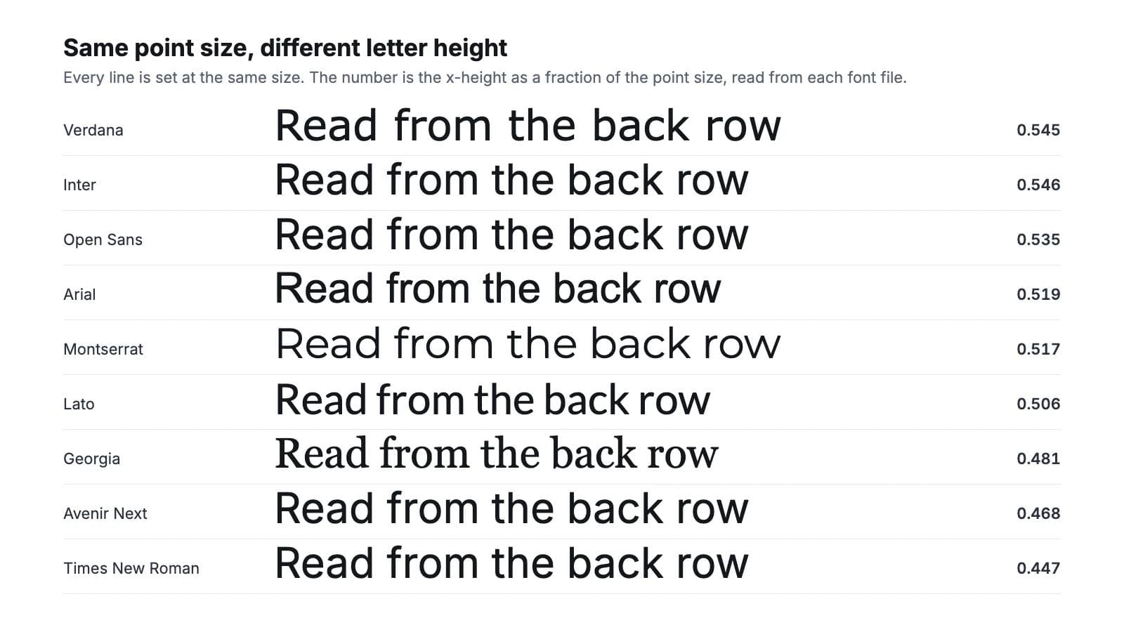
The practical reading: Georgia, Calibri and Avenir Next need roughly 12 to 15 percent more point size than Verdana or Inter to put the same amount of letter in front of the audience. When a template built in Verdana is switched to Calibri without changing sizes, the deck gets harder to read and nobody can say why.
How far away can it be read
The audiovisual industry sizes screens with a simple rule from the AVIXA display-size standard: for ordinary presentation content ("basic decision making"), the smallest element the audience must read should be at least one two-hundredth of the distance to the farthest viewer. AVIXA publishes the acuity factor of 200; the element is the lowercase letter height for text.
Put the two measurements together and you get a distance in image heights, which is the useful unit because you rarely know the room but you can always count how many screen-heights away the last row sits.
- 24 pt Open Sans body text on a standard PowerPoint slide has an x-height of about 12.8 pt on a 540 pt tall slide, or 2.4 percent of the image. It reads to about 4.8 image heights.
- A typical meeting room puts the back row at 4 to 6 image heights. A lecture hall can be 8.
- For 6 image heights you need a 3 percent x-height: 30 pt in Verdana, Open Sans or Inter, 33 pt in Georgia, 34 pt in Calibri.
- A footnote at 14 pt reads to about 2.8 image heights. Treat footnote text as something people read from the emailed file, not from the screen.
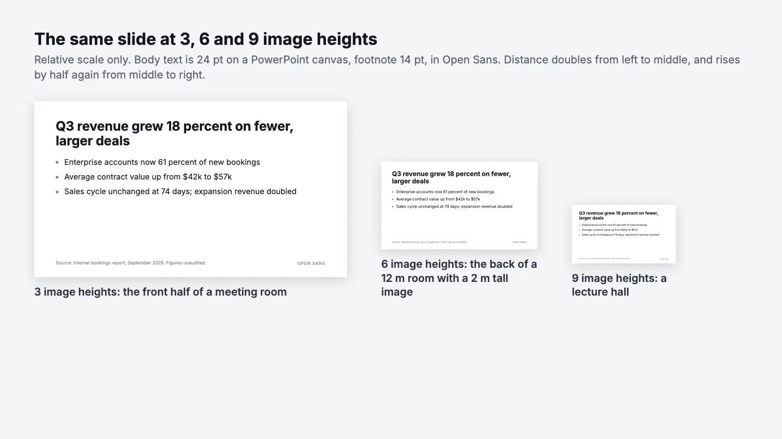
Screen sharing is not more forgiving. A viewer 60 cm from a laptop with the slide taking up 15 cm of window height is at 4 image heights, about the same as a meeting room. Someone on a phone, with the slide 5 cm tall at 35 cm, is at 7 image heights and needs your 32 pt version.
The size recipe, and why it changes per app
Point sizes are not comparable between apps because the slide canvases are different heights. PowerPoint's default Widescreen slide is 13.333 by 7.5 inches, which is 540 pt tall. Google Slides' Widescreen 16:9 page is 10 by 5.625 inches, 405 pt tall. Keynote's Wide themes are 1920 by 1080 pt. The same 24 pt is 4.4 percent of the slide in PowerPoint, 5.9 percent in Google Slides and 2.2 percent in Keynote. This is why text copied from a Slides deck into PowerPoint looks small, and why a Keynote deck imported into PowerPoint arrives with 48 pt body text.
The recipe below gives the same visual size in each app, for a 16:9 slide, using a large-x-height sans serif. Add about 12 percent for Georgia, Calibri or Avenir Next.
| Role | PowerPoint (540 pt canvas) | Google Slides (405 pt) | Keynote Wide (1080 pt) |
|---|---|---|---|
| Slide title | 36 to 44 pt | 27 to 33 pt | 72 to 88 pt |
| Body, back row within 5 image heights | 24 to 28 pt | 18 to 21 pt | 48 to 56 pt |
| Body, back row at 6 to 8 image heights | 30 to 36 pt | 22 to 27 pt | 60 to 72 pt |
| Footnote or source line | 14 pt | 10 to 11 pt | 28 pt |
Weight: use Regular or Medium for body text and Bold or SemiBold for titles. Skip Light and Thin on anything projected. Skip the extra-black display weights for body text; they close up the counters and make lines hard to scan.
Test 2: will it survive the file leaving your machine
This is the test nobody runs until a deck opens on a client's laptop in Arial. A font name in a .pptx is a request, not a guarantee. The opening machine fills the request from what it has installed, from what its app can fetch, or from what is embedded in the file. There are four ways a font arrives intact, and each one has conditions.
1. It ships with the operating system
If a font is installed by both Windows and macOS, the request is filled everywhere. The overlap is smaller than people assume.
Microsoft's Windows 11 font list includes Arial, Calibri, Cambria, Candara, Corbel, Franklin Gothic Medium, Georgia, Segoe UI, Tahoma, Times New Roman, Trebuchet MS and Verdana. It does not include Helvetica, Avenir, Futura or Gill Sans (Gill Sans Nova is an optional download), and it does not include any Google font.
Apple's fonts included with macOS Sequoia include Helvetica, Helvetica Neue, Avenir, Avenir Next, Futura, Gill Sans, Baskerville, Palatino, Optima, Charter, plus Arial, Georgia, Verdana, Trebuchet MS, Tahoma and Times New Roman. It does not include Calibri, Cambria, Segoe UI or Aptos. A Mac gets Calibri when Microsoft Office is installed, because Microsoft supplies it with Windows and within Office applications; a Mac with only Keynote and Google Slides does not have it.
So the fonts on both lists are Arial, Georgia, Verdana, Trebuchet MS, Tahoma and Times New Roman. That is the whole set of typefaces you can name in a file and expect to be present on any laptop with no further conditions. Segoe UI is the common trap in the other direction: it is the Windows interface font, it looks like a safe default on a Windows machine, and it is on no Mac.
2. The app fetches it
Two of the three big apps can fill a font request over the network.
Microsoft 365 has cloud fonts. Microsoft says they are "available to Microsoft 365 subscribers", the device "needs to be online", and documents that use them "will render the same when opened in the Office apps listed in the table, without you having to embed them" (Cloud fonts in Office). Aptos, the default Office font since it replaced Calibri, is a cloud font. Inside an organization on Microsoft 365, Aptos is as safe as Arial. Sent to someone on a perpetual Office license, on Keynote, or in Google Slides, it is not there, and it is also not on Microsoft's Windows 11 list. Microsoft offers Aptos as a free download for that case.
Google Slides draws from the Google Fonts library. The font menu starts with a short list and the "More fonts" button adds most of the Google Fonts library to it; added fonts persist in that app. Because Slides renders in the browser from Google's servers, anyone viewing the deck in Slides sees the font you chose. Slides also has Calibri and Cambria, which Google added in 2010, alongside the classic set of Arial, Georgia, Verdana, Trebuchet MS and Times New Roman. It does not have Helvetica, Avenir, Aptos or Segoe UI, and you cannot upload your own font file. When Slides opens a .pptx that names a font it lacks, the text is drawn in a fallback. Google does not document the rule; reports on its own help forum describe Arial taking over and the change sticking once the file is edited.
Keynote fetches nothing. When it opens a file with a missing font, Apple says "a missing font notification appears briefly at the top of the presentation" and offers Format > Font > Replace Fonts; the replacement "uses the same size and weight as the font it replaces" (Apple Keynote guide).
3. The font is embedded in the .pptx
PowerPoint can carry the font inside the file. On Windows the setting is File > Options > Save > "Embed fonts in the file"; on Mac it is PowerPoint > Preferences > Output and Sharing > Save > Font Embedding. It offers "Embed only the characters used in the presentation" (smaller file, other people cannot type new text in that font) or "Embed all characters (best for editing by other people)" (Microsoft: benefits of embedding custom fonts).
Embedding is not a right you have; it is a permission the font's maker grants. Every TrueType and OpenType font carries a license flag with one of four settings: installable, editable, preview and print, or restricted. Microsoft names the same four and warns that "Not all TrueType fonts can be embedded". When a font is restricted, PowerPoint shows the message Some of your fonts can't be saved with the presentation and saves without it. The same page notes that PostScript Type 1 and Apple Advanced Typography fonts cannot be embedded at all.
We read that flag from the actual font files on a Mac running Sequoia and from the current Google Fonts releases. The results are the part of this article you cannot get from a listicle:
- Arial, Verdana, Tahoma, Georgia and Trebuchet MS carry the editable flag. They embed, and the recipient can edit the text.
- Open Sans, Roboto, Lato, Montserrat, Inter, Source Sans 3, Merriweather and Libre Franklin carry the installable flag, the most permissive setting. All of them are published under the SIL Open Font License. If they are installed on the machine that saves the .pptx, they embed without complaint.
- Helvetica Neue on macOS carries the installable flag. Apple's Helvetica collection mixes installable and preview-and-print faces.
- Avenir Next, Avenir, Gill Sans, Palatino and Charter on macOS carry the preview-and-print flag. That is the setting that lets a viewer see the text but does not license editing in that font. If you are choosing a Mac system font for a deck that other people will edit, this is the flag to avoid.
Two limits on embedding. Microsoft documents the setting for PowerPoint on Windows and Mac, 2016 and later; if a deck is finished in any other editor, check the saved file rather than assuming the font traveled. And embedded fonts add the whole font file, or the subset, to every copy of the deck, so a four-weight brand family can add a few megabytes.
4. You send a PDF
A PDF carries the letterforms. Adobe's description of the mechanism is the one every PDF writer follows: "A font can be embedded only if it contains a setting by the font vendor that permits it to be embedded", embedding "prevents font substitution", and subsetting "only the characters used in the file" keeps the size down (Adobe: embedding fonts in PDFs). The same restricted flag that blocks PowerPoint embedding blocks PDF embedding, and a viewer then substitutes.
For anything sent to be read rather than edited, a PDF is the right deliverable and the font question disappears, with one caveat: a PDF has one page per slide with every build shown in its final state, so animation-heavy decks lose their sequencing.
Test 3: does it fit the register
Once a font passes the first two tests, choose by the room.
- Corporate and internal: Aptos or Calibri inside Microsoft 365; Arial when the deck goes outside. Georgia for body text if the house style leans editorial.
- Startup, product and sales: Open Sans, Lato or Inter for body, Montserrat SemiBold or Bold for titles. Install them on the presenting machine and turn embedding on before you send the .pptx.
- Academic and research: Georgia for body copy and captions, Arial or Verdana for charts and tables. Both are on every machine in the seminar room and in the journal's slide template.
- Keynote and conference stage: Helvetica Neue in two weights, or Avenir Next if the deck never leaves your Mac. Large sizes, few words, a bold weight for anything under 40 pt.
- Remote and screen share: Verdana. It was drawn for low-resolution screens, it has the largest x-height in the table, and it is installed everywhere.
The shortlist
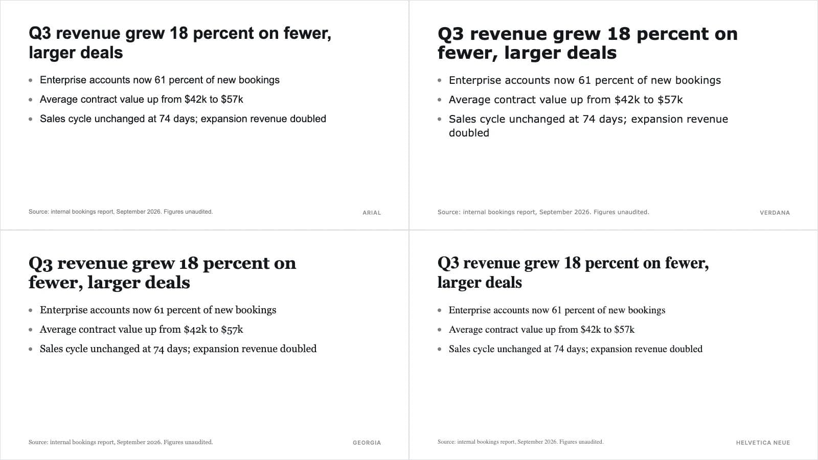
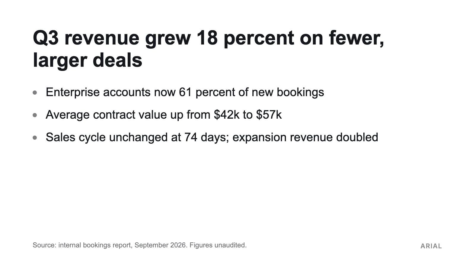
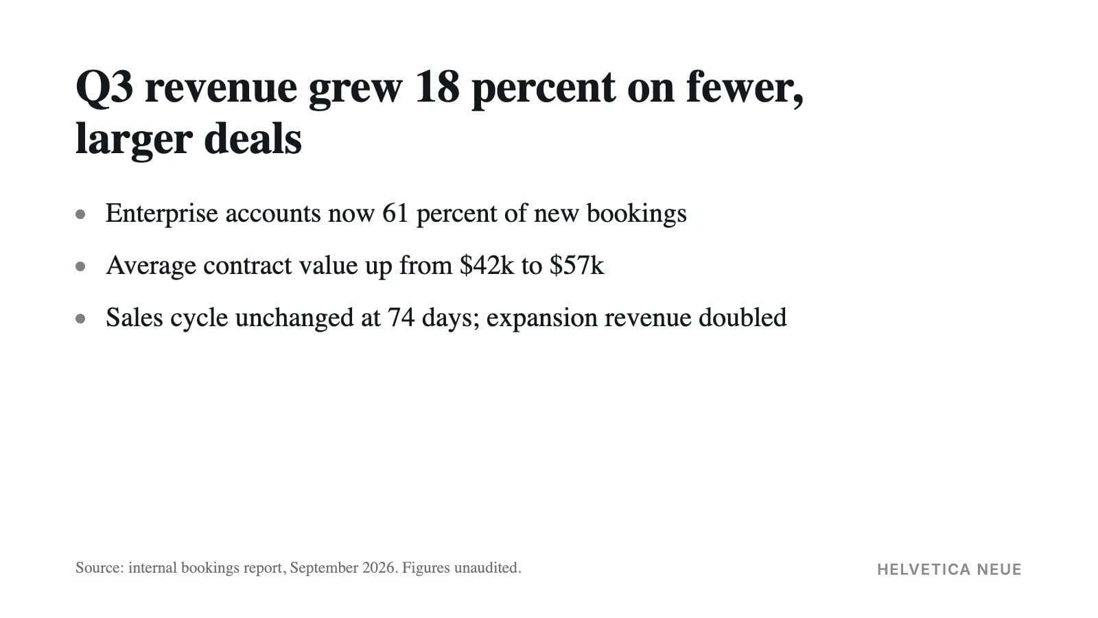
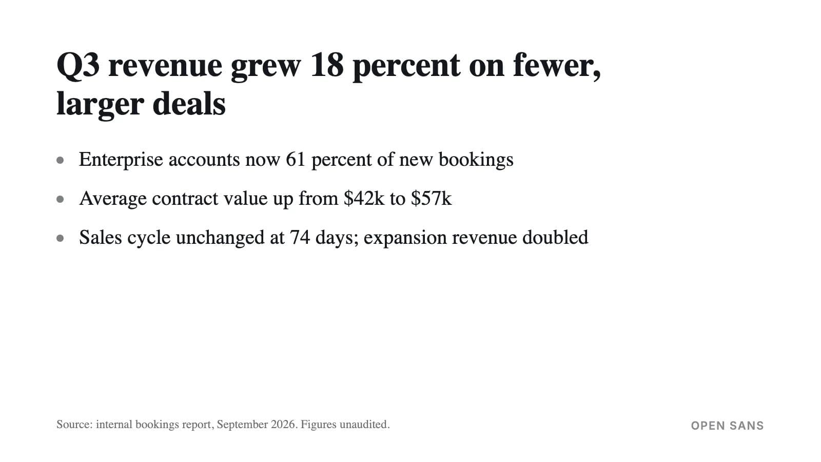
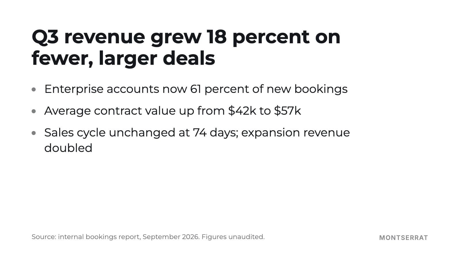
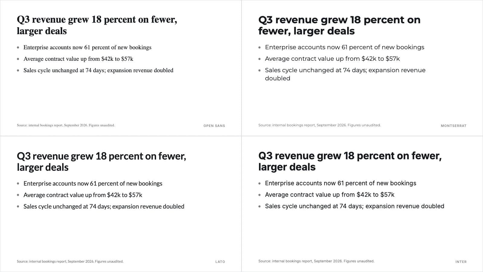
Eight fonts, one reason each, and the same slide set in each: title 40 pt, body 24 pt, footnote 14 pt on a standard PowerPoint canvas.
1. Arial
On every Windows and Mac machine, in Google Slides by default, embeds as editable. The font you choose when the file matters more than the look.
2. Verdana
The largest x-height of any widely installed font, so it reads at a smaller point size than anything else here. The remote-meeting default.
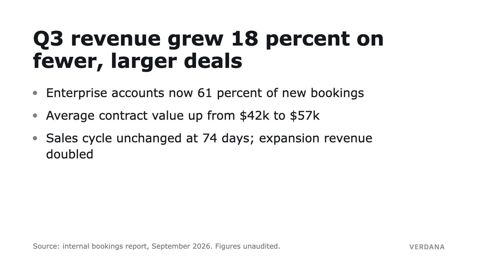
3. Georgia
One of two serifs installed on both operating systems and in Slides, and unlike Times New Roman it was drawn for screens. Set it 12 percent larger than a sans serif for the same legibility.
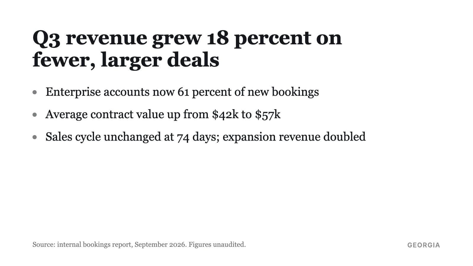
4. Aptos
Microsoft's current default, a cloud font for Microsoft 365 subscribers, with a slightly narrower Display cut for large titles. Safe inside the organization, absent outside it.
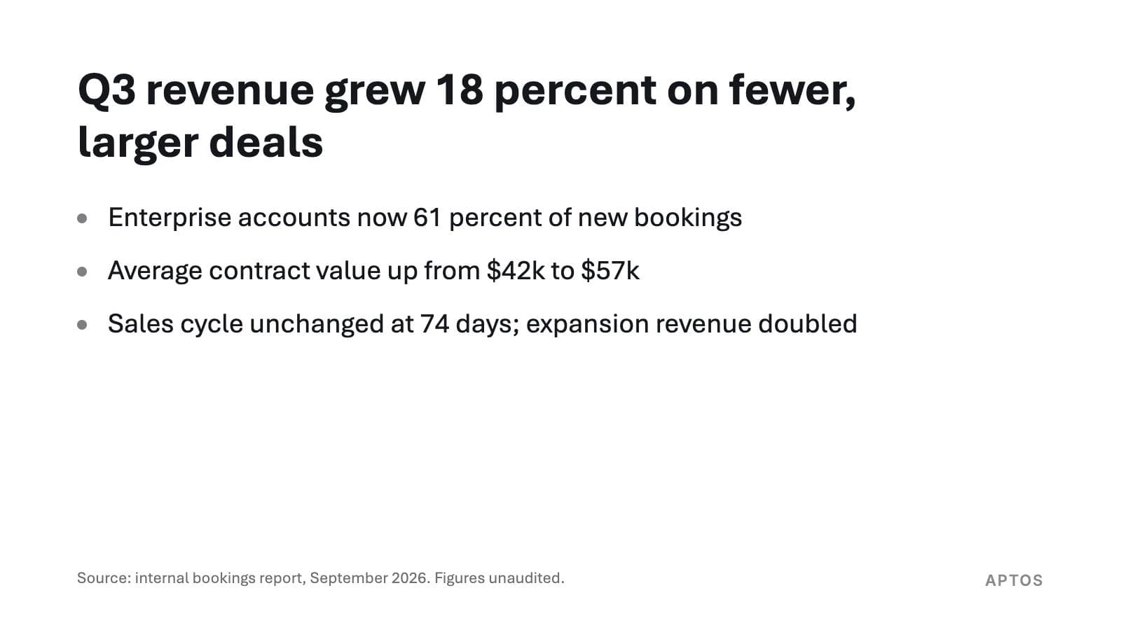
5. Calibri
Still on every Windows machine and in Google Slides, still what most corporate templates are built on. Small x-height, so size it up.
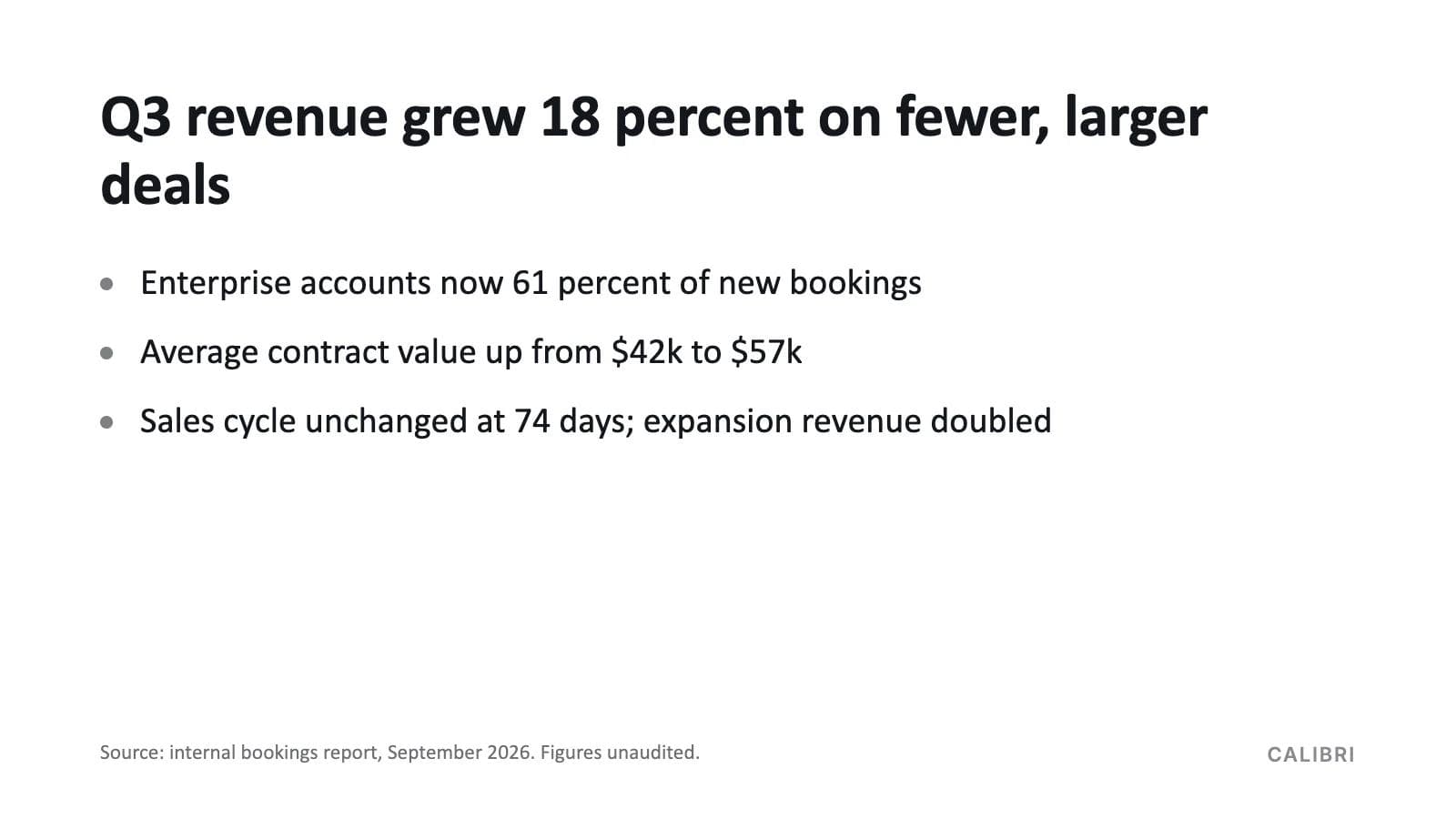
6. Helvetica Neue
The Mac's own workhorse: a full weight range, an installable embedding flag, and it is on every Mac. Not on Windows, not in Slides.
7. Open Sans
The Google Fonts workhorse: large x-height, installable license, in the Slides menu via More fonts, embeds cleanly from PowerPoint once installed. The best body font for a deck that must look current and still travel.
8. Montserrat
Geometric, wide and confident at title sizes; too wide for body text at the sizes you can afford. Pair it with Open Sans or Lato.
Also worth knowing: Lato (rounder than Open Sans, slightly smaller x-height), Inter (drawn for screens, large x-height, the technical-product look), Roboto (Android's system font, very similar metrics to Open Sans), and Avenir Next (beautiful on a Mac, preview-and-print flag, keep it at home).
Pairings that hold up
- Montserrat SemiBold titles with Open Sans body: the startup deck.
- Georgia titles with Arial body: the academic or editorial deck that opens anywhere.
- Aptos Display titles with Aptos body: one family, two cuts, no install anywhere on Microsoft 365.
- Helvetica Neue Bold titles with Helvetica Neue Light body, body never below 48 pt on the Keynote canvas: the stage deck.
- Verdana Bold titles with Verdana body: the deck for a shaky projector or a phone screen.
Comparison table
| Font | Ships with Windows 11 | Ships with macOS Sequoia | In Google Slides font menu | Embeds in PowerPoint | Body size, PowerPoint canvas | Register |
|---|---|---|---|---|---|---|
| Arial | Yes | Yes | Yes, default list | Yes, editable flag | 24 to 28 pt | Corporate, universal |
| Verdana | Yes | Yes | Yes, default list | Yes, editable flag | 22 to 26 pt | Remote, data-heavy |
| Georgia | Yes | Yes | Yes, default list | Yes, editable flag | 26 to 30 pt | Academic, editorial |
| Calibri | Yes | Only with Office installed | Yes | Microsoft font; flag not measured here | 26 to 30 pt | Corporate default before 2024 |
| Aptos | Cloud font for Microsoft 365; not in the base list | Only with Microsoft 365 | No | Renders for subscribers without embedding | 24 to 28 pt | Current Office default |
| Helvetica Neue | No | Yes | No | Yes on Mac, installable flag | 24 to 28 pt | Keynote, stage |
| Avenir Next | No | Yes | No | Preview and print flag only | 26 to 30 pt | Keynote, premium |
| Open Sans | No, install it | No, install it | Yes, via More fonts | Yes, installable flag | 24 to 28 pt | Startup, product |
| Lato | No, install it | No, install it | Yes, via More fonts | Yes, installable flag | 24 to 28 pt | Friendly corporate |
| Montserrat | No, install it | No, install it | Yes, via More fonts | Yes, installable flag | Titles 36 to 44 pt | Startup titles |
| Inter | No, install it | No, install it | Yes, via More fonts | Yes, installable flag | 22 to 26 pt | Product, technical |
| Segoe UI | Yes | No | No | Windows only; do not rely on it | 24 to 28 pt | The Windows-only trap |
Sources for the availability columns are Microsoft's Windows 11 font list, Apple's Sequoia list and Google's Fonts Knowledge article linked above. The embedding column is our own reading of the license flag in each font file on 9 September 2026; Calibri and Aptos were not installed on the test machine.
The default pick for each app
PowerPoint. Use Aptos if everyone who will open the deck is on Microsoft 365. Use Arial or Verdana, or Calibri, if you do not know who will open it. If you want a Google font, install it on the saving machine, turn on "Embed fonts in the file", and check the file size before you send it.
Google Slides. Open Sans or Lato through More fonts if the deck stays in Slides; every viewer sees it. If the deck will be downloaded as a .pptx, use Arial, Georgia or Verdana, which are in the Slides menu and on both operating systems, so the file arrives the same. Our Google Slides vs PowerPoint comparison covers the rest of that handoff.
Keynote. Helvetica Neue for a deck you present from your own Mac. Arial or Georgia if you will export to PowerPoint, because Keynote's Mac-only fonts are the ones Windows lacks, and Avenir Next carries the preview-and-print flag. Keynote's 1080 pt canvas needs roughly twice PowerPoint's point sizes for the same visual result.
Moda. Moda builds decks on a canvas and exports real .pptx and PDF files, and we checked how its exporter handles fonts rather than guessing. For PowerPoint, it embeds the full font file for every family the deck uses that is in Moda's font library or your team's uploaded brand fonts, writing the regular, bold, italic and bold-italic faces into the file so PowerPoint binds them natively; other weights such as SemiBold are written as their own typeface. If a font file cannot be fetched, that face is skipped and PowerPoint substitutes, the same as an unembedded deck. The exporter reads the license flag and logs a restricted font, but it does not refuse it, so a restricted brand font is your call, not the tool's. The PDF export embeds the typefaces as a real vector PDF with selectable text. If you want to make a deck where the font travels with the file by default, make it in Moda; it is not the tool for changing the fonts in a PowerPoint file someone already sent you, which PowerPoint's own Replace Fonts does in one dialog.
Before any deck leaves, do what our Canva vs Google Slides guide suggests for a test file: open the exported deck on a machine that is not yours, without the fonts installed, and read one text-heavy slide.
Frequently asked questions
What is the best font size for a presentation?
Body text at 24 pt or larger on a standard PowerPoint slide, 18 pt in Google Slides, 48 pt in Keynote; titles 36 to 44 pt in PowerPoint. Go up a third when the back row is more than five screen-heights away, and about 12 percent for fonts with a small x-height such as Georgia or Calibri.
What is the 10-20-30 rule in PowerPoint?
Guy Kawasaki's rule for pitch decks: ten slides, twenty minutes, nothing smaller than 30 pt. The 30 pt part is a legibility floor that also forces you to cut words. It is a rule for a pitch in a small room, not a universal minimum; a lecture hall may need more.
What is the 5 5 5 rule for PowerPoint?
A folk rule with no single author: no more than five words per line, five lines per slide, and five text-heavy slides in a row. It is a density guideline. It does not replace choosing a size the room can read.
What is the most visually pleasing font?
There is no measured answer, and "pleasing" is not the test that matters for a slide. Pick by x-height, weight and availability first, then by register. Among fonts that pass those tests, Helvetica Neue, Avenir Next and Montserrat are the ones people usually mean by pleasing.
Which fonts work in both PowerPoint and Google Slides?
Arial, Georgia, Verdana, Trebuchet MS, Times New Roman, Calibri and Cambria are in the Slides menu and installed on Windows and Mac. Any Google font, such as Open Sans, Lato or Montserrat, works in Slides and in PowerPoint on a machine where it has been installed, and it can be embedded in the .pptx.
Is font size 11 or 12 better?
That is a document question, and on a slide neither is readable from more than about two screen-heights away. Text at 11 or 12 pt belongs in a footnote or in the handout version, not on the projected slide.
Should I use a serif or sans serif font for a presentation?
Sans serif for body text on screen, because thin serifs break up on projectors and low-resolution displays. Georgia is the exception worth using: it was designed for screens and is installed everywhere.

Real editable visuals. Real canvas. Full control.
Fly through design work