Best Font for a Resume: 8 Safe Choices Rendered at 11 pt, and One Default
The best font for a resume has to pass three tests: an ATS reads it, a recruiter reads it in seconds, and it survives the recipient's machine. Eight fonts rendered at 11 pt, one default.
 Anvisha Pai, Co-founder & CEO, Moda
The best font for a resume is Calibri at 11 pt with 1.15 line spacing. If you write in Google Docs, where Calibri is not offered, use Arial at 10.5 pt. If you want a serif, use Georgia at 10.5 pt. Any of the eight fonts below will pass an applicant tracking system, read cleanly on a dense page, and look the same on the recruiter's machine as on yours, provided you send a PDF.
That is the answer. The rest of this article is the reasoning, because the reasoning is what lets you choose something other than the default with confidence. A resume font has to pass three tests, in this order: the software has to read it, a person has to read it fast, and the file has to survive being opened on a computer you have never seen. Most advice on this subject skips straight to a list of names. The names matter less than the three tests.
The three questions, in order
- Will an applicant tracking system read it? This is a question about the file, not the typeface. Almost any text font passes. Columns, icons, text boxes and text saved as an image fail.
- Will a recruiter read it in a few seconds? This is where the typeface matters: how tall its lowercase letters are, how wide it sets, how it holds up at 10 to 12 pt, and how much line spacing it needs.
- Will it survive the recipient's machine? A font that is not installed where the file is opened gets swapped for one that is. A PDF avoids that. A Word file does not.
Fonts that pass all three are the shortlist. Fonts that pass the first two but not the third are fine as long as you never send the .docx.
Question 1: Will an applicant tracking system read it?
An applicant tracking system takes your file, extracts the text, and tries to sort it into fields: name, contact details, each job with its title, employer and dates, education, skills. The recruiter usually sees both the parsed fields and the original file, but searches and filters run against the parsed fields. If the parser puts your employer in the job title box or loses a section, the search misses you.
Greenhouse, one of the most common systems at technology companies, publishes both its accepted resume formats (.doc, .docx, .pdf, .rtf and .txt) and its list of reasons a resume fails to parse. None of the reasons is a font. The reasons are layout: text saved as an image, graphics and photos, letters spaced out with blanks, complex tables, contact details placed in the page header or footer or in a text box, and columned layouts. Files over 2.5 MB are not parsed at all.
So the rules that keep a parser happy are about structure:
- One column. Sidebars and two-column layouts are read left to right across the whole page, which interleaves the columns. Put skills below experience, not beside it.
- Real text. The PDF must have a text layer. Open it, select all, copy, and paste into a plain text editor. If your resume comes out as readable lines, a parser can read it too. If nothing pastes, the text was saved as an image.
- No icons in place of words. A phone icon is a picture. Write "Phone" or just give the number.
- Standard section names. Experience, Education, Skills. Parsers match those words.
- Contact details in the body, not in the document header or footer.
- A standard typeface. Not because parsers are fussy about fonts, but because unusual fonts are how text ends up as an image. Word's PDF export has an option labelled "Bitmap text when fonts may not be embedded": if a font's licence blocks embedding, Word draws the text as pictures so the PDF still looks right. It also becomes unreadable to a parser. Design tools that "outline" or "flatten" text for export do the same thing. Every font in the shortlist below embeds normally.
If you want to see how much of a difference a text layer and a single column make to automated readers in general, the hands-on tests of seven document parsers show the same failures on ordinary business PDFs: columns interleave, images of text vanish.
So what are ATS-friendly fonts? Any standard text font that embeds in a PDF. Calibri, Aptos, Arial, Georgia, Cambria, Garamond, Times New Roman, Lato, Source Sans 3, Open Sans and Roboto all qualify. The phrase describes the file more than the font.
Question 2: Will a recruiter read it in a few seconds?
A first read of a resume is a skim: name, current title, last two employers, a scan for keywords. The typeface either helps that skim or fights it. Four properties do most of the work. The width figures below come from setting the same two bullet points in each font at 11 pt and measuring the line.
x-height. The height of a lowercase letter relative to the capitals. Fonts with a tall x-height (Arial, Georgia, Verdana) look bigger at the same point size and stay legible at 10 pt. Fonts with a small x-height (Garamond) look smaller and need 12 pt to match.
Set width. How much horizontal room the letters take. Garamond, Times New Roman and Calibri are the compact end; Arial and Georgia take about nine percent more room than Calibri for the same words, Verdana about a quarter more. A compact font is the natural choice for a one-page resume with a lot of experience; a wide one forces shorter lines or a smaller size.
Weight contrast. The bold needs to be clearly bolder than the regular, because bold job titles are how the eye finds the next role. Every shortlisted font has a real bold weight, not a computer-thickened one.
Line spacing. Set 1.1 to 1.2 for body text, never "single" if your tool means the font's own tight default, and never double. Add a little space before each section heading rather than a blank line.
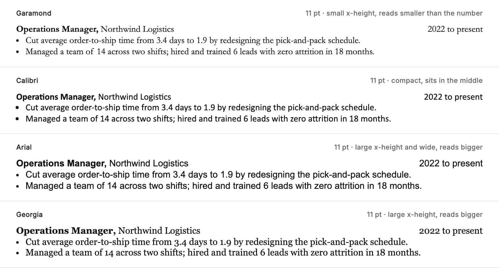
Should a resume be 11 or 12 pt? Neither is universally right, because 11 pt Garamond and 11 pt Arial are not the same size on the page, as the image above shows. The working rule:
- 10.5 pt for large fonts: Arial, Georgia, Verdana if you insist on it.
- 11 pt for medium fonts: Calibri, Aptos, Cambria, Lato, Source Sans 3, Times New Roman.
- 12 pt for small fonts: Garamond and EB Garamond.
- Never below 10 pt for body text. If the content does not fit at 10.5, cut content rather than shrink type.
- Name at 18 to 22 pt, section headings at 11 to 12 pt bold, everything else at body size.
The one universal rule is consistency. Pick one body size and one heading size and use them everywhere.
Question 3: Will it survive the recipient's machine?
When a document is opened on a computer that does not have its font installed, the software substitutes a font it does have. Word does this silently: the text reflows into the substitute and the font box on the ribbon still shows the original name, so the author never sees the problem. A one-page resume built in Garamond becomes a page and a bit in Times New Roman on a laptop without Office.
A PDF solves this. When Word, Google Docs or a design tool exports a PDF, it embeds the fonts inside the file, so the page renders identically everywhere. This is the single strongest reason to send a PDF unless the application explicitly asks for a Word file.
If you must send a .docx, the font has to already exist on the other machine, and which fonts exist depends on what was installed there:
- System fonts ship with the operating system. Windows 11 ships Arial, Calibri, Cambria, Georgia, Times New Roman, Verdana, Segoe UI and Tahoma. macOS Tahoe ships Arial, Georgia, Times New Roman, Verdana, Helvetica, Palatino and Avenir, and does not ship Calibri, Cambria or Aptos.
- Office fonts arrive with Microsoft Office on either platform. Calibri, Cambria, Garamond, Book Antiqua and Century Gothic are in this group; Microsoft's own font pages describe them as available within Office applications. A Mac with Office has Calibri. A Mac without Office does not.
- Cloud fonts download on demand for Microsoft 365 subscribers. Aptos, the current Office default, is distributed this way and is also a free download from Microsoft. A reader on an old perpetual Office licence or on Google Docs will not have it.
- Google Fonts (Lato, Source Sans 3, Open Sans, Roboto, EB Garamond) are free under the Open Font License and are the font menu in Google Docs, but they are not installed on anyone's Windows or Mac by default. They exist on the recipient's machine only if you send a PDF.
Word can embed fonts in a .docx (File, Options, Save, "Embed fonts in the file" on Windows; Word for Microsoft 365 for Mac supports it too), which makes the file larger and only works when the font's licence allows it. It is a reasonable fallback. Sending a PDF is a better one.
The practical reading of all this: for a PDF, choose any font in the shortlist. For a .docx that will be opened on an unknown machine, choose from the fonts that are on both Windows and macOS out of the box: Arial, Georgia or Times New Roman.
The shortlist: eight fonts, each with a recipe
Each entry gives the one reason to pick it, where it comes from, and the size and spacing that make it work. Sizes are recommendations based on how each face sets at 11 pt in the specimens above, not laws.
Calibri: the default
Designed by Lucas de Groot and the Office default from 2007 until Aptos arrived, Calibri is compact, has a clear bold, and is on every Windows machine and every Office install. It reads as neutral and current. Its only weakness is that it reads slightly small, so do not go under 10.5 pt.
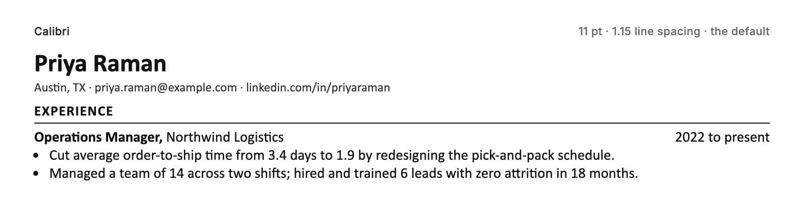
Recipe: body 11 pt, line spacing 1.15, name 20 pt bold, section headings 11 pt bold in capitals with a thin rule under them.
Aptos: the new default
Steve Matteson designed Aptos for Microsoft as the replacement for Calibri. It is a touch larger and more open than Calibri at the same size, with six weights. It is what a resume typed in a current Microsoft 365 Word looks like with no changes, which is both its strength (nobody will find it odd) and its limitation (it is not installed with Windows itself, so a .docx opened outside Microsoft 365 falls back to something else). Send it as a PDF.
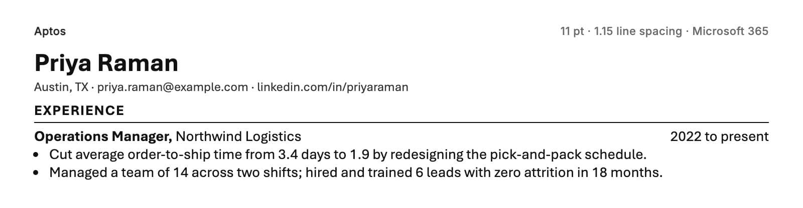
Recipe: body 10.5 to 11 pt, line spacing 1.1, name 20 pt bold, headings 11 pt semibold.
Arial: the everywhere font
Arial is the one sans serif that is on Windows and macOS out of the box and in the Google Docs font menu without adding anything. It is wide and has a large x-height, so it fills a line quickly and reads big; drop it to 10.5 pt. It is the safest possible choice for a .docx that has to open anywhere.
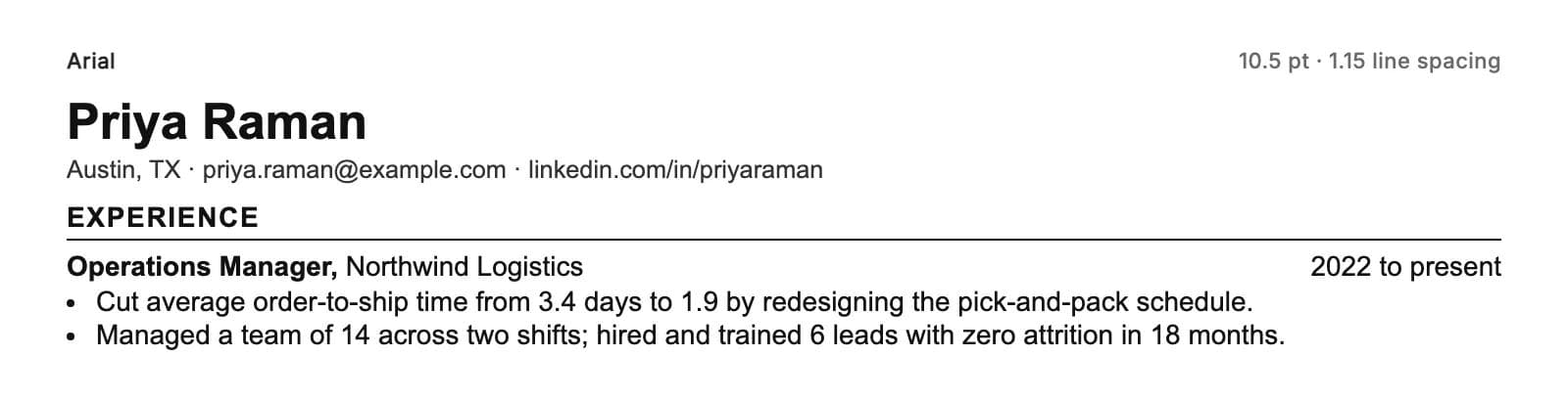
Recipe: body 10.5 pt, line spacing 1.15, name 18 pt bold, headings 10.5 pt bold.
Georgia: the serif that is on every machine
Matthew Carter designed Georgia for screens with a deliberately raised x-height, which is why it reads large and clear at small sizes on a printed page too. It is on Windows and macOS and in Google Docs. Its numerals are old-style (they dip below the line), which looks bookish in a dates column; some people like that, some do not.
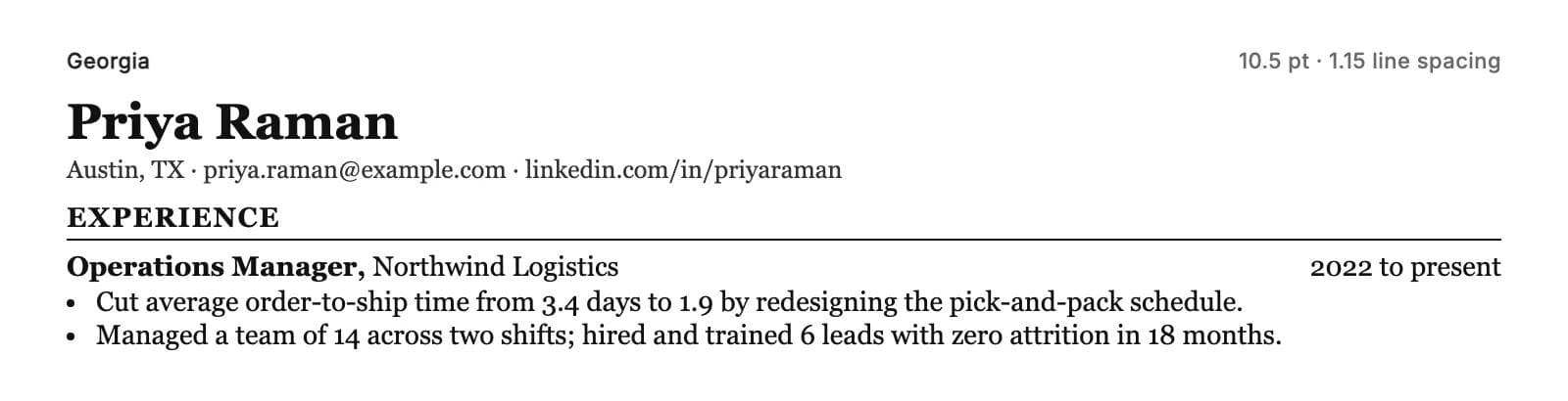
Recipe: body 10.5 pt, line spacing 1.15, name 20 pt bold, headings 11 pt bold.
Cambria: the serif for Word users
Jelle Bosma designed Cambria as a workhorse text face and a potential replacement for Times New Roman, with short serifs and even spacing that hold up well in bullet points. It comes with Windows and with Office on either platform, but not with macOS alone, so treat it as a PDF font.
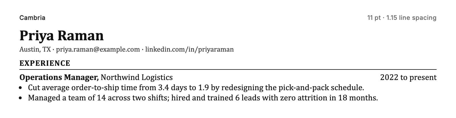
Recipe: body 11 pt, line spacing 1.1, name 20 pt bold, headings 11 pt bold.
Garamond: the traditional choice, at 12 pt
The Garamond that comes with Office is Monotype's 1922 revival of a 17th-century face, and Microsoft's own description says it "works particularly well in books and lengthy text settings". It has the smallest x-height in this list and looks undersized at 11 pt, so set it at 12 pt, where it still fits nearly as much on a line as Calibri at 11. It suits law, academia, publishing and anywhere a classic register is an asset. In Google Docs, EB Garamond is the open equivalent.
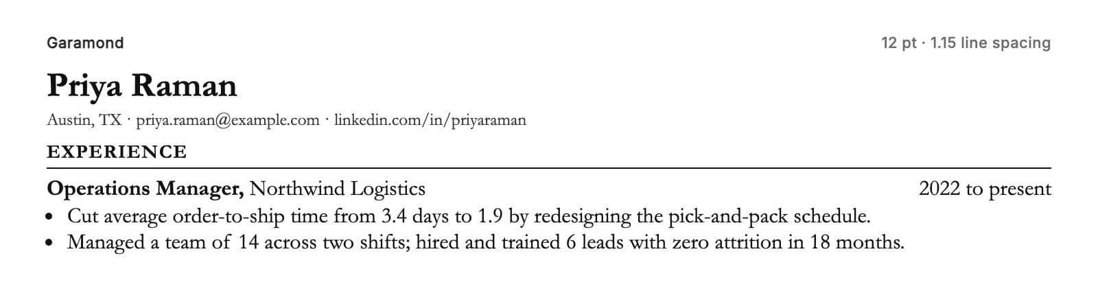
Recipe: body 12 pt, line spacing 1.1, name 22 pt bold, headings 12 pt bold in small capitals if the tool offers them.
Lato: the Google Docs sans that is not Arial
Lato is a humanist sans serif designed to be, in its designer's words, "transparent" in body text. It sits between Calibri and Arial in width, has a full range of weights, and looks a little warmer than either. It is a good default for anyone writing in Google Docs. It is not on any machine by default, so PDF only.
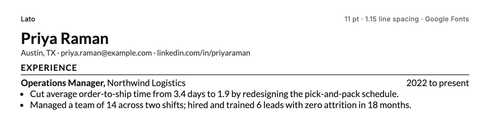
Recipe: body 10.5 to 11 pt, line spacing 1.2, name 20 pt bold, headings 11 pt bold.
Source Sans 3: the Google Docs stand-in for Calibri
Source Sans 3 is Adobe's open-source sans, designed for interfaces. Measured on the same two bullet points at 11 pt, it sets within two percent of Calibri's width, which makes it the closest thing to Calibri's fit that Google Docs offers. If your experience runs long and you are fighting for one page in Docs, this is the font. PDF only.
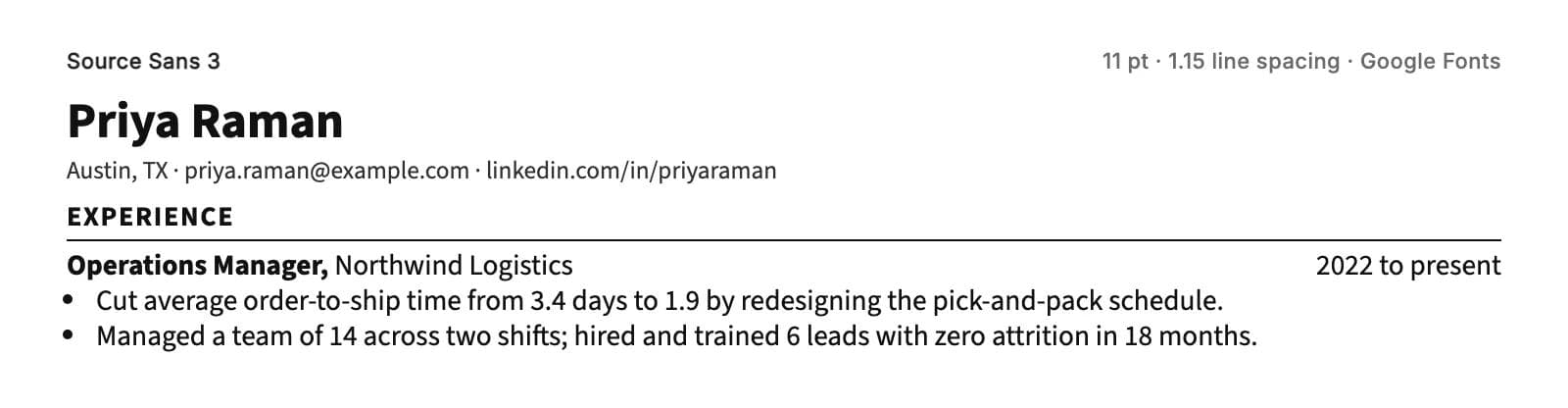
Recipe: body 11 pt, line spacing 1.2, name 20 pt bold, headings 11 pt semibold.
Two more that would have made a longer list: Open Sans and Roboto are both fine Google Fonts choices at 10.5 to 11 pt, with the same PDF-only caveat as Lato. Neither does anything Lato or Source Sans 3 does not.
The comparison table
| Font | Ships with | Google Fonts | Body size | Best for |
|---|---|---|---|---|
| Calibri (sans) | Windows 11; Office on Mac or PC | No | 11 pt | The default; Word users; one-page fit |
| Aptos (sans) | Microsoft 365 only | No | 10.5 to 11 pt | Current Microsoft 365 users sending a PDF |
| Arial (sans) | Windows 11; macOS; Office | No | 10.5 pt | A .docx that must open anywhere; Google Docs |
| Georgia (serif) | Windows 11; macOS; Office | No | 10.5 pt | A serif that is on every machine |
| Cambria (serif) | Windows 11; Office on Mac or PC | No | 11 pt | Word users who want a serif |
| Garamond (serif) | Office only; macOS document support | EB Garamond | 12 pt | Law, academia, publishing |
| Lato (sans) | Nothing by default | Yes | 10.5 to 11 pt | Google Docs users who want warmth |
| Source Sans 3 (sans) | Nothing by default | Yes | 11 pt | Calibri's fit in Google Docs; long experience on one page |
"Windows 11" and "macOS" mean the font ships with the operating system, per Microsoft's Windows 11 font list and Apple's macOS Tahoe font list. "Office" means it is installed with Microsoft Office on either platform; "Microsoft 365 only" means it arrives as a cloud font with a subscription. macOS lists Garamond under "document support", meaning it is available only to documents that already use it, so a Mac can display a Garamond file but a Mac user cannot pick it in a menu.
Arial or Calibri?
Calibri, unless one of two things is true.
Arial wins if the file will be sent as a Word document and you cannot know what is on the other end, because Arial is on Windows and macOS alike and Calibri is not on a Mac without Office. Arial also wins if you write in Google Docs, which does not offer Calibri.
Otherwise Calibri is the better resume font: it is narrower, so it fits more on a page at the same size, and its rounded stroke endings and slightly softer shapes read as more considered than Arial, which many people associate with default settings and forms. Neither is a mistake. If you are choosing between them for a PDF, pick Calibri and set it at 11; if you pick Arial, set it at 10.5.
Fonts to avoid, and why
The fonts people usually warn against are jokes: Comic Sans, Papyrus, Curlz. Nobody reading this was going to use them. The fonts that actually cause problems are respectable ones used in the wrong place.
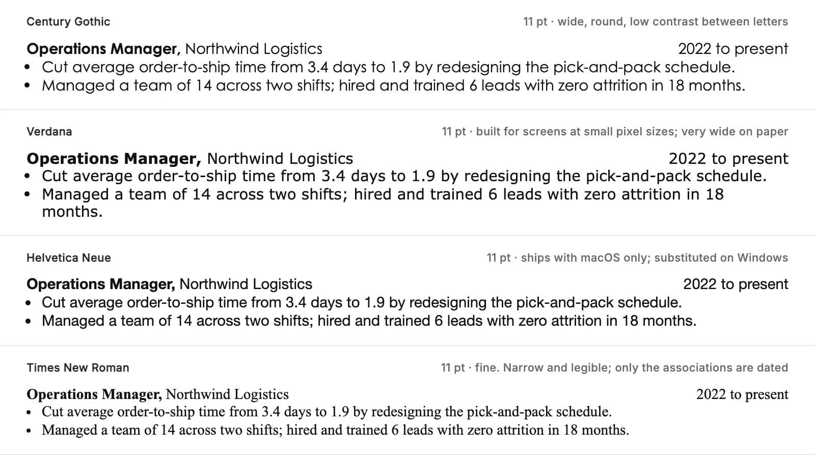
- Century Gothic. Geometric, round and wide. Monotype describes it as useful for headlines and small quantities of text; a resume is neither. The round letters look alike, which slows a skim.
- Verdana. Designed for screens at small pixel sizes, so it is deliberately very wide. At 11 pt on paper it uses about a quarter more room than Calibri for the same words and looks oversized. If you must, set it at 10 pt.
- Helvetica and Helvetica Neue. Excellent typefaces that ship with macOS and not with Windows. As a PDF they are fine. As a .docx opened on Windows they become Arial, and the layout shifts.
- Light, thin and condensed weights. They look elegant on screen at 24 pt and disappear on a printer at 11 pt. Use the regular weight for body text.
- Script and display fonts anywhere but possibly your name. Even there, most recruiters would rather see the name in the same font as the rest, one size up.
- Anything you downloaded from a free font site. Not because it looks bad, but because its licence may block embedding, which is how text turns into pictures in the PDF (see question 1).
Times New Roman is fine. It was designed for legibility in narrow newspaper columns, it is on every Windows and Mac machine, it is compact, and at 11 to 12 pt it is perfectly readable. The only argument against it is association: it is the default nobody changed, and in some fields (design, marketing, technology) that reads as inattention. In law, academia, government and finance it reads as normal. If you like it, use it at 11.5 or 12 pt with 1.15 spacing and stop worrying.
Where a template helps, and where it does not
If you are starting from a blank page, the font is one of about six decisions (margins, sizes, spacing, section order, date alignment) that a good one-column template has already made consistently. Moda's resume templates are single editable pages that export to PDF with a real text layer; pick one of the plain one-column layouts rather than a sidebar or infographic design if the resume is going into an applicant tracking system, and check the export with the select-all-and-paste test above like you would any other PDF. The same approach applies to any one-page document: the one-pager guide covers what to give the tool and how to review the result.
If you already have a resume in Word and the only thing wrong with it is the font, none of this requires a new tool. Select all, change the font, fix the size per the recipe above, check that it still fits on the page, and save as PDF. Ten minutes.
Conclusion
Use Calibri at 11 pt with 1.15 spacing, one column, real text, exported as a PDF. If you write in Google Docs, Arial at 10.5 or Lato at 11. If you want a serif, Georgia at 10.5 or Garamond at 12. Check the PDF by selecting all and pasting into a text editor. If it pastes as clean lines, the parser will read it and the recruiter will see exactly what you see.
The font is the last thing a recruiter will consciously notice and the first thing that will quietly go wrong if the file is a .docx in a font the other machine does not have. Send the PDF. If you want to start from a layout that already gets the spacing right, the resume templates are one-column pages you can edit and export.
Frequently asked questions
What is the best font for a resume?
Calibri at 11 pt is the best default: compact, neutral, on every Windows and Office install, and clearly readable at 10.5 to 11 pt. In Google Docs use Arial at 10.5 pt or Lato at 11 pt. For a serif, use Georgia at 10.5 pt or Garamond at 12 pt.
What are ATS-friendly fonts?
Any standard text font that embeds in a PDF: Calibri, Aptos, Arial, Georgia, Cambria, Garamond, Times New Roman, Lato, Source Sans 3, Open Sans and Roboto all qualify. Applicant tracking systems fail on layout, not typefaces: columns, tables, icons, contact details in headers, and text saved as an image. Greenhouse's published list of parse failures names no fonts.
Is Arial or Calibri better for a resume?
Calibri for a PDF: it is narrower and fits more on a page at 11 pt. Arial for a Word document that has to open on an unknown machine, because Arial ships with both Windows and macOS and Calibri does not ship with macOS. Arial is also the choice in Google Docs, which does not offer Calibri.
Should a resume be 11 or 12 pt font?
It depends on the font, because 11 pt Garamond is visibly smaller than 11 pt Arial. Use 10.5 pt for large fonts (Arial, Georgia), 11 pt for medium fonts (Calibri, Aptos, Cambria, Lato, Source Sans 3) and 12 pt for small fonts (Garamond). Never go below 10 pt for body text.
Which font is not recommended for a resume?
Century Gothic and Verdana set too wide at body sizes; Helvetica ships only with macOS and is substituted on Windows in a Word file; light, thin and condensed weights vanish in print; script and display fonts slow a skim; and any font whose licence blocks embedding can turn your PDF text into images. Times New Roman is fine.
Does the font matter if I send a PDF?
Less than people think. A PDF embeds the font, so it looks identical on every machine and any standard text font parses. The font still affects how much fits on the page and how fast a recruiter can skim it, which is why size and spacing recipes matter more than the name.

Real editable visuals. Real canvas. Full control.
Fly through design work