Dental Website Design: 6 Patient-Journey Teardowns
See six dental websites analyzed section by section, with lessons for patient trust, service routing, booking, insurance, privacy, and accessibility.
 Anvisha Pai, Co-founder & CEO, Moda
Dental website design has to do more than make a practice look modern. It has to help an often-anxious local visitor identify the right care, trust the clinicians, understand access and payment, and take a safe next step. The strongest site for a family dentist should not look or behave exactly like the strongest site for an orthodontist, pediatric surgeon, or multi-location group.
This guide studies six live dental websites as complete patient-conversion systems. Instead of scoring colors and hero photos, we follow what happens after the first screen: how services are organized, where proof appears, how payment concerns are handled, and whether the path ends in an appropriate appointment action.
Six dental website examples at a glance
- Jackson Family Dental: A family practice that combines broad service discovery, emergency care, local proof, and direct appointment paths.
- Blue Line Dental: A Manhattan practice that presents dentistry as a personal relationship and gives uninsured patients a visible membership option.
- BrightSmiles Pediatric Dentistry: A pediatric site that uses its office environment, parent reviews, and board-certified team to reduce anxiety.
- Bates Orthodontics: A focused orthodontic site that routes visitors by age and treatment stage rather than presenting one generic service list.
- Pediatric Dental Surgical Associates: A narrow specialty practice that explains who it serves, what it does, and how patients return to their regular dental home.
- Dentologie: A multi-location group that pairs strong consumer branding with online booking, emergency routing, insurance information, and location choice.
The six questions a dental homepage must answer
A dental homepage works when a patient can answer these questions without assembling the story from five different pages:
- Is this the right type of practice? A parent, implant candidate, emergency patient, and routine cleaning patient are not looking for the same signals.
- Can this practice address my problem? Treatment language should match how patients describe their need, with clinical detail available after the initial choice.
- Will I feel safe here? Real providers, a visible office, plain-language explanations, and a clear first-visit process do more than generic claims about compassion.
- Can I afford or use coverage here? Insurance, financing, membership, and self-pay information should reduce uncertainty without promising a final treatment price before evaluation.
- Can I be seen when I need to be seen? Routine care, consultations, and emergencies need different paths.
- What should I do next? Calling, requesting an appointment, booking a real time, and sending clinical details are different actions. The website should route each one safely.
This framework exposes the main weakness of most dental website galleries. A polished hero may answer the first question and still leave the other five unresolved.
1. Jackson Family Dental: organize broad care around family access
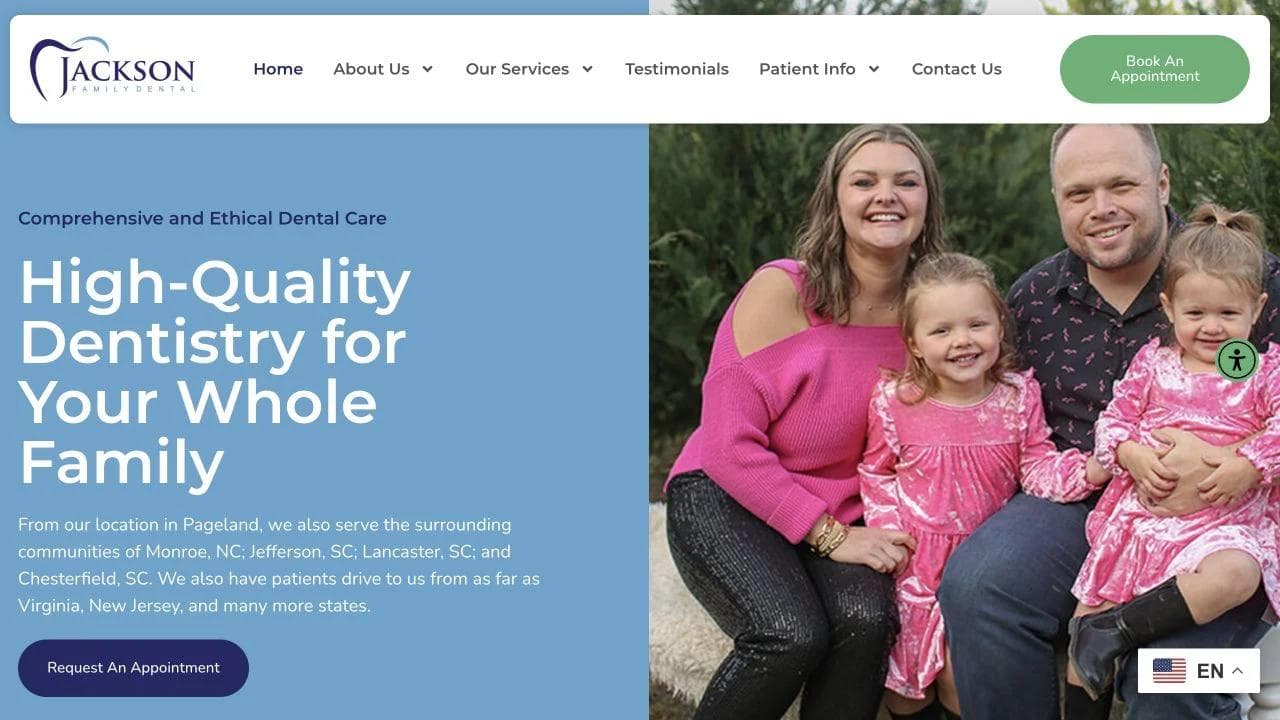
Jackson Family Dental serves a broad audience in Pageland, South Carolina. Its homepage has to make general, cosmetic, restorative, pediatric, and emergency dentistry feel like one coherent local practice rather than a directory of unrelated procedures.
What the opening accomplishes
The hero names the service, audience, and local market in one statement: high-quality dentistry for the whole family. A family photograph turns the claim into a recognizable patient group, while the appointment button and location text give the visitor an immediate next step.
The strip below the hero adds operational reassurance. New-patient forms, office hours, and appointment access answer questions that generic brand language cannot. That practical layer matters because many visitors already believe they need a dentist. They are comparing how difficult each practice will be to use.
How the page expands from promise to selection
The practice introduction adds three reasons to choose the office: a nonjudgmental environment, patient education, and technology intended to improve the experience. These are more useful than a long mission statement because they address distinct hesitations.
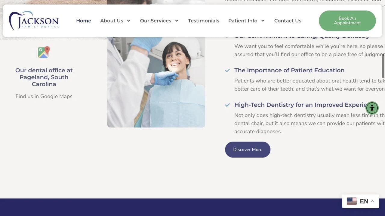
The service grid then lets patients self-select. Children's dentistry, cosmetic work, implants, dentures, emergency care, and preventive services are visible without opening a large navigation menu. Each card gives just enough context to confirm relevance before sending the reader to a dedicated page.
This structure also supports local search. A useful service page can answer one clear need in depth, while the homepage remains an orientation layer. Google recommends accurate business information and permits local business structured data for details such as hours and departments. The schema is not a substitute for useful pages, but it helps machines interpret facts already visible to people through LocalBusiness structured data.
How the page closes
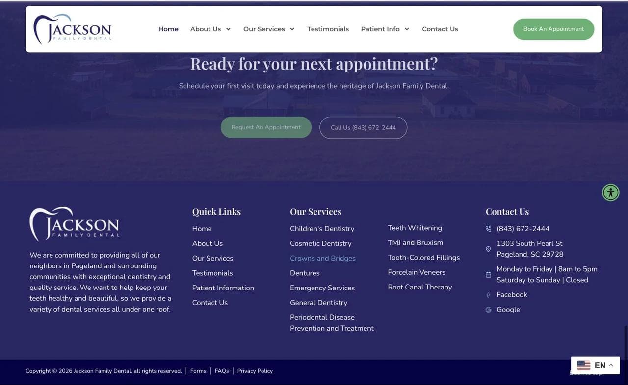
The final appointment panel repeats two actions: request an appointment or call. The footer keeps hours, phone number, address, service links, and emergency services visible at the end of the journey.
What to borrow: Put operational facts beside the initial promise, expose high-intent service choices on the homepage, and repeat the primary action after the reader has seen proof.
What not to copy blindly: A broad service grid works for a general practice because breadth is part of the promise. A narrow specialist should not imitate it by listing procedures that are outside its actual role.
2. Blue Line Dental: connect a personal brand to payment clarity
Blue Line Dental operates in Midtown Manhattan and leads with a more personal, cosmetic-forward presentation. The page is useful because it does not make visual polish carry the entire conversion job.
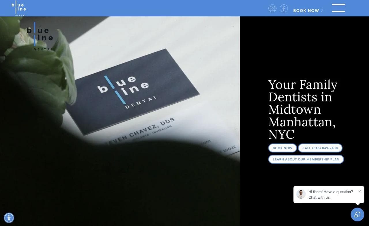
The hero establishes a relationship, not just a procedure
The opening pairs editorial imagery with a direct statement about family dentistry in Manhattan. Booking and calling remain visible. This allows the brand to feel considered without hiding the practical action behind an animation or portfolio-style entrance.
For cosmetic-oriented care, the visual standard is itself evidence. A practice asking patients to trust its aesthetic judgment should treat typography, photography, and spacing as part of that claim. The page does so without turning every section into a luxury slogan.
Provider proof and treatment evidence appear before the financial fork
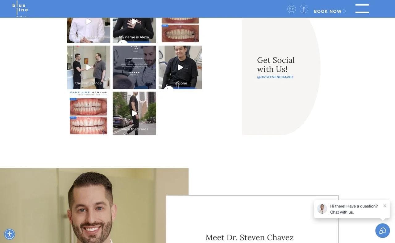
Further down, the site combines social content, provider introductions, and images related to outcomes. This creates three different kinds of trust:
- Human trust: Visitors can see who provides the care.
- Process trust: The site shows an active practice rather than an abstract brand.
- Outcome trust: Treatment-related visuals make cosmetic claims more concrete.
Before-and-after galleries need careful governance. Practices should obtain appropriate authorization, avoid implying that one result guarantees another, and explain what the images represent. The American Dental Association notes that photos and videos of patients can constitute protected health information and urges caution in dental marketing and social media in its marketing and advertising guidance.
The membership plan gives uninsured visitors a real branch
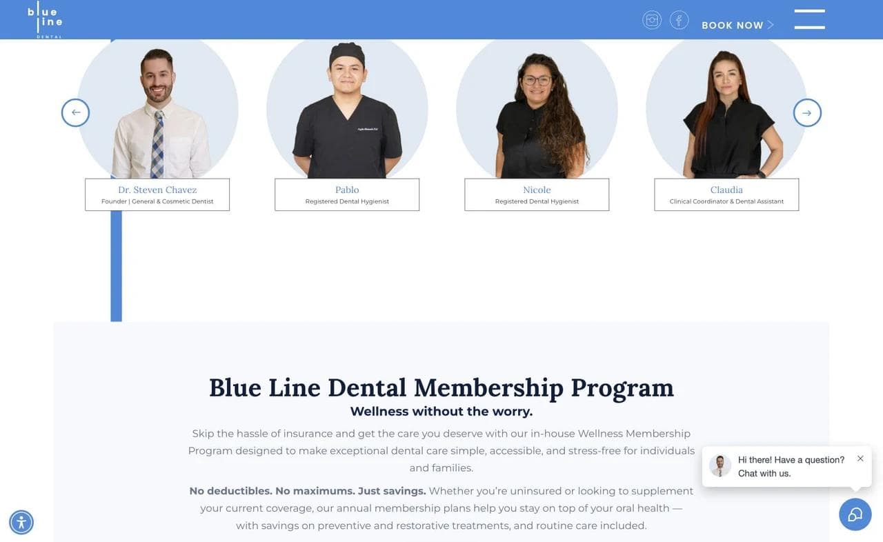
The membership section is not a small footer link. It sits within the main persuasion path and explains who the program is for. That makes the site more useful to a visitor who would otherwise leave at the word “insurance.”
The ADA distinguishes in-office dental plans from insurance and provides planning guidance for practices considering them. A site should describe the actual agreement accurately, including inclusions, exclusions, renewal, payment, and whether discounts apply to other work. The ADA's in-office dental plan guide is a better starting point than copying another practice's promotional language.
What to borrow: Match the site’s visual standard to the care being sold, introduce the clinicians before asking for a high-consideration commitment, and treat membership as a distinct patient route.
What not to copy blindly: Minimalist styling cannot replace treatment explanations, practical access details, or honest financial terms. A beautiful page that withholds those answers still creates friction.
3. BrightSmiles: design for the parent while reassuring the child
A pediatric dental website has two audiences. The parent evaluates credentials, logistics, and safety. The child experiences the office, language, and emotional tone. BrightSmiles addresses both without turning the site into a cartoon.
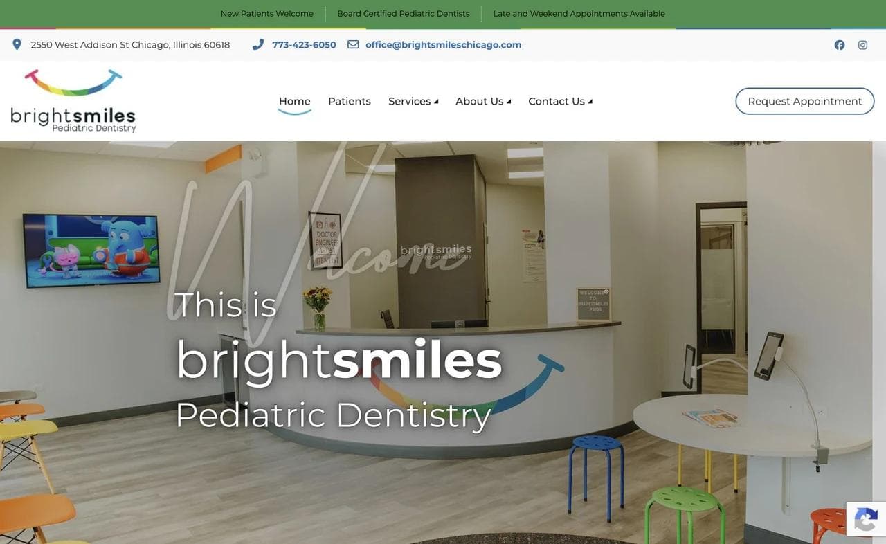
The office is part of the product
The homepage opens on the actual clinic environment. That helps a parent imagine the visit and gives them something concrete to show a child before an appointment. The design is colorful, but the navigation, phone number, office hours, and request button remain adult-readable.
This is a useful alternative to a stock photo of a smiling child. The visitor needs to know what this particular practice will feel like, not merely what a happy child looks like.
Reviews translate the promise into parent language
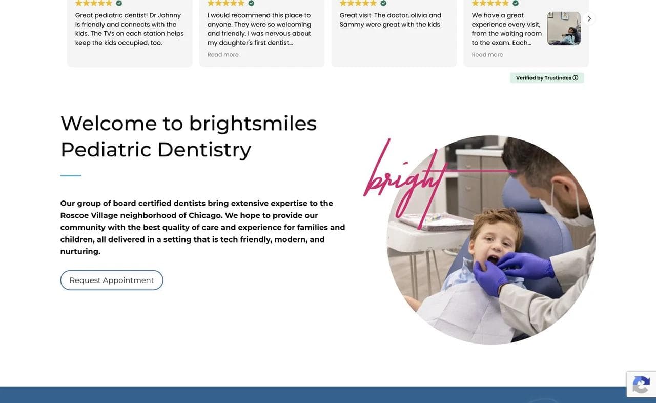
The service and review sequence moves from capability to lived experience. Parent comments discuss kindness, clear explanations, the office environment, and how children reacted. Those details answer the emotional questions a generic five-star badge cannot.
Practices still need to be cautious when responding to reviews. The ADA warns that a provider can create a privacy problem by confirming that a reviewer was a patient, even when the reviewer disclosed the relationship first. Its online review guidance recommends broad, privacy-preserving responses.
Board certification and team visibility close the trust gap
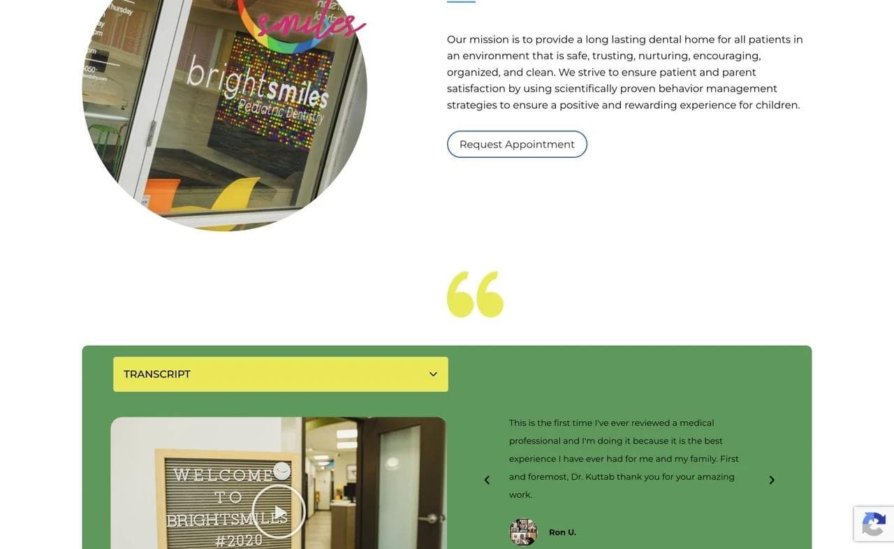
The team section names the pediatric dentists and foregrounds relevant credentials. For parents evaluating specialized care, this is not decorative biography. It explains why the practice is equipped for children and gives the family a person to recognize when they arrive.
What to borrow: Show the actual environment, use reviews to answer emotional objections, and make specialty credentials understandable rather than presenting an alphabet of initials.
What not to copy blindly: A pediatric palette is not a pediatric strategy. A practice still needs clear policies for first visits, emergencies, special healthcare needs, insurance, and age-specific care.
4. Bates Orthodontics: route by life stage and treatment decision
Orthodontics is usually a longer, more considered purchase than a cleaning. The website must help a family understand when treatment is appropriate, which options apply, and what a consultation will clarify.
The opening sells a future state
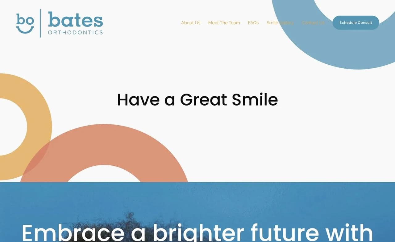
Bates leads with the outcome of a confident smile, then offers a consultation path. That is appropriate for elective and planned treatment. An emergency practice should lead with access and triage instead, but an orthodontic practice can give more space to aspiration.
The page keeps navigation restrained and gives the brand a distinctive visual system. This makes the experience feel focused rather than like a general dental site with an orthodontics tab added later.
Treatment choices are organized around the patient's stage
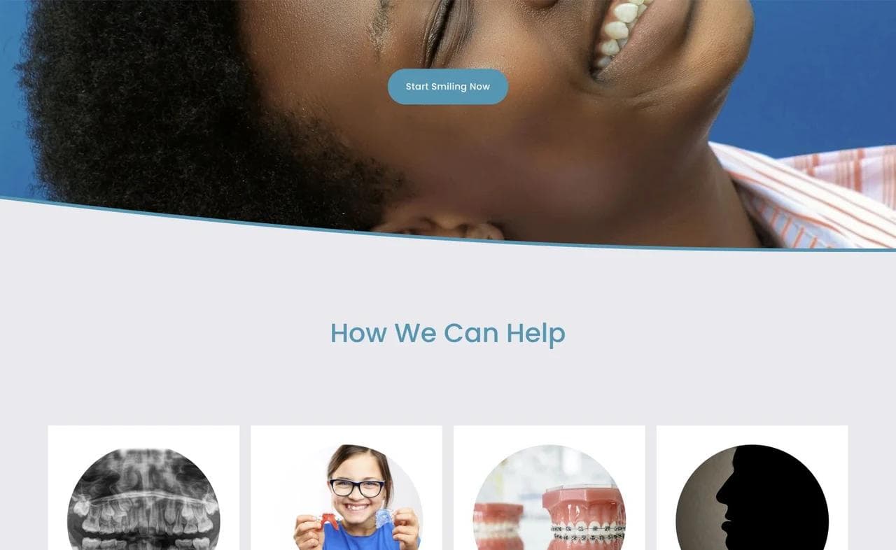
The “How We Can Help” section distinguishes growth monitoring, early intervention, comprehensive treatment, adult treatment, and other paths. This is better than presenting appliance names before the visitor understands the underlying decision.
The ordering matters. Parents often arrive asking whether it is too early or too late, while adult patients may be comparing discreet options. The site starts with those questions, then lets the treatment pages carry the clinical detail.
The orthodontist becomes part of the decision
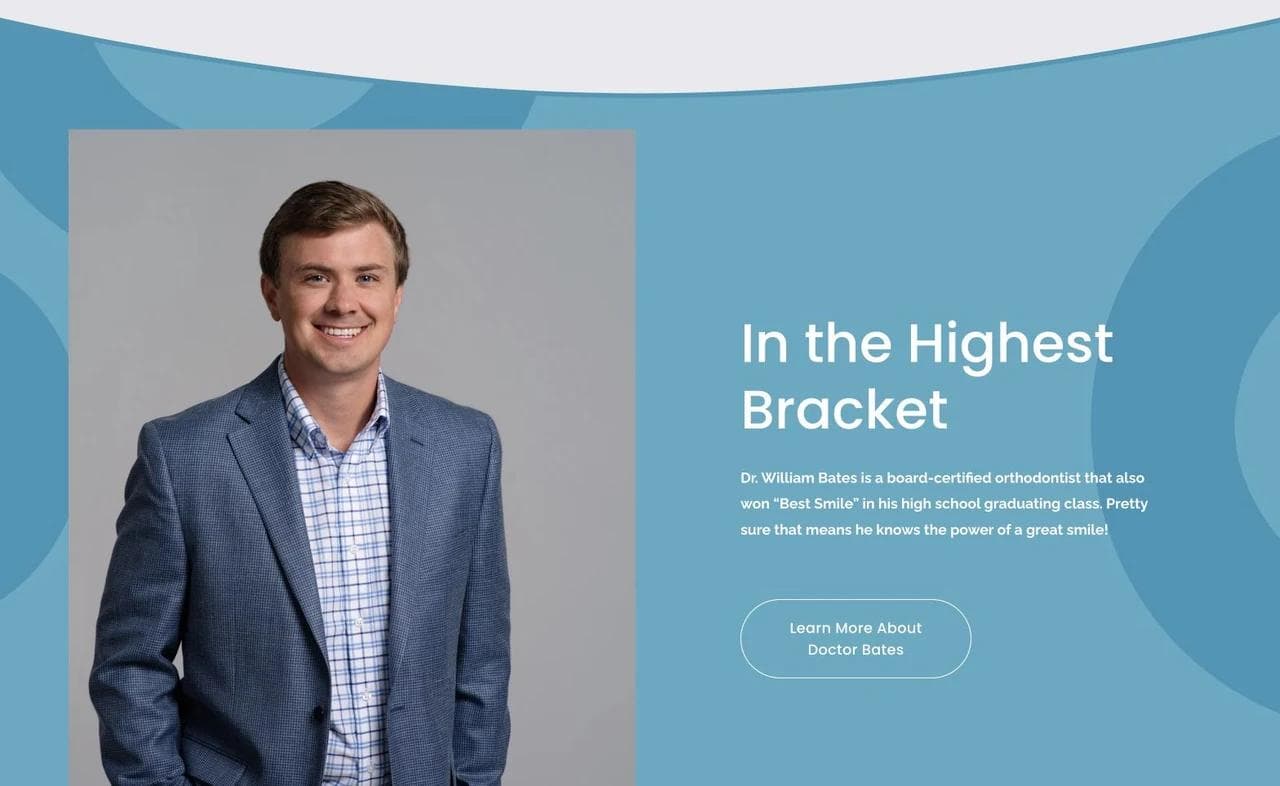
The provider section introduces the orthodontist with a clear portrait and point of view. A consultation is not only a product demo. It begins a relationship that may last for years, so the clinician's role deserves more space than a small footer bio.
What to borrow: Organize treatment by patient stage, make the consultation a visible next step, and treat the provider relationship as part of the offer.
What not to copy blindly: Outcome-led language should not imply a guaranteed result or compress every patient into one path. Clinical assessment and individualized treatment planning still need to be explicit.
5. Pediatric Dental Surgical Associates: explain a narrow role precisely
Pediatric Dental Surgical Associates solves a harder information problem. It is not a general pediatric practice. It provides full-mouth dental rehabilitation under general anesthesia for a defined group of young children, then returns patients to their dental home for routine care.
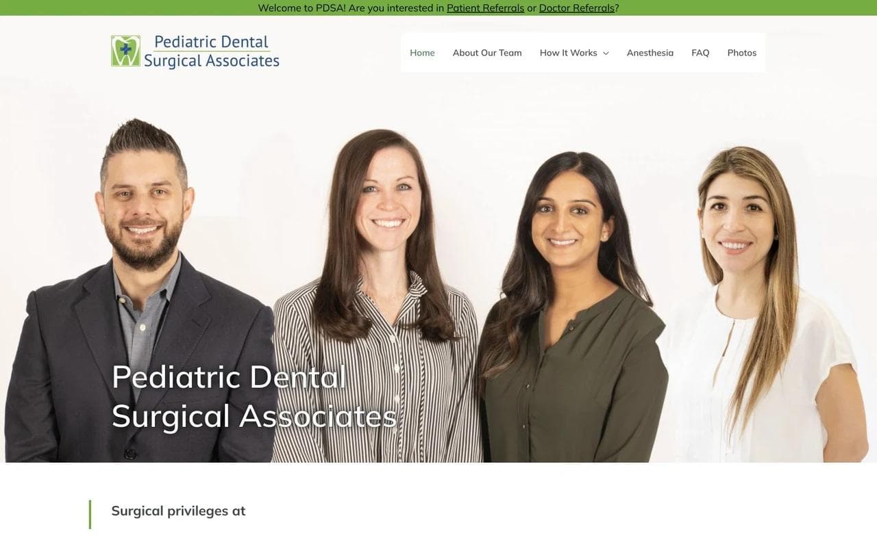
The site separates two audiences immediately
Parents and referring dentists receive different entry points. This is an important pattern for specialty practices because the two audiences arrive with different knowledge, responsibilities, and questions.
The page also names hospital privileges near the opening. That connects the practice's specialty claim to the clinical setting in which care occurs.
The process reduces ambiguity without pretending to replace consultation
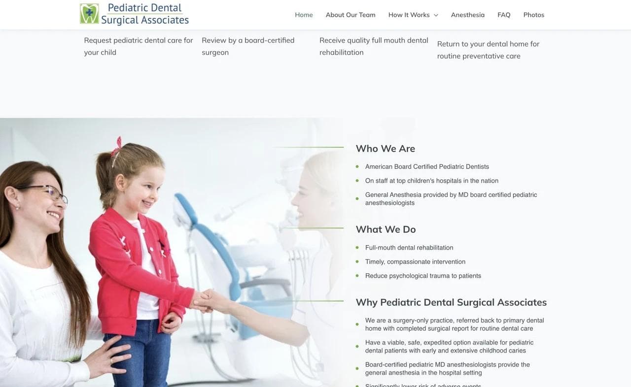
The patient path is shown as a sequence: request care, receive review, complete treatment, and return to the regular dental home. The sequence sets expectations and makes the practice's boundary unusually clear.
That boundary is persuasive. Saying what the practice does not do can strengthen trust when specialization is real. It also reassures referring dentists that the practice is not trying to absorb routine patients.
Scope, rationale, and team evidence support a high-stakes decision
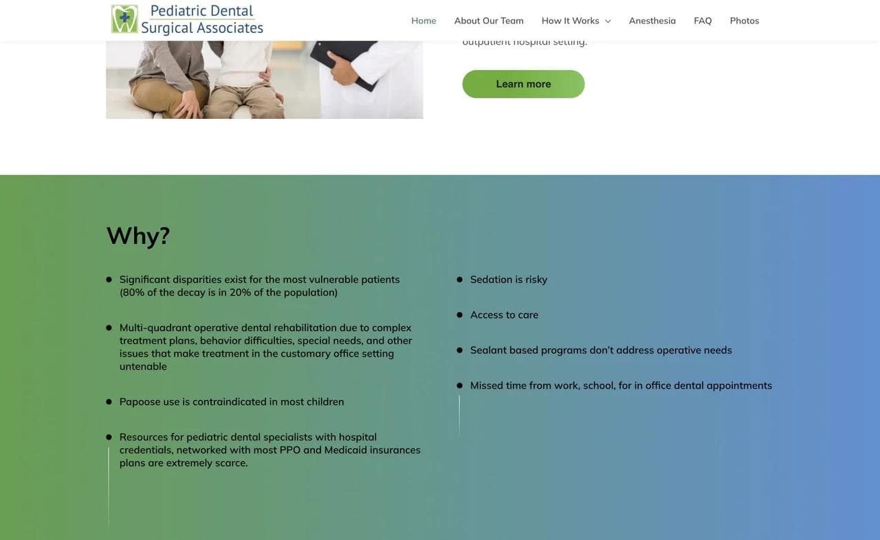
Lower sections explain the clinical scope, the reasons this pathway may be considered, and the team involved. For complex care, education is part of conversion. The page should help a parent prepare better questions, not pressure them into treating a marketing page as medical advice.
What to borrow: Split professional and patient audiences, show the referral journey, state the practice boundary, and connect credentials to the exact care model.
What not to copy blindly: A general practice does not need specialist density everywhere. The depth is justified here because the decision is narrow, unfamiliar, and high stakes.
6. Dentologie: make a multi-location group feel usable
Dentologie has a different problem from a solo practice. It needs to preserve a recognizable brand while helping patients choose a city, location, service, and appointment type.
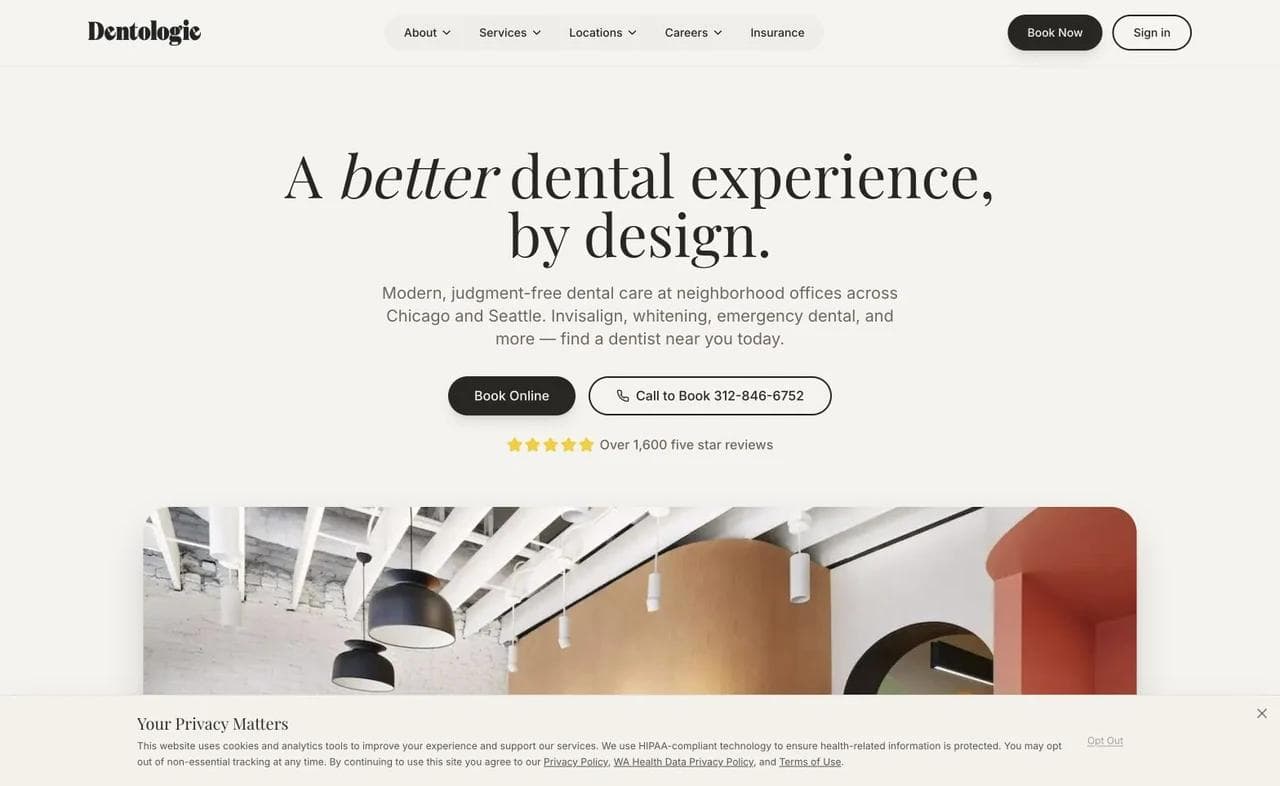
Brand and booking share the first screen
The hero presents the consumer promise, but the booking and calling routes remain direct. Office imagery shows the physical experience, which helps a multi-location group avoid feeling like an anonymous directory.
The main lesson is not to imitate the tone. It is to make the brand promise and the operational action coexist. A strong slogan should not push location and appointment decisions several screens down.
Service routing uses patient jobs
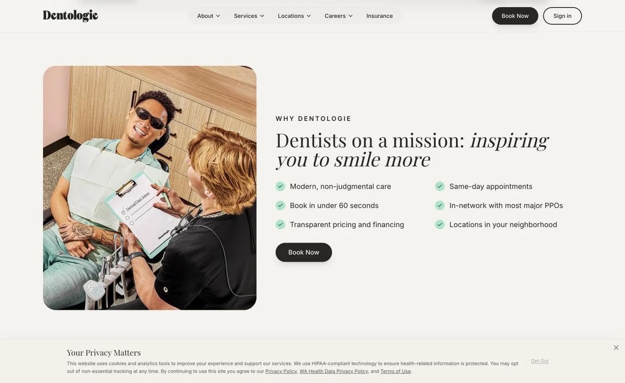
The service section gives first visits, routine care, Invisalign, emergency exams, and other common jobs distinct paths. Emergency care receives its own booking action rather than sharing a generic contact form.
This is the correct architecture for mixed urgency. A routine patient can browse. Someone in pain should see same-day instructions, a phone path, hours, location eligibility, and guidance for a life-threatening emergency without decoding a broad services menu.
Insurance information reduces friction before location choice
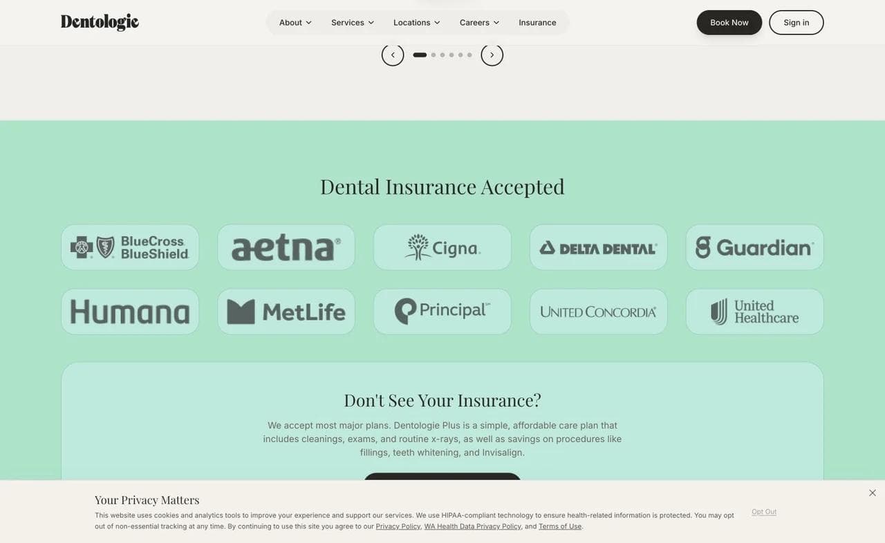
The insurance section names accepted carriers and gives visitors a way to investigate coverage before booking. A multi-location group should also state whether participation varies by office, provider, or plan, because a logo alone can create false confidence.
Location pages should be substantive. Each needs accurate address, hours, phone number, providers, services, accessibility information, parking or transit details, and a location-specific booking route. Duplicating the same citywide paragraph under many addresses is less useful to patients and search engines.
What to borrow: Keep booking visible, separate urgent from routine care, and make insurance and location selection part of the main journey.
What not to copy blindly: A single-location practice does not need a platform-style information architecture. It can use its smaller scope to be more personal, specific, and locally grounded.
What every dental website needs, and where the design must fork
Across all six examples, several elements are close to universal:
- A plain statement of practice type and location.
- A visible phone number and an appropriate appointment action.
- Service paths written in language patients recognize.
- Real provider, team, or office evidence.
- Insurance, financing, membership, or self-pay guidance.
- Office hours, address, and access information.
- A clear new-patient path.
- Privacy, accessibility, and emergency boundaries.
The rest should fork according to the practice model.
Family and general practices
Lead with breadth, continuity, convenience, and a nonjudgmental first visit. The main navigation should help adults, parents, routine patients, and urgent patients find the right route without turning the homepage into an encyclopedia.
Cosmetic and implant practices
Give more room to clinician expertise, treatment education, consultations, financial pathways, and properly authorized outcome evidence. High-consideration treatment requires a stronger explanation of process and alternatives.
Pediatric practices
Design for the parent who makes the decision and the child who receives care. Office imagery, first-visit preparation, behavior guidance, special-needs capabilities, and emergency instructions are usually more important than a long cosmetic service list.
Orthodontic practices
Route by age, development stage, and treatment decision. Explain what a consultation determines. Financing and expected process matter, but the site should avoid presenting generalized timelines as promises.
Referral-based specialists
Separate referring professionals from patients. State what qualifies for referral, what records are needed, what the process looks like, and what happens after treatment.
Multi-location groups
Treat location selection as a product experience. Each office needs enough unique information to support a real choice, while the broader brand maintains consistent service definitions and expectations.
Build an emergency path, not an emergency marketing badge
“Emergency dentistry” in a service grid is not enough. The urgent path should answer:
- Whether the office is currently open.
- Whether same-day care is offered and at which locations.
- Whether the visitor should call or book online.
- What information is safe and useful to provide before the visit.
- What symptoms require emergency medical services rather than a dental appointment.
Keep this route available from every page on mobile. Do not require a visitor in pain to complete a long lead form or wait for a general inbox response.
Treat payment information as navigation
Insurance and financing are not footer compliance topics. They determine whether a patient continues.
A useful payment section distinguishes:
- Plans the practice participates in from plans it can submit claims to.
- Insurance from a practice membership or discount arrangement.
- Financing applications from treatment estimates.
- Promotional starting prices from the final cost of individualized care.
Give visitors enough information to choose the next conversation. Avoid promising exact coverage or treatment cost based only on a carrier logo.
Keep marketing forms separate from clinical systems
A short “request an appointment” form can be useful, but its fields and destination matter. A generic website form should not quietly become a channel for symptoms, diagnoses, radiographs, insurance documents, or other sensitive details.
HIPAA applies directly to covered entities and business associates, and the ADA explains that covered dental practices must use appropriate safeguards for patient information in its HIPAA overview. The correct implementation depends on the practice, vendors, data flow, and applicable state law. A website designer should work with the practice's privacy, legal, and technical advisors rather than adding a “HIPAA compliant” badge to an ordinary form.
Use the public website for education, orientation, and low-risk appointment routing. Use appropriately configured clinical, scheduling, or patient-portal systems for protected workflows.
Accessibility is part of patient access
Keyboard navigation, visible focus, meaningful headings, readable contrast, form labels, alt text, captions, and zoom behavior directly affect whether people can use the site. The Department of Justice explains that businesses open to the public can have obligations to make web content accessible under the ADA in its web accessibility guidance.
Test the real booking handoff as well as the marketing pages. An accessible homepage that sends visitors into an unusable third-party scheduler has not completed the job.
Where Moda fits in a dental website workflow
Moda can help a practice create the public-facing marketing layer: a branded homepage, provider and office sections, treatment explainers, campaign landing pages, and coordinated social posts or ads. Its AI works on a real editable canvas, which is useful when the practice needs the website and campaign creative to share a consistent visual language.
Moda is not a patient portal, practice-management system, electronic health record, clinical intake channel, or appointment infrastructure. Keep protected health information and operational clinical workflows in systems selected and configured for those jobs.
If you need a polished public site or the visual campaign around it, try Moda today. For broader tool selection, see our guide to the best AI website builders. The same trust principles also appear in our law firm website design teardowns, though healthcare introduces distinct privacy and patient-access requirements.
Dental website design checklist
Before launch, verify the site as six different visitors: a routine new patient, a parent, a cosmetic or implant researcher, an urgent patient, an uninsured patient, and a keyboard-only mobile user.
Positioning and trust
- Practice type, location, and audience are clear in the first screen.
- Real clinicians and the actual office appear with accurate context.
- Credentials are explained in patient language.
- Reviews and outcome images follow privacy and advertising rules.
Services and conversion
- Service navigation matches patient problems and treatment stages.
- Routine, consultation, and emergency paths are distinct.
- Phone numbers are tap-friendly and office hours are current.
- The appointment action explains whether it is a request or a confirmed booking.
Access and payment
- Insurance participation language is precise.
- Financing and membership terms link to complete details.
- Each location page includes unique, practical information.
- Forms request only the information appropriate for that channel.
Technical quality
- Core pages and the booking handoff work on a small phone.
- Images are compressed without making text or faces blurry.
- Headings, labels, focus states, contrast, alt text, and captions are tested.
- Analytics and advertising scripts are reviewed with privacy requirements in mind.
- Business name, address, phone, hours, and structured data remain consistent.
The best dental website is not the one with the most effects. It is the one that helps the right patient understand the practice, reduce uncertainty, and reach the correct next step with confidence.
Dental website design FAQ
What should a dental website include?
A dental website should clearly state the practice type and location, show real providers and the office, organize services around patient needs, explain new-patient and payment routes, provide accurate hours and contact details, and offer an appropriate appointment action. It should also include accessibility, privacy, and emergency boundaries.
Should a dental website offer online booking?
Online booking can reduce friction when the connected scheduler shows real availability and routes the correct appointment types. If the form only sends a request, label it as a request rather than implying the appointment is confirmed. Urgent cases should also have a visible phone path.
How should a dental website explain insurance?
State participation carefully, link to current details, explain whether coverage varies by provider or location, and avoid promising benefits based only on a carrier logo. Separate insurance from financing, self-pay offers, and in-office membership plans.
Can a normal website contact form collect dental information?
A practice should not assume that an ordinary marketing form is appropriate for symptoms, records, insurance documents, or other sensitive information. Covered practices should evaluate vendors, data flows, safeguards, and applicable law with qualified privacy, legal, and technical advisors, then use appropriately configured clinical or portal systems where needed.
What makes pediatric dental website design different?
The parent makes the decision while the child experiences the care. Strong pediatric sites therefore combine adult-readable logistics and credentials with real office imagery, first-visit preparation, age-appropriate reassurance, emergency guidance, and information about special healthcare needs.
Can Moda build a dental practice website?
Moda can help create the public marketing site and coordinated visual campaign, including provider pages, office sections, treatment explainers, social posts, and ads. It is not a patient portal, electronic health record, practice-management system, protected-health-information channel, or appointment backend.

Real editable visuals. Real canvas. Full control.
Fly through design work