Law Firm Website Design: 6 Full-Page Teardowns for Small Firms
See six small and midsized law firm websites analyzed section by section, with practical lessons for trust, proof, intake, accessibility, and local SEO.
 Anvisha Pai, Co-founder & CEO, Moda
Good law firm website design does more than make a practice look established. It helps the right prospective client recognize their problem, trust the people who may handle it, and understand the next step without having to decode legal language.
That job changes with the practice. Someone facing a felony charge is making a different decision from a founder negotiating SaaS contracts or a family planning an estate. The best small law firm websites therefore share a trust architecture, but not one visual formula.
This guide studies six complete homepages from solo, small, and midsized firms across criminal defense, personal injury, family and immigration law, employment law, estate planning, and business law. Rather than judging only the hero, we trace what every section contributes, where a page repeats itself, and what another firm should borrow.
The four jobs of a law firm homepage
Before choosing colors, type, or a template, decide what the homepage must accomplish.
- Recognition: Tell the visitor which problems, clients, and locations the firm serves.
- Confidence: Provide specific evidence that the firm can handle this kind of matter.
- Risk reduction: Explain the people, process, cost model, confidentiality boundary, or likely first conversation well enough to reduce hesitation.
- Action: Offer a next step that matches the urgency and commitment of the matter.
Many weak attorney websites jump from a vague promise such as "experienced advocacy" directly to a contact form. The missing middle is the site. A good page shows why this firm fits, what working with it will feel like, and why contacting it is a reasonable next move.
Six law firm website examples at a glance
- [Paceline Law](https://pacelinelaw.com/): A solo bicycle-injury practice built around one audience and one authentic metaphor.
- [The Jones Firm, The Brilliant Brawler](https://www.thebrilliantbrawler.com/): A solo criminal-defense practice that turns the attorney into a memorable, polarizing brand.
- [ZafiroLaw](https://zafirolaw.com/): A small family and immigration firm that makes the overlap between its two practices coherent.
- [Bain Mazza & Debski](https://www.bmdlegal.com/): A three-attorney employment and personal-injury practice that relies on real people and detailed client testimony.
- [Cary Estate Planning](https://caryestateplanning.com/): A growing estate-planning firm that teaches, qualifies, and reassures across a long research journey.
- [SaaS Law](https://www.saaslaw.io/): A technology-focused practice that productizes part of the legal workflow while keeping a human attorney available.
These are not ranked. Each page is responding to a different buyer, urgency level, and trust problem.
1. Paceline Law: make the niche the brand
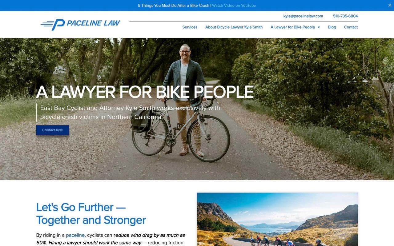
Paceline Law is a Northern California bicycle-injury practice led by cyclist and attorney Kyle Smith. The homepage does not present cycling as one practice-area card among many. The audience defines the whole firm.
How the page is structured
The hero says "A lawyer for Bike People" and immediately names the narrower fit in the supporting line: an East Bay cyclist and attorney working exclusively with bicycle crash victims in Northern California. Real cycling photography, route-like visual motifs, and the firm name all reinforce the same promise.
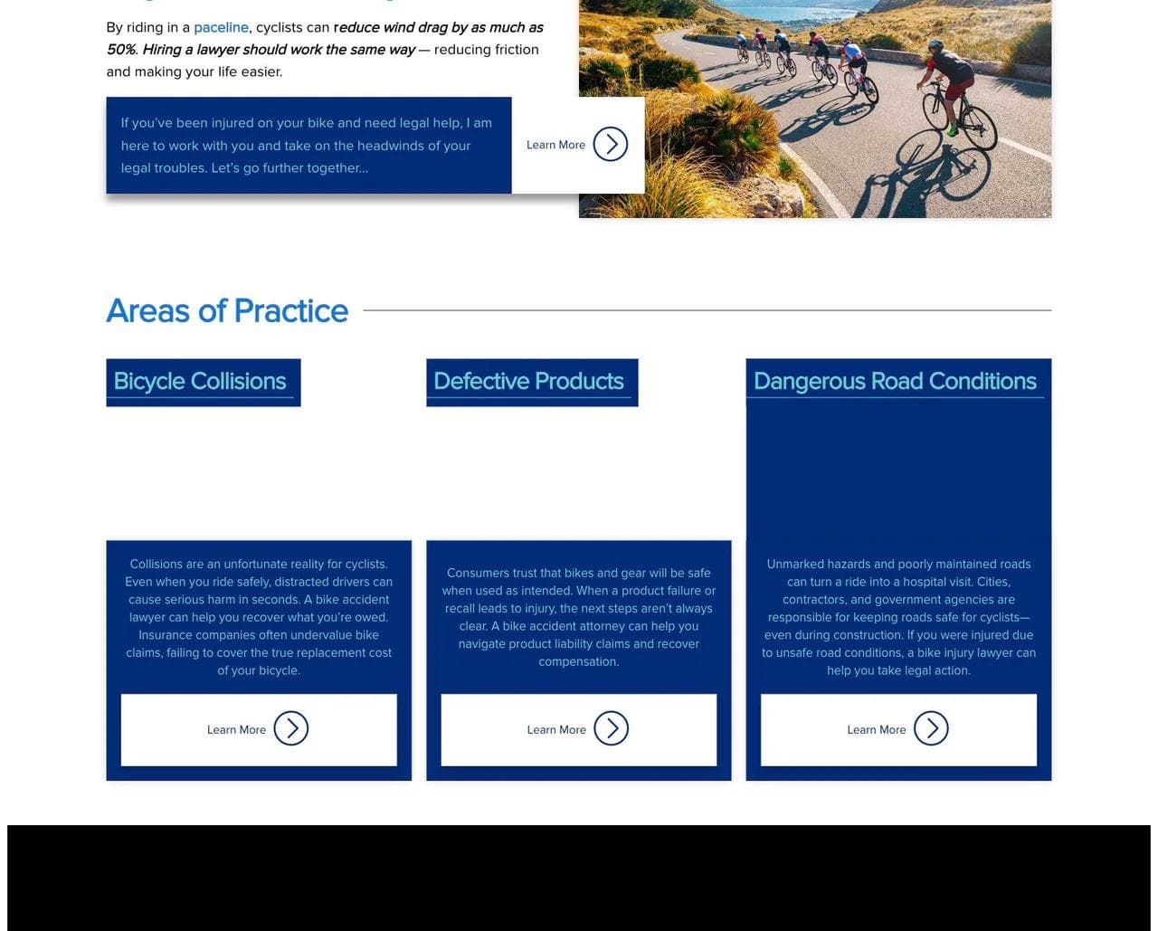
The next section explains the paceline metaphor. Cyclists reduce drag by riding together, and the lawyer should reduce friction for the client. Then the page breaks the practice into bicycle collisions, defective products, and dangerous road conditions.
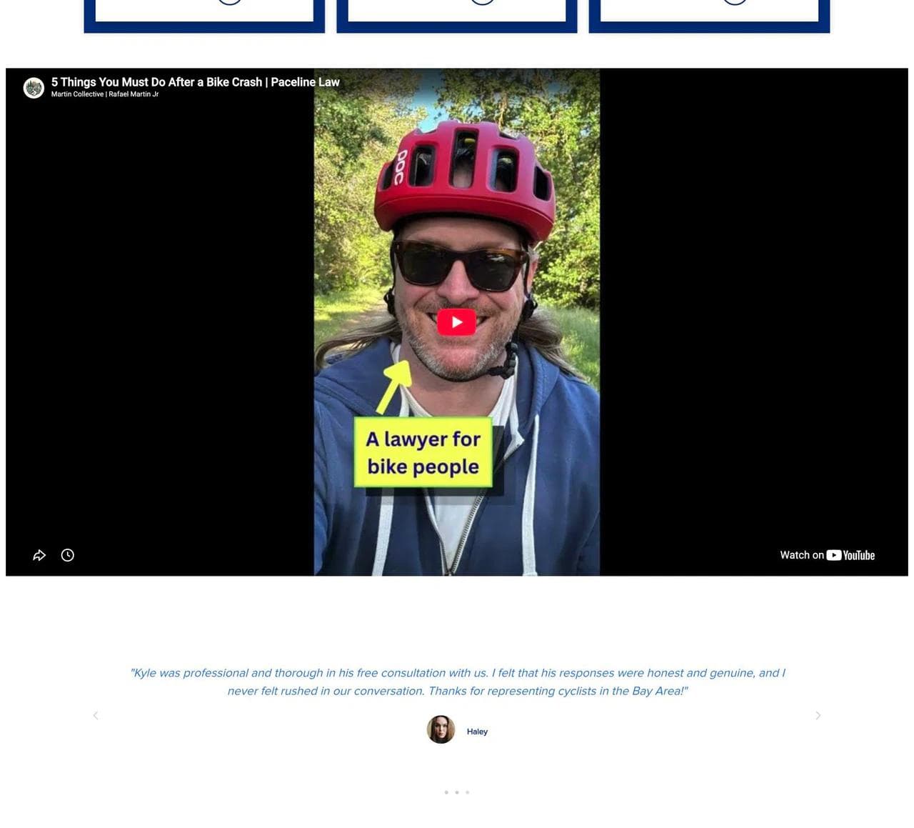
A short educational video moves the founder from a static bio into a recognizable person. Client reviews then supply interpersonal proof, not only outcome claims. The page closes with a direct invitation and contact details.
What works
- The niche is unmistakable. A cyclist does not have to wonder whether a general personal-injury firm understands bicycle damage, road conditions, or riding culture.
- The brand metaphor has structural value. "Paceline" explains collaboration and appears in the story, photography, language, and service promise. It is not a decorative slogan.
- The specificity reduces the need for inflated claims. An exclusive focus is more memorable than another declaration of aggressive representation.
- The practice cards reflect distinct causes of harm. The page helps a visitor recognize a matter instead of presenting a generic personal-injury category.
What to borrow
If your practice has a defensible niche, let it shape the entire page. Use the vocabulary, situations, and proof that the audience recognizes. A cycling lawyer, immigration attorney, outside general counsel, and special-needs planner should not sound interchangeable.
What not to copy blindly
A narrow identity works only when it matches the matters the firm actually wants. It can intentionally repel unrelated leads. A general practice should not imitate niche branding unless it is ready to make the same business tradeoff.
2. The Brilliant Brawler: use a founder brand as a filter
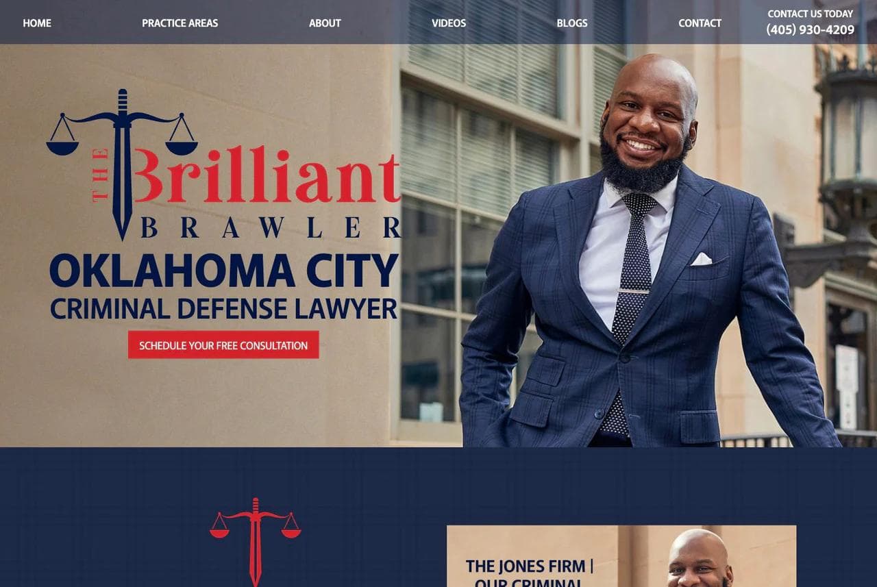
The Jones Firm handles serious criminal charges in Oklahoma. Its "Brilliant Brawler" identity is far more theatrical than a conventional attorney site, but the page consistently connects the persona to the buyer's decision.
How the page is structured
The hero combines a large founder portrait, the Oklahoma City criminal-defense category, and a free-consultation action. The copy narrows the work to serious state and federal matters and describes the required qualities as brains, guts, and grit.
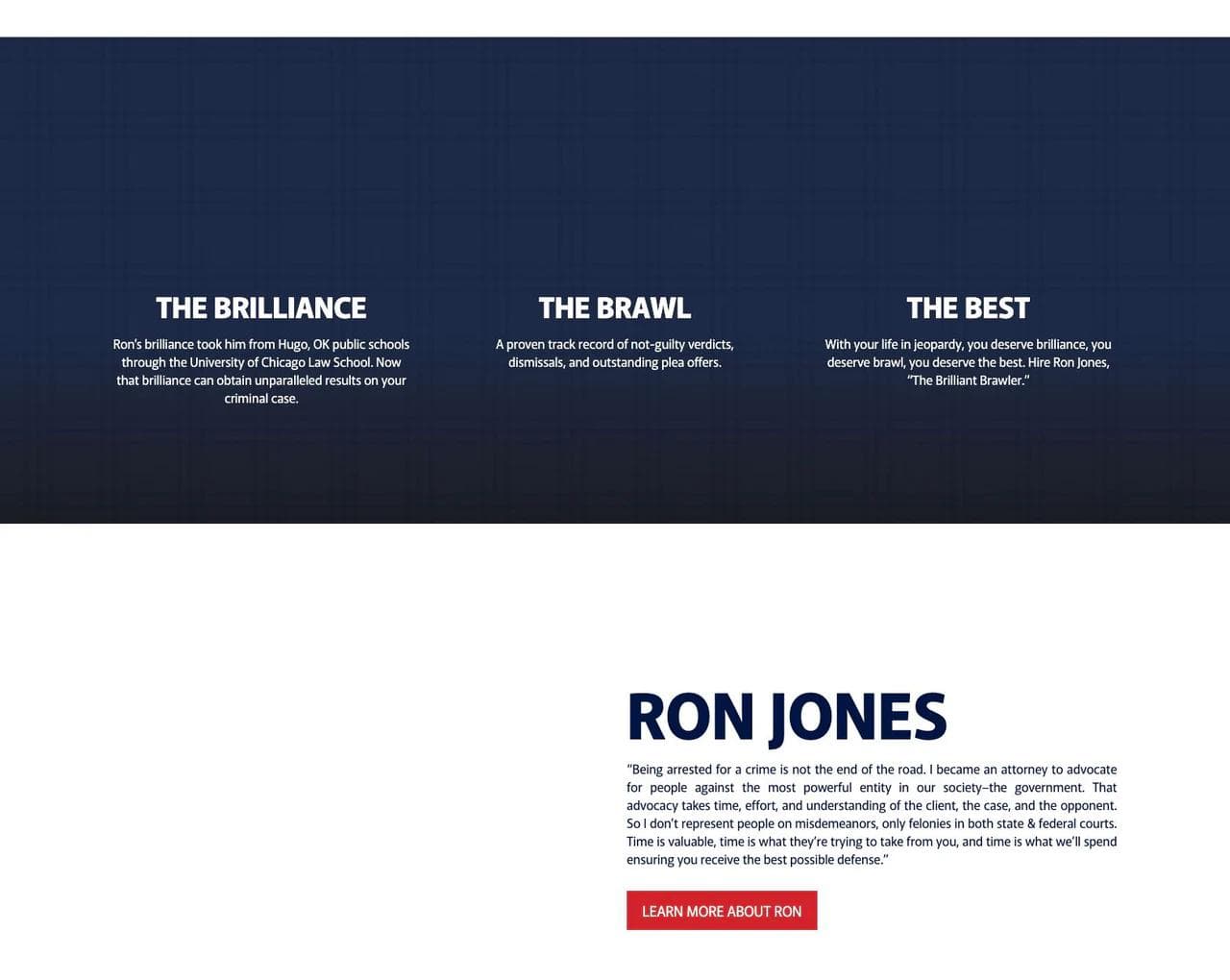
The middle lists specific charges, then turns the brand into three pillars: brilliance, brawl, and the best. A founder section gives the persona a biography and an explanation of why the practice focuses on felonies rather than lower-level matters.
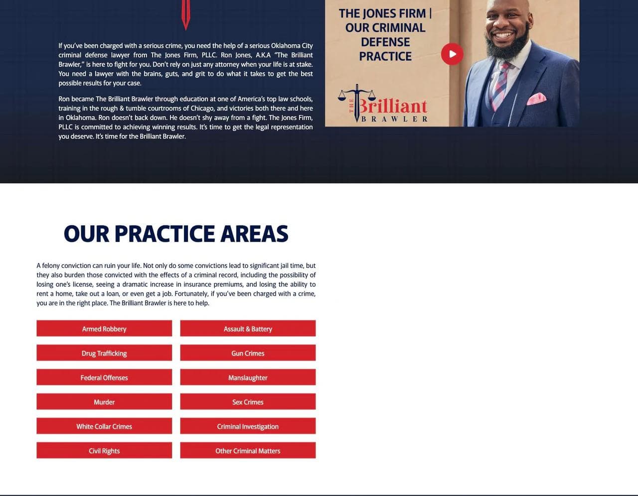
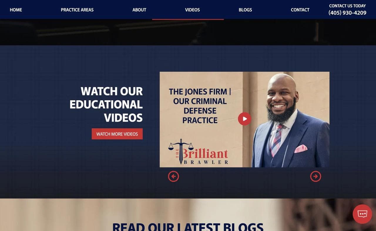
The page then clarifies statewide reach and repeats the focus on serious offenses. A results-oriented section, educational videos, and recent articles add evidence and depth before the final consultation CTA.
What works
- The tone matches the emotional state of the buyer. A person facing incarceration may value confidence and fight more than restraint and polish.
- The persona is backed by a service boundary. The page explains the education, trial posture, and case focus behind the character.
- The firm is memorable in a crowded category. The visual system and language are hard to confuse with a template.
- The long page alternates identity and evidence. It does not rely on the nickname alone.
What to borrow
A strong founder brand can be useful when the attorney's point of view is part of the service. Give the idea supporting facts, a clear matter filter, and repeated visual language. The brand should help a visitor predict what representation will feel like.
What not to copy blindly
The same level of aggression would be wrong for many estate-planning, family, or collaborative business practices. A polarizing voice is a strategy, not a universal conversion tactic. It should attract the clients the firm serves best and accurately represent the lawyer who will meet them.
3. ZafiroLaw: connect two practices through the client's life
ZafiroLaw combines family law and immigration law, two categories that could look unrelated in navigation. The page makes them coherent by focusing on families whose legal issues cross both systems.
How the page is structured
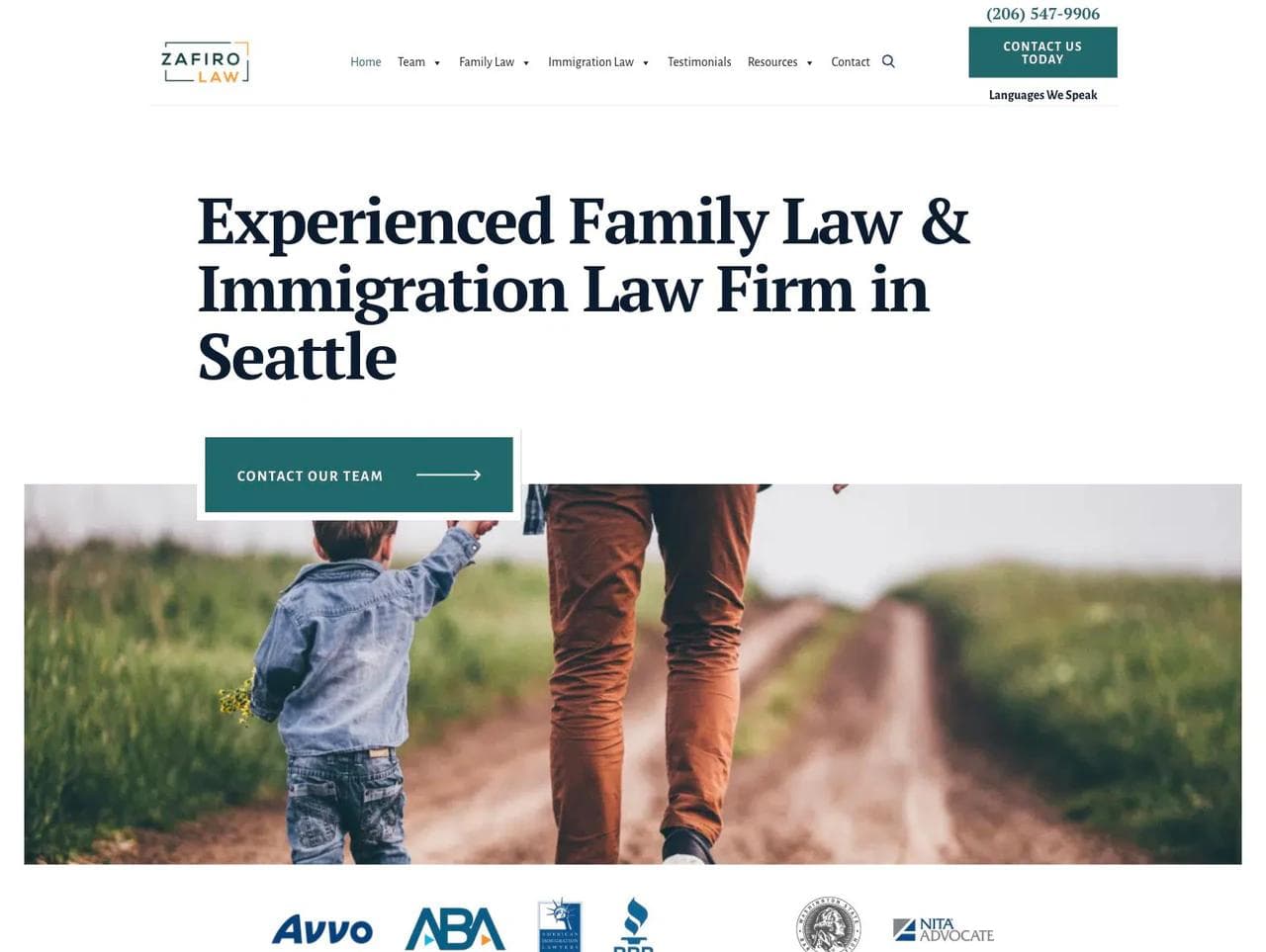
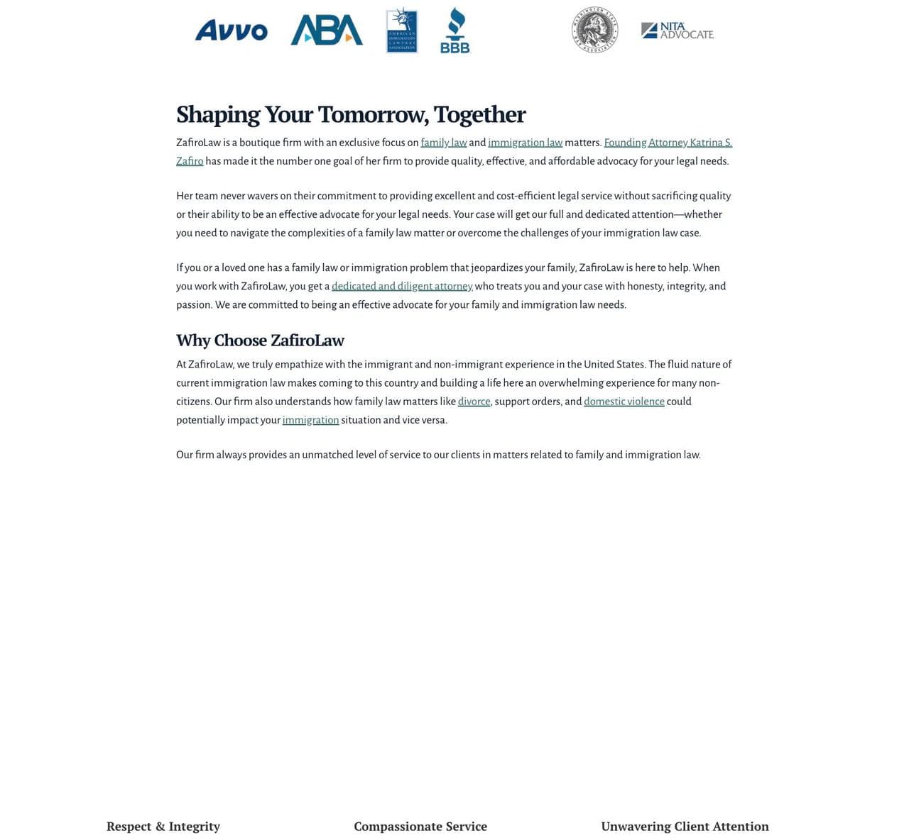
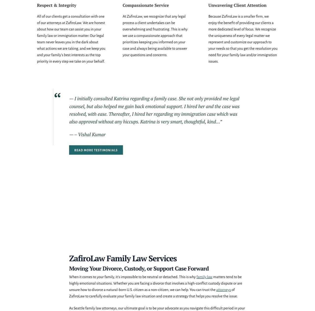
The hero names both practices and Seattle immediately. Below it, "Shaping Your Tomorrow, Together" changes the frame from legal categories to a shared future. Three values, respect and integrity, compassionate service, and unwavering client attention, establish the emotional standard.
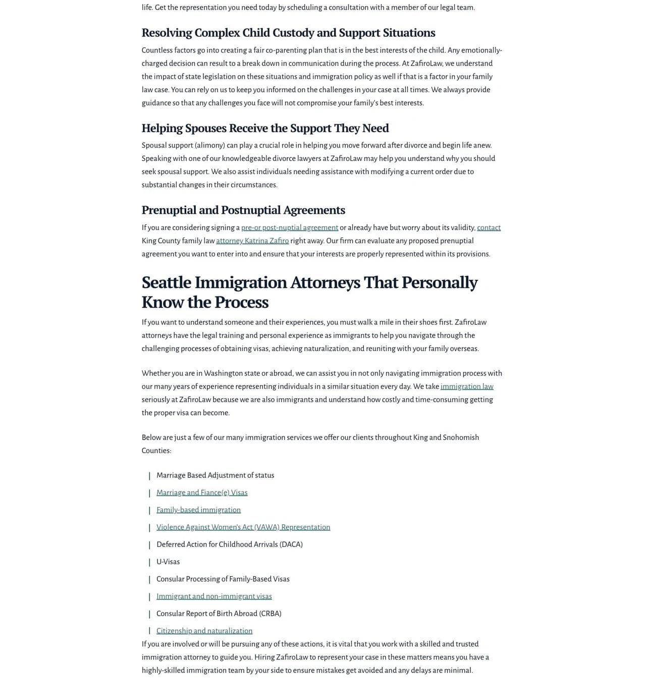
A detailed testimonial arrives before the deeper service explanation. The family-law section covers divorce, custody, support, and situations involving immigration status. The immigration section then describes the team's own familiarity with the immigrant experience and lists specific services such as family-based immigration, visas, DACA, VAWA, and naturalization.
The founder section makes Katrina Zafiro visible and explains the firm's point of view. FAQs, guides, a contact form, and location details complete the research and intake path.
What works
- The overlap is a reason to choose the firm. Family and immigration matters can affect one another, so the breadth feels intentional rather than miscellaneous.
- Emotional reassurance comes before exhaustive legal detail. The page recognizes that the client may be dealing with family conflict, status uncertainty, or both.
- The service lists become more specific as the visitor scrolls. The top stays understandable while the middle supports self-qualification.
- The founder's personal connection supports the positioning. It gives the empathy claim a source.
What to borrow
When a small firm has two or three practices, explain the client situation that connects them. "We do X and Y" is a list. "X and Y often collide in this part of your life" is a position.
What not to copy blindly
Long narrative passages can slow down a visitor who already knows the exact service needed. Clear practice links and a strong next step should remain visible even when the homepage carries substantial educational copy.
4. Bain Mazza & Debski: put the actual team and client experience up front
Bain Mazza & Debski is a three-attorney Bay Area firm focused on employee-side employment law and personal injury. Its homepage is shorter and more conventional than the first three, but it makes the people behind the firm unusually visible.
How the page is structured
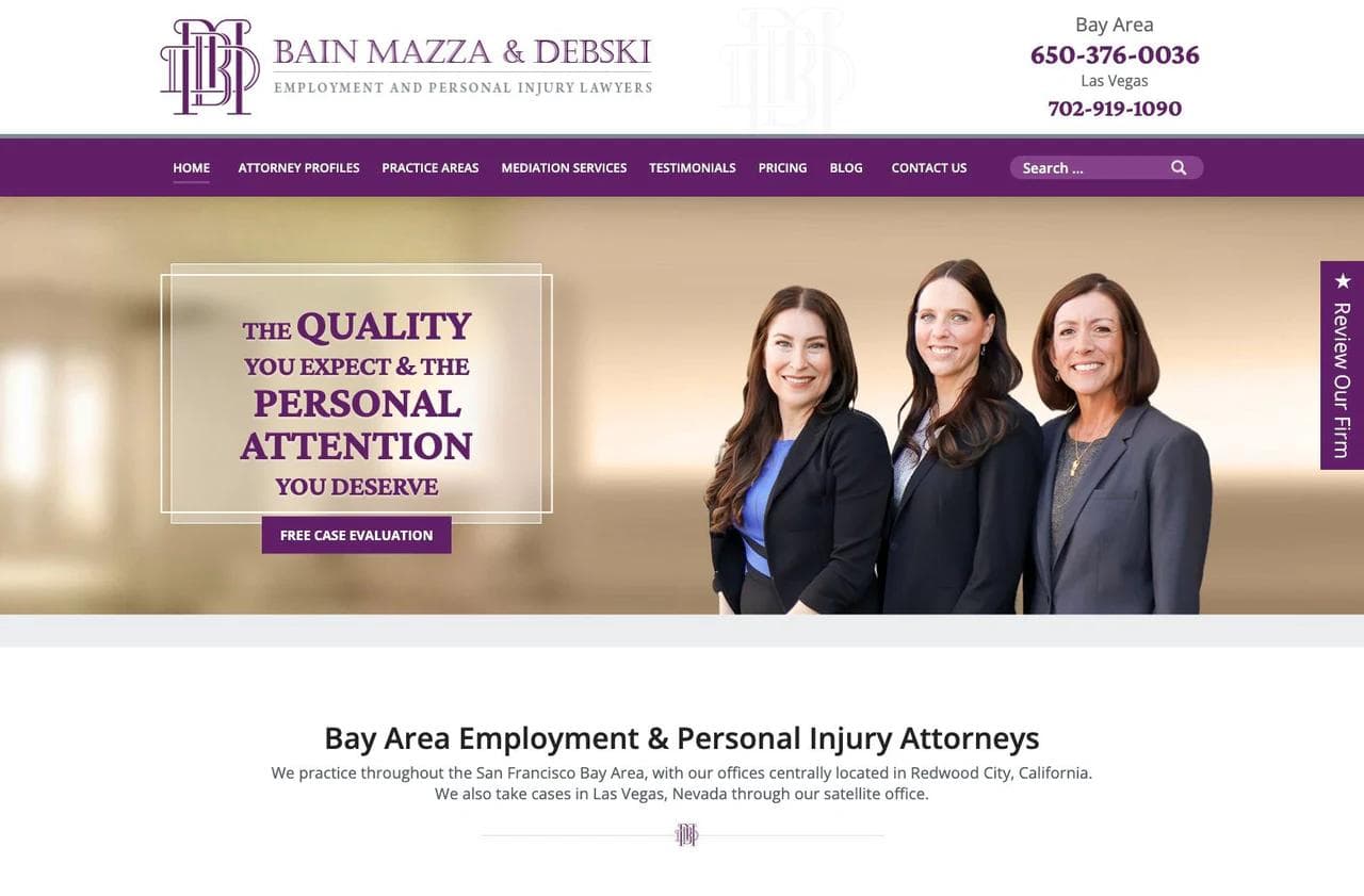
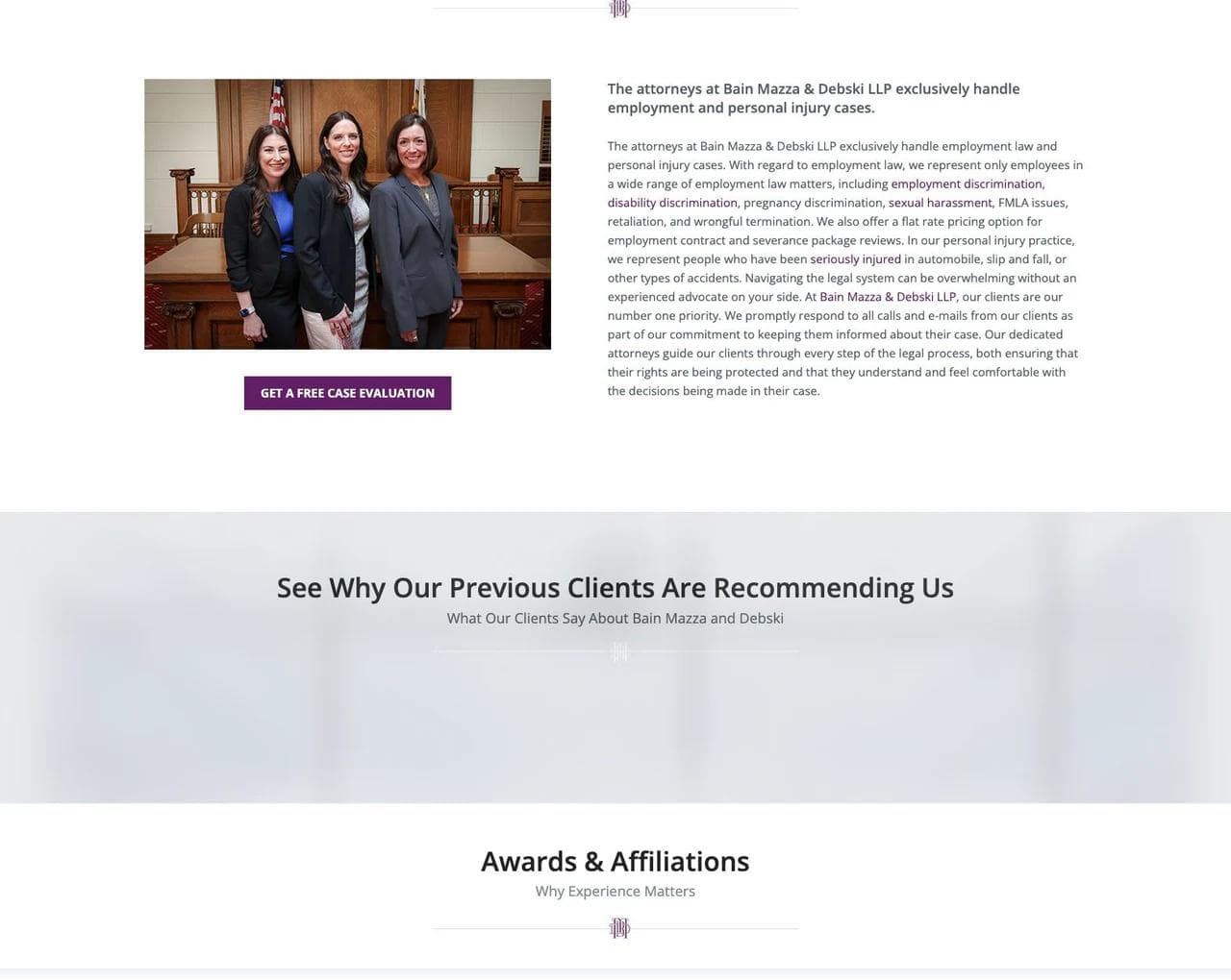
The hero combines the firm's three attorneys with the message "Quality work, personal attention, excellent results." The page then names the geography, practice areas, and employee-side orientation. A firm overview explains the kinds of employment disputes and injury matters handled, plus the expectation of prompt communication.
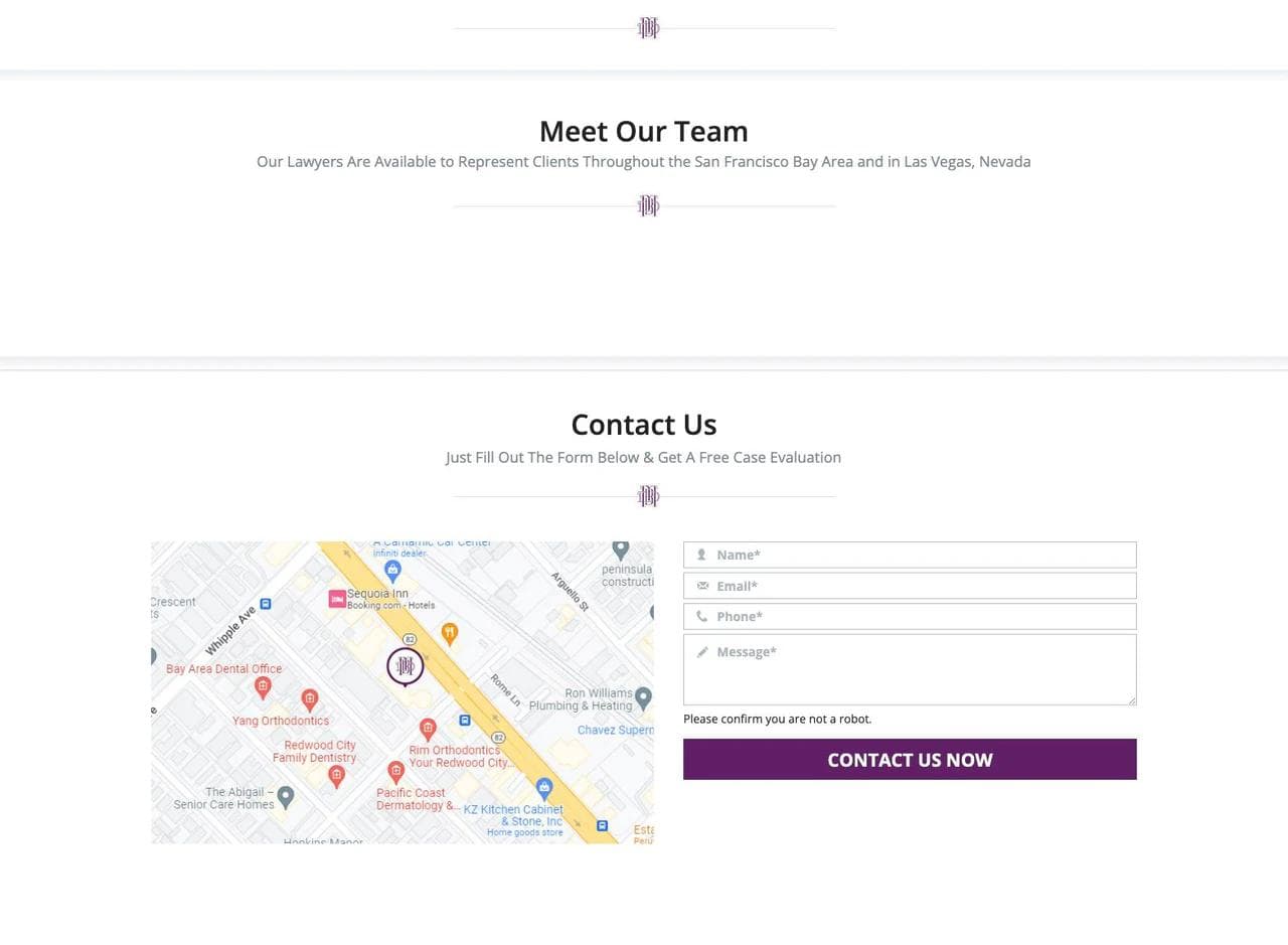
The largest section is client proof. Reviews describe responsiveness, accessibility, emotional support, agreement review, trial work, and the experience of dealing with a stressful matter. Awards and affiliations follow, then the three attorney profiles, a free case-evaluation form, offices, and the legal disclaimer.
What works
- Real attorney photographs appear immediately. For a three-person firm, the team is part of the product.
- The employee-side boundary is clear. "Employment law" alone could attract employers and employees with opposite needs.
- The reviews explain working style. They are more useful than generic stars because they describe communication, preparation, and care.
- The site respects a short decision path. A qualified local visitor can identify the fit, inspect proof, meet the team, and contact the firm without navigating a complex homepage.
What to borrow
Use testimonials to answer an uncertainty, not to fill space. Select excerpts that reveal responsiveness, process, judgment, fee clarity, or the experience of a consultation. Pair them with real people and a clear practice boundary.
What not to copy blindly
A long review carousel can become repetitive. The strongest excerpts should be edited for the question each one answers, with links to the original platform when appropriate. Practice pages still need to carry the search and educational depth that the short homepage does not.
5. Cary Estate Planning: design for a long, anxious research journey
Cary Estate Planning serves families across North Carolina with a team of attorneys and staff. Its homepage is much longer than the others because the decision is rarely urgent in the same way as a criminal charge or accident, but it is emotionally and technically complex.
How the page is structured
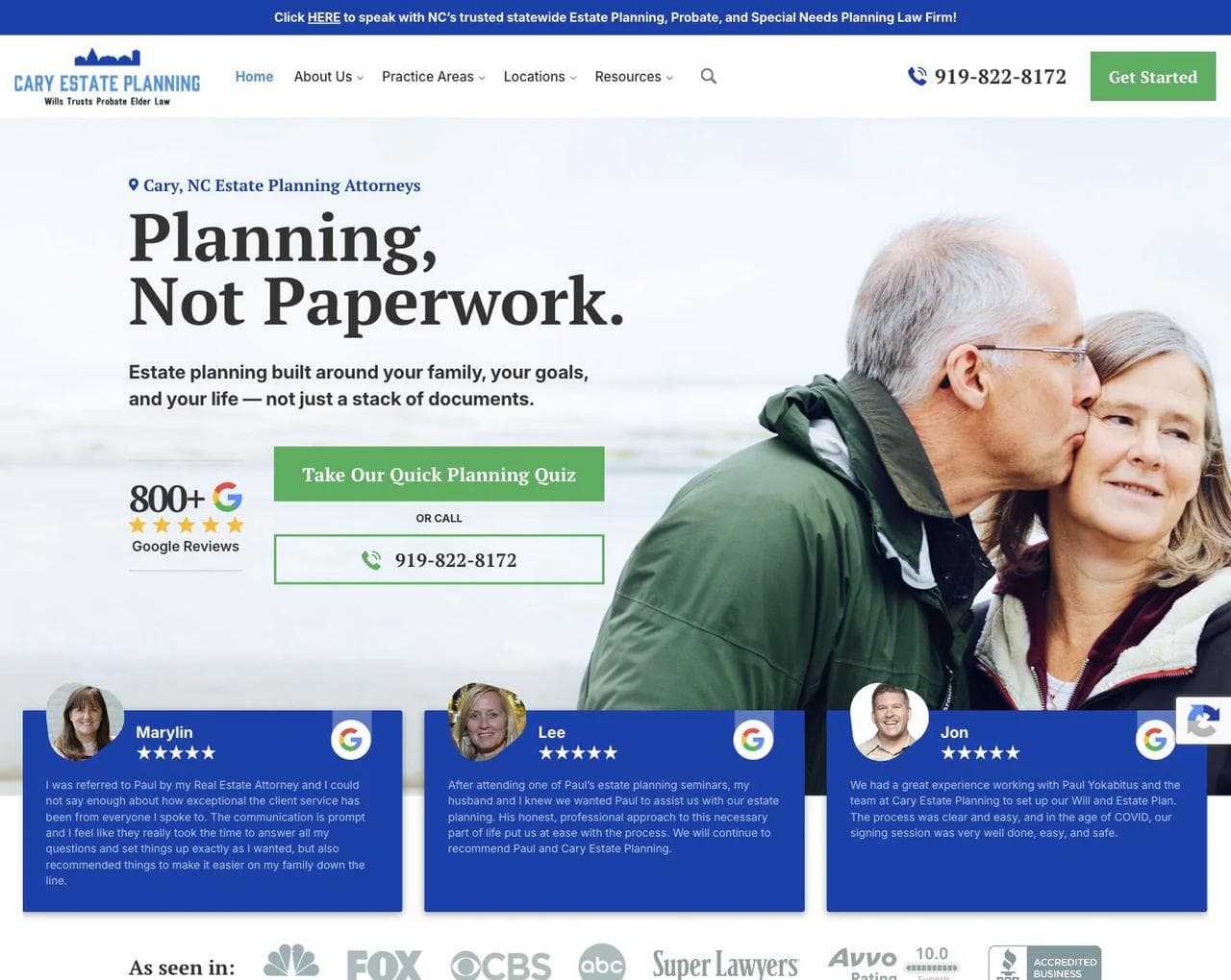
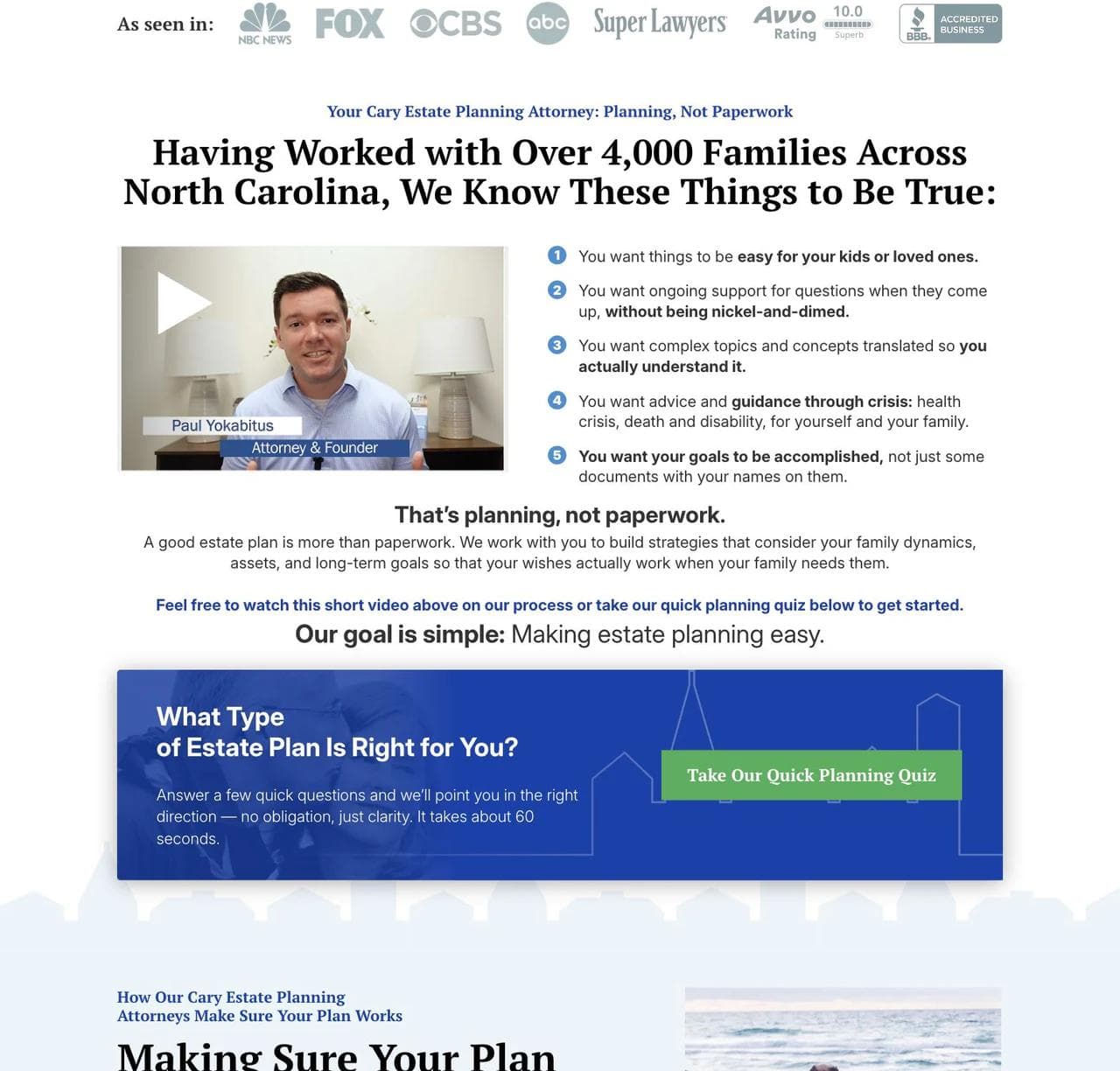
The hero leads with "Planning, Not Paperwork" and a plain-language promise. Nearby proof includes the number of families served, review volume, recognizable publications, and client comments. The next section lists what families actually want: ease for loved ones, understandable advice, ongoing support, and a plan that works in a crisis.
A short planning quiz offers a lower-pressure next step than contacting an attorney. The page then explains the practical work after documents are signed, the value of an ongoing relationship, and situations involving children, business ownership, special needs, family tension, and multigenerational goals.
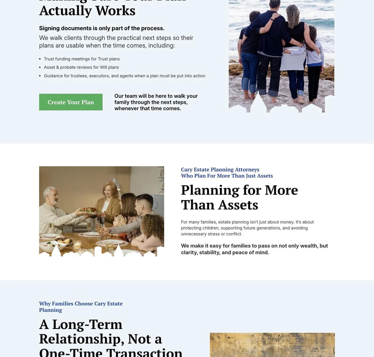
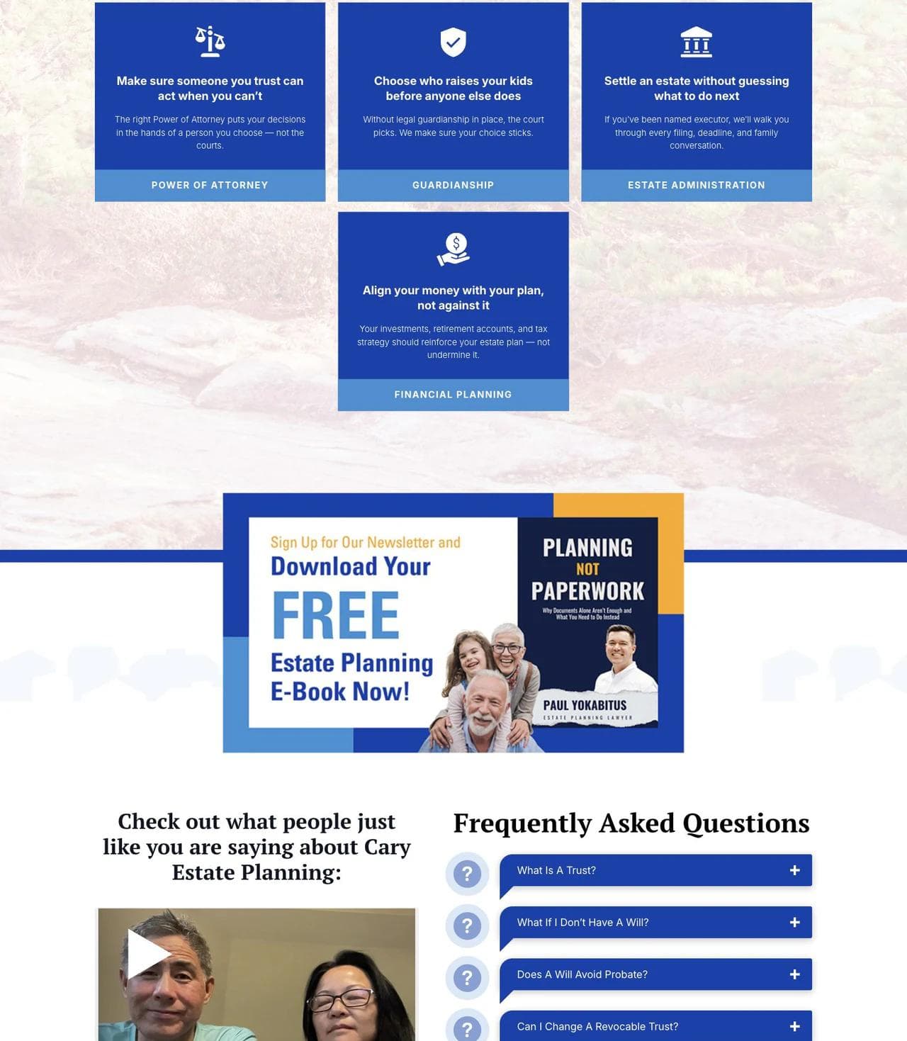
The service section translates wills, trusts, probate, elder law, guardianship, powers of attorney, and financial planning into client outcomes. Later sections add reviews, FAQs, a four-step working process, life-stage navigation, local offices, resources, and another planning CTA.

What works
- The page sells an operating model, not documents. "Planning, not paperwork" distinguishes ongoing guidance from a commodity will.
- The quiz matches a low-certainty visitor. Someone who does not know whether they need a will, trust, or special-needs plan can still take a useful first step.
- Practice areas are translated into consequences. The cards explain what each legal instrument helps a family accomplish.
- The page supports multiple stages of awareness. A ready buyer can get started, while a researching visitor can learn through FAQs, videos, events, and guides.
- Scale does not erase humanity. The site combines team depth with family photography, plain language, and client stories.
What to borrow
For a considered legal decision, build a ladder of commitments. A quiz, guide, seminar, or short call can precede a full consultation. Explain the relationship after the initial matter so the firm is not reduced to a one-time document provider.
What not to copy blindly
Length is justified only when sections answer different questions. This page sometimes revisits the same planning themes and calls to action. A smaller estate-planning firm could keep the same sequence while using fewer repetitions and moving some depth to dedicated service pages.
6. SaaS Law: productize the repeatable part of legal work
SaaS Law is the outlier in this set. Its homepage currently leads with a contract-negotiation platform, while the law firm remains available for legal services. That makes the page useful for practices experimenting with subscriptions, fixed scopes, self-service tools, or technology-assisted delivery.
The page also behaves like a focused SaaS homepage. For a broader explanation of that structure, see our full-page SaaS landing page teardowns.
How the page is structured
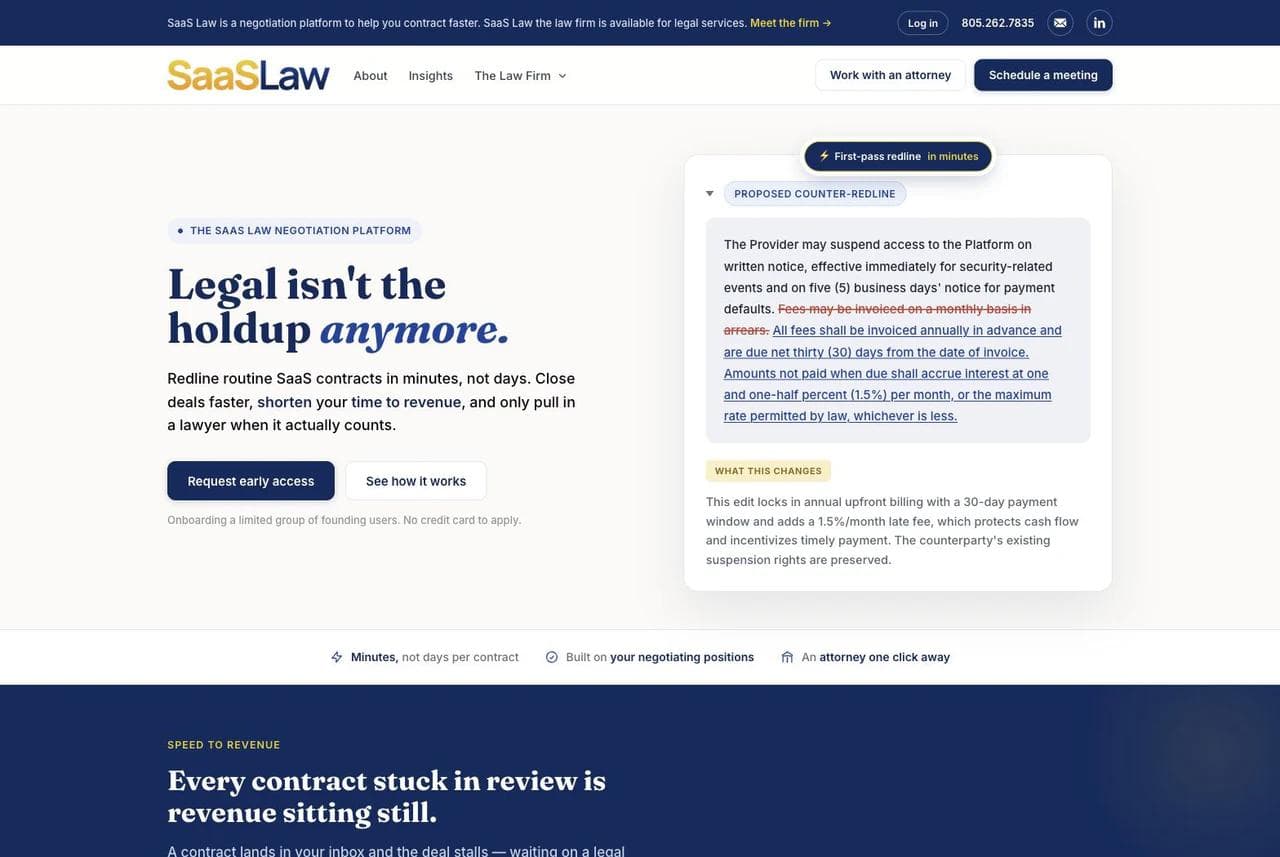
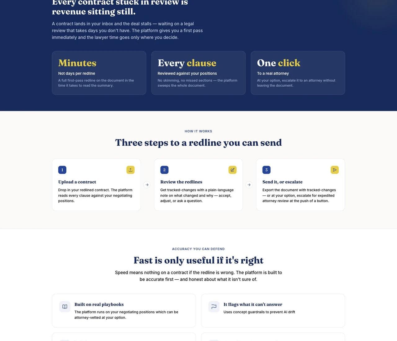
The hero names the business bottleneck: routine SaaS contracts delay revenue. A realistic redline example shows the mechanism, and the primary action requests early access. The page then quantifies the workflow in operational terms, minutes per redline, every clause reviewed, and one-click escalation to an attorney.
A three-step section explains upload, review, and send or escalate. The next section handles the central objection by discussing playbooks, uncertainty flags, full-document review, audit trails, and human approval.
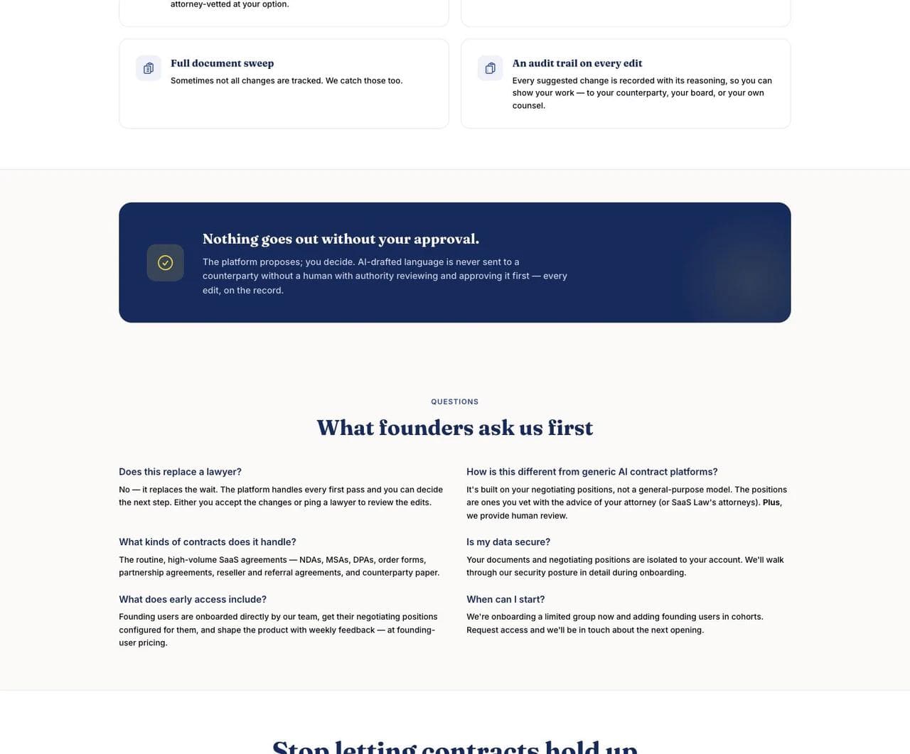
FAQs address whether the product replaces a lawyer, supported contract types, security, and onboarding. The intake form then asks for business details, while a separate path remains available for visitors who would rather work directly with an attorney.
What works
- The page is organized around a business outcome. It leads with time to revenue rather than a list of legal capabilities.
- The mechanism is visible. The redline and explanation make a productized service concrete.
- Risk handling is part of the sales story. Accuracy, uncertainty, approval, and escalation are not buried in a footnote.
- The human boundary is explicit. The platform and the law firm are connected without claiming that automation replaces legal judgment.
What to borrow
Even without software, a law firm can package repeatable work more clearly. Define the inputs, steps, deliverable, review points, expected timeline, and moment when the scope changes. Business clients often value operational clarity as much as visual prestige.
What not to copy blindly
A product interface can distract from the attorney relationship if the service boundary is unclear. Firms offering legal advice should keep jurisdiction, engagement, confidentiality, and human-review language precise. Productization should remove avoidable friction without pretending every matter is standardized.
What every strong small law firm website has in common
Across different practices and page lengths, the same foundations recur.
A specific statement of fit
The page identifies a practice, problem, audience, and usually a geography. "Full-service legal solutions" forces the visitor to do the categorization work. "Bicycle crash victims in Northern California" or "family and immigration law in Seattle" does not.
Real people
Every example makes at least one attorney visible. Headshots, a founder video, a quotation, or a clear biography lets the visitor evaluate the person behind the promise. Stock courthouse imagery cannot do that job.
Proof matched to the matter
Proof is not one universal logo strip. A criminal-defense visitor may look for courtroom experience and case focus. A family client may value empathy and familiarity with overlapping issues. An estate-planning family may want review volume, educational depth, and an ongoing process. A business buyer may care about workflow clarity and risk controls.
A visible path to contact
Phone, consultation, scheduling, quiz, and early-access actions represent different levels of urgency. The best CTA is not necessarily the boldest. It is the next step the visitor is ready to take.
A boundary around the service
Strong pages say who they serve and, directly or indirectly, who they do not. Paceline focuses on cyclists. Bain Mazza & Debski represents employees. The Jones Firm emphasizes serious criminal matters. SaaS Law separates platform assistance from attorney review. Clear exclusions improve lead quality.
The real design forks by practice type
The six pages also show why one law-firm template cannot solve every problem.
Urgent consumer matters
Criminal defense and personal injury benefit from immediate category recognition, a prominent phone or consultation action, real attorney visibility, and evidence that the firm knows the exact situation. Mobile tap targets and a short first-contact path matter more here than a long educational funnel.
Family, immigration, and estate matters
These pages must combine competence with emotional safety. Plain language, process explanation, privacy awareness, frequently asked questions, and lower-pressure actions can matter more than an aggressive outcome claim.
Business and transactional matters
Business buyers often want scope, process, turnaround, deliverables, and expertise with their operating context. Product screenshots, workflow diagrams, representative matters, scheduling, and precise service packages may outperform broad trust language.
Boutique litigation and high-value advisory work
When referrals and reputation drive the buyer, the site can use a quieter conversion path. Representative matters, attorney experience, publications, industries, and clear contact information may carry more weight than repeated free-consultation buttons.
A practical homepage blueprint for a small law firm
Use this as a starting sequence, then remove any section that does not advance the client's decision.
- Hero: Practice, client, location, primary outcome, and one suitable next step.
- Immediate proof: One to three signals relevant to the matter, such as experience, reviews, representative outcomes, credentials, or clients served.
- Problem recognition: Situations or questions that help the visitor identify the right practice.
- Why this firm: A specific method, niche, lived experience, team model, or service boundary.
- How it works: What happens after contact, including any consultation, evaluation, document, or escalation step.
- Attorney or team: Real people, useful biographies, and a reason each person fits the work.
- Deeper proof: Testimonials, representative matters, educational resources, or process evidence.
- FAQ or decision aid: Answer high-friction questions without making guarantees.
- Final CTA: Restate the fit and offer the appropriate next step.
- Operational footer: Locations, phone, hours if relevant, privacy, accessibility contact, and required attorney-advertising or jurisdictional language.
If the firm is choosing a platform as well as a page structure, compare the maintenance model and content needs in our guide to the best AI website builders. A conventional visual builder may be preferable when nontechnical staff need predictable manual control; our Wix versus Squarespace comparison explains that tradeoff in more detail.
Law firm website requirements that are not merely visual
Advertising claims need review
The ABA Model Rule 7.1 prohibits false or misleading communications about a lawyer or legal services. State rules and required disclaimers vary. Have counsel familiar with the applicable jurisdictions review superlatives, testimonials, case results, specialization language, and intake promises before launch.
Contact forms should set a confidentiality boundary
Do not invite a prospective client to paste a complete confidential record into an unsecured general form. Ask only for the information needed to route the inquiry, state that submitting the form does not create an attorney-client relationship, and explain what happens next. Secure portals, payments, document collection, conflict checks, and practice-management workflows may require systems beyond the public marketing site.
Accessibility requires design and testing
The Department of Justice web accessibility guidance calls out barriers such as weak color contrast, color-only instructions, missing semantic headings, and lack of keyboard access. It also notes that automated checkers alone do not establish accessibility. Use the WCAG 2.2 quick reference during design, then test forms, navigation, focus order, zoom, error messages, and media with people and assistive technology.
Local search needs a site architecture
The homepage cannot carry every service and location query. Give each meaningful practice area its own useful page, connect attorney bios to relevant work, keep names, addresses, and phone numbers consistent, and publish genuinely helpful local explanations. Do not create dozens of near-duplicate city pages with only the place name changed.
Build for trust before visual novelty
The strongest lesson from these law firm website examples is that design quality is not the same as decoration. Paceline uses an authentic niche. The Brilliant Brawler uses a founder persona. ZafiroLaw connects overlapping legal problems. Bain Mazza & Debski foregrounds people and client experience. Cary Estate Planning builds an educational journey. SaaS Law explains a productized operating model.
For a small firm, the best website is the clearest truthful version of how the practice actually works. Start with the client's decision, arrange evidence around it, and make the next step feel proportionate.
Moda can help a small firm create a branded static marketing site with responsive pages, service explanations, attorney profiles, resources, and a simple lead form. It is a reasonable fit when the public website is primarily a trust and lead-generation surface. It is not a substitute for a secure client portal, practice-management system, conflict-check workflow, payment system, or matter database. Connect those systems separately and preserve a clear boundary between public marketing and privileged client work.
Building a public-facing law firm marketing site? Try Moda today.
Frequently asked questions
What makes a good law firm website?
A good law firm website quickly identifies the practice, client, and geography, then supports that fit with real attorneys, relevant proof, an understandable process, and an appropriate next step. It should also work well on mobile, be accessible, load quickly, and keep advertising and confidentiality boundaries clear.
What pages should a small law firm website include?
Most small firms need a homepage, one useful page for each meaningful practice area, attorney or team profiles, an about or approach page, a contact page, privacy and accessibility information, and required legal disclaimers. Add location pages, FAQs, resources, results, or client-service pages only when they help a real visitor or search query.
Should a law firm website include testimonials and case results?
They can be valuable when they are truthful, specific, permitted in the relevant jurisdiction, and presented with any required context or disclaimers. Testimonials are strongest when they explain the client experience. Case results should not imply that a similar outcome is guaranteed.
What is the best website builder for a small law firm?
The best choice depends on who will maintain the site and which systems it must connect to. A visual or AI website builder can suit a branded static marketing site. A firm with extensive publishing, multilingual content, complex local SEO, secure portals, payments, or deep practice-management integrations may need a more configurable CMS and specialist implementation.
Does a law firm website need to be ADA compliant?
Law firms should treat accessibility as a core requirement. The Department of Justice states that inaccessible web features can prevent people with disabilities from accessing goods and services offered by businesses open to the public. Use current WCAG guidance, combine automated and manual testing, and get legal advice for the jurisdictions in which the firm operates.
How do law firm websites generate leads?
They generate qualified inquiries by matching a specific problem and location, earning trust with relevant evidence, answering high-friction questions, and making the next step easy. Search visibility helps people discover the page, while the page itself must help the right visitor decide to call, book, or submit a short inquiry.

Real editable visuals. Real canvas. Full control.
Fly through design work