Hotel Website Design: 5 Complete Booking-Journey Teardowns
See five hotel websites analyzed across positioning, rooms, direct booking, destination content, events, accessibility, and the booking-engine handoff.
 Anvisha Pai, Co-founder & CEO, Moda
Good hotel website design must do two jobs. It has to make a traveler choose the property, then make booking direct feel as trustworthy and convenient as returning to an online travel agency. Attractive photography matters, but it cannot compensate for unclear room choices, hidden policies, a weak booking handoff, or a site that never explains why this particular stay is worth the trip.
This guide examines five independent hotel websites across the complete decision journey. Instead of treating each homepage as a mood board, we look at how the sites position the property, compare accommodations, explain the destination, route weddings and other special trips, and hand a ready traveler into live booking infrastructure.
Five hotel website examples at a glance
- The Menhaden: a small coastal boutique hotel that combines a concise room story with local North Fork context.
- Hotel Peter & Paul: a historic urban hotel that turns a complex property into distinct room families, dining, programming, and event journeys.
- Eastwind Hotels: an experiential mountain-hotel group that first asks visitors to choose a destination, then a room or cabin type.
- Lokal Hotel: an apartment-style hotel brand whose website explains a low-touch, live-like-a-local operating model.
- Basin Harbor: a lake resort where accommodations are only one part of the purchase. Activities, dining, family logistics, and weddings all shape the booking decision.
These are not five interchangeable visual styles. They represent different commercial problems. A six-suite city hotel, a multi-property mountain escape, and a family resort should not share the same homepage architecture simply because all three sell overnight stays.
The two questions every hotel website must answer
Travelers often discover a property through Google, an OTA, social media, a wedding invitation, or a destination guide. By the time they reach the official site, they are usually resolving two uncertainties.
Why choose this property?
The site must turn a building and a list of amenities into a specific stay. That requires more than adjectives such as luxurious, unique, or unforgettable. Useful evidence includes a recognizable location, distinct room types, an operating concept, on-property experiences, a credible service promise, and enough practical detail to imagine the trip.
Why book direct?
An OTA offers familiarity, comparison, reviews, and a known checkout. The hotel site must preserve that confidence while adding reasons to remain. A visible date-and-guest search, accurate room details, direct-booking benefits, clear policies, secure payment, and a coherent transition into the booking engine all matter.
The marketing website and booking engine are different systems, but they create one customer experience. If the transition changes branding, loses selected dates, hides fees, or returns the visitor to a generic property search, the technical handoff becomes a conversion problem.
1. The Menhaden: sell a small hotel through restraint and specificity
The Menhaden is a boutique property in Greenport, New York. Its website does not need to organize hundreds of rooms or a sprawling resort. Its harder job is explaining why a relatively small coastal hotel should become the visitor's North Fork base.
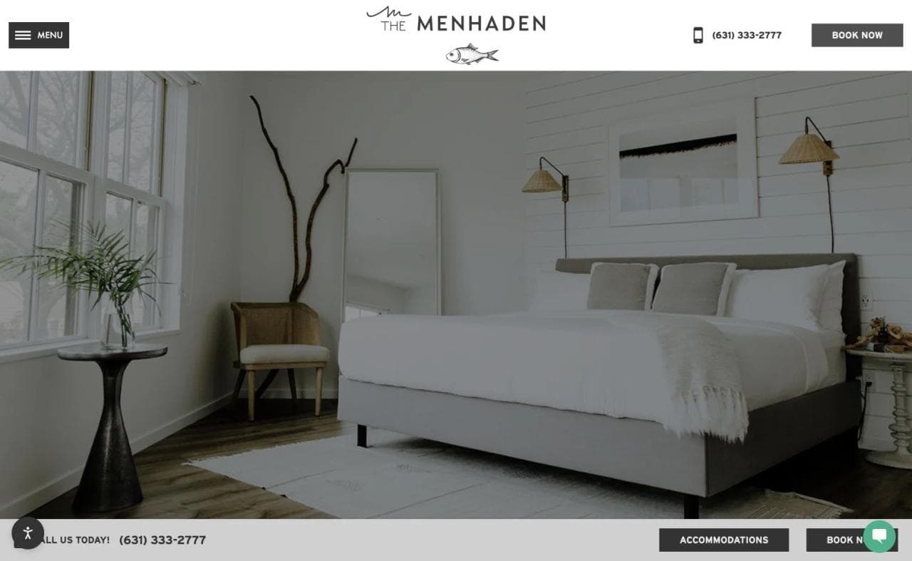
The accommodations page leads with a large room image, a persistent Book Now action, a telephone number, and an accommodation path. The visual tone is quiet, but the navigation remains transactional. This is an important balance for hospitality sites: atmosphere should support the next step rather than hide it.
What the page does well
The positioning connects the room product to the surrounding destination. Greenport, wineries, farms, waterfront activity, and local access give the stay a purpose beyond the room itself. The page also avoids pretending that every guest wants the same experience. It addresses ordinary stays, pet-friendly needs, and accessible accommodations separately.
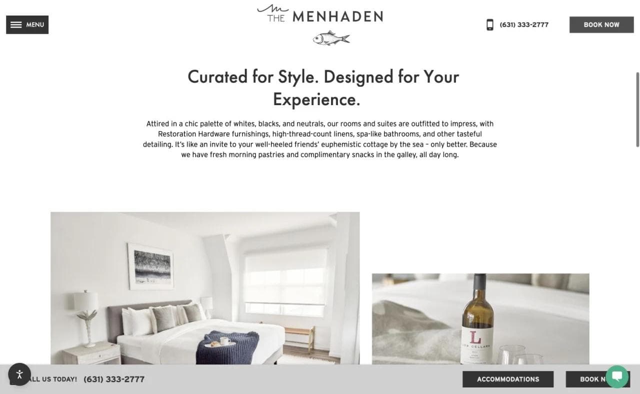
The section titled "Curated for Style. Designed for Your Experience." moves from mood into practical differentiation. The copy describes room design, comfort, and location without forcing the visitor through an oversized brand manifesto.
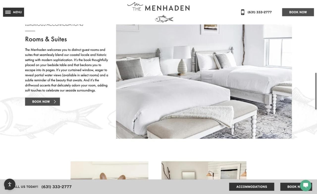
The Rooms & Suites section pairs concise copy with direct room imagery and a booking action. A small property benefits from this compression. Visitors can understand the accommodation category without navigating an elaborate taxonomy built for a much larger inventory.
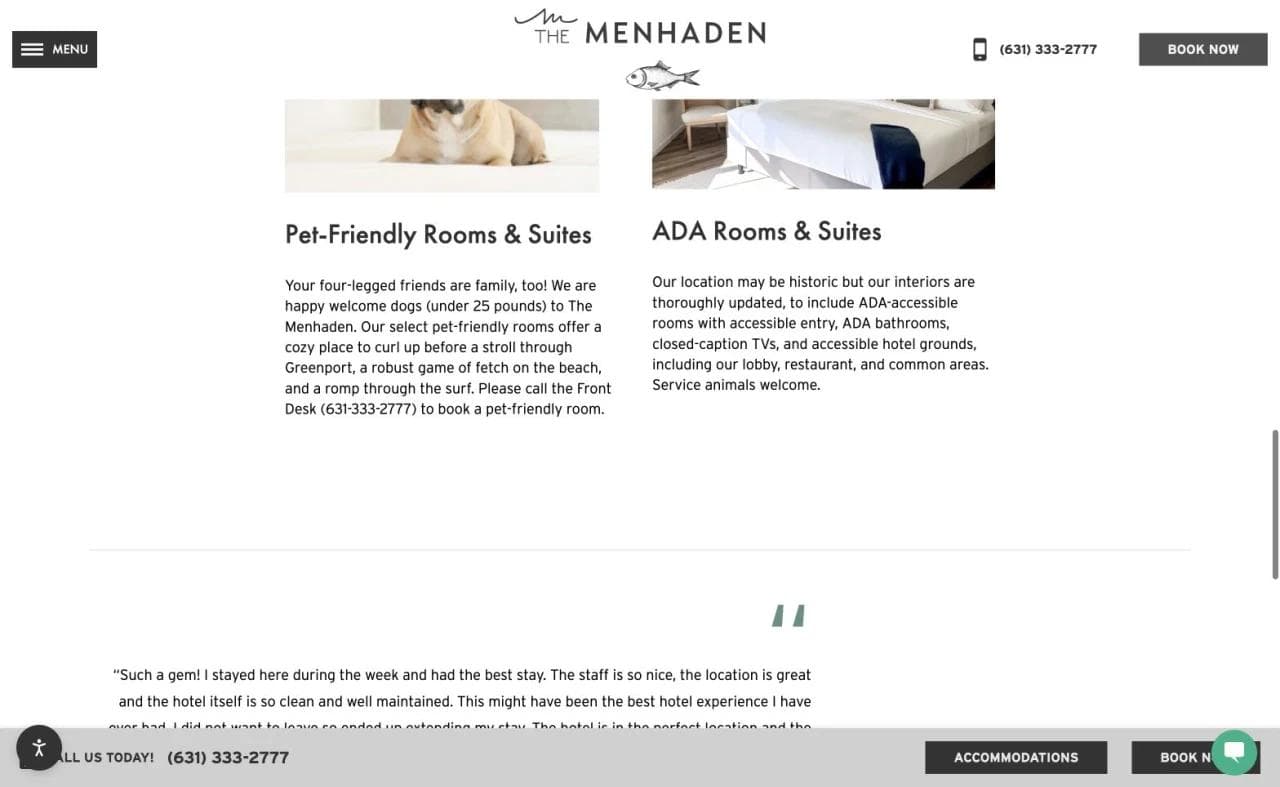
Pet-friendly and ADA information appears as part of the accommodation journey rather than being buried only in the footer. That helps guests determine fit before entering the booking engine. The next improvement would be making the accessible-room details even more scannable through precise features, room names, and a clear availability path.
What to borrow
- Keep the booking action visible without turning every section into a promotion.
- Connect the room to the destination visitors actually came to experience.
- Surface pet and accessibility questions near accommodation selection.
- Use a compact journey when the property has a compact inventory.
What not to copy blindly
A sparse page works only when the remaining information is precise. A property with complicated room categories, resort fees, parking constraints, or family occupancy rules would need more comparison detail before sending visitors to booking.
2. Hotel Peter & Paul: turn property history into usable choices
Hotel Peter & Paul occupies a restored church, school house, rectory, and convent in New Orleans. That story is a genuine differentiator, but it also creates a navigation problem. Travelers need to understand that rooms across the buildings can differ in architecture, layout, and atmosphere.
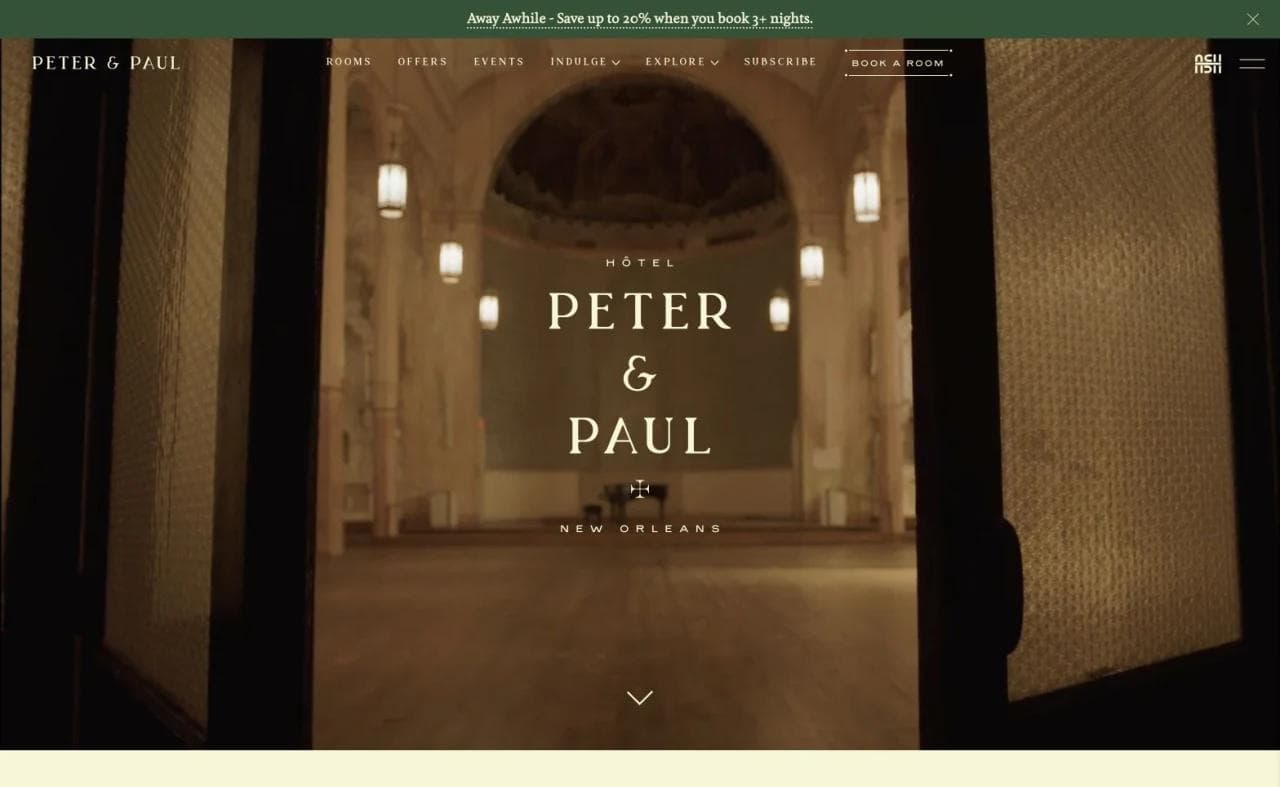
The opening makes the historic setting unmistakable while keeping a direct booking action in view. The value proposition is not simply "a hotel in New Orleans." It is a stay inside a particular restored complex in a particular neighborhood.
Room taxonomy does real commercial work
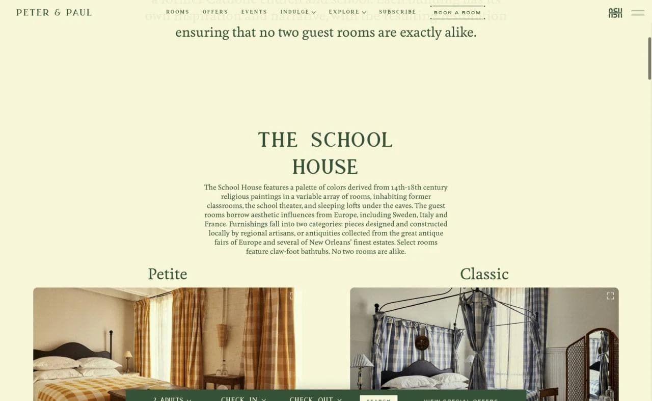
The room page organizes inventory by building, beginning with the School House. Names such as Petite, Classic, Grande Loft, Bunk, and Two of Queens create useful expectations around scale and occupancy. The taxonomy also reinforces the property's story rather than replacing room information with storytelling.
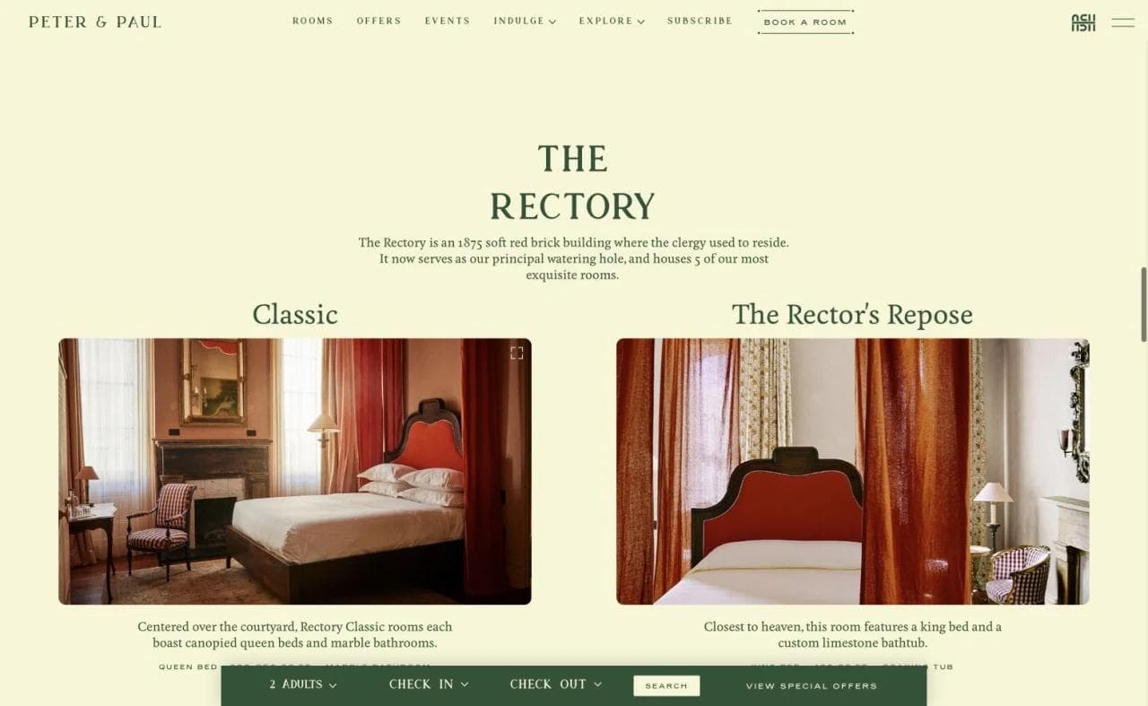
The Rectory section shows why room families need visual and written comparison. Two rooms may share a property and service level while offering materially different emotional experiences. This page would become even more decision-friendly with a compact comparison of bed type, occupancy, approximate size, accessibility, and notable features beside the imagery.
Events are a separate purchase journey
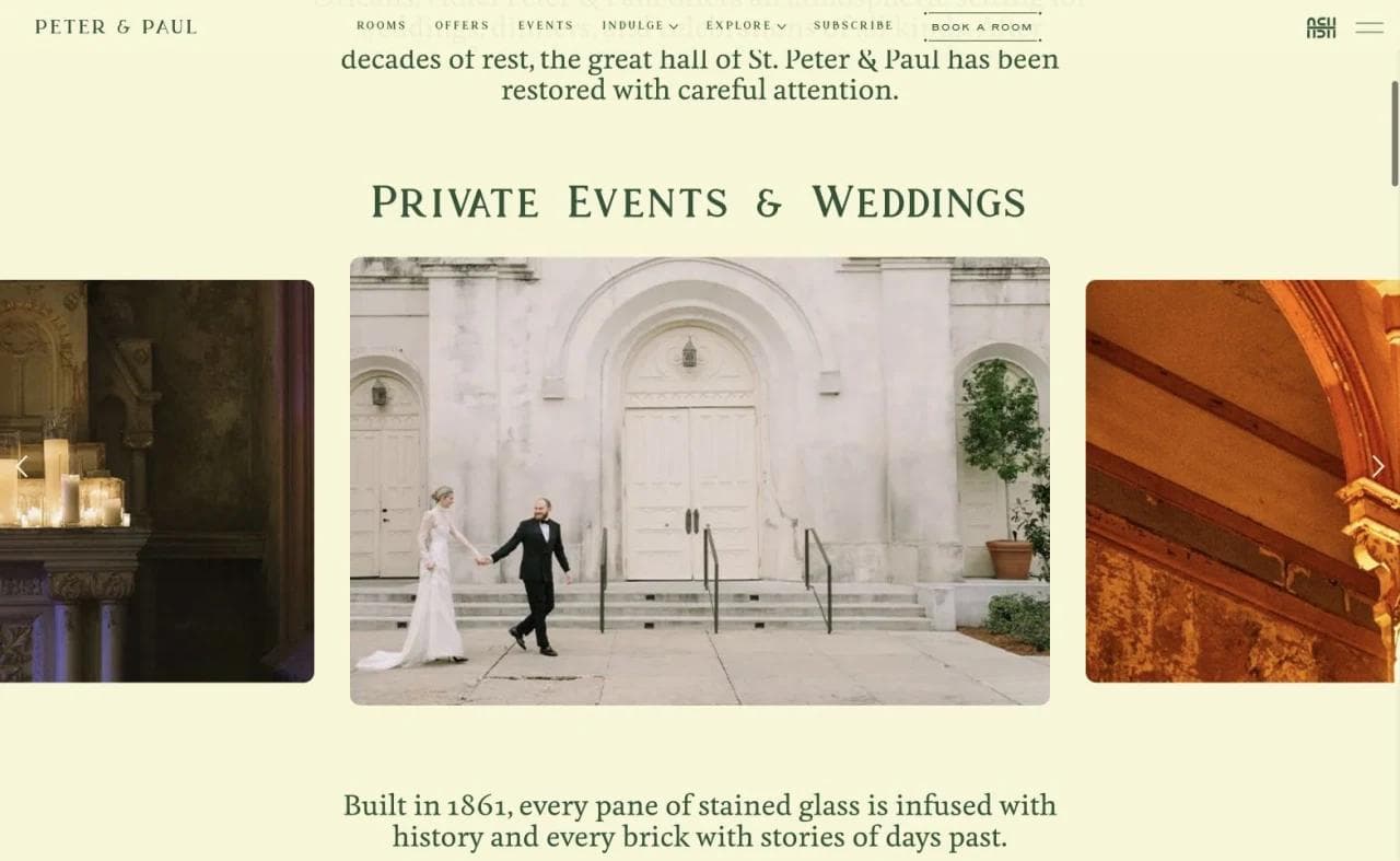
Private events and weddings receive their own persuasive path. The site explains the setting, shows how spaces feel when occupied, and routes visitors toward event planning rather than a standard room reservation. That separation matters because an event buyer needs capacity, format, catering, room blocks, and contact expectations that a leisure guest does not.
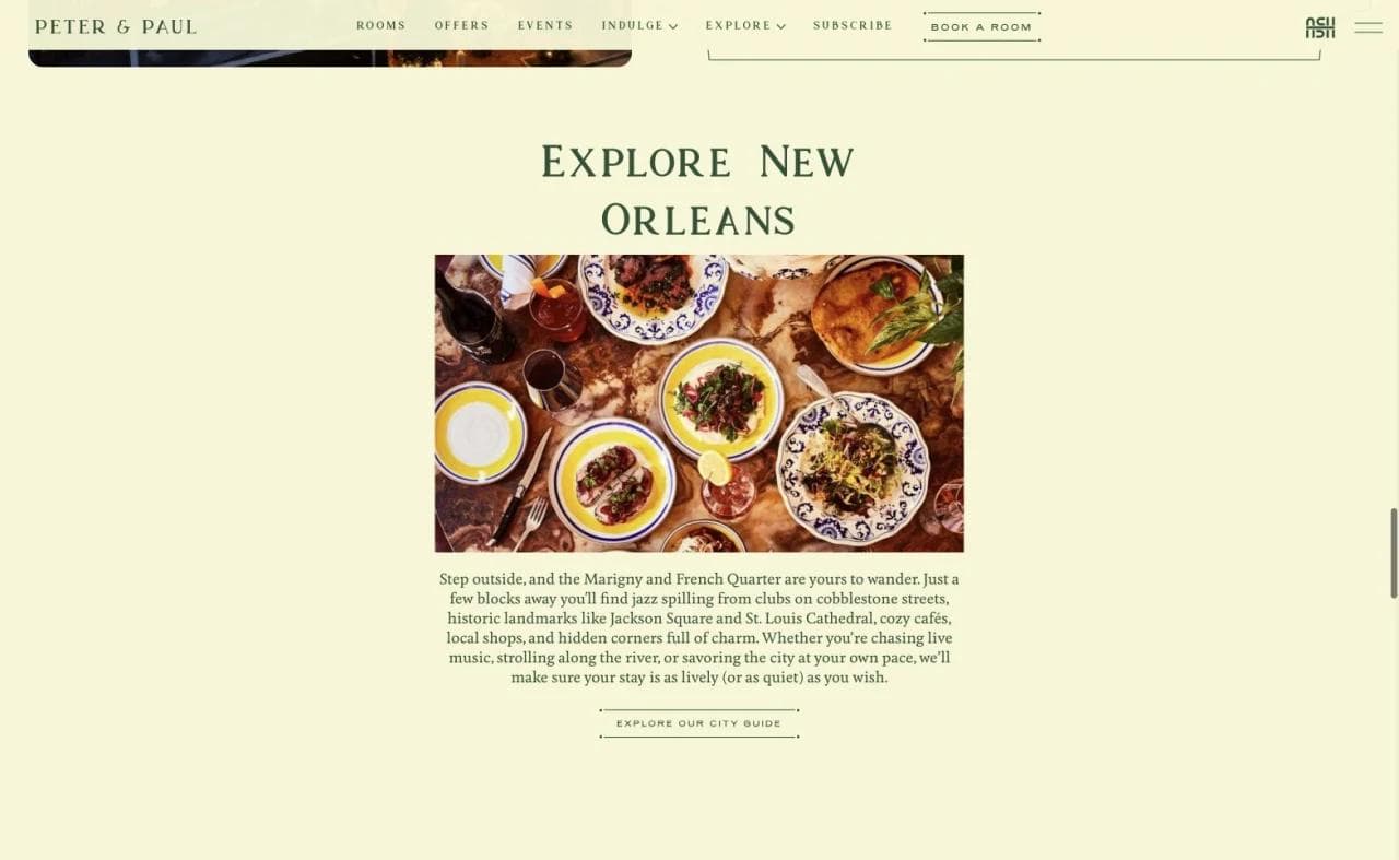
The destination section connects the property to New Orleans through food and neighborhood context. This is stronger than a generic attractions grid because it extends the hotel's point of view. The visitor learns not only what is nearby, but what kind of trip the hotel helps create.
What to borrow
- Turn unusual architecture into a clear room-selection system.
- Give weddings and private events a dedicated journey with its own next step.
- Use destination content to reinforce the property's character.
- Separate romantic language from practical room comparison. Both are necessary.
What not to copy blindly
Distinctive room names can become an extra decoding task. If the visitor cannot quickly compare beds, occupancy, size, views, and accessibility, brand-rich naming increases uncertainty instead of reducing it.
3. Eastwind Hotels: make destination selection the first fork
Eastwind operates mountain properties in Oliverea Valley, Lake Placid, and Windham, New York. Its first design problem is not room choice. It is helping visitors understand which destination matches the trip they want.
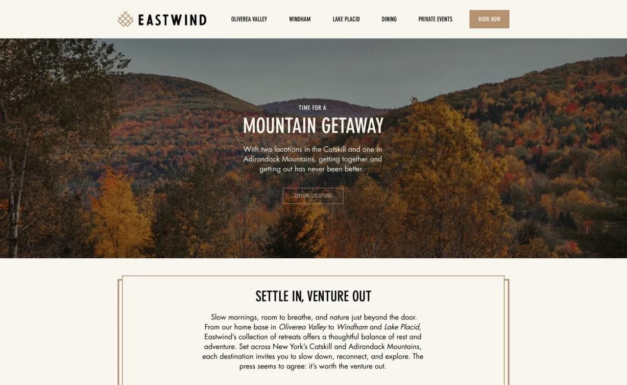
The homepage establishes a mountain-getaway promise before moving into the property choices. The design creates an experiential frame, but it does not assume that brand mood alone will resolve location.
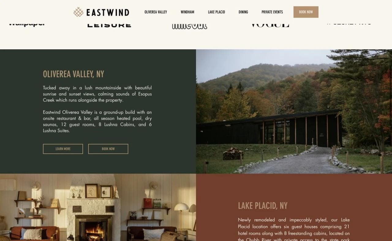
Each property receives a dedicated visual and short description. This is the correct first fork for a small multi-property group. Sending everyone into one combined room grid would make visitors compare cabins and hotel rooms before they have chosen a place.
Compare categories within the selected property
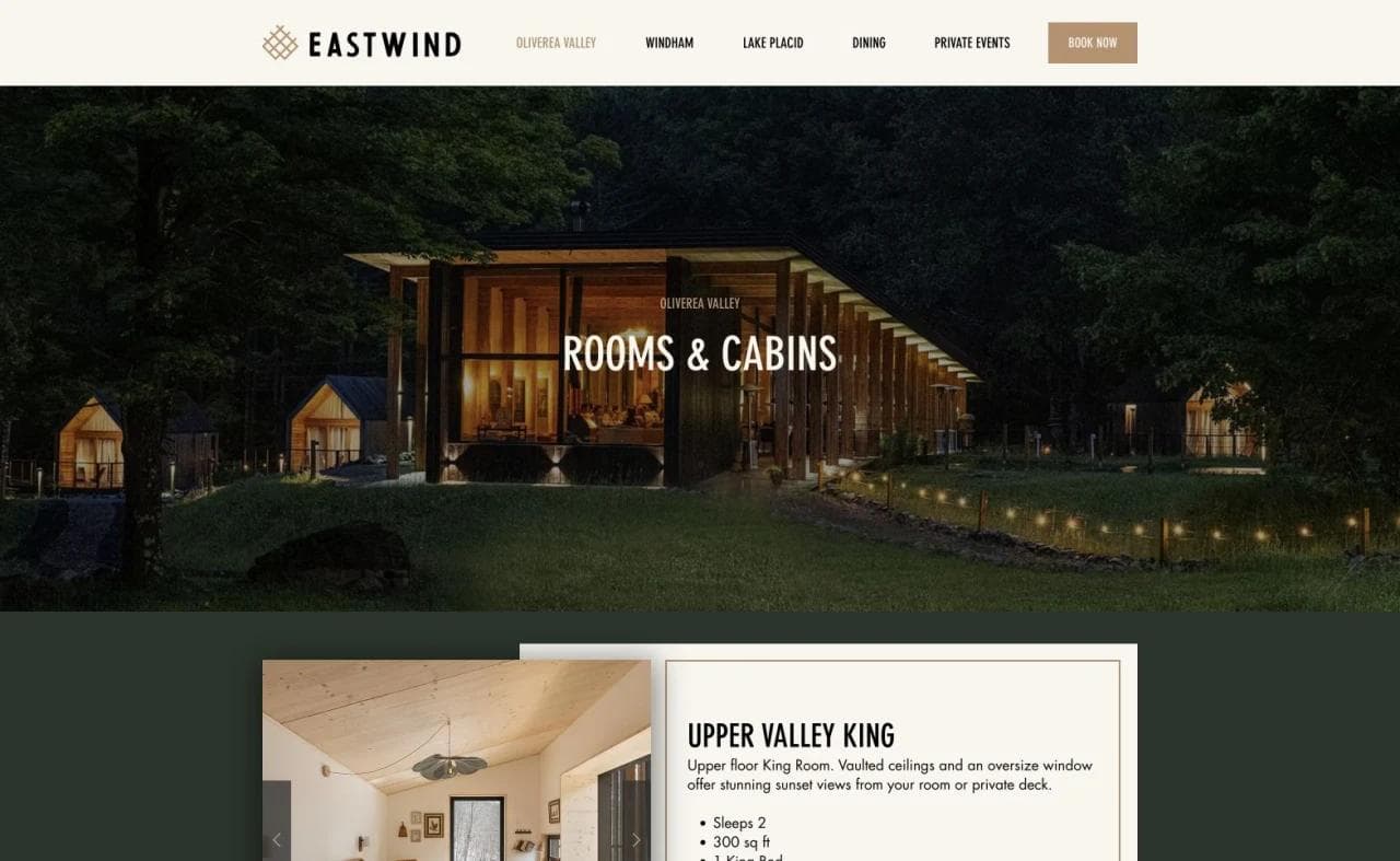
The Oliverea Valley page introduces rooms and cabins as different ways to stay. This is more useful than displaying all inventory as equivalent cards. The category decision carries real implications for privacy, setting, amenities, and the overall experience.
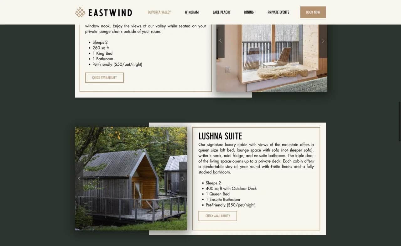
Individual accommodation cards combine photography, descriptive details, and booking actions. The strongest version of this pattern preserves the selected property and accommodation type when the visitor enters the booking engine. If that context disappears, the customer must repeat work the marketing site already helped complete.
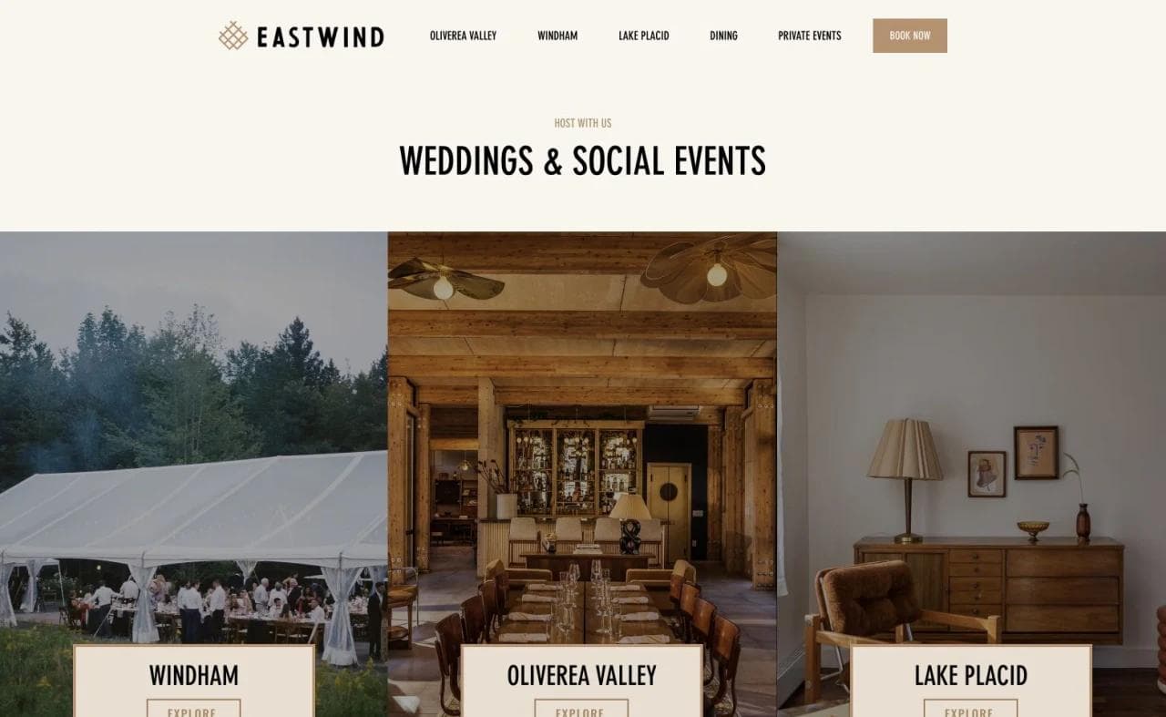
The weddings page repeats the property fork because the event experience differs by destination. This is a good example of shared brand architecture without pretending every location offers the same setting.
What to borrow
- Ask visitors to choose the destination before comparing room inventory.
- Explain the difference between cabins, rooms, and other accommodation formats.
- Preserve location context across leisure and event journeys.
- Let the brand system unify properties while keeping their individual reasons to visit.
What not to copy blindly
Multi-property architecture adds steps. A single hotel should not invent a destination selector or category hierarchy it does not need. Every fork should remove uncertainty, not merely expose the company's organization chart.
4. Lokal Hotel: explain the operating model, not only the interiors
Lokal combines apartment-style hotel suites in Philadelphia with properties in Cape May and South Jersey. Its defining idea is "invisible service": guests receive a designed, locally grounded stay without a conventional full-service hotel experience.
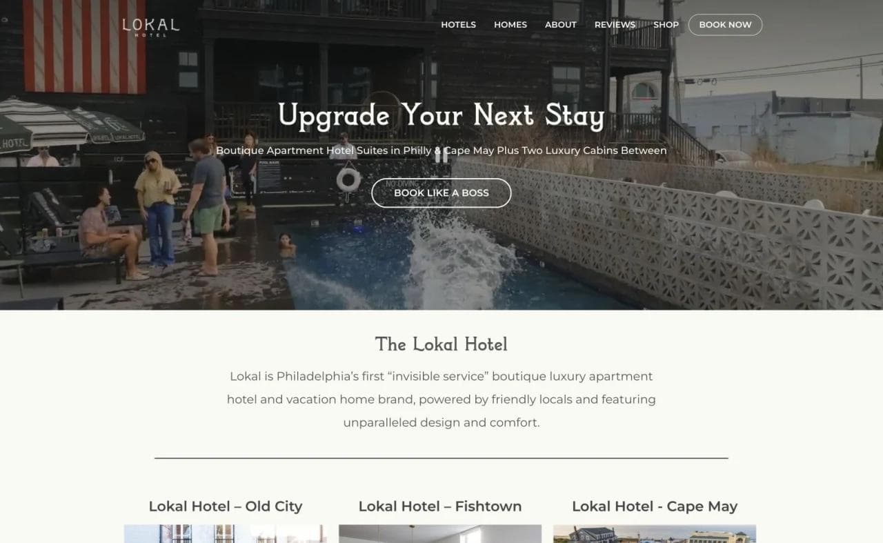
The homepage sells an upgraded stay and quickly presents the brand as a set of boutique apartments, a micro resort, and cabins. This is a broader inventory than a single hotel, so the site must clarify both location and accommodation format.
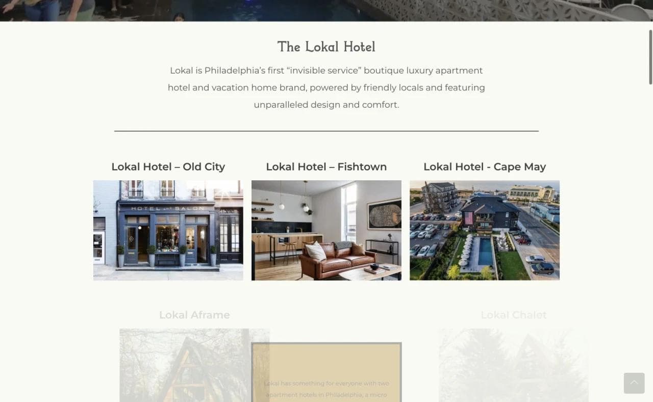
Property cards show meaningful visual differences between Old City, Fishtown, and Cape May. The copy adds neighborhood and format information, which prevents the gallery from becoming a set of attractive but unexplained interiors.
Apartment features change the comparison criteria
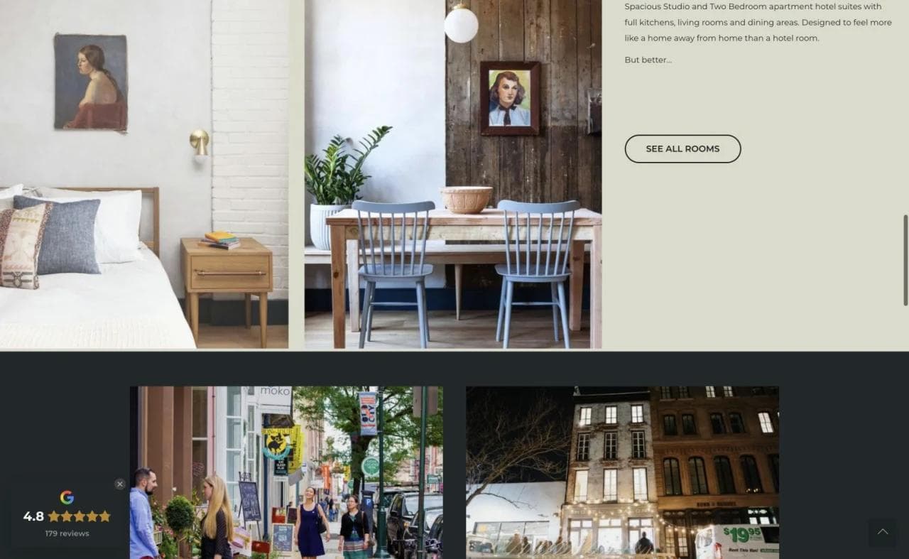
The Old City room section emphasizes space, kitchens, living rooms, and dining areas. Those details address why someone might choose Lokal over a conventional hotel room, especially for a longer stay, a family trip, or a guest who wants more independence.
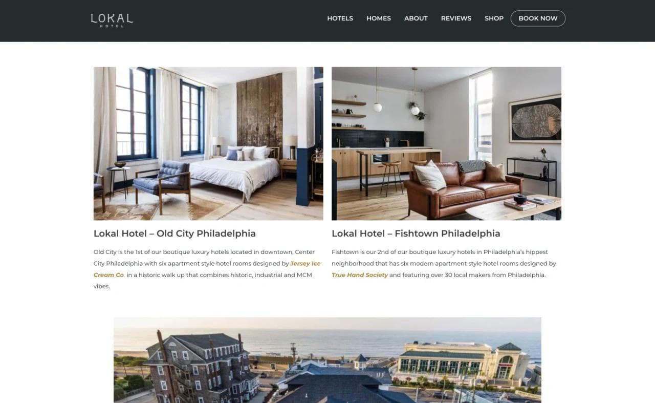
The direct booking page begins with a property choice. That is sensible for a geographically distributed portfolio, but it also shows a common handoff risk. The booking layer should make it obvious which property, room format, dates, and policies apply. A traveler should never wonder whether the page is still part of the official hotel experience.
What to borrow
- Explain a nontraditional service model before guests encounter it onsite.
- Compare properties using both location and accommodation format.
- Treat kitchens, living areas, laundry, and self-service logistics as core product information.
- Design the booking entry around the portfolio structure visitors already learned.
What not to copy blindly
Lifestyle language cannot replace service expectations. A low-touch property should be especially clear about arrival, support, luggage, housekeeping, parking, accessibility, and what happens when a guest needs help.
5. Basin Harbor: sell the whole resort operating system
Basin Harbor is a long-running Lake Champlain resort with guest rooms, cottages, dining, recreation, family activities, and weddings. The room alone is not the complete product. Visitors are deciding whether the property can support an entire trip.
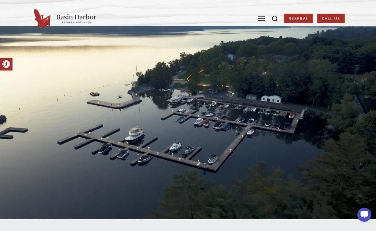
The homepage leads with place. The lake and grounds communicate scale immediately, while Reserve and Call Us remain visible. This is effective because the resort's strongest differentiator is not a generic room interior. It is access to the whole setting.
Accommodation categories need more context at a resort
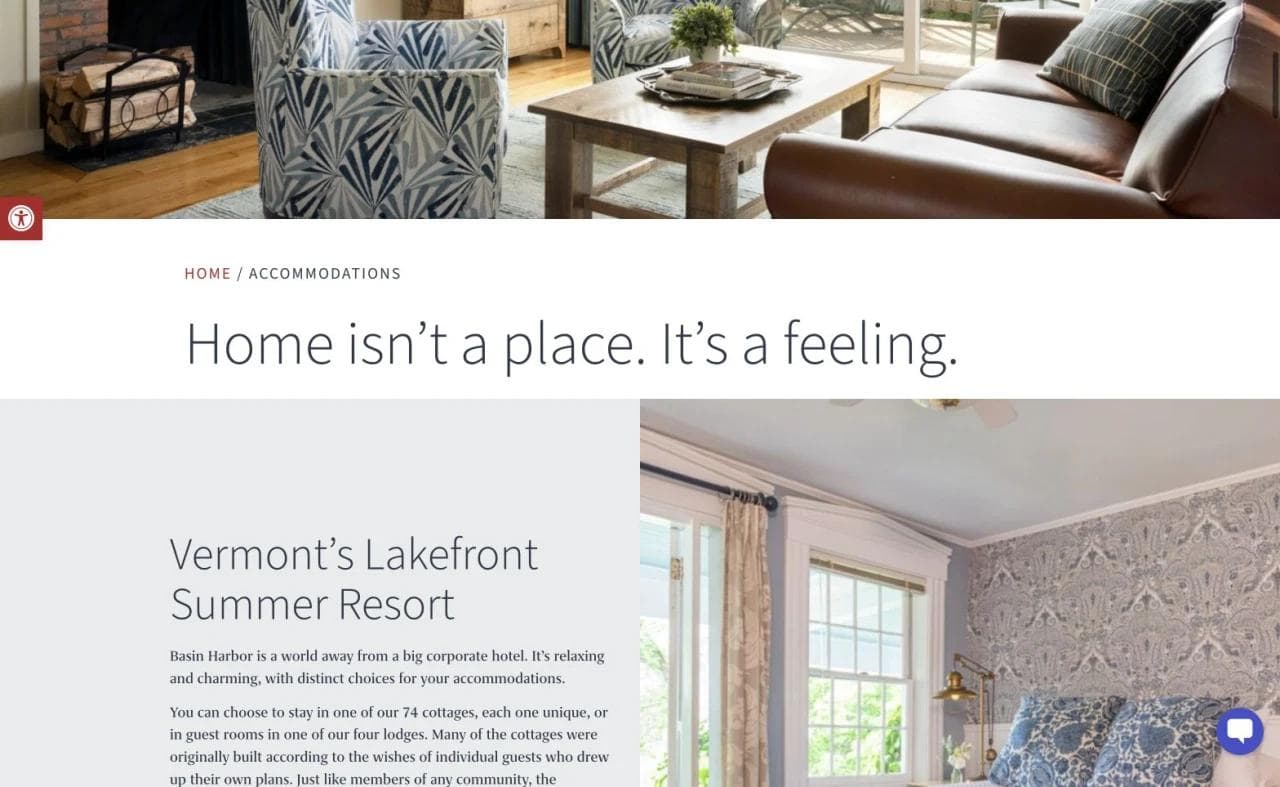
The accommodations journey introduces the emotional promise of feeling at home, then distinguishes lodging across the property. For a resort, room descriptions should also help visitors understand distance, stairs, views, nearby activity, vehicle access, occupancy, and whether a building suits children or mobility needs.
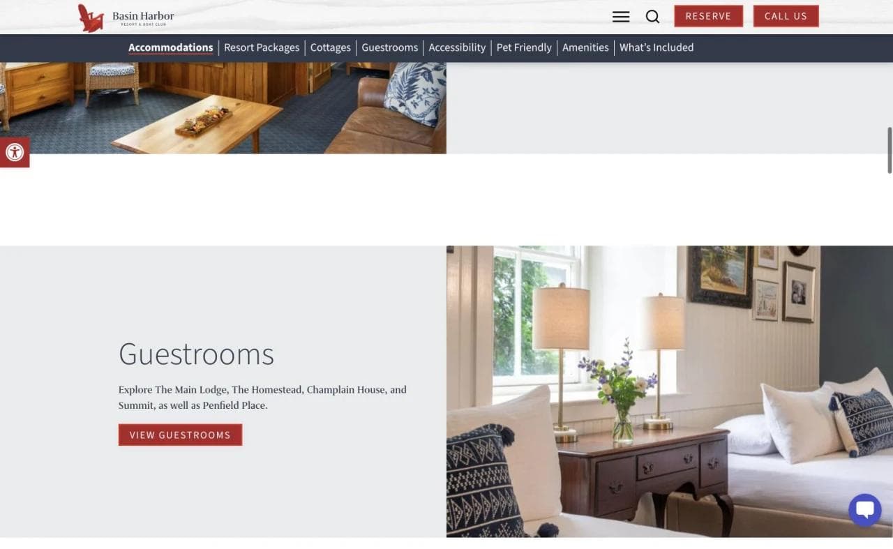
Guestroom imagery and booking actions provide a clear next step, but the resort context makes comparison metadata especially valuable. A beautiful room can still be the wrong choice if it is far from the activities a family expects to use.
Reduce uncertainty before arrival
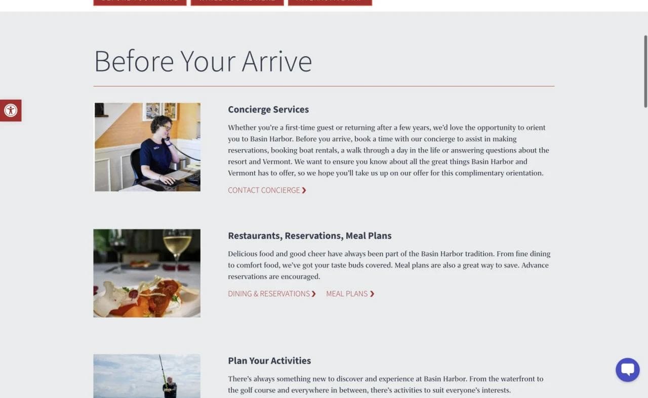
The pre-arrival section covers concierge help, restaurants, reservations, meal plans, and activity planning. This content serves two audiences. Prospective guests see evidence that the resort can support a complex stay, while booked guests get a practical planning hub.
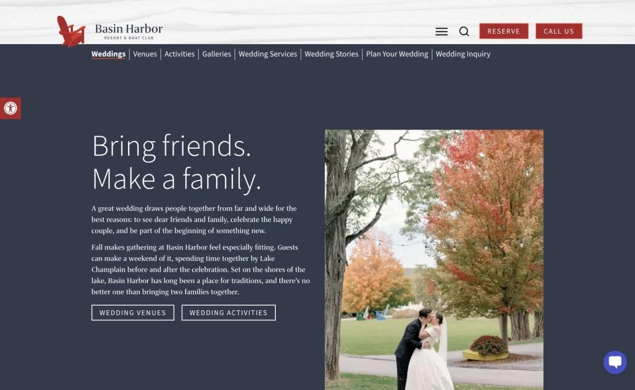
The wedding path opens with an event-specific promise and routes visitors to venues and activities. It recognizes that the product is a weekend shared by many guests, not only a ceremony space. A complete wedding journey should eventually make capacity, seasonality, lodging blocks, rain plans, catering, accessibility, and inquiry expectations easy to find.
What to borrow
- Lead with the setting when the setting is the main reason to visit.
- Explain how lodging choice affects access to the rest of the property.
- Build a pre-arrival hub that also demonstrates service before purchase.
- Treat weddings as multi-day group experiences rather than a room-booking add-on.
What not to copy blindly
Large resorts can accumulate navigation indefinitely. Activities, dining, events, history, accommodations, and guest information need a clear hierarchy. Adding every operation to the primary menu makes the site mirror internal departments instead of visitor decisions.
Patterns every effective hotel website needs
The examples differ, but several requirements are close to universal.
A specific property promise
The opening should identify the place, stay, or traveler the property serves. "Luxury in the heart of it all" is too generic to distinguish one hotel from another. Historic buildings, apartment-style independence, mountain cabins, coastal access, and a full lake-resort experience are specific enough to guide choice.
Persistent booking access
Visitors should not have to return to the homepage to check dates. Keep the booking action available from room, offer, destination, dining, and event pages. On mobile, make the action visible without allowing it to cover essential content.
Comparable room information
Photography should answer questions, not only establish mood. Each room page should identify beds, occupancy, approximate size, important amenities, accessibility, views, location within the property, and meaningful limitations. When categories are similar, use a table or consistent card structure.
A trustworthy booking handoff
The booking engine should retain the hotel's brand, property selection, dates, guests, and room context where possible. Display total-price information, taxes, fees, cancellation terms, deposits, and payment expectations at the point they become relevant. Do not make guests restart a generic search after choosing a room.
Destination context with a booking purpose
Local guides should help travelers decide where to stay, when to visit, and how to plan. Link neighborhood, itinerary, event, and seasonal pages back to relevant rooms, packages, or availability instead of leaving them as an isolated blog.
Accessible information and booking
Accessibility is not a footer badge. Describe accessible room features precisely, provide text alternatives for meaningful images, keep booking controls keyboard-operable, preserve readable contrast, caption important video, and make support easy to reach. The W3C Web Accessibility Initiative provides the current WCAG framework, while legal requirements vary by jurisdiction.
Real architecture forks to decide deliberately
Not every hotel should copy the same modules. The following are genuine strategic forks.
Single property or portfolio
A single property can lead directly into rooms and experiences. A small group should usually establish the shared brand, then help visitors choose a destination before exposing inventory.
Room-led or experience-led
An urban overnight stay may foreground location and room choice. A resort, lodge, or retreat may need to establish activities, dining, seasonality, and trip format first. The test is simple: what uncertainty prevents the visitor from choosing this property?
Instant booking or guided inquiry
Standard rooms should generally support direct date-and-guest search. Weddings, buyouts, retreats, long stays, and complex accessible needs may require a human-assisted path. Keep the two actions distinct so a leisure guest is not sent into an inquiry form and an event planner is not sent into ordinary room checkout.
Full-service or low-touch
Full-service properties should make their service visible. Low-touch and contactless properties should explain how arrival, support, housekeeping, security, and problem resolution work. Silence invites guests to assume a conventional operating model.
A practical hotel homepage sequence
For many independent properties, this is a strong starting architecture:
- State the property promise, location, and primary booking action.
- Show a date-and-guest search or a clear path to one.
- Explain the property's defining experience in specific terms.
- Present accommodation categories with consistent comparison details.
- Add proof such as credible press, reviews, awards, or repeat-guest evidence.
- Show the destination, activities, dining, or neighborhood that completes the stay.
- Route weddings, groups, families, business stays, or extended stays where relevant.
- Explain direct-booking benefits and important policy expectations.
- Close with contact, accessibility, address, transport, and another booking path.
The exact order should follow the property's hardest decision. A resort may establish activities before room cards. An apartment hotel may explain its service model before booking. A historic property may need to explain room families before the visitor can compare them.
Where Moda fits in a hotel marketing workflow
Moda is useful around the hotel website, not as a replacement for its booking experience. Hospitality teams can use Moda to create social posts, paid ads, printable and downloadable PDFs, wedding and event collateral, sales presentations, destination guides, seasonal campaign graphics, and other on-brand creative. Try Moda today if that is the layer you need.
Keep room inventory, rates, availability, reservations, payments, guest accounts, and operational data in a property-management system and booking engine designed for hospitality. Moda does not provide that transaction or operations layer.
For adjacent design guidance, see our SaaS landing-page teardowns and real estate website design examples. The industries differ, but both guides show how full-page sequencing turns visual design into a decision path.
Hotel website design checklist
- The property, location, and reason to stay are clear in the opening screen.
- Book Now remains accessible on desktop and mobile.
- Date, guest, and property selections survive the booking handoff.
- Room cards use consistent beds, occupancy, size, amenity, and accessibility information.
- Policies, deposits, fees, parking, pets, and cancellation terms are easy to locate.
- Photography represents the actual room category and meaningful surrounding context.
- Destination content routes visitors back toward rooms, offers, or availability.
- Weddings, groups, extended stays, and standard leisure bookings use appropriate separate paths.
- Accessible rooms and booking support are described with concrete features.
- Address, phone, email, transport, check-in, and check-out information are current.
- The booking engine is secure, branded, mobile-friendly, and easy to recover from after an error.
- Analytics distinguish marketing-page engagement, booking-engine entry, availability searches, checkout starts, and completed reservations.
Frequently asked questions
What should a hotel website include?
A hotel website should explain the property, location, accommodation types, amenities, and direct-booking path. It should also provide accurate room details, rates and fee context, policies, accessibility information, contact details, destination guidance, and a secure mobile-friendly booking handoff.
How can a hotel website encourage direct bookings?
Make date and guest search easy to find, preserve selections across the booking handoff, explain direct-booking benefits honestly, and provide room details that reduce uncertainty. The booking engine should remain branded, fast, secure, and clear about total price, deposits, fees, and cancellation terms.
Should a hotel show prices on its website?
Hotels should expose current rates through live availability rather than publishing static prices that can become inaccurate. The booking journey should make taxes, mandatory fees, deposits, package conditions, and cancellation rules visible before the guest commits.
What makes a good hotel room page?
A good room page combines representative photography with beds, occupancy, approximate size, important amenities, accessibility features, views, property location, and meaningful limitations. It should connect directly to availability for that room or clearly explain how to request it.
Does a hotel website need a booking engine?
A property that accepts ordinary room reservations online needs a booking engine or equivalent live reservation system connected to accurate availability and rates. Weddings, buyouts, group blocks, and complex long stays may also need separate inquiry paths with human follow-up.
Can Moda build a complete hotel booking website?
No. Moda can help hotel teams create social posts, paid ads, PDFs, wedding and event collateral, sales presentations, destination guides, seasonal campaign graphics, and other on-brand creative. It does not replace a PMS, room inventory, rate management, payment processing, or a hotel booking engine.

Real editable visuals. Real canvas. Full control.
Fly through design work