How to Create an Org Chart in PowerPoint, With an AI Alternative
Build an org chart in PowerPoint with SmartArt, improve its layout, or create a more modern branded version in Moda. Includes screenshots and editable files.
 Anvisha Pai, Co-founder & CEO, Moda
PowerPoint’s SmartArt makes it straightforward to build an org chart. Turning its default boxes into a team slide that fits your presentation takes a little more design work.
This guide covers both parts. We’ll create an org chart in PowerPoint, organize the reporting relationships, and improve the layout. Then we’ll build the same team slide in Moda for a more modern, branded result and bring it back into PowerPoint. You’ll see both designs, the steps behind them, and what happens when a new person joins the team.
We tested the native steps in PowerPoint for Mac 16.112.4. Menu placement can differ on Windows. Both examples use fictional people and are available as editable PowerPoint files.
Two ways to present the same team
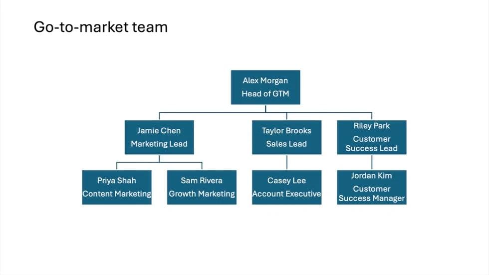
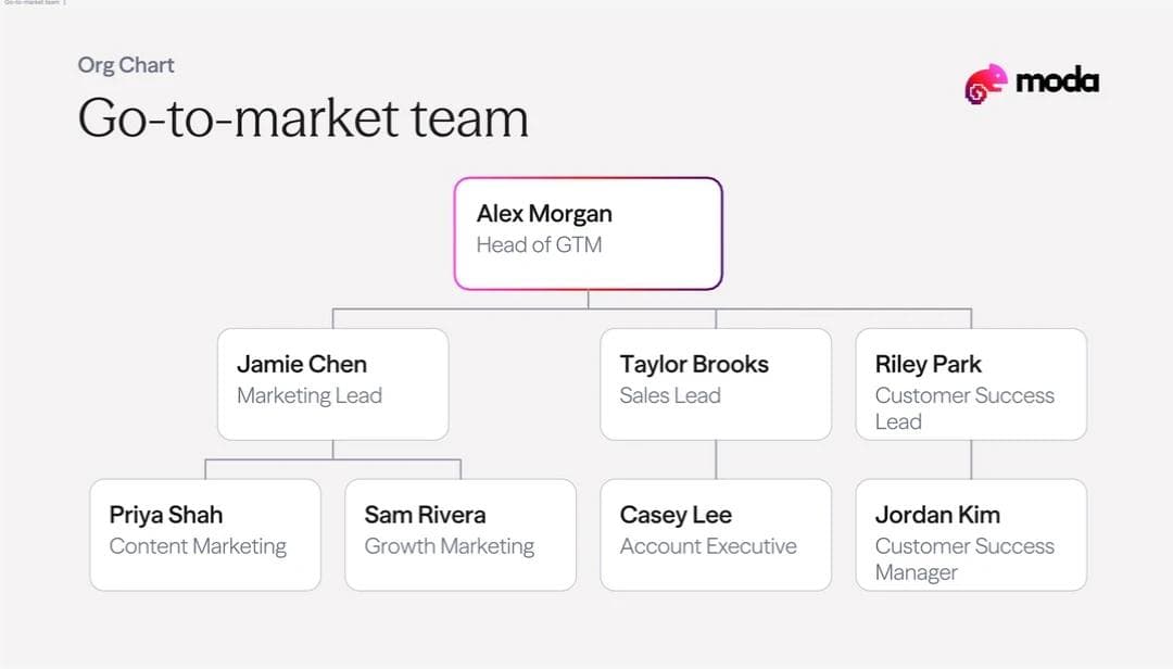
Build it in PowerPoint · Create it with AI in Moda
Download the native SmartArt PowerPoint file or the Moda-created PowerPoint file. Both downloads contain the final eight-person team. The walkthrough starts with seven people, then adds Jordan.
The native version uses SmartArt’s filled rectangles and centered text. We changed the branch layouts so the reporting lines are easier to follow. It is a functional team diagram, and PowerPoint manages its structure for you.
The Moda version treats the chart as a designed presentation slide. Names stand out from job titles, the cards have a lighter treatment, and the title and brand accents give the slide a more deliberate visual hierarchy. That is the main reason to consider the alternative, particularly for an onboarding or leadership deck that needs a consistent look.
You can customize PowerPoint’s colors, type, and shapes too. The choice is whether to do that design work yourself or start from a brief and refine what Moda produces.
The team we’ll use
Start with a short roster that says who reports to whom. For this fictional GTM team, Alex has three direct reports. Two people report to Jamie, and one reports to Taylor:
Alex Morgan / Head of GTM
  Jamie Chen / Marketing Lead
    Priya Shah / Content Marketing
    Sam Rivera / Growth Marketing
  Taylor Brooks / Sales Lead
    Casey Lee / Account Executive
  Riley Park / Customer Success Lead
The indents represent reporting levels. They are not a recommendation about how your company should be organized. Use your actual roster as the source of truth.
Build the org chart in PowerPoint
1. Insert an Organization Chart
Start on a new slide and choose Home > Layout > Blank. Then select Insert > SmartArt > Hierarchy > Organization Chart. That was the path in our Mac version. Microsoft's general instructions use the same SmartArt category and layout. Microsoft’s org chart instructions
Choose Organization Chart, rather than assuming every diagram in the Hierarchy category behaves identically. The gallery also offers layouts such as Name and Title Organization Chart and Horizontal Organization Chart.
2. Enter one person per bullet
With the graphic selected, open SmartArt Design > Text Pane. This opened a separate SmartArt Text window on our Mac.
Replace the placeholder entries with the roster. Start with one bullet for Alex, then enter the other people. Keep each person's name and job title together initially, for example “Jamie Chen / Marketing Lead.” Press Return to add another person.
Use the pane to manage the hierarchy before spending time on typography. If you create a separate bullet for a job title, PowerPoint can treat that title as another position in the chart.
3. Set the reporting levels with Promote and Demote
Select an entry and use Demote to move it one level deeper. Use Promote to move it back up. The Text Pane in our Mac version has arrow buttons for these controls.
For the example:
- Alex stays at the top level.
- Jamie, Taylor, and Riley sit one level below Alex.
- Priya and Sam sit one level below Jamie.
- Casey sits one level below Taylor.
A newly created bullet can inherit the level of the previous entry. After entering Sam, promote the next entry before typing Taylor, or Taylor may end up inside the marketing branch.
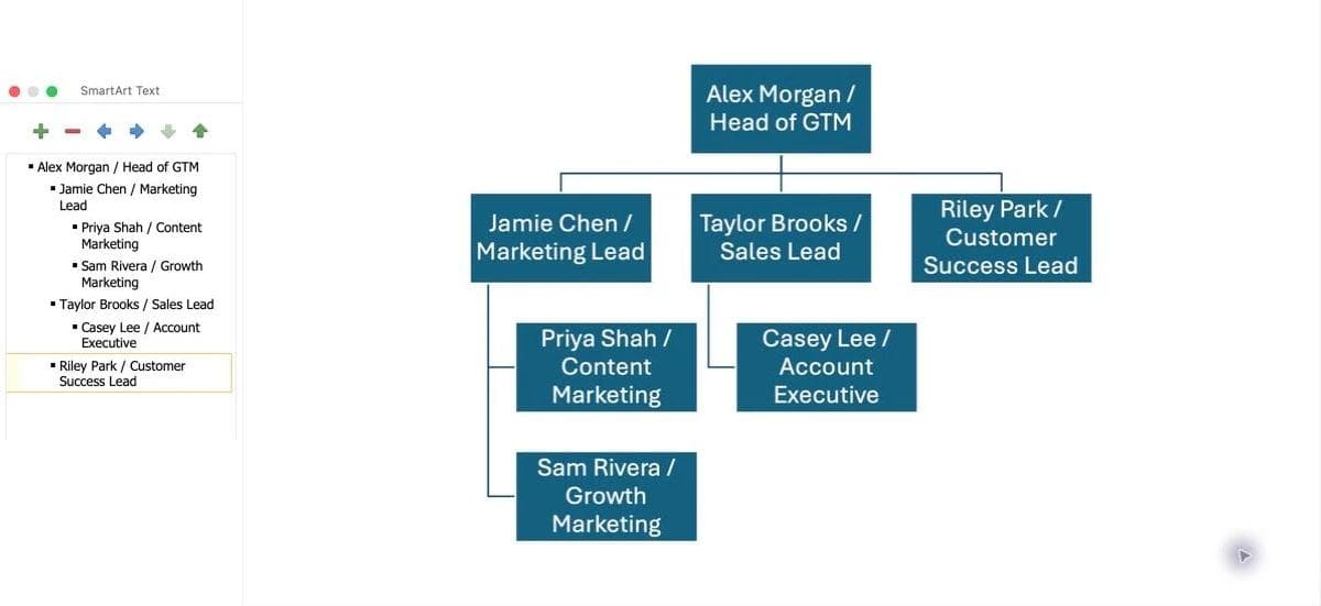
Check the rendered chart as well as the list. You should have seven people, with the lines connecting them to the managers in the roster. Indentation errors are much easier to fix now than after you have styled every box.
4. Put names and roles on separate lines
Once the structure is correct, edit the text inside each box. In our example, we replaced the slash-separated entry with a name and job title on separate lines by pasting the two-line text into the existing box.
For Jamie, that is:
Jamie Chen
Marketing Lead
Select the existing text before replacing it. The goal is to format one person's box, not add another item to the reporting hierarchy.
Keep the same treatment across equivalent roles. Short titles are easier to fit, but do not silently rewrite someone's actual role to solve a layout problem.
5. Add a slide title
Use Insert > Text Box or the Home ribbon's Text Box tool to add a heading above the diagram. We used “Go-to-market team.” Give it enough space to read as the slide title rather than another person in the chart.
The title should explain the scope: a department, project team, leadership group, or whole organization. That is more useful than simply labeling every slide “Org chart.”
Improve the SmartArt layout before redesigning it
Our first chart placed the marketing reports in a vertical hanging arrangement. Changing that branch to Standard put Priya and Sam side by side beneath Jamie.
To make the same change:
- Select the manager's box, Jamie in this case.
- Open SmartArt Design > Layout.
- Choose Standard.
- Check the other branches and apply the same layout where appropriate.
The Mac menu also offered Both, Left Hanging, and Right Hanging. These are presentation choices for arranging the branch. Use the roster and Text Pane to check the reporting relationships.
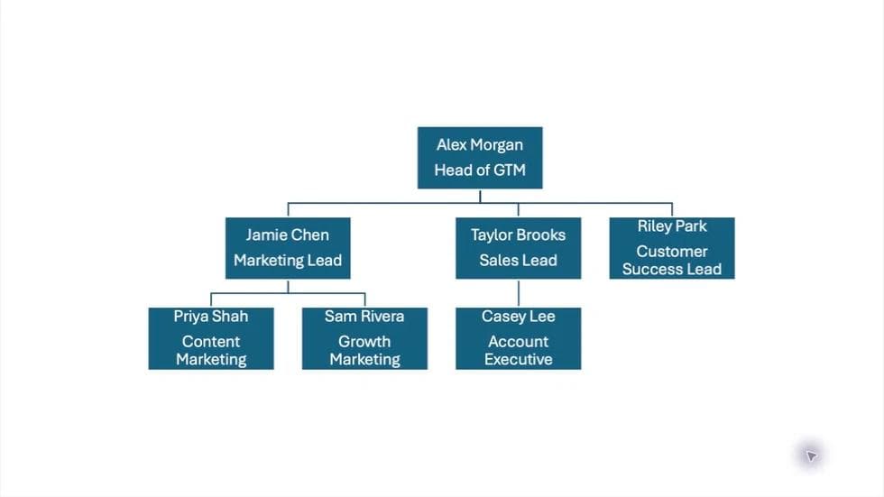
Next, use SmartArt Design > Change Colors to try a palette that fits the rest of the deck. You can also format selected boxes and text through PowerPoint’s normal controls. A new palette alone will not change the weight of the boxes or the hierarchy between names and titles, so judge the whole slide after each change.
For this small team, a single slide is enough. For a much larger organization, use an overview and department slides rather than making every name tiny. Our presentation font guide covers type choices and readability when the deck is shared.
Add a new hire under the right manager
We expanded the example with Jordan Kim, Customer Success Manager, reporting to Riley Park.
- Select Riley's box.
- Open the small arrow next to Add Shape on the SmartArt Design ribbon.
- Choose Add Shape Below.
- Replace the new placeholder with Jordan's name and role.
- Check that the chart now contains eight people and that Jordan connects to Riley.
The dropdown matters. Clicking the main Add Shape button invokes its default action. The menu lets you choose the relationship explicitly: After or Before for a peer, Below for a direct report, and Above for a new level above the selected box. Microsoft's documentation describes these behaviors in detail. Adding org chart boxes
SmartArt rearranged our chart after the new hire was added. We selected Riley and chose Layout > Standard so Jordan sat directly underneath, consistent with the sales branch.
Check for leftover placeholder boxes and inspect the text again after the layout changes. A longer title such as “Customer Success Manager” needs more room than “Sales Lead.”
Create a more modern org chart with AI in Moda
If the reporting structure is simple but you want a more polished team slide, you can give Moda the roster and a design brief. We selected Slides, chose the Moda brand kit, and used this prompt:
Create one editable 16:9 slide titled "Go-to-market team" using the selected Moda brand kit. This is a fictional team for a PowerPoint tutorial.

Build a modern, presentation-ready org chart with these exact people, roles, and reporting relationships:
Alex Morgan / Head of GTM
- Jamie Chen / Marketing Lead reports to Alex
  - Priya Shah / Content Marketing reports to Jamie
  - Sam Rivera / Growth Marketing reports to Jamie
- Taylor Brooks / Sales Lead reports to Alex
  - Casey Lee / Account Executive reports to Taylor
- Riley Park / Customer Success Lead reports to Alex

Design the whole slide: a strong title, generous breathing room, clear hierarchy between each name and job title, restrained brand accents, and thin readable reporting lines. Use light cards rather than a wall of heavy filled boxes. Keep equivalent roles visually consistent. No headshots, generated images, invented people, extra relationships, or extra slides. Preserve every name and role exactly. The chart must remain legible in a presentation. Keep text, cards, and connectors editable. We will add one direct report under Riley later, then export as PPTX and edit the slide in PowerPoint.
The first result had the correct seven-person hierarchy, light cards, distinct names and job titles, and the selected brand treatment. Its card shadows were heavier than we wanted, so the follow-up combined a design refinement with the new hire:
Add Jordan Kim / Customer Success Manager as a direct report to Riley Park, on the same slide. Preserve all existing names, roles, and reporting relationships. Keep the title and brand typography. Also remove the pronounced dark shadows around the cards for a lighter presentation style. Keep the cards readable with subtle borders and thin connectors. Do not add any other people or another slide.The revised version added Jordan below Riley and removed the pronounced shadows. The lighter borders and clearer name/title hierarchy are the design changes to look at in the comparison at the start of this post.
This is also a useful way to revise your own result: identify the person or visual treatment to change, state what should stay fixed, and inspect the whole chart afterward. A correctly spelled roster is not enough if the lines connect people to the wrong manager.
Export to PowerPoint and check the handoff
In Moda, open Export, select PowerPoint, and click Download. Open the PPTX in PowerPoint before sending it to someone else.
We checked the complete exported slide in PowerPoint presentation view. All eight names, roles, and reporting relationships were visible, and the lighter card design was retained. To test a real edit, we changed “Jordan Kim” to “Jordan Lee” inside PowerPoint, confirmed that only the name changed, then undid the edit.
The export contains editable slide elements, not a native SmartArt hierarchy. You can change the text directly, but adding another report does not trigger SmartArt’s automatic layout. If you move boxes, check their reporting lines too. Check the fonts on the computer that will present the file.
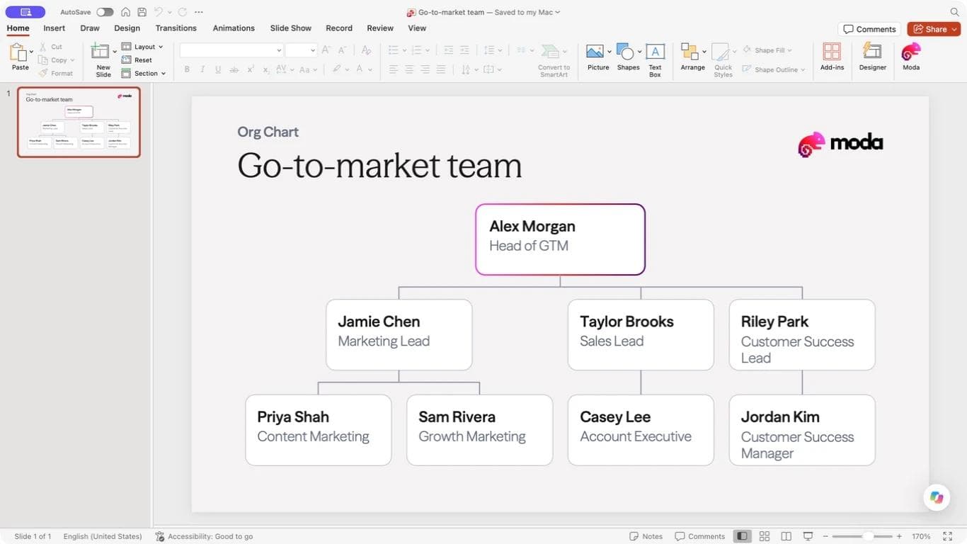
Keep the native SmartArt version if you want PowerPoint to manage the hierarchy as the team changes. Use the Moda route when you want help designing the slide and prefer to revise the source through a brief before handing it off.
Neither example is a live employee directory. When the team changes, update the source roster and the slide. For more details on checking imported slides, see our PowerPoint export guide.
PowerPoint org chart questions
How do I create an org chart in PowerPoint?
Choose Insert > SmartArt > Hierarchy > Organization Chart. Enter one person per bullet in the Text Pane, then use Promote and Demote to set reporting levels. Check the lines against your roster before formatting the chart.
How do I add someone under a manager?
Select the manager's box, open the Add Shape dropdown, and choose Add Shape Below. Enter the new person's name and role, then check the reporting line and the revised layout.
Can I make a PowerPoint org chart look less like the default SmartArt diagram?
Yes. Change the branch layout, use your presentation's colors and fonts, and format the boxes and text. If you want a designed starting point, you can also create the slide in Moda and export it to PowerPoint, as shown above.

Real editable visuals. Real canvas. Full control.
Fly through design work