Instagram Stories Ads Examples: 12 Ads Running Right Now, Torn Down (2026)
Twelve Instagram Stories ads that are live in the Meta Ad Library today, with Library IDs, start dates, and a teardown of what each one does that you can reuse.
 Anvisha Pai, Co-founder & CEO, Moda
Most Instagram Stories ads examples you can find online are screenshots somebody took years ago, with no way to tell whether the ad ran for a week or is still running. This post is different in one way: every one of the twelve ads below was live in the Meta Ad Library on September 2, 2026, and each comes with its Library ID, its start date, how long it had been running, and whether the advertiser is testing versions of it. You can open any of them yourself and see whether it is still running.
The twelve were chosen from six keyword searches (skincare, coffee, fitness app, furniture, budgeting app, travel) with the library's Platform filter set to Instagram, then narrowed to vertical creative, then picked so that they make different decisions: image versus video, a product hook versus a person hook, proof in the frame versus proof in the copy, a price versus a promise. At least a third come from categories whose buyers overlap (skincare, coffee, fitness, and budgeting apps all sell a better daily routine to the same phone), which is the point: the structures transfer, the claims do not.
The method is the one in our Meta Ad Library guide. This post applies it to one placement.
How the twelve were chosen
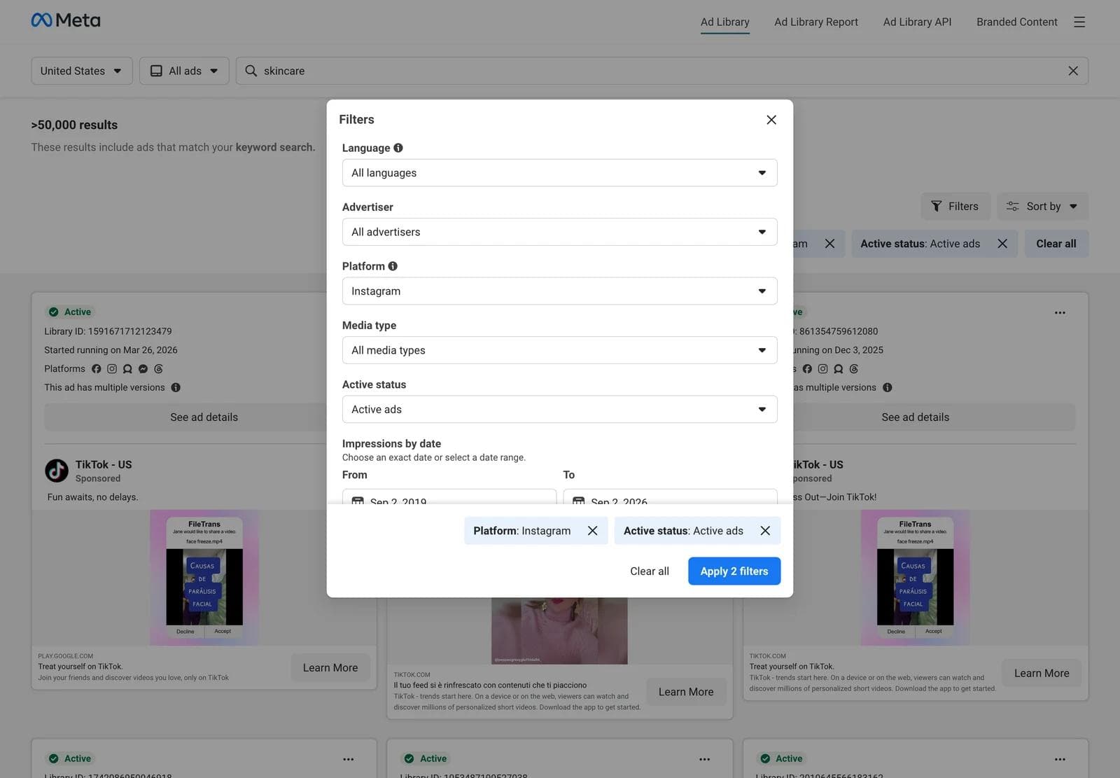
The Meta Ad Library cannot filter by placement. There is no "Stories" option anywhere in the interface, and the Ad Details panel shows platforms (Facebook, Instagram, Messenger, Threads, WhatsApp, Audience Network) but not whether an ad ran in the feed, in Stories, or in Reels. So "Instagram Stories ads" has to be inferred, and here is exactly how we inferred it:
- Platform filter set to Instagram. In the Filters panel, Platform offers each of Meta's apps. Choosing Instagram adds
publisher_platforms[0]=instagramto the URL and a "Platform: Instagram" chip to the results. Media type was left on All media types, Active status on Active ads, country United States. - Vertical creative. For each result card we read the creative's natural dimensions. A 9:16 asset (video at 360 x 640 in the card, images at 338 x 600) is built for Stories or Reels; a square or 4:5 asset is a feed ad that Meta may also serve in Stories with padding. We kept only creative with a width-to-height ratio of 0.6 or lower.
- Six searches, first 70 to 79 cards each. Keyword searches are unordered, so "skincare" matches any ad whose text contains the word; the first three results were TikTok's own app-install ads, which is a good reminder that a keyword search returns a slice of the library, not a category.
- Twelve chosen on decisions, not on quality. We do not know which of these ads make money. We know when each one started, how many platforms it runs on, and whether it has versions. Those are the only performance signals the library gives you for a commercial ad.
What a Stories ad has to do that a feed ad does not
Before the examples, the constraints. These come from Meta's own ads guide pages for Instagram Stories, checked on September 2, 2026.
- It is full screen and vertical. The recommended ratio is 9:16 at 1440 x 2560 pixels, with a 1 percent tolerance. Minimum width is 500 pixels for images and 250 for video. Source: Meta Ads Guide, Awareness Image Ad Specs on Instagram Stories and Awareness Video Ad Specs on Instagram Stories.
- The edges belong to Instagram. Meta's current guidance says to leave roughly 14 percent of the top, 35 percent of the bottom, and 6 percent of each side free of text, logos, and key creative elements, so the profile icon at the top and the call-to-action at the bottom do not cover them. Older guides quote 14 percent top and 20 percent bottom; the 35 percent bottom figure is what both Stories spec pages say today.
- The first frame is the hook. An image Story shows for 5 to 16 seconds, or until the viewer swipes out. A video under 16 seconds plays in full; 16 seconds or longer may be split into up to three cards, and viewers may see a Keep Watching option.
- The CTA is a button in the bottom band. The call-to-action (Shop Now, Learn More, Install Now, Book Now) renders as a button in the bottom safe zone, which is why that zone is so large. Primary text is capped at 125 characters and sits with the button rather than in the creative.
- Assume sound off, design for sound on. Meta lists captions and sound as optional but recommended for Stories video. Every video ad below carries on-screen text in its first second.
The 12 teardowns
Each entry records the same three things: what the eye lands on first, what the ad asks you to believe, and what would transfer if you swapped in your own product. Every caption carries the advertiser, Library ID, start date, days running on September 2, 2026, and the versions flag. Video ads show the library card on the left and one frame from the video on the right.
1. CeraVe: one product, one claim, six seconds
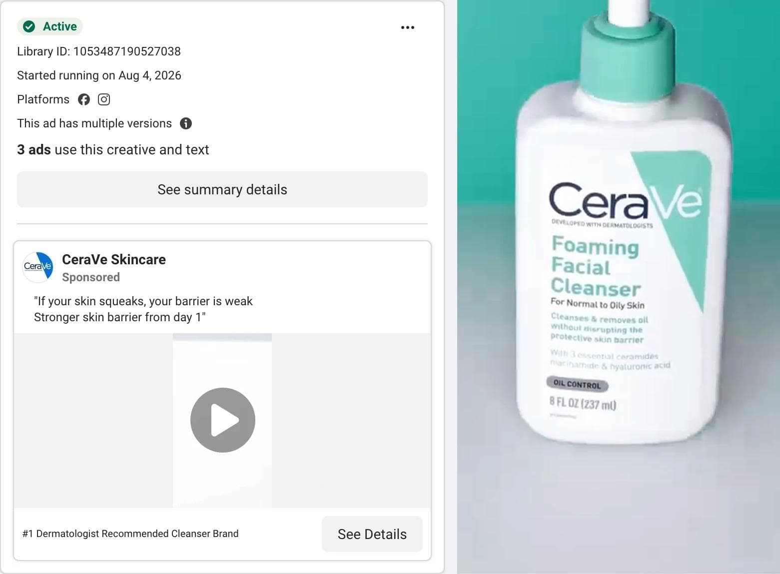
The eye lands on the bottle, centered on a flat teal field, filling most of the frame. The video is six seconds long and the product is the only thing in it. What the ad asks you to believe: the headline says it, "#1 Dermatologist Recommended Cleanser Brand", and the primary text adds a mechanism, "If your skin squeaks, your barrier is weak." The claim is the proof. What transfers: the shape. A plain color field, one product, one superlative with a source behind it, and nothing else for six seconds. The claim itself does not transfer; you need your own.
2. DRMTLGY: the offer as a receipt
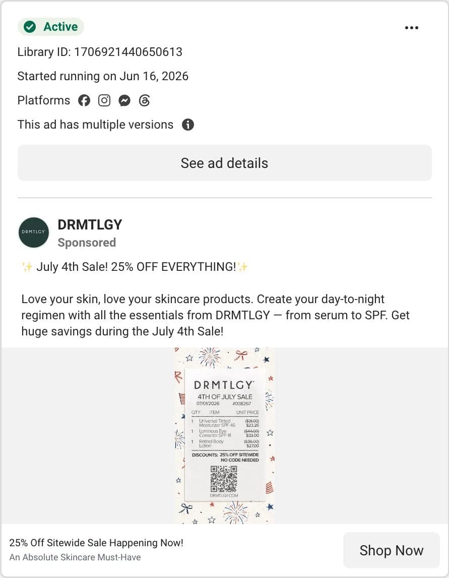
The eye lands on a receipt. Three products, each with its old price struck through and the sale price beside it, a "25% off sitewide, no code needed" line, and a QR code, all set on a July 4th fireworks pattern. What the ad asks you to believe: the discount is real and already applied. A receipt is a document, and documents read as facts. What transfers: the format. Any brand with three hero products and a sitewide sale can render the offer as a receipt. Note the date: this July 4th ad was still running two months later with versions, which suggests the receipt outlived the holiday it was made for.
3. Folgers: a mood in eight seconds
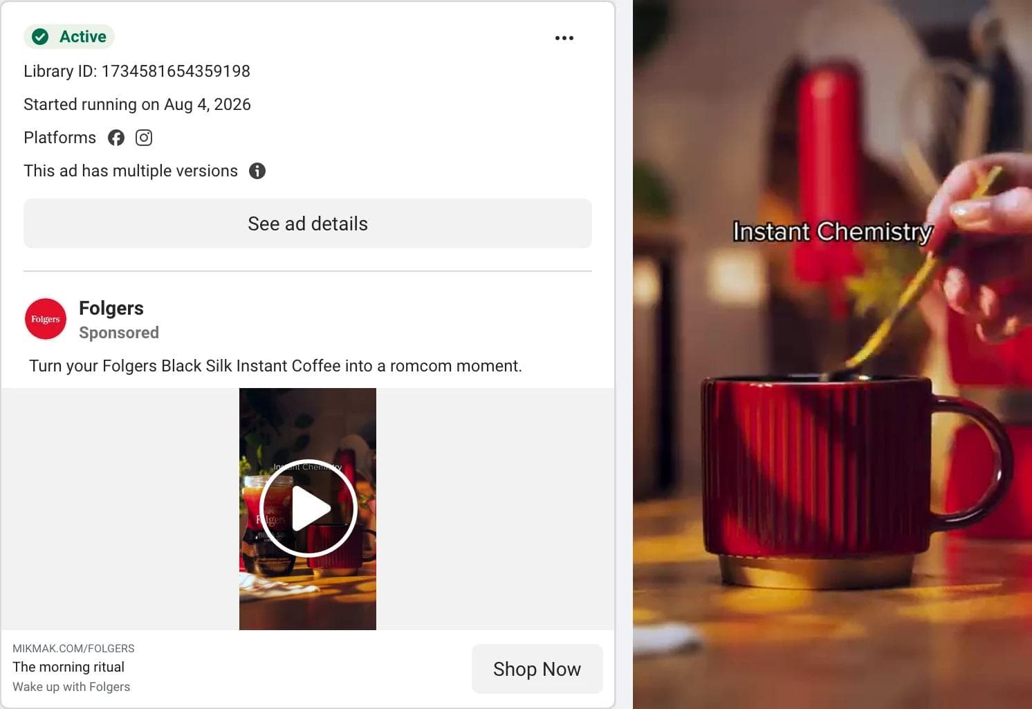
The eye lands on warm light, a red mug, a hand stirring, and two words: "Instant Chemistry." The product jar is visible in the first frame and gone by the second. What the ad asks you to believe: instant coffee can be a small romantic ritual. The primary text says so directly: "Turn your Folgers Black Silk Instant Coffee into a romcom moment." What transfers: the pun as the on-screen line and the decision to cut away from the product almost immediately. A commodity product borrowing a genre (here, the romcom) is a structure, and it works for anything sold on feeling rather than spec.
4. RYZE Superfoods: price and a strikethrough
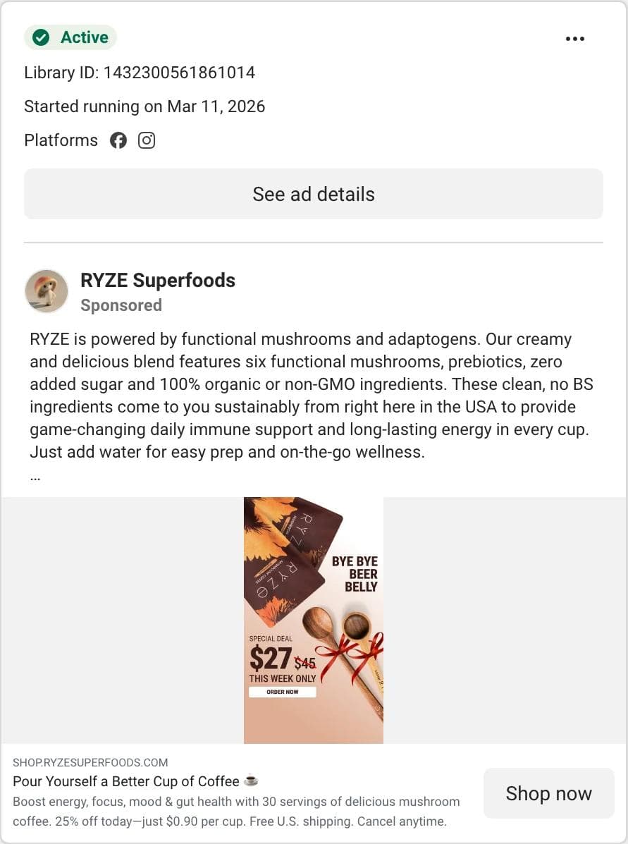
The eye lands on "$27" with "$45" struck through beside it, then "This week only," then a fake Order Now button drawn into the image. The product pouches sit above, with a "Bye bye beer belly" line in the corner. What the ad asks you to believe: the deal expires this week. It has been running for 175 days. What transfers: the price block (new price large, old price struck, urgency line, button-shaped element) is the most copied structure in direct-response Stories, and here it sits in the middle third of the frame where nothing from Instagram's interface covers it. What does not transfer: the body claim, and the "this week only" line if it is not true for you.
5. Fitbod: a hook that names the reader
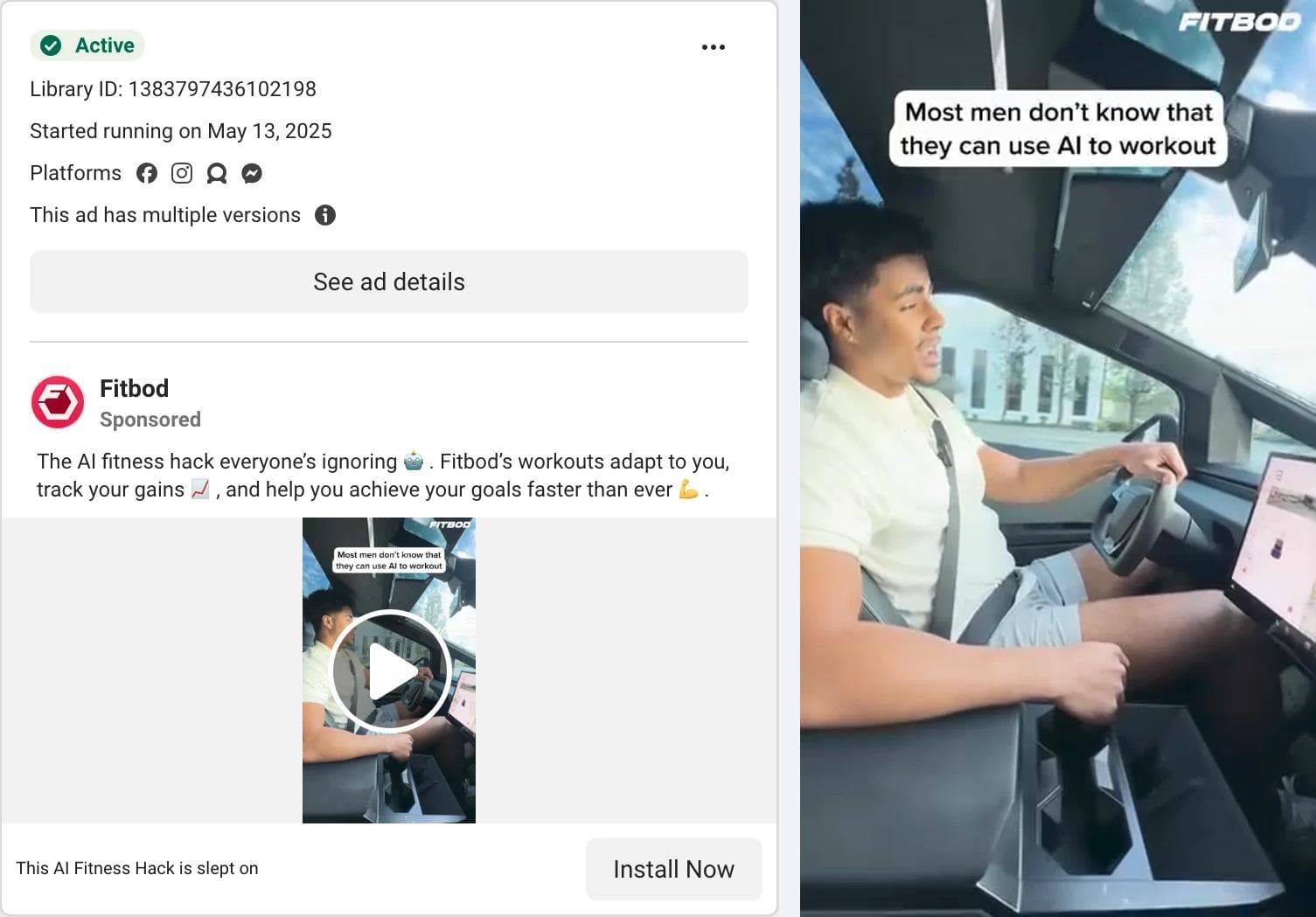
The eye lands on a caption box in the top third: "Most men don't know that they can use AI to workout." A man talks to camera from a car. The Fitbod logo is a small watermark in the corner. What the ad asks you to believe: you are missing something other people have found. The headline repeats it: "This AI Fitness Hack is slept on." What transfers: the caption-as-hook, placed high but under the 14 percent line, and the creator-style talking head with the brand kept small. This ad is the oldest in the set at 477 days and carries the versions flag, which is the pattern the library gives you for something an advertiser keeps paying for.
6. Cal AI: borrowed authority in the first frame
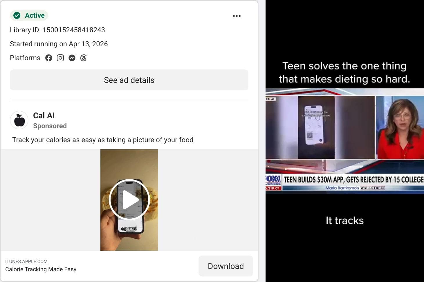
The eye lands on a television news chyron, "Teen builds $30M app, gets rejected by 15 colleges", framed by a caption: "Teen solves the one thing that makes dieting so hard." The app appears on a phone inside the news footage. What the ad asks you to believe: the press already covered this, so it is real. What transfers: using a third party's frame (news, a review site, a podcast) as the first second, with your own caption above it. The founder story is the proof; the product demo comes later in the 39 seconds. What does not transfer: the footage itself, which belongs to the broadcaster.
7. Wayfair: the seasonal sale as a pattern
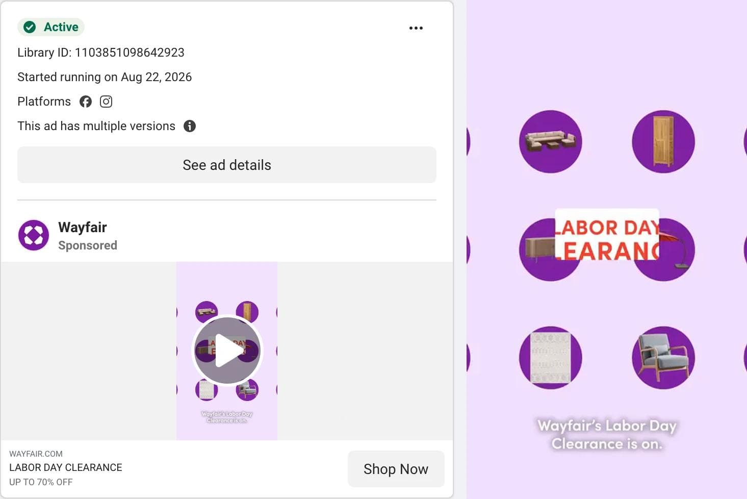
The eye lands on the words "Labor Day Clearance" in the exact middle of a field of small furniture icons, then on a red and blue gingham pattern that takes over the frame. No photograph, no room, no person. What the ad asks you to believe: it is the sale weekend and the discounts are large (the headline says "Up to 70% off"). What transfers: a sale ad that is all typography and pattern, centered, with the product reduced to icons. Swap the holiday and the palette and it is any retailer's clearance ad.
8. Rejuvenation: two frames, one sofa
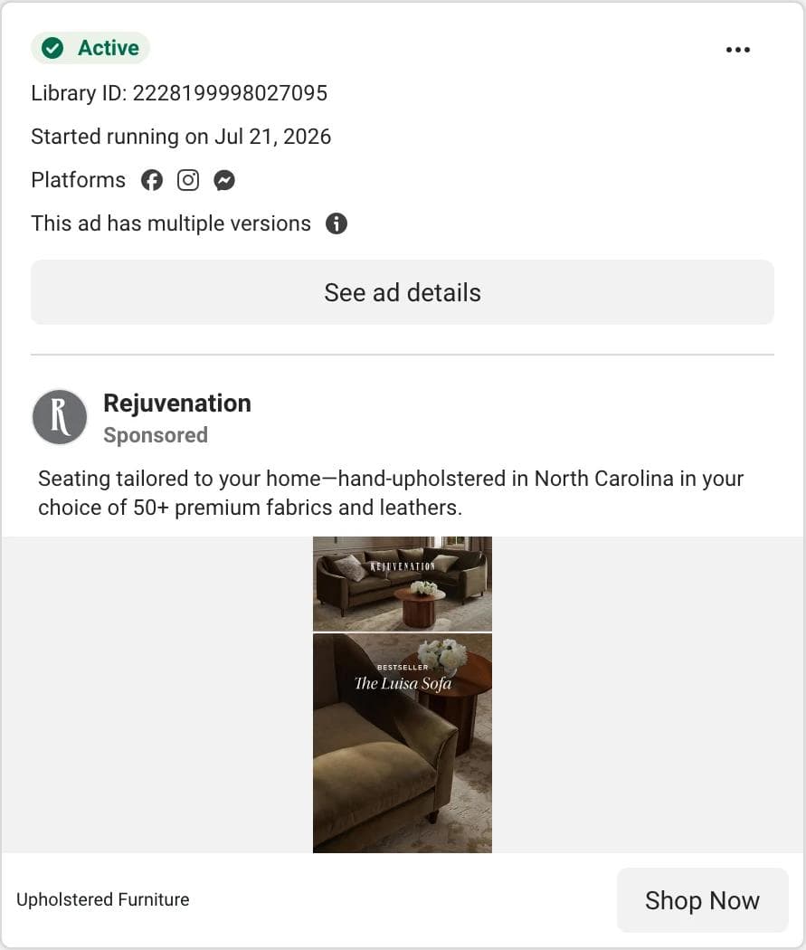
The eye lands on the split: a wide shot of the sofa in a styled room on top, a close-up of the velvet arm below, with "Bestseller, The Luisa Sofa" set over the seam. What the ad asks you to believe: this is a well-made object, and other people already chose it. The proof sits in the copy: "hand-upholstered in North Carolina in your choice of 50+ premium fabrics and leathers." What transfers: the two-frame stack, which solves the problem every furniture brand has with 9:16 (a sofa is landscape) by pairing a room shot with a texture shot. The "bestseller" label as the only in-image text is a decision worth borrowing for any catalog brand.
9. Quicken: a quiz that is not a quiz
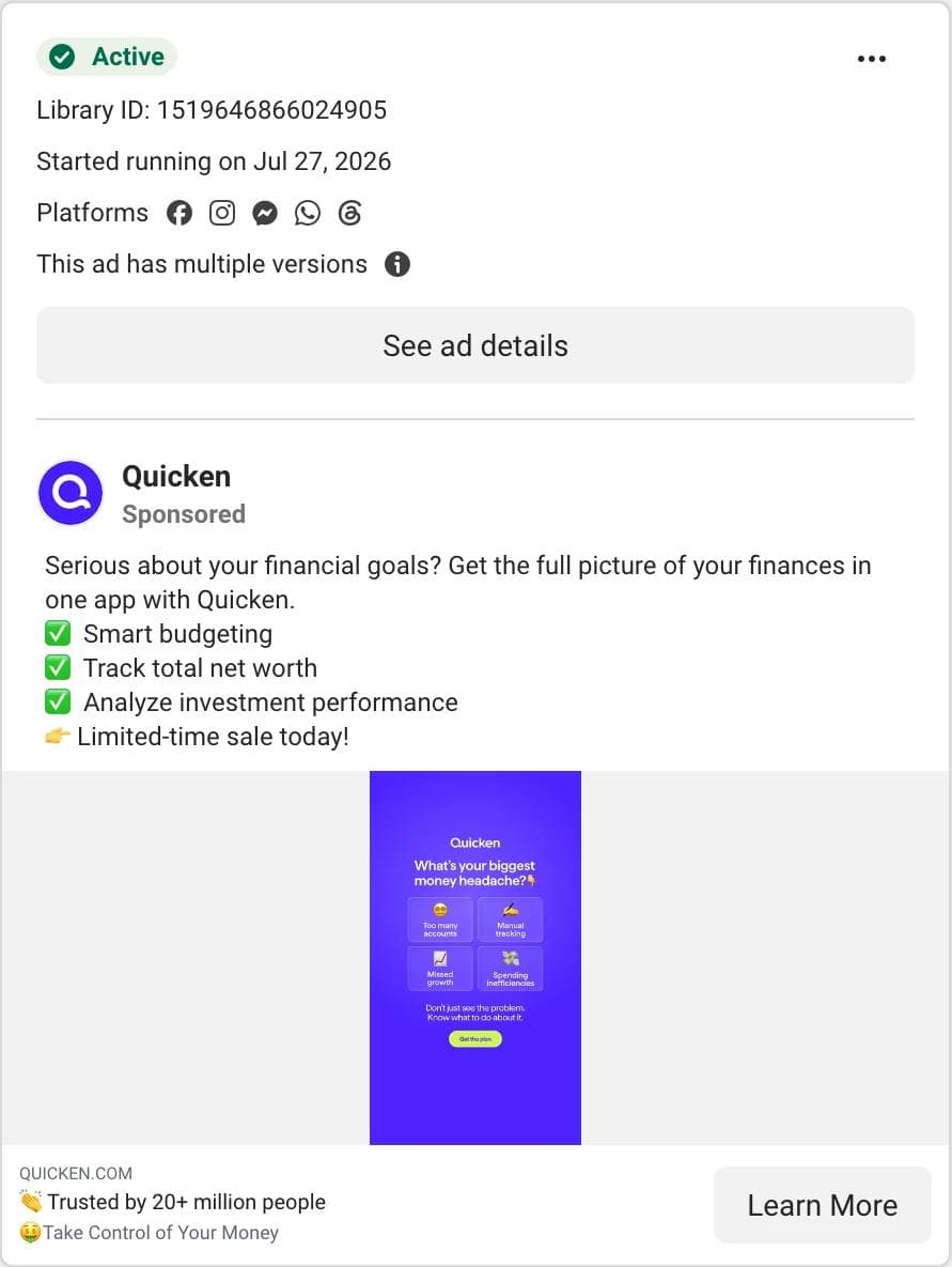
The eye lands on a question, "What's your biggest money headache?", with four answer tiles (too many accounts, manual tracking, missed growth, spending inefficiencies) and a button drawn beneath them. It is a static image; nothing is tappable. What the ad asks you to believe: your problem is on that list, and the app is the plan for it. The headline carries the social proof: "Trusted by 20+ million people." What transfers: the diagnosis layout. A question at the top, the reader's options in the middle, the promise at the bottom, all inside the safe zone. The "trusted by" number goes in the headline field under the creative rather than in the image, where it would compete with the question.
10. Dollarwise: the insight before the product
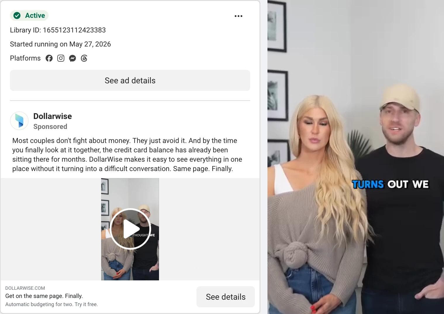
The eye lands on two people, a couple, framed from the waist up in a living room, with a word-by-word caption ("We thought we", "Turns out we") building under them. What the ad asks you to believe: the problem is not the money, it is the conversation. The primary text is the strongest piece of copy in the set: "Most couples don't fight about money. They just avoid it." The product does not appear until the viewer has agreed with the diagnosis. What transfers: insight first, product second, delivered by the kind of people who would use it. The caption style (one or two words at a time, high contrast, centered) is the sound-off answer for a talking-head ad.
11. Chase Sapphire: a print ad that fits a phone
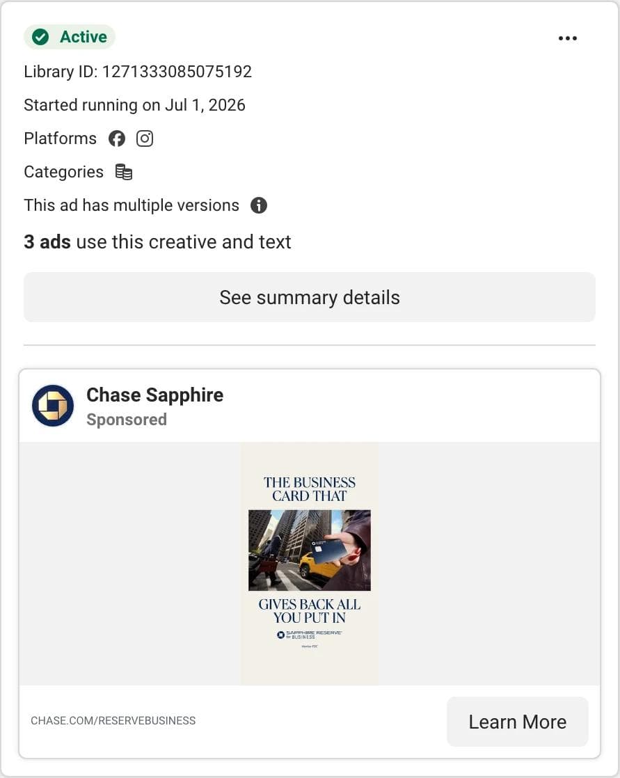
The eye lands on a headline split around a photograph: "The business card that" above, a hand holding the card on a Manhattan street in the middle, "gives back all you put in" below, in a serif on cream. There is no primary text at all; the image is the whole ad. What the ad asks you to believe: a business card can feel like a luxury object. What transfers: the magazine layout, which keeps all type in the middle 60 percent of the frame and leaves the top and bottom bands empty, exactly where Instagram's interface sits. This is the safe-zone rule turned into a design choice.
12. Booking.com with Andare: the partnership ad
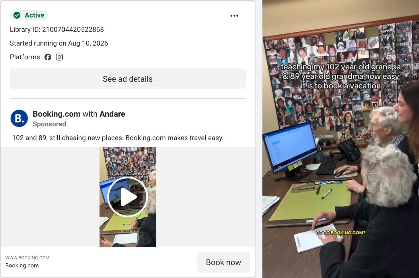
The eye lands on a caption that reads like a personal post ("teaching my 102 year old grandpa & 89 year old grandma how easy it is to book a vacation") over footage of two very old people at a desk covered in family photographs. What the ad asks you to believe: if they can book it, anyone can. The advertiser line reads "Booking.com with Andare", which is how the library labels a partnership ad: a creator's post, promoted by the brand, with the creator's name first. What transfers: the caption written in the creator's voice, the demonstration by the least likely user, and the brand's name held back until the end ("Go to Booking.com?" appears as a small on-screen prompt).
Patterns across the twelve
Counting what the twelve actually do, rather than what Stories advice says they should do:
| Decision | Options seen | Count of 12 |
|---|---|---|
| Format | Video / static image | 7 / 5 |
| Layout | Product or object centered on a flat field / person talking to camera / typography and pattern only / stacked frames | 4 / 4 / 2 / 2 |
| Hook type | Claim or superlative / price or offer / question or insight / borrowed authority (news, creator, family) | 3 / 3 / 3 / 3 |
| Proof type | In the copy (headline or primary text) / in the image / in a third party's frame / none stated | 5 / 3 / 2 / 2 |
| In-image text in the first frame | Yes / no | 11 / 1 |
| CTA button | Shop Now or Order Now / Learn More or See Details / Install Now or Download / Book Now | 5 / 4 / 2 / 1 |
| Versions flag | Multiple versions / single | 8 / 4 |
| Platforms | Facebook and Instagram only / three or more | 6 / 6 |
Four things stand out.
Text is in the frame, almost always. Eleven of twelve carry text in the first frame, and the one that does not (CeraVe) has the product name printed on the bottle in a type size that reads as a headline. The sound-off assumption is universal.
The middle third does the work. Every price block, question, and headline sits between roughly 20 and 65 percent of the frame's height. The Chase Sapphire and Quicken ads make this most obvious, but even the talking-head videos keep their captions in that band. This is the 14 / 35 / 6 safe zone as designers actually apply it.
Proof migrates to the copy in static ads. The image carries the hook; the headline field under it carries the number ("Trusted by 20+ million", "#1 Dermatologist Recommended", "hand-upholstered in North Carolina"). Video ads do the reverse and put the proof on screen, because the headline field is not visible while a Story plays.
Versions are the norm for brands with budgets. Eight of twelve carry the multiple-versions flag, and two of those (CeraVe, Chase Sapphire) also show "3 ads use this creative and text", meaning the same ad runs in several ad sets.
What did not transfer
Three things in the sample looked like Stories ads and were not useful as references.
Feed creative served in Stories. In the furniture search, only 26 of 79 cards were vertical; most of the rest were square or 4:5 product shots that Meta pads with a blurred background when it serves them in Stories. They may run in Stories, but they were not designed for it.
Adjacent categories that do not share a buyer. The skincare search returned a Hostess ad ("Proof a tasty snack is as reviving as a 7-step skincare routine") built as a vertical image with a text overlay. It is a well-made Stories ad, but the joke is the whole ad, and a skincare brand cannot use it. Adjacent means the same buyer and a comparable purchase, not a shared keyword.
Cash-advance and loan ads in the budgeting search. More than a third of the budgeting app results were "need cash now" ads from lending apps, several of them running the same creative under different page names. They are vertical, they are static, and they are the same ad. A pattern that repeats because one advertiser bought it many times is not a pattern.
The sample, with dates
Two of the six searches, quoted exactly as captured, so the numbers can be checked. Both are the first cards of a keyword search with the Platform filter set to Instagram, Active status set to Active ads, Media type set to All, United States, on September 2, 2026. A keyword search is a slice of the library, not the category, and one advertiser can hold many cards.
| Instagram-filtered search, US, 2026-09-02 | skincare | budgeting app |
|---|---|---|
| Cards captured | 77 | 71 |
| Distinct advertisers | 51 | 32 |
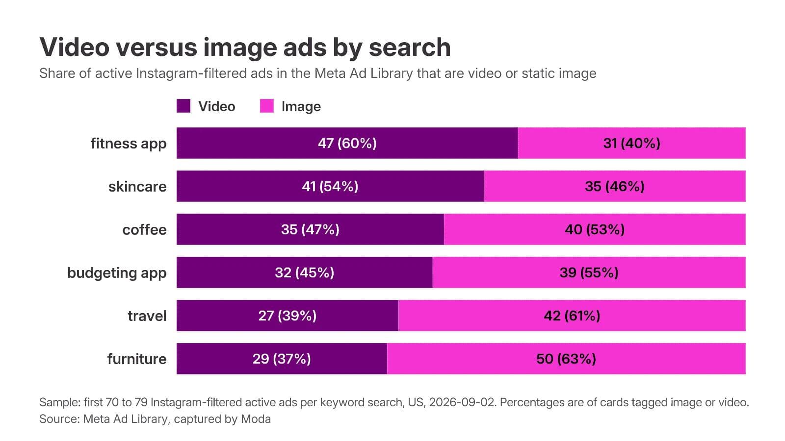
| Video / image cards | 41 / 35 | 32 / 39 |
| Vertical (9:16) cards | 43 | 36 |
| Vertical cards from distinct advertisers | 33 | 20 |
| Median days running, all cards | 134 | 38 |
| Median days running, vertical cards | 104 | 35 |
| Running over 90 days | 49 | 20 |
| Running over a year | 9 | 2 |
| Marked as having multiple versions | 29 | 39 |
| Partnership ads ("X with Y") | 9 | 5 |
Skincare on Instagram is mostly video (41 of 77), mostly vertical (43), and long-lived (median 134 days). Budgeting apps are mostly image (39 of 71), short-lived (median 38 days), and heavily versioned (39 of 71 flagged), which reads like an aggressive testing cadence from a few advertisers rather than a settled set of winners. The other four searches sat in between: coffee 78 cards, median 94 days, 42 vertical; fitness app 79 cards, median 80 days, 47 vertical; furniture 79 cards, median 112 days, 26 vertical; travel 70 cards, median 79 days, 32 vertical.
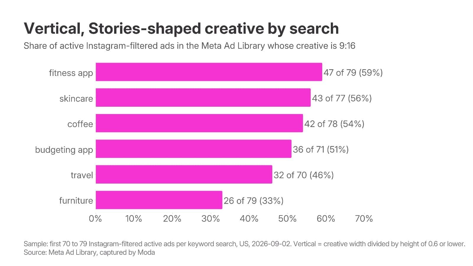
One correction to the usual advice. "Old ads are winners" is weaker than it sounds here for the same reasons it is weak in the feed: the oldest ads in these searches included a mobile game at 862 days, a nail-products page at 1,064 days, and a smart home gym at 1,408 days. One of those is a real product ad and two are the kind of tiny-budget ad that runs forever, and the date alone cannot tell you which is which. Compare longevity within an advertiser, weight the versions flag, and prefer a Shop Now or Install Now destination over a profile visit.
Build a reference set
The library cannot save anything, so the set lives in a folder you keep. For each Stories ad you want to reuse, record:
- Library ID and advertiser, so you can find it again. The permalink is
facebook.com/ads/library/?id=plus the ID. - Start date, versions flag, and platforms, the three signals the card gives you.
- What the eye lands on first, in one phrase: product on a flat field, caption over a face, price block, question tiles, two-frame stack.
- Where the text sits, as a rough percentage of the frame's height, because that is what you will have to reproduce inside the safe zone.
- What the ad asks you to believe, and where the proof for it lives (image, headline, primary text, third party).
- What you would keep and what you would change for your brand.
For video ads, save a still of the first frame and one from a second or two in. The first frame is the hook and the second is usually where the product appears. Ad Details shows the full creative and copy but, as noted, not the placement; take the vertical ratio as your evidence.
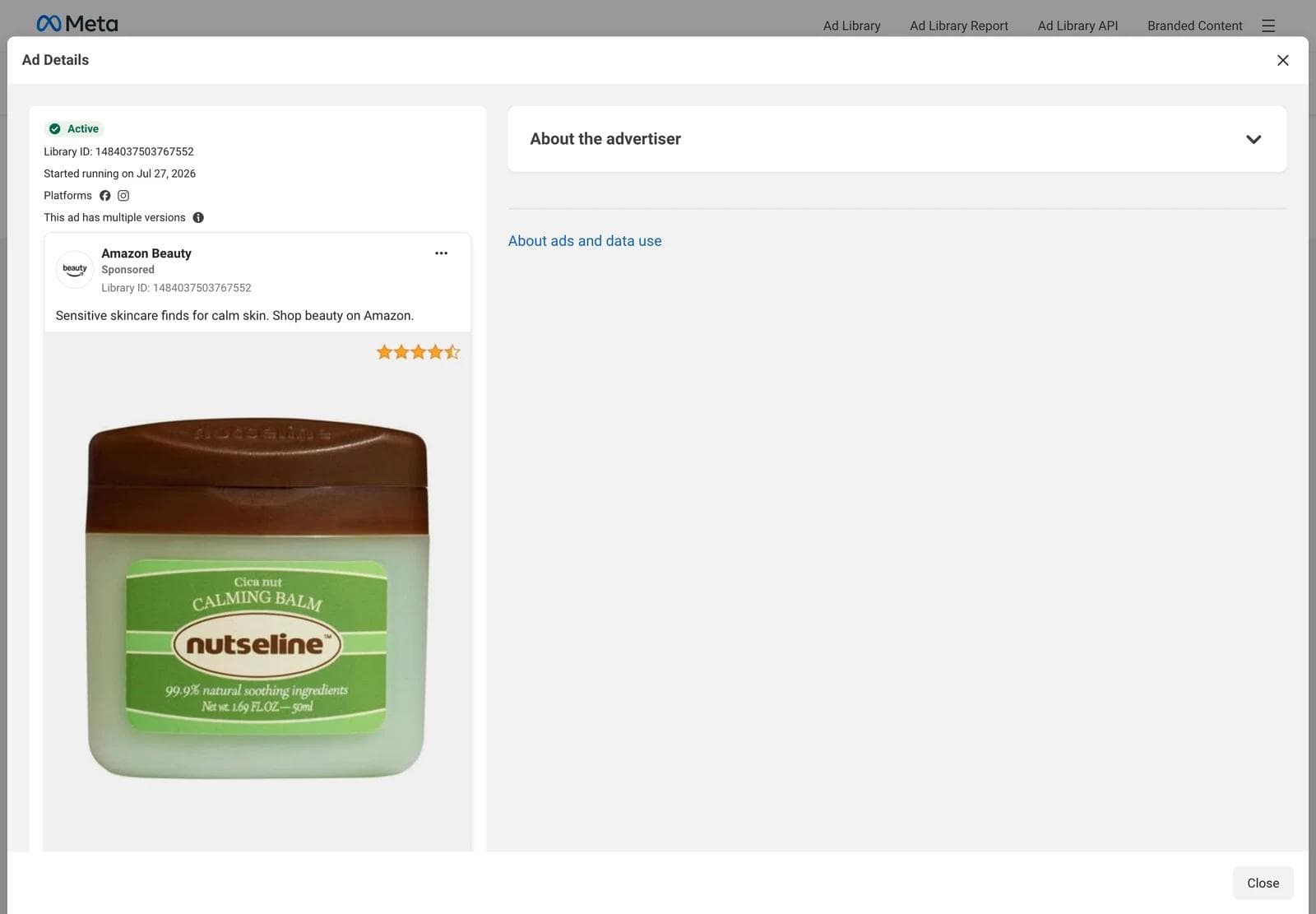
The creative is the advertiser's property. Saving a still for reference and analysis is ordinary competitive research; reusing their footage, their people, their copy, or a broadcaster's news clip in your own ad is not. Adapt the structure, then supply your own product, people, and claims.
Turn references into on-brand Stories ads in Moda
A reference set is a list of structures: a receipt, a two-frame stack, a question with four tiles, a magazine layout with type above and below a photo. Rebuilding one of those with your own brand kit and your own product is a design task, and it is one an AI design agent handles well when you give it references instead of adjectives.
In Moda, attach two to four saved stills to a message, name the brand kit to apply, and describe what stays and what changes. A prompt that works:
Use these three stills as layout references. Make four Instagram Stories ads at 1080 x 1920 for our oat milk latte using the Fieldnote brand kit. Keep the top 14 percent and bottom 35 percent of each frame free of text and logos. First ad: product centered on a flat brand-color field with one headline and one proof line. Second: a receipt showing three products with the sale price applied. Third: a question at the top with four answer tiles in the middle. Fourth: a two-frame stack, wide shot above, texture close-up below, with a single "bestseller" label. Replace all photography with our product shots and write new copy. Do not reuse any reference copy.The agent builds the ads on an editable canvas, so the result is not a flat export. Headlines, product images, tiles, and badges stay as separate objects you can move, restyle, or swap, and the same layout can be pushed to 1080 x 1350 for the feed or 1080 x 1080 for a square placement without rebuilding it.
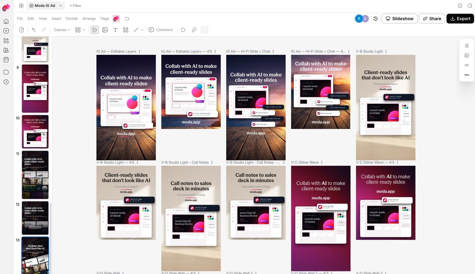
What to check before any of these ships:
- Preview the ad in Ads Manager's Stories placement preview. The safe-zone percentages are guidance; the preview is the test.
- The claims are yours and true. A reference ad's "#1 dermatologist recommended" or "trusted by 20 million" line does not come with the layout.
- The first frame works as a still. If the ad is video, the first frame is what a viewer sees while the video loads, and it has to carry the hook alone.
- You have at least two hooks against the same layout, so the first test tells you about the message and not only the design.
If you want to set up the brand side first, how AI design tools build a brand kit from your website covers what gets extracted and what to correct. For the search method behind this post, and for feed ads rather than Stories, start with the Meta Ad Library guide.
Frequently asked questions
How do I find Instagram Stories ads in the Meta Ad Library?
Search a keyword or advertiser, open Filters, set Platform to Instagram and Active status to Active ads, and leave Media type on All. The library cannot filter by placement, so look for vertical 9:16 creative in the results; square and 4:5 ads are feed creative that may also be served in Stories with padding.
What size should an Instagram Stories ad be in 2026?
Meta's ads guide recommends a 9:16 ratio at 1440 x 2560 pixels for both image and video Stories ads, with a 1 percent tolerance. 1080 x 1920 is the same ratio and is what most design tools export. Leave roughly 14 percent of the top, 35 percent of the bottom, and 6 percent of each side free of text and logos.
How long can an Instagram Stories ad be?
An image Story shows for 5 to 16 seconds or until the viewer swipes out. A video under 16 seconds plays in full. Video of 16 seconds or longer may be split into up to three cards, and viewers may be offered a Keep Watching option. Most of the video ads in this set were 6 to 43 seconds.
Does the Ad Library show whether an ad ran in Stories?
No. A card and its Ad Details panel show the platforms an ad runs on (Facebook, Instagram, Messenger, Threads, WhatsApp, Audience Network), not the placement within them. Vertical creative is the practical signal that an ad was made for Stories or Reels.
Can I tell which Instagram Stories ads perform best?
Not from the library. Commercial ads show no spend, reach, clicks, or results. The start date and the multiple-versions flag are the only proxies, and both need care: tiny-budget ads run for years, and a versions flag can mean testing rather than winning. Compare within an advertiser and treat every saved ad as a hypothesis to test.
Are Instagram Stories ads static images or video?
Both run. In the Instagram-filtered skincare search on September 2, 2026, 41 of 77 cards were video and 35 were images; in the budgeting app search, 32 were video and 39 were images. Five of the twelve ads in this post are static images, and all five carry their hook as text inside the frame.

Real editable visuals. Real canvas. Full control.
Fly through design work