Microsite Examples: 15 Full-Page Teardowns by Use Case
See 15 microsite examples analyzed from top to bottom, including sales, RFP, onboarding, event, report, education, and campaign use cases.
 Anvisha Pai, Co-founder & CEO, Moda
A microsite is a focused website or small set of pages built for one audience, campaign, product, event, account, or body of content. The best microsites do not merely look different from a company homepage. They remove the parts of the main website that do not help a particular reader make a particular decision.
That focus can serve very different jobs. A sales microsite helps a buying committee revisit a proposal. An event microsite changes before, during, and after the event. A report microsite lets readers scan findings before choosing a deeper chapter. An interactive tool can deliver value before a visitor speaks to sales.
This guide examines 15 complete page journeys across sales, RFP, onboarding, product launch, lead generation, education, brand systems, events, regional marketing, research, impact reporting, and public awareness. The analysis follows the sections in order and distinguishes what is visible on the page from what we can only infer. We do not have access to the owners' conversion data.
The short version: choose the microsite by job
- Sales and presales: give one account a shared place for demos, validation, stakeholders, and next steps.
- RFP and proposal: connect the formal response, evidence, team, process, and supporting files.
- Client onboarding: carry context and commitments from the sale into the first phase of delivery.
- Product or publication launch: turn one idea into a complete persuasive narrative.
- Interactive lead generation: deliver a diagnosis, preview, calculator, or useful output immediately.
- Education and resource hubs: help one audience understand a system or complete a task.
- Event: serve planning, live participation, and the post-event archive.
- Report and thought leadership: layer a scannable story over detailed evidence.
- Awareness and advocacy: combine human stories, institutional trust, and clear routes to help or action.
Microsite, landing page, or main website?
The boundary is not the number of pages. It is the scope of the promise and the amount of exploration the reader needs.
- Use a landing page when one audience needs one argument and one primary action, such as registering for a webinar or downloading a guide.
- Use a microsite when the focused experience needs multiple content paths, repeated visits, a distinct identity, account-specific material, or a lifecycle of its own.
- Use the main website when the content is permanent, depends on the rest of the company information architecture, or should compound authority under an established domain.
A single long page can still be a microsite, and a five-page project can still be too small to justify a separate destination. The operational questions matter: who owns it, how it will be updated, what data it collects, and what happens when the campaign ends.
What most microsite example galleries miss
A hero screenshot can show taste, but it cannot show the page's argument. The useful questions appear below the fold: What does the page explain next? Where does proof arrive? Can a returning visitor find a resource quickly? Does the final call to action match the visitor's confidence? What happens on mobile?
The examples below are therefore organized around section order and reader decisions. Several public sales examples are fictional vendor demonstrations because real account microsites often contain confidential material or sit behind access controls. They are included for structure, not as customer outcome claims.
15 microsite examples, analyzed from top to bottom
1. Denvertek + ACME: a personalized presales microsite
View the live microsite example.
This is a public demonstration site from Zoomforth, not a live customer deal room.
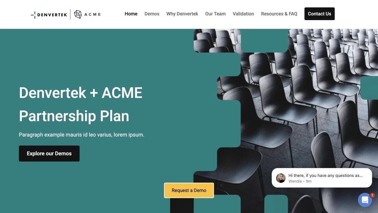
Page sequence
- A co-branded partnership hero names both companies and frames the page as a shared plan.
- A short introduction and testimonial establish a relationship before product detail.
- A grid routes the buyer to demos, the vendor case, the account team, validation, resources, and contact details.
- Separate subpages let different members of the buying committee investigate the questions that matter to them.
Why the sequence fits the job
The page behaves like a buyer enablement hub, not a public acquisition page. It assumes the recipient already knows the vendor and now needs a durable place to revisit demos, circulate evidence, and bring colleagues into the decision. The co-branding makes the experience feel prepared for one account instead of copied from a generic campaign.
What to borrow
Use the hero to confirm who the page is for, then organize the rest around buyer tasks. A strong sales microsite should help a champion answer internal questions without searching through an email thread. Replace sample sections with the exact demo recording, security document, implementation plan, team biographies, and commercial next step for that deal.
2. ACME Air: an RFP response microsite
View the live microsite example.
This is a public fictional RFP example from Zoomforth.
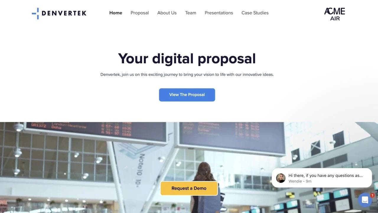
Page sequence
- The hero labels the experience as a digital proposal and leads directly to the formal response.
- A vision section explains the bidder's interpretation of the buyer's future.
- Capability copy and quantified company facts establish scale and credibility.
- A process video explains how the team would work.
- A document library collects presentations and supporting material.
Why the sequence fits the job
The page separates the persuasive story from the compliance artifact. Procurement can still access the formal proposal, while evaluators can understand the team, approach, evidence, and vision in a more navigable format. That is the central advantage of an RFP microsite: it does not replace required documents, it makes them easier to interpret and share.
What to borrow
Mirror the evaluation logic. If the RFP scores approach, team, experience, security, and price, make those categories visible in navigation. Include the required files, but use the page to connect them into one argument. Avoid decorative metrics that are not relevant to the buyer's decision.
3. ACME and DenverTek: a client onboarding portal
View the live microsite example.
This is a public fictional onboarding example from Zoomforth.
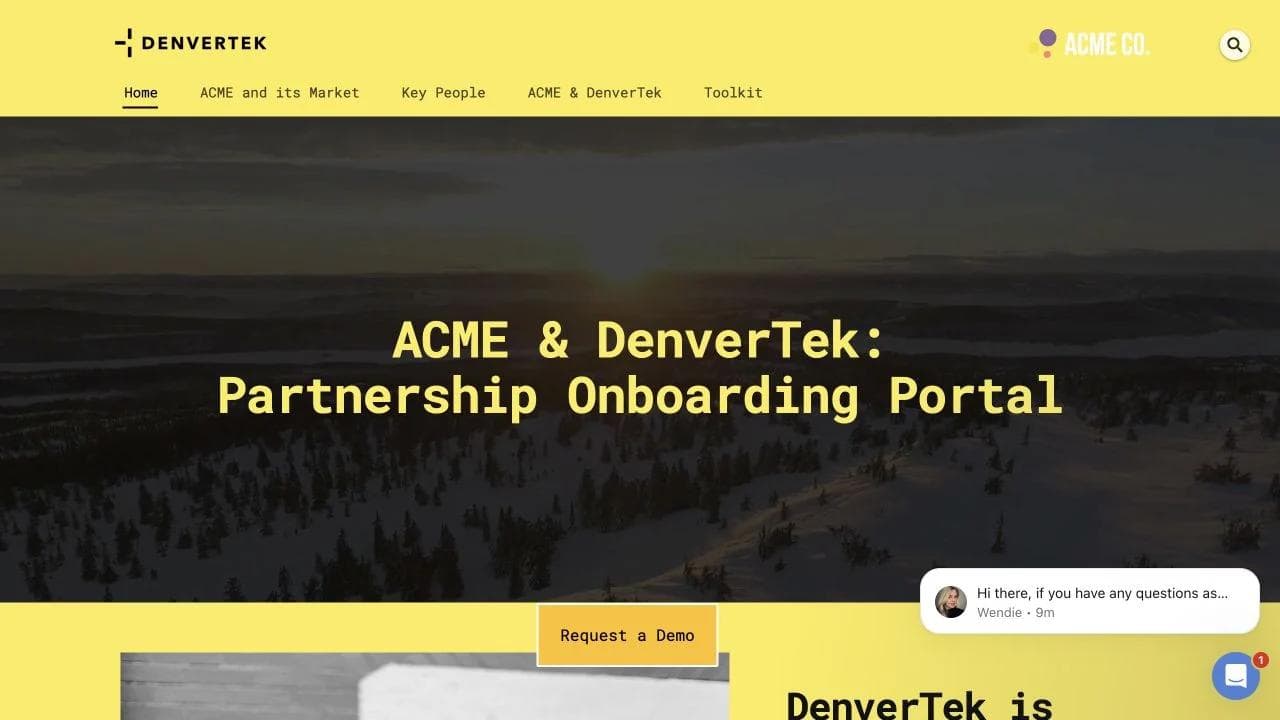
Page sequence
- A partnership hero welcomes the named client.
- An account overview summarizes the customer, market, news, and important numbers.
- A people section identifies the relationship owners.
- Account details explain the engagement.
- A toolkit gives both teams a shared place for working material.
Why the sequence fits the job
This microsite starts after the sale. It reduces the awkward reset that often happens between sales and delivery by making the customer context, people, commitments, and resources visible in one place. The page is closer to a lightweight client portal than a campaign landing page, but it still uses editorial structure and brand design to make the relationship legible.
What to borrow
Build around the first 30 days: goals, owners, milestones, dependencies, meeting cadence, shared files, and escalation paths. Keep information current or remove it. An onboarding microsite becomes harmful when it looks authoritative but contains old contacts or outdated dates.
4. The Conversion Code: a book launch microsite
View the live microsite example.

Page sequence
- The hero presents one transformation: stop chasing leads and start attracting clients.
- Three quantified content promises preview what the buyer will get from the book.
- Topic sections connect the book to digital marketing, lead follow-up, and inside sales.
- Large-scale customer proof and review counts reduce purchase risk.
- The page returns repeatedly to a direct purchase action.
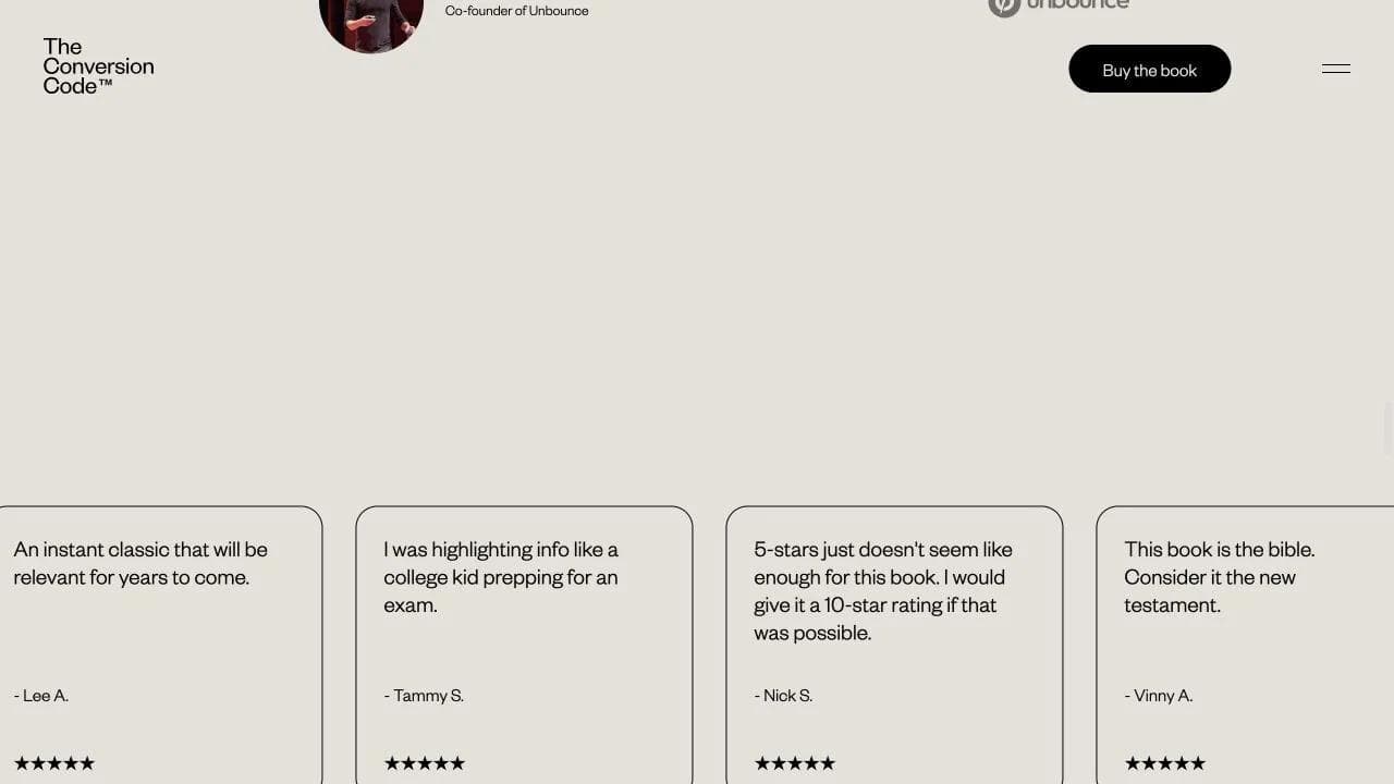
Why the sequence fits the job
The page sells an idea before it sells a book. It names the frustration, previews the useful material, then proves that other businesses have adopted it. The microsite has enough space to turn an author's argument into a visual sales narrative without carrying the navigation and competing offers of a larger publisher site.
What to borrow
For a book, report, course, or methodology, let visitors sample the thinking. Show an actual framework, chart, lesson, or tool before asking for the purchase. Specific previews make the promise credible and give readers a reason to share the page even if they are not ready to buy.
5. HubSpot Website Grader: an interactive lead-generation microsite
View the live microsite example.
Page sequence
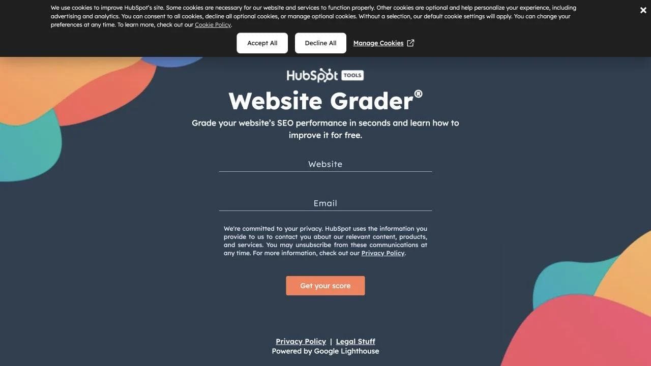
- A compact hero promises an SEO and performance grade in seconds.
- A two-field form creates the first useful action immediately.
- Privacy language and Google Lighthouse attribution reduce uncertainty around the input.
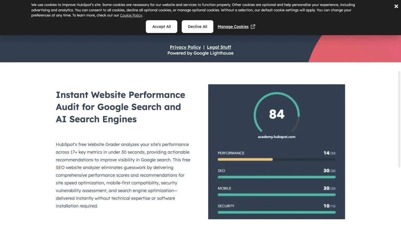
- Explanatory copy and FAQs expand the page for visitors who need more context.
- The result experience turns the diagnosis into recommendations and adjacent HubSpot education.
Why the sequence fits the job
The tool is the argument. Instead of describing HubSpot's expertise, the microsite demonstrates it with a personalized output. The page keeps the first screen focused because visitors understand the exchange: provide a URL and email, receive a score and recommendations.
What to borrow
If your microsite can calculate, diagnose, configure, preview, or generate something useful, put that interaction near the top. Explain the data exchange clearly and make the output valuable on its own. A weak quiz that only gates a sales form will not earn the same trust.
6. Dropbox Brand Guidelines: a public brand resource hub
View the live microsite example.
Page sequence
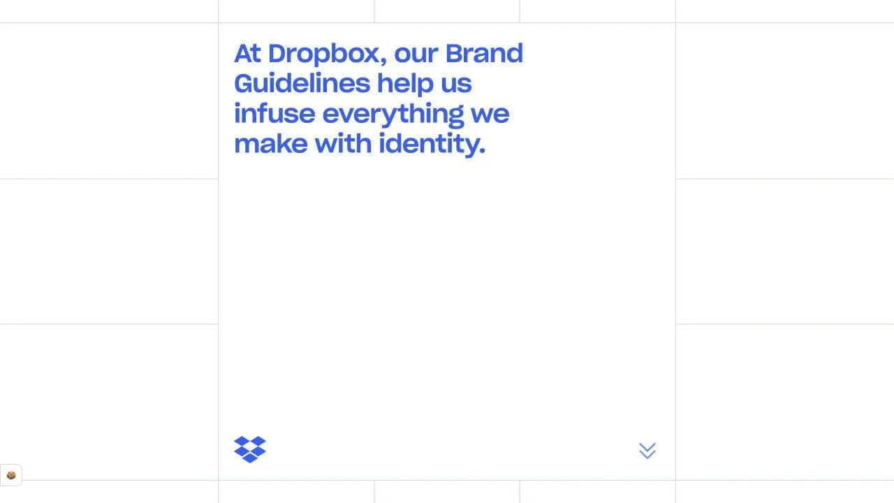
- A manifesto-like opening explains why details matter.
- The page frames the guidelines as a toolkit for making things, not a rulebook to admire.
- Clear routes lead to framework, voice and tone, logo, typography, iconography, color, imagery, and motion.
- Separate partner and legal resources handle higher-risk use cases.
Why the sequence fits the job
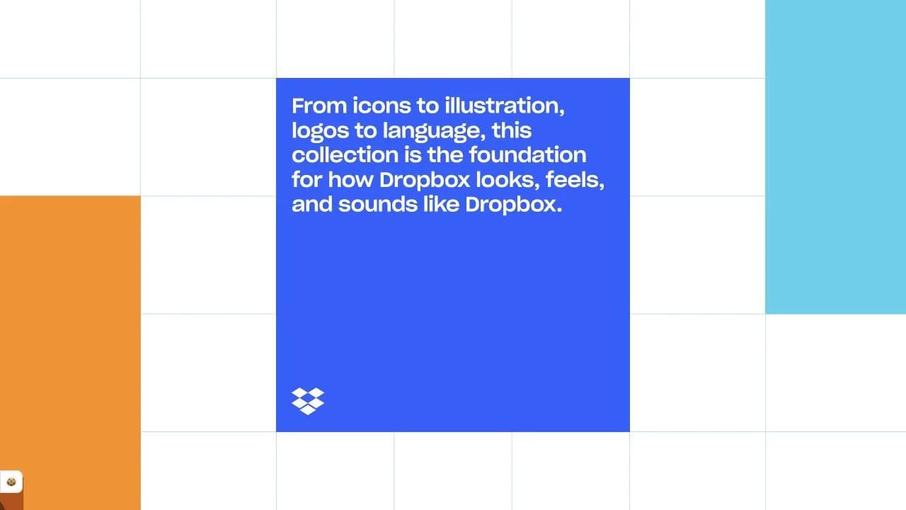
The microsite gives a specialized audience a cleaner destination than Dropbox's product website could provide. Its visual language also functions as evidence: the site demonstrates the system while documenting it. The result is both instructional and expressive.
What to borrow
A brand hub should make correct use easier. Lead with principles, then provide downloadable assets, examples, constraints, and contact paths. Separate inspiration from legal requirements so partners can find an answer without decoding the entire identity system.
7. Chrome Music Lab: an interactive education microsite
View the live microsite example.
Page sequence
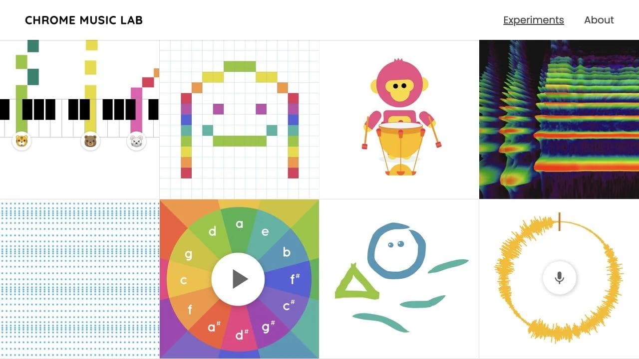
- The homepage opens with a visual grid of experiments rather than a long explanation.
- Each card leads to a small, immediate interaction such as Song Maker, Rhythm, or Spectrogram.
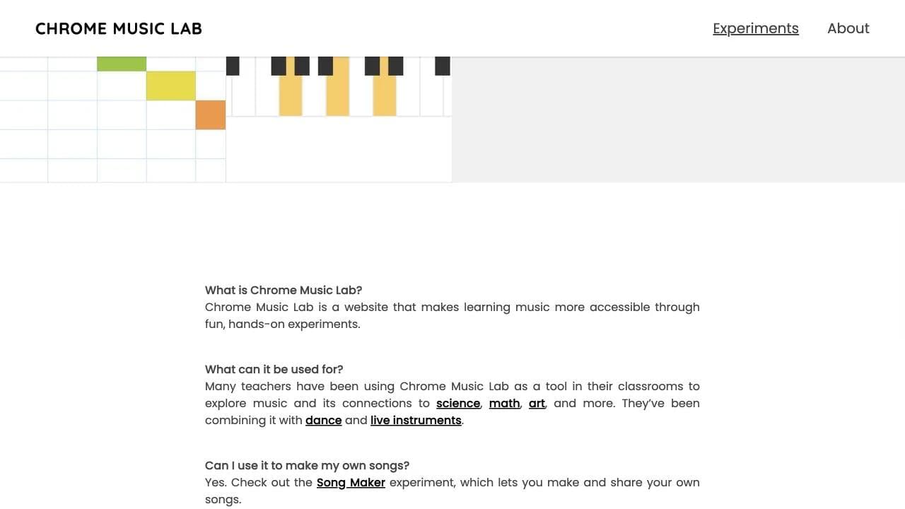
- A concise About section explains the educational purpose, classroom uses, technology, devices, and account-free access.
Why the sequence fits the job
Visitors learn the concept by playing. The collection model also accommodates multiple entry points: a teacher may start with rhythm, a student with Song Maker, and a developer with the technical notes. The common visual system keeps those experiments feeling like one coherent initiative.
What to borrow
For educational microsites, make the first lesson do-able. A tiny simulation, calculator, or guided exercise can communicate more than a feature list. Keep account creation out of the way when the goal is reach, experimentation, or classroom use.
8. Spotify Made to Be Found: a product education microsite
View the live microsite example.
Page sequence
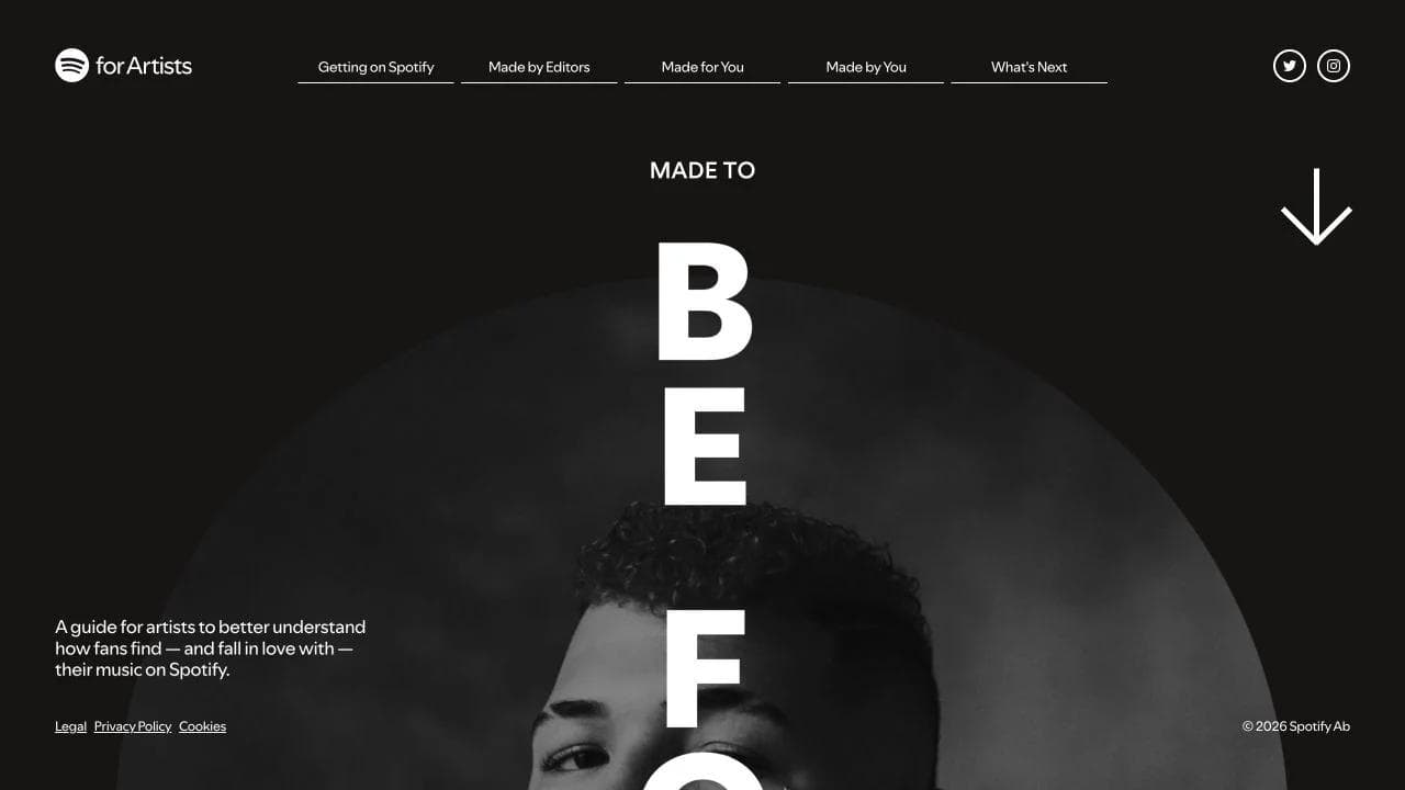
- The opening names one audience, artists, and one problem, understanding discovery on Spotify.
- The introduction defines discovery and explains the roles of editorial curation, algorithms, and listener playlists.
- The story then follows the release journey through preparation, pitch, fan discovery, and ongoing growth.
- Tools and tips convert platform mechanics into actions an artist can take.
Why the sequence fits the job
Spotify could have buried this information in support documentation. The microsite instead treats education as a guided story, which makes an opaque system feel more navigable. The focused visual identity distinguishes the initiative while remaining recognizably Spotify.
What to borrow
Use a microsite when customers need a mental model, not just instructions. Organize the page around the user's sequence and explain why each step matters. Product education becomes persuasive when it helps people feel more capable inside the product.
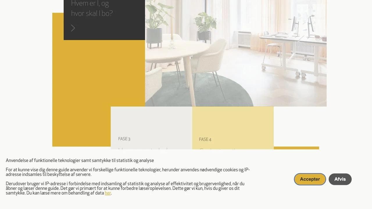
9. Jeudan's office guide: a practical lead-nurture microsite
View the live microsite example.
Page sequence
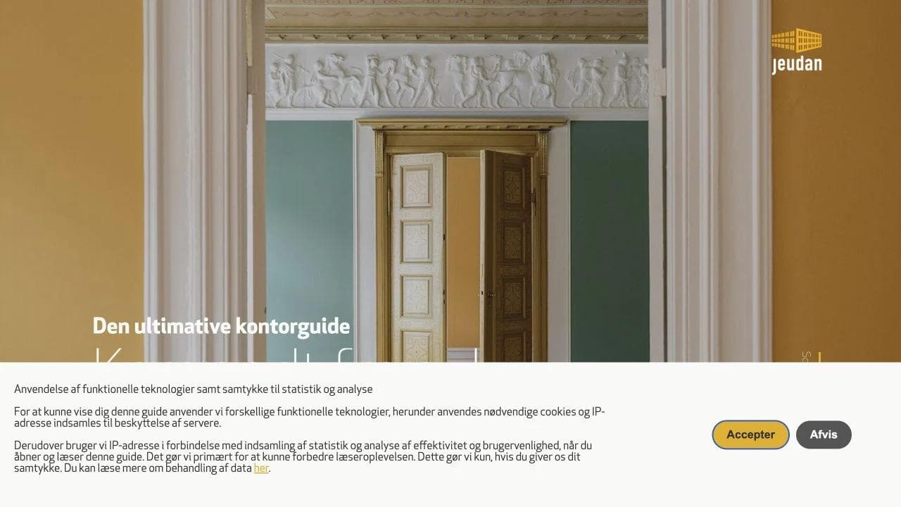
- The opening promises help moving from no plan to a new office.
- The guide starts with questions about the organization and location.
- It moves through reading property details, estimating space, preparing for viewings, and choosing an office.
- A glossary resolves unfamiliar commercial property terms.
- Related publications continue the research journey.
Why the sequence fits the job
The page maps directly to a buyer process. Rather than lead with available properties, it teaches a prospective tenant how to make the decision. That creates a useful reason to engage before the reader is ready to contact a broker.
What to borrow
For considered purchases, build the microsite around the customer's checklist. Give each stage a practical artifact, question set, or definition. The page should make the eventual sales conversation better, not merely start it sooner.
10. Dentsu at Cannes Lions: an event microsite
View the live microsite example.
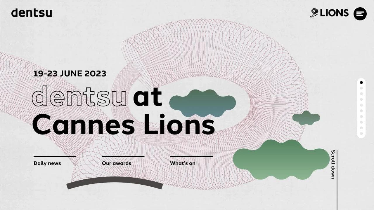
Page sequence
- The hero anchors the event name and dates.
- Daily news and a rewind report serve visitors before and after the event.
- Awards and jurors establish Dentsu's role in the festival.
- A program section explains what is happening and where.
- Power of dentsu and social impact sections connect event activity back to the corporate story.
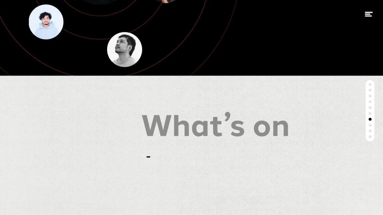
Why the sequence fits the job
An event creates several audiences at once: attendees planning a visit, colleagues following remotely, and people reviewing the outcome later. The microsite gives all three a focused destination. It also allows a more energetic identity than the main corporate site without abandoning the parent brand.
What to borrow
Design for the event lifecycle. Before the event, emphasize logistics and registration. During it, surface schedules, locations, updates, and contact details. After it, replace stale countdowns with recordings, recaps, awards, and a clear archive or redirect plan.
11. Bibendum Northern Ireland: a regional portfolio microsite
View the live microsite example.
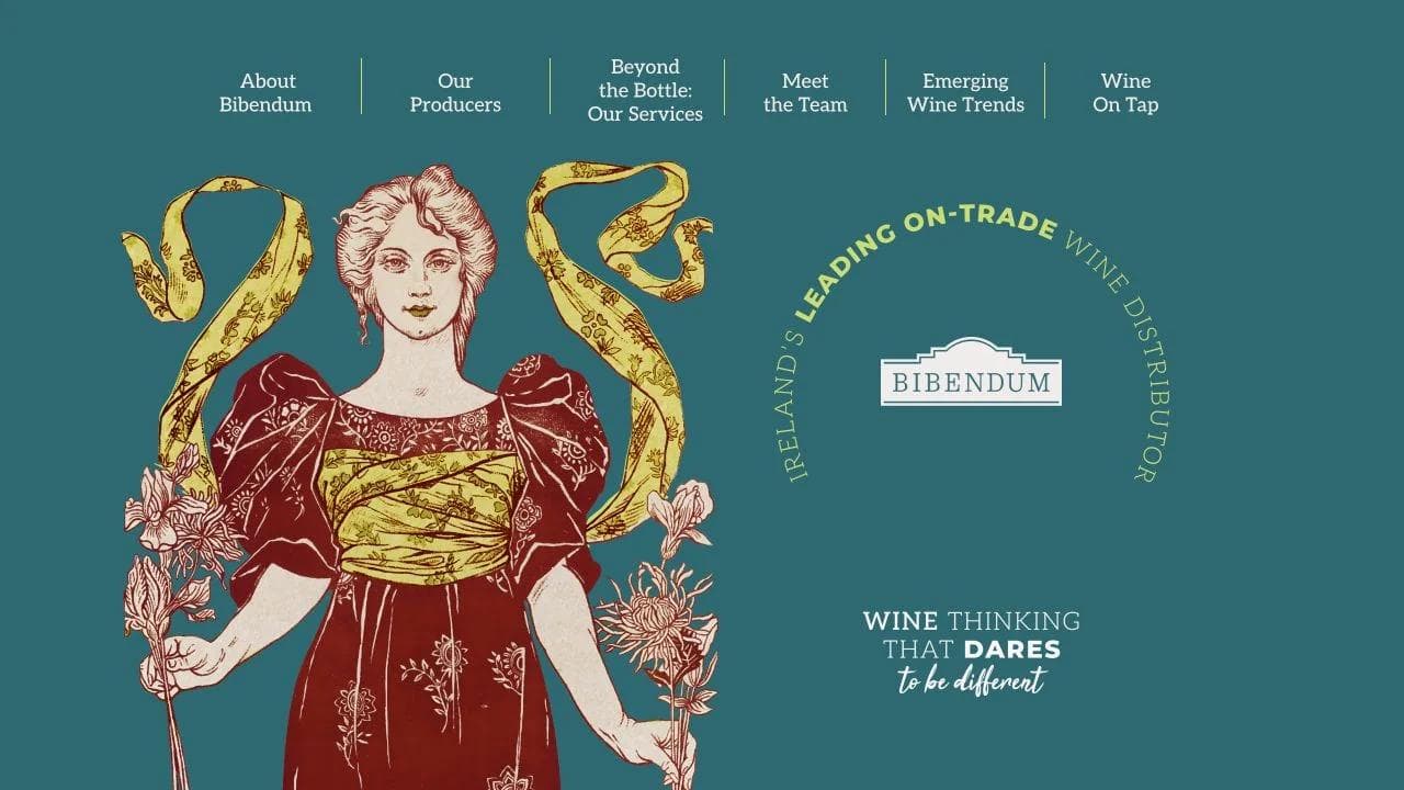
Page sequence
- The navigation exposes editorial topics such as wine on tap, emerging trends, services, producers, and the team.
- A portfolio introduction explains the selection philosophy and regional relevance.
- Producer stories give individual wineries room without turning the page into a product grid.
- Service and team sections connect the catalog to the people supporting hospitality buyers.
Why the sequence fits the job
The microsite narrows a large distributor story to one geography and audience. It combines portfolio browsing with education and relationship proof, which better matches a trade buyer's needs than a generic corporate page would.
What to borrow
A regional or vertical microsite should change more than the headline. Curate the offers, examples, terminology, contacts, and proof for that audience. If the content remains generic, a filtered page on the main site may be simpler and stronger.
12. ARMEDANGELS Impact Report 2024: a digital report microsite
View the live microsite example.
Page sequence
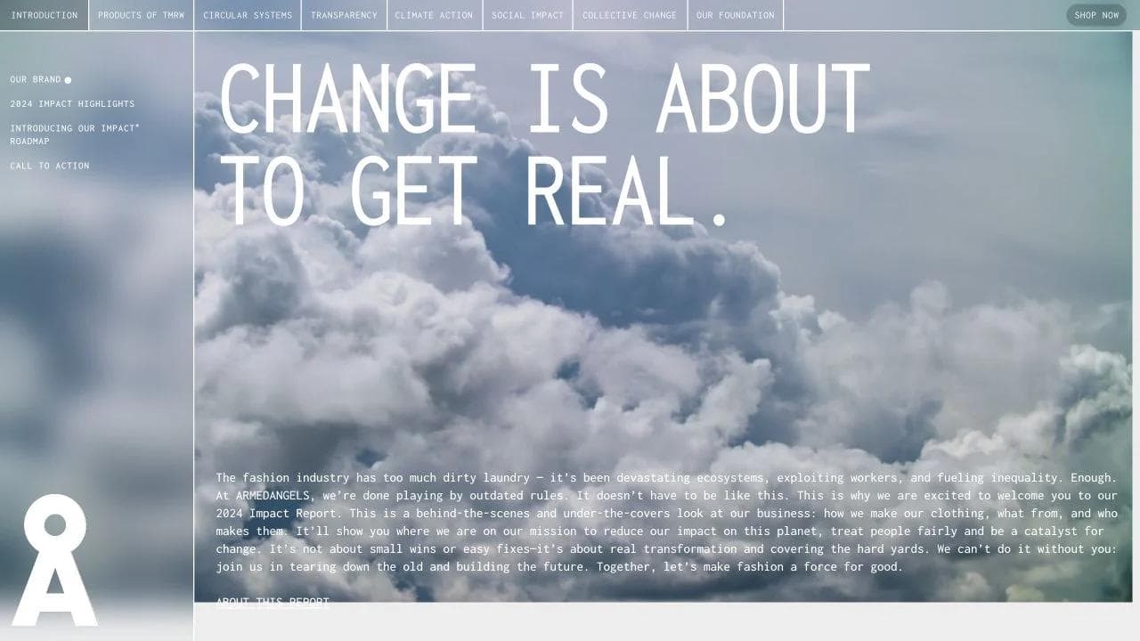
- A direct introduction acknowledges the fashion industry's harms and frames the report as evidence of change.
- Impact highlights and a roadmap provide the executive view.
- Chapters cover foundation, collective change, social impact, climate action, transparency, circular systems, and future products.
- Expandable details let readers move between summary and depth.
- Calls to action connect accountability back to participation and shopping.
Why the sequence fits the job
The microsite turns a long report into a layered experience. Readers can scan highlights, follow thematic chapters, or inspect detail without downloading a PDF first. The explicit acknowledgement of hard problems also gives the evidence more weight than a page made only of celebratory claims.
What to borrow
Start with the reporting boundary and the uncomfortable baseline. Pair every major claim with a metric, method, example, or source. Keep a downloadable document when stakeholders need a fixed record, but use the page to make the findings easier to navigate.
13. IKEA Life at Home: an evergreen research hub
View the live microsite example.
Page sequence
- A simple introduction invites readers into homes around the world.
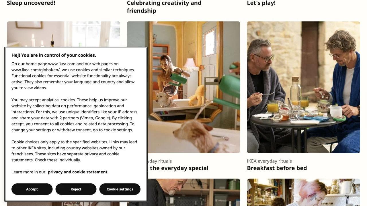
- Current reports on life at home, sleep, play, and everyday rituals sit beside human stories.
- Topic filters and load-more behavior support exploration across years.
- Individual stories provide the depth while the hub maintains continuity.
Why the sequence fits the job
This example now lives inside IKEA's global site, which is a useful boundary lesson. The initiative began as a distinct research destination, but its long-term value and growing archive fit a permanent content hub. The focused editorial idea remains microsite-like even though the URL has been consolidated.
What to borrow
Plan for success. A one-year report can use a temporary microsite. A research program that will accumulate annual reports and stories needs durable information architecture, ownership, and redirects. The best format may change as the initiative becomes permanent.
14. The Bright Future of Car Sharing: a visual thought-leadership microsite
View the live microsite example.
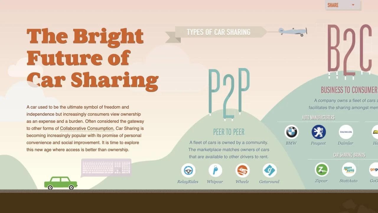
Page sequence
- The opening reframes car ownership as expense and burden, then introduces access as an alternative.
- Large statistics establish environmental and behavioral stakes.
- A map and category system explain peer-to-peer, business-to-consumer, manufacturer, rental, and nonprofit models.
- The page closes by presenting the market as a broader shift in consumption.
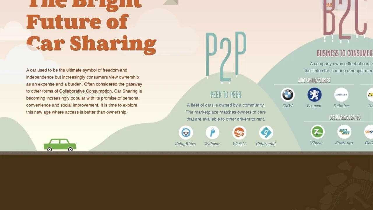
Why the sequence fits the job
The page makes a thesis browsable. Data, illustrations, and interactive geography break a complex market argument into a scroll sequence. It also shows the durability risk of data-driven microsites: several company names and figures reflect the era in which it was created.
What to borrow
Use visual explanation when the relationship between facts is the point. Cite sources beside the relevant claim, include the data year, and assign an update owner. If the thesis is evergreen but the numbers are not, preserve an archived date or refresh the evidence.
15. Out of Darkness: a public-awareness story microsite
View the live microsite example.
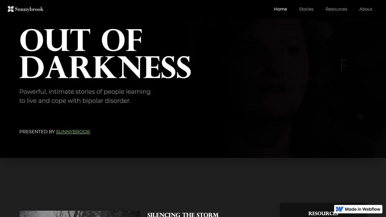
Page sequence
- The opening states the subject and emotional promise without euphemism.
- A series of named personal stories combines written profiles with video.
- Content warnings appear before potentially difficult material.
- Resources and background information provide help beyond the stories.
- Sunnybrook attribution establishes the institution behind the project.
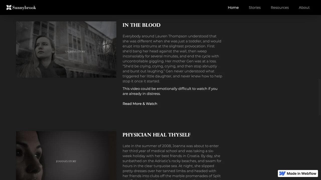
Why the sequence fits the job
The microsite gives one sensitive topic enough space and restraint. Individual stories create recognition, while the resource layer helps the page serve readers who arrive with different levels of need. The institution remains visible without making the campaign feel like a hospital service page.
What to borrow
For health, advocacy, or public-interest work, design for care as well as attention. Use plain content warnings, accessible controls, transcripts, clear authorship, and direct routes to qualified help. Emotional storytelling should never obscure what a vulnerable reader can do next.
What the 15 microsites have in common
The visual styles vary, but the strongest examples share a small set of structural choices.
One narrow audience is named or strongly implied
The page is not for everyone who could buy from the parent company. It is for one account, artists releasing music, people choosing an office, event attendees, brand partners, or readers interested in one issue.
The page gives that audience a complete path
A focused hero is not enough. The experience supplies the explanation, evidence, resources, and next action needed for the job. The path may be linear, as in a report, or navigable, as in a sales hub.
The identity supports the topic
A microsite can depart from the corporate system, but the difference should help the initiative communicate. Event energy, report readability, and account co-branding are functional choices. Novelty alone is not a strategy.
The call to action matches the stage
Website Grader asks for the input needed to create a result. The Conversion Code asks for a purchase. A presales hub routes people to demos, evidence, and contact. A public-awareness site offers stories and resources. The next step follows from the page rather than being pasted onto it.
The biggest fork: public campaign or private buyer experience
Public microsites optimize for discovery, comprehension, sharing, and a scalable action. Private sales microsites optimize for relevance, internal circulation, continuity, and controlled access. Trying to use one structure for both produces predictable problems.
A public campaign microsite usually needs
- A clear searchable topic and descriptive title.
- A self-contained explanation for visitors with little prior context.
- Fast mobile performance and accessible interaction.
- Analytics, consent, ownership, and a sunset or consolidation plan.
A sales microsite usually needs
- Account and stakeholder context, often with co-branding.
- A controlled way to share sensitive or deal-specific material.
- Demos, validation, security, implementation, team, and commercial resources organized for a buying committee.
- An owner who keeps the page aligned with the current deal stage.
- A sensible archive policy after the opportunity closes.
A practical sales microsite anatomy
For a complex sale, a useful default sequence is:
- Account-specific opening: confirm the companies, objective, and current decision.
- Shared understanding: restate the buyer's priorities in their language.
- Recommended approach: connect capabilities to those priorities.
- Demonstration: include the relevant recording, workflow, or prototype, not the whole product tour.
- Validation: provide customer evidence, technical proof, security information, and references proportional to risk.
- Delivery plan: show owners, milestones, dependencies, and the transition from purchase to value.
- Resource center: collect the proposal, pricing, recordings, FAQs, and documents in one place.
- Next step: make the current action and owner explicit.
The page should reduce work for the buyer champion. If it adds another destination to maintain without replacing scattered emails and attachments, it is not doing its job.
Microsite planning checklist
Purpose and audience
- Can you name one primary audience and one decision or task?
- Does the content need a distinct identity, repeated visits, or several paths?
- Would a page on the main site inherit useful authority and navigation instead?
Content and proof
- What must the reader believe after each section?
- Is every major claim supported by an observable example, metric, source, artifact, or qualified testimony?
- Can a returning visitor find the most important resource quickly?
Experience
- Do headings tell a coherent story without the body copy?
- Are interactive elements understandable with a keyboard, touch, reduced motion, and assistive technology?
- Is important text readable without waiting for animation?
Operations
- Who owns updates, analytics, forms, consent, and access?
- What is the launch date, review cadence, and end state?
- Will the URL redirect, remain as a dated archive, or move into the main website?
Common microsite mistakes
Treating visual difference as the purpose
A different typeface and animation style do not justify a separate site. The content, audience, or lifecycle must benefit from independence.
Building a generic sales page for a specific account
A logo swap is not personalization. Use the buyer's priorities, stakeholders, evidence, technical questions, and next step. Otherwise, send the normal product page.
Hiding required detail behind the experience
RFP evaluators, investors, partners, and report readers may need a fixed document, methodology, or source. Use the microsite to improve access and understanding, not to make evidence harder to retrieve.
Launching without an owner
Event dates pass, team members change, statistics age, and proposal terms expire. A focused site can become visibly stale faster than a broad website because its relevance depends on a specific moment.
Ignoring the domain decision
A separate domain creates freedom but starts with little authority and requires its own governance. A subdomain or subdirectory may simplify trust, analytics, redirects, and search. Choose based on the initiative's lifespan and discovery needs, not aesthetics.
Building a microsite with Moda
Moda is a strong fit for visually polished, mostly static microsites such as campaign pages, sales hubs, event pages, digital reports, resource guides, portfolios, and public-facing launch sites. You can draft the page from a prompt, refine the copy and hierarchy, edit the layout visually, and publish it as a hosted website.
If your project is closer to a broad company site, the website design teardown guides show how complete marketing pages build positioning, proof, fit, and action across the full scroll.
For a compact sales artifact, see how to create a one-pager with AI. A one-pager is easier to attach or print, while a microsite is better when the buyer needs navigation, media, updates, or a shared resource center.
Moda is not a replacement for authenticated deal-room software, a customer portal with complex permissions, an event ticketing platform, an experimentation stack, or an application backend. Use the simplest system that protects the data and supports the required workflow.
Ready to turn a focused brief into an editable site? Try Moda and build the page around one audience and one job.
Frequently asked questions
What is a microsite?
A microsite is a focused website or small group of pages created for one audience, campaign, product, event, account, or topic. It may use a separate domain, subdomain, or a distinct section of the main site. Its defining feature is narrow scope, not a fixed page count.
What is the difference between a microsite and a landing page?
A landing page usually presents one argument and one primary action on a single page. A microsite often supports more exploration, several content paths, repeat visits, a distinct identity, or a lifecycle beyond one conversion. A one-page experience can still be a microsite when it functions as a self-contained focused site.
What should a sales microsite include?
A sales microsite should include the account context, buyer priorities, recommended approach, relevant demos, validation, team, implementation plan, security or technical resources, proposal documents, and a clear current next step. The exact structure should match the buying committee and deal stage.
Should a microsite use a separate domain?
Only when the value of independence outweighs the cost. A separate domain can support a distinct identity or campaign, but it requires its own trust, analytics, governance, and SEO plan. A subdirectory or subdomain may be better for evergreen content that should benefit from the parent site.
How long should a microsite stay live?
Keep it live while it remains accurate and useful. Before launch, choose an owner, review date, and end state. The end state may be a redirect, a dated archive, consolidation into the main website, or restricted access after a sales or onboarding engagement ends.
Can a microsite be one page?
Yes. A microsite can be one long page or a small collection of pages. Use as many pages as the audience needs to understand the story and find resources without unnecessary navigation.

Real editable visuals. Real canvas. Full control.
Fly through design work