Best Fonts for Business Cards: 8 Fonts Tested at Print Size, and the Smallest Size That Survives
The best fonts for business cards survive 8 pt contact lines on a 3.5 by 2 inch card. Eight fonts measured for stroke thickness, fit and register, with printer specs from Vistaprint, MOO and Jukebox.
 Anvisha Pai, Co-founder & CEO, Moda
The best font for a business card is Inter, with the name at 12 pt semibold and the contact lines at 8 pt regular. It has a tall lowercase, even strokes that stay above every printer's minimum line weight at 7 pt, and it is free. If you want something that does not read as a technology company, use Lato or Georgia at the same sizes. If you have a long email address to fit, use Source Sans 3 or Roboto Condensed. If you want a classic serif, use EB Garamond, but set the contact lines at 9 pt, not 8.
Those picks come from three tests rather than from looking at fonts and choosing the nice ones. A card is 3.5 by 2 inches, it has to hold a name, a title, a phone number, an email address and a URL, and it has to come back from the printer legible. That is measurable.
The three tests
Does it survive print at small sizes, does it fit, and does it fit the register. For every font we rendered the same card at 300 dpi (1050 by 600 pixels) with the name at 12 pt and the title and three contact lines at 8 pt, then measured the thinnest stroke, the lowercase height and the characters per line.
Test 1: does it survive print at small sizes
What the printers say
Vistaprint's font guide puts the name between 10 and 16 pt and contact details at no smaller than 8 pt, and warns that "ultra-light and hairline styles can disappear when printed." MOO's design guidelines say to keep all text at 8 pt or higher and to keep sharp lines at 0.5 pt or thicker; MOO's font size article allows 7 pt as an absolute minimum for ordinary printing, asks for 10 pt on foil and spot gloss, and permits 6 pt only for terms and conditions. Jukebox Print allows 6 pt for secondary text but adds the numbers that matter for choosing a font: a minimum stroke thickness of 0.25 pt for most print processes, and 0.3 pt for reversed type, meaning light text on a dark background.
So the floor is 7 to 8 pt for the smallest line, and the fine print is the stroke: whatever the font, its thinnest part has to stay above a quarter of a point.
What that means for a font
A font's strokes are a fixed fraction of its size. At 8 pt a regular-weight sans serif has stems around 0.6 pt, more than double the minimum. A serif's stems are as thick, but the hairlines joining them are not. We measured the thinnest stroke of a lowercase o in each font and scaled it to 8 pt.
- Inter, Arial, Lato, Source Sans 3, Roboto Condensed, Montserrat: 0.50 to 0.63 pt at 8 pt. All pass at 7 pt with room to spare.
- Georgia: 0.30 pt at 8 pt. Passes at 8 pt; at 7 pt the hairlines sit at 0.26 pt, right on the line.
- EB Garamond: 0.24 pt at 8 pt. It needs 8.5 pt to clear the 0.25 pt rule and 10 pt to clear the reversed-text rule.
- Playfair Display and Cormorant Garamond: 0.16 pt at 8 pt. The hairlines do not reach 0.25 pt until 12.5 pt. These are name fonts, not contact-line fonts.
- Light weights: Montserrat Light drops to 0.36 pt and Lato Light to 0.30 pt at 8 pt. Regular weights only for anything under 10 pt.
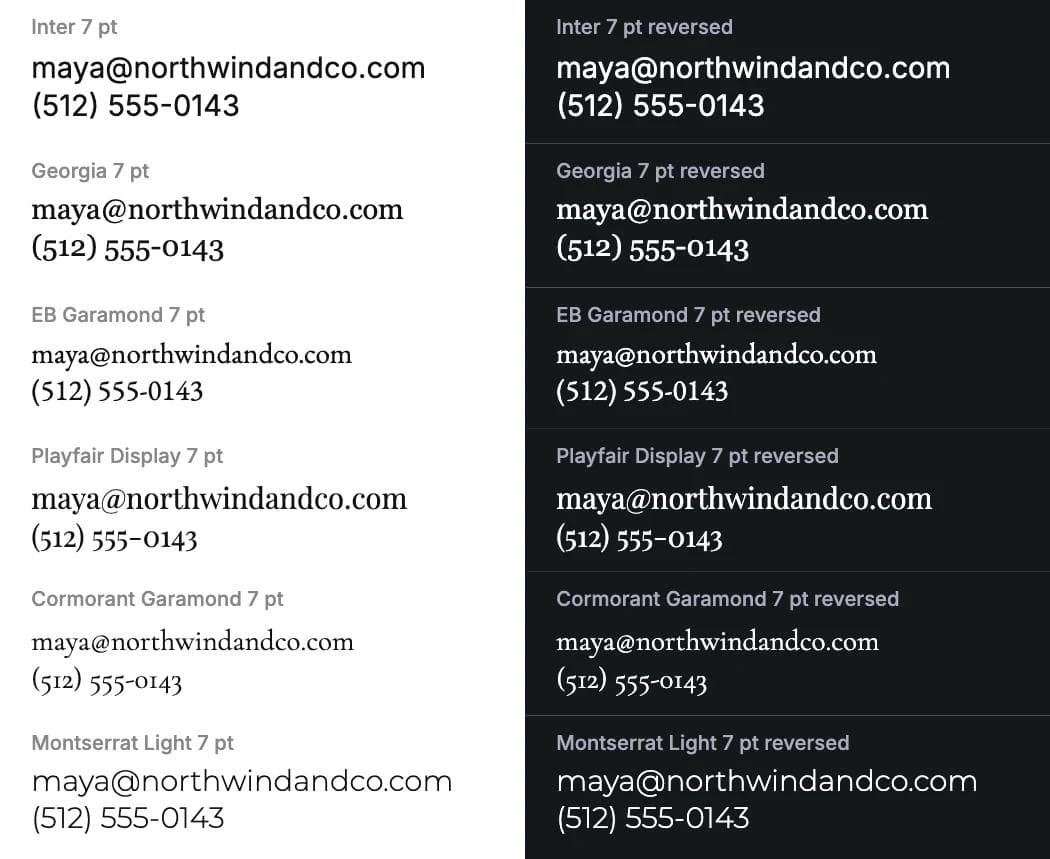
Reversed text is worse because ink spreads slightly into the paper, so a dark background creeps into white letters and every stroke gets thinner. That is why Jukebox raises the stroke minimum for reversed type. If your card is dark, add a point to every size and keep serifs out of the contact lines.
Where 300 dpi comes in
Vistaprint asks for at least 300 dpi for images and logos; MOO asks for a vector PDF, with photographs at 300 dpi or higher. In a vector PDF the letters are outlines and the press draws them at its own resolution. In a PNG or JPEG they are frozen at 300 dots per inch: an 8 pt letter is about 33 dots tall and a 0.25 pt hairline is one dot wide. The enlarged crops below are that raster, the worst realistic case. Send a PDF when you can.
Test 2: does it fit
The contact block is usually the widest thing on a card, and an email address plus a phone number plus a URL is around 60 characters. We set the same 60-character line at 8 pt in each font and measured how many characters fit in 3 inches, the card's width minus a quarter-inch margin each side.
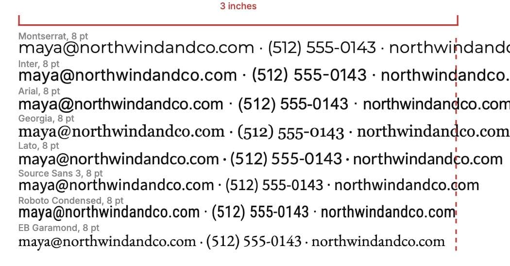
- Montserrat: 49 characters
- Inter: 51
- Arial: 55, Georgia: 55, Lato: 56
- Source Sans 3: 58
- Roboto Condensed: 62
- EB Garamond: 63 (at 8 pt; at its safe 9 pt it fits 56)
If your email address is long, choose from the bottom of that list or stack the contact lines.
Test 3: does it fit the register
Four registers cover most cards:
- Corporate and professional services: neutral sans serifs and sturdy serifs. Inter, Arial, Georgia.
- Creative: geometric sans serifs, or a display serif for the name only over a plain body. Montserrat.
- Trades and services: condensed and bold, because the card carries more information. Oswald for the name, Roboto Condensed for the rest.
- Hospitality and retail: warmer humanist sans serifs and classic serifs. Lato, EB Garamond.
Register is a preference. The first two tests are not. A hotel card in Cormorant Garamond at 7 pt is on-brand and unreadable.
The shortlist: eight fonts, one card each
Each specimen is the same card at 300 dpi with the contact lines enlarged to twice card scale below it. The body font in each pairing sets the title and the contact lines.
Inter: the default
Inter has the tallest lowercase of the sans serifs here (55 percent of the point size), even strokes measured at 0.63 pt at 8 pt, and enough weights that the name in Semibold and the contacts in Regular come from one family. Free on Google Fonts. It reads as current and a little technical, which suits most professional cards and undersells a hospitality brand. It is the second-widest font on the list, so stack the contact lines.
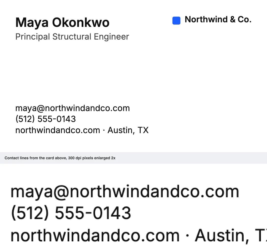
Pairing: Inter Semibold name, Inter Regular body. Minimum for contact lines: 7 pt, 8 pt reversed.
Arial: the one that is already there
Arial is on every Windows and Mac machine and in every online card editor. Its strokes (0.58 pt at 8 pt) and lowercase (52 percent) sit a hair behind Inter, and it is narrower, fitting 55 characters to Inter's 51. It reads as plain, which on a law firm's card is the point. Helvetica, if you have it, measures the same.
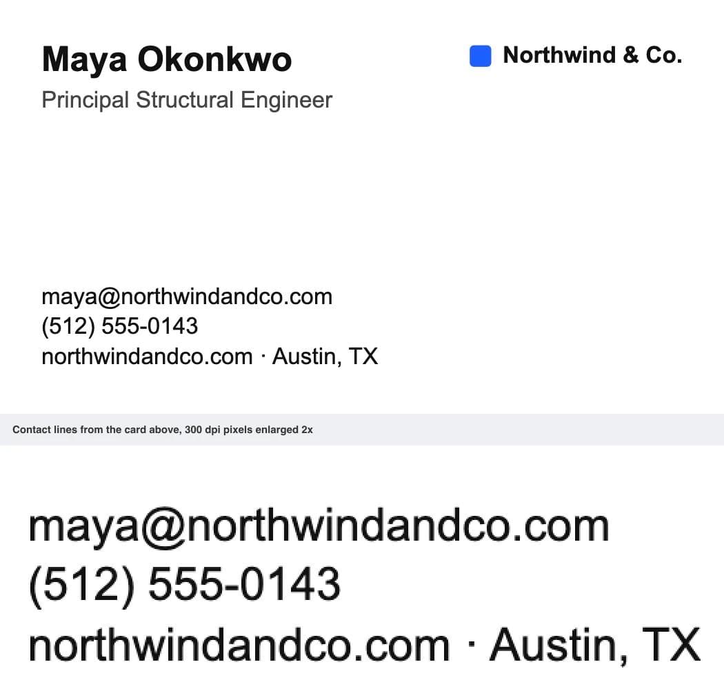
Pairing: Arial Bold name, Arial Regular body. Minimum for contact lines: 7 pt, 8 pt reversed.
Source Sans 3: the one that fits
Adobe's open-source sans serif is narrower than Inter or Arial without looking condensed: 58 characters in 3 inches at 8 pt, strokes at 0.55 pt. Its lowercase is shorter (49 percent), which is why its minimum is 7.5 pt rather than 7. The choice when you have a long email address and a two-line title and refuse to go below 8 pt. Free on Google Fonts.
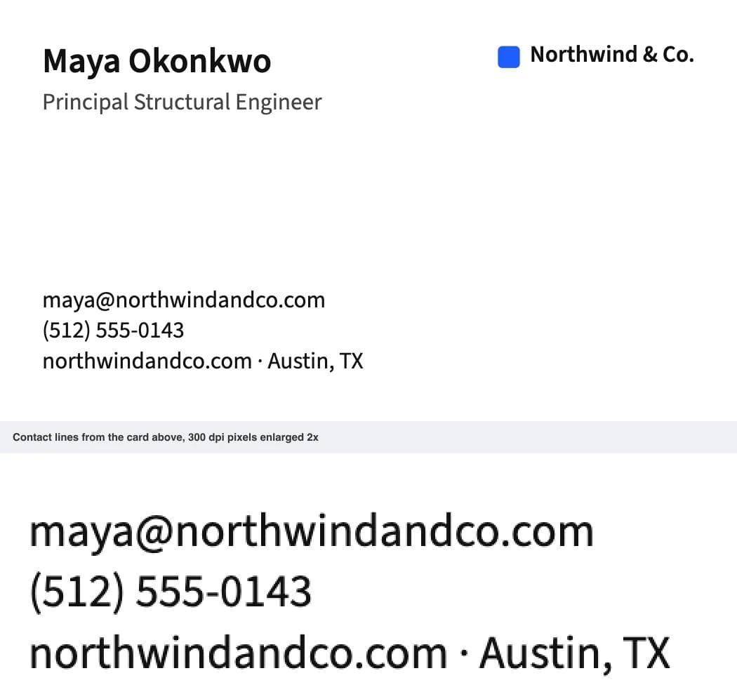
Pairing: Source Sans 3 Semibold name, Source Sans 3 Regular body. Minimum for contact lines: 7.5 pt, 8 pt reversed.
Oswald with Roboto Condensed: for trades
A contractor's card carries a licence number, a service area and an after-hours line. Roboto Condensed fits 62 characters in 3 inches at 8 pt, the most of any sans serif here, and keeps strokes at 0.59 pt because condensing narrows the letters, not the stems. Oswald, a condensed bold, gives the name weight without eating width. Both free on Google Fonts. The pair reads as capable and direct.
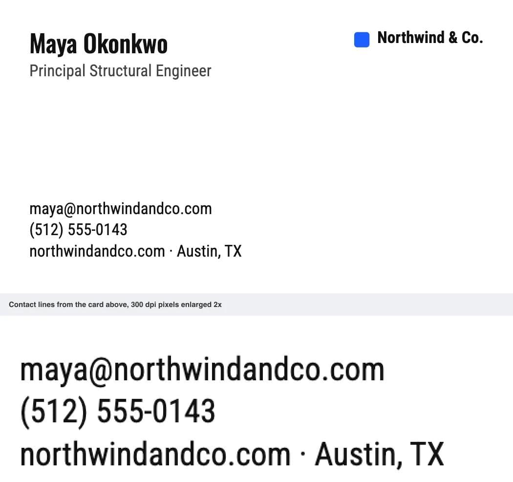
Pairing: Oswald Medium name, Roboto Condensed Regular body. Minimum for contact lines: 7 pt, 8 pt reversed.
Montserrat: for creative work
Montserrat is round, open and confident at 12 pt in a name. It is also the widest font here (49 characters in 3 inches) and its regular weight is the lightest of the sans serifs, 0.50 pt at 8 pt, still double the minimum. Keep the contact lines short or set them in Source Sans 3. Do not use Montserrat Light under 10 pt: it drops to 0.36 pt. Free on Google Fonts.
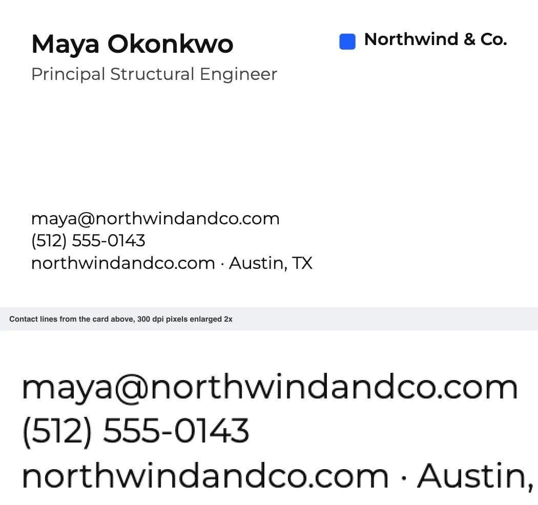
Pairing: Montserrat Semibold name, Montserrat Regular body (or Source Sans 3 for long contact lines). Minimum for contact lines: 7 pt, 8 pt reversed.
Lato: for hospitality without a serif
Lato has a warmth in its curves that Inter and Arial do not, and measures almost exactly like Arial (0.56 pt strokes, 51 percent lowercase, 56 characters per line). The safe choice for a restaurant, salon or boutique that wants to feel friendly without a serif. Free on Google Fonts.
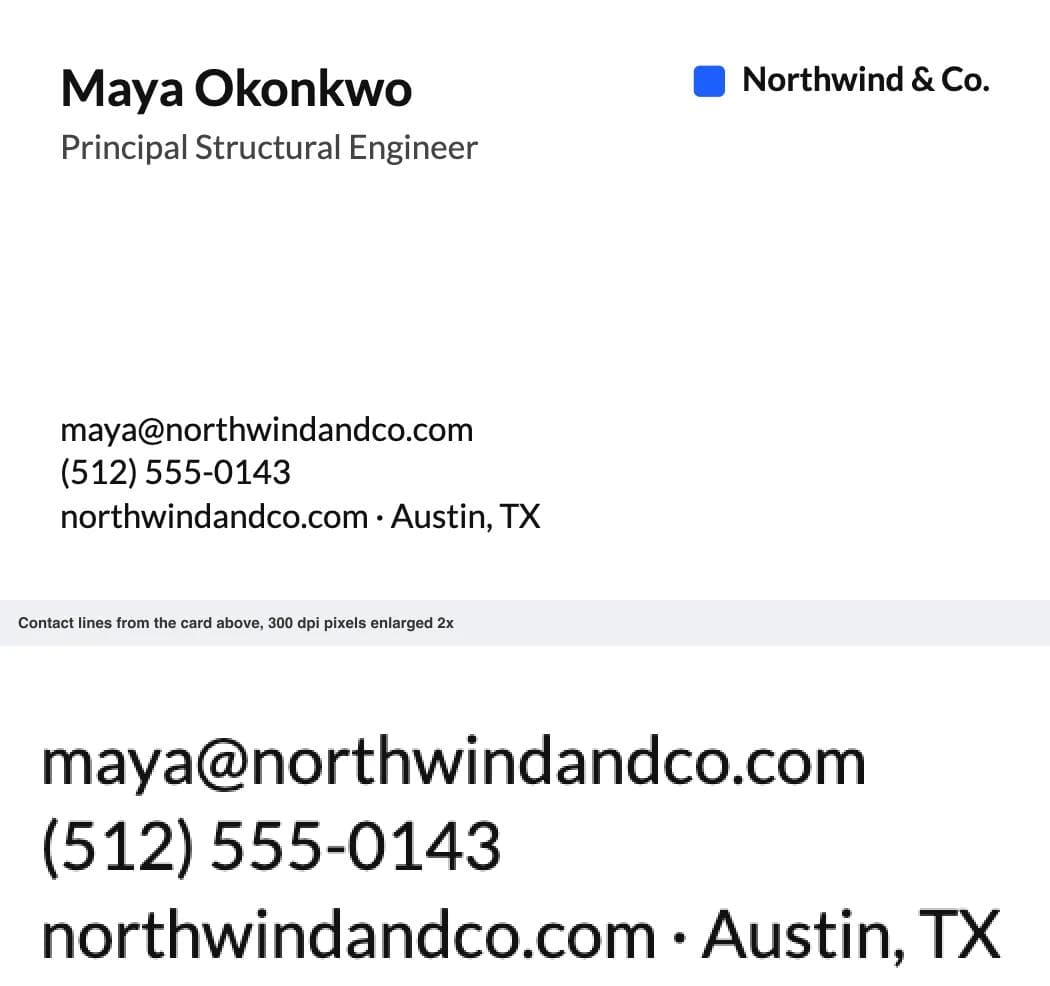
Pairing: Lato Bold name, Lato Regular body. Minimum for contact lines: 7 pt, 8 pt reversed.
Georgia: the serif that survives 8 pt
Georgia was designed for screens with a tall lowercase and sturdy hairlines, and that carries to print. Its thinnest stroke is 0.30 pt at 8 pt, the only serif here that clears the 0.25 pt rule at that size, and it fits 55 characters per line. On every Windows and Mac machine. Its old-style numerals dip below the baseline, which makes a phone number look bookish. Reversed, give it 8.5 pt.
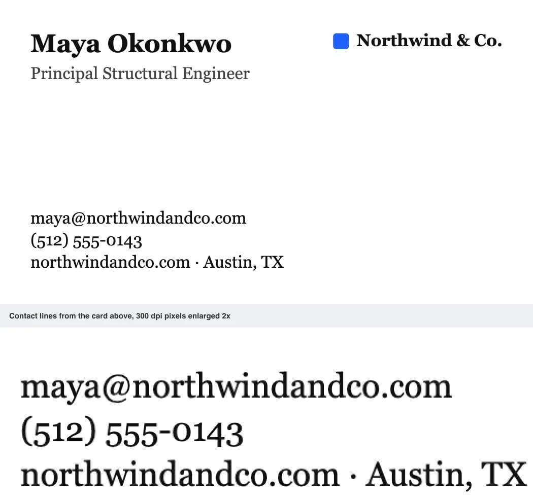
Pairing: Georgia Bold name, Georgia Regular body. Minimum for contact lines: 7.5 pt, 8.5 pt reversed.
EB Garamond: the classic, at 9 pt
EB Garamond is the free version of the serif lawyers, publishers and good hotels have used for a century. It is the narrowest font here, but its lowercase is small (41 percent) and its hairlines measure 0.24 pt at 8 pt, just under the minimum. Set the contact lines at 9 pt, where the hairlines reach 0.27 pt and the lowercase matches Arial at 7 pt, and the name at 13 pt. At 9 pt it still fits 56 characters per line, the same as Lato at 8. Do not reverse it below 10 pt. Free on Google Fonts.
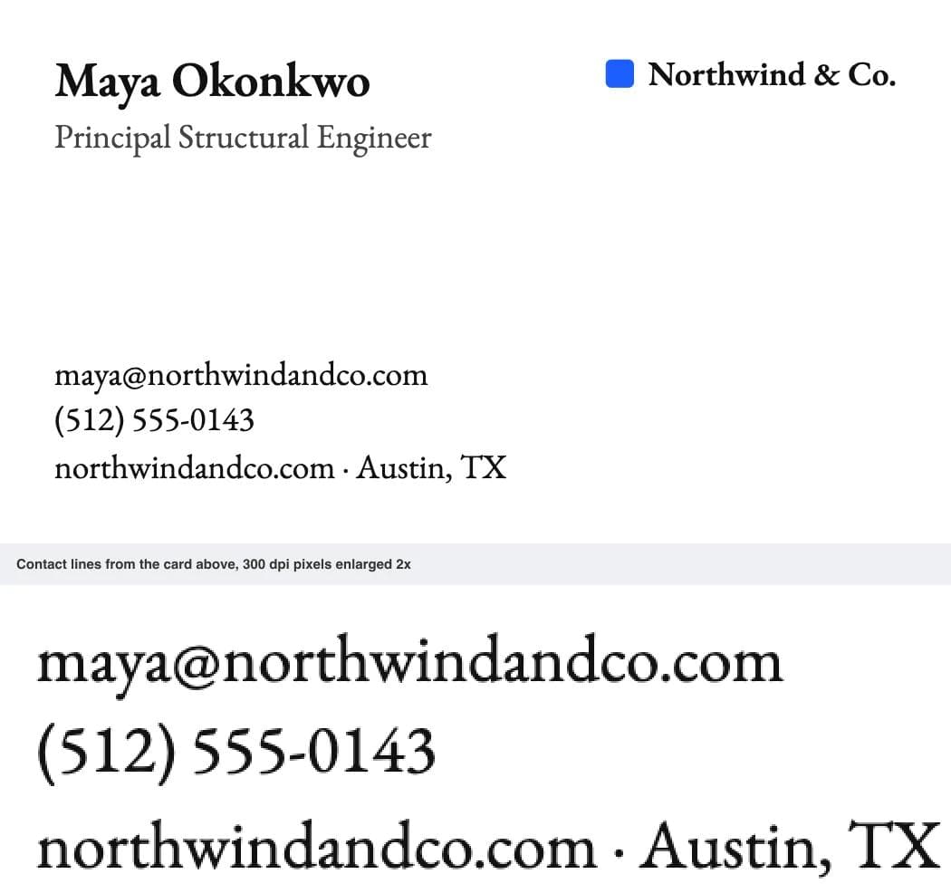
Pairing: EB Garamond Semibold name, EB Garamond Regular body. For a creative card, Playfair Display at 14 pt for the name over Source Sans 3 at 8 pt for the body. Minimum for contact lines: 9 pt, 10 pt reversed.
The comparison table
Minimum sizes are the smallest half-point size at which the font's thinnest stroke clears 0.25 pt (0.3 pt reversed) and its lowercase is at least as tall as Arial's at 7 pt, the size the printers publish as their floor. Characters per line were measured on a 60-character contact line at 8 pt.
| Font | Category | Minimum for contact lines | Reversed | Characters per 3 in line at 8 pt | Licence | Best for |
|---|---|---|---|---|---|---|
| Inter | Sans serif | 7 pt | 8 pt | 51 | Free, Google Fonts | The default; professional services, technology |
| Arial | Sans serif | 7 pt | 8 pt | 55 | Ships with Windows and macOS | Plain corporate; anything built in a printer's editor |
| Source Sans 3 | Sans serif | 7.5 pt | 8 pt | 58 | Free, Google Fonts | Long email addresses; two-line titles |
| Roboto Condensed (Oswald name) | Condensed sans | 7 pt | 8 pt | 62 | Free, Google Fonts | Trades; cards with a lot of information |
| Montserrat | Geometric sans | 7 pt | 8 pt | 49 | Free, Google Fonts | Creative; short contact blocks |
| Lato | Humanist sans | 7 pt | 8 pt | 56 | Free, Google Fonts | Hospitality, retail, salons |
| Georgia | Serif | 7.5 pt | 8.5 pt | 55 | Ships with Windows and macOS | A serif that prints at 8 pt |
| EB Garamond | Old-style serif | 9 pt | 10 pt | 63 (56 at 9 pt) | Free, Google Fonts | Law, publishing, hotels, restaurants |
Measured and left off: Playfair Display and Cormorant Garamond (hairlines need 12.5 pt, so name only), Times New Roman (8 pt minimum; Georgia does the same job with more open letters), Futura and Avenir Next (Mac-only, so a printer's editor substitutes them).
Foil, letterpress and rounded corners
Special finishes tighten every number above. MOO asks for 10 pt minimum on foil and spot gloss because thin foil pools. Boxcar Press, which makes letterpress plates and foil dies, asks for 8 pt for most fonts in foil, 10 pt for reversed type, and no line thinner than 0.25 pt, and notes that reversed and closely spaced details fill in more with foil than with letterpress. Use a regular or medium sans serif for anything in foil.
Rounded corners change nothing. Vistaprint's rounded cards use a quarter-inch radius with the same safe area as a square card, so a contact block inside the safe area is untouched.
Sizing the file
Every printer wants the background to extend past the trim line (the bleed) and text inside a margin (the safe area), but the numbers differ: Vistaprint's bleed is 3.61 by 2.11 inches with a 3.36 by 1.86 inch safe area, MOO's is 3.66 by 2.16 with a 3.34 by 1.84 safe area. Use your printer's template. For dimensions, bleed and safe area in pixels, inches and millimetres, the business card size reference has them on one page.
If you design the card in Moda, the Business Card preset is the 3.5 by 2 inch trim size and the PDF export keeps text as vector outlines with the fonts embedded, so an 8 pt line reaches the printer as outlines rather than pixels. Two things it does not do: the PDF is RGB, not CMYK, and there is no bleed setting, so if your printer wants bleed in the file, set a custom canvas to their bleed dimensions and extend the background to the edge. Moda is not a printer. Upload the PDF to one.
Conclusion
Set the contact lines at 8 pt in a regular-weight sans serif and no font on this list will give you a legibility problem. Inter is the default because it clears every printer's floor with the most margin and needs no second font. Pick Arial inside a printer's editor, Source Sans 3 or Roboto Condensed for a long contact block, Lato or Georgia for a warmer register, EB Garamond at 9 pt for the classic serif. Keep hairline serifs and light weights for the name at 12 pt or larger, add a point to everything on a dark card, and send a PDF.
For pairing a name font with a body font more generally, the font pairing guide covers the three rules; the resume font guide covers which fonts ship with which operating systems.
Frequently asked questions
What is the best font for a business card?
Inter, with the name at 12 pt semibold and the contact lines at 8 pt regular. It has a tall lowercase, strokes measured at 0.63 pt at 8 pt (well over the 0.25 pt minimum printers ask for) and it is free. Lato and Georgia are the alternatives for a warmer register; Source Sans 3 and Roboto Condensed fit the most text.
What font size should a business card be?
Name 10 to 16 pt, title and contact lines 8 pt, with 7 pt as the absolute minimum for ordinary printing. Vistaprint puts primary text at 10 to 16 pt and contact details at no smaller than 8 pt; MOO asks for 8 pt or higher and allows 7 pt as a floor. On foil or spot gloss, MOO asks for 10 pt.
What is the minimum font size for a business card?
7 pt for a regular-weight sans serif on a light card; 8 pt reversed; 9 pt for a Garamond-style serif; 10 pt for foil. The stroke is the real limit: Jukebox Print asks for a minimum stroke thickness of 0.25 pt, 0.3 pt for reversed text, and thin serifs and light weights fall below that at 8 pt.
What is the most professional font for business cards?
For law, finance and consulting, Inter, Arial or Georgia at 8 pt for the contact lines. For a traditional practice, EB Garamond at 9 pt. All four are neutral, print cleanly at small sizes and are free or already installed.
How many fonts should a business card have?
Two at most: one for the name and company, one for everything else. Vistaprint recommends a maximum of two complementary fonts. Many of the pairings above use one family in two weights, which counts as one.
Should business card text be in CMYK?
Printers print in CMYK and most ask for CMYK files. For small black text, MOO recommends 100 percent black (K only) because it prints crisper than a black mixed from four inks. If your tool exports RGB, the printer converts it; that affects colour accuracy, not the legibility of black text.

Real editable visuals. Real canvas. Full control.
Fly through design work