Canva Font Pairings: 12 Combinations That Work, All Free
Twelve Canva font pairings shown as real specimens, grouped by job, with each font's Free or Pro status checked in Canva and the matching Google Font named.
 Anvisha Pai, Co-founder & CEO, Moda
The quickest good answer for a Canva font pairing is a bold geometric sans serif for the heading and a plain humanist sans serif for everything else: Montserrat Bold over Open Sans. It suits a deck, a flyer or a LinkedIn post, both fonts are free in Canva, and both are on Google Fonts under the same names.
The rest of this article is for when that default is not quite right. It covers how Canva's own font pairing suggestions work and where they stop, the three rules that make any pairing hold together, and twelve pairings grouped by the job you are doing: clean corporate, friendly small business, editorial, bold social, elegant event and technical. Every pairing is shown as a rendered specimen rather than described. For each font we checked whether it is Free or Pro in Canva by searching the font panel of a Canva Free account on September 9, 2026, and every one of the 23 fonts came up without the Pro crown. Each is also a Google Font, so the same pairing works in PowerPoint, a website or Moda without substitutes.
How Canva's font pairing suggestions work
Canva gives you three ways to find a pairing without leaving the editor.
The Font combinations grid. Open the Text tab in the editor side panel and scroll past the default text styles and the apps row. The section headed Font combinations is a grid of styled text presets: a heading and a subheading already set in two fonts, with color and effects applied. Click one and it drops onto the page as editable text. In the Free account we used, most of the presets we scrolled through carried the small crown that marks Pro content, so treat the grid as inspiration on Free and as a shortcut on Pro.
Search fonts and combinations. The search box at the top of the Text tab searches both fonts and presets at once. Type a font name and you get the font itself, then every preset that uses it. Typing Montserrat, for example, returns a page of combinations built around Montserrat, which is the fastest way to see what Canva's designers think goes with a font you already like.
The font panel. Select a text box and click the font name on the toolbar. The panel that opens lists your document fonts, recently used fonts, your Brand Kit fonts and Canva's library. A filter icon beside the search box lets you narrow the list by language and by price, with Free and Pro as the two options. Pro fonts show greyed out with a crown; Free fonts show in black. That filter is the definitive check for your own account, and it is what we used for the table below.
Where Canva's suggestions stop
Three limits matter for someone choosing a pairing this week.
The presets are styles, not systems. A Font combinations preset gives you one heading and one subheading. It does not set a body font, and it does not carry across to the next design unless you copy the text box. Canva's answer to that is Brand Kit fonts, where you set a default font for H1 through H5 and body text. That feature is on Canva Pro, Teams, Business, Education and Nonprofits, according to Canva's brand fonts help page. The Free plan's Brand Kit holds three colors and nothing else, as our Canva pricing guide sets out.
You cannot upload a font on Free. Canva's font upload help page is explicit: uploading to a Brand Kit is available to team owners, administrators and brand designers on Pro, Teams, Business, Education and Nonprofits, in OTF, TTF or WOFF, up to 500 fonts per Brand Kit, and Canva does not support variable fonts. If your brand typeface is not in Canva's library and you are on Free, the pairing has to be built from the library. A registered charity can get the upload path free through the nonprofit program; see who qualifies for Canva for Nonprofits.
Some Canva library fonts exist only inside Canva. Canva Sans, Glacial Indifference and many of the fonts in the styled presets are not on Google Fonts. A design built on them cannot be reproduced in PowerPoint or on a website without a substitute. Every pairing below avoids that problem by using fonts Canva ships under the same name Google Fonts uses.
The three rules that make a pairing work
Designers pair fonts by instinct, but the instinct reduces to three checks. The six specimens below, one from each group in this article, pass all three.
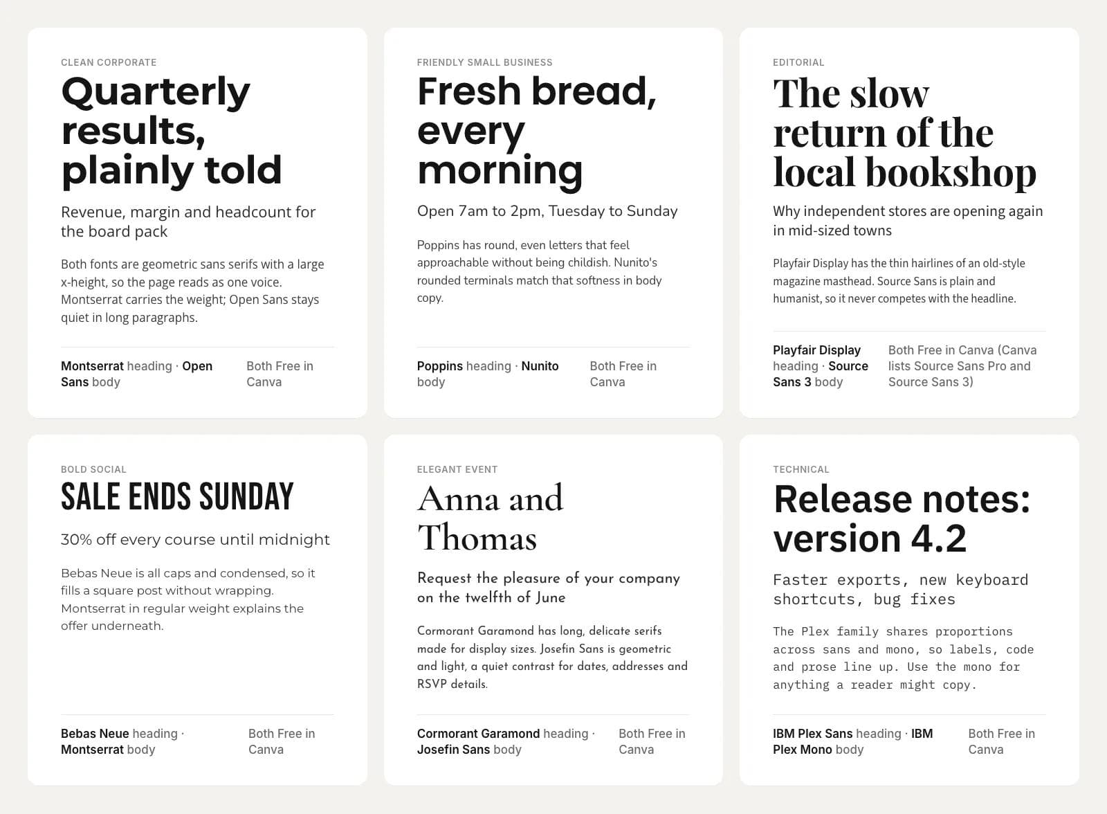
Contrast of category. Put the two fonts in different families: a serif with a sans serif, a condensed display face with a normal-width text face, a script with something plain. Two similar sans serifs, such as Lato with Open Sans, look like a mistake rather than a choice because the reader cannot tell why they differ. If you want two sans serifs, make the contrast weight and width instead: Bebas Neue, which is condensed and all caps, over Montserrat Regular.
Shared proportions. The two fonts should agree on x-height (how tall the lowercase letters are relative to the capitals) and on overall width. Montserrat and Open Sans both have large x-heights and generous widths, which is why they read as one voice. Playfair Display's tall, narrow letters pair well with Source Sans 3 because Source Sans is also slightly narrow. Cormorant Garamond has a small x-height, so it pairs with Josefin Sans, another small x-height face, rather than with a wide modern sans.
One job each. The heading font gets the personality and the body font gets the reading. A script, a heavy condensed face or a high-contrast serif belongs in a heading of a few words. The body font should disappear. If you find yourself admiring the body font, it is probably competing with the heading. The specimens below keep to this rule: the character is always in the top line.
Twelve Canva font pairings by job
Each specimen shows the heading font, a subhead and two lines of body text in the body font, rendered from Google Fonts at the same sizes so they can be compared fairly. The Free or Pro status is what the Canva font panel showed for a Free account on September 9, 2026; check the panel in your own account before you build, because Canva changes its library.
Clean corporate
For board packs, proposals, internal decks and anything that must look competent rather than expressive.
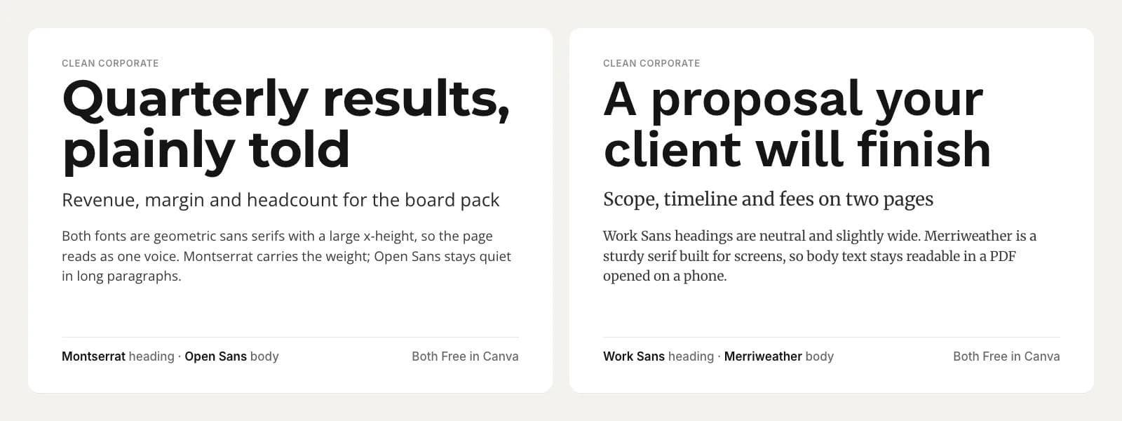
Montserrat Bold with Open Sans. Both are Free in Canva. Both are geometric sans serifs with a large x-height, so the page reads as one voice; Montserrat carries the weight in the heading and Open Sans stays quiet through long paragraphs. This is the pairing to reach for when you do not have time to think about fonts.
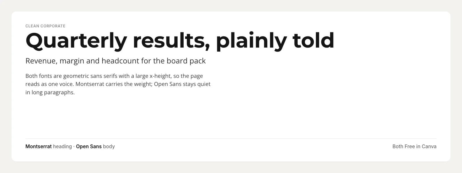
Work Sans Semibold with Merriweather. Both are Free in Canva. Work Sans is neutral and slightly wide, which makes a heading feel steady rather than loud. Merriweather is a serif drawn for screens with sturdy strokes, so body text in a PDF stays readable when the client opens it on a phone.
Friendly small business
For a bakery, a studio, a shop or a service business that wants to be approachable without being twee.
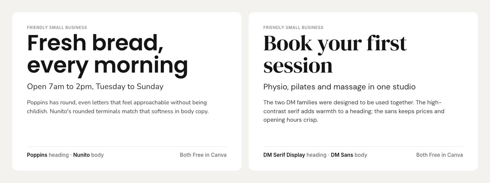
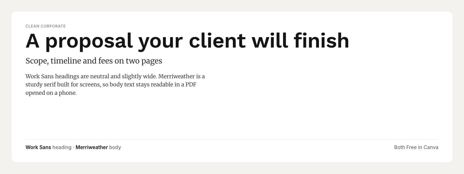
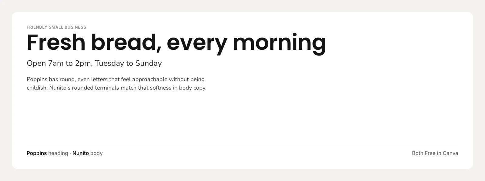
Poppins Semibold with Nunito. Both are Free in Canva. Poppins has round, even letters that feel open without being childish. Nunito's rounded stroke endings echo that softness in body copy, so the two agree in mood while still differing in weight and role. Keep Poppins to Semibold; the heavier weights start to shout.
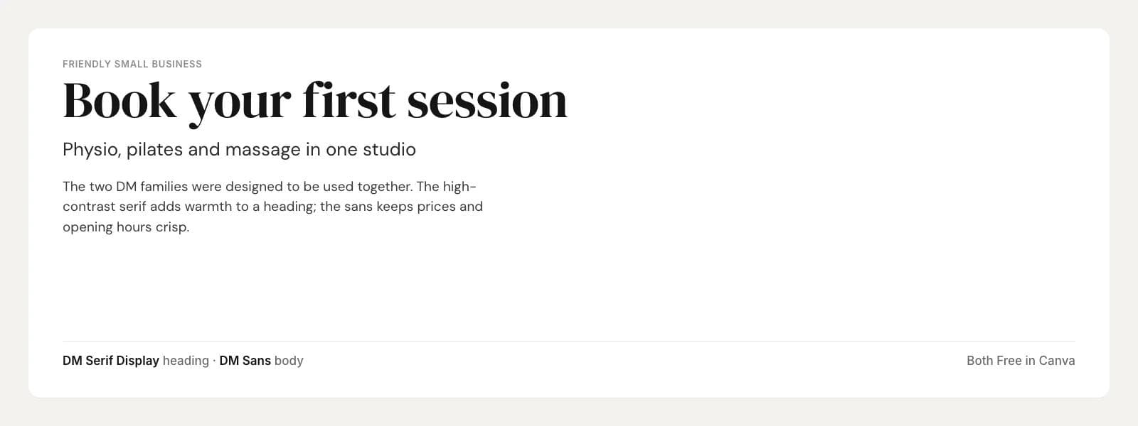
DM Serif Display with DM Sans. Both are Free in Canva. The two DM families were designed to be used together, which is why this pairing looks finished with no adjustment. The high-contrast serif adds warmth to a heading; the sans keeps prices, opening hours and addresses crisp. A good choice for a wellness or beauty business that wants to look considered.
Editorial
For newsletters, long captions, reports with real reading in them, and anything that borrows the feel of a magazine.
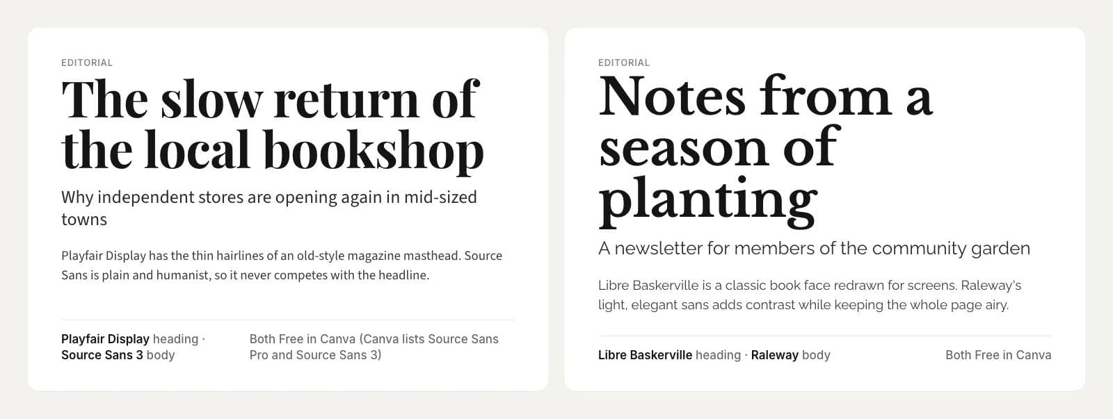
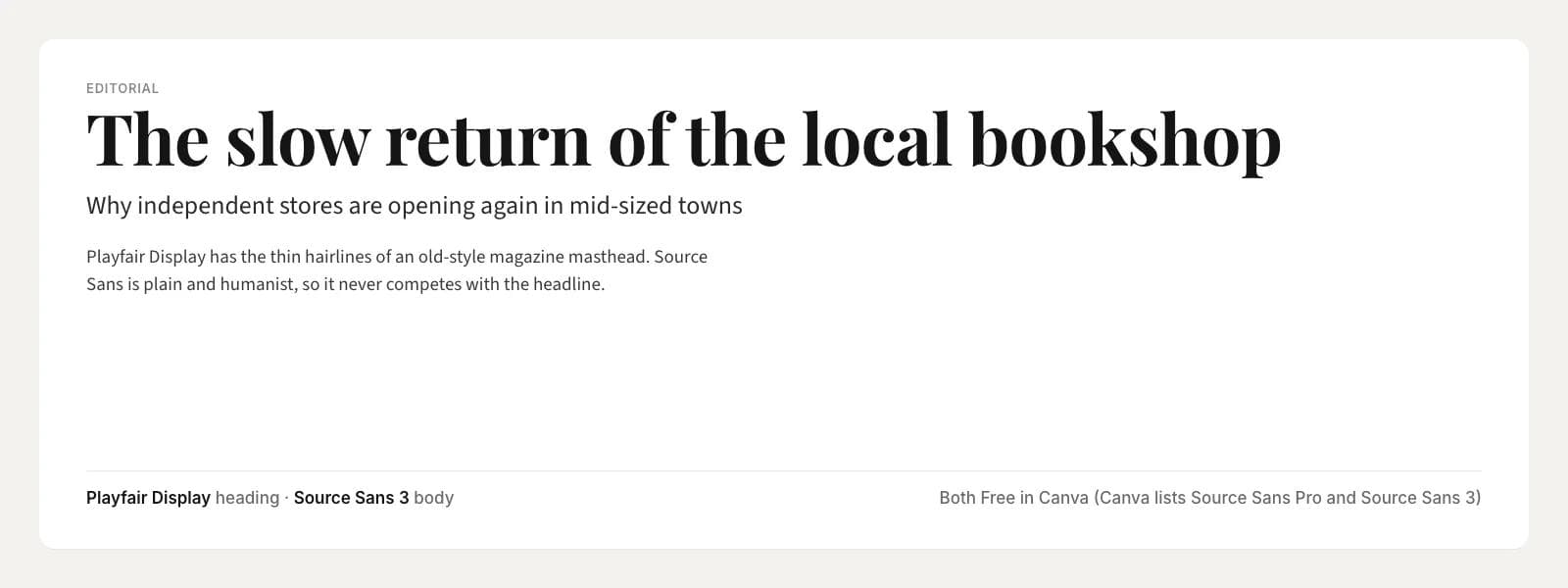
Playfair Display Bold with Source Sans 3. Both are Free in Canva. Playfair Display has the fine hairlines of an old magazine masthead and needs size to show them, so keep it for headings above about 28 points. Source Sans is plain and humanist and never competes. Canva lists this body font under both its old name, Source Sans Pro, and its current Google Fonts name, Source Sans 3; they are the same design.
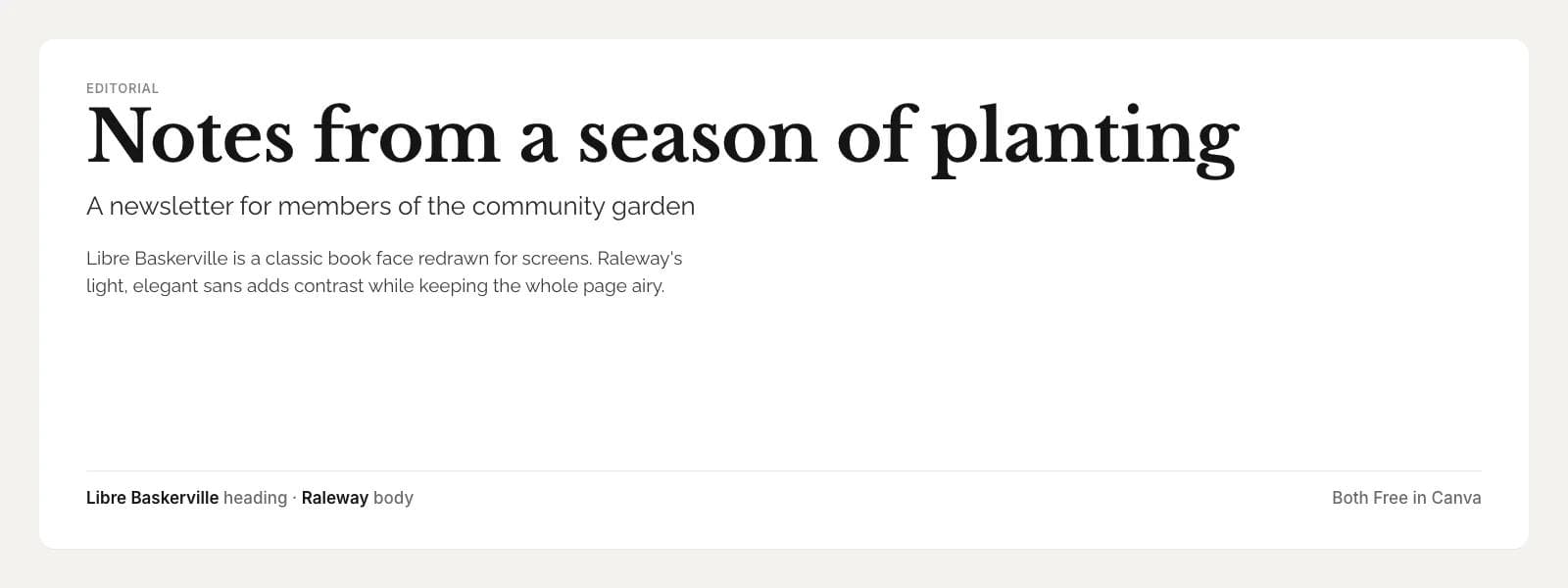
Libre Baskerville Bold with Raleway. Both are Free in Canva. Libre Baskerville is a classic book face redrawn for screens, and the bold weight makes a heading with authority. Raleway is a light, elegant sans that adds contrast while keeping the whole page airy. Use Raleway at Regular or Medium for body text; the Light weight is too thin at small sizes.
Bold social
For Instagram and LinkedIn posts, story covers and ads, where the heading has to survive compression and a two-second glance.
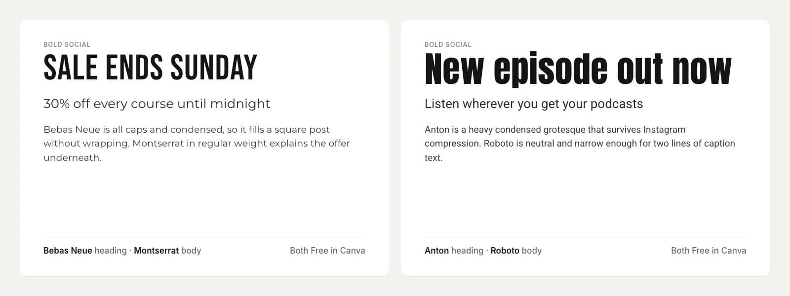
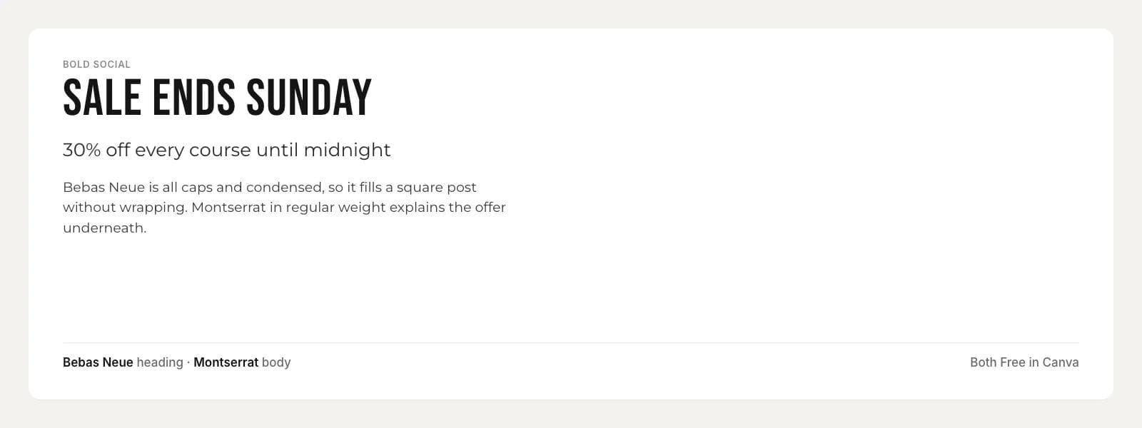
Bebas Neue with Montserrat. Both are Free in Canva. Bebas Neue is all caps and condensed, so a five-word headline fits a square post without wrapping. Montserrat in Regular weight explains the offer underneath. This is the pairing Canva's own font guide recommends for fashion retail, and it works for almost any promotion.
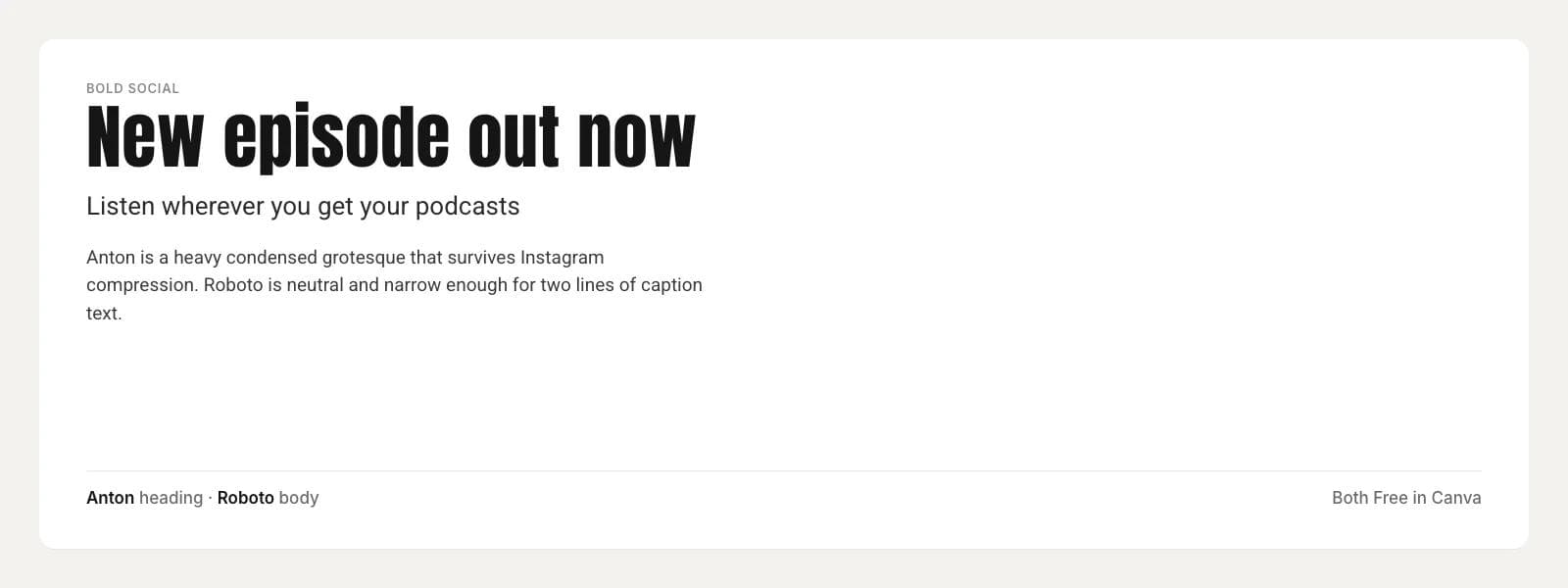
Anton with Roboto. Both are Free in Canva. Anton is a heavy condensed grotesque that stays legible after Instagram recompresses the image. Roboto is neutral and narrow enough to fit two lines of caption on a story. Give Anton a little extra letter spacing, around 1 to 2 percent, or the letters close up at large sizes.
Elegant event
For invitations, save the dates, menus and anything printed for an occasion.
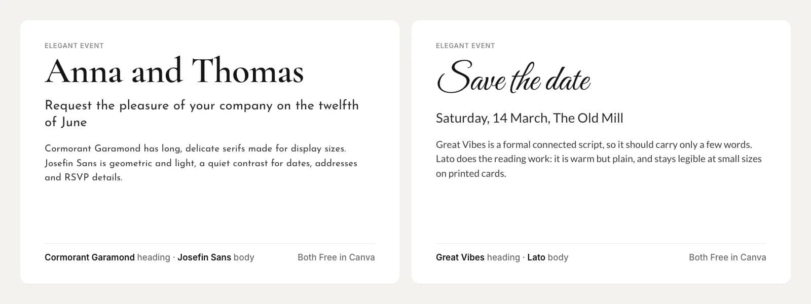
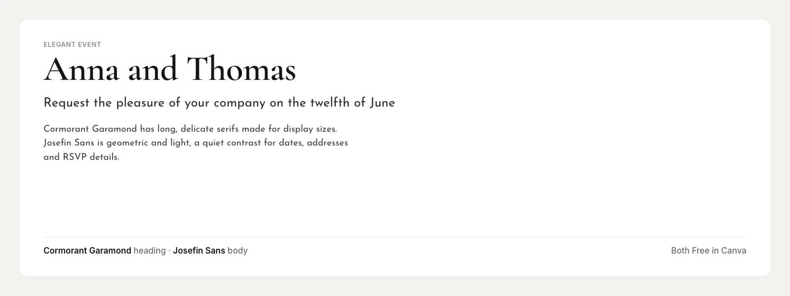
Cormorant Garamond Semibold with Josefin Sans. Both are Free in Canva. Cormorant Garamond has long, delicate serifs made for display sizes and a small x-height. Josefin Sans is a geometric sans with the same small x-height, so the two sit at the same visual height even when the sans is used for dates, addresses and RSVP details. Use Cormorant at Semibold; the Regular weight is too light to print cleanly.
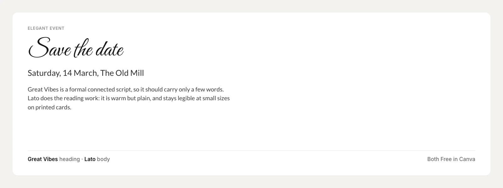
Great Vibes with Lato. Both are Free in Canva. Great Vibes is a formal connected script and should carry only a few words: a name, a date, a phrase. Lato does the reading work. It is warm but plain and stays legible at the small sizes on a printed card. Never set Great Vibes in all caps, and never use it for the body.
Technical
For release notes, spec sheets, product one-pagers and any document with numbers, labels or code in it.
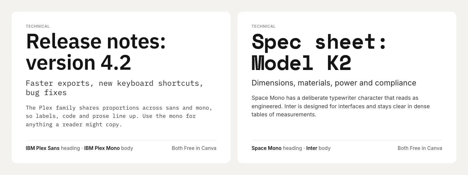
IBM Plex Sans Semibold with IBM Plex Mono. Both are Free in Canva. The Plex family shares its proportions across the sans and the mono, so labels, code snippets and prose line up on the same baseline grid. Use the mono for anything a reader might copy, such as a version number or a command, and the sans for everything else.
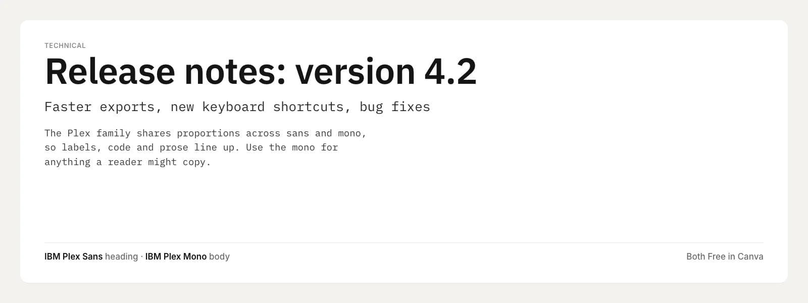
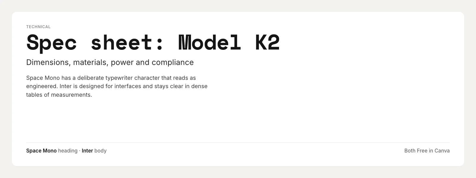
Space Mono Bold with Inter. Both are Free in Canva. Space Mono has a deliberate typewriter character that reads as engineered, which makes it a distinctive heading face for a hardware or software brand. Inter was designed for user interfaces and stays clear in dense tables of measurements. Note that Space Grotesk, the sans companion to Space Mono, was not in Canva's library when we checked, which is why Inter takes the body role here.
The twelve pairings at a glance
Free or Pro is what the Canva font panel showed for a Free account on September 9, 2026. Google Fonts names are the names to search on fonts.google.com; where Canva uses a different or older name, both are given.
| Job | Heading font | Body font | Canva status | Google Fonts |
|---|---|---|---|---|
| Clean corporate | Montserrat Bold | Open Sans | Both Free | Montserrat, Open Sans |
| Clean corporate | Work Sans Semibold | Merriweather | Both Free | Work Sans, Merriweather |
| Friendly small business | Poppins Semibold | Nunito | Both Free | Poppins, Nunito |
| Friendly small business | DM Serif Display | DM Sans | Both Free | DM Serif Display, DM Sans |
| Editorial | Playfair Display Bold | Source Sans 3 | Both Free | Playfair Display, Source Sans 3 (Canva also lists Source Sans Pro) |
| Editorial | Libre Baskerville Bold | Raleway | Both Free | Libre Baskerville, Raleway |
| Bold social | Bebas Neue | Montserrat | Both Free | Bebas Neue, Montserrat |
| Bold social | Anton | Roboto | Both Free | Anton, Roboto |
| Elegant event | Cormorant Garamond Semibold | Josefin Sans | Both Free | Cormorant Garamond, Josefin Sans |
| Elegant event | Great Vibes | Lato | Both Free | Great Vibes, Lato |
| Technical | IBM Plex Sans Semibold | IBM Plex Mono | Both Free | IBM Plex Sans, IBM Plex Mono |
| Technical | Space Mono Bold | Inter | Both Free | Space Mono, Inter |
Taking a pairing outside Canva
Because all 23 fonts are on Google Fonts, the pairing travels. What changes is how the font gets to the reader.
Google Fonts and the web. On fonts.google.com every family above can be downloaded for desktop use or embedded on a website with a link tag. The names match Canva's, with the one exception noted for Source Sans. Google Fonts lists weights as numbers rather than names: Semibold is 600 and Bold is 700.
PowerPoint and Google Slides. PowerPoint uses the fonts installed on the machine that opens the file. Download the two families from Google Fonts, install them, and set them in the slide master so every new slide inherits the pairing. If a colleague without the fonts opens the deck, PowerPoint substitutes a default, so either install the fonts on their machine too or export a PDF for review. Google Slides draws its font menu from Google Fonts, so the same names are usually available there directly under More fonts.
Moda. Moda's font catalog is built from the Google Fonts library, just under 2,000 families at the time of writing, plus fonts your team uploads as TTF or OTF files. Every pairing in this article can be selected by name in the editor's font picker. A Moda brand kit stores fonts with a role, such as title, subtitle or body, and the agent reads those roles when it builds a design, so you can set Playfair Display as the heading and Source Sans 3 as the body once and have every deck, one-pager and social post follow. If you want to try a pairing on a real design rather than a specimen, describe the piece to Moda and name the two fonts.
Moda does not manage the fonts inside your Canva account. Changing a font in a Canva design is done in Canva. If you have a large Canva library and want a second workspace that starts designs from a brief, our Canva alternatives guide compares the options by the job you need to improve.
Choosing quickly
If you need one pairing for everything, use Montserrat Bold with Open Sans. If you need warmth, DM Serif Display with DM Sans. If the heading has to stop a thumb, Bebas Neue with Montserrat. If it is going on paper for an occasion, Cormorant Garamond with Josefin Sans. All four are free in Canva and on Google Fonts, so the decision you make this week does not lock you into one tool.
Frequently asked questions
Does Canva have a font pairing tool?
Yes, in three forms. The Text tab in the editor has a Font combinations grid of preset heading and subheading pairs; the search box above it searches fonts and combinations together, so typing a font name returns presets that use it; and paid plans can set default fonts for each heading level in a Brand Kit. There is no standalone pairing generator on canva.com that we could find; canva.com/font-combinations now redirects to Canva's written guide of 30 combinations.
Are the fonts in this article free in Canva?
All 23 fonts across the twelve pairings appeared without the Pro crown when we searched the font panel of a Canva Free account on September 9, 2026. Canva changes its library, so confirm in your own account: select a text box, open the font panel from the toolbar, and use the filter to show Free fonts only.
Can I upload my own fonts to Canva on the Free plan?
No. Canva's help center lists font upload as available to team owners, administrators and brand designers on Canva Pro, Teams, Business, Education and Nonprofits. Supported formats are OTF, TTF and WOFF, up to 500 fonts per Brand Kit, and variable fonts are not supported.
How many fonts should I use in one design?
Two, with the heading font doing the expressive work and the body font doing the reading. A third font is justified only for a distinct job, such as a script for a single name on an invitation or a monospace face for code. Vary weight and size within a family before adding another family.
What is the Google Fonts equivalent of a Canva font?
For the twelve pairings here, the Google Font is the same font under the same name; the exception is Source Sans Pro, which Google Fonts now calls Source Sans 3 and Canva lists under both names. Fonts that exist only in Canva, such as Canva Sans or Glacial Indifference, have no exact Google equivalent, so pick a pairing from this list instead if the design has to leave Canva.
Which Canva font pairing is best for a presentation?
Montserrat Bold with Open Sans for a general business deck, Work Sans with Merriweather when the slides carry real paragraphs, and IBM Plex Sans with IBM Plex Mono for a technical or product deck. All three are legible at the back of a room and free in Canva.

Real editable visuals. Real canvas. Full control.
Fly through design work