Best Fonts for Email: 8 Safe Choices, Rendered With the Fallback Your Reader Gets
The best fonts for email are the ones the recipient's inbox can show. Six safe fonts and two web fonts rendered on the same email, with the fallback each one gets on Windows, Android and Gmail.
 Anvisha Pai, Co-founder & CEO, Moda
The best font for a work email is Arial, at the size your mail client already uses. It is installed on Windows, macOS and iOS, Android swaps it for Roboto without moving a line break, and every client renders it. For a newsletter, use a stack of Helvetica, Arial and sans-serif, or Georgia for a reading serif, and add a web font such as Open Sans only in front of that stack, because Gmail and Outlook will not load it.
The answer is short because of the thing most people miss about email fonts: you do not choose the font, the recipient's client does. The name you set in Gmail or a newsletter template is a request. The inbox that opens the message fills it from the fonts on that device, or from a web font if that client loads them, and substitutes something else if it cannot. This article measures that. Each of the eight fonts below is rendered on the same email at 600 pixels wide, next to the fallback a reader actually gets on the platform that lacks it.
The recipient's client decides
Three things settle what a reader sees, in this order.
- Is the font installed on the reader's device? Windows, macOS, iOS and Android each ship a different set, and Android ships none of the usual names.
- Does the reader's client load web fonts? Apple Mail fetches a linked Google Font. Gmail ignores the instruction.
- What happens when the font is missing? Usually the client moves to the next name in your font-family stack. Outlook on Windows has one exception that turns everything into Times New Roman.
A font that passes the first test everywhere never reaches the other two. That is why the shortlist is boring on purpose.
Which email clients render web fonts
Can I Email tests each client against the CSS @font-face rule, which is how a web font reaches an email. In its current data, updated August 2026, Apple Mail on macOS and Mail on iOS load web fonts, and so do Samsung Email on Android and Thunderbird. Gmail does not, in the web app or its iOS and Android apps. Outlook.com and the Outlook apps for iOS and Android do not. Yahoo does not.
Outlook for Windows is marked partial, with this note: elements using a font declared with @font-face ignore the font stack and fall back to Times New Roman. Litmus documents the same behaviour for fonts pulled in with <link> or @import and gives the fix: declare the font with @font-face, add mso-font-alt: 'Arial' inside the declaration, or hide the import from Outlook with an MSO conditional comment so it drops to your fallback. Litmus lists older Outlook for Mac versions as supporting web fonts; Can I Email records recent versions as not. Treat it as unreliable.
So a web font is decoration for Apple readers. Everyone else sees the fallback, which makes the fallback the design and the web font a bonus.
The email-safe stack, platform by platform
Email-safe fonts are the ones that ship with both Windows and macOS. Microsoft's Windows 11 font list and Apple's fonts included with macOS Tahoe overlap on Arial, Georgia, Verdana, Tahoma, Trebuchet MS, Times New Roman and Courier New. Helvetica is on the Mac list only. Calibri and Cambria are on the Windows list only, and Aptos is on neither, because Microsoft distributes it as a Microsoft 365 cloud font, as our resume fonts guide sets out.
Phones change the picture.
- iOS matches the Mac for Arial, Helvetica, Georgia, Verdana, Trebuchet MS, Times New Roman and Courier New, all tagged as iOS system fonts on Apple's system fonts list. Tahoma is tagged "iOS downloadable": it is not there until an app fetches it, and Mail does not. A Tahoma email on an iPhone shows the next font in your stack.
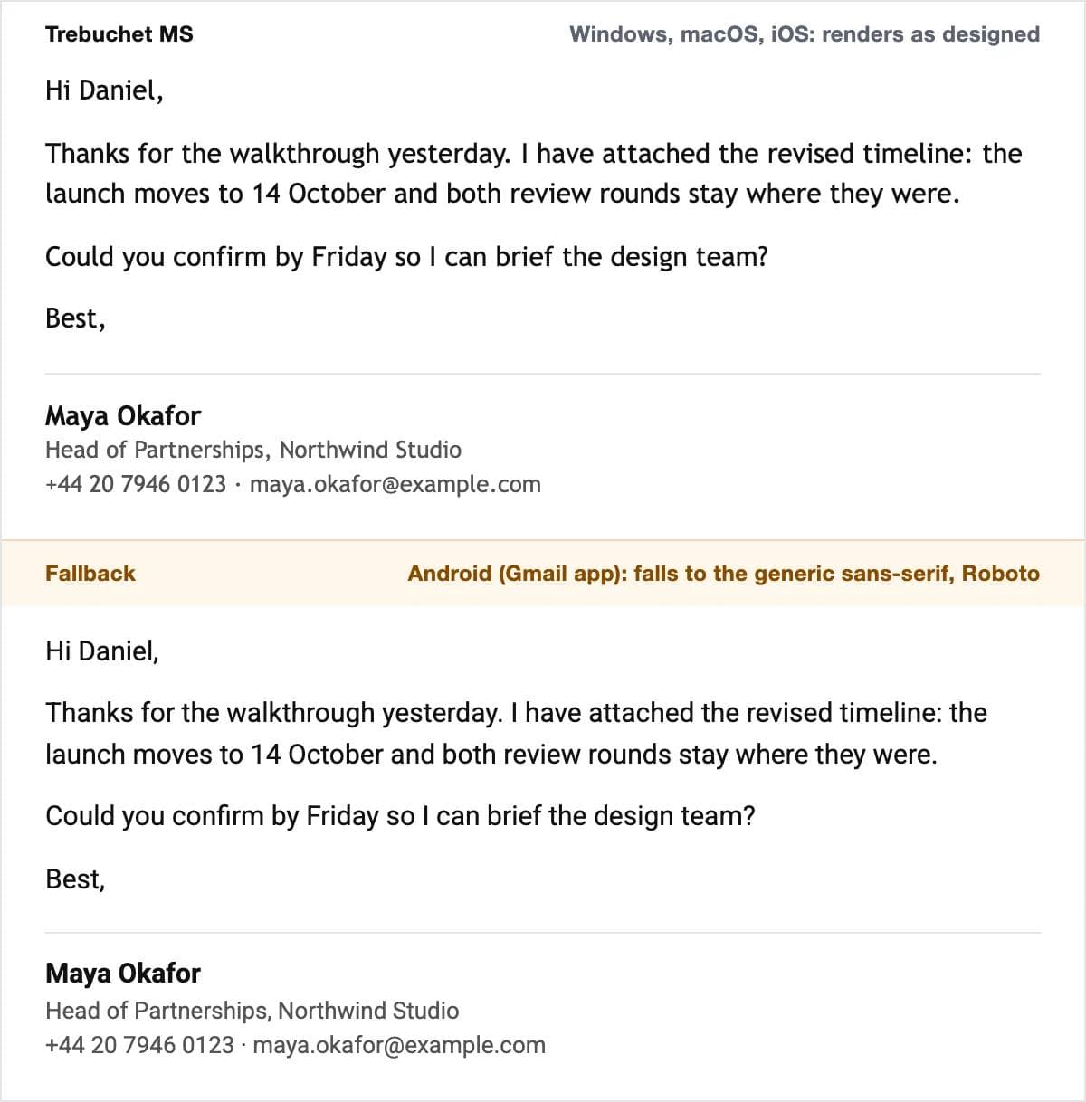
- Android has none of these fonts. Its system configuration, fonts.xml in the Android source, defines sans-serif as Roboto and serif as Noto Serif, then aliases the familiar names onto them: arial, helvetica, tahoma and verdana map to sans-serif; times, times new roman and georgia map to serif. Trebuchet MS has no alias and drops to whatever generic family ends your stack. Every Android reader sees Roboto or Noto Serif, and the layout survives because the aliases keep the text in the right family.
- Windows has no Helvetica, but the request does not fail. The system's substitution table maps the name to Arial; Microsoft's documentation uses Helvetica to Arial as its worked example. The same page states the rule every email should follow: a font-family list should always end with a generic family such as serif or sans-serif, so there is always something to draw.
Written as stacks:
- Sans serif:
Helvetica, Arial, sans-serif(Helvetica on Apple, Arial on Windows, Roboto on Android). - Sans serif, larger:
Verdana, Tahoma, sans-serif(Verdana on desktop and iOS, Roboto on Android). - Serif:
Georgia, 'Times New Roman', serif(Georgia everywhere except Android, where it becomes Noto Serif).
Font size and line height for email
A 600 pixel newsletter is scaled down to a 360 pixel phone screen, so sizes have to survive both. They are given in pixels because that is what email HTML uses; the point equivalents are for setting a default in Outlook or Apple Mail, where 1 point is 1.33 pixels.
| Role | Size | Line height | Notes |
|---|---|---|---|
| Newsletter body | 15 to 16 px (11 to 12 pt) | 1.5, so 22 to 24 px | 14 px is the floor; below it Georgia and Times get thin on a phone |
| Newsletter heading | 22 to 28 px | 1.2 to 1.3 | Bold; one size step for the whole email; skip light weights |
| Work email body | The client's default | The client's default | Gmail's Normal, Outlook's 11 pt. Changing it makes your replies look odd in a thread |
| Signature name | 14 to 15 px, bold | 1.4 | Same font as the body |
| Signature details | 13 px, dark grey | 1.4 | Never below 12 px; grey no lighter than #555 on white |
These are recommendations from the specimens below, not a standard. The specimens use them: 15 px body, 1.5 line height, a 15 px bold name and 13 px details.
Gmail's and Outlook's default fonts, and how to change them
Gmail. The default text style is Sans Serif, which arrives as Arial on most machines. Google's help page gives the path: open Gmail, click Settings, then See all settings, scroll to the Default text style section, change the text in the box to the style you want, and click Save Changes. The menu offers the safe set (Sans Serif, Serif, Georgia, Tahoma, Trebuchet MS, Verdana and a few others) and four size names rather than numbers. The signature lives on the same settings page, holds up to 10,000 characters including any image, and can differ for each address you send from.
Outlook. Current Microsoft 365 uses Aptos; Microsoft's New Office theme page says "Aptos is the default font across all of Office", and older versions used Calibri at 11 point. Both are Microsoft fonts that a Mac or a phone outside Microsoft 365 does not have, so an Apple Mail reader sees a substitute. To change the default, Microsoft's page gives three paths: in new Outlook, View, then View settings, Mail, Compose and reply, Message format; in classic Outlook, File, Options, Mail, Stationery and Fonts, then Font under New mail messages; in Outlook on the web, Settings, Mail, Compose and reply, Message format. Set Arial 11 and your messages look the same on a Mac as on your own screen.
Apple Mail uses Helvetica, set under Mail, Settings, Fonts & Colors, where Message font covers writing and reading. A Windows reader sees Arial in its place, which is fine.
The shortlist: six safe fonts and two web fonts
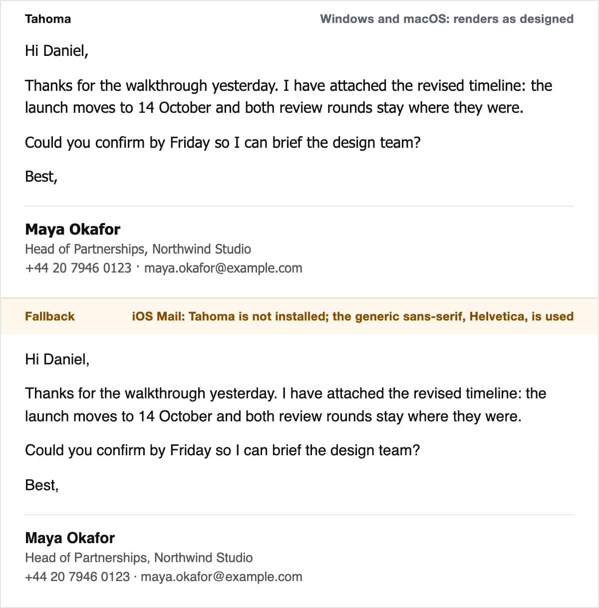
Each specimen is the same email at 600 pixels wide with a 15 pixel body. The top half is the font as designed; the bottom half is what a reader gets on the platform that does not have it.
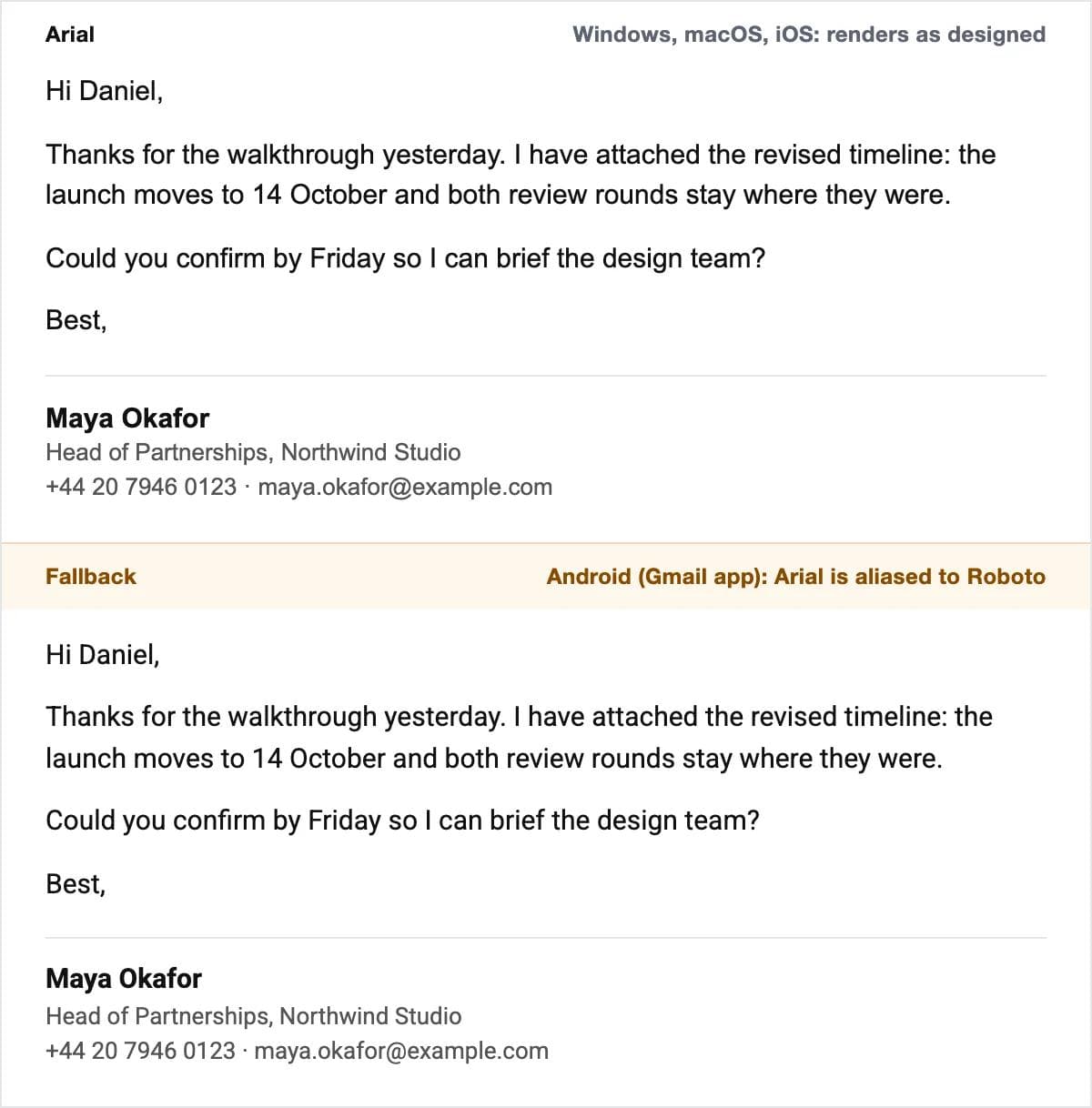
Arial: the default for work email
On Windows, macOS and iOS, mapped to Roboto on Android, and what Gmail sends anyway. Its large x-height makes 15 px comfortable. It is not interesting, which in a work email is the point.
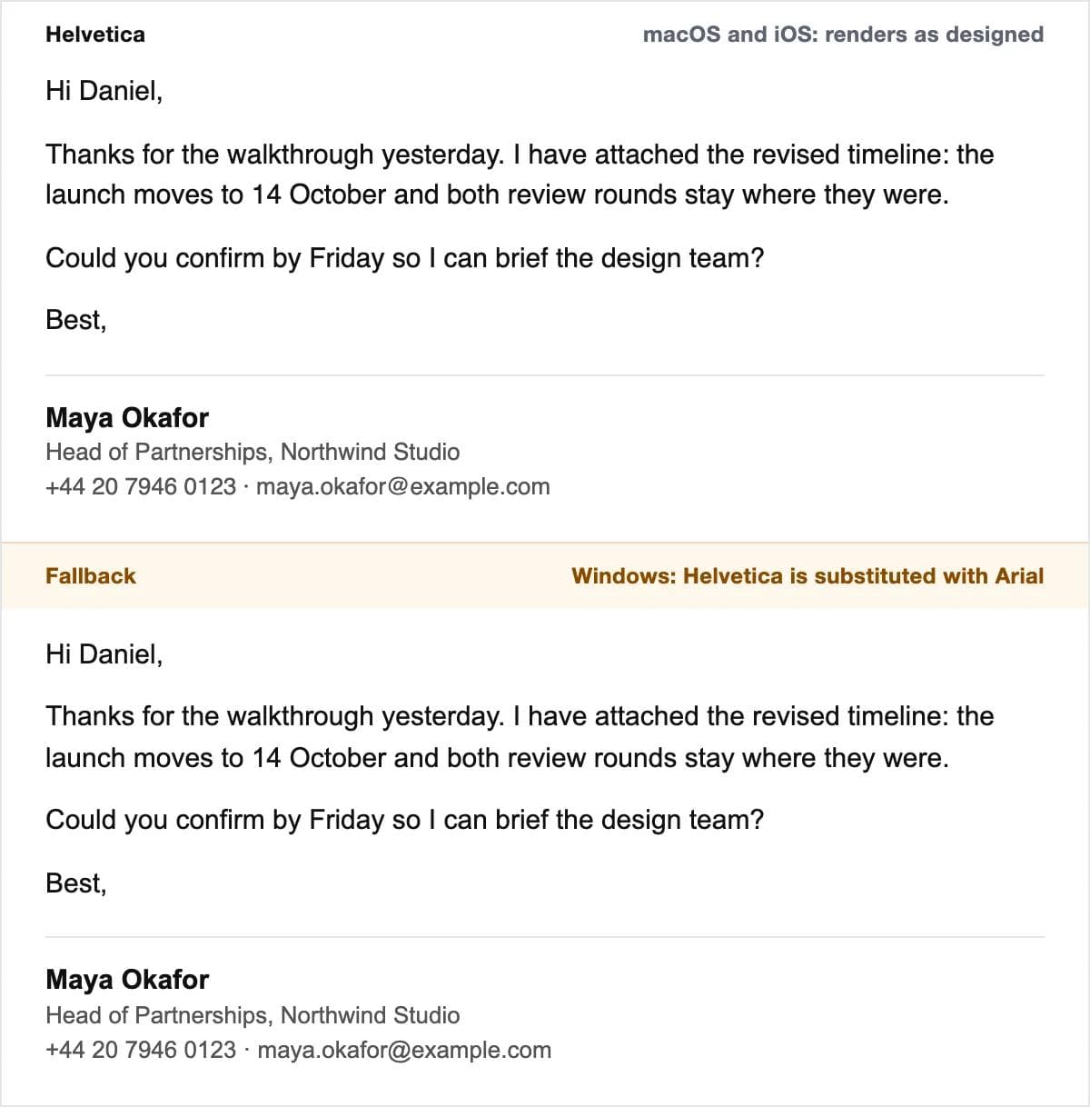
Helvetica: the Apple default that degrades cleanly
The Mac and iPhone default. Windows substitutes Arial, which is close enough in proportion that line breaks barely move. Put Arial second in the stack so the substitution is explicit.
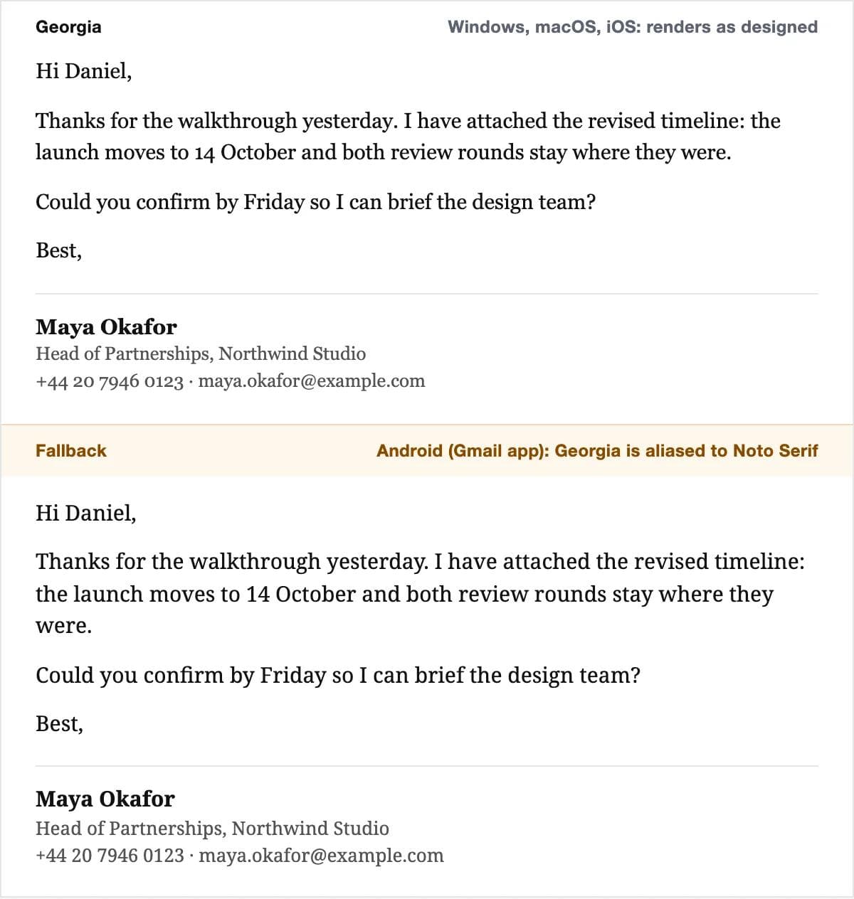
Georgia: the serif for newsletters
Drawn for screens, with a tall x-height that keeps it readable at 15 px where Times New Roman looks thin. On Windows, macOS and iOS. Android reads it as Noto Serif, a wider face, so a Georgia newsletter runs a line or two longer there.
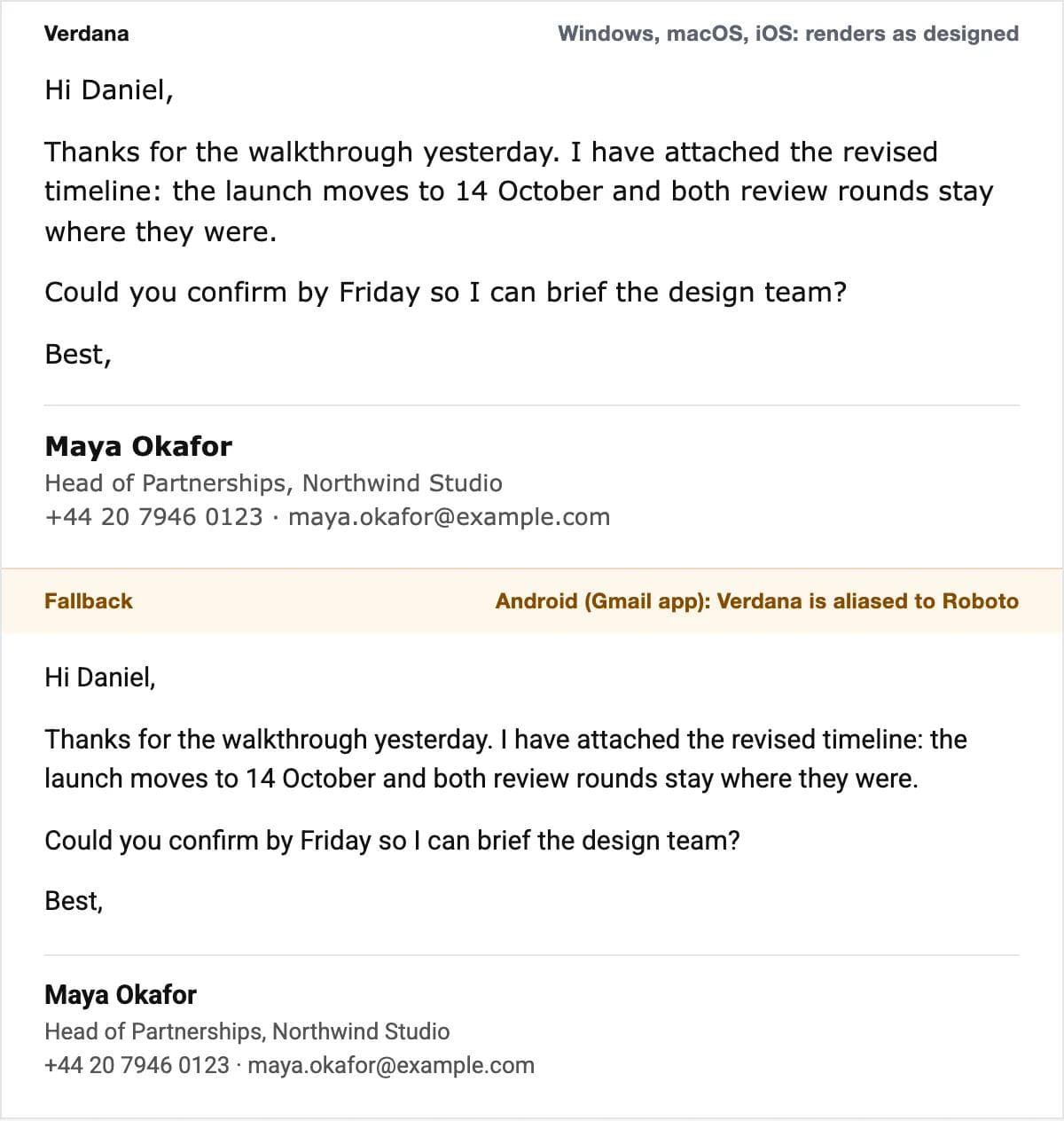
Verdana: the largest safe font
Built for low resolution screens with the biggest lowercase of any safe font, so it can drop to 14 px and still read. It is wide, so a 600 px column holds fewer words per line. Good for accessibility-first newsletters.
Trebuchet MS: the safe sans with some character
Narrower than Verdana, with a distinctive lowercase g. On Windows, macOS and iOS. It has no Android alias, so end its stack with sans-serif or Android falls back to its serif default.
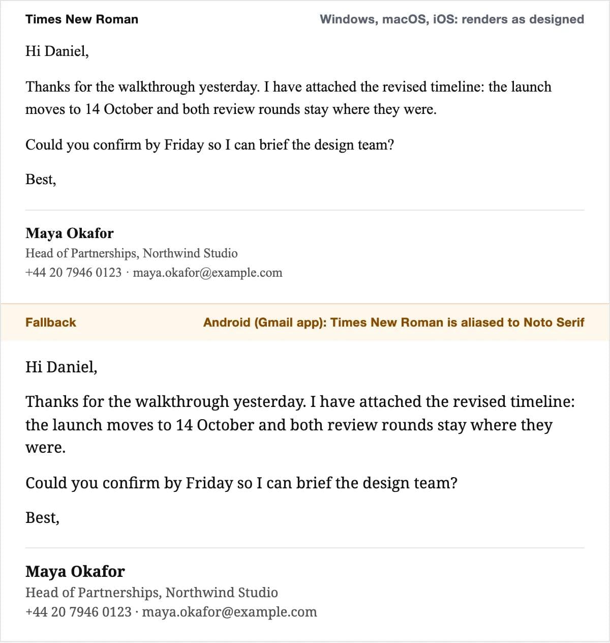
Times New Roman: the fallback to choose on purpose
On every desktop and iPhone, Noto Serif on Android, and what Outlook shows when a web font declaration goes wrong. At 16 px it is a respectable formal serif; at 14 px it is too thin. Use it deliberately rather than by accident.
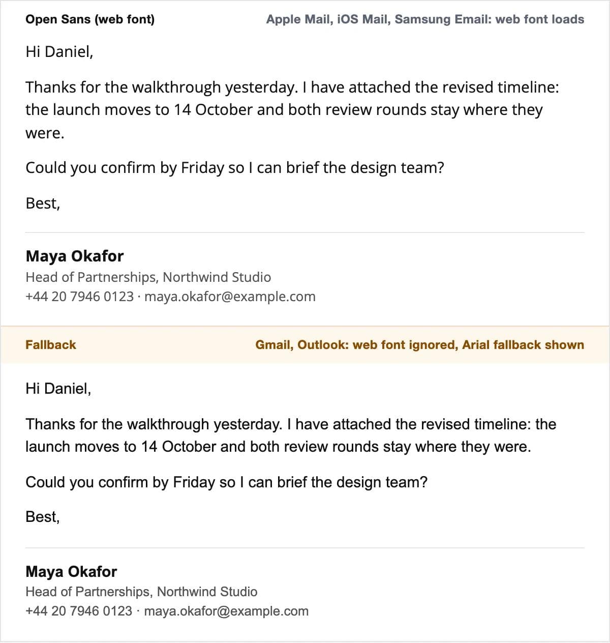
Open Sans: a web font over Arial
Open Sans is a humanist sans serif by Steve Matteson under the Open Font License and the most common web font in newsletters. Declare it with @font-face, list Arial after it, and Apple Mail readers get Open Sans while Gmail and Outlook readers get Arial. The widths are close enough that the layout holds.
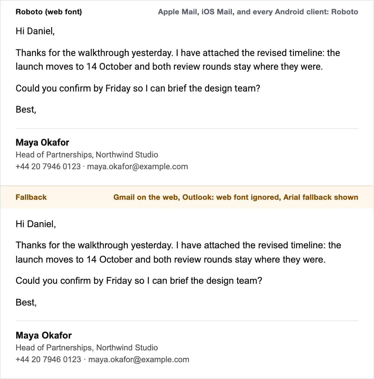
Roboto: the web font Android already has
Roboto is Android's own sans-serif, so every Android reader sees it natively, Apple Mail loads it as a web font, and Gmail on the web and Outlook show Arial from the stack. It is the one web font that reaches most of a consumer list as designed, and its metrics are close to Arial's, so the fallback reflows little.
Tahoma is left out on purpose. It is on Windows and macOS and Gmail offers it, but iOS lists it as downloadable rather than installed, so an iPhone shows the next font in your stack, or the system's Helvetica if the stack ends in sans-serif. Use it only with Verdana behind it.
Comparison table
| Font | Windows | macOS and iOS | Android | Gmail, Outlook, Apple Mail | Fallback to list | Best for |
|---|---|---|---|---|---|---|
| Arial | Yes | Yes | No; aliased to Roboto | All render it | sans-serif | Work email default |
| Helvetica | No; substituted with Arial | Yes | No; aliased to Roboto | All render it or Arial | Arial, sans-serif | Newsletters, Apple-heavy lists |
| Georgia | Yes | Yes | No; aliased to Noto Serif | All render it | 'Times New Roman', serif | Reading newsletters |
| Verdana | Yes | Yes | No; aliased to Roboto | All render it | Tahoma, sans-serif | Accessibility, small screens |
| Tahoma | Yes | macOS yes; iOS downloadable only | No; aliased to Roboto | All except iOS Mail | Verdana, sans-serif | Windows-heavy internal mail |
| Trebuchet MS | Yes | Yes | No alias; generic family | All render it | sans-serif | Friendly sans without a web font |
| Times New Roman | Yes | Yes | No; aliased to Noto Serif | All render it | serif | Formal register; Outlook's own fallback |
| Open Sans (web) | Install only | Install only | Install only | Apple Mail and iOS Mail load it; Gmail and Outlook show the fallback | Arial, sans-serif | Newsletters, with Arial behind it |
| Roboto (web) | Install only | Install only | Yes, the system font | Android and Apple Mail show it; Gmail web and Outlook show Arial | Arial, sans-serif | Consumer newsletters |
Availability columns come from Microsoft's Windows 11 list, Apple's macOS Tahoe and system fonts pages, and the Android fonts.xml aliases linked above; the client column is Can I Email's @font-face data as of August 2026.
One default for work email, one for newsletters
Work email and your signature: Arial, at the client's default size. Leave Gmail on Sans Serif and set Outlook to Arial 11 so a Mac reader does not see a substitute for Aptos. Build the signature as text in the same font, name in bold, details one size smaller in dark grey. Put the logo in as a small image and nothing else; a signature made of one big picture disappears when images are blocked, and every reply quotes it again.
Newsletters: `Helvetica, Arial, sans-serif` at 16 px with 24 px line height, or Georgia if the register is editorial. Add Open Sans or Roboto in front of that stack with @font-face and mso-font-alt if your list skews to Apple and Android readers, and test one send in Outlook for Windows before you trust it. Keep to one family for body and headings and use weight and size for hierarchy.
Where a graphic belongs, the sizes are conventions rather than rules. Email bodies are built to 600 pixels wide, so a header is commonly 600 by 200 pixels supplied at double resolution; the email header size guide explains where those numbers come from. That header, a banner, or the logo for your signature is what you would design in Moda and export as a PNG. Moda does not send email or change the font in Gmail or Outlook; those settings live in the clients, at the paths above, and the text inside the email should stay live text in the stack you chose. The same reasoning applies to a deck that leaves your machine, which our presentation fonts guide covers for PowerPoint, Slides and Keynote.
Frequently asked questions
What font is best for professional emails?
Arial, at your mail client's default size. It is installed on Windows, macOS and iOS, Android maps it to Roboto without changing the layout, and every email client renders it. If you prefer a serif, Georgia is on the same three platforms and reads well at 15 to 16 pixels.
What is the most popular font in emails?
The client defaults: Arial in Gmail (its Sans Serif setting), Aptos in current Outlook and Calibri in older versions, and Helvetica in Apple Mail. Most work email goes out in whichever of those the sender never changed. Newsletters lean on Arial and Helvetica stacks because Gmail and Outlook do not load web fonts.
Should email font be 11 or 12?
For a work email, keep the client's default, which is 11 point in Outlook and Normal in Gmail. For a newsletter, 15 to 16 pixels (11 to 12 point) with a line height of about 1.5 is comfortable on a phone. Do not go below 14 pixels for body text.
What is the best font for an email signature?
The same font as the body, usually Arial: name in bold at 14 to 15 pixels, details at 13 pixels in dark grey. A script or display font is substituted on most recipients' machines. Keep the logo as a small image and everything else as text.
What is the 3 font rule?
A design habit, not a standard: no more than three typefaces in one piece, one each for headings, body and accents. In email, one family is safer, because each one you add is another chance for a substitution on the recipient's device.
What is the most visually pleasing font for email?
There is no measured answer. Helvetica and Georgia are the two people usually mean, and both are safe: Helvetica falls back to Arial on Windows and Roboto on Android with almost no reflow, and Georgia is installed everywhere except Android.
Can I use Google Fonts in email?
Yes, but only Apple Mail, iOS Mail, Samsung Email and a few smaller clients load them; Gmail, Outlook and Yahoo show your fallback. Declare the font with @font-face rather than a link tag so Outlook for Windows does not drop to Times New Roman, and list Arial or Georgia after it.

Real editable visuals. Real canvas. Full control.
Fly through design work