Best Fonts for Websites: 8 Picks Tested at 16 px on a Phone, Measured for Load Size
The best fonts for websites pass three tests: they read at 16 px on a phone, they load in under 50 KB, and they fit the site. Eight Google Fonts measured, with sizes and one default per site type.
 Anvisha Pai, Co-founder & CEO, Moda
The best font for most websites is Inter for both headings and body text, set at 16 px with a line height of 1.5 for paragraphs and 32 px for the main heading on a phone. It reads well at small sizes, one 48 KB file covers every weight from thin to black, and it looks like the products people already trust. If Inter feels too familiar, DM Sans or Plus Jakarta Sans give the same reliability with more character. If the site is about words rather than a product, use Lora.
That is the answer. The rest is the reasoning, so you can choose something else with confidence. A website font has to pass three tests: it has to read on a phone at 16 px, it has to load without hurting the page, and it has to fit what the site is for. Most font advice is a list of pleasant names. The names matter less than the tests, and the tests can be measured.
What font looks good on a website
A font looks good on a website when the body text is easy to read at 16 px on a phone and the headings have a heavy weight that sits well above it. The eight fonts below are shown in the same landing section at 390 px wide so you can judge that directly. The three tests, in order:
- Does it read at 16 px on a phone? How tall the lowercase letters are, how open the shapes are, how wide it sets, and whether it has a real bold.
- Does it load without hurting the page? How many files, how big, and what the browser shows while it waits.
- Does it fit the register? A bookkeeping tool, a photographer and a bakery should not share a font by default.
Test 1: does it read on a phone at 16 px
x-height. The height of the lowercase letters as a fraction of the font size, read from each font's own metrics table. Merriweather 0.555, Poppins 0.548, Inter 0.546, Plus Jakarta Sans 0.536, Open Sans 0.535, Roboto 0.528, DM Sans 0.526, Lora 0.500. Arial is 0.519 and Georgia 0.481 for comparison. Anything above about 0.52 reads comfortably at 16 px. Lora, at 0.500, is happier at 17 or 18 px.
Width. On a 390 px screen with 20 px of padding either side, a line is 350 px. Setting one 140-character sentence at 16 px, Roboto and Arial come out the same width; Open Sans, DM Sans, Plus Jakarta Sans and Lora are 5 percent wider; Inter 7 percent; Merriweather 8 percent; Poppins 13 percent. That is about 50 characters a line for Roboto and 44 for Poppins. Both are fine for short paragraphs. For long ones, keep Poppins for headings.
Weight range. Headings need a weight clearly heavier than the body, and a button label needs one in between. Every font below has 400, 600 and 700. Lora stops at 700; the others reach 800 or 900, which is more than a website needs.
The size and line-height recipe
| Element | Phone (390 px) | Desktop (1200 px and up) | Line height | Weight |
|---|---|---|---|---|
| Body paragraph | 16 px (17 to 18 px for Lora) | 16 to 18 px | 1.5 | 400 |
| H1 | 32 px | 48 to 56 px | 1.1 to 1.15 | 700 |
| H2 | 24 px | 32 px | 1.2 to 1.25 | 700 |
| Button and label | 16 px | 16 px | 1 | 600 |
| Small text and captions | 13 to 14 px | 13 to 14 px | 1.4 | 400 |
Never go below 12 px for anything a visitor is meant to read. Google's Lighthouse flags a page as illegible when less than 60 percent of its text is 12 px or larger, and 12 px is already too small for a paragraph. On desktop, cap paragraph width at about 65 ch so lines stay between 45 and 75 characters.
Test 2: does it load without hurting the page
A web font is a file the visitor downloads before your text appears in it. Three decisions set the cost.
Where the file comes from
System font stack. A stack such as system-ui, -apple-system, Segoe UI, Roboto, Helvetica, Arial, sans-serif downloads nothing. The visitor sees their device's own interface font: San Francisco on an iPhone, Roboto on Android, Segoe UI on Windows. Fastest possible, and your site looks slightly different on every device. "Web safe fonts" are the older version of the same idea: Arial, Georgia, Verdana, Times New Roman and Trebuchet MS ship with both Windows 11 and macOS.
Google Fonts from Google's servers. One link tag. Google sends the smallest file the browser supports and only the latin subset to an English visitor. The old argument that visitors already have the font cached from another site is gone: Google's own FAQ says that benefit "is no longer true", because browsers stopped sharing cached files between sites (Chrome from version 86). What remains is one extra connection and a request to Google, which matters if your privacy policy says it does not happen.
Self-hosted. Download the woff2 files, put them on your server, write the @font-face rules. No third party, no data to Google. The SIL Open Font License on every font here allows it; Google's FAQ confirms they are free to use and redistribute commercially. The cost is maintenance, and most site builders will not let you do it unless they do it for you.
How many files you are really downloading
We requested the latin subset of each font from Google Fonts with a Chrome user agent and recorded the bytes. One weight of Inter is 24 KB. Ask for two weights, or three, or the whole range from 100 to 900, and Google sends a single 48 KB variable font file. The same happens for every variable family in the table: Roboto, Open Sans, DM Sans, Plus Jakarta Sans, Lora and Merriweather. A variable font holds every weight in one file, so the third weight costs nothing once you have two. Request the weights you use, and stop worrying about adding a 600 for buttons.
Poppins is the exception here. It is a static family, so each weight is its own file of about 8 KB; regular and bold together are 16 KB, the smallest two-weight download in the list. Italics are a separate file for every family, so request them only if the site uses italics.
A whole site's type should fit in about 50 KB: one variable sans, or a sans plus a serif for headings. Merriweather's 98 KB is fine for a publication and heavy for a landing page.
What the browser shows while it waits
Every @font-face rule takes a font-display value. MDN defines them: block hides text briefly, then shows the web font; swap shows the fallback at once and swaps when the font lands; optional uses the web font only if it arrives almost instantly. Google Fonts' link tag uses swap. Google's performance guidance calls optional the most efficient because text can never jump, at the cost of a first visit sometimes in the fallback font. For a small business site, swap is right. Make the fallback a system font of similar width so the swap is not a jolt: Arial behind the sans serifs here, Georgia behind Lora and Merriweather.
Test 3: does it fit the register
One default per register, with a second choice if the default is too familiar.
- SaaS, startup and product sites: Inter. If every competitor already uses it, DM Sans.
- Portfolio and studio sites: Plus Jakarta Sans for a clean modern look; Lora if the work is photography or writing and you want warmth.
- Local business (trades, clinics, restaurants, salons): Poppins headings over Open Sans body. Roboto under Poppins if Open Sans feels dated.
- Editorial, blog and long-form: Lora at 18 px, or Merriweather at 17 px for a heavier, more traditional page. Inter or Source Sans 3 for navigation and buttons.
The shortlist: eight fonts at phone width
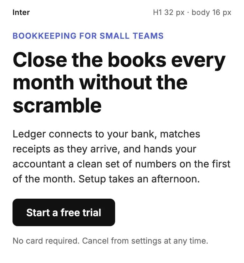
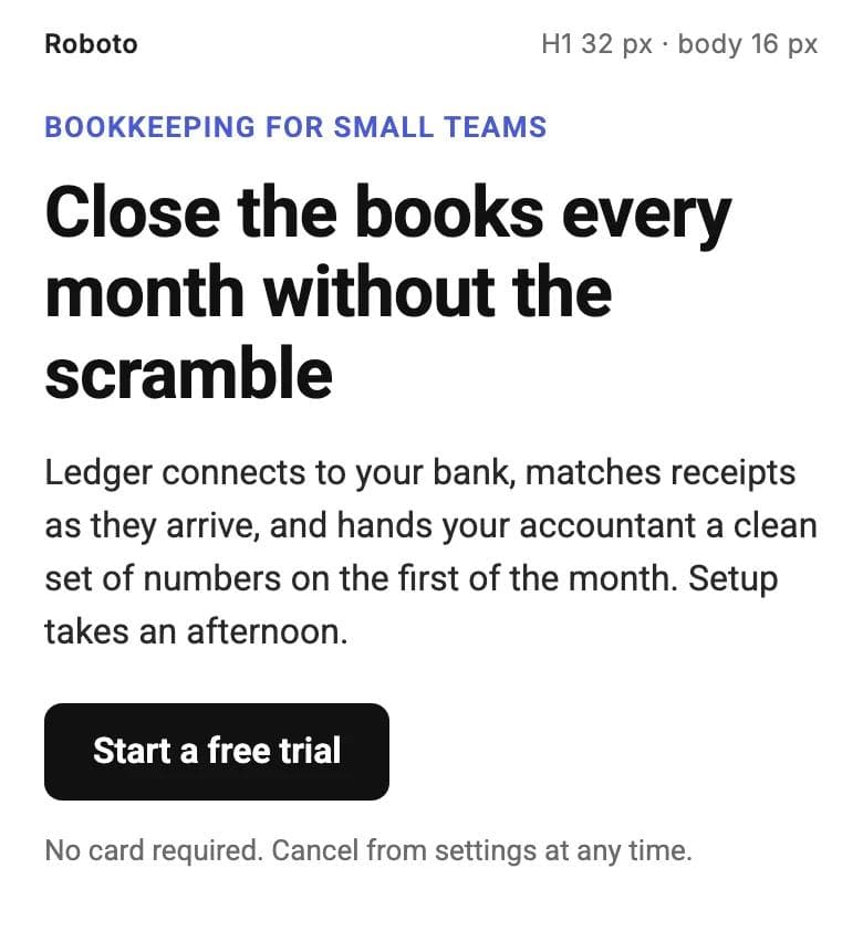
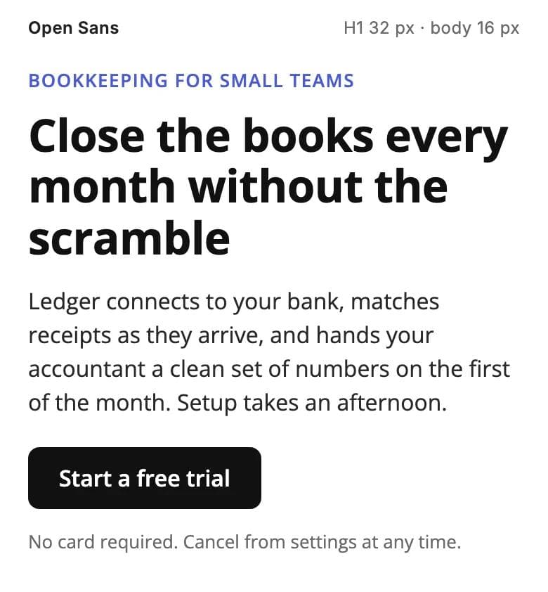
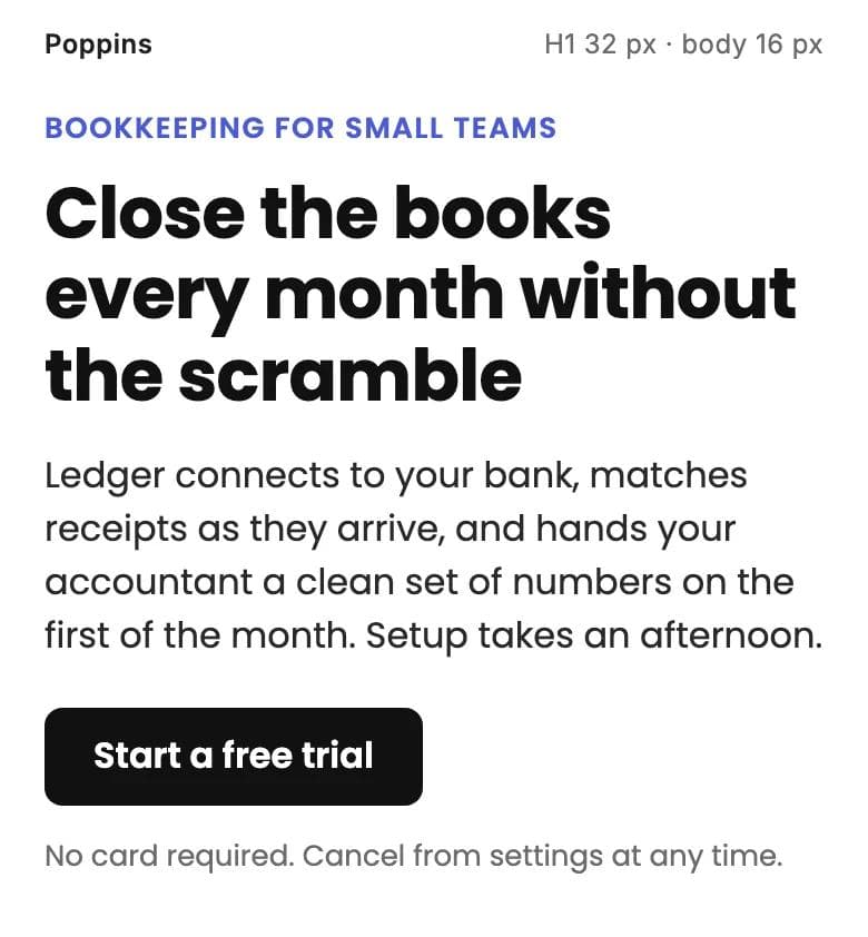
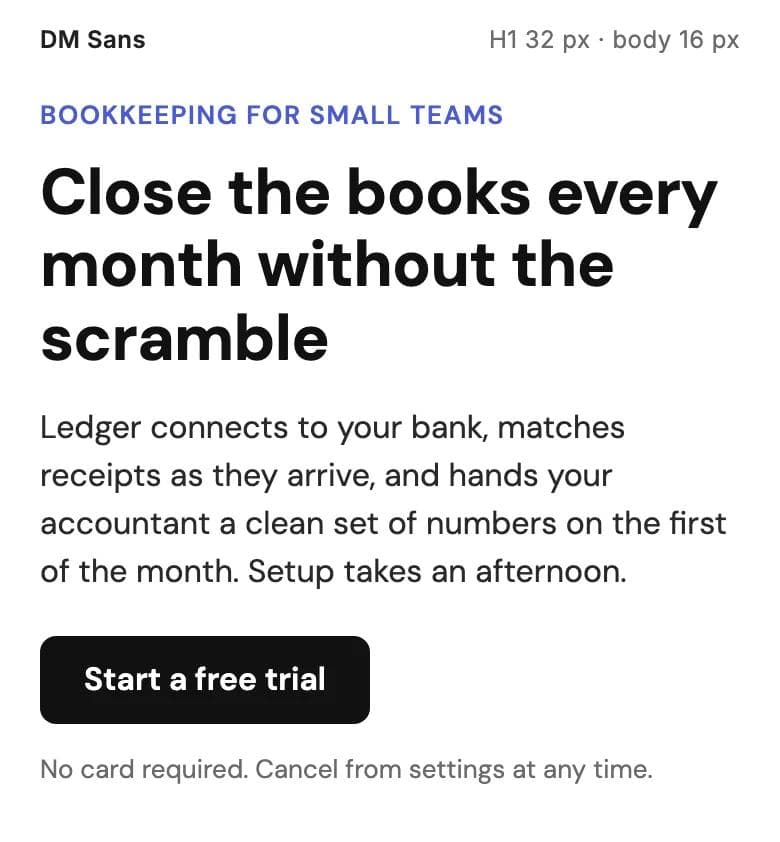
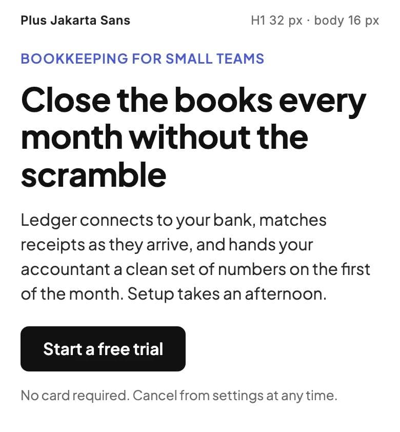
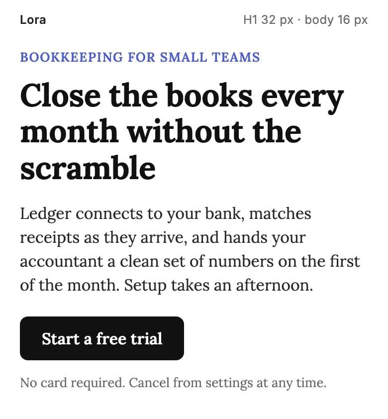
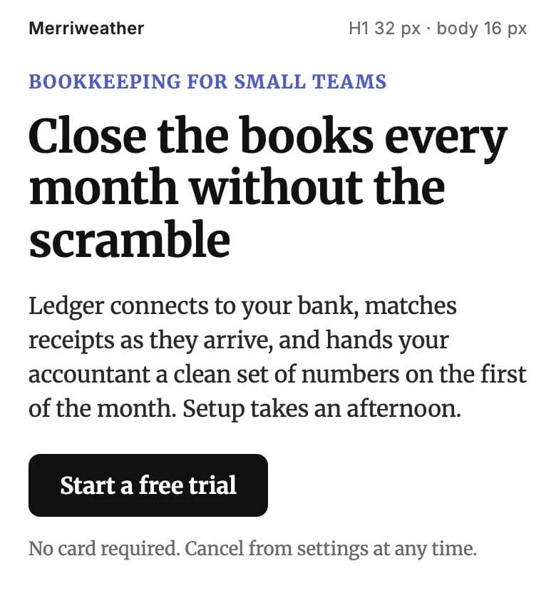
Each specimen is the same section at 390 px: a 32 px H1, a 16 px paragraph at 1.5 line height, a 16 px button. Bytes are the latin woff2 from Google Fonts on 9 September 2026. Every font is under the SIL Open Font License, checked in Google's font repository.
Inter: the default for anything that is a product
Inter was drawn for screens: tall x-height, open shapes, weights 100 to 900 with italics in one 48 KB variable file. At 16 px it runs about 46 characters a line on a phone. It reads as neutral and current, and that is also its weakness: a great many product sites use it. Pairing: Inter alone, or Inter body under Playfair Display headings.
Roboto: the plain one
Roboto is the Android system font and sets the same width as Arial, the narrowest here. Weights 100 to 900 with italics, one 38 KB variable file. Unfussy to the point of anonymous, which suits a site where the content carries the personality. Pairing: Roboto body with Roboto Bold or Roboto Slab headings.
Open Sans: the safe body font
Open Sans has been a default web body font since 2011 for good reason: large x-height, wide apertures, a steady rhythm at small sizes. Weights 300 to 800 with italics; one weight is 13 KB, the variable file 43 KB. Its headings are competent rather than memorable, so it is usually the body half of a pairing. Pairing: Poppins or Montserrat headings over Open Sans.
Poppins: the friendly heading font
Poppins is geometric and round, with a big x-height and the widest setting here. The width and the round shapes are why it is a heading font first: at 16 px a paragraph runs about 44 characters a line and reads soft. Static family, about 8 KB per weight, 16 KB for regular and bold. Pairing: Poppins SemiBold headings over Open Sans or Roboto body.
DM Sans: Inter with more personality
DM Sans is a low-contrast geometric sans with slightly quirky letterforms that stop it looking generic. Weights 100 to 1000 with italics, one 37 KB variable file with an optical size axis that tightens headings automatically. Reach for it when Inter is the obvious choice and you want to be one step from obvious. Pairing: DM Sans throughout, or DM Sans headings over Inter body.
Plus Jakarta Sans: the modern portfolio default
Plus Jakarta Sans has a tall cap height that makes headings feel poised and the smallest variable file of the sans serifs here, 27 KB for weights 200 to 800. It is common on studio and agency sites, so it signals care about appearance without shouting. Pairing: Plus Jakarta Sans headings over Inter or Open Sans body, or alone.
Lora: the serif for sites about words
Lora is a calligraphic serif with moderate contrast that stays crisp on screens. Its x-height is the lowest here, so set body at 17 or 18 px; at 18 px expect about 42 characters a line on a phone, which is right for reading. Weights 400 to 700 with real italics, one 38 KB variable file. Pairing: Lora for body and headings, Inter or Source Sans 3 for navigation and buttons.
Merriweather: the heavier reading serif
Merriweather was designed to be read at small sizes on screens: the largest x-height in the list, sturdy serifs, an even dark texture. Weights 300 to 900 with italics. It is also the heaviest download, 49 KB for one weight and 98 KB for the variable file, because it carries width and optical size axes. Worth it for a publication; not for a five-section landing page. Pairing: Merriweather body with Inter or Open Sans headings and labels.
Comparison table
Sans serifs first, then the two serifs. x-height is read from each font's metrics table as a fraction of the font size. Width is one sentence at 16 px relative to Arial.
| Font | Weights | Variable | Latin woff2: one weight / all | x-height | Width vs Arial | Best for |
|---|---|---|---|---|---|---|
| System font stack | Device dependent | n/a | 0 KB | varies | 100 to 102% | Speed above all |
| Inter | 100 to 900 + italic | Yes | 24 KB / 48 KB | 0.546 | 107% | SaaS, product, startup |
| Roboto | 100 to 900 + italic | Yes | 16 KB / 38 KB | 0.528 | 100% | Plain sites, dense text |
| Open Sans | 300 to 800 + italic | Yes | 13 KB / 43 KB | 0.535 | 105% | Body under a heading font |
| Poppins | 100 to 900 + italic | No | 8 KB / 16 KB for two | 0.548 | 113% | Local business headings |
| DM Sans | 100 to 1000 + italic | Yes | 14 KB / 37 KB | 0.526 | 105% | Product sites, less like Inter |
| Plus Jakarta Sans | 200 to 800 + italic | Yes | 12 KB / 27 KB | 0.536 | 105% | Portfolio, studio, agency |
| Lora | 400 to 700 + italic | Yes | 21 KB / 38 KB | 0.500 | 105% | Editorial, photography, writing |
| Merriweather | 300 to 900 + italic | Yes | 49 KB / 98 KB | 0.555 | 108% | Long-form reading |
Three questions people also ask
What is the 3 font rule
The rule says a site should use no more than three typefaces. It is a heuristic, mostly right for the wrong reason. The real constraints are roles and files. A site has about three text roles: headings, body, and labels or code. One typeface per role is the ceiling, and most sites need two because the body font can do labels. The rule fails both ways: three typefaces at three weights each is nine files and a slow page, while one variable font at 400, 600 and 700 is one file covering all three roles. Count roles and files, not typefaces.
What is the most attractive font for a website
There is no measured answer, and attractiveness on a website comes more from size, spacing and heading weight than from the typeface. Among fonts that pass the three tests, the ones people usually mean are Inter, DM Sans and Plus Jakarta Sans for a modern look and Lora or Playfair Display headings for an elegant one. Set any of them to the recipe above and it will look attractive. Set a beautiful font at 14 px with tight leading and it will not.
What is Gen Z's favorite font
Nobody has surveyed this in a way that would answer it, so treat any confident answer as a guess. What we can offer is observational. Sites and brands aimed at people under 30 in 2026 lean on wide, slightly odd grotesques such as Space Grotesk and Bricolage Grotesque, on display serifs such as Instrument Serif and Fraunces set very large, on monospace and pixel faces, and on plain Times New Roman or Arial as a deliberate anti-design gesture. Google Fonts' own popularity ordering still puts Roboto, Open Sans, Inter, Montserrat, Lato and Poppins at the top, and those are what most sites for any age group use.
Where Moda fits, and where it does not
Moda builds and hosts websites at *.moda.page from a chat brief, and we read its website code rather than guessing how it handles type. A published Moda site may load fonts from two places only: its own address and Google Fonts. Fonts outside your brand kit come from Google Fonts with a link tag. Fonts you upload to a brand kit are self-hosted at publish: Moda stores each weight the site uses on the site itself and writes an @font-face rule with font-display: swap. Moda's canvas font library is built from the Google Fonts catalog, so a font you pick for a deck is available for the site under the same name.
One instruction in Moda's website agent is worth knowing: unless your brand kit names them, it avoids Inter, Roboto, Open Sans, Lato, Montserrat, Poppins, Raleway, Oswald, Nunito and Playfair Display. That is a deliberate push away from the most common choices, five of which are in this article. If you want Inter on a Moda site, put it in the brand kit or ask for it by name.
Moda is not the answer if you already have a site on WordPress, Squarespace or Wix and only want to change the fonts. Each has a site-wide styles or theme panel where heading and body fonts are set once; WordPress block themes do it in the Styles panel of the Site Editor. That takes minutes. Do that rather than moving a working site.
For a deck rather than a site, the tests differ; our presentation fonts guide covers them. Canva users can find these same Google Fonts under Canva's names in our Canva font pairings guide. For the builder itself, see the best AI website builders by site type.
Choosing quickly
Pick Inter unless you have a reason not to. If the reason is that every product site uses Inter, pick DM Sans or Plus Jakarta Sans. For a restaurant, a clinic or a trade, put Poppins on the headings and Open Sans under it. If people come to read, pick Lora at 18 px. Set body at 16 px with 1.5 line height and the H1 at 32 px on a phone, request only the weights you use, leave font-display on swap, and check the site on a real phone before you call it done.
Frequently asked questions
What is the best font for a website?
Inter, for most sites: it reads well at 16 px on a phone, one 48 KB variable file covers every weight, and it suits product and business sites. Use DM Sans or Plus Jakarta Sans if Inter is too common, Poppins over Open Sans for a local business, and Lora or Merriweather for a site people come to read.
What font looks good on a website?
Any font with a large x-height and a real bold, set at 16 px for body text with 1.5 line height and 32 px for the main heading on a phone. Inter, Roboto, Open Sans, DM Sans and Plus Jakarta Sans all pass; Lora and Merriweather are the serifs that do.
What is the 3 font rule?
A heuristic that says a site should use at most three typefaces. It holds because a site has about three text roles: headings, body, labels. It fails when three typefaces mean nine files, and it is unnecessary when one variable font covers all three roles in one file. Count roles and files, not typefaces.
What is the most attractive font for a website?
There is no measured answer. Attractiveness comes from size, spacing and heading weight more than from the typeface. Among fonts that read well and load fast, Inter, DM Sans and Plus Jakarta Sans for a modern look; Lora or Playfair Display headings for an elegant one.
What is Gen Z's favorite font?
There is no reliable survey. Observationally, sites aimed at younger audiences in 2026 use wide grotesques such as Space Grotesk and Bricolage Grotesque, large display serifs such as Instrument Serif, monospace and pixel faces, and deliberately plain Times New Roman or Arial. Google Fonts' popularity ordering still puts Roboto, Open Sans and Inter at the top.
What are web safe fonts?
Fonts installed on both Windows and macOS out of the box, so they render without a download: Arial, Georgia, Verdana, Times New Roman and Trebuchet MS. A system font stack that starts with system-ui gives the same zero-download result using each device's interface font.
How many font weights should a website load?
Usually two or three: 400 for body, 600 for buttons, 700 for headings. With a variable family from Google Fonts, asking for two or more weights returns one file that contains them all, so a third weight costs nothing. With a static family such as Poppins, every weight is a separate file of about 8 KB.

Real editable visuals. Real canvas. Full control.
Fly through design work