Best Fonts for YouTube Thumbnails: 8 Free Fonts Tested at Phone Size, and One Default
The best fonts for YouTube thumbnails are the ones that still read at 168 by 94 pixels. Eight free fonts rendered at 1280 by 720, shrunk to phone size, measured, and one default pick.
 Anvisha Pai, Co-founder & CEO, Moda
The best font for a YouTube thumbnail is Montserrat Black, set in capitals with a cap height of at least 120 pixels on the 1280 by 720 canvas, a black stroke behind the letters, and no more than about ten letters per line. If you need more letters on a line, use Oswald Bold. If you want the compressed newspaper look that fills so many feeds, use Anton, and accept that its O and D fill in at phone size. All three are free on Google Fonts.
That is the answer. The reasoning matters because a thumbnail is almost never seen at the size it was made. You design it at 1280 by 720; a viewer on a phone sees it at roughly 168 by 94, one fifty-eighth of the area. Every rule below comes from rendering the same title in each font at full size, shrinking it to the sizes YouTube displays, and measuring what survived.
How big a thumbnail really is
We measured the rendered thumbnails on youtube.com and m.youtube.com in a signed-out Chromium browser on 9 September 2026. These are CSS pixels; a phone with a 3x screen draws each one with nine device pixels, but the letter is the same physical size.
- Desktop, 1440 pixel wide window: 248 by 139 in the sidebar of a watch page, 347 by 195 in a channel's Videos grid, 500 by 281 in search results.
- Desktop, 1920 pixel wide window: 330 by 186 in the watch page sidebar, 420 by 236 in a channel grid.
- Phone, 390 pixel wide screen: 390 by 219 for a full-width result, 390 by 232 for the next video under the player, and 160 by 90 in the list rows on a channel's Videos tab.
The signed-out home page shows no feed, so the logged-in home grid was not measured. The 160 by 90 list row is the smallest size we saw and is within five percent of the 168 by 94 figure most creators test against, so this article uses 168 by 94 for the phone test and 248 by 139 for the desktop test.
The arithmetic that decides everything: 1280 divided by 168 is 7.6. A 12 pixel stroke on your canvas becomes 1.6 pixels on a phone. A 10 pixel gap between strokes becomes 1.3 pixels, which the downscaling filter closes. Thin fonts do not get thinner at phone size; they disappear.
The size recipe
Work in cap height, not point size. Point size is the height of an invisible box around the letters, and two fonts at the same point size can differ by 25 percent in the height of their actual capitals. Anton's capitals are 86 percent of its font size; League Spartan's are 67 percent.
The recipe, measured on the renders below:
- Minimum cap height: 120 pixels at 1280 by 720. That is 16 pixels at 168 by 94 and 23 pixels at 248 by 139. Every font in the shortlist was set to exactly this cap height for the tests, which means font sizes from 140 pixels (Anton) to 180 pixels (League Spartan).
- If you use lowercase, keep the x-height at 11 pixels at 168 wide, about 85 pixels on the canvas. The x-height of these fonts is 62 to 86 percent of the cap height, so lowercase is a fifth smaller for the same line. Set thumbnails in capitals unless the lowercase is the point.
- Two lines maximum. Two lines of 120 pixel capitals with a gap take about 270 pixels, over a third of the height.
- Letters per line: 10 to 21, depending on the font. At a 120 pixel cap height across the 1170 pixels left after margins, Archivo Black fits 10 letters and spaces, Montserrat Black 11, Poppins ExtraBold 12, Oswald Bold 17, and Anton and Bebas Neue 21. This is the real reason condensed fonts dominate thumbnails: they let you say twice as much at the same height.
Ten letters is not many; "NO COFFEE" is nine. If the phrase does not fit in two lines, shorten the phrase before you shrink the type.
Which weight survives
One font at three weights shows why thumbnail fonts are heavy. We rendered Montserrat at Regular, Bold and Black at the same 120 pixel cap height and measured the vertical stroke of the H after shrinking to 168 by 94.
- Regular (400): stroke 1.7 pixels. The black outline is doing most of the work and the text reads as grey.
- Bold (700): stroke 3.7 pixels. Readable.
- Black (900): stroke 5.4 pixels. Solid at every size we tested.
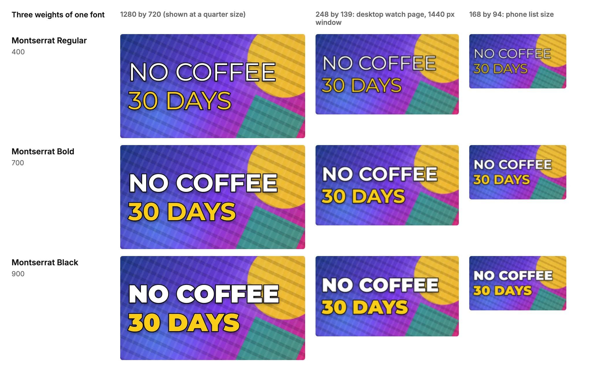
The rule of thumb that falls out: the main stroke of your letters should be at least 2 pixels wide at 168 by 94, so at least 15 pixels on the 1280 canvas. That rules out anything lighter than Bold, and it is why the fonts below are the Black, ExtraBold and display weights.
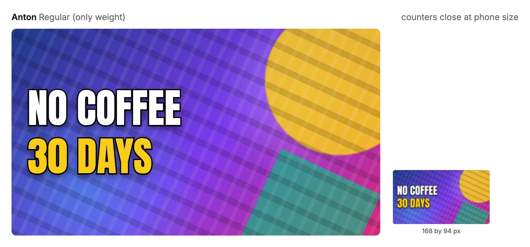
There is an opposite failure. Very heavy condensed fonts have tiny counters, the holes inside O, D, A and B. Anton's counter is 1.4 pixels at phone size; Impact's is 1.3. Both fonts still read as words on a phone because word shape carries them, but the O becomes a bar and 30 looks like 3O with a blob. Montserrat Black keeps a 6.9 pixel counter at the same size. If your titles are full of round letters and digits, that is a reason to pick a geometric font over a compressed one.
Stroke, shadow and busy backgrounds
A thumbnail's background is usually a face or a product photo, so the text lands on light and dark areas at once. White text alone vanishes over the bright parts, black over the dark parts. The fix is a dark outline behind light letters, and the measurement says how thick it has to be.
- Stroke: 7 percent of the font size, painted behind the fill. At a 170 pixel font size that is 12 pixels, which shrinks to 1.6 pixels at 168 by 94, just enough to separate the letter from anything behind it. Thinner strokes disappear at phone size. Thicker strokes start closing counters. If your tool paints the stroke centred on the letter's edge rather than behind it, halve the number, because half of it will eat into the letter.
- Shadow: soft, offset downward, about 6 percent of the font size. It does not need to read as a shadow; its job is to darken the pixels around the letter so the stroke has something to sit on.
- Colour: white and one saturated accent. Yellow on a dark background is the usual accent because it is nearly as bright as white and still reads as a colour. Red is risky over a face, because red and skin tones are close in brightness and the downscaling averages them together.
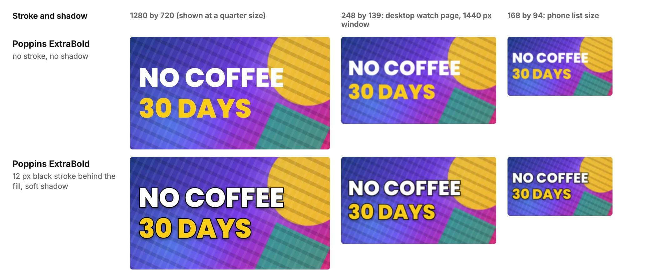
The shortlist: eight free fonts tested at 168 by 94
Every font here is on Google Fonts, free for commercial use, and in most design tools including Moda, whose font picker draws on the Google Fonts library. We rendered the same invented title in each at a 120 pixel cap height with the stroke and shadow above, then shrank the 1280 by 720 image to 248 by 139 and 168 by 94 with a high-quality filter. A font survives if its main stroke is at least 2 pixels and its counters at least 1.5 pixels at 168 by 94, and the small image reads without knowing what it says.
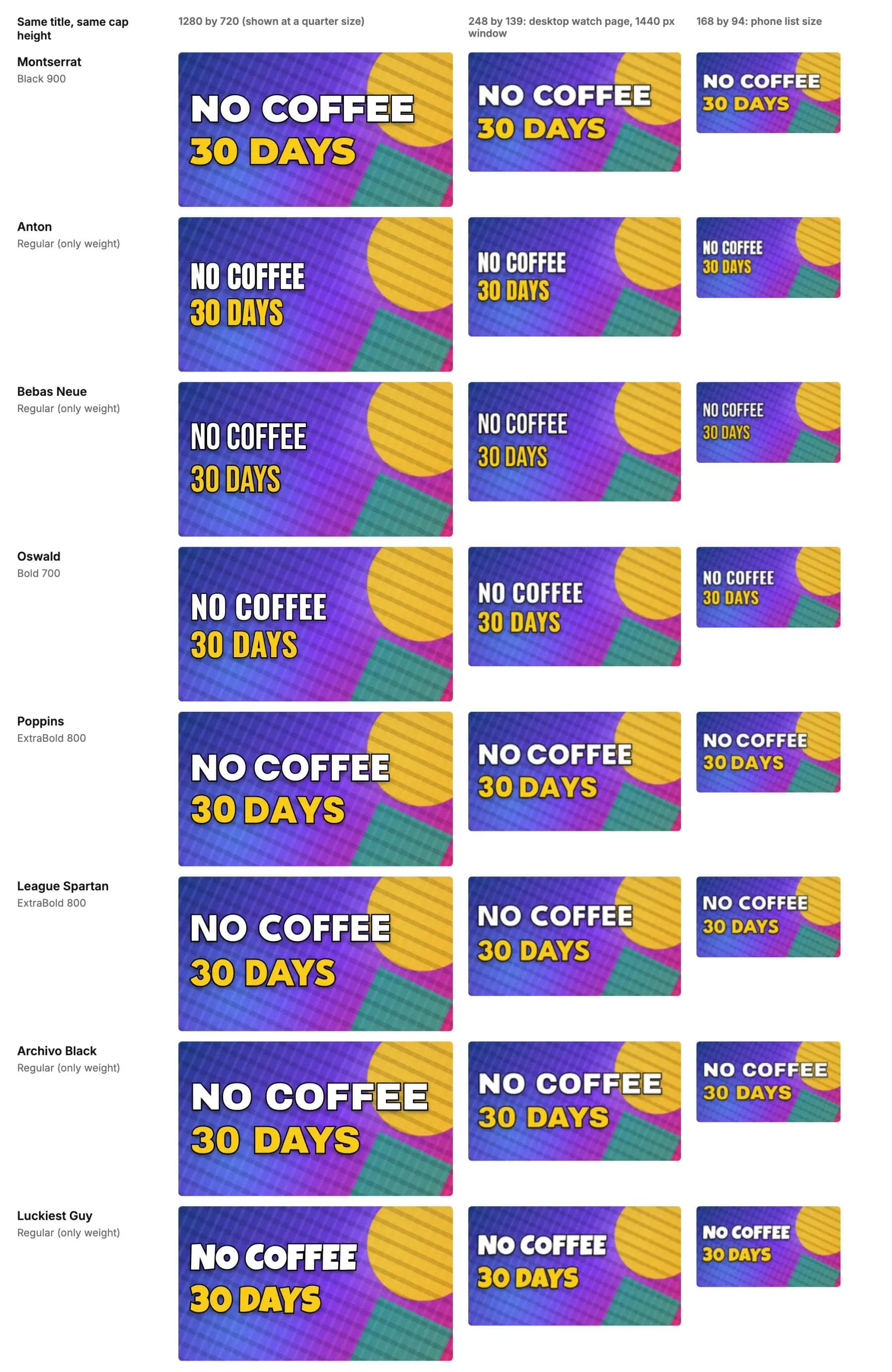
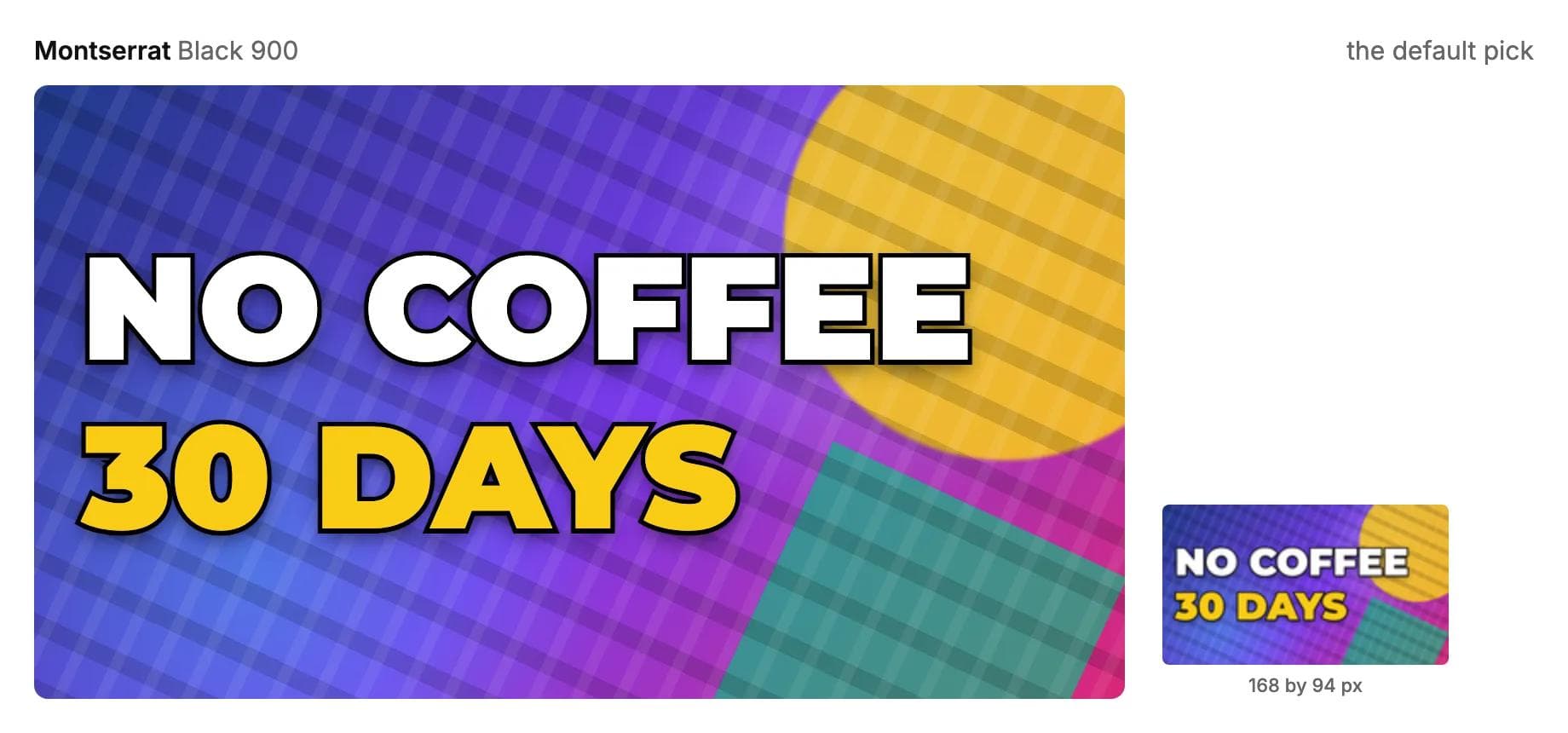
1. Montserrat Black (the default)
The default, and the one to start from if you have no house style. Montserrat Black has the thickest strokes in the geometric group (5.4 pixels at phone size) with counters wide enough (6.9 pixels) that digits and round letters stay open. The cost is width: 11 letters per line. Designed by Julieta Ulanovsky and others, SIL Open Font License, nine weights, so the same family can set your channel banner and end screens.
2. Anton
The free font with the compressed, heavy look most people picture when they think of a thumbnail. It fits 21 letters per line, twice Montserrat, and its capitals are the tallest here relative to font size, so it needs only 140 pixels to hit the cap height. The trade is counters: 1.4 pixels at phone size, so O, D and 0 fill in. It reads anyway, as word shapes, and it is the right choice when the title is long. By Vernon Adams, SIL Open Font License, one weight.
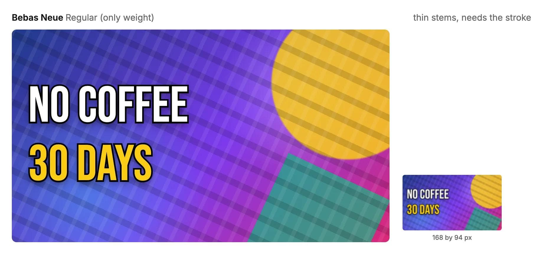
3. Bebas Neue
The cleanest condensed font, and it fits the most: 21 letters per line. It is lighter than Anton, with a 2.5 pixel stroke at phone size, right at the edge of the survival rule, so it depends on the black outline more than the others. Without it on a busy photo it goes; with it, it is crisp and even. Its lowercase is small capitals, so the case question does not arise. By Ryoichi Tsunekawa, SIL Open Font License, one weight.
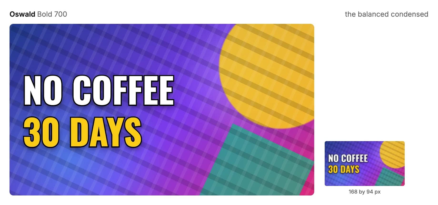
4. Oswald Bold
The balanced condensed font: 17 letters per line, a 3.6 pixel stroke and a 2.3 pixel counter at phone size, so it fits nearly as much as Anton while keeping round letters open. Six weights and a real lowercase make it the condensed choice for a channel that wants one family everywhere. By Vernon Adams, Kalapi Gajjar and Cyreal, SIL Open Font License.
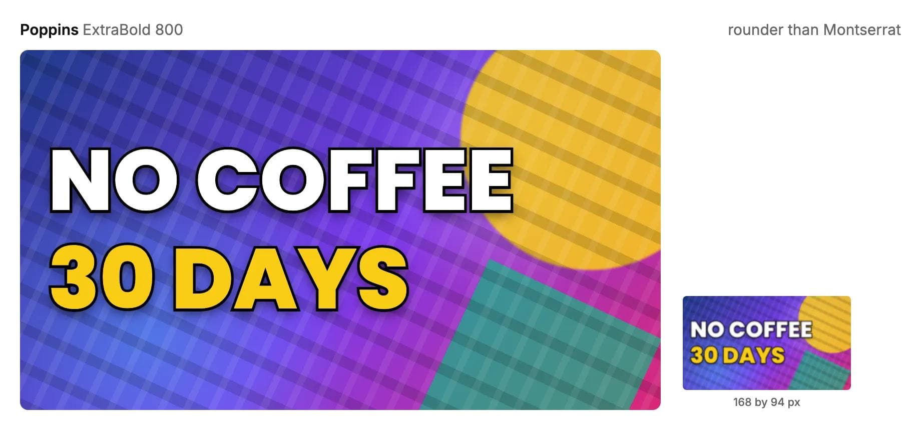
5. Poppins ExtraBold
Rounder and friendlier than Montserrat, with a 4.4 pixel stroke and 7.1 pixel counters at phone size. Twelve letters per line. The choice for education, kids, food and lifestyle channels where Montserrat looks corporate. By Indian Type Foundry, SIL Open Font License, nine weights.
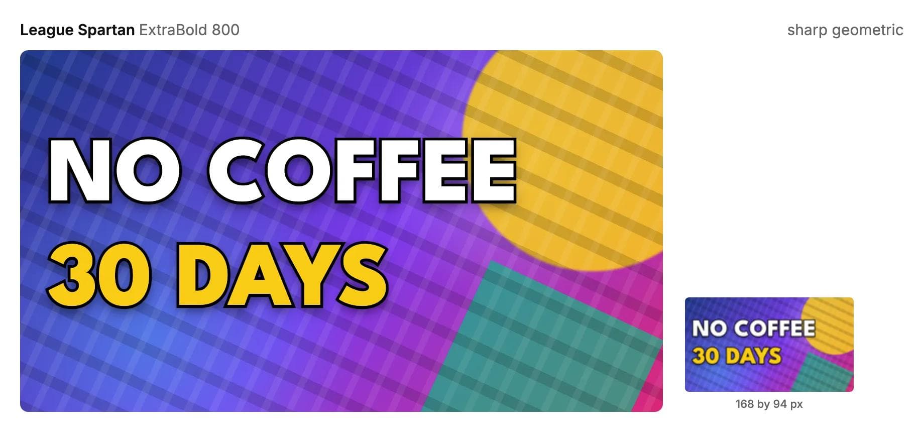
6. League Spartan ExtraBold
A sharper geometric with the widest counters in the test (7.6 pixels) and a 4.1 pixel stroke. Its capitals are short relative to the font size, so it needs 180 pixels to reach the cap height, and its lowercase is smaller still; keep it in capitals. Twelve letters per line. For tech, finance and design channels that want the geometric look without Montserrat's softness. By Matt Bailey and Tyler Finck, SIL Open Font License, nine weights.
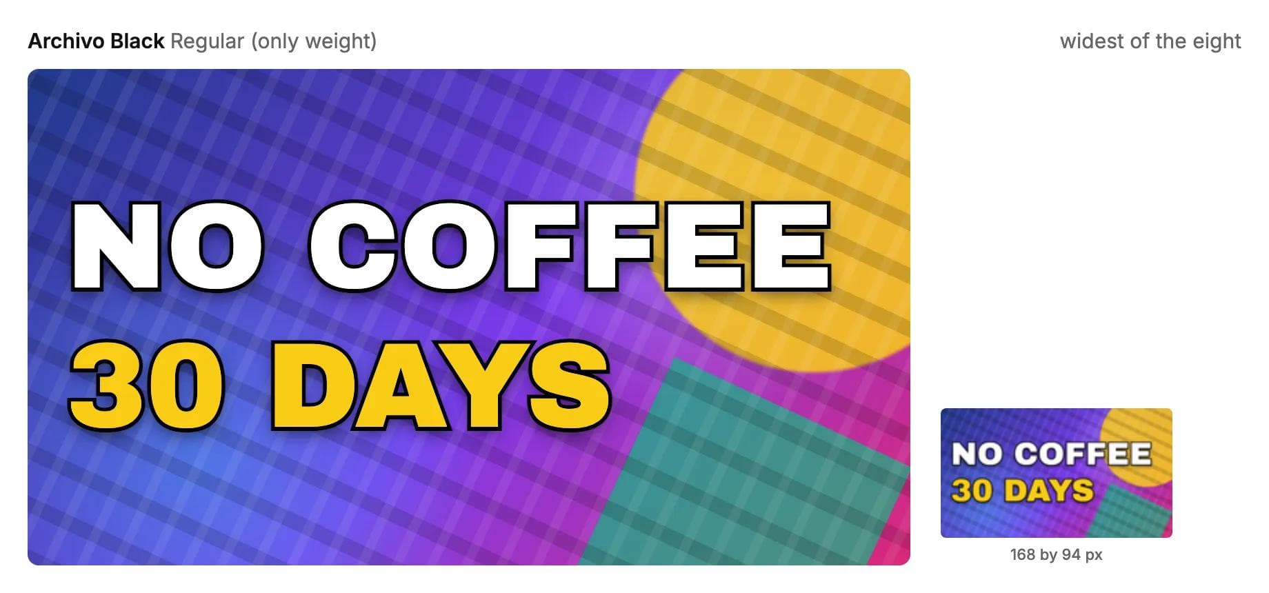
7. Archivo Black
The heaviest and widest font here: a 5 pixel stroke, 6.6 pixel counters, and only 10 letters per line. Use it for one or two words that carry the whole thumbnail, a number, a name, a reaction. It is the wrong font for a sentence. By Omnibus-Type, SIL Open Font License, one weight.
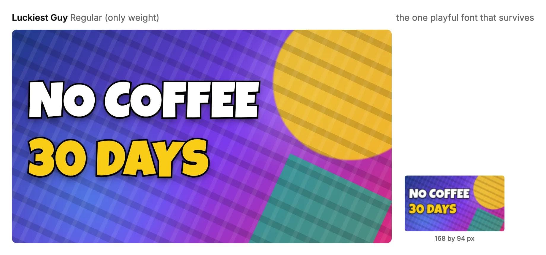
8. Luckiest Guy
The playful pick. Its comic-lettering shapes have a 5.1 pixel stroke and 4.2 pixel counters at phone size, and 14 letters fit on a line. It belongs on gaming, family and challenge channels and looks wrong on a tutorial. Bangers and Lilita One, the other free fonts in this style, also survived; Bangers is narrower and slanted, Lilita One rounder and quieter. Luckiest Guy is by Astigmatic under the Apache 2.0 license, also free for commercial use.
Comparison table
Cap height 120 pixels on a 1280 by 720 canvas, 7 percent stroke behind the fill. "Letters" is how many characters of a capitalised title fit in one line across 1170 pixels. Stroke and counter are measured at 168 by 94 after downscaling.
| Font | Weight used | Font size for 120 px caps | Letters per line | Survives at 168 by 94 | Licence | Best for |
|---|---|---|---|---|---|---|
| Montserrat | Black 900 | 170 px | 11 | Yes (stroke 5.4 px, counter 6.9 px) | SIL OFL | The default; business, tech, most channels |
| Anton | Regular | 140 px | 21 | Reads, counters close (3.2 / 1.4 px) | SIL OFL | Long titles, news, reaction, sport |
| Bebas Neue | Regular | 170 px | 21 | Yes with stroke (2.5 / 2.5 px) | SIL OFL | Long titles, fitness, travel, vlogs |
| Oswald | Bold 700 | 147 px | 17 | Yes (3.6 / 2.3 px) | SIL OFL | One family for everything, condensed |
| Poppins | ExtraBold 800 | 169 px | 12 | Yes (4.4 / 7.1 px) | SIL OFL | Education, food, lifestyle, kids |
| League Spartan | ExtraBold 800 | 180 px | 12 | Yes (4.1 / 7.6 px) | SIL OFL | Tech, finance, design |
| Archivo Black | Regular | 174 px | 10 | Yes (5.0 / 6.6 px) | SIL OFL | One or two words, numbers |
| Luckiest Guy | Regular | 168 px | 14 | Yes (5.1 / 4.2 px) | Apache 2.0 | Gaming, family, challenges |
| Impact (reference) | Regular | 151 px | 18 | Reads, counters close (4.2 / 1.3 px) | Ships with Windows and macOS | Meme style; not on Google Fonts |
Also measured and left out: Barlow Condensed ExtraBold (17 letters, 3.7 / 2.0 px) is an Oswald alternative with more weights; Fjalla One (20 letters, 2.4 / 2.7 px) is a warmer Bebas Neue; Russo One and Titan One survive but read as gaming and toy styles; Bangers and Lilita One are covered under Luckiest Guy.
What about Impact, and the fonts famous creators use
Impact is the font people mean when they say "the meme font". It ships with Windows and macOS, so it is in every editor without installing anything, and it fits 18 letters per line with a 4.2 pixel stroke at phone size. Its weakness is Anton's with less room: a 1.3 pixel counter, the smallest we measured, so round letters and digits fill in. If you already use Impact there is no measurable reason to switch; Anton is the closest free download.
On what specific creators use: identifying a font from a thumbnail is guesswork unless the creator has said so, because the 168 pixel image most people look at hides the details that tell fonts apart. The heavy comic-lettering style many large challenge channels use is served for free by Luckiest Guy, Lilita One and Bangers; the compressed newspaper style by Anton and Oswald. Copy the category, not the name.
Putting it together
Design at 1280 by 720. YouTube's help page accepts larger uploads and asks for a minimum width of 640 pixels, 16:9, JPG or PNG; the dimensions and file limits are on Moda's YouTube thumbnail size page. A larger file does not make text more legible on a phone, because the phone still shows 168 pixels of it.
The check that catches most problems: set the zoom in your design tool to 13 percent, which shows a 1280 canvas at 168 pixels wide. If you cannot read it there, nobody scrolling a feed will.
Moda makes the still image: a 1280 by 720 thumbnail preset, the Google Fonts above in the font picker, drop shadows, and PNG or JPG export. It is not a video editor; the cut, the end screen and the upload happen elsewhere, and the CapCut alternatives guide covers that choice. For a second font on a channel banner or lower third, the Canva font pairings post pairs Bebas Neue and Montserrat with body fonts, and the presentation fonts guide applies the same legibility arithmetic to slides.
Conclusion
Montserrat Black in capitals, 120 pixel cap height, two lines of ten letters, a 12 pixel black stroke behind the letters and a soft shadow, white with one yellow accent. If the title is longer, Oswald Bold at the same cap height fits 17 letters; Anton fits 21 and reads as word shapes on a phone. Whatever you pick, judge it at 168 by 94, because that is where it will be seen.
Frequently asked questions
What is the best font for YouTube thumbnails?
Montserrat Black, set in capitals at a cap height of at least 120 pixels on a 1280 by 720 canvas with a black stroke behind the letters. It keeps a 5.4 pixel stroke and 6.9 pixel counters when shrunk to the 168 by 94 phone size. For longer titles use Oswald Bold or Anton, which fit 17 and 21 letters per line.
What font size should I use for a YouTube thumbnail?
Set the capitals to at least 120 pixels tall on a 1280 by 720 canvas, which is 16 pixels at phone size. In font-size terms that is about 140 pixels for Anton, 150 for Oswald and Impact, 170 for Montserrat, Bebas Neue and Poppins, and 180 for League Spartan, because each font's capitals are a different fraction of its point size. Use two lines at most.
What font do most YouTubers use for thumbnails?
Heavy condensed sans serifs such as Impact, Anton, Bebas Neue and Oswald, and heavy geometric sans serifs such as Montserrat Black and Poppins ExtraBold. Identifying the exact font a specific creator uses from a thumbnail is unreliable, so match the style: compressed newspaper (Anton, Oswald), geometric (Montserrat, Poppins, League Spartan) or comic lettering (Luckiest Guy, Lilita One, Bangers).
Is Impact a good font for thumbnails?
It works. Impact ships with Windows and macOS, fits 18 letters per line and keeps a 4.2 pixel stroke at phone size. Its counters shrink to 1.3 pixels, so O, D and digits fill in. Anton is the closest free download and behaves the same way.
Should thumbnail text have an outline?
Yes, if the text sits on a photo. Paint a black stroke about 7 percent of the font size behind the letters, around 12 pixels at a 170 pixel size, plus a soft shadow. At 168 by 94 the stroke shrinks to about 1.6 pixels, which is enough to separate white letters from the light parts of the image. Thinner strokes vanish; much thicker strokes close the letters' counters.

Real editable visuals. Real canvas. Full control.
Fly through design work