Ecommerce Website Design: 6 Complete Store Teardowns
See six ecommerce websites analyzed across discovery, product pages, trust, merchandising, fit, subscriptions, and checkout decisions.
 Anvisha Pai, Co-founder & CEO, Moda
Ecommerce website design is not a homepage styling exercise. A useful store has to help someone find the right product, understand it without touching it, judge the risk of buying, and complete checkout without surprises. This guide studies six complete ecommerce experiences across food, cookware, fragrance, spices, pet products, and apparel.
The examples are visually distinct, but the more useful lesson is structural. Each store solves a different kind of buying uncertainty. Graza explains a product people think they already understand. Caraway justifies a high-consideration purchase. Snif sells a sensory product through language and trial mechanics. Diaspora Co turns sourcing into product evidence. Wild One makes a configurable bundle manageable. OddBird explains fit, material, and care for handcrafted goods.
Six ecommerce website examples at a glance
- Graza: Best for studying category education, product roles, replenishment, and bundles.
- Caraway: Best for studying high-ticket reassurance, product comparison, and visual merchandising.
- Snif: Best for studying how to sell a sensory product shoppers cannot evaluate through a screen.
- Diaspora Co: Best for studying mission, sourcing, editorial content, and a broad catalog.
- Wild One: Best for studying bundles, color and size configuration, and fit guidance.
- OddBird: Best for studying artisan products, inclusive sizing, care education, and honest expectation setting.
The five jobs every ecommerce journey must perform
A store does not need every conversion tactic. It does need to answer five questions in a sensible order.
- What should I look at? Navigation, search, collections, use cases, and merchandising reduce the catalog into a manageable next step.
- Why this product? Product imagery, benefits, comparison, ingredients, materials, and demonstrations make the offer legible.
- Will it work for me? Size guides, compatibility, scent notes, specifications, reviews, and customer photos reduce product-specific uncertainty.
- What happens if I am wrong? Shipping costs, delivery estimates, returns, trials, warranties, and support reduce transaction risk.
- What should I do now? Variant selection, quantity, subscription frequency, bundles, add to cart, and checkout must stay clear as the page becomes more persuasive.
This is where many design galleries fall short. They evaluate a hero image while ignoring the moment a shopper chooses a size, checks a return policy, or compares two bundles. Baymard's product-page research repeatedly finds that basic decision support, including visible variants, shipping costs, return information, and price-per-unit context, remains difficult on many stores.
1. Graza: turn a familiar category into distinct buying jobs
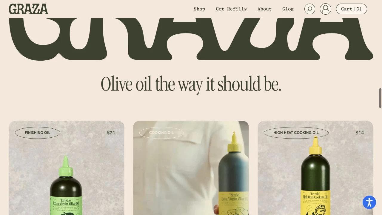
Graza sells olive oil, but its website does not assume that "olive oil" is a complete shopping category. The store separates finishing, everyday cooking, and high-heat use. That vocabulary gives shoppers a reason to buy more than one product without forcing them through a technical lesson first.
What the homepage contributes
The homepage opens with brand impact, then quickly converts a broad category into concrete products. The strongest merchandising move is the role-based system: Drizzle, Sizzle, and Frizzle are not merely flavors or package sizes. Each one owns a kitchen job.
That system creates a natural sequence:
- Learn that olive oils can serve different purposes.
- Recognize which purpose matches the current need.
- See the trio as a complete system rather than an arbitrary bundle.
- Return later through refills or subscription.
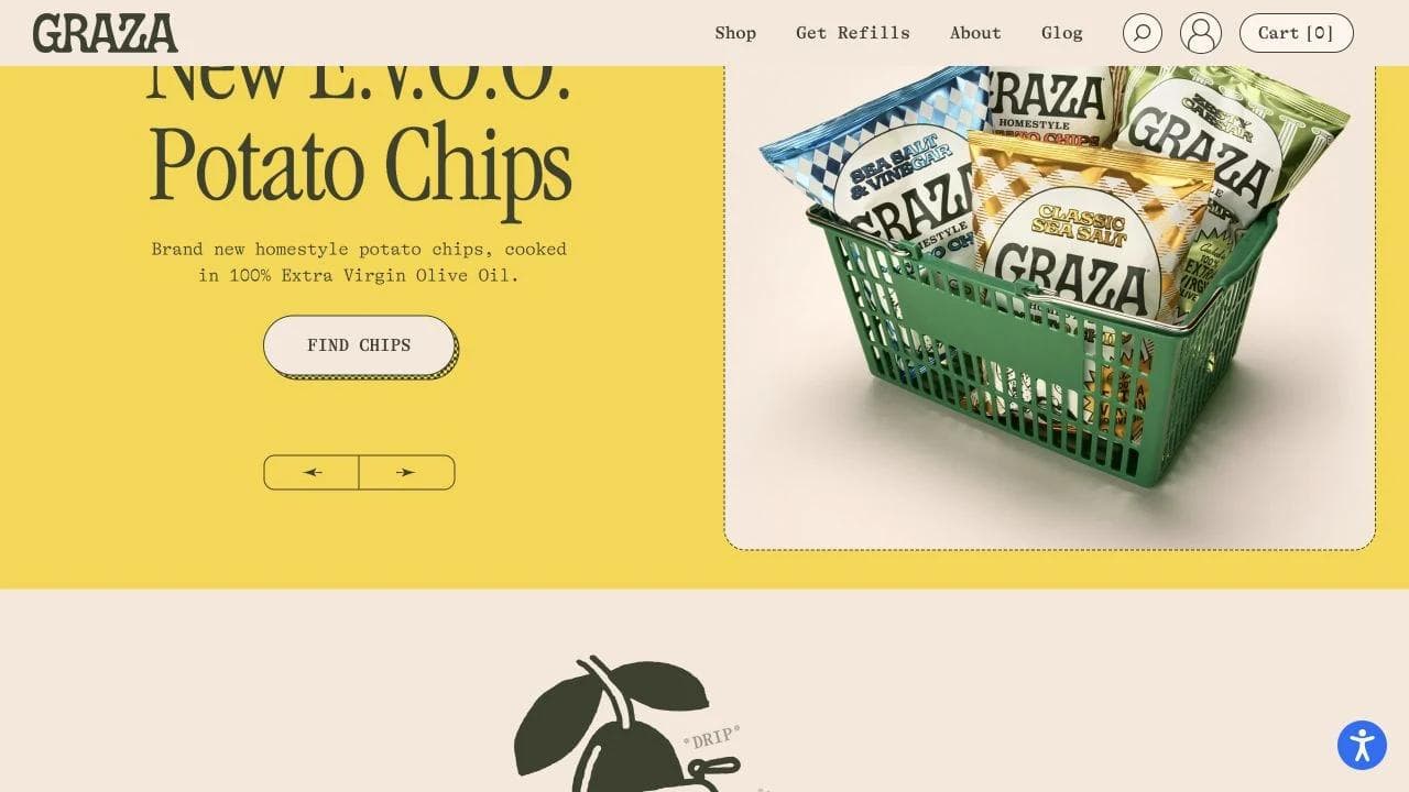
The page also alternates selling with education. Product modules are followed by explanations about freshness, olives, and origin. This gives the brand's premium positioning something more durable than typography and packaging.
What the product page contributes
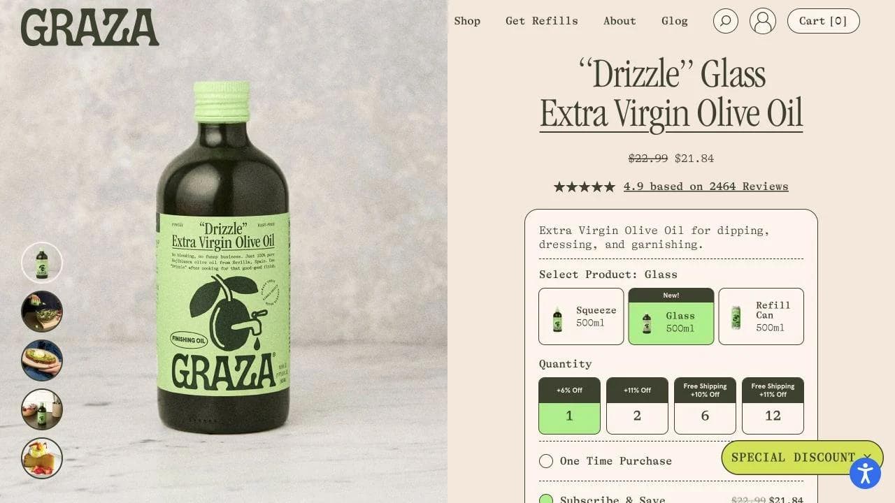
The Drizzle product page keeps the buy box dense but understandable. A shopper can compare container formats, quantities, one-time purchase, subscription, frequency, reviews, and gifting from the same decision area. The page then moves from transaction controls into use-case education and product proof.
Below the buy box, Graza explains why the product is a finishing oil and shows it in use. That matters because a product taxonomy only works when the store teaches shoppers how to apply it.

What to borrow
- Name products around jobs when shoppers do not naturally understand your assortment.
- Make the bundle represent a complete system.
- Put subscription beside the one-time option, with frequency and cancellation language visible.
- Use education to justify the category structure, not as disconnected blog filler.
What not to copy blindly
Graza's visual language is intentionally loud. The same density can overwhelm a store with dozens of unrelated categories. The transferable idea is the role-based product system, not the exact color palette or motion treatment.
2. Caraway: reduce the risk of a high-consideration purchase
Caraway asks shoppers to buy products that are expensive, durable, visually prominent in the home, and difficult to evaluate online. Its design therefore carries more reassurance than a low-cost impulse store needs.
What the homepage contributes
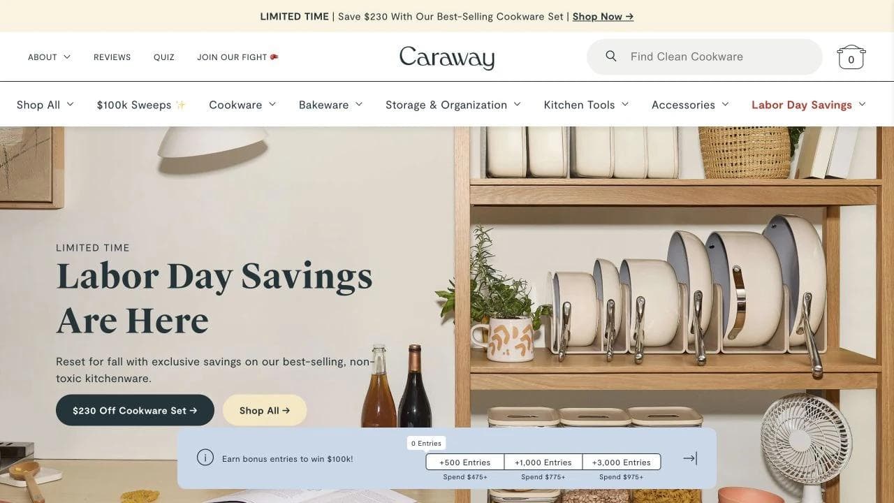
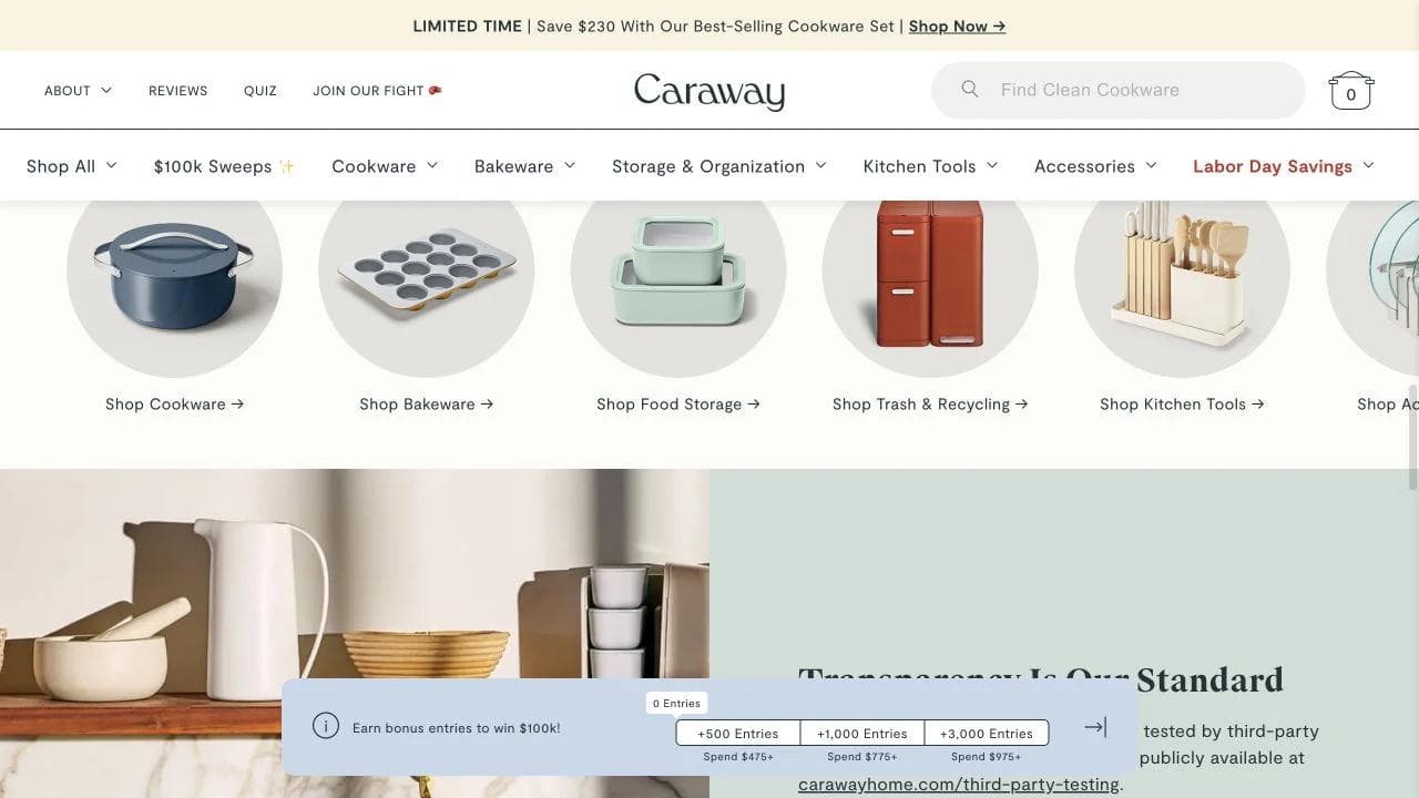
The homepage uses polished kitchen imagery to establish taste, then changes modes. Product collections, review evidence, material standards, and transparency claims each answer a different objection.
The page is effective because it does not treat "beautiful cookware" as the whole argument. Shoppers also need to know what is included, which surfaces and stovetops are supported, how products store, how they compare with familiar cookware, and what care requires.
What the product page contributes
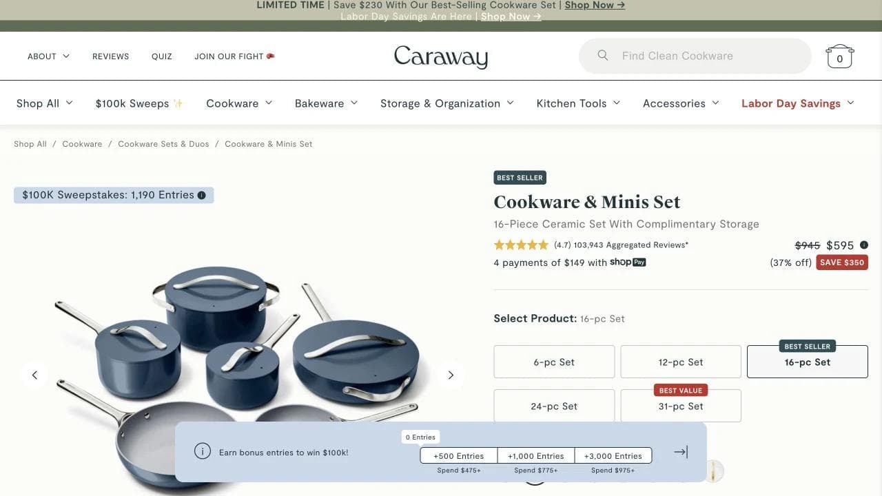
The set page handles a complicated purchase through visible hierarchy. Product configuration, colors, set sizes, financing, discount, reviews, and included pieces occupy the primary decision area. The page does not hide the fact that the buyer is choosing among materially different bundles.
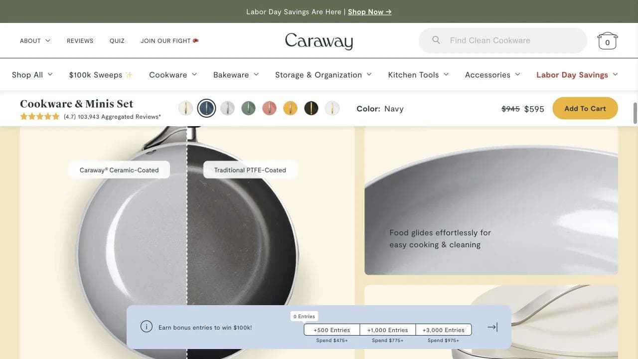
The deeper page then explains intended performance and materials with visual demonstrations. This is more useful than repeating adjectives because it connects claims to cooking behavior and maintenance.
What to borrow
- Scale reassurance with purchase risk. Higher price and longer ownership justify more specifications, comparisons, care details, and policy visibility.
- Show exactly what a set contains before asking shoppers to compare set sizes.
- Use lifestyle images for aspiration and neutral product images for evaluation.
- Keep safety, compatibility, warranty, and care close to the product decision.
What not to copy blindly
Promotions, financing, reviews, savings, and bundle selectors can compete for attention. A smaller store should not add every reassurance mechanism at once. Start with the objections that actually stop customers from buying.
3. Snif: sell what a screen cannot reproduce
Fragrance creates a fundamental ecommerce problem: shoppers cannot smell the product. Snif does not solve this with more photography alone. It combines scent vocabulary, product families, sampling, social proof, and at-home trial mechanics.
What the homepage contributes
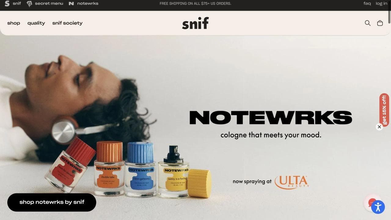
The homepage turns an invisible experience into recognizable worlds. Product photography, ingredient language, scent families, and playful names help shoppers build expectations before they reach a product page. It also exposes multiple ways to enter the catalog, rather than assuming everyone arrives knowing a fragrance name.
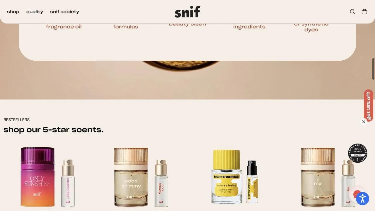
What the product page contributes
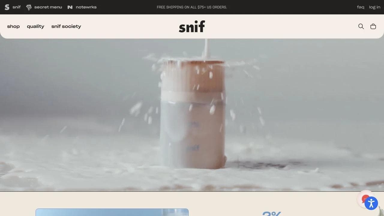
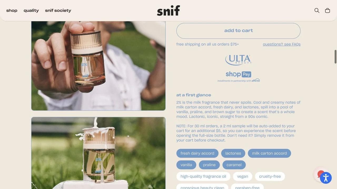
The product page gives the fragrance a concise profile, then lets shoppers choose a size and purchase type. The strongest idea is not the styling. It is the risk-reversal system. Sample and trial language acknowledges that the final judgment happens after delivery.
Further down, descriptive notes, layering suggestions, quality standards, and community language compensate for the missing sensory input. These modules are useful only because they answer the central uncertainty: what will this smell like, and what can I do if it is wrong for me?
What to borrow
- Identify what shoppers cannot verify through a screen, then design the journey around that missing input.
- Treat sampling, trials, and returns as product UX, not footer policy.
- Use consistent descriptive dimensions so shoppers can compare unfamiliar products.
- Let bundles teach combinations when products are naturally layered or paired.
What not to copy blindly
Evocative language is valuable for scent, taste, and texture. It becomes frustrating when a shopper needs exact compatibility, dimensions, ingredients, or care information. Poetry should not replace specifications.
4. Diaspora Co: make sourcing part of the product
Diaspora Co sells many visually similar products. A jar of pepper cannot communicate farming relationships, harvest freshness, flavor, or sourcing economics from a catalog thumbnail. The site makes those facts part of the commerce architecture.
What the homepage contributes
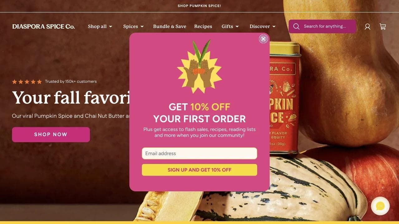
The homepage introduces seasonal products while stating a broader standard: single origin, fair wages, harvest freshness, and quality. Recipes and educational content give shoppers practical entry points into a catalog that could otherwise feel specialist.
This creates three paths for three levels of familiarity:
- A confident cook can browse specific spices.
- A curious shopper can start with bundles or bestsellers.
- A novice can begin with recipes and learn what to buy.
What the product page contributes
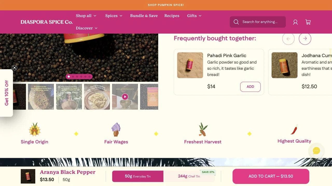
The Aranya Black Pepper page combines familiar ecommerce controls with unusually specific origin evidence. The primary area covers format, price, reviews, and add to cart. The rest of the page explains flavor, harvest, farmer, growing region, recipes, FAQs, and customer evidence.
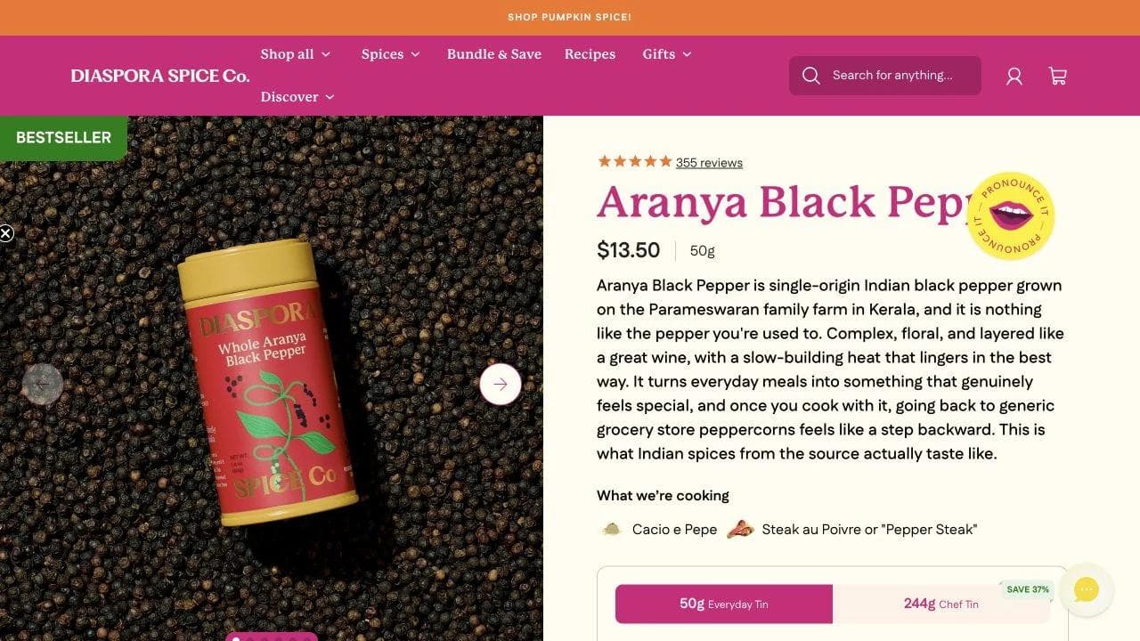
The origin section matters because it moves the mission from a generic About page into the product a shopper is considering. A sourcing claim is stronger when it names the place and people connected to the item.
What to borrow
- Put mission evidence on product pages when it changes the product's value.
- Use recipes or guides as navigation into a complex catalog.
- Offer starter sets for shoppers who lack category expertise.
- Connect each product to its origin, use, and people instead of repeating a company-wide promise.
What not to copy blindly
Editorial depth requires maintenance. Old harvest information, dead recipes, or vague sourcing language will weaken trust. Only build content-rich product pages if the operating process can keep them current.
5. Wild One: make configuration feel like progress
Wild One sells products with interdependent choices. A walk kit may require a harness style, size, leash, color, and accessories. The website's most important job is not visual novelty. It is preventing a shopper from losing track of a configuration.
What the homepage contributes
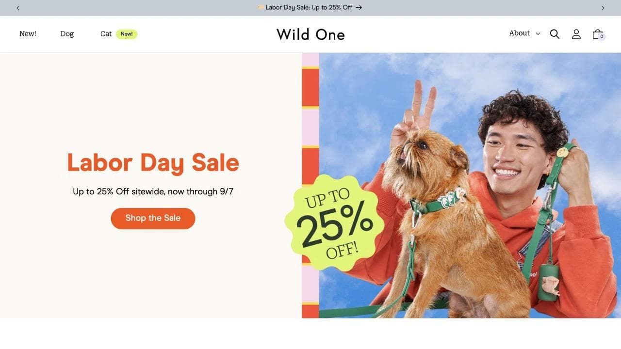
The homepage organizes shopping around pet, activity, and kit. This lets a buyer start with the job, such as walking, instead of assembling the catalog from individual components. Color becomes a merchandising device, but kits remain the commercial unit.
What the product page contributes
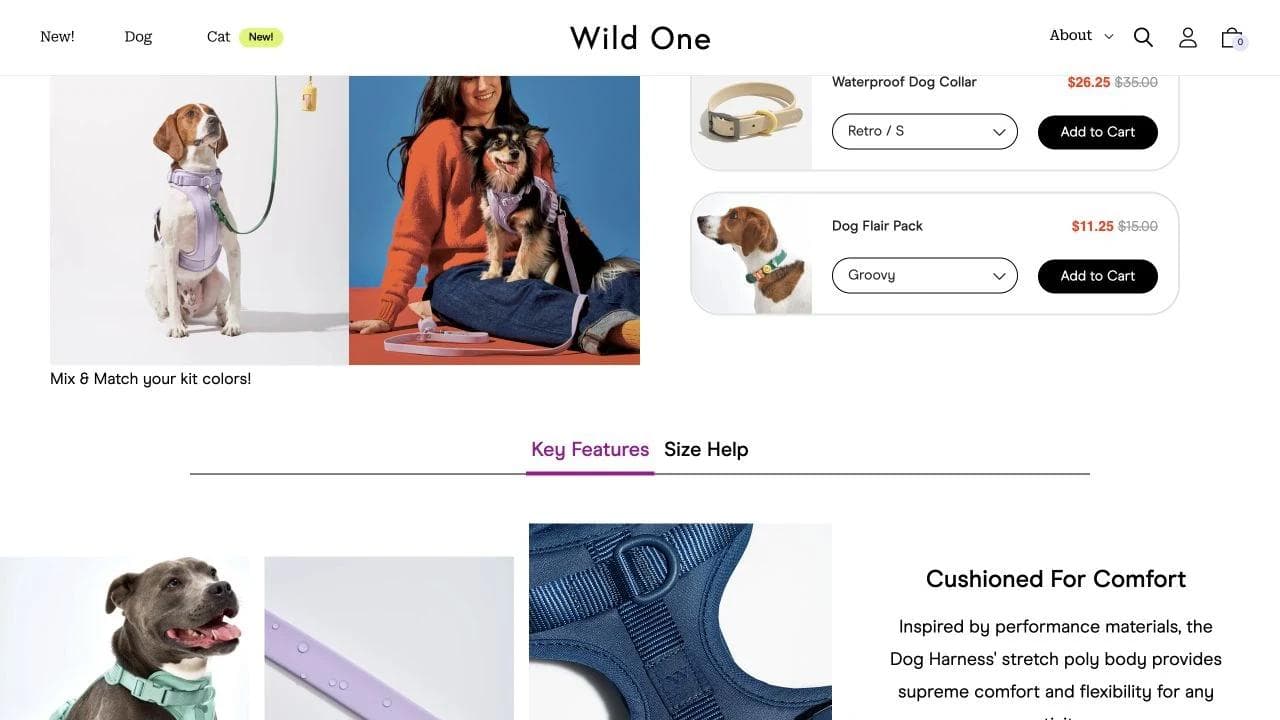
The walk-kit page shows the selected components and requires necessary choices before purchase. The configuration stays connected to a visible bundle and savings story, which is clearer than sending buyers across separate product pages.
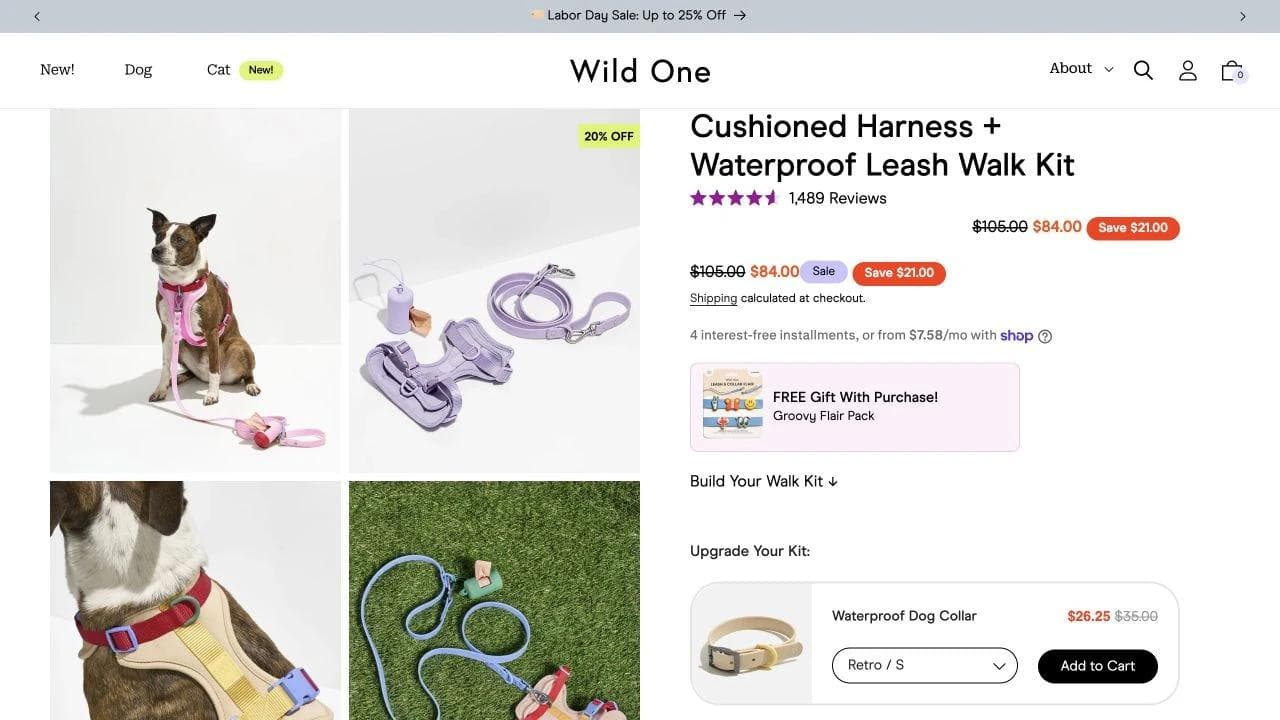
Fit guidance is the critical second layer. Measurements, model examples, adjustment details, and product construction reduce the risk that a visually appealing harness fails in use.
What to borrow
- Start bundles with an outcome, then expose the required component choices.
- Show progress and incomplete selections clearly.
- Put size and compatibility help inside the configurator's path.
- Use customer or model context to make measurements easier to interpret.
What not to copy blindly
Bundles can increase order value, but they can also turn one decision into five. If components are not truly interdependent, a simple set with optional add-ons may be easier than a full configurator.
6. OddBird: set expectations for handcrafted products
OddBird sells textiles whose texture, drape, sizing, care, and small-batch production matter as much as color. The store uses restrained styling and detailed copy to explain what shoppers will receive and how it changes with use.
What the homepage contributes
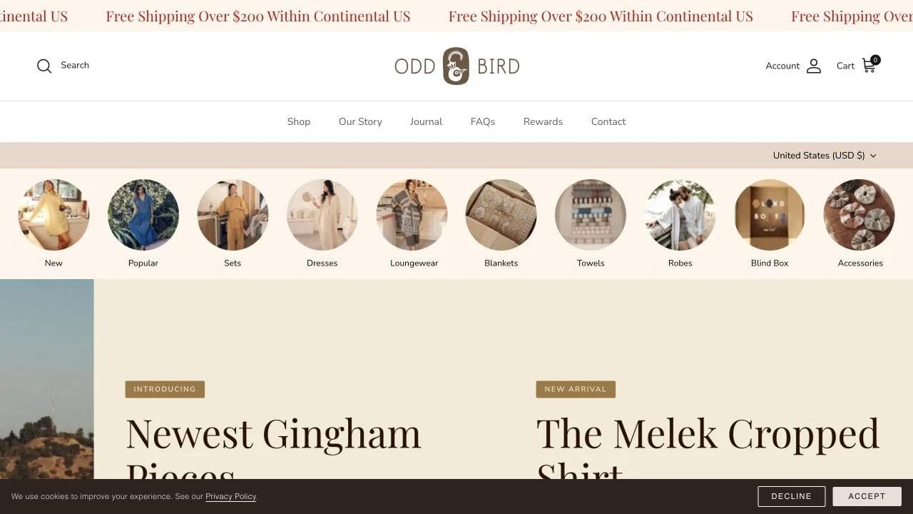
The homepage presents collections visually, then makes the operating values concrete: artisan production, lifetime repair, inclusive sizing, and responsiveness to customer feedback. Those are relevant purchase considerations, not generic values language.
What the product page contributes
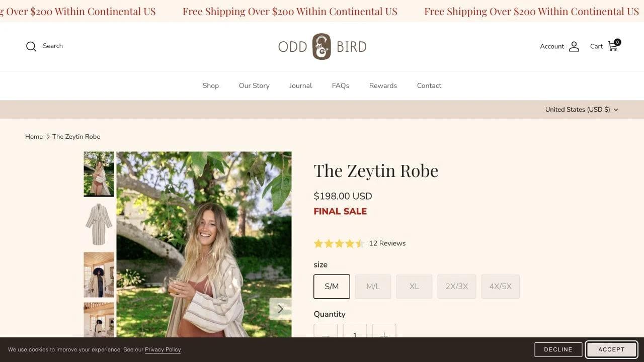
The robe page pairs imagery with size selection, availability, price, pickup, shipping, and return information. Its descriptions explain fiber blend, weight, use, and the handmade nature of the item.
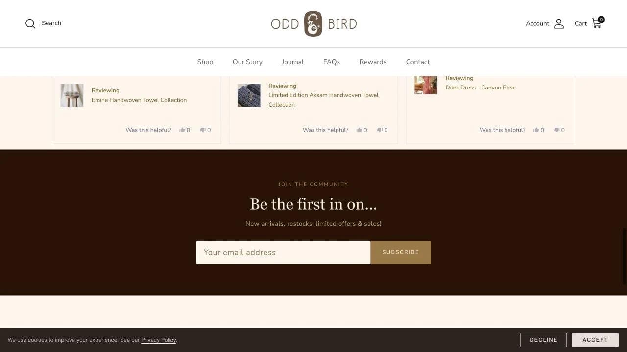
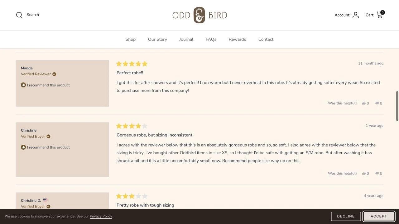
Care and customer reviews handle an important expectation: natural, minimally processed textiles may feel and behave differently from a conventional robe. Explaining break-in and washing is more credible than promising universal softness.
What to borrow
- Explain variation when products are handmade or use natural materials.
- Give care guidance before purchase when maintenance changes satisfaction.
- Make inclusive sizing visible in collection and product navigation.
- Let honest reviews surface fit and texture questions, then answer them directly.
What not to copy blindly
Long descriptions can support considered purchases, but they need scannable headings and a clear buy area. Do not force shoppers to read the entire brand story before finding size, price, availability, and returns.
What all six stores have in common
The visual styles vary, but the strongest journeys share a common architecture.
They organize around buying decisions
Good navigation does more than mirror an inventory database. It gives people useful starting points: cooking role, set, scent family, recipe, activity, or collection. Category names should reflect how customers think before they learn your internal taxonomy.
Product pages change with the product's risk
A bottle of olive oil, cookware set, fragrance, harness, and robe need different reassurance. The product page should answer the uncertainties created by that specific item:
- Consumables need flavor, use, quantity, replenishment, and price context.
- High-ticket goods need contents, comparison, care, warranty, and return clarity.
- Sensory goods need descriptive systems, samples, and risk reversal.
- Configurable goods need progress, compatibility, and fit help.
- Handmade goods need material, variation, care, and expectation setting.
They turn content into a shopping route
Recipes, guides, sourcing stories, and demonstrations are not valuable merely because they improve SEO. They become useful when each page helps a reader choose a product, understand a product already under consideration, or use a product after purchase.
They keep transaction information visible
Shipping, returns, total cost, subscription terms, availability, and delivery should not appear for the first time after a shopper commits to checkout. Baymard recommends placing total-order-cost and return information near the product decision because uncertainty at that stage can interrupt purchase evaluation.
Three ecommerce website architectures to choose from
A small catalog with a strong point of view
Use a short homepage, role-based product categories, a clear starter bundle, deep product education, reviews, and a replenishment path. Graza and Snif demonstrate different versions of this architecture.
A high-consideration product catalog
Use comparison, specifications, strong image coverage, financing where relevant, delivery and returns, warranty, care, reviews, and customer photos. Caraway shows why the page must do more work as purchase risk rises.
A broad or unfamiliar catalog
Use guided categories, bestsellers, starter sets, filters, search, editorial routes, and detailed product pages. Diaspora Co demonstrates how recipes and use cases can make expertise accessible.
Ecommerce design checklist
Before changing colors or animations, test the full path.
Discovery
- Can a first-time visitor understand what the store sells in seconds?
- Do navigation labels match customer language?
- Are search and filters proportional to catalog complexity?
- Can shoppers enter through use case, category, and bestseller paths?
Evaluation
- Are product images useful for scale, detail, and real use?
- Are price, availability, variants, and add to cart visible together?
- Does the page answer the product's main uncertainty?
- Are specifications, ingredients, dimensions, or care easy to scan?
- Do reviews help shoppers understand fit and tradeoffs, not only rating averages?
Risk and purchase
- Are shipping conditions and returns visible before checkout?
- Are subscription savings, frequency, and cancellation terms clear?
- Do bundles explain what is included and why the items belong together?
- Does variant selection provide immediate, visible feedback?
- Can someone complete the journey with a keyboard and understand it with assistive technology? Use the WCAG standard as the baseline, then test the actual flow.
Mobile and operations
- Does the buy box remain understandable on a narrow screen?
- Are tap targets, drawers, filters, and variant selectors usable with one hand?
- Can the content team keep ingredients, sizing, harvests, stock, and policies current?
- Are analytics events tied to real decisions such as search, size-guide use, variant changes, and checkout errors?
Where Moda fits in an ecommerce workflow
Moda is not an ecommerce platform. It does not replace Shopify, BigCommerce, WooCommerce, inventory management, payment processing, subscriptions, customer accounts, fulfillment, or checkout.
Its adjacent role is campaign creative. Ecommerce teams can use Moda to create editable social ads, Instagram posts, product-launch graphics, presentations, and other visual assets that send qualified shoppers into the store. The storefront should stay on commerce infrastructure built for catalog data, orders, and payments. If that division matches your workflow, try Moda today for the creative work around the store.
For more website planning guidance, see our SaaS landing-page teardown, real estate website design guide, and guide to AI website builders.
Frequently asked questions
What makes a good ecommerce website design?
A good ecommerce design makes products easy to find, compare, understand, and buy. It also exposes the information that reduces purchase risk, including variants, availability, shipping, returns, compatibility, fit, care, and reviews. Visual identity matters, but it should support those decisions rather than hide them.
What pages does an ecommerce website need?
Most stores need a homepage, collection or category pages, product pages, search, cart, checkout, shipping and returns, contact or support, privacy and terms, and an accessible account or order path where relevant. The exact set expands with subscriptions, wholesale, loyalty, store locations, or complex products.
Should an ecommerce homepage show products immediately?
Usually, yes. A homepage should provide a direct path into products or collections while explaining enough positioning for a first-time visitor. A story-first opening can work, but shoppers should not have to decode a campaign before they can shop.
How should product pages be designed?
Put the product name, useful images, price, availability, variants, and purchase action in a coherent primary area. Then answer the product's specific uncertainties with details, demonstrations, comparison, size or compatibility help, reviews, policies, and FAQs. The page should become more specific as the shopper moves down it.
How many images should an ecommerce product page have?
There is no universal number. Include enough to show the product clearly, in context, at useful scale, from important angles, and in each meaningful variant. One excellent image cannot replace a detail view or an in-use demonstration when those answer different questions.
Is Shopify required for ecommerce website design?
No. Shopify is one option among commerce platforms such as BigCommerce, WooCommerce, Adobe Commerce, Squarespace, and custom stacks. Choose infrastructure based on catalog complexity, payments, inventory, subscriptions, integrations, international needs, content workflow, and technical ownership. A general static website builder is not a substitute for commerce infrastructure when real transactions are involved.

Real editable visuals. Real canvas. Full control.
Fly through design work