Landing Page Examples: 13 Teardowns by the Job the Page Does
Thirteen live landing page examples torn down by job: where the CTA sits, how often it repeats, how many fields the form asks for, and what each page leaves out.
 Anvisha Pai, Co-founder & CEO, Moda
Most landing page examples articles are galleries. Thirty screenshots, a sentence of praise under each, and no way to tell which decision you are supposed to copy. This one is built the other way around. We loaded thirteen live pages on 8 September 2026, measured the same things on each, and grouped them by the job the page is doing rather than by industry or visual style.
The measurements are simple and you can repeat them on your own page in about ten minutes: how far the primary call to action sits from the top, how many times it repeats, how many fields the form asks for, where proof appears relative to the ask, and what the page deliberately leaves out.
We have no conversion data for any of these pages, and neither does anyone else publishing screenshots of them. So nothing here says a page "converts well." Everything here is an observable structural choice and an argument about the job it serves.
The thirteen pages, measured
Page length is expressed in screens, where one screen is a 1440 by 900 desktop viewport. "Distance to primary ask" is where the main action first appears, measured from the top of the document.
| Page | Job | Length | Primary ask appears at | Fields on the page |
|---|---|---|---|---|
| Plausible | Free trial signup | 7.1 screens | 0.5 screens | 0 |
| Basecamp | Free trial signup | 5.5 screens | Nav only, then 1.0 screens | 0 |
| Vanta demo | Demo request | 1.7 screens | 0.2 screens | 14 |
| Lattice demo | Demo request | 2.7 screens | 0.6 screens | 3 |
| Wistia report (gated) | Lead magnet | 4.4 screens | 0.2 screens | 1 |
| Wistia report (open) | Lead magnet | 30.4 screens | 27.5 screens | 0 |
| AMA webinar | Webinar registration | 2.7 screens | 0.7 screens | 0 |
| Web Summit | Event registration | 9.9 screens | Nav only | 0 for tickets |
| Phend Plumbing | Local service enquiry | 8.5 screens | 0.7 screens | 0 inline |
| Peak Design | Ecommerce product | 15.1 screens | 1.1 screens | 3 selectors |
| Flighty | App download | 15.7 screens | 0.9 screens | 0 |
| Raycast for Windows | App download | 11.4 screens | 0.9 screens | 0 |
| charity: water | Donation | 4.8 screens | 1.2 screens | 5 to complete |
Read down the "distance to primary ask" column and a pattern appears immediately. It has almost nothing to do with page length. The 15 screen product page puts its button just past the first screen. The 30 screen report waits until the twenty-eighth. What varies is not how long the page is but how much the page thinks you already decided before you arrived.
Free trial signup: make the click cheap and say so
Plausible Analytics
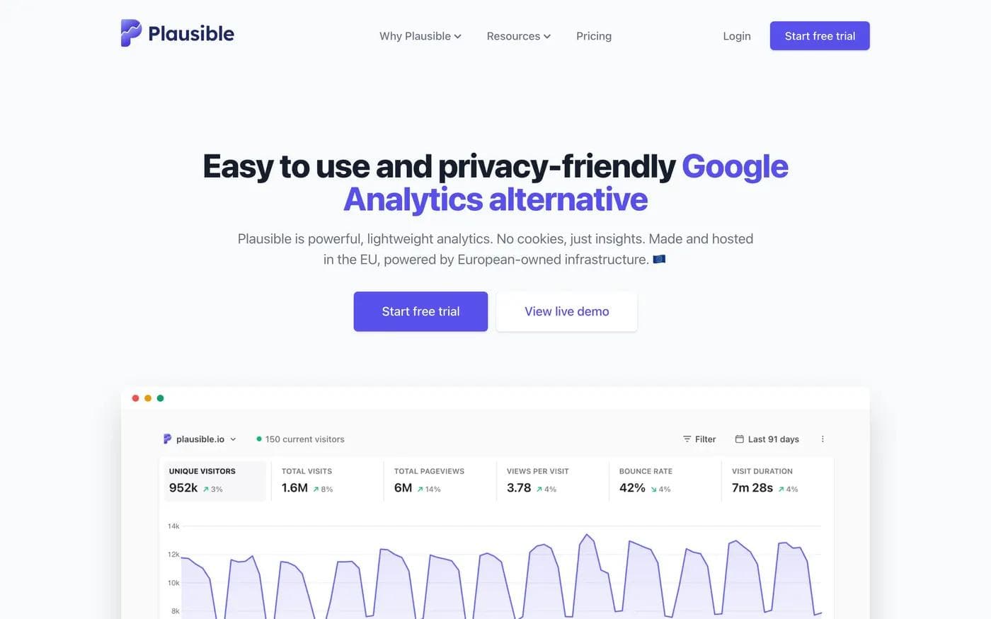
Plausible puts the whole promise in one line: an easy to use and privacy friendly Google Analytics alternative, powerful and lightweight, with no cookies, hosted in the EU. The headline names the product being replaced, which is the fastest way to establish a category without spending a paragraph on it.
Two things are worth stealing here. The first is the second button. Next to "Start free trial" is "View live demo," which sends you to a real dashboard with real numbers rather than a video. Visitors who are not ready to create an account get somewhere useful instead of bouncing, and the demo does the product explanation the hero cannot.
The second is the price of the click. Beside the plan buttons, the page says "Sign up for 30-day free trial. No credit card required." That single line answers the question that stops most trial signups.
Proof arrives late and it is unusually specific. Four screens down, past the feature grid, the page shows named practitioners including the co-founder of Hugging Face and the founder of Ghost rather than a logo wall. That ordering is deliberate. On this page the visitor's first problem is comprehension, not trust, so the endorsements arrive after the product is understood.
The primary CTA repeats four times across seven screens: navigation, hero, pricing table, and closing block. That is close to the ceiling across this set: no page repeated a single action more than four times.
What it leaves out: no lead form, no chat widget, no gated content, no logo strip in the hero.
Basecamp
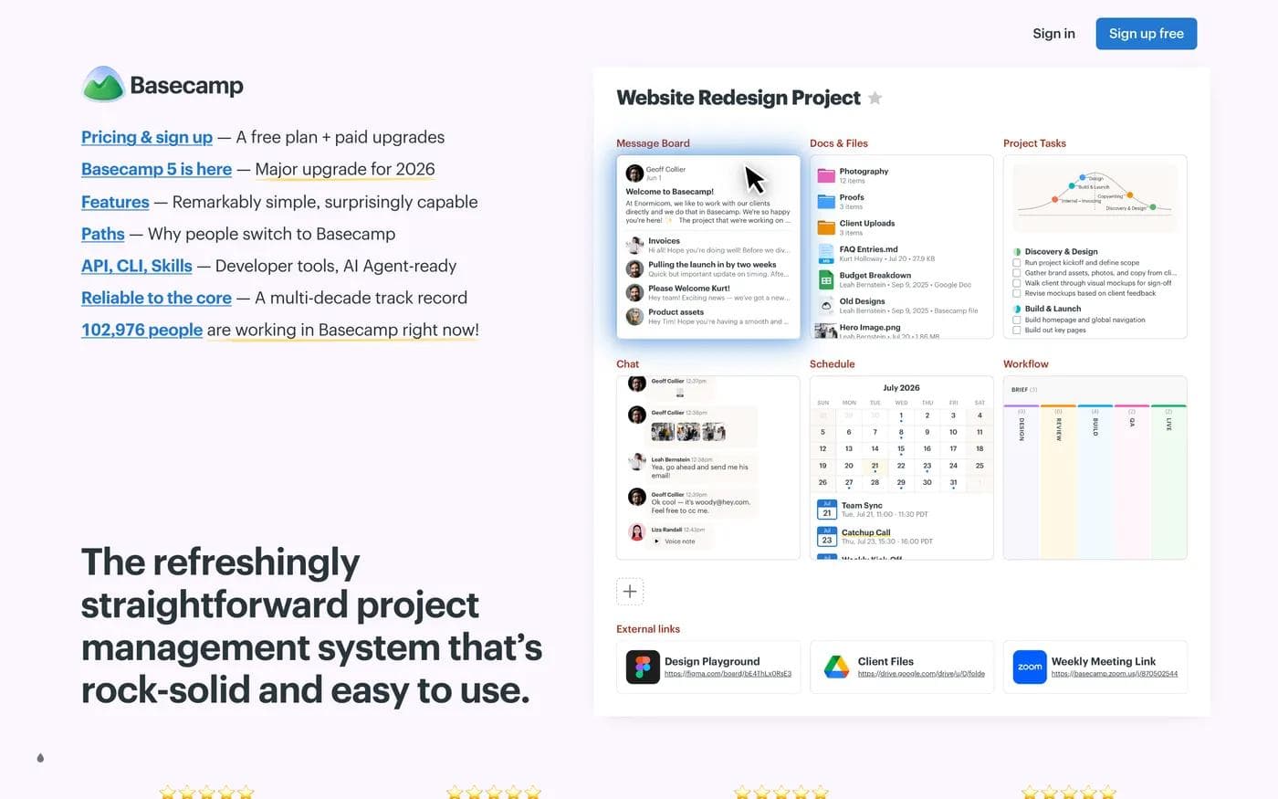
Basecamp breaks nearly every convention on this list and is worth studying for exactly that reason. The top of the page is a list of underlined text links, not a hero: pricing and signup, the new version, features, why people switch, developer tools, reliability. The headline sits below that list. There is one conventional button on the entire 5.5 screen page, "Sign up free" in the navigation, plus a "Take a 3 minute tour" control under the hero.
The last item in that link list is the interesting one: a live count of people working in Basecamp right now. It is proof, it is above the fold, and it costs one line.
The rest of the page is a narrative rather than a feature grid. A section titled "Tell me if this sounds about right" describes the chaos of scattered tools before naming the product as the fix. Then customers, then reliability numbers, then a section about support quality, then an invitation to a free live class. That last one is a real secondary conversion: people who will not start a trial today will attend a class.
What to borrow is the confidence to make the page an argument. What not to borrow blindly is the text-index opening. It works because Basecamp is a two decade old brand with an audience that already knows what it sells. A new product using the same layout would leave visitors with no idea what they are looking at.
Demo request: the form is where you decide who does the qualifying
The two pages in this section do the same job and disagree completely about how to do it. That disagreement is more instructive than either page alone.
Vanta
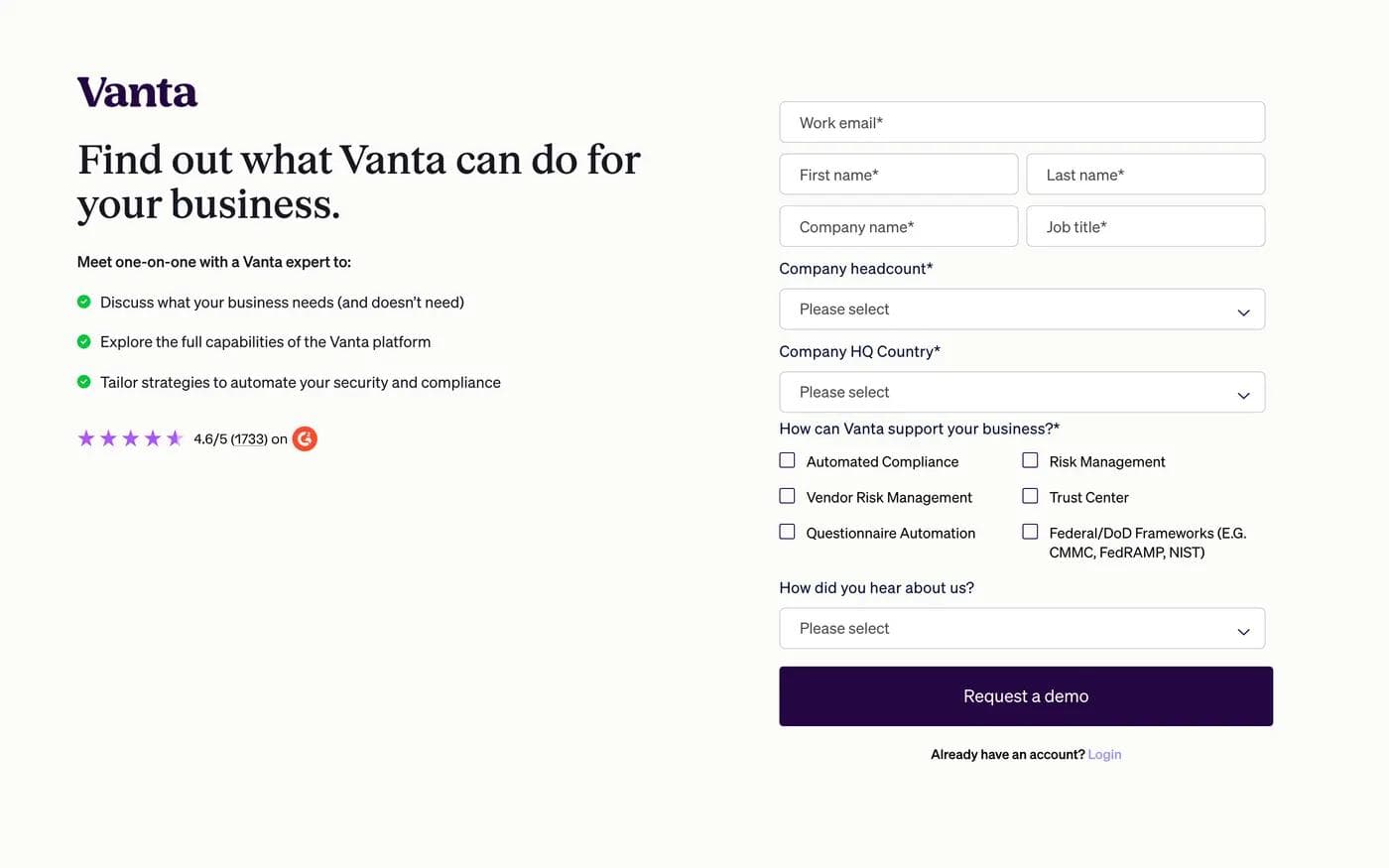
Vanta's demo page is 1.7 screens long and has no site navigation. The logo and a login link are the only ways off it. The form asks fourteen questions, eight of them marked required, including company headcount, HQ country, a six way product interest checklist, and how you heard about them.
That is a long form by any conventional rule, and the page pays for it in three ways. The left column says what the meeting is, in three bullets, one of which promises a discussion of what your business does not need. The G2 rating, 4.6 from 1,733 reviews, sits directly beside the form rather than in a proof section further down. Below the form, a customer logo band carries the count of organizations served.
The structural argument is coherent. Someone arriving at a dedicated demo URL has usually already decided to talk to a vendor, so the page spends its space on qualification rather than persuasion. Removing the navigation removes the browse instinct.
The honest cost: fourteen questions is a real filter, and "How did you hear about us?" is an attribution question, not a qualification one. It sits between the last product question and the button.
Lattice
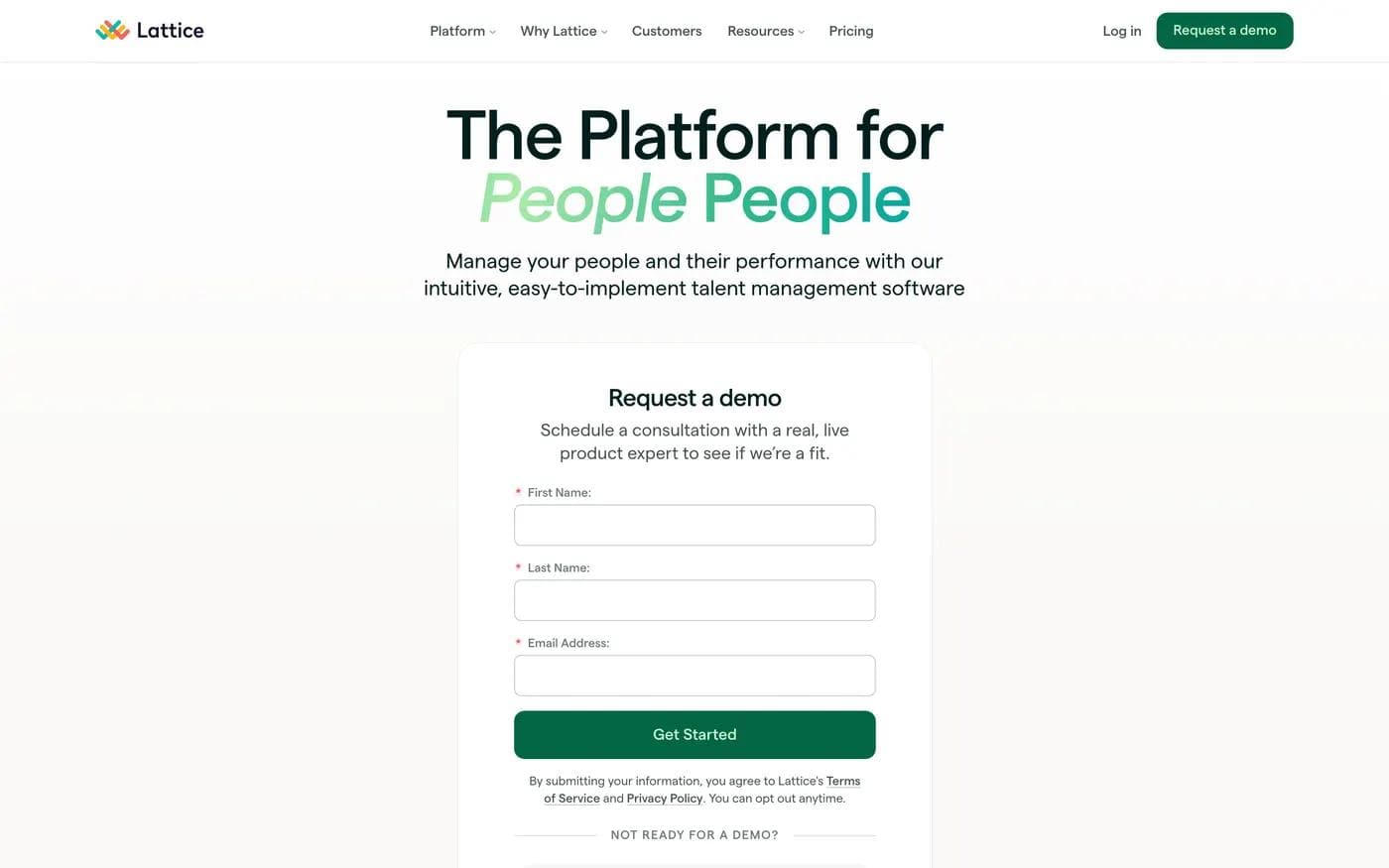
Lattice's demo page asks for three fields: first name, last name, email. It keeps the full site navigation. Directly under the button, a line reading "Not ready for a demo?" introduces two alternatives: an interactive product tour and a seven minute video walkthrough.
Below the form, four short blocks handle the objections a demo request creates rather than the objections the product creates: you will talk to a real person, there is no purchase decision at the end, your data is not sold. One of them describes the call as a first date.
Neither approach is correct in the abstract. Vanta qualifies at the form and accepts fewer, better-fitting submissions. Lattice qualifies after the form and accepts more, at the cost of sales time. If you are choosing, the question is not "how many fields is best," it is "who in this company has time to sort the list."
The one thing worth copying from Lattice regardless of field count is the escape hatch. A demo page with no lower commitment option converts a ready buyer and loses everyone else.
Lead magnet: the same report, published twice
Wistia's State of Video report is the most useful example on this list because it exists as two different pages with two different jobs, and comparing them shows the entire lead magnet tradeoff in one place.
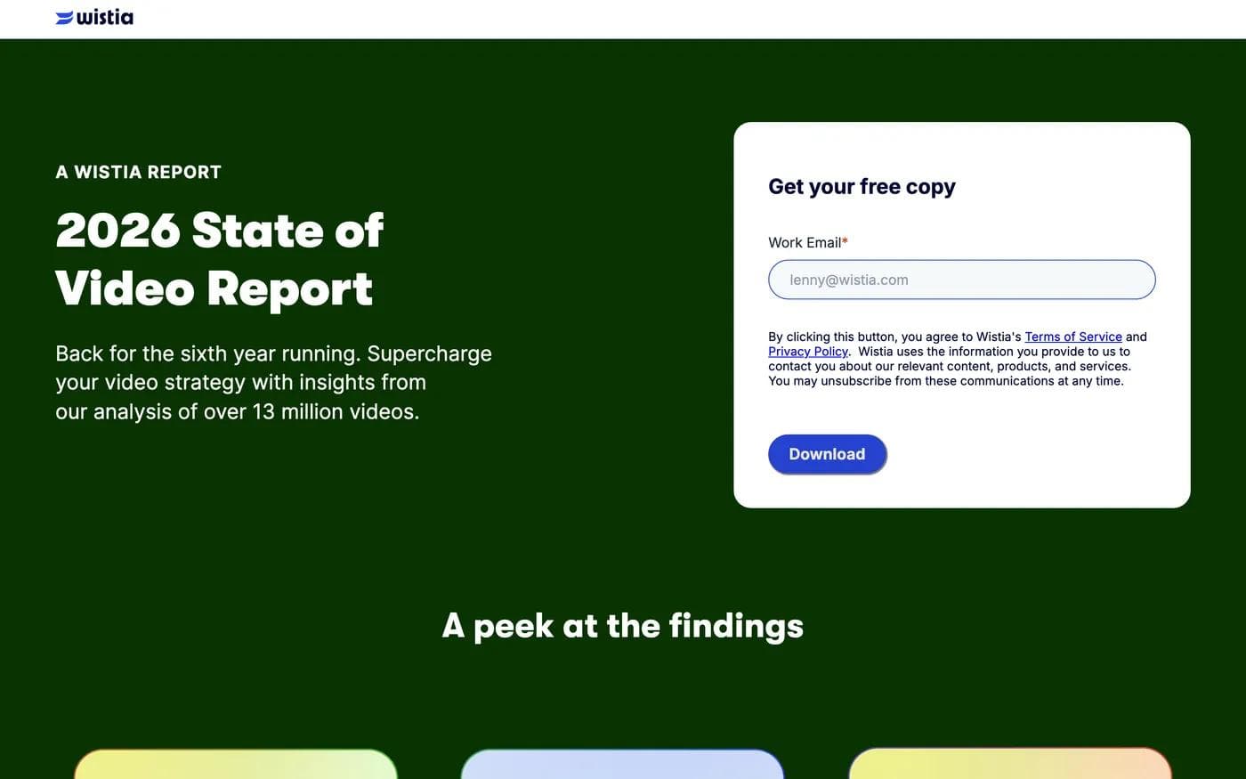
The gated page strips the navigation to a logo, states what the report is and what it is drawn from, and asks for one field. Below the form, a section called "A peek at the findings" gives away enough to make the download feel worth an email. Total length is 4.4 screens, and the ask is complete before you scroll.
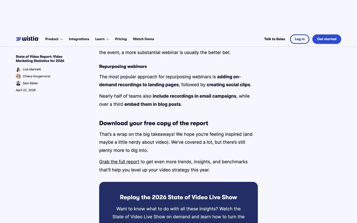
The open page publishes the same research as a full web article, 30 screens of charts and commentary, with the site navigation intact. The download prompt, headed "Download your free copy of the report," appears at about 90 percent of page depth, and the ask itself is a plain inline text link rather than a button. The only form on the page is a newsletter subscribe at the very bottom.
Read together, the pair says something the galleries never do. The open page is not a failed landing page; it is a search asset, and its conversion path is deliberately soft. The gated page is where the capture happens, and it earns the email by removing every distraction and showing a sample first.
The cost of the split is that a reader who bounces at screen fifteen of the open page never sees any ask at all. If you publish a report both ways, put a modest, non-blocking prompt earlier in the open version and keep the gated page as the destination.
Event and webinar registration: the ask is usually two steps
American Marketing Association webinar
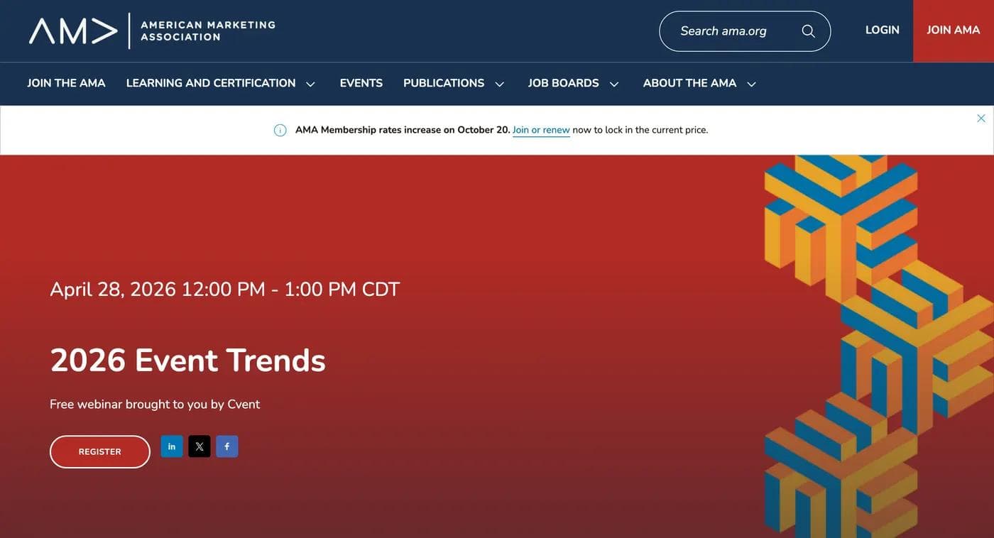
The AMA's webinar page does the two things a registration page has to do before anything else: it puts the date and time above the title, and it says the session is free and who is presenting it. Registration is a two step flow. The page itself asks for nothing; the REGISTER control, which appears at 0.7 screens and again at 1.8 screens, carries you to the form.
That is a defensible choice for a live event, where the decision is "is this worth an hour" rather than "do I trust this vendor." The page spends its space on the agenda and the value instead.
Two observable costs. The page keeps the full association navigation and a membership promotion bar sitting above the hero, which competes with the registration ask at the exact moment the visitor is deciding. And because the live date has passed, the page now carries both an on demand notice and a register control, which is more forgiving than a dead page but demands that the visitor read carefully to work out what they are signing up for.
Web Summit
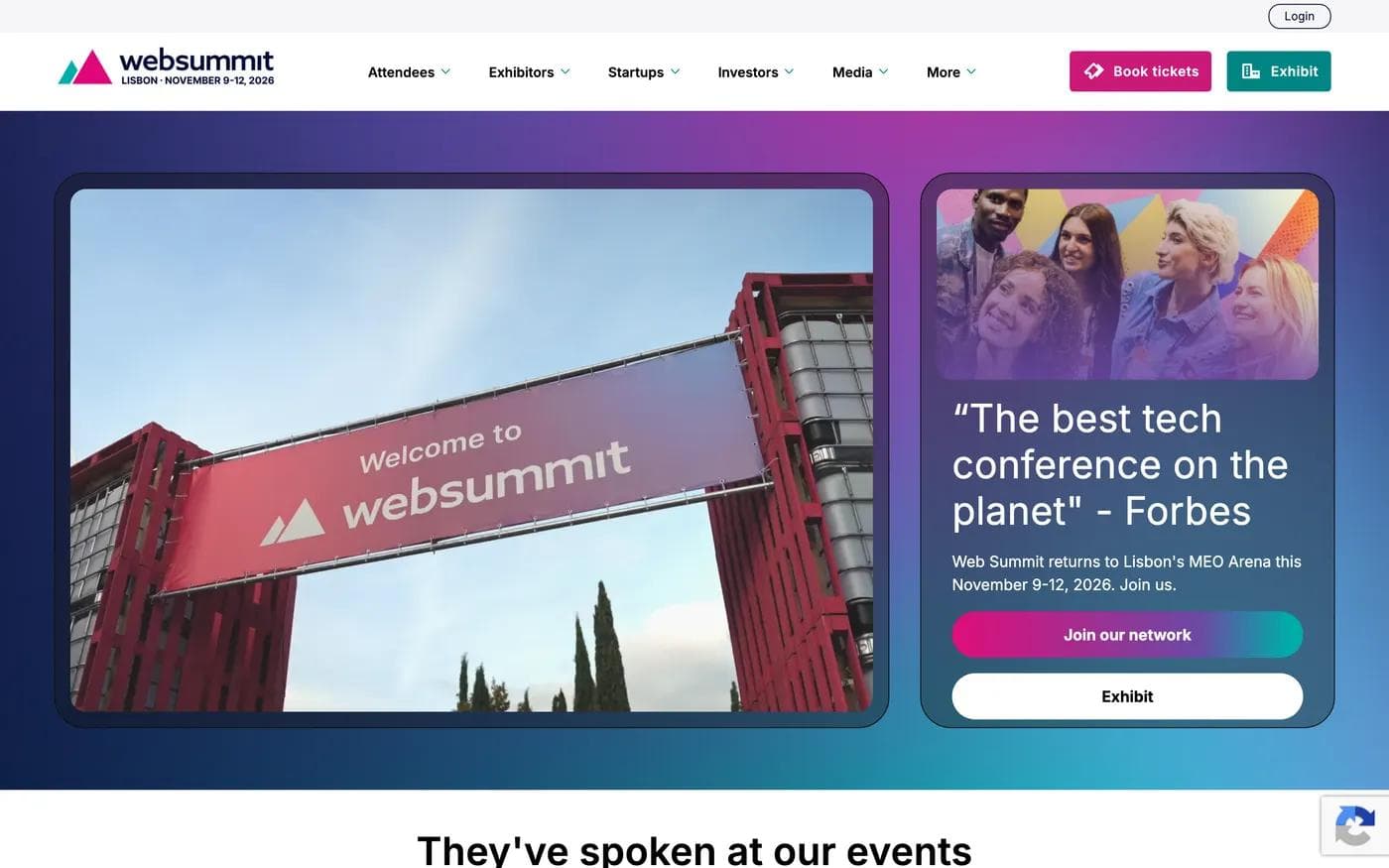
Web Summit shows what a large event page looks like when one URL serves five audiences. The body of the page is organized entirely by who you are: people who have spoken, people who have attended, startups, media, investors. Each section carries its own proof and its own path. For an event that has to sell tickets, exhibitor packages, startup passes, press accreditation, and investor attendance from a single page, that segmentation is the right architecture.
The fold is the weak point, and it is worth naming because the same mistake is easy to make on a smaller page. The first screen carries a media panel and a Forbes pull quote with the dates and city, but no sentence of the site's own explaining what the event is or who should come. The page's actual headline, "Experience Web Summit," does not appear until about two thirds of the way down. And the primary commercial action, "Book tickets," lives only in the navigation bar. The two buttons in the first screen are "Join our network" and "Exhibit."
There is a defensible reason for a soft first screen at this scale, since most visitors already know the brand and a hard sell would misjudge the audience. But a pull quote is not a value proposition, and if you borrow this structure, keep the segmented proof and put one plain sentence and the ticket button in the hero.
The email capture two screens down is worth copying on its own: two fields, positioned as access to discounts and announcements, for visitors who are interested but not ready to buy a ticket today.
Local service enquiry: answer the logistics before the sales pitch
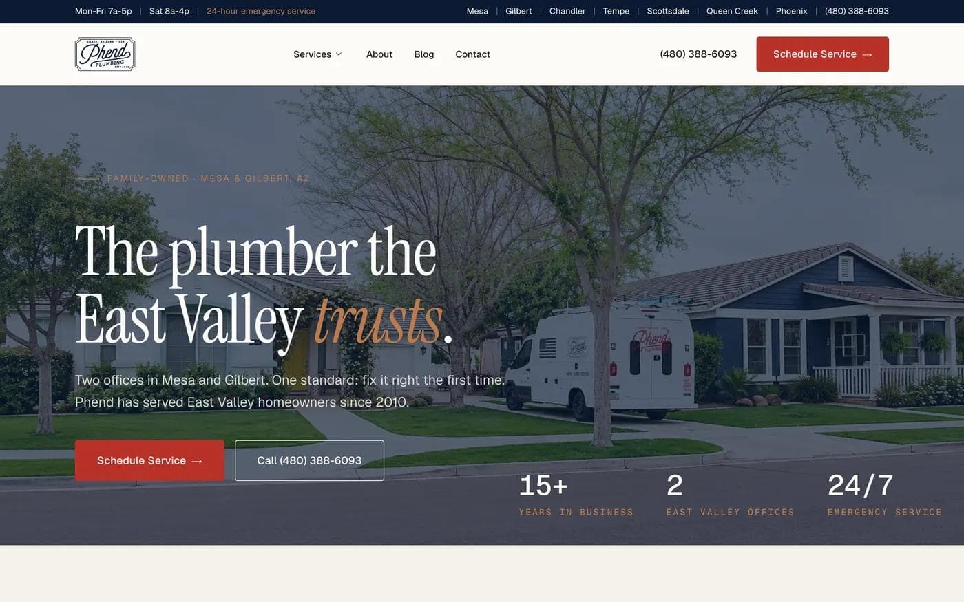
Phend Plumbing, a family owned business with two offices in Mesa and Gilbert, Arizona, is the smallest company on this list and the page most worth copying if you run a local service business.
Everything a homeowner with a problem needs to know is resolved before the headline. The utility bar carries weekday and Saturday hours, 24 hour emergency service, seven named service areas, and the phone number. The hero then gives two actions of equal weight, "Schedule Service" and "Call," because a burst pipe at 7pm and a water softener quote are different intents. Three numbers under the hero, years in business, offices, and emergency availability, do the trust work that a paragraph of "about us" copy usually does badly.
The phone number appears four times: utility bar, navigation, hero, and again in a dedicated emergency block five and a half screens down that answers a specific question, whether a Sunday morning call reaches the same on-call technician you would get on a Tuesday. That is repetition earning its place by answering a new objection rather than restating the offer.
The proof is local and countable: four service counters, and three review quotes that name the technician who did the work. The service descriptions are written for Arizona conditions specifically, hard water at 300 to 500 parts per million, slab foundations, and corroded pipe in homes built before 2000. Generic service copy could be swapped between any two plumbers in the country. This copy could not.
What it leaves out: prices. For diagnostic trade work that is honest rather than evasive, since the number depends on the job. If your service does have a published starting price, saying so is a stronger move than hiding it.
Ecommerce: the buy box is the landing page
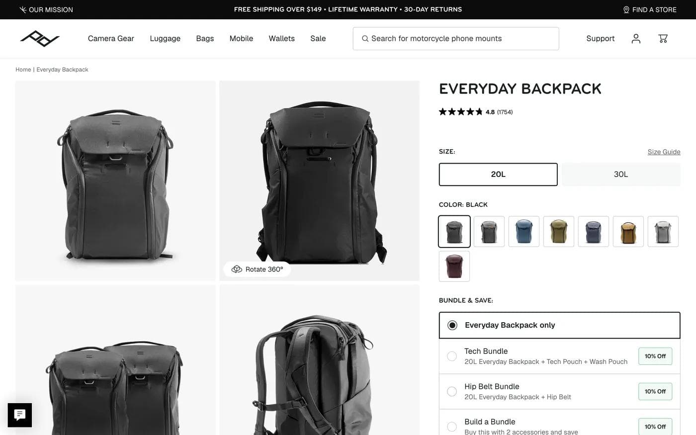
The Peak Design Everyday Backpack page is 15 screens long, and the entire commercial decision happens in the first one and a bit. The buy box holds the rating and review count, two sizes, eight colours, and a bundle selector offering ten percent off with accessories. Add to cart sits just below the first screen, and it is the only add to cart control on the page.
Everything after that is education for people who are not ready: a front, back, and inside walkthrough, then four accordions covering camera use, specs, materials and sustainability, and what is in the box, then recommended accessories with their own prices.
Two decisions are worth borrowing. First, risk reversal lives in the top utility bar, not in a section at the end, so free shipping, lifetime warranty, and 30 day returns are visible before the price registers. Second, the accordions keep a long specification list out of the scroll path of a decided buyer while still answering the researcher. A product page that flattens all of that into stacked sections makes both audiences scroll past content meant for the other.
App download: proof does all the work
Flighty
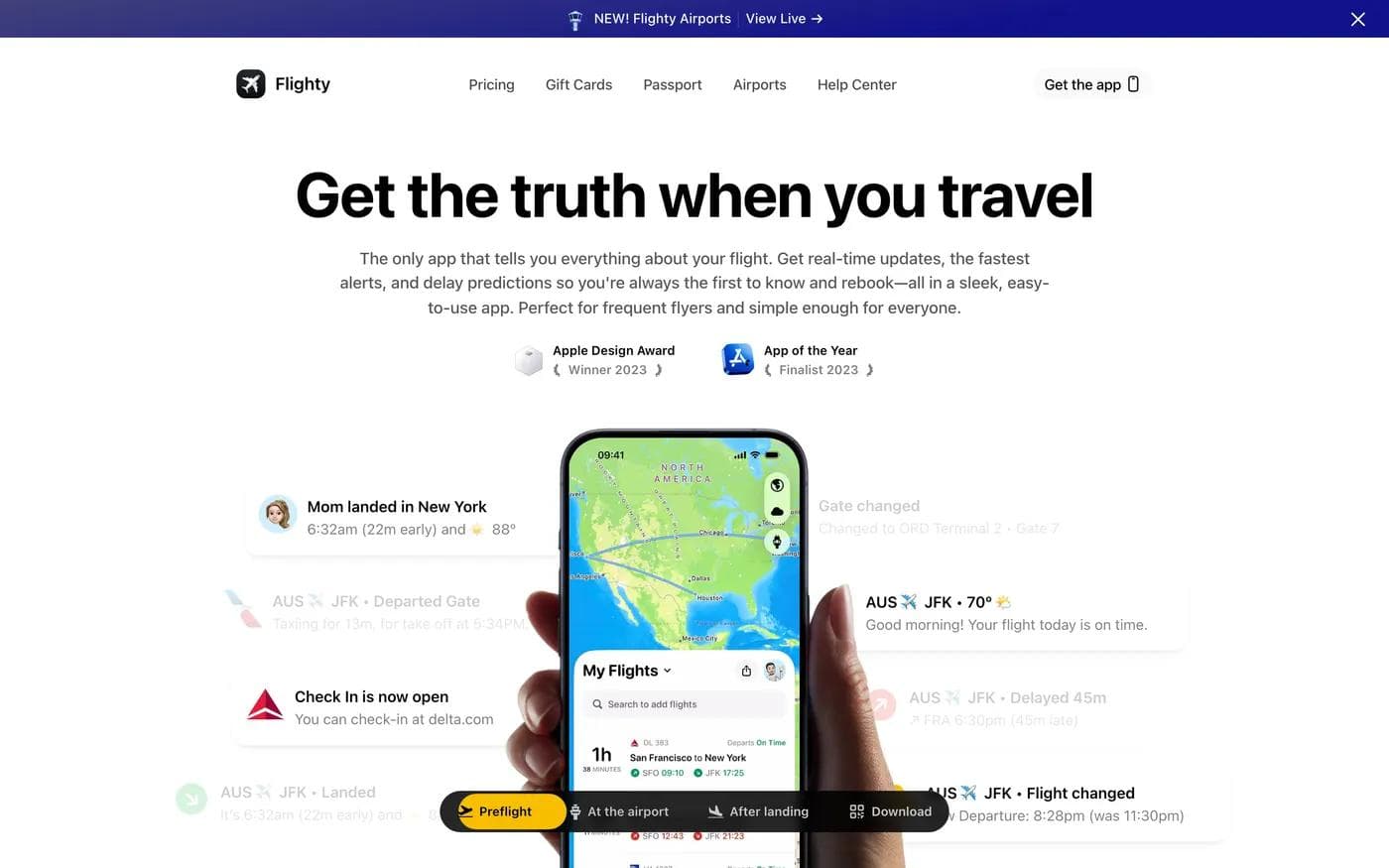
Flighty has no email capture, no pricing form, and no lead gen anywhere on 15.7 screens. The only ask is the app store, appearing three times.
The first screen shows the two award badges and a set of realistic notification cards: gate changed, check in open, delayed 45 minutes, landed. Showing the notification rather than describing the feature is the whole product argument, since the product is essentially a better notification.
The proof section near the bottom is the most varied on this list: press quotes, App Store reviews with usernames and dates, and posts from named people describing specific saves, including a cancelled flight caught 30 minutes before the airline announced it. Specific stories outperform star ratings here because the claim being made, that the app knows before the airline does, is exactly the sort of thing a reader would otherwise discount.
Raycast for Windows
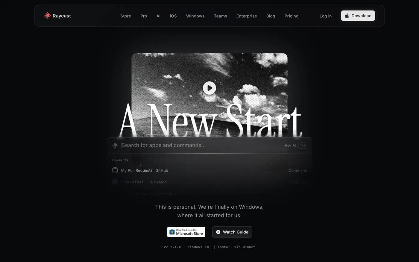
Raycast for Windows is a launch page for a port, and it solves a problem most product pages avoid: what to say about the things that are not finished yet.
The first screen is unusual. The headline is "A New Start," which means nothing on its own, but the line under the install buttons does the explaining: this is personal, the team is finally on Windows, where it started. Under that sits the technical line most pages bury, the version number, the minimum OS, and the package manager command. For a developer audience that line removes more friction than another benefit sentence would.
Two thirds down, the page names what has not shipped yet: window management, notes, focus, AI chat. Publishing your own gap list is a risk on a page whose job is downloads, and it works here because the audience will discover the gaps in ten minutes anyway and would rather hear it first. The testimonial wall of two dozen named engineers and designers is doing the same job as Plausible's endorsements: for a tool sold to practitioners, recognizable individuals outperform company logos.
Donation: put the unit of impact next to the button
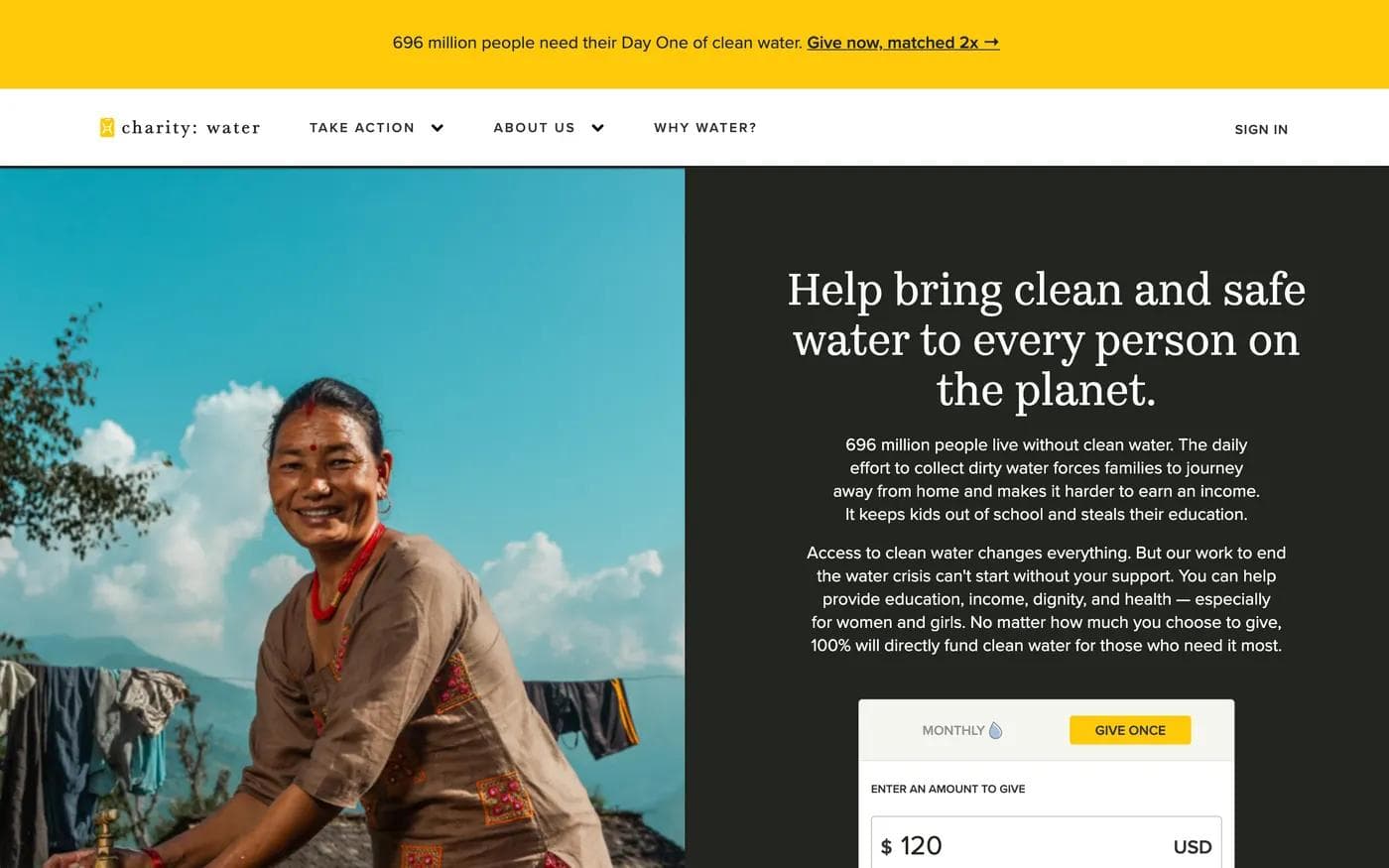
The charity: water donation page is the tightest conversion architecture of the thirteen. The widget is in the first screen with the amount already filled in, a monthly or one time toggle, and an option to give in honour of someone. Immediately above the give button is the line that does the persuading: it takes 40 dollars to bring one person reliable access to clean water. The unit of impact sits between the amount and the button, exactly where the visitor is deciding what number to type.
The rest of the page, under five screens total, is not more persuasion. It is routing: a confidence section, the monthly giving programme, project sponsorship for gifts above ten thousand dollars, and then honour gifts, legacy giving, cheque and stock, and cryptocurrency. Each block serves a donor who cannot or will not complete the widget at the top, and none of them competes with it visually.
The lesson generalizes past nonprofits. If your product has a natural unit, cost per seat, per invoice, per shipment, state it next to the ask rather than on the pricing page.
What repeats across all thirteen
Five patterns held on every page, regardless of job or company size.
- The primary ask appears in the first screen and a half, or the page explains why it does not. Twelve of the thirteen put the main action within 1.2 screens. The exception, Wistia's open report, is not really an exception: it is a search asset whose ask is deliberately deferred.
- Repetition is bounded and each repeat does new work. No single action repeated more than four times on any page here. Where a CTA recurred, it followed a section that had answered a new objection: pricing, emergency availability, the feature gap list.
- Proof sits beside the ask when trust is the barrier, and later when comprehension is the barrier. Vanta and charity: water put evidence within a few hundred pixels of the button. Plausible and Raycast wait several screens, because the visitor's first problem is understanding the product.
- The page states the price of the click. No credit card required, you will not have to make a decision, download for free, Windows 10 or later, 30 day returns. Every page named the cost of the next step somewhere near the button.
- Specific evidence beats general evidence. Named individuals, counted reviews, a technician's first name, a cancelled flight caught 30 minutes early. Not one of the strongest proof blocks on these pages was a bare logo strip, though several used logos as supporting material.
What only worked in context
Four choices were effective on the page we saw them on and would misfire elsewhere.
- A long form. Vanta's fourteen fields work on a dedicated demo URL for a considered purchase. The same form on a first touch page from a cold ad would filter out people who have not decided to talk to anyone yet.
- A soft or headline-free fold. Web Summit and Basecamp both open without a conventional value proposition. Both are established brands whose visitors arrive already knowing the category. A new product copying this leaves the visitor guessing.
- Removing navigation. Vanta and Wistia's gated page strip it. Lattice and the AMA keep it. The rule is not "always remove the nav." It is that navigation should go when the visitor arrived intending to act, and stay when they might reasonably need to check something first.
- Publishing your gaps. Raycast lists unfinished features on a download page. That builds credibility with developers who will find the gaps anyway. On a page selling to a risk-averse buyer, the same list reads as a warning.
Run this teardown on your own page
Open your page at a desktop width and answer these in order. Every one of them is observable, so you do not need analytics to complete the exercise.
- Where does the primary ask first appear, in screens from the top? If the answer is more than about 1.5 and the visitor arrived from an ad or an email, that is the first thing to fix.
- How many times does it repeat, and what new information precedes each repeat? A repeat that follows nothing new is decoration.
- How many fields does the form ask for, and how many are marked required? Then ask who will use each answer, this week. Attribution questions and unused segmentation fields are the usual dead weight.
- What does the headline promise, and does the form ask for something proportionate? A one field email ask can promise a report. A fourteen field ask needs to promise a meeting with a named outcome.
- How far is your strongest proof from your primary button? If trust is the barrier, close the distance.
- Does the page name the price of the click anywhere? If not, add one line.
- What did you leave out, and can you defend it? Every page here omitted something obvious. Peak Design has no lead capture in the buy box. Flighty has no email form at all. Phend publishes no prices. Omission is a decision, not an oversight, and you should be able to say why.
- What is the escape hatch for a visitor who is interested but not ready? A demo video, a live product, a class, a newsletter, a report. Only two pages here offered nothing between the primary ask and leaving: Vanta's demo page and Flighty.
Where a design tool fits, and where it does not
A landing page is two separate problems. The first is the page itself: message order, layout, proof placement, and the visual system it shares with the campaign around it. The second is the machinery behind it: form routing, CRM handoff, payment, booking, and experimentation.
Moda is built for the first problem. Its agent generates responsive multi-page HTML from a prompt, the result stays editable on a real canvas rather than as a flat image, and it publishes to a Moda subdomain or a custom domain. It is a reasonable fit when the landing page has to look like the deck, the ads, and the social assets around it, because those can be produced from the same brand system. It also handles simple lead forms.
It is not the right tool for several of the pages above. Peak Design's buy box belongs to a commerce platform. charity: water's donation widget is payment infrastructure. Vanta's fourteen field form is only useful because of what happens to the submission afterwards in a CRM. If your main need is running structured A/B tests across many campaign variants, a dedicated landing page platform such as Unbounce or Instapage is built for that and a design tool is not.
If you want more on the page-level decisions behind a specific category, our SaaS landing page teardowns follow six software homepages section by section, and the microsite examples guide covers the cases where a campaign needs its own small site rather than one page. If you are still choosing a platform, the AI website builder comparison sorts the options by the kind of site you are actually building.
Frequently asked questions
How long should a landing page be?
Length tracked the visitor's starting intent, not any rule. Pages built for people who arrived intending to act ran under three screens. Pages built for people still deciding ran ten to fifteen. What mattered on every page was that the primary action appeared within about the first screen and a half.
How many form fields should a landing page have?
There was no consistent answer among the pages we measured, and the two demo pages disagree by a factor of four. A short form moves qualification to your sales team; a long one moves it to the visitor. Choose based on who has capacity to sort the resulting list, and if you use a long form, remove any question whose answer nobody will read.
Should a landing page have navigation?
The pages that removed it, Vanta's demo page and Wistia's gated report, were both destinations that visitors reached having already decided to act. Pages whose visitors might still be comparing, such as Lattice's demo page and the AMA webinar page, kept it. Removing navigation is a reasonable choice for a campaign destination and a risky one for a page that also has to answer questions.
What makes a landing page example worth copying?
Copy the structural decision, not the look. The useful questions are where the ask sits, what the page proves next to it, what it asks the visitor to give up, and what it left out. A page's colour scheme and illustration style transfer to your business far less reliably than its argument order does.
Every page in this article was loaded and captured on 8 September 2026 at a 1440 by 900 desktop viewport. Measurements describe those pages as they existed on that date, and live pages change.

Real editable visuals. Real canvas. Full control.
Fly through design work