Plumbing Website Design: 5 Full-Page Teardowns
See five plumbing websites analyzed section by section, with practical lessons for emergency calls, booking, local SEO, service areas, trust, and lead routing.
 Anvisha Pai, Co-founder & CEO, Moda
Plumbing website design is a routing problem before it is a visual-design problem. A strong site helps a visitor answer three questions quickly: do you serve my location, can you solve this problem, and should I call now or schedule for later? It then earns trust with licensing, real people, reviews, service expectations, and a clear handoff into the business.
That is different from a construction portfolio. Many plumbing visitors arrive on a phone with an active leak, blocked drain, failed water heater, or business interruption. They do not need a cinematic project gallery first. They need calm orientation, a usable phone number, honest response expectations, and proof that the person entering the property is credible.
This guide studies five complete plumbing homepages across residential service, scheduled appointments, drain and sewer specialization, plumbing plus HVAC, multi-area operations, and commercial contracting. We look at what each section contributes, which ideas transfer to a smaller business, and where the page creates unnecessary friction.
Five plumbing website examples at a glance
- Vantage Plumbing: A San Diego residential and commercial plumber that separates emergency calls, estimates, and online appointments.
- Zoom Drain: A drain and sewer specialist that organizes the page around a narrow problem category, local routing, and a visible service process.
- Chambliss Plumbing: A San Antonio company that leads with reviews, licensing, same-day scheduling, financing, and service-specific authority.
- Foster Plumbing: A Denver commercial contractor that uses capabilities, project evidence, and qualified service requests instead of residential urgency language.
- Plumb Pro+: A Lowcountry plumbing and HVAC operator that manages multiple service areas, specials, financing, referrals, and several service lines on one homepage.
The plumbing website framework: place, problem, urgency, proof, action
The best page structure follows the customer's decision rather than the company's org chart.
- Place: Confirm the cities, neighborhoods, ZIP codes, or radius actually served. A visitor should not complete a form before learning that the address qualifies.
- Problem: Use recognizable needs such as burst pipe, clogged drain, no hot water, leak detection, repiping, or commercial backflow testing. Internal department names are less useful.
- Urgency: Separate emergencies from planned work. A call is usually appropriate for active damage. A scheduler or short request form can work for maintenance and installations.
- Proof: Show the license, insurance status, team, review source, warranty terms, relevant certifications, and the operating practices behind the promise.
- Action: Tell visitors what happens after they call, book, or request an estimate. "Get Started" is weaker than "Call for emergency service" or "Request a same-day appointment."
This framework also prevents a common design mistake: treating every lead as equally urgent. If every button says "Call now," planned-job visitors may feel pressured. If every inquiry goes through a form, emergency visitors may wait for an inbox that is not monitored overnight.
1. Vantage Plumbing: separate emergency calls from scheduled work
Vantage Plumbing serves residential and commercial customers in San Diego. Its homepage is useful because the opening provides several actions without making them feel interchangeable.
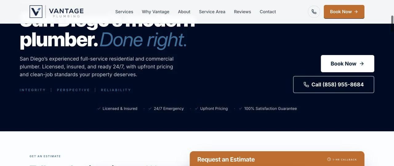
What the opening contributes
The hero names the market, service category, and operating standards. It places booking and calling beside licensing, insurance, 24/7 emergency availability, upfront pricing, and a satisfaction promise. A visitor can identify both the next step and the claims that support it in one screen.
The estimate form immediately below asks the visitor to describe the problem. It also explains that callbacks happen within an hour and that emergency calls move to the front of the line. That sentence is more useful than a generic "fast response" badge because it describes the routing rule.
There is still a purchase check to make. A plumbing company should not publish a response window, priority rule, or satisfaction guarantee unless its dispatch operation can deliver the promise consistently. The website is creating an operational expectation, not merely an advertising mood.
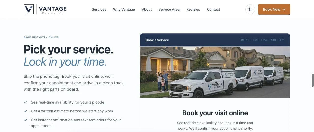
The middle gives planned work a lower-pressure route
Vantage presents a service-selection path and an online booking path for visitors who do not need immediate dispatch. The distinction is important. Someone replacing a water heater may want to compare timing and options. Someone watching water spread across a floor wants the phone number.
The page says online visitors can see availability, receive confirmation, and get reminders. Those details reduce uncertainty about whether the request disappeared into a form. If a business uses a third-party scheduler, the handoff should retain the service and location context and should work well on a phone.
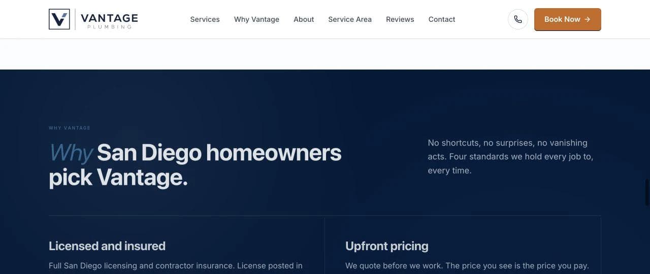
Standards are stronger than generic claims
The "why" section focuses on licensed and insured work, upfront pricing, emergency response, and a satisfaction guarantee. It then adds a local company story. This sequence works because the standards answer purchase risk before the story asks visitors to care about the brand.
The page could make the guarantee terms easier to inspect. A guarantee is most credible when it links to plain conditions, exclusions, and the remedy. The same principle applies to "upfront pricing." Explain whether the customer receives a written estimate before work, what diagnostic fees apply, and what can change the scope.
Reviews and FAQs close the remaining gaps
The lower page combines customer reviews with common questions. That is a sensible closing sequence: social proof establishes that other customers completed the journey, while the FAQ handles practical hesitation.
The tradeoff is length. Some sections repeat the same four standards, and the page occasionally asks the visitor to reprocess information already shown above. A tighter page could keep the hero, dual intake paths, service grid, standards, reviews, and FAQ while removing repeated slogans.
What to borrow
- State what happens after a form submission.
- Give emergencies and planned jobs different actions.
- Place operating standards beside the first decision.
- Explain pricing and guarantee terms rather than relying on badges.
What not to copy blindly
Do not offer real-time booking, callback windows, or emergency priority in the copy before confirming that the field-service system and team actually support them.
2. Zoom Drain: make specialization obvious
Zoom Drain is a larger specialist brand, but its homepage contains useful lessons for independent drain and sewer businesses. The strongest idea is focus. Visitors do not have to determine whether drain work is a minor item inside a broad home-services menu.
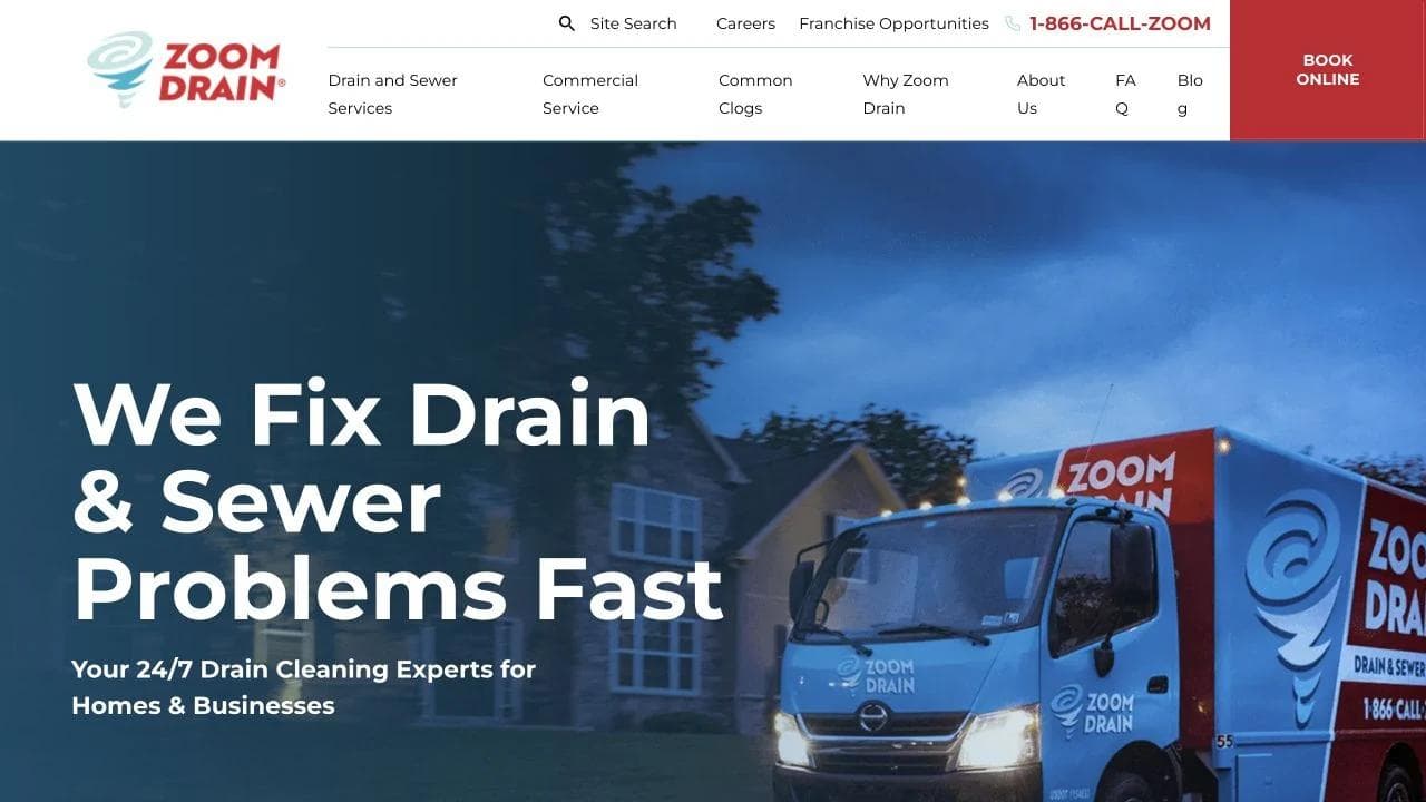
The hero owns one problem category
The opening promises help with drain and sewer problems and offers booking immediately. Below it, the page describes recognizable symptoms such as clogs, slow drains, odors, and gurgling. This is problem-based navigation: the visitor identifies what is happening before learning the technical name of the service.
Residential, commercial, and location paths remain visible. Those distinctions matter because a restaurant manager with a backed-up drain has different downtime risk and intake information from a homeowner with a slow sink.
The page would be even stronger if the location check preceded any service expectation that varies by market. A national or regional brand should not imply identical hours, pricing, or arrival times before it knows which operator serves the address.
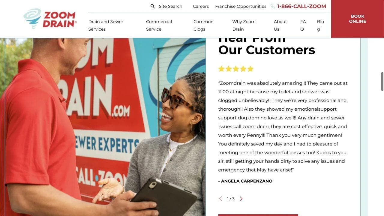
The trust section explains the service experience
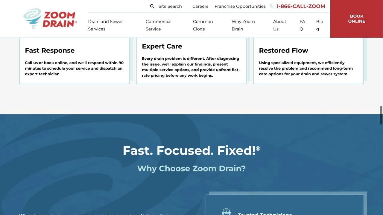
The page combines customer proof with a short "how it works" sequence. The process describes fast response, expert care, and restored flow. This is the right kind of content for an urgent category because it helps a stressed visitor imagine the next few steps.
However, process labels should stay concrete. "Expert care" is less informative than telling the customer whether the technician diagnoses first, presents options, obtains approval, protects the work area, and documents the result. Small operators can compete with a large brand by being more specific about the actual visit.
A specialist needs a reason to exist
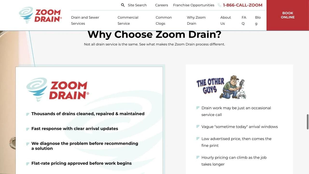
The page uses a dedicated promise section and a comparison-style "why choose" block to explain the focus on drains and sewers. Specialization can reduce doubt when the problem matches, but it should be backed by equipment, training, availability, warranties, or job types that generalists may handle less often.
Avoid unsupported comparison language. If the page contrasts the company with "other drain companies," each claimed difference should be accurate across the locations that use it. A local specialist can often make a stronger case with named equipment, real technician credentials, and specific types of difficult work.
The lower page connects segments to local action
Tailored solutions route property managers, hospitality buyers, mechanical contractors, and homeowners into different contexts. A location CTA then returns the visitor to the practical next step.
This is a valuable pattern for a multi-location business: specialize in the problem globally, then localize the promise. Each location page should contain real hours, service boundaries, license details, team or operator information, and services that are actually available there.
What to borrow
- Lead with symptoms as well as technical services.
- Make the specialty impossible to miss.
- Separate residential and commercial contexts.
- End broad brand claims with a local location check.
What not to copy blindly
Do not adopt franchise-scale comparison language or market-wide promises when a smaller business can win with more precise local facts.
3. Chambliss Plumbing: turn trust signals into a scheduling decision
Chambliss Plumbing serves San Antonio. Its page shows how a local residential company can place reviews, tenure, licensing, financing, and scheduling into one coherent purchase argument.
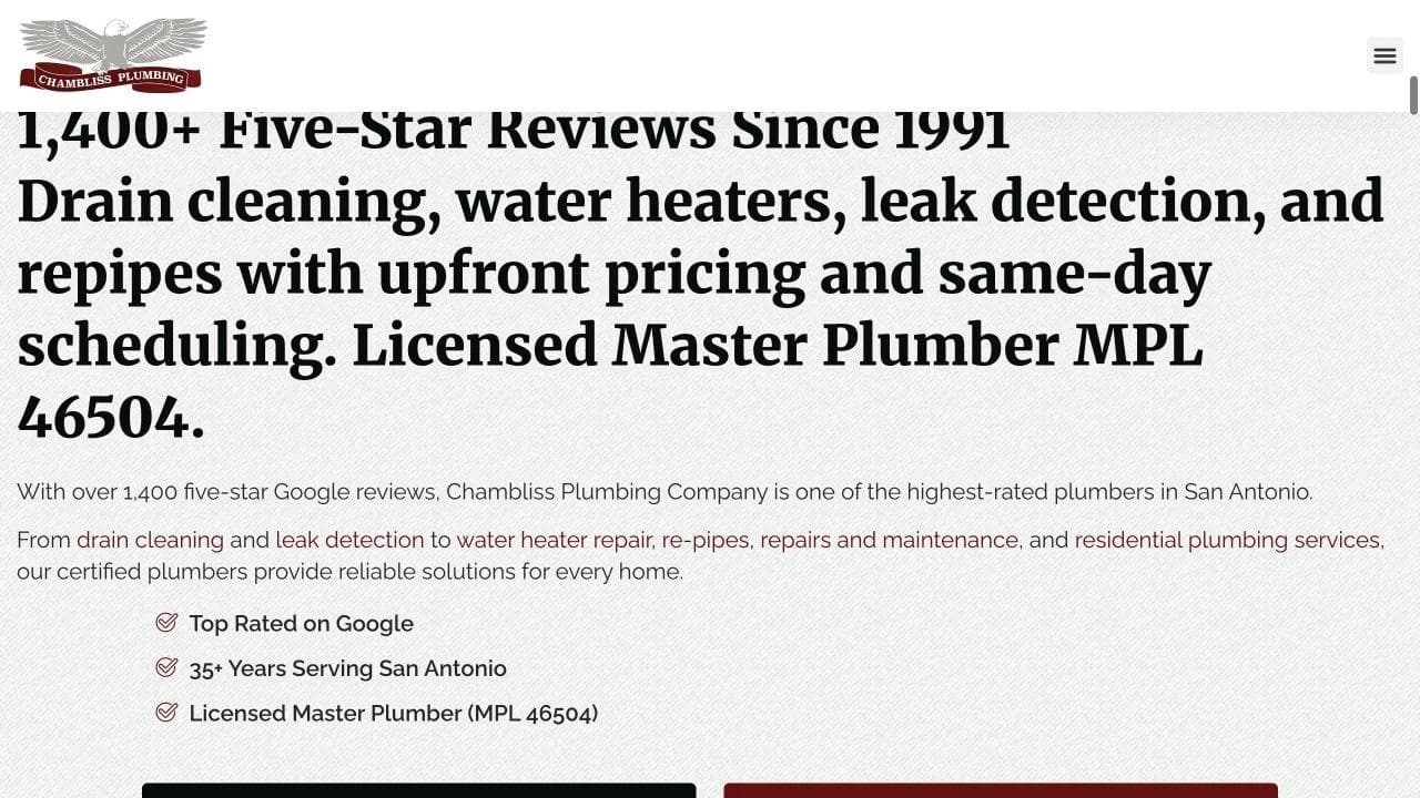
The first screen answers credibility and affordability
The headline cites more than 1,400 five-star reviews and service since 1991. Supporting copy names core services, upfront pricing, same-day scheduling, and the Master Plumber license number. Financing is presented as a visible option rather than hidden at the end of a water-heater page.
This is dense, but the density has a purpose. The customer can verify market, tenure, service category, review volume, license, and two next steps without leaving the opening.
Review claims need maintenance. Link to the source, preserve the date or current count, and avoid converting a changing platform metric into a timeless statement. The FTC's guidance on reviews emphasizes honest, transparent treatment of customer feedback. Do not suppress negative reviews or present incentives in a way that distorts the record.
Services connect to local conditions
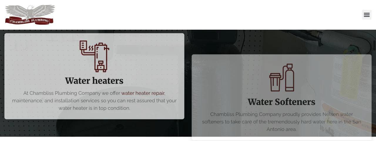
The service grid highlights water heaters, water softeners, and tankless systems before expanding into broader plumbing work. That ordering makes sense in San Antonio, where water quality and hot-water systems are meaningful purchase categories.
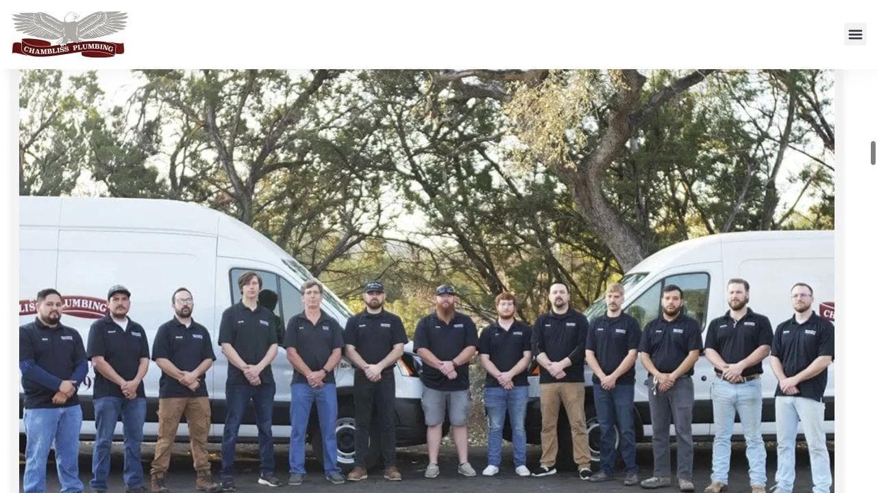
The following company section connects tenure and training to a local service promise. This is stronger than saying "family owned" by itself. A useful local story should explain what the team knows about the area's housing stock, water, permitting, common failures, or equipment.
Membership creates a planned-maintenance fork
The plumbing membership appears before the complete service grid. It creates a second business model on the homepage: not every visitor is buying a one-time repair. Maintenance members may value priority scheduling, inspections, or discounts, while emergency visitors still need a direct call path.
Membership terms should be easy to compare. State the annual or monthly price, included work, exclusions, renewal behavior, cancellation rules, and how priority service works during high demand. A promotional card without terms can create more questions than it resolves.
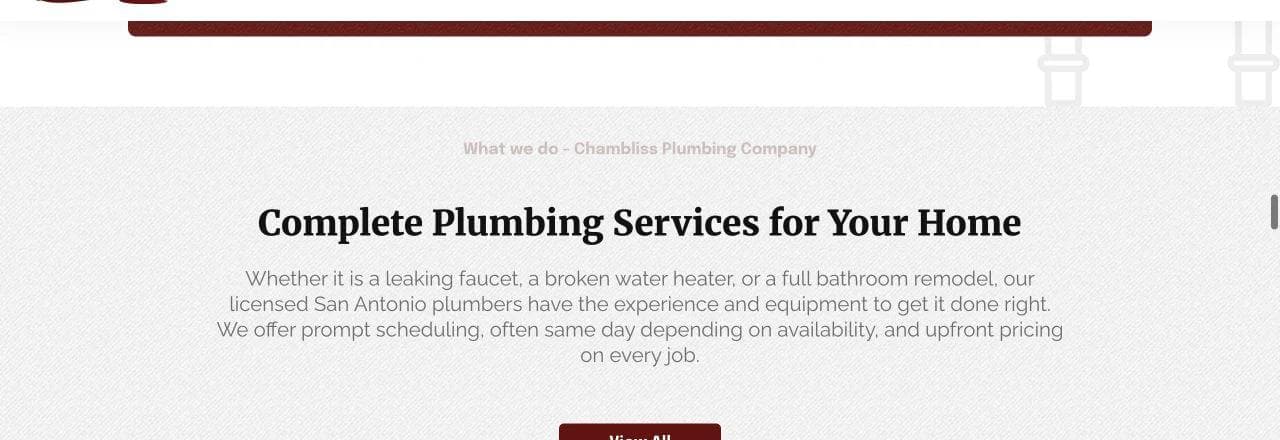
The complete-service section is organized by recognizable work such as residential plumbing, repairs, inspections, leak detection, drain cleaning, and water treatment. That makes it useful for both visitors and internal linking.
Local proof is repeated in different forms
The lower page combines service-area detail, customer reviews, and product brands. These proof types answer different questions: can you reach me, did customers trust you, and do you work with equipment I recognize?
The page could reduce duplication between the opening review claim and the later testimonials. The lower section is most valuable when each review includes enough context to identify the type of job, communication, pricing experience, or follow-through.
What to borrow
- Put the license number and review source near the first action.
- Connect the service hierarchy to local demand.
- Give maintenance membership a separate decision path.
- Publish financing and pricing expectations where high-cost jobs appear.
What not to copy blindly
Do not stack awards, badges, review counts, and tenure into a wall of proof. Prioritize evidence the customer can verify and that changes the hiring decision.
4. Foster Plumbing: qualify commercial buyers instead of mimicking residential service
Foster Plumbing focuses on commercial plumbing, maintenance, and construction in Colorado. Its homepage demonstrates why commercial work needs a different information hierarchy.
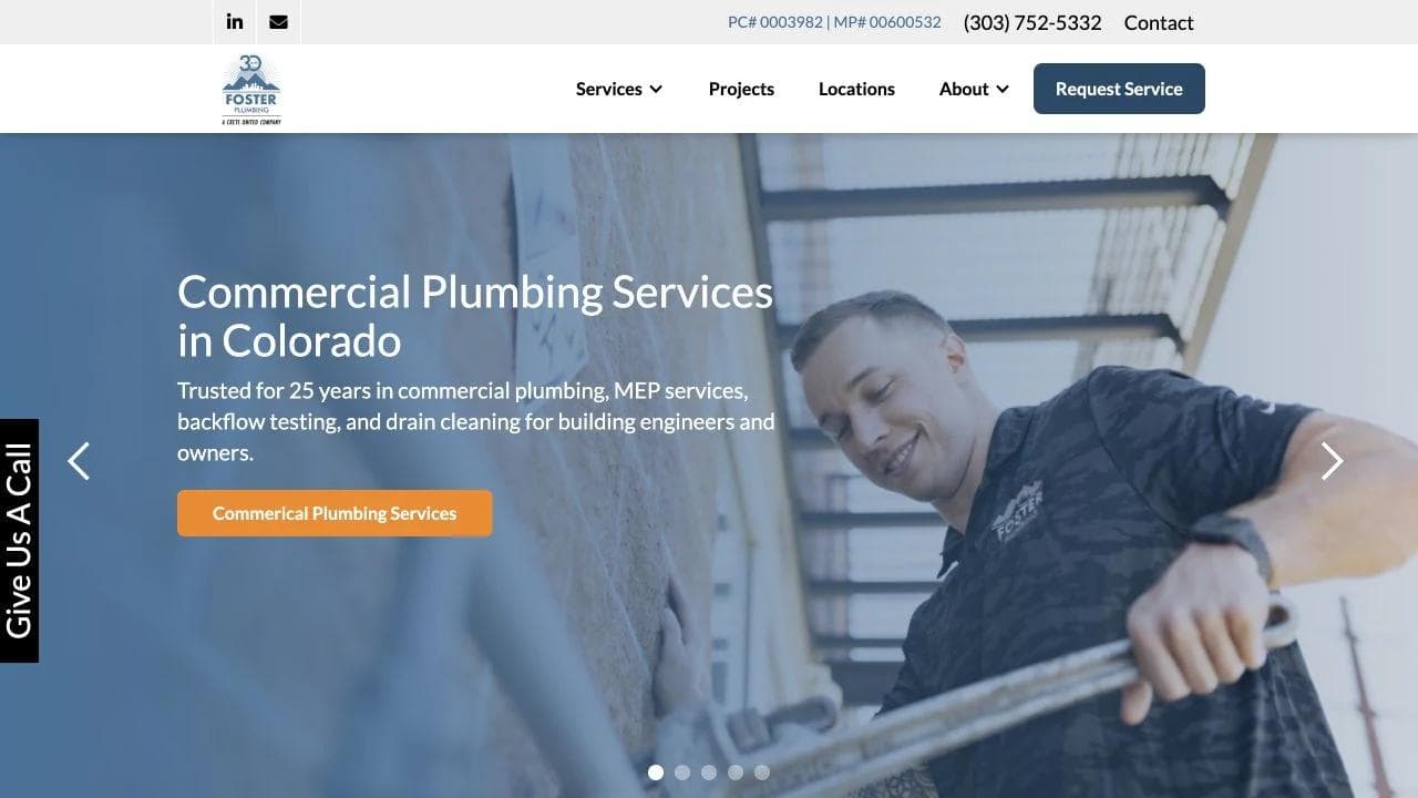
The opening names capability, not panic
The hero identifies commercial plumbing and provides a request-service action. Below it, the page separates ongoing commercial services from construction services. The first column includes maintenance and repair needs; the second addresses ground-up work, tenant improvement, and larger project scopes.
This division prevents a facilities manager with an active service issue from sharing the same vague intake path as a general contractor seeking a construction partner. The homepage could strengthen this further with distinct "Request service" and "Discuss a project" forms.
For commercial work, the intake should ask for property type, location, urgency, occupied status, system or issue, and preferred contact. Construction inquiries may also need bid date, plans, project stage, general contractor or owner role, and anticipated start. Do not force all of that into a residential callback form.
Reviews and projects perform different proof jobs
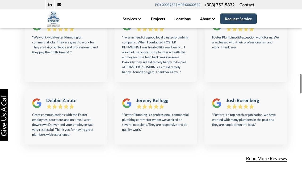
Customer reviews describe service experience, while project imagery demonstrates relevant environments and scale. Combining both is useful because a commercial buyer cares about responsiveness and technical fit.
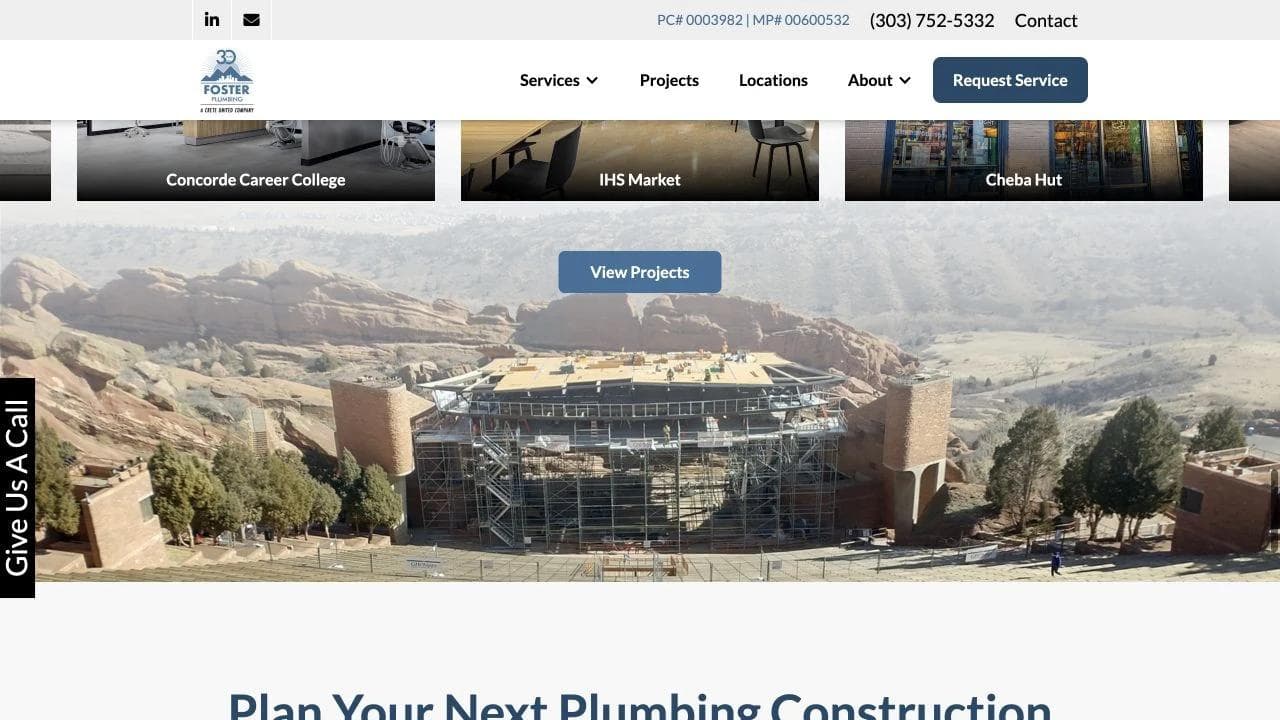
The projects would qualify buyers more effectively with visible metadata: client or property type, location, scope, occupied-building constraints, delivery method, schedule, and result. This is where the construction website design guide goes deeper. Plumbing service pages should still keep dispatch and maintenance paths more prominent than a general contractor would.
The closing sequence returns to a scoped conversation
The page follows project proof with a project CTA and a final company-positioning section. That is appropriate for planned commercial work, where the next step is qualification rather than instant booking.
The main opportunity is audience routing. Service, construction, and perhaps emergency buyers should see different response expectations. A single "request service" label can obscure whether the form reaches dispatch, estimating, or business development.
What to borrow
- Separate service calls from construction projects.
- Ask for commercial context before promising a response.
- Pair experience reviews with scope-specific project evidence.
- Use CTA labels that reveal which team receives the inquiry.
What not to copy blindly
Do not lead a residential emergency page with a commercial project portfolio. The proof must match the visitor's immediate risk.
5. Plumb Pro+: manage a broad service portfolio without losing the visitor
Plumb Pro+ serves multiple Lowcountry markets with plumbing and HVAC. The site has a harder information problem than a plumbing-only operator: it must route by service line, geography, urgency, and offer while maintaining one brand.
The opening creates clear service forks
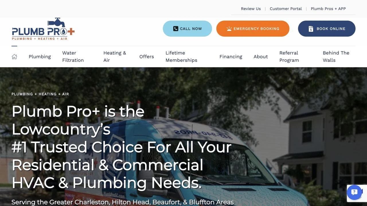
The hero states residential and commercial HVAC and plumbing, names the market, and provides calling, emergency booking, and online booking actions. The next section separates heating and air from plumbing and adds customer proof.
This is the right first fork. A broad home-services company should not make a visitor decode one giant list of equipment and problems. Route first by category, then by problem, then by location.
The page would benefit from clearer rules for "emergency booking" versus ordinary booking. If the emergency action is only a request and not live dispatch, say so. A visitor should know whether to wait for confirmation or call directly.
Geography and service lists support qualification
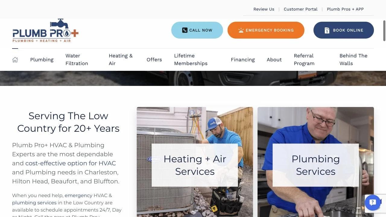
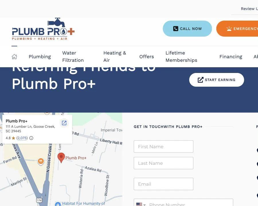
The service-area section uses a map and location language, followed by separate HVAC and plumbing service lists. That sequence answers where first, then what.
For local SEO, the map is not enough. Each location page should explain the actual service boundary, contact details, hours, locally available services, and useful location-specific information. Google's service-area business guidance recommends accurate service areas rather than using an arbitrary radius. Location pages should help customers, not simply swap city names into duplicated text.
Offers, financing, and referrals are conversion systems
The page presents service specials, a ticket promotion, financing, and a referral program. These are not decorative modules. Each one needs current terms, an expiration or eligibility rule, and an operational owner.
Offers can help planned jobs, especially system replacements. They can distract from urgent work if they sit between an emergency visitor and the phone number. Keep emergency contact persistent, and place coupons where visitors are comparing services or price.
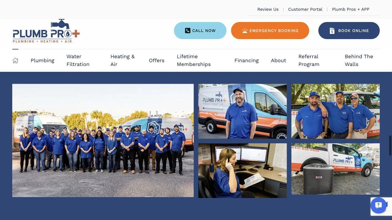
Referral programs and recruiting-style company photos also support retention and local familiarity. The tradeoff is homepage focus. A business with many promotions should archive expired offers immediately and prevent old campaigns from appearing in search snippets.
The lower page exposes the operating footprint
The closing sequence includes contact, service-area selection, financing, family-owned positioning, and local business information. That helps visitors verify that the company is reachable and established.
The page becomes repetitive because specials and referral content appear again near the footer. A tighter ending would preserve the contact route, address, hours, financing link, licenses, and privacy terms while moving campaign modules to focused pages.
What to borrow
- Route broad businesses by service line before listing every job.
- Put service-area confirmation near the service decision.
- Treat offers and referral programs as maintained systems.
- Keep emergency contact visible while planned-job promotions appear.
What not to copy blindly
Do not let promotions become the primary architecture. A customer must still understand service, location, urgency, and next step when every coupon expires.
Patterns shared by effective plumbing websites
Across these examples, several patterns are close to universal.
Put the urgent route in the first screen
The emergency phone number should be tappable, readable, and labeled. Do not rely on a small phone icon. State whether emergency service is truly 24/7, after-hours priority, or a request that will be confirmed later.
Confirm place before collecting a long lead
Show the service area in visible text, then validate ZIP code or address when necessary. Multi-location businesses should route to local hours, license information, and availability before making market-specific promises.
Organize services by customer problems
"No hot water" is often a better starting point than "water-heating solutions." Use symptoms to orient the visitor, then explain repair, replacement, inspection, and product choices on the service page.
Show what happens next
A good form confirmation is not enough. Explain whether dispatch calls, a scheduler confirms a window, a technician diagnoses on site, an estimate precedes work, or an estimator reviews plans.
Make trust verifiable
Include the correct license identifier, insurance language, review-source link, team photography, address where appropriate, warranty terms, and named certifications. Avoid stock badges that do not link to evidence.
Three homepage architectures for different plumbing businesses
Emergency-led residential plumber
Use this order:
- Location, 24/7 or after-hours status, and tap-to-call action.
- Common urgent problems.
- License, insurance, reviews, and realistic response expectations.
- Emergency process and immediate safety guidance.
- Planned services and booking.
- Service areas, team, FAQs, and complete business details.
Appointment-led residential plumber
Use this order:
- Market, services, call, and schedule actions.
- Short estimate or appointment route.
- Service categories and pricing process.
- Team, licensing, guarantees, and reviews.
- Financing or membership for relevant jobs.
- Local guides, FAQs, and closing contact.
Commercial plumbing contractor
Use this order:
- Property types, geography, and separate service or project actions.
- Maintenance, emergency, and construction capabilities.
- Credentials, safety, licensing, insurance, and coordination model.
- Projects with scope metadata.
- Service-level or response expectations.
- Qualified inquiry paths for facilities work and construction bids.
Local SEO, mobile performance, and accessibility
Local plumbing pages should be useful even if rankings did not exist. A city or service page needs real information about the service, location, hours, local contact path, common conditions, and the next step. Do not publish dozens of near-identical pages that only replace the city name.
Google's LocalBusiness structured-data documentation explains how to provide business details such as address, hours, and other properties to search engines. Structured data supports accurate interpretation, but it does not replace visible content or a maintained Google Business Profile.
Mobile testing should include the actual customer state: one hand, poor connectivity, a sticky call control, keyboard input, and an address or ZIP lookup. Core Web Vitals provide useful performance signals, but also test whether third-party schedulers, review widgets, maps, and chat tools block the primary action.
Accessibility is operationally important. Phone numbers, forms, menus, error messages, contrast, focus states, and alternative text must work for people using keyboards and assistive technology. The Department of Justice's web accessibility guidance explains how the ADA applies to businesses open to the public and points to technical resources. Automated scans are useful, but they do not replace manual keyboard and screen-reader testing.
Where Moda fits in a plumbing marketing stack
Moda can build and edit the public marketing layer: a branded homepage, service pages, service-area pages, technician introductions, simple lead forms, educational pages, and campaign creative. The same visual system can also support local ads, social posts, financing promotions, and seasonal maintenance graphics.
Moda is not a replacement for dispatch, CRM, estimating, scheduling, invoicing, call tracking, payments, inventory, or field-service operations. If those systems are central, choose the operational platform first and connect the public site to it deliberately.
If you need a polished public site and campaign assets around an existing operating stack, try Moda today. Keep the claims on the page aligned with the response times, pricing process, service areas, and guarantees the business can actually deliver.
For adjacent design decisions, see the construction company website guide, real estate website teardowns, and the broader comparison of AI website builders.
Plumbing website design checklist
- The first screen names the service and market.
- The emergency phone number is a labeled tap target.
- Planned work has a booking or estimate route.
- Service-area eligibility appears before a long form.
- Services use customer-recognizable problems.
- Residential and commercial inquiries separate when intake differs.
- License, insurance, review source, team, and warranty terms are verifiable.
- Pricing, diagnostic fees, financing, and memberships have plain terms.
- The page explains what happens after contact.
- Forms provide usable errors and confirmation.
- Schedulers, maps, review widgets, and chat do not block the primary action.
- Location pages contain real local information.
- Mobile, keyboard, screen-reader, and slow-connection tests are complete.
- Expired offers and unsupported claims have been removed.
Frequently asked questions
What should a plumbing website include?
A plumbing website should show the service area, urgent phone route, planned-work booking path, recognizable services, licensing and insurance information, review source, team or company proof, pricing process, and what happens after contact. Commercial and residential inquiries should separate when their intake requirements differ.
Should emergency plumbing and scheduled service use the same form?
Usually not. Active leaks, backups, and other damage risks need a clearly labeled phone or live dispatch route. Planned maintenance, inspections, replacements, and installations can use a scheduler or short request form. If one system handles both, state how emergencies receive priority and whether a booking is confirmed immediately.
Should plumbers publish prices online?
Publish prices when the scope is standardized enough for the number to help. Otherwise explain diagnostic fees, minimum charges, estimate approval, common cost drivers, financing, and what can change the scope. Coupons and memberships need current terms, exclusions, expiration details, and renewal rules.
How can a plumbing website improve local SEO?
Create useful service and location pages with accurate hours, contact details, service boundaries, local conditions, and relevant next steps. Maintain the Google Business Profile, use accurate LocalBusiness structured data, earn legitimate reviews, and connect service pages to genuinely useful location content. Avoid near-identical city pages that only swap place names.
Does a plumbing company need online booking?
Not every company needs it. Online booking is valuable for planned work when the calendar, service area, confirmation, and reminder system are reliable. A visible phone route may be more important for urgent work. The site should never imply real-time availability if the request still waits for manual review.
How often should a plumbing website be updated?
Update the site whenever hours, service areas, licenses, team, prices, financing, memberships, warranties, emergency coverage, or contact routing changes. Remove expired offers promptly. Test forms, phone links, schedulers, maps, review widgets, accessibility, and mobile performance on a regular schedule.

Real editable visuals. Real canvas. Full control.
Fly through design work