Restaurant Website Design: 6 Full-Page Teardowns
See six restaurant website designs analyzed section by section, with practical lessons for menus, reservations, ordering, locations, local SEO, and events.
 Anvisha Pai, Co-founder & CEO, Moda
Restaurant website design works when a hungry or planning visitor can answer four questions quickly: What is this place, where is it, is it open, and how do I order or reserve? The visual identity matters, but it should support those decisions instead of delaying them.
This guide examines six complete restaurant homepages across different operating models. We look beyond the hero image to see how each site handles menus, location choice, reservations, ordering, events, proof, and repeat visits.
The four visits a restaurant website has to support
A restaurant homepage is not one funnel. It serves people at four different moments:
- Eat now: The visitor wants hours, directions, the menu, pickup, or delivery.
- Plan a meal: The visitor is deciding whether the food, room, price, and occasion fit.
- Plan a group: The visitor needs private dining, catering, event capacity, or a human contact.
- Come back: The visitor wants a favorite dish, loyalty account, gift card, special event, or new location.
The first screen should establish the restaurant and surface the primary action. The rest of the homepage should route these four intentions without forcing everyone through the same path.
There are also three kinds of proof. Operational proof shows that the restaurant is open and current. Experiential proof shows what eating there feels like. Transactional proof makes the next step credible by explaining reservation rules, ordering coverage, event capacity, or pickup details.
Six restaurant website examples at a glance
- Monster Vegan is a single-location Philadelphia restaurant that turns a horror theme into events, direct ordering, and a reason to visit in person.
- Xi'an Famous Foods is an order-first, multi-location business that connects family story, signature dishes, locations, and shipped products.
- Dhamaka is a reservation-led New York restaurant that pairs a strong point of view with an HTML menu, press proof, and explicit booking rules.
- Maman is a multi-location cafe brand that uses seasonal campaigns to route visitors toward ordering, locations, catering, and events.
- Bakery Lorraine is a bakery and cafe whose homepage behaves partly like a retail storefront for classes, merchandise, shipped macarons, and gifts.
- The Morris is a neighborhood restaurant that puts its dinner menu, wine list, reservations, hours, address, and private-event path on one compact homepage.
These sites are not ranked. Each solves a different business problem, and each makes tradeoffs worth studying.
1. Monster Vegan: turn a theme into reasons to visit
Monster Vegan is more than a vegan restaurant with spooky graphics. Its site treats the horror concept as an operating system for movie nights, specials, cocktails, private dining, direct orders, and repeat visits.
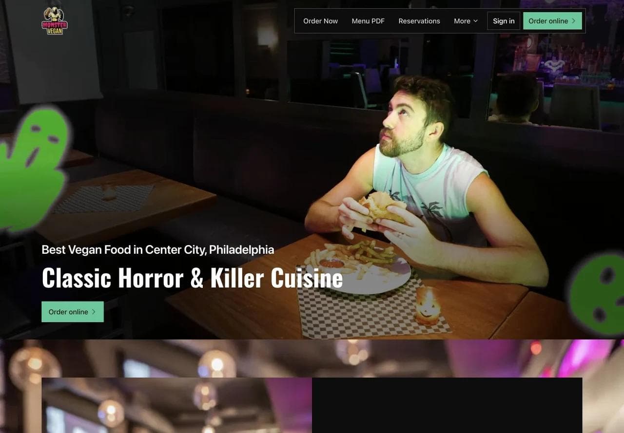
The hero does three jobs at once. It identifies the cuisine and city, shows the restaurant's personality, and keeps direct ordering visible. A first-time visitor can understand the concept without reading a long origin story.
The homepage moves from atmosphere to an actual calendar
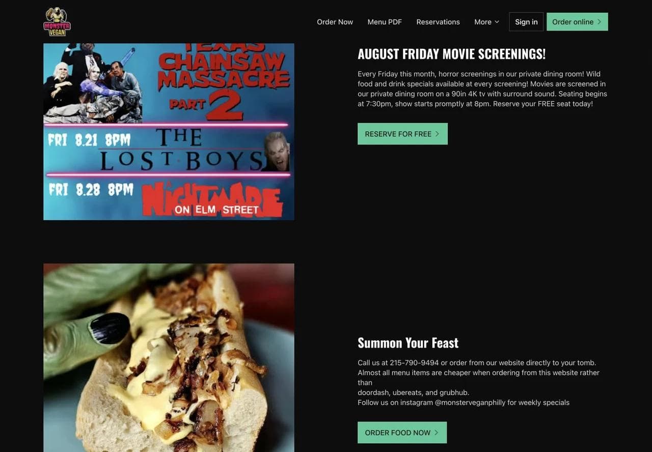
The next sections give the theme something to do. Movie screenings become dated events with a specific reservation action. The direct-order section explains why a guest might order from the restaurant rather than a delivery marketplace. That is more useful than a generic “Order now” button because it supplies a reason to choose the channel.
The page also separates a seat reservation, an event reservation, and a food order. Those are different transactions and should not share one ambiguous button.
Hours and specials supply operational proof
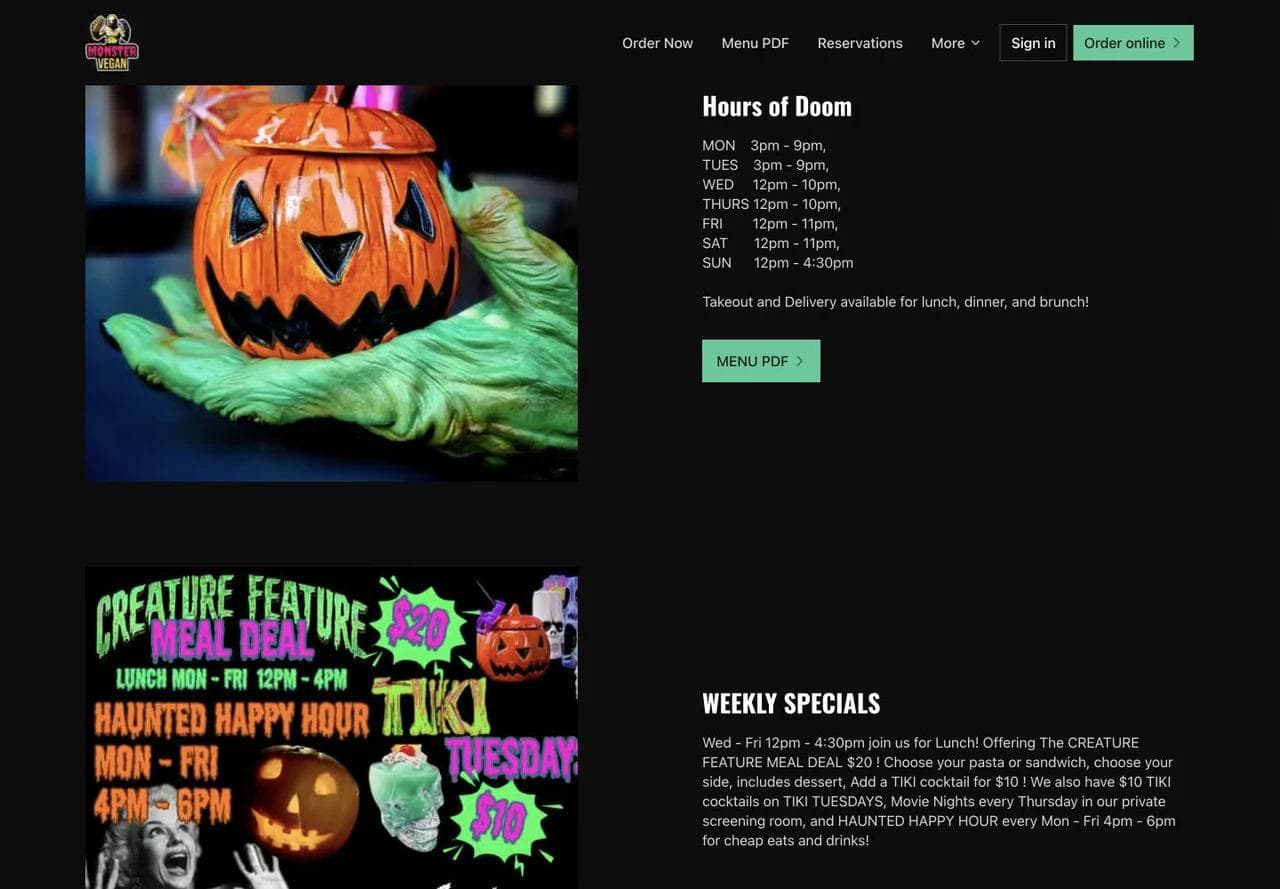
The “Hours of Doom” section keeps the voice consistent while giving practical information. Weekly specials sit beside the hours, so the page answers both “Can I go?” and “Why should I go this week?”
This is a useful pattern for restaurants with recurring programming. Happy hour, brunch, live music, trivia, or tasting nights should have a stable home on the site, not exist only in an Instagram post that disappears from view.
Space, location, and reviews close the remaining gaps
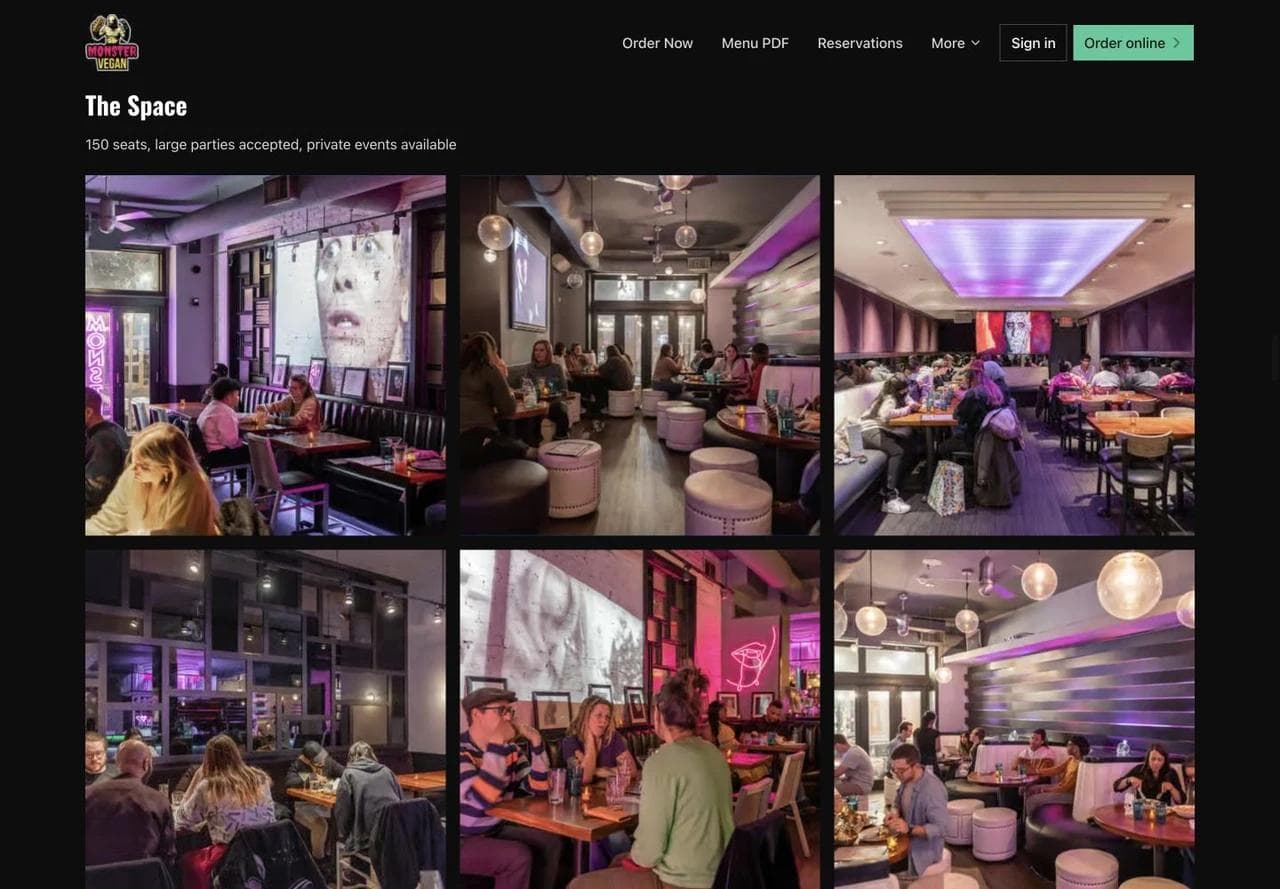
Interior photography helps a group organizer assess the room, not merely admire it. The page names its capacity and private-event availability, which turns the gallery into evidence for a larger booking.
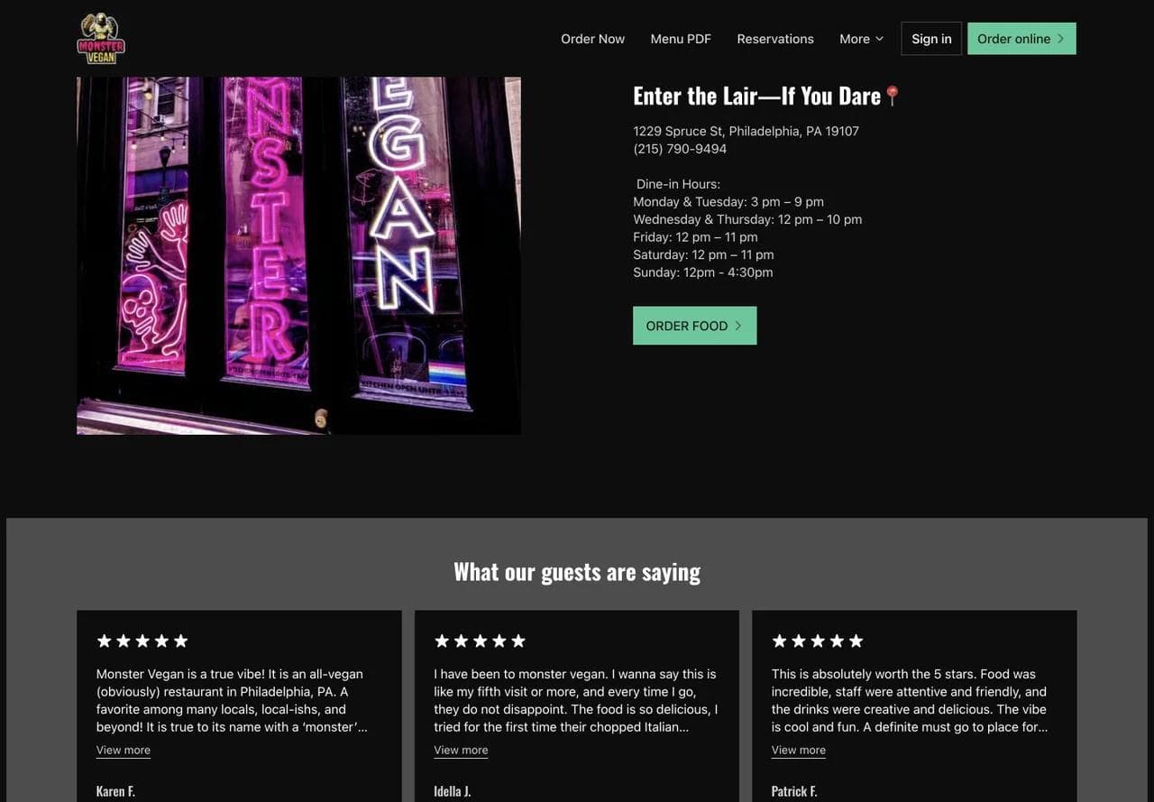
The location block repeats the address and hours near another order action. Reviews then answer an emotional objection: whether the themed room is enjoyable as an actual restaurant.
What to borrow: Give a distinctive brand multiple jobs. Use it in the event calendar, offer names, photography, and interface language, while keeping actions recognizable.
What not to copy blindly: This homepage is very long and image-heavy. A restaurant without enough changing programming would create repetition by using the same structure. The menu is also offered as a PDF, which adds friction on smaller screens compared with a well-structured HTML menu.
2. Xi'an Famous Foods: connect menu discovery to a family story
Xi'an Famous Foods operates across multiple locations, but its homepage does not begin with a generic location finder. It first establishes the food category and the dishes that make the business recognizable.
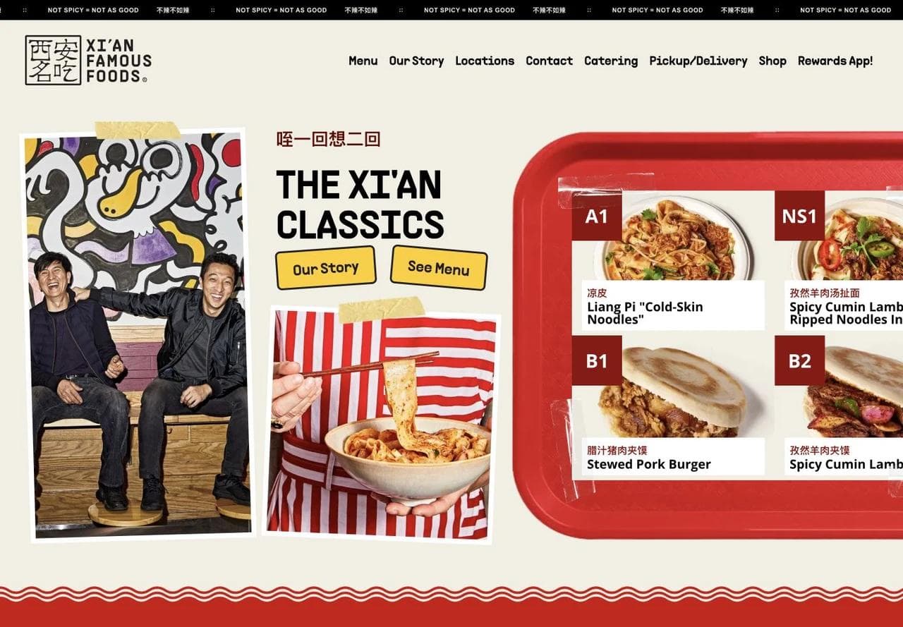
The hero names “The Xi'an Classics,” shows dish codes and names, and offers both story and menu paths. Pickup and delivery remain visible in the navigation. This lets a returning customer act immediately without reducing the homepage to a transaction screen.
The story explains why the dishes belong together
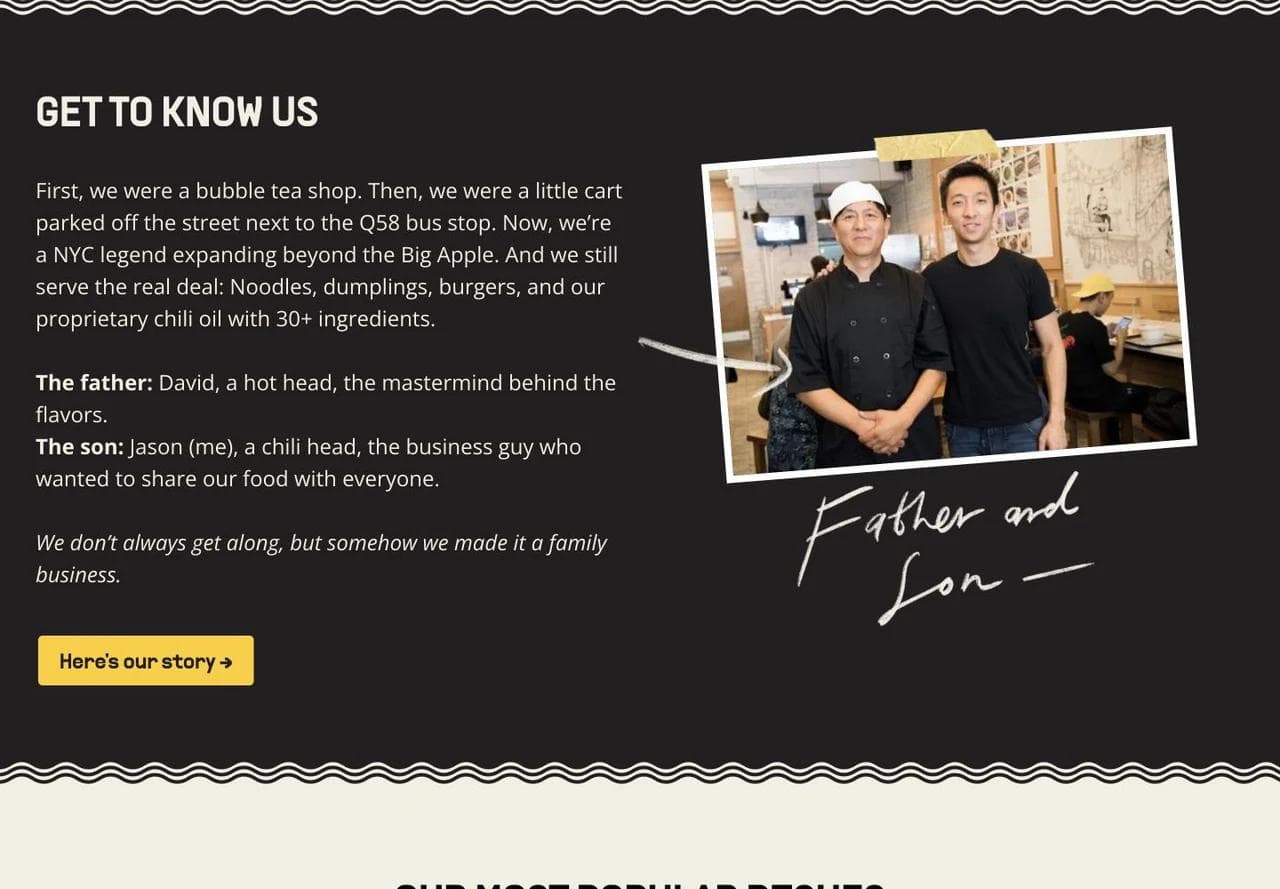
The family story is concrete: a bubble tea shop, a cart near a bus stop, a father responsible for flavors, and a son responsible for the business. This gives the menu an organizing idea. It does not ask the visitor to care about a vague passion for hospitality.
For a founder-led restaurant, a story should explain a product decision, service ritual, ingredient, or point of view. If removing the story would not change how a guest interprets the food, it probably belongs deeper in the site.
Signature dishes reduce menu anxiety
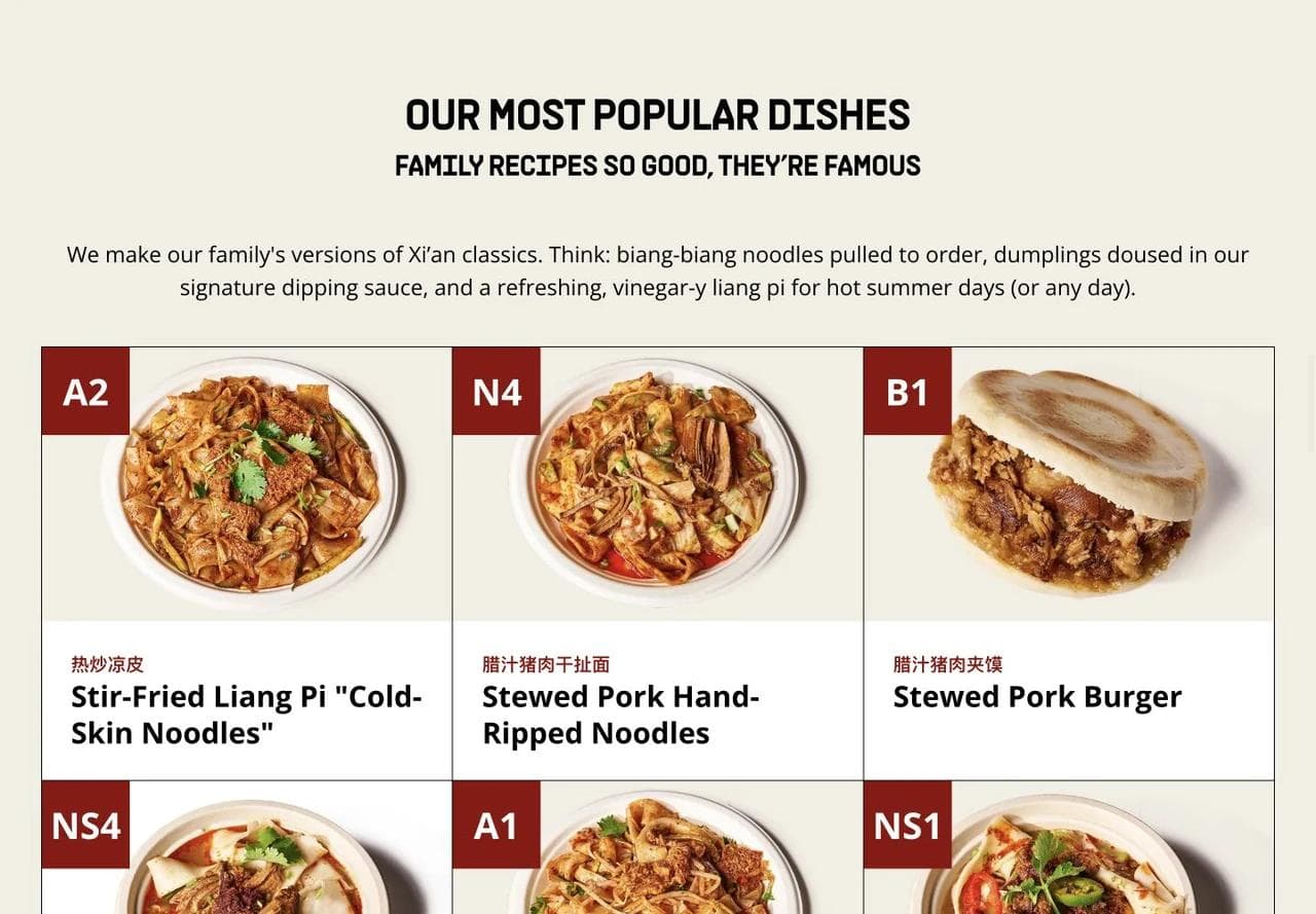
The popular-dishes grid introduces unfamiliar food through photos, English descriptions, Chinese names, and stable menu codes. It helps a first-time guest choose a starting point without simplifying the full cuisine into one bestseller.
This is especially useful when a menu contains terms the target customer may not know. A short discovery layer can build confidence, while the complete menu remains available for people ready to order.
Retail products extend the relationship beyond a location
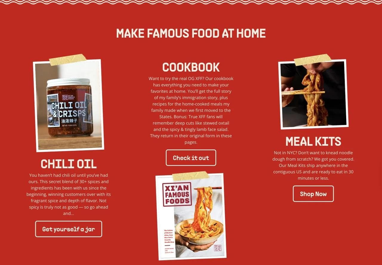
Cookbook, chili oil, and meal-kit paths follow the restaurant story instead of appearing as unrelated merchandise. Each product carries part of the same food system into the home.
The main tradeoff is route density. Menu, locations, catering, ordering, shipped products, rewards, and story all compete for attention. Multi-location restaurants should decide which action belongs in the header for a nearby hungry customer and which belongs later in the journey.
What to borrow: Teach the category through a few representative dishes, then connect those dishes to a credible origin story.
What not to copy blindly: A strong retail extension makes sense when the restaurant has recognizable packaged products. Generic merchandise can distract from ordering and location choice.
3. Dhamaka: make the point of view specific, then make booking rules explicit
Dhamaka is reservation-led. The homepage needs to sell a particular dining experience and prepare the guest for a more constrained booking process.
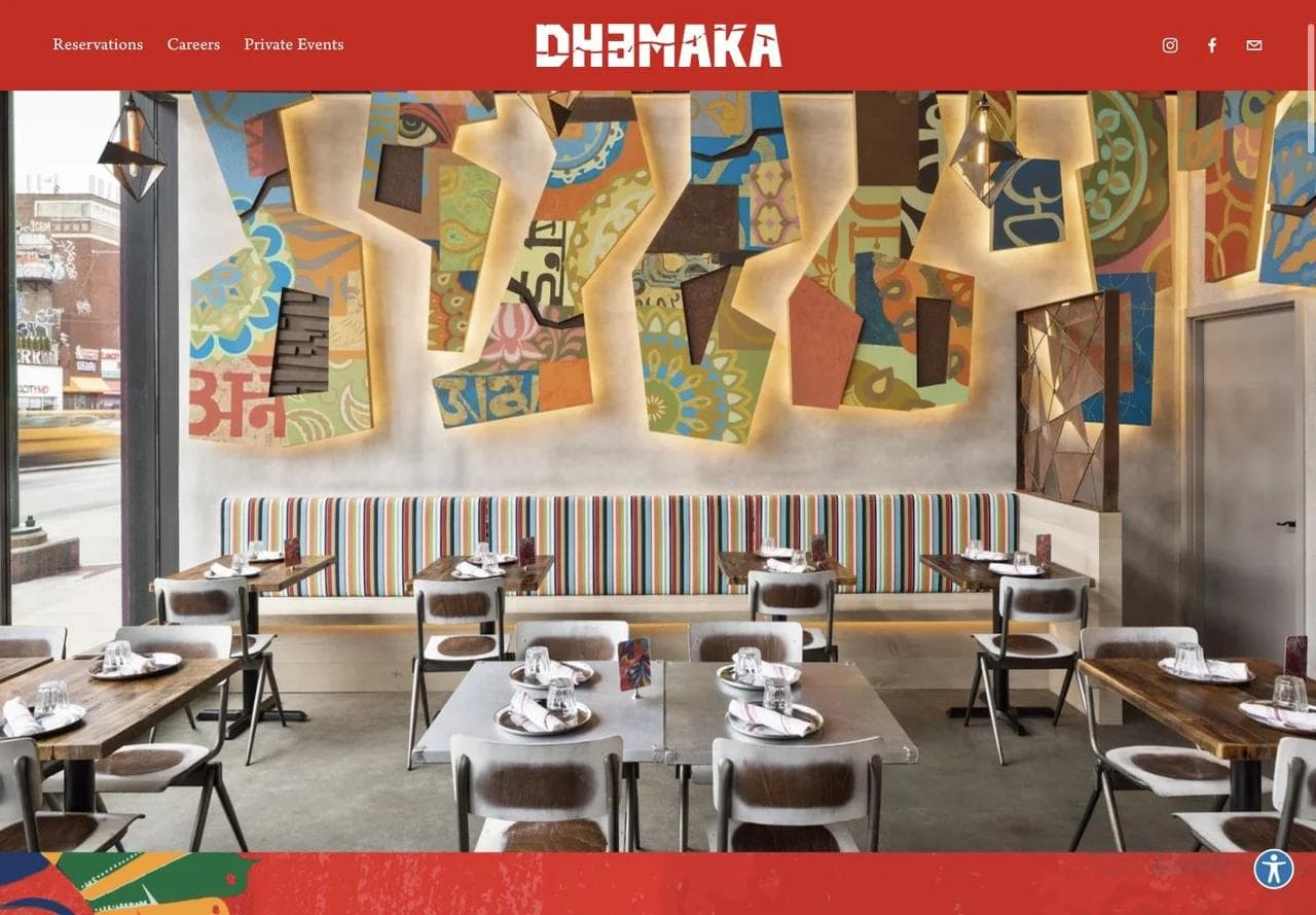
The hero relies on the room and food rather than a dense value proposition. Reservations and private events stay in the navigation. This works because the visual identity is distinct and the booking action is always available.
The story defines what the restaurant will and will not serve
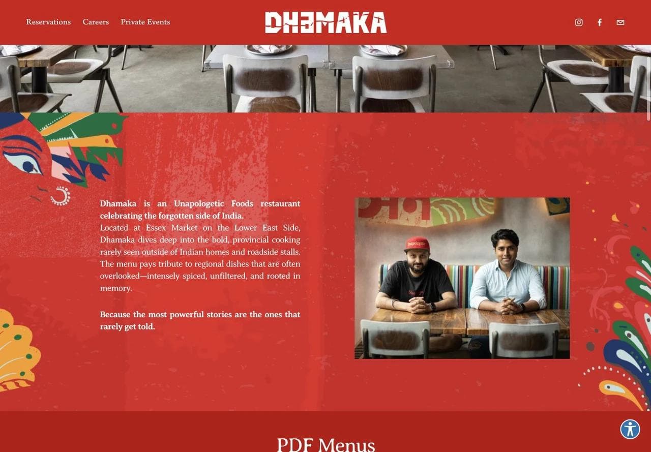
The positioning is unusually specific: provincial Indian cooking that the restaurant says is often overlooked outside homes and roadside stalls. The site explains the curatorial choice rather than claiming only authenticity or bold flavor.
The PDF menu links appear immediately after this story. They are easy to download, but PDFs are not the end of the menu experience here.
The HTML menu is the practical center of the page
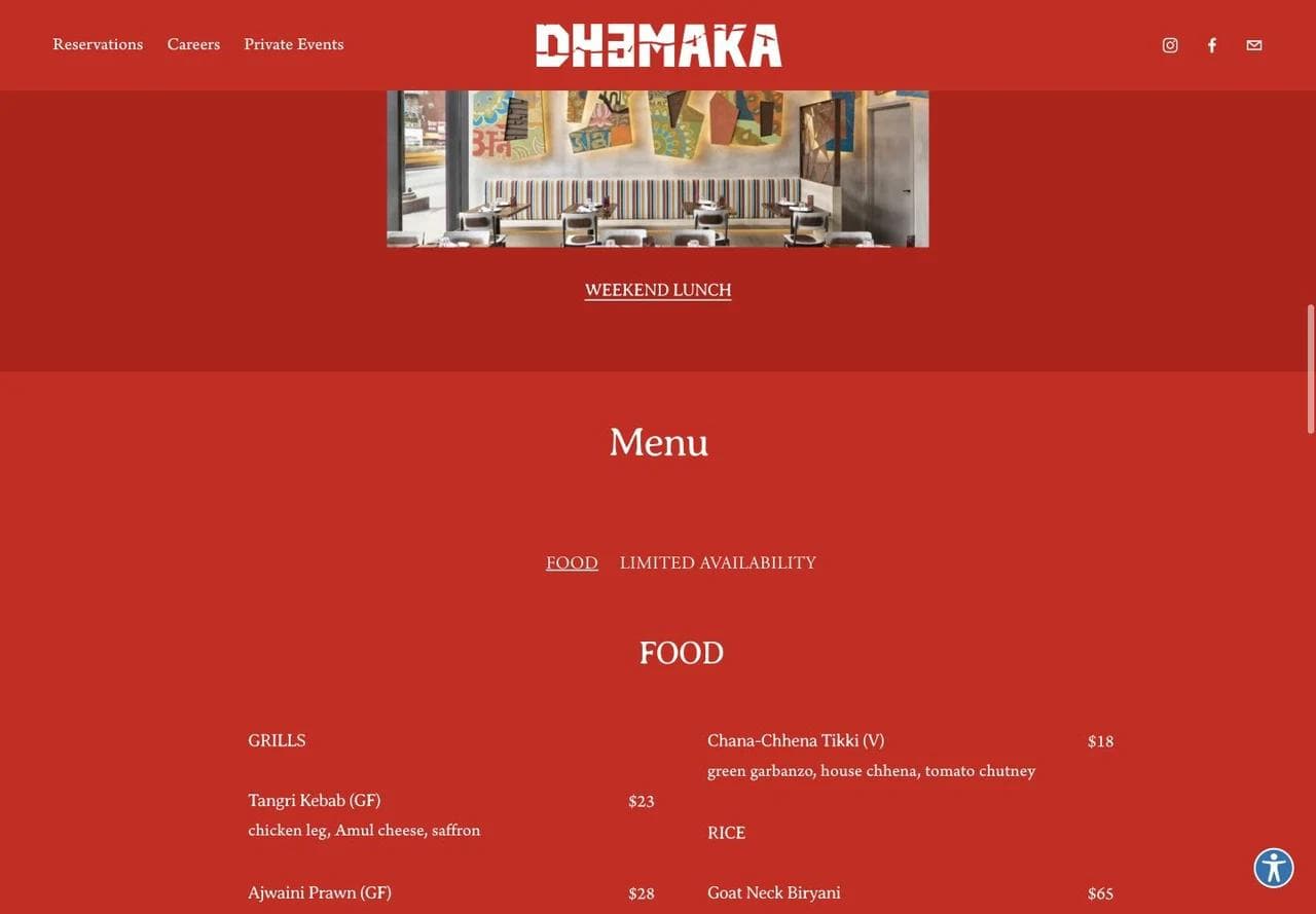
The embedded menu exposes dish names, prices, descriptions, sections, and dietary abbreviations as selectable text. That is easier to scan and more useful to search engines than an image of a menu. It also lets a visitor compare choices without leaving the homepage.
Dietary labels such as V or GF can help people narrow a menu, but they are not a substitute for an allergen policy or a conversation with the restaurant. A website should explain how guests can ask about cross-contact and accommodations when that information matters.
Press proof supports the price and occasion decision
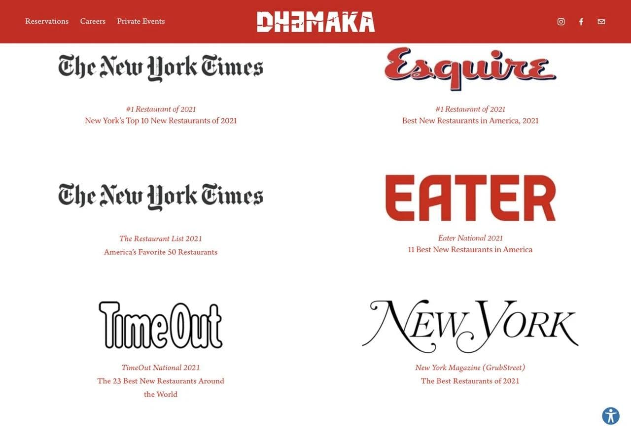
The press grid is not required for every restaurant. Here it helps validate a destination dining decision. The logos are recognizable, and the accompanying labels explain what each source selected the restaurant for.
Reservation policy prevents a failed handoff
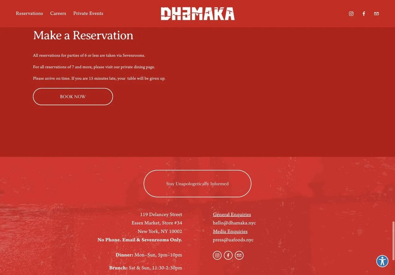
The booking section states the party-size boundary, where larger groups should go, and what happens when a table is late. The footer then gives the address, service times, and contact policy. This is transactional proof: the guest knows what the reservation button will and will not solve.
What to borrow: Put policy beside the action that depends on it. A party-size limit hidden in an FAQ creates avoidable dead ends.
What not to copy blindly: Large press grids can overwhelm a newer neighborhood restaurant whose visitor mainly needs menu, hours, parking, and availability.
4. Maman: route a broad restaurant brand through campaigns
Maman has multiple locations and revenue streams, including cafe visits, pickup, shipped gifts, catering, and events. Its homepage behaves more like a campaign hub than a single restaurant homepage.
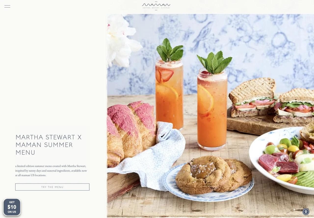
The first screen promotes a seasonal menu collaboration. The photography and art direction communicate a coherent brand, while the call to action leads to a specific current offer.
This structure is useful when a business can update the homepage reliably. A stale seasonal hero is worse than a stable evergreen one, so campaign-led sites need a clear owner and expiration process.
Location choice and ordering are separate paths
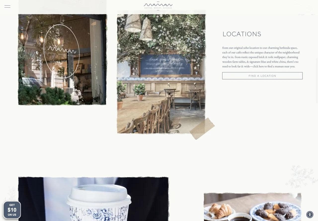
The location section explains that each cafe reflects its neighborhood and sends the visitor to a dedicated location finder. Ordering has its own section and loyalty framing. Separating these paths matters because a person choosing a cafe needs different information from someone placing an immediate pickup order.
Every location should ultimately have its own page with address, current hours, menu or menu scope, phone or contact method, ordering link, and local photography. Google also advises multi-location businesses to use action links that lead to the specific location rather than a generic brand page.
Catering and events deserve different briefs
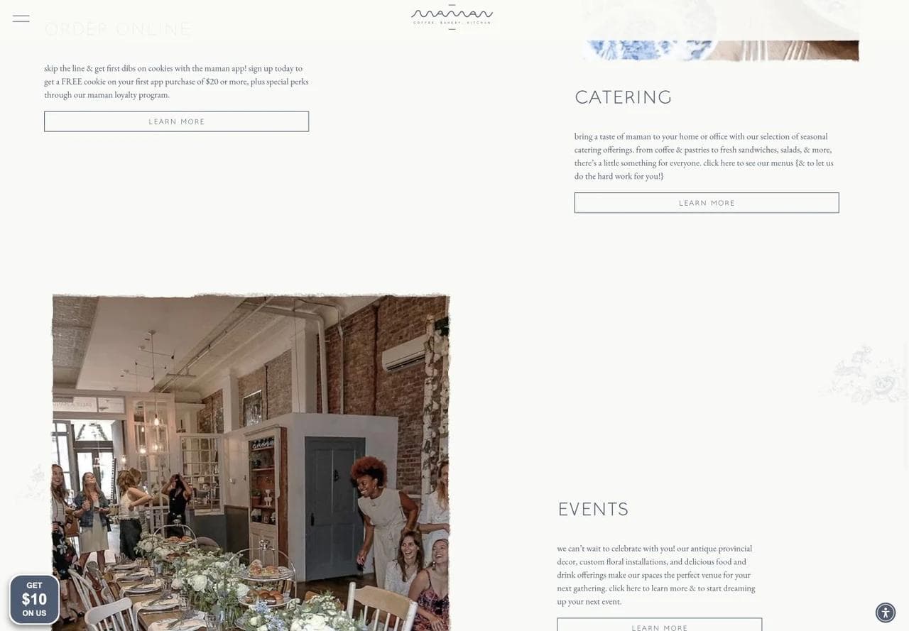
Catering is framed around food delivered to a home or office. Events are framed around the physical rooms and atmosphere. The distinction helps visitors self-select before they encounter an inquiry form.
What to borrow: Treat location, ordering, catering, and events as separate customer jobs. Use the homepage to route them, then let each path collect the information it needs.
What not to copy blindly: Seasonal campaigns dominate the practical restaurant information. A smaller cafe without a strong location hub could make a nearby visitor work too hard to find today's hours.
5. Bakery Lorraine: know when the homepage has become a storefront
Bakery Lorraine shows a different fork. A bakery and cafe may also sell classes, shipped goods, gifts, custom orders, and merchandise. At that point, the homepage partly becomes an ecommerce storefront.
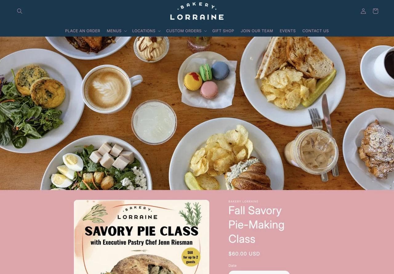
The current hero sells a dated pie-making class with price, date options, quantity, and cart action. This is a direct commerce experience, not a promotional banner that sends the visitor to another system.
The strength is clarity for the promoted event. The tradeoff is that a person looking for a nearby pastry, menu, or opening time must use the navigation.
Merchandise and shipped food create a different browsing rhythm
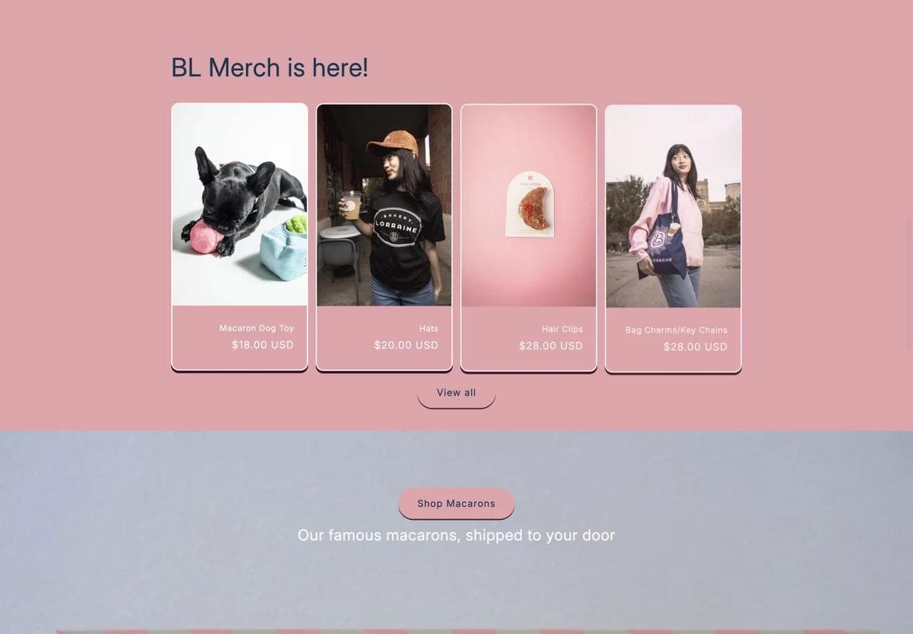
The product carousel uses familiar ecommerce patterns. It works because these items can be evaluated visually and bought without choosing a cafe location.
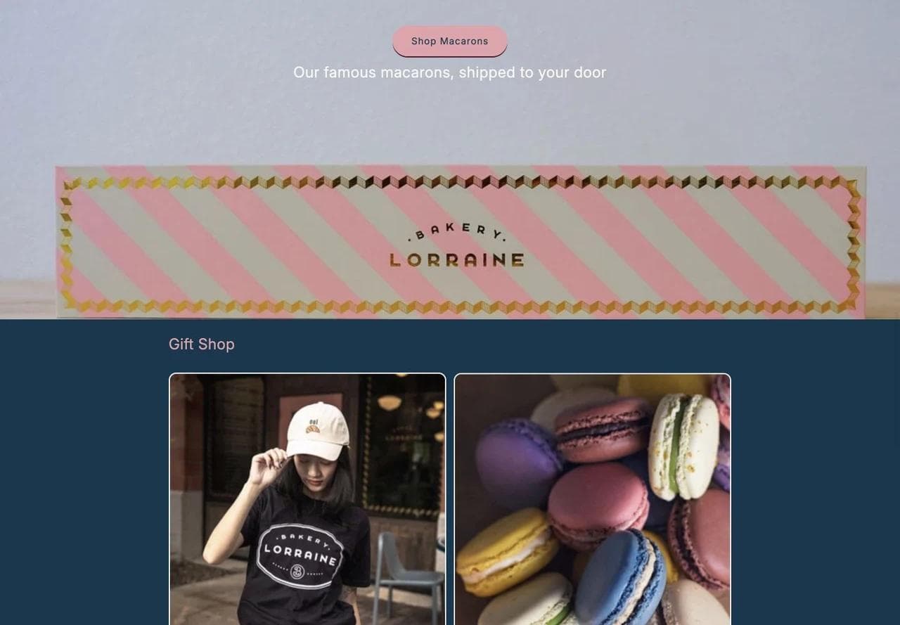
Shipped macarons and gifts extend the business beyond local visits. The page keeps those products inside the same visual world as the cafe.
This suggests a useful architecture decision. If local visits are the main business, lead with cafe information and place commerce later. If classes, gifts, or shipping are strategically important, use a storefront structure but keep “Visit,” “Menu,” and “Order pickup” persistently visible.
What to borrow: Separate products that ship from products that require a location, date, pickup window, or production lead time.
What not to copy blindly: A campaign or class should not replace evergreen location information unless the navigation makes the local visit path unmistakable.
6. The Morris: put the practical details on the first screen
The Morris takes the opposite approach from a campaign hub. Its hero acts as a compact operating card for one neighborhood restaurant.
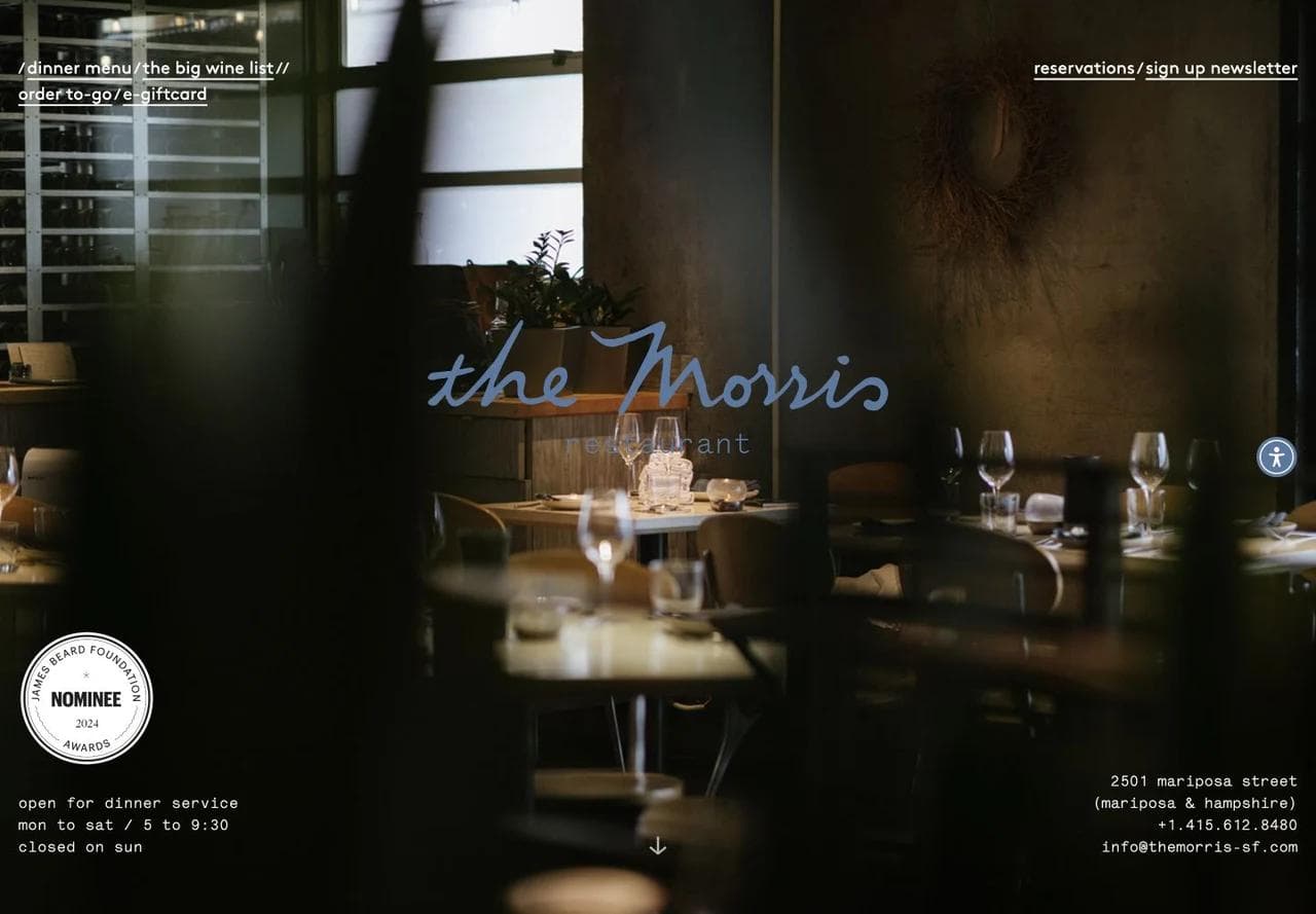
The dinner menu, wine list, to-go order, gift card, reservations, newsletter, service hours, address, phone, and email all appear around the room photograph. A returning guest can act without scrolling.
This much information works because the typography is restrained and the site has one location. The same composition would become crowded for a restaurant group.
Story and gallery reinforce a neighborhood position
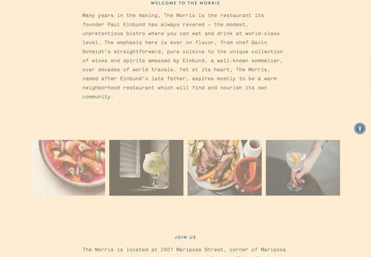
The story describes a modest, unpretentious bistro with ambitious food and wine. A small gallery follows. The copy tells the visitor what kind of relationship the restaurant wants with its neighborhood, while the images show the food and people behind it.
The visit section answers edge-case questions
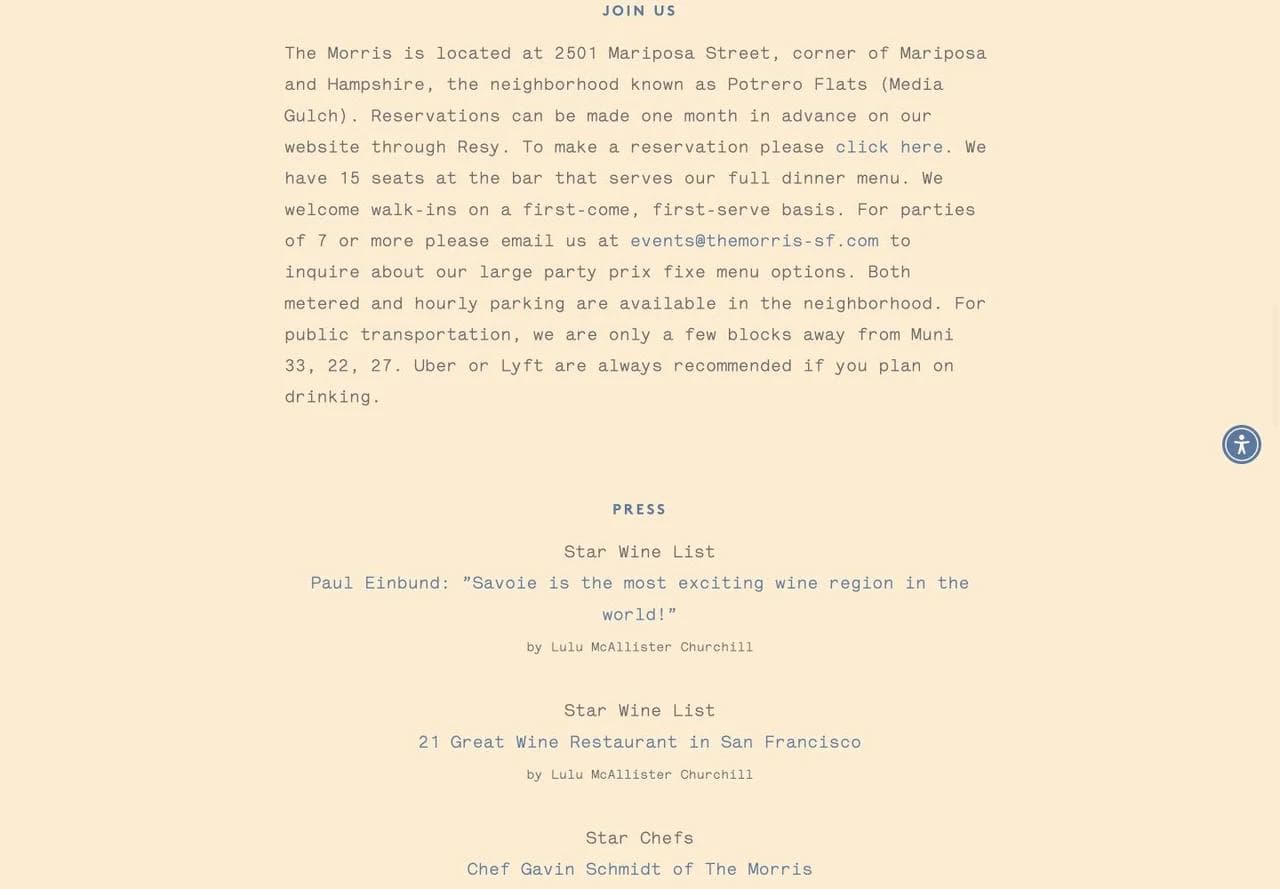
The “Join Us” section explains how far ahead reservations open, that the bar accepts walk-ins, how larger parties should inquire, and what transportation or parking looks like. These details reduce uncertainty that a booking widget cannot resolve.
Private events use a qualified human handoff
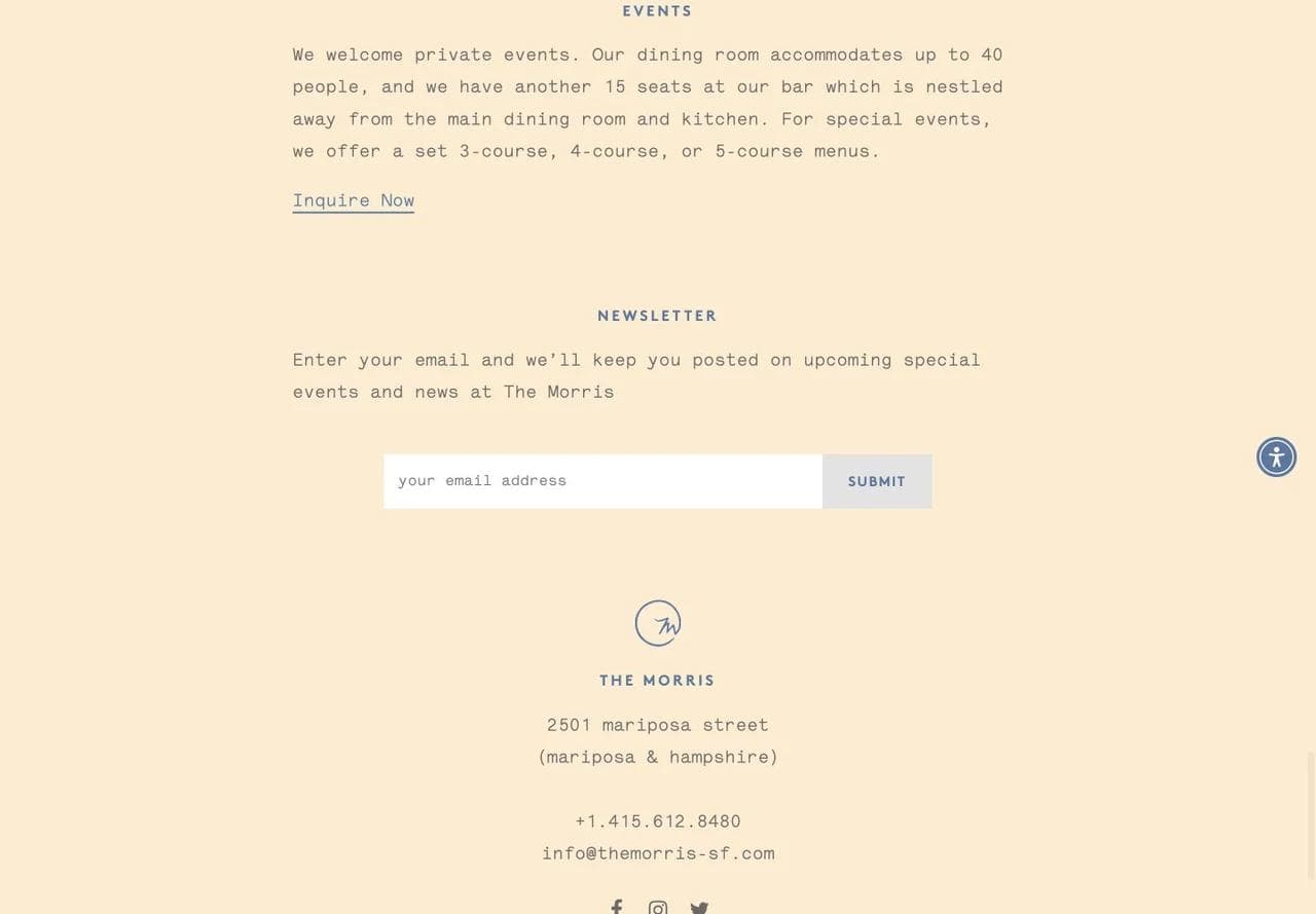
The event section names capacity for seated and standing formats, then sends the visitor to an inquiry. That is enough information for a prospect to rule the venue in or out before emailing.
What to borrow: Give edge cases a clear route. Walk-ins, large parties, corkage, parking, and private events are common reasons a guest leaves the reservation widget and searches elsewhere.
What not to copy blindly: The menu and wine list are PDFs, and the long press archive eventually outweighs the practical content. Keep old proof available, but prioritize current guest decisions on the homepage.
What every restaurant website should make obvious
Across these different models, the universal layer is small:
- What you serve: Name the cuisine or concept in language a first-time guest can understand.
- Where you are: Show the neighborhood and city early. Multi-location brands should route to specific location pages.
- When you are open: Keep regular and special hours consistent with your Google Business Profile and ordering or reservation systems.
- What it costs: Publish a current menu with prices or explain the fixed-price format.
- What the guest should do next: Use a direct verb such as Reserve, Order pickup, View menu, Get directions, or Ask about private dining.
- What the experience feels like: Show real food, room, and service photography that answers the occasion question.
- How exceptions work: Explain party-size rules, dietary-contact paths, event capacity, pickup boundaries, or other constraints beside the relevant action.
Do not give every action equal visual weight. A fast-casual restaurant may prioritize Order, then Menu and Locations. A reservation-led dining room may prioritize Reserve, then Menu and Private dining. A bakery may prioritize Visit or Order pickup, then Custom orders and Shipping.
Menu design: searchable text first, downloadable file second
The menu is usually the highest-intent content on a restaurant site. Build the primary menu as semantic HTML text when practical. That makes it responsive, selectable, easier to update in a content system, and available to search engines.
A downloadable PDF can still help guests who want a printable version, a wine list, or a banquet package. Treat it as a supplement. Avoid making a scan, image, or PDF the only way to learn the menu.
For each item, include the name, concise description, price, and relevant dietary label. Explain what labels mean and provide a contact path for allergy questions. Do not imply that a small icon guarantees the absence of cross-contact.
Seasonal items create a maintenance problem. Assign one system as the source of truth and show a visible “updated” date only if the team will maintain it. A stale date reduces confidence rather than increasing it.
Restaurant local SEO starts with operational consistency
Local SEO is less about adding city names everywhere and more about making each real location unambiguous.
- Create one useful page per location with unique hours, address, contact method, menu scope, order or reservation link, amenities, and local photography.
- Keep the business name, address, phone, and hours consistent across the site and Google Business Profile.
- Add the correct menu, reservation, and ordering URLs to the profile. Google lets restaurants select preferred links, and its policy says multi-location action links should lead to the specific location.
- Add `Restaurant` structured data with the location, hours, and menu URL. Validate it with Google's Rich Results Test.
- Link neighborhood, event, catering, and menu content to the relevant location page rather than creating isolated articles with no action path.
Do not manufacture dozens of thin neighborhood pages for places the restaurant does not serve. A location page earns its URL by containing information that is genuinely different and useful.
Mobile, accessibility, and third-party handoffs
Most urgent restaurant visits happen on a phone. Test the whole path, not only the homepage breakpoint:
- Can a visitor tap Menu, Call, Directions, Reserve, and Order without zooming?
- Does a sticky button cover menu items or accessibility controls?
- Can the navigation and modal dialogs be used with a keyboard?
- Do photographs have useful alternative text when they communicate a dish, room, or event setup?
- Does the ordering or reservation provider preserve the selected location and return a clear error when no slot is available?
- Can a guest recover if the third-party page opens in a new tab or loses context?
The W3C navigation-menu guidance recommends structural labels, keyboard operation, visible focus, and click targets that work for people with fine-motor or touch-screen needs. Accessibility review should include the third-party tools that complete orders and reservations, not stop at the marketing site.
Three practical restaurant homepage blueprints
Single-location full-service restaurant
- Cuisine, location, and primary reservation action
- Current menu preview and full menu
- Room and food photography
- Story or chef point of view
- Hours, address, directions, and contact
- Private dining or large-party path
- Current events, gift cards, and newsletter
Order-first or multi-location restaurant
- Food category and Order action
- Location selector before the ordering handoff
- Signature dishes and menu categories
- Pickup, delivery, catering, and rewards paths
- Brand story and sourcing only where they explain the product
- Specific location pages with hours and local actions
Bakery, cafe, or hospitality hybrid
- Decide whether Visit, Order pickup, Shop, or Book an event is primary
- Separate same-day local products from shipped products
- Explain lead times for cakes, catering, or custom work
- Show cafe locations and menus independently from ecommerce collections
- Use dated campaigns only with an owner and expiration process
These are starting structures, not templates. The correct sequence follows the business model and the visitor's most valuable next action.
Where Moda fits in a restaurant marketing workflow
Moda can help a restaurant create a visually distinctive static marketing site, a campaign or event page, social ads, Instagram posts, menus, and other on-brand creative. Try Moda today if you want an AI agent to build and revise those assets on an editable canvas.
Moda is not a restaurant operating system. Use dedicated tools for live reservations, online ordering, POS integration, loyalty accounts, inventory, and location-specific availability. The website should present the brand and route each guest cleanly into that infrastructure.
For broader examples of planning complete pages, see our SaaS landing-page teardowns, law-firm website design guide, and real-estate website design guide.
Restaurant website design checklist
- The cuisine, city, and primary action are clear in the first screen.
- Menu, hours, address, phone, and directions are current and easy to reach.
- Ordering and reservation buttons lead to the correct location and transaction.
- The menu uses readable web text, with a PDF only as an optional supplement.
- Dietary labels are explained and allergy questions have a contact path.
- Private dining and catering pages state capacity, service area, or minimum useful qualifications.
- Real food, room, and team photography supports a visitor decision.
- Every location has a useful page with unique local information.
- Google Business Profile links and site links agree.
- Restaurant structured data validates.
- Navigation, forms, dialogs, and third-party handoffs are tested with keyboard and mobile input.
- Old campaigns, expired events, and outdated specials have an owner and removal date.
Frequently asked questions about restaurant website design
What should a restaurant website include?
At minimum, include the cuisine or concept, current menu and prices, hours, address, directions, phone or contact method, real photography, and a direct reservation or ordering action. Add private dining, catering, gift cards, loyalty, and events only when they support the business model.
Should a restaurant menu be a PDF or a web page?
Use a responsive HTML web page as the primary menu when practical. It is easier to scan on a phone, update in a content system, and expose to search engines. A downloadable PDF can be a useful supplement for printing, wine lists, or event packages.
How quickly should visitors be able to order or reserve?
The primary action should be visible on the first screen and remain easy to reach. More important than an arbitrary click count is preserving the correct location, service type, date, and party context when the visitor enters the transaction system.
Does every restaurant location need its own page?
Yes, when the locations have distinct addresses, hours, menus, amenities, or ordering links. Each page should contain genuinely local information and route to that location’s transaction. Do not create thin pages that differ only by a city name.
How often should a restaurant update its website?
Update hours, closures, menu prices, ordering links, and reservation policies whenever operations change. Give seasonal campaigns and events an owner and an expiration date. Review location pages and third-party handoffs regularly on both desktop and mobile.
Can Moda replace a restaurant ordering or reservation platform?
No. Moda can create a static marketing site, campaign page, social creative, ads, and menus, but restaurants should use dedicated systems for live ordering, reservations, POS, loyalty, inventory, and location-specific availability.

Real editable visuals. Real canvas. Full control.
Fly through design work