Static Ads: What Still Works, and the Anatomy of One That Runs (2026)
What a static ad is, the six parts of one that keeps running, five layouts that survive on Meta and LinkedIn with measured samples, what breaks on phones, and how to rebuild references on-brand.
 Anvisha Pai, Co-founder & CEO, Moda
A static ad is a single image with copy around it: one picture, one headline, one call to action, and no motion. On Meta feeds and on LinkedIn it is still the working unit of paid social. Not because video stopped working, but because a static ad is the cheapest thing to make, the fastest to test, and the format most of the ads that survive a quarter of budget reviews turn out to be.
This guide is about the anatomy: the six parts every static ad has, the five layouts that keep running in public ad libraries, what breaks on a phone, and how to turn a set of saved references into ads that match your brand. The examples come from the Meta Ad Library and the LinkedIn Ad Library, captured on September 2, 2026, and each one carries its dates. Neither library shows spend, clicks, or results, so the only thing we can say about any ad is how long it has run and whether the advertiser is running versions of it. Longevity is a proxy, and a leaky one. It is still the best public evidence there is.
What a static ad is, and why it is the working unit
On Meta, a static ad is an image ad: a photo or graphic in the 4:5 or 1:1 frame, primary text above it, a headline and description below it, and a button. Meta's Ads Guide, checked September 2, 2026, recommends 4:5 at 1440 x 1800 pixels for both the Facebook and Instagram feed placements, with a primary text of 125 characters and a headline of 40 characters for Instagram. On LinkedIn the equivalent is the Single Image Ad: introductory text, then the image, then a headline and a call-to-action button. LinkedIn's spec page, same date, recommends 1:1 at 1200 x 1200 for delivery across desktop and mobile, allows 1.91:1 at 1200 x 628 and a mobile-only vertical, and caps the headline at 70 characters and the intro at 150.
Why it is the working unit is visible in the libraries. In three LinkedIn start cohorts from June 2026, single image was the format of 68 of the 90 ads we opened; video was 8. On Meta, a keyword search filtered to image ads returns hundreds of active creatives per category in seconds, and half the skincare sample had been running for more than three months. A static is also the format a small team can produce ten of in an afternoon, which is what makes testing possible at all. It is read on a phone, in a second or two, by someone who did not ask for it, and everything below follows from that.
The anatomy of a static ad
Every static ad has the same six parts, whether the advertiser planned them or not. Reading an ad by its parts is how a reference set becomes something you can rebuild rather than something you admire.
Hook
The hook is the first thing the reader processes, and on a feed that is usually the image, then the first line of text. In the Meta sample the strongest hooks are almost never in the image. They are in the primary text, and they are questions or confessions: "Still thinking it over?" from Epilynx Cosmetics, "Please STOP layering more concealer under your tired-looking eyes after 50" from a persona page called Tricia Jenner. On LinkedIn the hook tends to live in the image as a headline, because the intro text is cut off in the feed after about 150 characters and the image is the only thing guaranteed to be seen whole.
Hierarchy
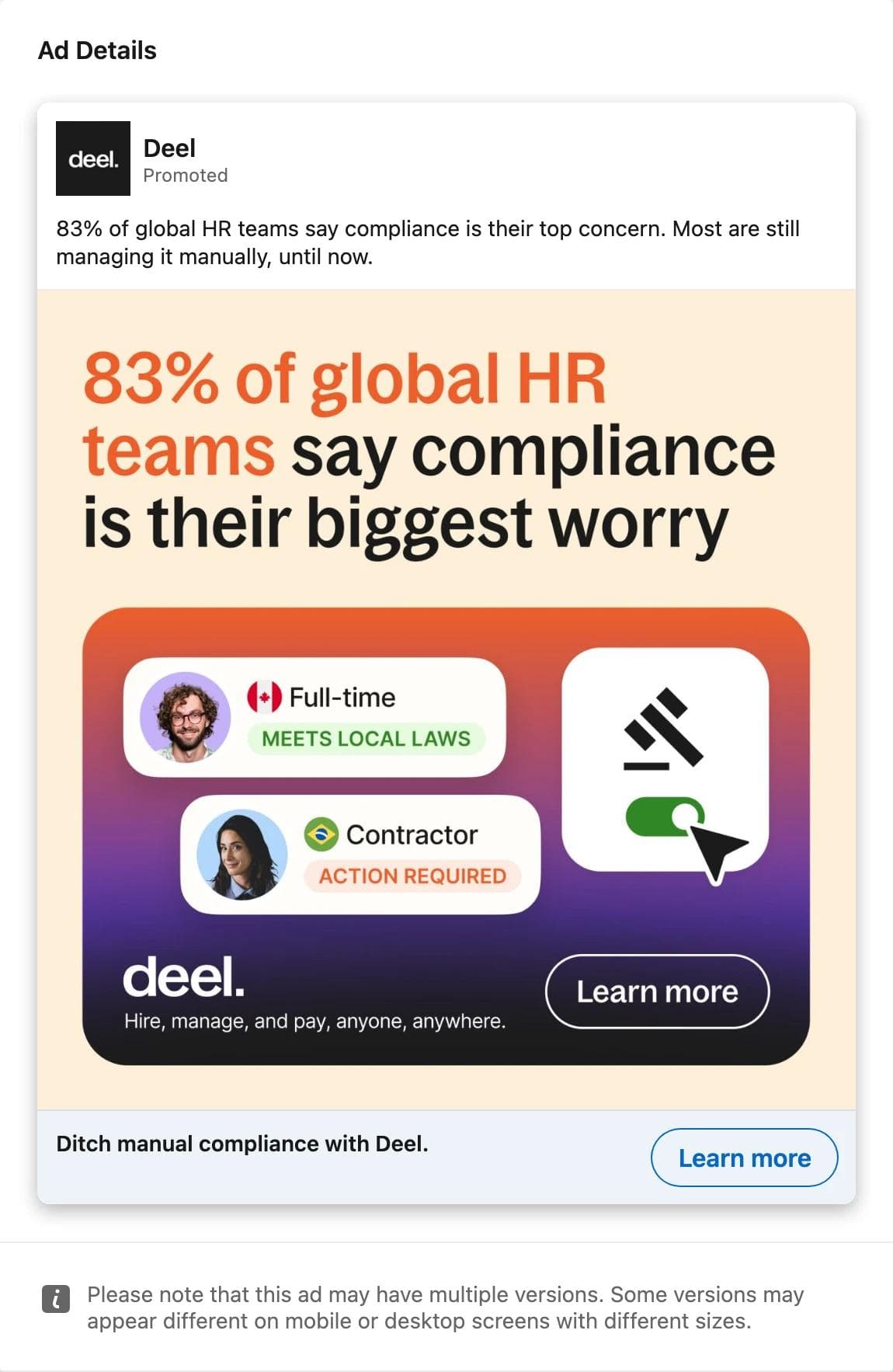
Hierarchy is the order the eye takes. A good static ad has one thing that is clearly biggest, one thing that is second, and everything else small. The Deel ad below is the cleanest example in either library: a number, then an illustration of what the product does, then a headline under the image that says the benefit in plain words. Three levels, in that order, and nothing competing.
Proof
Proof is whatever makes the claim believable without a click: a review count, a badge, a before-and-after, a named customer, a number with a source. In the Meta sample proof is mostly photographic, a before-and-after or a person's face, and the claim sits in the copy. In the LinkedIn sample proof is typographic, a stat or a badge inside the image. The Forward ad in the hub post is five G2 badges and nothing else; the WorkMotion ad below is a customer quote with a name, a title, a logo, and five stars, which is the whole ad.

Offer
The offer is what the reader gets for clicking: a product at a price, a discount with a code, a guide, a demo, a webinar seat. Consumer ads put it in the copy and often in the image; B2B ads usually make the offer a piece of content. Epilynx's offer is a code, a discount, and a free-shipping threshold in one line of primary text. SAP's offer, in the LinkedIn hub, is an e-book with a Read now button painted into the artwork.
Call to action
The CTA is a button the platform renders, so its design is not your decision, but its choice is. Across the 417 Meta cards we captured, Learn more was the button on 167 and Shop now on 109; the rest were Book now, See details, Contact us, Sign up, and a handful of Visit Instagram profile and Like Page buttons. In the LinkedIn cohorts, Learn more was 35 of 90 and the next most common label, Show more, belongs to Thought Leader ads that have no button at all. LinkedIn's Single Image Ad spec lists ten options, from Learn More and Download to Request Demo and Register. Match the button to the offer: Shop now on a product ad, Download on a guide, Register on an event.
Format
Format is the frame and the safe zone. Meta's help center, checked September 2, 2026, says that for Instagram feed ads at 1:1 or 4:5 the bottom and side edges should be kept free of key elements, text, and logos, because the interface can cover them, and that Ads Manager has a Safe zone guardrail toggle that draws the zone on your creative. LinkedIn's vertical option is mobile-only and the spec recommends 4:5 over 1:1.91 to avoid borders. Whatever the layout, the headline and the product have to live in the middle of the frame.
What the samples show
We classified 60 Meta crops and 60 LinkedIn crops by eye, recording what the eye lands on first, how much text is in the image, and whether the image repeats the copy. The Meta sample spans four keyword searches, skincare, haircare, supplements, and cosmetics, all active image ads in the United States; the LinkedIn sample is 40 CRM, 10 payroll, and 10 cybersecurity ads from June start cohorts found through a German search, the search that exposes run dates.
| Classified by eye, September 2, 2026 | Meta, 60 image ads | LinkedIn, 60 single-image cohort ads |
|---|---|---|
| A person or body part is the first thing seen | 32 | 20 |
| A product or still life | 9 | 0 |
| A setting, illustration, or scene | 18 | 1 |
| Typography or a graphic card | 1 | 27 |
| A screenshot or document | 0 | 12 |
| No text in the image | 55 | 9 |
| A headline or more inside the image | 4 | 47 |
| Image text repeats the headline or first line of copy | 0 | 14 |
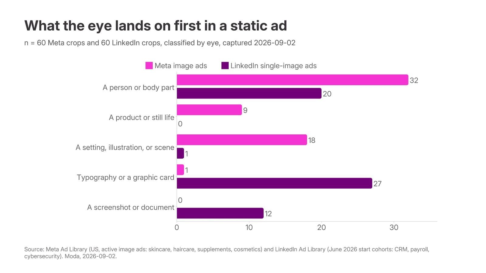
The two platforms are almost inverses. Meta feed images in these categories are photographs with no words on them; the argument is made in the primary text, which ran to a median of about 200 words in the captures and past 900 characters in 269 of 417 cards. LinkedIn images are cards with words on them; 47 of 60 carried a headline or more, and in 14 of those the words in the image were the same words as the headline or the intro.
Longevity by layout is the table the category's advice never gives you, so here it is, with its caveats attached. On Meta, long means more than 90 days running as of capture; on LinkedIn, more than 30 days from a June 26 to 30 start, which is the cohort's window.
| Layout | Meta: long-running of sampled | LinkedIn: long-running of sampled |
|---|---|---|
| Person or body part first | 16 of 32 | 4 of 20 |
| Product or still life first | 2 of 9 | none sampled |
| Scene or illustration first | 5 of 18 | 0 of 1 |
| Typography or graphic card first | 0 of 1 | 5 of 27 |
| Screenshot or document first | none sampled | 4 of 12 |
| All layouts | 23 of 60 | 13 of 60 |
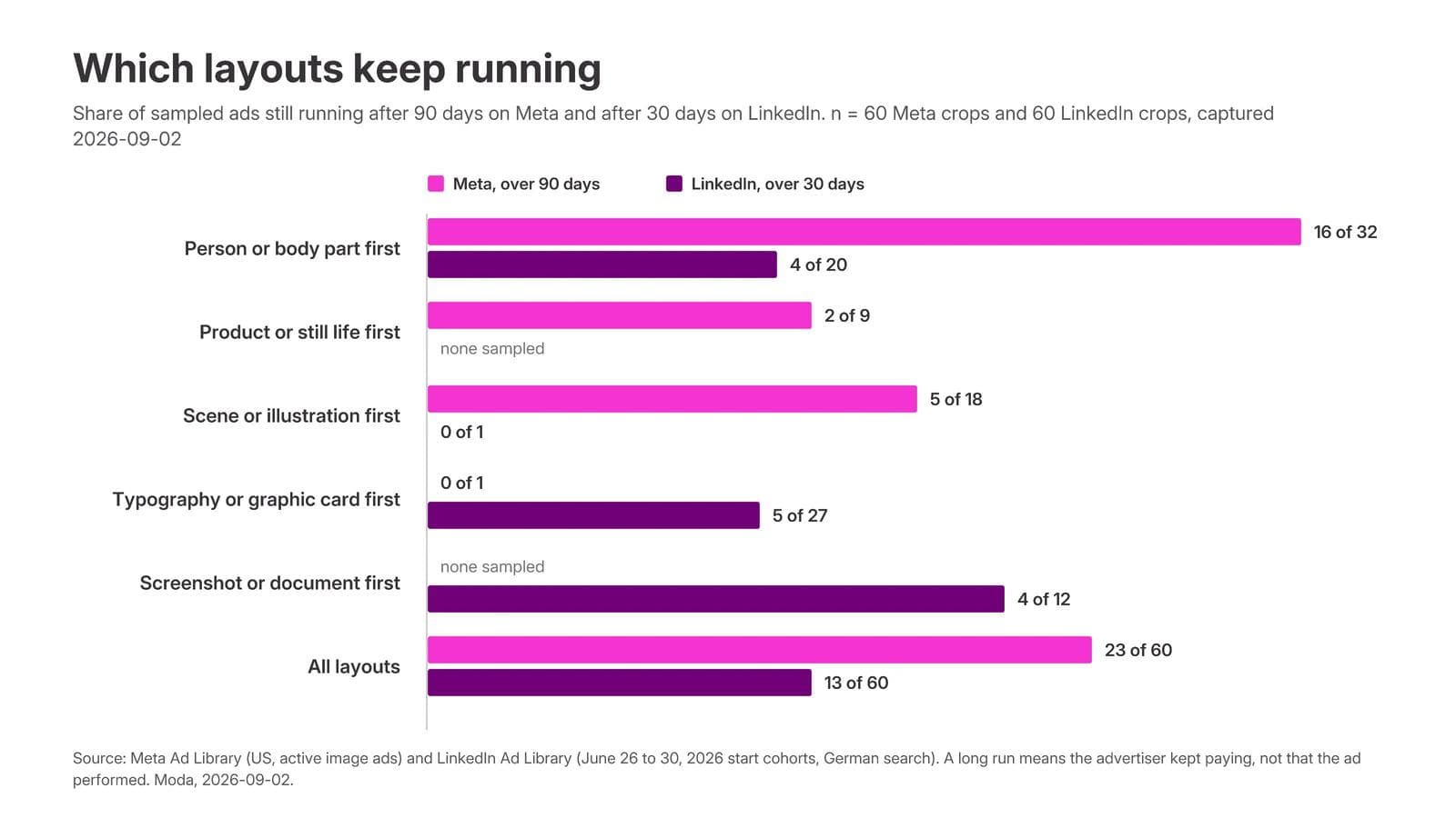
Three things are safe to say. All 23 long-running Meta ads had no text in the image, but so did 55 of the 60, so that is the category's habit, not a finding about text. On Meta, ads with a person in frame survived at twice the rate of ads with a scene, and the scene ads were mostly persona-page story ads whose photograph is a prop for the copy. On LinkedIn, 7 of the 13 long-running ads were Thought Leader ads, a person's post promoted by a company, which were 19 of the 60; the hub post found the same thing in the full CRM cohort, where every ad still running after ten weeks was one.
What is not safe to say is that any of these layouts works. A long run means the advertiser kept paying at that budget. A persona page with a long story and a five-dollar daily budget can run for a year. Compare longevity within one advertiser, weight the versions notice, and treat every survivor as a hypothesis to test with your own product.
Headline length, for the record: the median Meta headline in the captures was 5 words and 31 characters, and 81 of the 293 cards that had one exceeded Meta's recommended 40. The median LinkedIn headline was 7 words and 45 characters, and 19 of 87 exceeded LinkedIn's 70-character limit, which means they were cut off in the feed.
Five layouts that survive
Each archetype below comes with one worked example and the three-question record from the hub posts: what the eye lands on, what the ad asks the reader to believe, and what transfers if you swap the product.
1. Product on a field
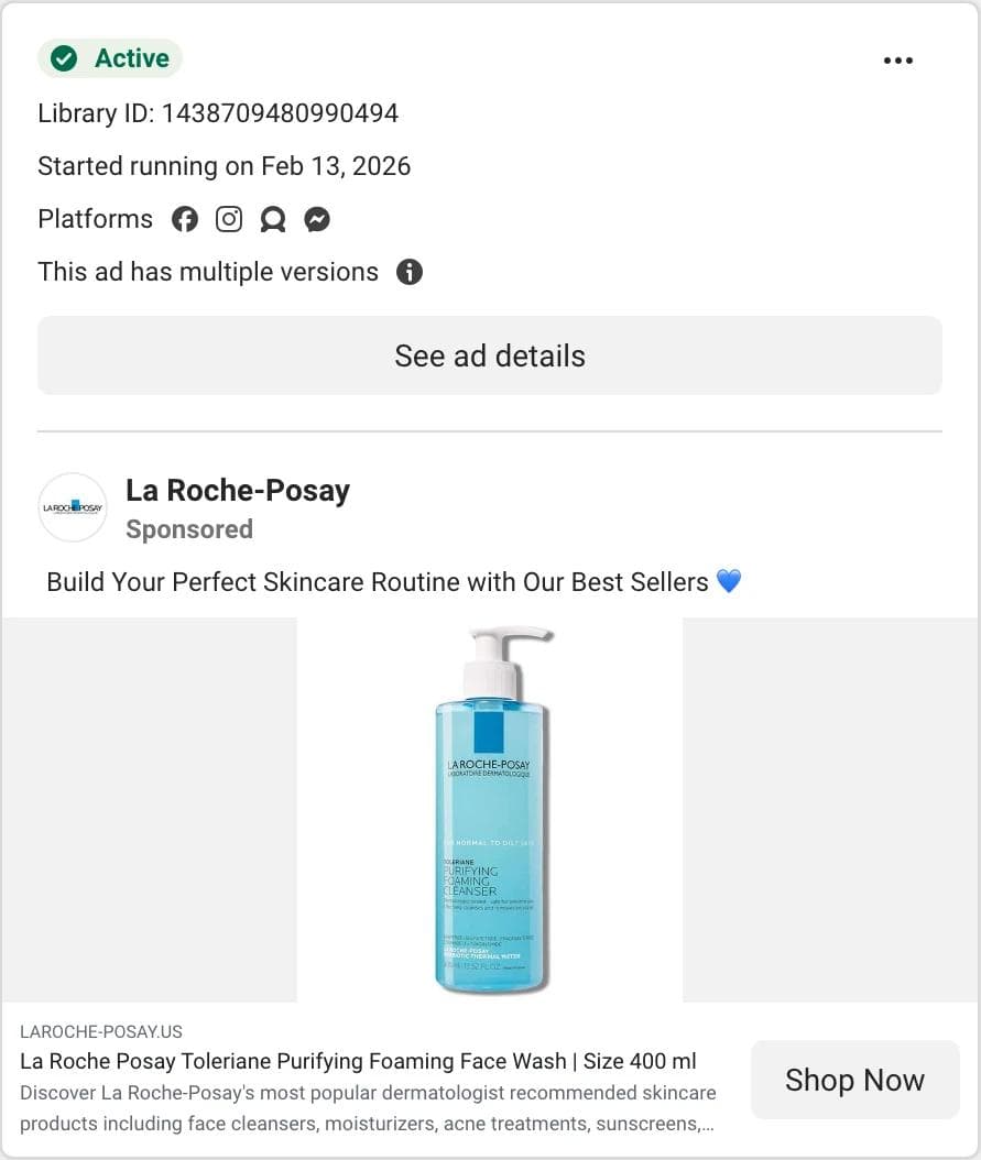
The eye lands on one product, centered, with nothing else in the frame, not even a headline. The ad asks you to believe that a brand you already know is reason enough. What transfers is the template: an empty field, a product shot, a product-name headline, and the proof carried in the copy rather than the image, which is what Benefit Cosmetics does with the same layout in the hub. It fails for a brand nobody recognizes yet, and in our sample the product-first layout was the least likely to be a long runner, 2 of 9, which is consistent with it being a catalog format that gets rotated rather than a hero that gets kept.
2. Stat as headline
The Deel ad above is the archetype: a number as the biggest thing in the frame, the product reduced to one illustrated state, the benefit under the image. The eye lands on 83 percent. The ad asks you to believe that a problem you have is common and now solved. What transfers is the hierarchy, number then picture then plain-words headline, and the discipline of one number. The counterexample is worth seeing too.
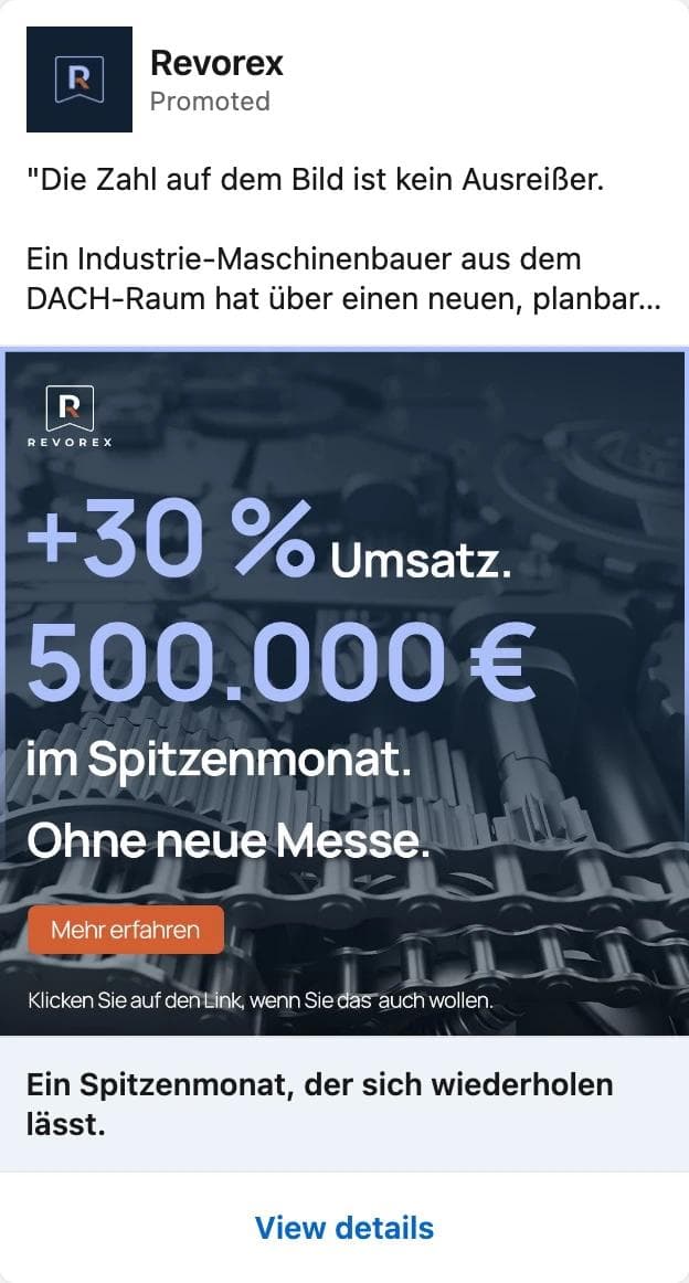
Revorex ran the same stat-as-headline layout with two numbers, a painted button, a caption under the button, and a headline that adds a third idea. It ran two days. We cannot say the layout failed; two days is a test that lost or a budget that moved. But the difference from Deel is observable: one number versus two, one idea versus three, an illustration of the product versus a stock photo of gears.
3. Person plus overlay
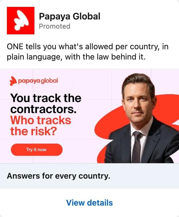
The eye lands on the face, then reads the question. The ad asks you to believe that the risk is yours and the answer is a click away. What transfers is the split: a person on one side, a two-line question on the other, one accent color for the second line, one button. Papaya ran this creative in three copies alongside sibling ads with a different headshot and question, which is what a tested layout looks like from the outside, even though each ad ran under two weeks. On Meta the same archetype drops the overlay: Epilynx Cosmetics shows a person holding the product and keeps the offer in the copy, and that ad has run since February 2026.
4. Proof as the creative
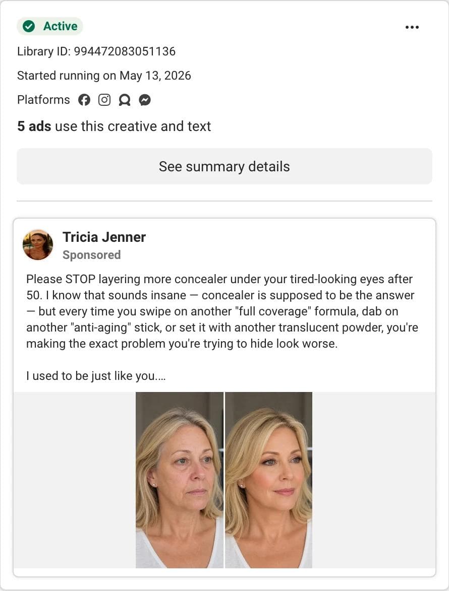
The eye lands on the split. The ad asks you to believe the right-hand photo. What transfers is the decision to make the proof the entire image and put every word in the copy: the before-and-after on Meta, the badge wall and the testimonial card on LinkedIn. The Forward ad in the LinkedIn hub is the B2B version, five G2 badges and a line of text, and it ran a month, which for a seasonal badge campaign is a full run. What does not transfer is the claim. A before-and-after implies a result, and the result has to be yours and demonstrable. This advertiser held 21 of the 117 cosmetics cards, the most of any page, and a persona with that many near-identical ads is a copy operation, not a brand to model.
5. Story first, product last
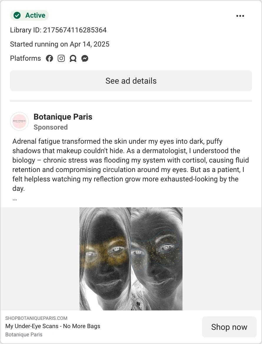
The eye lands on the text, because the image is strange enough to make you read. The ad asks you to believe a mechanism before it mentions a cream. What transfers is the sequence: a first-person problem, a mechanism, then the product in the headline, with the image as a hook rather than a catalog shot. This is the layout of most long-running Meta ads in the sample, and it is also the one that carries the most risk, because the persona pages that use it make claims a real brand cannot. Borrow the sequence, not the dermatologist.
What breaks
Four failure modes show up in the captures, and each is observable without knowing a single result.
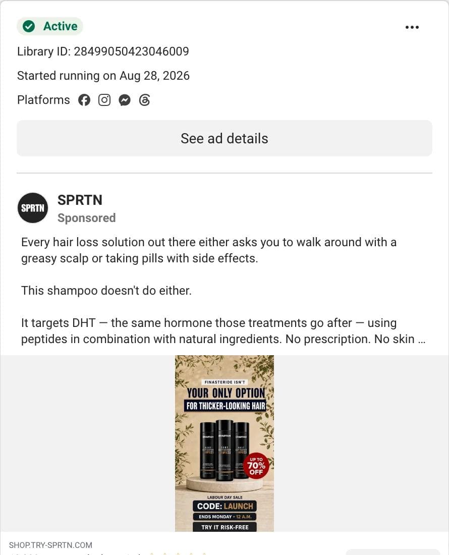
Text density on phones. A 4:5 frame is roughly 350 to 400 points wide on a phone. The SPRTN ad below puts seven text elements into it: a kicker, a two-line headline, a discount badge, a sale name, a code, an end time, and a guarantee, plus three bottles and a star-rated headline underneath. It started six days before capture, so it has no longevity read at all, and it may be a fine test. But Meta's own guidance for text in ads is one message and one call to action, and the surviving Meta ads in the sample carried none in the image.
The image repeating the copy. On LinkedIn, 14 of the 47 sampled images with a headline in them used the same words as the headline or the intro. Faddom's laptop photo says Map all your servers in 60 minutes on a sticker, the headline says Map All Your Servers in 60 Minutes, and the intro opens with Total IT visibility in 60 minutes. Three slots, one sentence. Deel repeats its stat the same way and is still running, so repetition is not fatal; it is a wasted slot. The fix is to give each slot a job: the image makes the claim, the headline names the benefit, the intro gives the reason.

Claims you cannot make. The Meta captures are full of them: adrenal fatigue, reversed bruising, a cardiologist's refusal to take medication. Persona pages make these claims because they are built to be disposable. A brand that borrows a survivor's structure has to replace its claim with one it can defend, and that is usually the moment the layout changes, because a smaller claim needs a different proof.
Formats that do not travel. A LinkedIn card dropped into an Instagram feed is a wall of text at phone size; a Meta lifestyle photo dropped into LinkedIn has no headline where LinkedIn readers expect one. The frames differ too: 4:5 on Meta, 1:1 or 1.91:1 on LinkedIn, and different safe zones on each. A layout transfers between platforms; a file does not.
A build checklist
Before a static ad goes into an ad set:
- One image, one headline, one call to action. If there are two ideas, make two ads.
- The product or the person is recognizable at phone width. Check the mobile preview, not the desktop one.
- The headline fits the platform: 40 characters on Meta, 70 on LinkedIn, and shorter is safer on both.
- The image and the headline say different things. Claim in one, benefit in the other, reason in the copy.
- Key elements sit inside the safe zone. On Meta, turn on the Safe zone guardrail in Ads Manager.
- The proof is yours: your customer, your badge, your photograph, your number with a source.
- The button matches the offer. Shop now for a product, Download for a guide, Register for an event.
- There are at least two hooks against the same layout, so the first test measures the message and not only the design.
- The file is exported per placement, 4:5 for Meta feeds and 1:1 for LinkedIn, rather than cropped by the platform.
Turn references into on-brand ads in Moda
A reference set is six to ten saved ads with the three-question record attached. Rebuilding one of those structures with your own brand kit, photography, and claims is a design task, and it is the kind an AI design agent handles well when it is given references instead of adjectives.
In Moda, the workflow is: attach two to four saved ad images to a message, name the brand kit to apply, and describe what stays and what changes. A prompt for the stat-as-headline archetype looks like this:
Use the attached ad as a layout reference. Make four 1080 x 1350 feed ads for our scheduling product using the Northwind brand kit. Keep the hierarchy: one large statistic at the top, a single illustration of the product below it, a one-line benefit headline. Use our own stat (42 percent of shifts are rescheduled at least once, source: our 2026 customer survey). Do not reuse any reference copy or artwork. Also export each ad at 1200 x 1200 for LinkedIn.The result lands on an editable canvas, so the statistic, the illustration, the headline, and the logo stay separate objects you can move, restyle, or swap, and the same layout can be pushed to a 1:1 or a 9:16 frame without rebuilding it. If the brand side is not set up yet, how AI design tools build a brand kit from your website covers what gets extracted and what to correct.
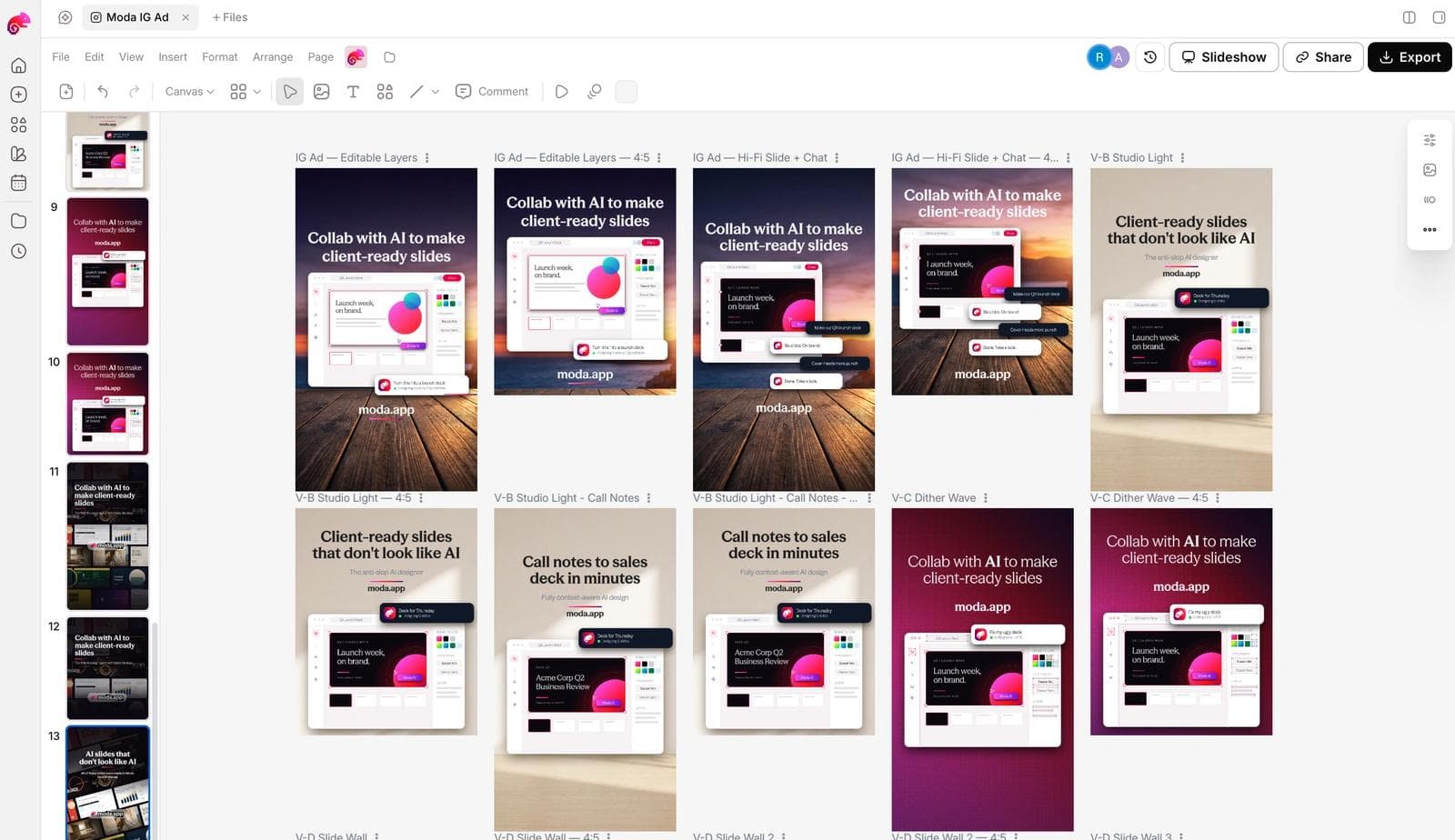
Two honest limits. Moda does not run or measure ads, so the test still happens in Ads Manager or Campaign Manager. And a reference is a structure, not a license: the photography, the people, and the claims in a saved ad belong to the advertiser, and the agent should be told to replace all three.
Frequently asked questions
What is a static ad?
A static ad is a single, unchanging image with copy and a call to action around it. On Meta it is the image ad format; on LinkedIn it is the Single Image Ad. It has no motion, no sound, and no personalized content, which is what separates it from video and dynamic catalog ads.
Are static ads better than video ads?
Neither is better in general. Statics are cheaper and faster to produce and test, and in the LinkedIn cohorts we checked they were 68 of 90 ads. Video reaches placements statics cannot, such as Reels. Most accounts run both, and the public libraries only show which formats advertisers keep paying for, not which ones perform.
What size should a static ad be?
Meta's Ads Guide recommends 4:5 at 1440 x 1800 pixels for Facebook and Instagram feed image ads. LinkedIn recommends 1:1 at 1200 x 1200 for Single Image Ads, with 1.91:1 at 1200 x 628 as the landscape option. Export one file per placement rather than letting the platform crop.
How much text should be in a static ad image?
Meta's current text guidance sets no percentage limit; it asks for one message and one call to action, and every one of the 23 long-running Meta ads in our sample had no text in the image at all. On LinkedIn a headline inside the image is the norm; keep it to one line that the headline field does not repeat.
Can I tell whether a static ad in an ad library is working?
No. The Meta Ad Library shows the start date and whether an ad has multiple versions; the LinkedIn Ad Library shows run dates and an impressions band only for ads whose targeting includes the EU. A long run means the advertiser kept paying, which is evidence of affordability at that budget, not of results. Use it to pick hypotheses to test.
Can I reuse an ad I found in an ad library?
Reuse the structure, not the ad. The layout, hierarchy, and offer format are ideas; the photography, the model, the copy, and the claims belong to the advertiser. Rebuild the structure with your own assets and claims you can support.

Real editable visuals. Real canvas. Full control.
Fly through design work