AI Infographic Generators: Whether the Numbers Survive
By Moda · Last updated
An AI infographic generator turns figures and a narrative into a visual explainer. The property that decides whether it is usable is not the layout but the data: whether each chart is drawn from a declared table of numbers, or painted to resemble one. Moda renders charts from their source data.
Every other design format fails visibly. A flyer with no bleed shows a white edge; a poster set too small is unreadable across a room. An infographic fails invisibly. A slice that reads as a quarter beside a label saying half, a bar taller than the number next to it, an axis label that is decoration rather than a scale — none of these look wrong. They look like an infographic. The reader believes them, and so does whoever approved the page, because the chart is the only evidence anyone checks it against.
What is an AI infographic generator?
An AI infographic generator turns a set of figures and a short narrative into a single visual explainer: charts, callout statistics, icons, and connecting copy arranged as one composition. The category splits on one question — where the numbers in the finished graphic came from.
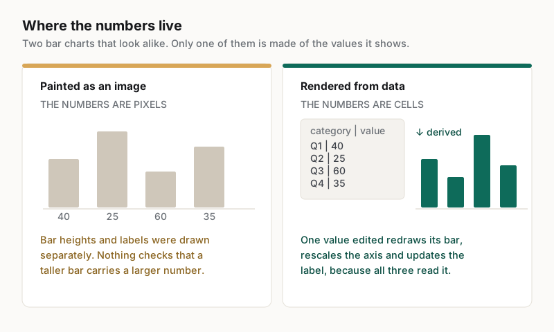
There are two answers, and they look identical on screen. Either the chart was rendered from a table of values the tool holds, or it was drawn as an image that resembles a chart. The first can be corrected, re-exported and trusted. The second is a picture, and a picture of a bar chart has no relationship to any number at all.
This is not a pedantic distinction. An infographic exists to make a quantity legible, so the rendering is a claim about the quantity. Every other property of the format — the palette, the icon set, the layout rhythm — is presentation. The data binding is the thing the format is actually for.
How does an AI-generated chart go wrong?
A generated image reproduces the appearance of a chart without its arithmetic. Slices disagree with the labels beside them, bar heights drift from their values, axes carry plausible numbers at uneven intervals, and legends name series the plot never draws. None of it shows without checking shape against label.
| What looks fine | What is actually wrong | How a reader would notice | Why a rendered chart cannot do it |
|---|---|---|---|
| A pie showing shares | The slices do not match the values beside them | Only by comparing each slice to its own label | Angles are computed from the values |
| A bar chart with value labels | A taller bar carries a smaller number | Only by comparing each bar to its label | Height and label come from the same cell |
| A labelled axis | Intervals are uneven, so the scale lies | Only by measuring gridline spacing | The axis is derived from the data range |
| A legend beside a plot | It names a series the plot never draws | Only by counting the plotted series | The legend is generated from the series set |
The reason these errors persist is that the usual review does not catch them. A designer checks composition, a marketer checks the message, and neither recomputes the arithmetic against a source spreadsheet. The graphic is approved because it reads as authoritative, which is precisely the quality the format is designed to project.
What does data-bound actually mean?
It means the geometry is recomputed from values the file holds, so editing a value moves the shape that represents it. In Moda a chart is declared with its data as rows, and the bars, slices and axis are derived from those rows rather than authored beside them.
The practical test is a correction. Change one figure and see whether the shape representing it follows. When the chart is data-bound, a revised number moves its bar, because the bar and the value are the same fact. When the chart is a picture, a revised number changes nothing, and the only route to a correct graphic is to generate a new one and hope the rest of the layout survives.
Three questions, in ascending order of what each one rules out:
- Can the underlying numbers be seen at all, as a table or a list, rather than only as a drawing? On its own this rules out nothing: a table can sit beside a drawing that ignores it.
- Does editing one value move the shape that represents it? This rules out a decorative table, because the geometry and the value now demonstrably share a source.
- Is the axis scale itself derived from the data, or fixed? This rules out a chart with one live bar in a baked frame, which is the most convincing imitation of the three.
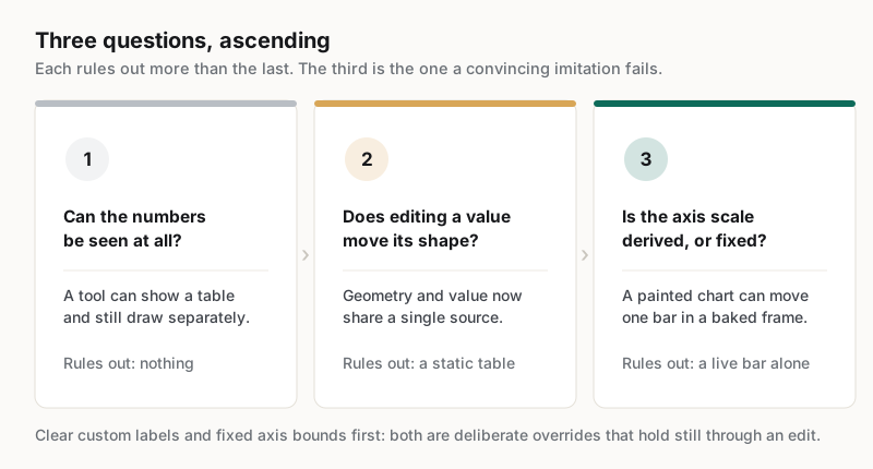
Clear any custom labels and any fixed axis bounds before running these, because Moda supports both deliberately: a chart can carry its own label column and explicit minimum and maximum values, and either will hold still through an edit without meaning the chart is unbound. Binding is about whether the geometry recomputes from the source, not about whether a presentation override moves. Export quality is a separate question again — a derived chart can be exported flat and a painted one exported cleanly, so the file says nothing either way about where the shapes came from.
What are the trade-offs of a rendered chart?
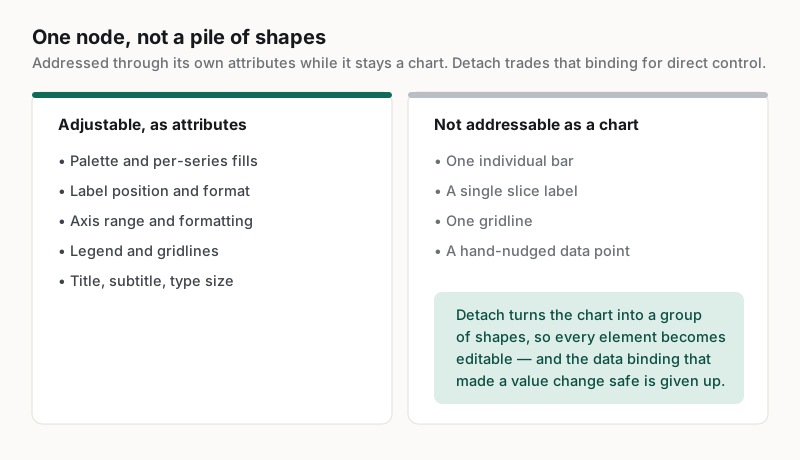
Data binding trades granular control for accountability. A rendered chart is one object rather than a pile of shapes, and its type does not scale with the surface it sits on. Neither is a dead end, but both are worth knowing before committing.
In Moda a chart is a single generated node. Its bars and labels are drawn natively and are not separately addressable, so the styling levers are the chart's own attributes — palette, per-series fills, label position, axis formatting — set when the chart is declared or by asking the agent, rather than through a per-bar panel in the editor. When a piece genuinely needs one bar annotated and moved, the chart can be detached into an ordinary group of shapes: every element becomes editable, and the data binding that made a value change safe is given up. That is the real trade — not that it cannot be done, but that doing it converts the chart back into a drawing.
The second trade-off catches people out more often. Chart type does not scale with the canvas it sits on, so type sized for a page-width document becomes sub-legible on a large surface. Set it deliberately for the format, then export at the finished size and read the axis labels before calling it done.
How should a team evaluate an AI infographic generator?
Test with proportions whose correct shape is obvious in advance, then compare the drawing to them rather than trusting the labels. Most evaluations use plausible sample data, which is exactly the condition under which a painted chart is indistinguishable from a rendered one.
Five checks, in the order they tend to fail:
- Supply proportions obvious by eye — one half and two quarters — then compare the drawing to them. Adding the printed labels up is a useful second pass, but a weaker one: labels can sum correctly beside shapes that ignore them.
- Clear any custom label column and any fixed axis bounds first, so a deliberate presentation override is not mistaken for a broken binding.
- Run the three binding questions above against the result, rather than trusting that a visible data table settles it.
- Ask for the same figures as a different chart type and confirm the values carry across intact.
- Export at the finished size and read the smallest axis label at that size, not zoomed in.
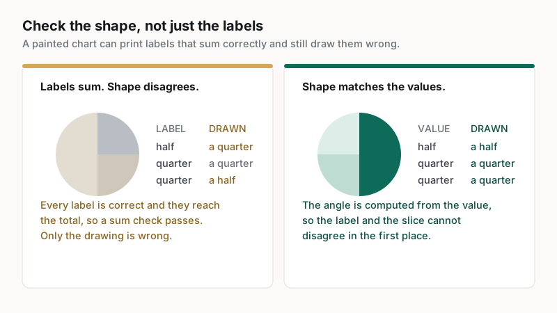
The first check is the one that does the work, and it takes a minute. A label and the shape beside it come from different steps in a painted chart, so they can disagree: a slice can read as a quarter while its label says half, and every label can still sum correctly. Proportions anyone can judge by eye turn that mismatch into something a reader sees rather than something only arithmetic finds. Realistic data hides it completely.
Which teams get the most out of one?
Teams that publish recurring quantitative explainers gain the most: monthly performance summaries, research digests, and reports that reuse the same visual frame with new figures. The value is in the update, where a data-bound chart turns a rebuild into an edit.
The pattern matches what customers report about recurring visual work generally. Cirrascale reported 20 min saved per asset with one marketer running the content pipeline, at https://moda.app/case-studies/cirrascale, and the saving comes from removing the wait on someone else for a small change. A monthly figures graphic is that case in its purest form: the design is settled after the first issue, and every issue after it is new numbers into a frame that already works.
An infographic generator is a poor fit where the graphic is an argument rather than a summary. A piece whose whole point is a bespoke visual metaphor, or one where the data needs interpretation a chart type cannot carry, still wants a designer and an analyst. The tool earns its place on the recurring quantitative work in between, which is most of what teams actually publish.
Related guides
Key takeaways
- An infographic fails invisibly: a wrong chart looks exactly like a right one.
- The dividing question is whether a chart is rendered from declared values or painted to resemble one.
- A data-bound chart redraws when a value changes; a painted chart cannot be corrected at all.
- Rendered charts trade granular control for accountability, and their type does not scale with the surface.
- Evaluate with proportions obvious by eye, because a painted chart's labels can sum correctly while its shapes do not match them.
Frequently asked questions
Can an AI infographic generator get the numbers wrong?
A tool that paints a chart as an image can, because nothing in it computes anything. A slice can read as a quarter while its label says half, and the labels can still sum correctly. A chart rendered from declared values cannot disagree with them, since the drawing and the label read the same cell.
How can a reader tell a rendered chart from a painted one?
Edit a value and watch the shape that represents it. If the geometry recomputes, the drawing is derived from the data; if only a caption changes, it is a picture. Clear custom labels and fixed axis bounds first, since both are legitimate overrides that hold still through an edit.
Are the individual bars in a chart editable?
Not while the chart stays a chart: it renders as one generated object, so styling runs through its own attributes rather than per-bar controls. A chart can be detached into a group of shapes when one element must be moved, which makes everything editable and ends the link to the data.
Why does chart text look small on a large canvas?
Chart type does not scale with the surface it is placed on, so a size that reads comfortably in a page-width document becomes sub-legible on a much larger one. Set the type size deliberately for the finished format, then export at that size and read the axis labels before publishing.
What should be tested before adopting one?
Use proportions whose correct shape is obvious rather than realistic sample data, and compare the drawing against them before trusting any label. Then confirm an outlier rescales the axis, that changing a value redraws the chart, and that the export holds up at the published size.
Published by Moda. Product behaviour is described from Moda's own chart implementation and documentation. Customer metrics are attributed to the companies named above and link to their published case studies. Competitor behaviour varies and changes; test any tool against figures whose correct answer is known before relying on its output.