AI Social Media Post Generators: One Idea, Many Frames
By Moda · Last updated
An AI social post generator produces platform-sized creative from a short brief. The work it is really being asked to do is not the first square image but the same idea at several aspect ratios, with room left for the interface each platform draws over it. Moda composes posts as objects, so a reframe is a layout change.
A social post looks like the easiest thing a design tool can be asked for, and it is the request most likely to produce output that cannot be used. The reason is that a post is not one artefact. The same announcement has to work as an upright feed image, a full-height story, and often a square, and each of those is a different composition rather than the same composition cropped. On top of that the platform draws its own interface over the design, so part of every vertical frame is not really available. Neither constraint is visible in the generated preview.
What is an AI social post generator?
An AI social post generator produces creative sized for a specific platform placement from a brief: an announcement, a quote, a statistic, a product shot. What separates the category is whether it produces one image per request, or one idea it can lay out again at a different shape.
A tool that returns a single flat image per prompt answers the request literally and leaves the rest of the campaign undone. The follow-up work is not more prompting, it is reframing: the same headline, mark and image in a taller frame, with the hierarchy rebuilt so the message still lands. That is a layout operation, and it needs the design to still be made of parts.
Moda's size reference covers the platforms below, and the point of a catalogue that size is that a single announcement usually touches several of them in the same week. The cost of a campaign is dominated by the second, third and fourth frame rather than the first.
| Platform |
|---|
| Discord |
| Snapchat |
| Spotify |
| Threads |
| TikTok |
| Twitch |
| X (Twitter) |
| YouTube |
Why does one design not survive being resized?
Because a crop removes area, and a composition is a relationship between the elements and the area they sit in. Moving from an upright feed image to a full-height story does not enlarge the design; it changes which parts are adjacent, how much space the headline has, and where the eye lands first.
The common failure is subtle rather than dramatic. Cropping an upright post to a vertical story keeps the subject and loses the breathing room the headline needed, so the type ends up against an edge and the composition reads as cramped. Scaling instead of cropping keeps the proportions and introduces empty bands at the top and bottom, which reads as an image posted in the wrong format — recognisable to any regular user of the platform, and a signal that nobody adapted the asset.
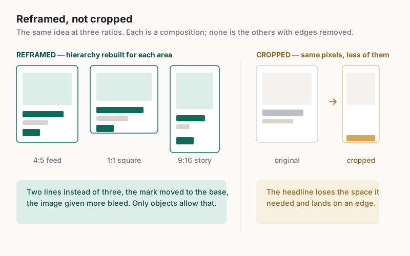
When the design is made of objects, the reframe is a set of decisions a person or an agent can make: give the headline two lines instead of three, move the mark from the corner to the base, let the image bleed further. When the design is a finished picture, none of those moves exist, and the only options are the two bad ones.
What does the platform draw on top of the design?
Vertical placements are partly covered by the interface. Usernames, captions, action buttons and progress bars occupy bands at the top and bottom of stories and reels, so a design that fills the frame edge to edge will have part of its content sitting underneath platform chrome.
This is measurable rather than a matter of taste, and it is published per format. The bands below are the overlay measurements the size reference carries for a story; a reel reserves more at the bottom again and adds a right-hand column for the action buttons. Both are read from the same catalogue that drives the published size pages, so a re-verified value moves here too.
| Band |
|---|
| Frame — 1080 × 1920 px |
| Top overlay — 250 px |
| Bottom overlay — 250 px |
| Left overlay — 0 px |
| Right overlay — 0 px |
| Band |
|---|
| Frame — 1080 × 1920 px |
| Top overlay — 210 px |
| Bottom overlay — 340 px |
| Left overlay — 0 px |
| Right overlay — 120 px |
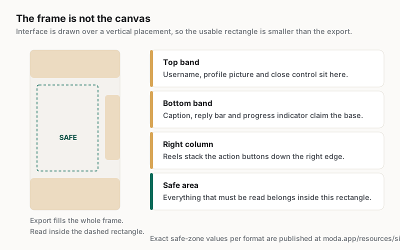
A generator has no way to know this unless the constraint is given to it, which is why a striking full-bleed story so often arrives with its headline half-hidden. The practical response is to treat the safe area as the real canvas and the full frame as bleed: fill the whole export so nothing letterboxes, but place everything that has to be read inside the smaller rectangle.
What makes a carousel harder than a single post?
A carousel is judged as a sequence, so consistency becomes the requirement rather than a nicety. Every card shares a grid, a type scale and a palette, and the reader experiences any drift as sloppiness because the cards are viewed one after another within seconds.
| Element | Across the sequence | Why |
|---|---|---|
| Grid and margins | Identical on every card | Swiping makes any shift read as a jump |
| Type scale | Identical roles, same sizes | A headline that changes size looks like a different template |
| Palette | Fixed, with one accent | Colour drift is the fastest way a set stops looking authored |
| Imagery | Varies freely | Variation is what makes the sequence worth swiping |
| Card purpose | Varies deliberately | Hook, argument, evidence, action is a structure, not repetition |
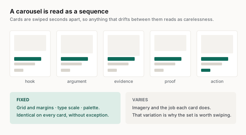
Generating cards one at a time is what breaks this. Each card is a fresh composition, so the grid drifts, the headline lands at a different size, and the set reads as assembled rather than designed. A tool that lays a sequence out from one shared system produces cards that differ where they should and match everywhere else, which is the whole effect a carousel is trying to achieve.
How should a team evaluate an AI social post generator?
Ask for the campaign rather than the post. A single square image tells you almost nothing, because the expensive part of social production is the reframe, the safe area and the sequence, and none of those are exercised by a first request.
Five checks, in the order they tend to fail:
- Ask for the same announcement as an upright feed post, a square, and a full-height story, then compare the three as compositions rather than as crops.
- Place the story version behind the platform interface and confirm nothing that must be read sits under a band.
- Change the headline and see whether the layout reflows or the text simply overruns.
- Ask for a carousel and check the grid, type scale and palette across every card.
- Export at the platform's stated pixel dimensions and confirm the file is that size.
The first check is the one that separates the category, and it costs one extra prompt. A tool that reframes will hand back three compositions that share an idea; a tool that crops will hand back the same picture three times with different parts missing. The difference is obvious the moment the three are placed side by side, and invisible when only one is requested.
Which teams get the most out of one?
Teams posting on a schedule with a settled visual system gain the most: one marketer covering several platforms, product teams shipping recurring announcements, and anyone running the same campaign structure repeatedly. The gain is in the second frame and the fifth card, not the first image.
Cirrascale reported 20 min saved per social asset with a single marketer running the whole content pipeline, at https://moda.app/case-studies/cirrascale. That shape is typical of the work: the design language is decided once, and everything after it is a new subject inside a frame the team already trusts, across whichever placements the announcement needs that week.
A generator is a poor fit for the launch piece that defines the visual system in the first place, or for creative whose whole value is that it looks unlike everything else in the feed. Those deserve a designer. The tool earns its place on the recurring cadence in between, where the realistic alternative is posting less often rather than posting something better.
Related guides
Key takeaways
- A social post is one idea at several aspect ratios, not one image that gets cropped.
- Reframing rebuilds the hierarchy for a new area; cropping and scaling are the two failure modes.
- Vertical placements are partly covered by platform interface, so the safe area is the real canvas.
- A carousel is judged as a sequence, so grid, type scale and palette must not drift between cards.
- Evaluate by asking for the whole campaign, because the first image exercises none of the hard parts.
Frequently asked questions
What size should a social post be?
It depends on the placement rather than the platform, and each one differs. Published pixel dimensions, aspect ratios and safe zones for every supported format are listed at https://moda.app/resources/sizes. Decide the placements before the design, because a composition built for one ratio rarely survives being moved to another.
Can one design be reused across every platform?
The idea can; the composition usually cannot. Moving between an upright feed image, a square and a full-height story changes the available area and therefore the hierarchy. A design made of objects can be laid out again for each frame, which is different from cropping one finished picture three ways.
What is a safe zone on a story or reel?
It is the part of a vertical frame the platform does not draw its own interface over. Usernames, captions and action buttons occupy bands at the edges, so anything that must be read belongs inside the smaller rectangle while the artwork still fills the whole export to avoid letterboxing.
Why do AI-generated carousels look inconsistent?
Because the cards are usually generated one at a time, so each is a fresh composition. The grid shifts, headline sizes drift and the palette wanders. Since a carousel is read as a sequence within seconds, that drift is the first thing a viewer notices, and it reads as carelessness.
Does a generated post export at the right dimensions?
Not always, and it is worth checking rather than assuming. Some tools return an image sized for a preview instead of the placement. Export, then confirm the file matches the published dimensions for that format before scheduling, because an undersized upload is resampled by the platform.
Published by Moda. Platform coverage and safe-zone guidance are read from the same catalogue that drives the published size reference and are linked to it. Customer metrics are attributed to the companies named above and link to their published case studies. Platforms change their layouts and interface overlays; confirm current dimensions before a campaign.