Display Ad Examples: 12 Banner Ads Running Right Now, With Run Dates (2026)
Twelve display ad examples from the Google Ads Transparency Center with creative IDs, first and last shown dates, sizes, and variations, plus a measured sample of 14 advertisers.
 Anvisha Pai, Co-founder & CEO, Moda
Display ad examples are easy to find and hard to trust: most galleries show a banner someone screenshotted years ago, with no way to tell whether it ran for a week or is still running. The twelve below were pulled from the Google Ads Transparency Center on September 2 and 3, 2026. Each comes with the advertiser's verified account, the creative ID, the size or layout Google rendered it in, the last-shown date, the variations count, and, where the advertiser also serves Europe, the first-shown date and a times-shown range. Ten were shown within three days of capture; two had last-shown dates in August and are in because their run dates tell a story.
They vary on the decisions a banner has to make, not on taste: product on a plain field, offer led, proof led, brand led, a dynamic feed, a recruiting ad, a launch campaign; rectangles, half-page skyscrapers, and the responsive layout Google builds from an advertiser's assets. Twelve advertisers across software, eyewear, mattresses, beauty, footwear, meal kits, travel, education, and finance, so a third of the set sits next to whatever you sell rather than on top of it. After the teardowns: the patterns by size, what did not transfer, a measured sample of 14 advertisers with two charts, and how to rebuild a reference as an on-brand set.
What a display ad has to do in under a second
A banner is read in the time it takes to scroll past it, on a page the reader came to for something else. Google's best-practices guide for responsive display ads, read September 2, 2026, turns that into rules: make the product or service the focus of the image, keep blank space under 80 percent, do not overlay text, logos, or buttons on the photo, and keep the short headline to 30 characters. The rules exist because the system assembles the ad without a designer looking at it.
Sizes are the second constraint. Google's uploaded display ad specifications, read the same day, list the fixed slots a hand-built image ad can fill:
| Family | Sizes Google lists | What fits |
|---|---|---|
| Rectangle and square | 300 x 250 (inline rectangle), 336 x 280, 250 x 250, 200 x 200 | One image, one line, one button |
| Leaderboard | 728 x 90, 970 x 90, 970 x 250 (billboard), 468 x 60 | A headline and a button side by side; the image is a strip or nothing |
| Skyscraper | 160 x 600, 300 x 600 (half page), 120 x 600, 300 x 1050 | A stacked argument: image, headline, proof, button |
| Mobile | 320 x 50, 320 x 100, 300 x 50 | Logo and a sentence |
Uploaded image ads are capped at 150 KB, and animated GIFs must stop within 30 seconds. Most of what you will find in the Transparency Center, though, is a responsive display ad: the advertiser supplied a landscape image (1.91:1, recommended 1200 x 628), a square (1200 x 1200), an optional vertical (900 x 1600), up to five 30-character headlines, a 90-character long headline, descriptions, and a logo, and Google assembled the ad for each slot. The create a responsive display ad page lists those inputs, which is why one creative ID in the center can show up to five variations. The best-practices page also carries a notice that Display campaigns are moving to Demand Gen, with voluntary migration from June 2026; the asset model is the same, so the layouts below transfer, but check the current requirements before you upload.
The 12 display ad examples
Each record names the size or layout, the dates, and three things: what the eye lands on first, what the ad asks the reader to believe, and what transfers if you swap the product. Crops are the ad as rendered on its Transparency Center detail page, shown for commentary with the advertiser named; they are not Moda output.
1. HubSpot: the benefit is the whole creative
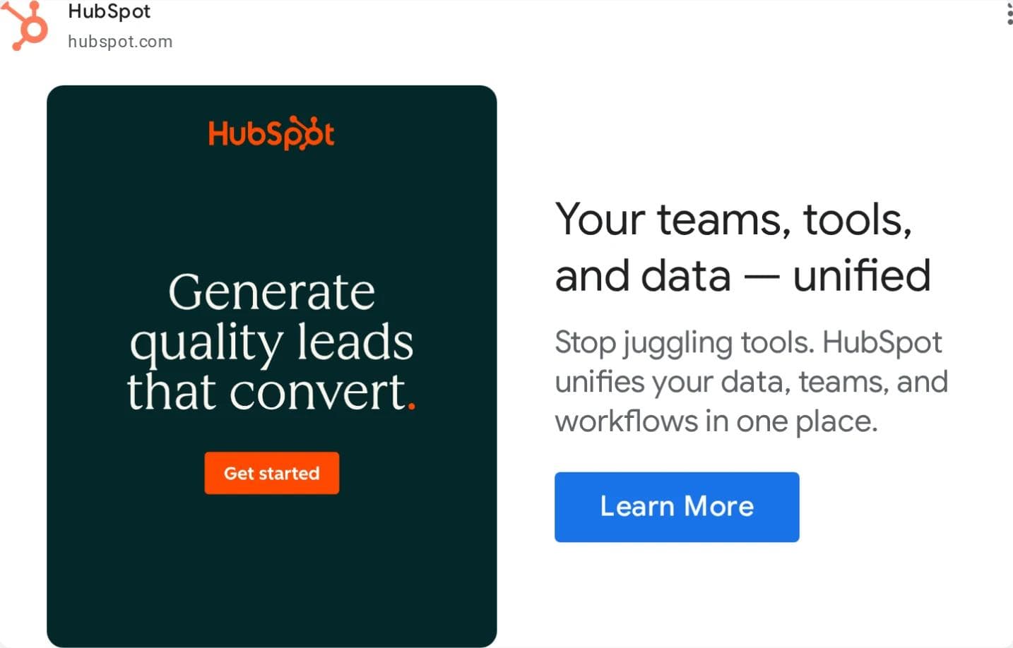
Layout. Responsive: the image asset is a dark green tile with a serif headline and its own orange button, and Google set it beside a 30-character headline, a description, and a blue Learn More button. What the eye lands on. The three-line headline inside the tile, then the orange button, then the second headline. No product, no screenshot, no person. What it asks you to believe. That HubSpot is where teams, tools, and data stop being separate, said twice in two voices. What transfers. The tile-as-image move: a designed card survives every responsive crop, and a benefit and button inside it get echoed by Google's own layout. Google's guidelines discourage overlaid text and buttons; HubSpot's tile is the argument that a designed card is not an overlay. What does not. Two buttons on one ad, unless you accept that the inner one is decorative.
2. Shopify: the product is the screenshot, the offer is free
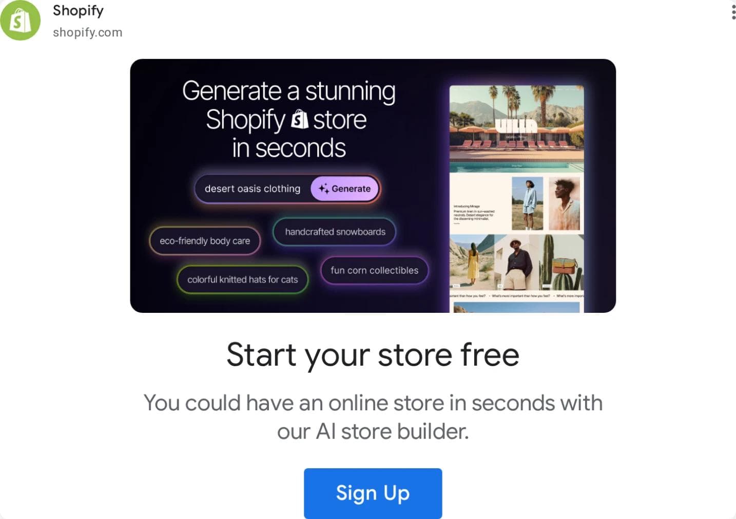
Layout. Responsive, with a product screenshot as the image and Google's headline, description, and Sign Up button under it. What the eye lands on. The words Generate a stunning Shopify store in seconds inside the interface, with prompt chips like desert oasis clothing, then Start your store free. What it asks you to believe. That the store builds itself from a sentence and that trying costs nothing: proof in the interface, offer in the headline. What transfers. For software, an interface shot with the promise typed into it beats a stock photo, and the free-to-start line belongs in the 30-character headline. What does not. A dense dashboard would not be legible at 300 px; this one is.
3. Grammarly: name the alternative
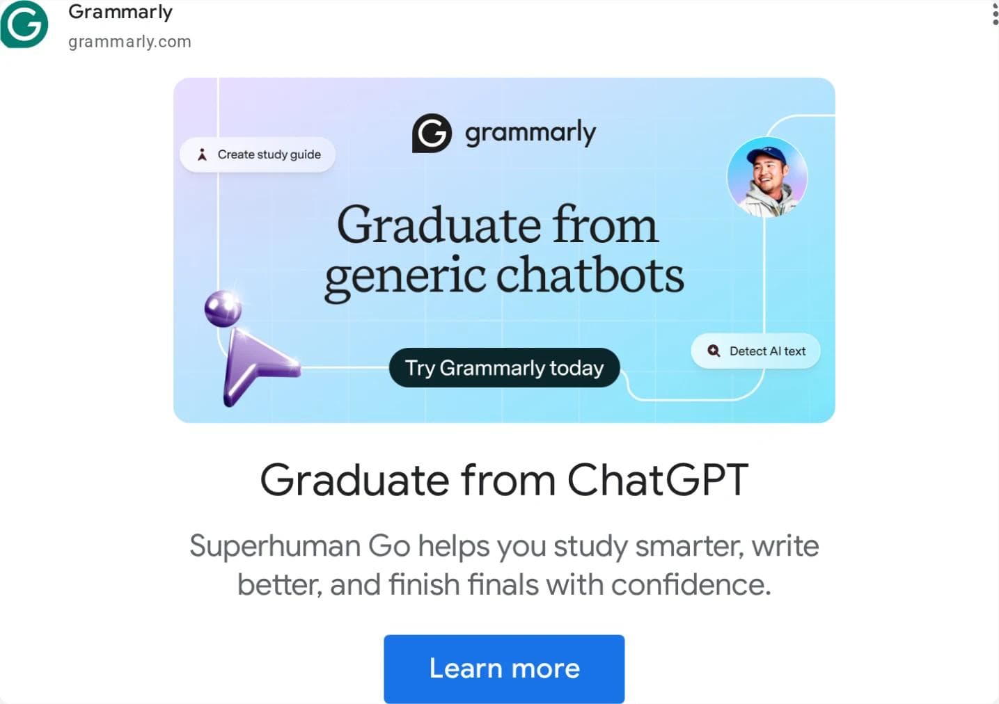
Layout. Responsive; a pastel illustrated tile with its own headline and pill button, then Google's headline, description, and button. What the eye lands on. Graduate from generic chatbots in the image, then Graduate from ChatGPT as the headline: the same sentence with the competitor named. What it asks you to believe. That you already use a chatbot to write and this is the step up; study, write, and finals in the description name the student. What transfers. Image says the category, headline says the thing you replace. It works when the incumbent is universally known and the claim is an upgrade, not an attack. What does not. Naming a competitor has trademark and policy limits that vary by market.
4. Casper: the number is the headline
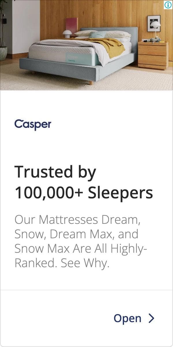
Layout. A 300 x 600 half page: photo, logo, headline, two description lines, an Open link. What the eye lands on. The bed, then Trusted by 100,000+ Sleepers, then four product names. What it asks you to believe. That volume is proof. No price or trial here; the sibling in the same listing, CR07237354634921115649, uses the same photo and layout with Claim A Free 100-Night Trial as the headline, the offer version of one template. What transfers. The skyscraper as a stacked argument, and the discipline of running the proof version and the offer version on one layout so the test is the headline. What does not. The number, unless it is yours; Highly-Ranked needs a source on the landing page.
5. Warby Parker: the feed is the ad
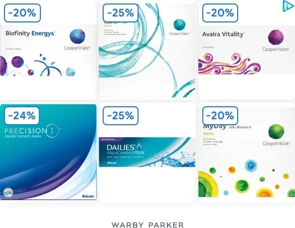
Layout. A 300 x 250 filled with a six-product grid, each box with a blue percentage badge, the wordmark at the bottom. What the eye lands on. -20%, -25%, -24%, then the lens brands, then Warby Parker. What it asks you to believe. That these are the lenses you already wear, cheaper. It is the dynamic remarketing layout Google builds from a product feed, which is why the products are other brands' and the headline is a wordmark. What transfers. With a feed, Google generates this for you; the decisions left are badge style, wordmark, and the white field. What does not. Without a feed, only the lesson that a price cut reads faster than a headline.
6. Glossier: product on a field, with a claim
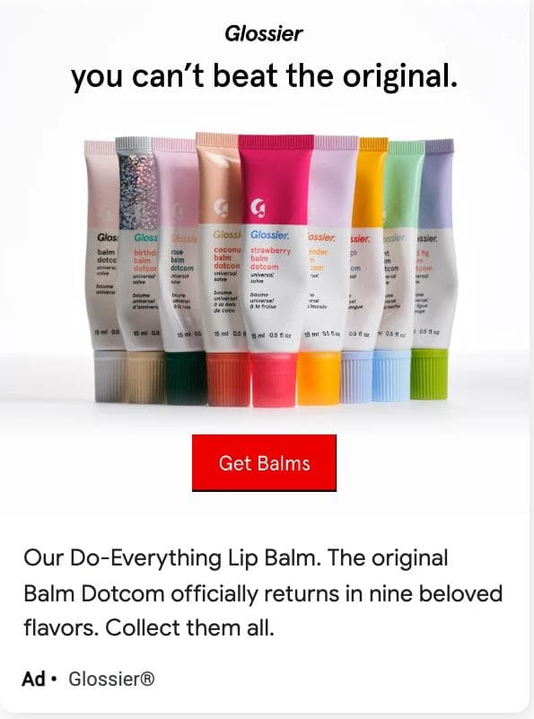
Layout. Responsive square-ish: the product lineup on white with the brand's own headline and button, Google's description and Ad label under it. What the eye lands on. Nine colored tubes in a row, then you can't beat the original, then the red Get Balms button. What it asks you to believe. That the product is back and is the one you remember; nine beloved flavors is a relaunch claim with a number in it. What transfers. The lineup-as-hero: a row of variants on a plain field says range and color without a word, for any product with visible variants. What does not. The nostalgia; you can only say the original if you have one.
7. Allbirds: one photograph, one sale
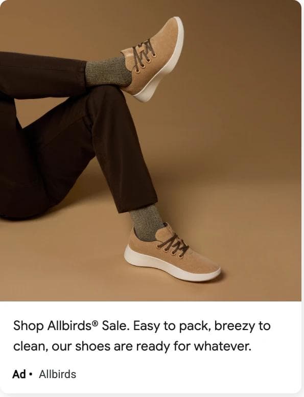
Layout. Responsive: the photo is the whole image asset, Google adds one description line and the Ad label. What the eye lands on. The shoes, because the photo is tone on tone and the trousers point at them; then Shop Allbirds Sale, the first three words of the description. What it asks you to believe. That the shoes are easy to live with and on sale. What transfers. A single lit product photo with no overlaid text is what Google's guidelines ask for, and it lets the copy carry the offer. Put the offer in the first three words of the description; that is what survives the smallest layout. What does not. The photography.
8. HelloFresh: a display ad for a job
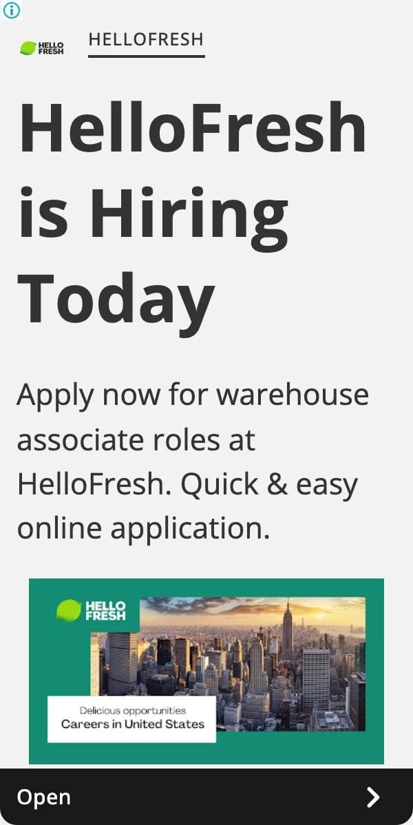
Layout. A 300 x 600, text first: logo, three-line headline, description, a photo tile, a dark Open button. What the eye lands on. HelloFresh is Hiring Today, as large as the slot allows. What it asks you to believe. That the application is quick and the role is a warehouse job. The consumer ads in the same US listing are all dynamic product cards, so this is the one ad written for a person rather than a feed. What transfers. Headline states the fact, description states the friction removed, button says Open: a template for any recruiting, event, or sign-up ad. The German version's run data is why it is here: ten months, with a times-shown range most product ads in the sample never reach. What does not. Nothing else; there is no photo or claim to borrow.
9. Booking.com for Business: the account is the offer
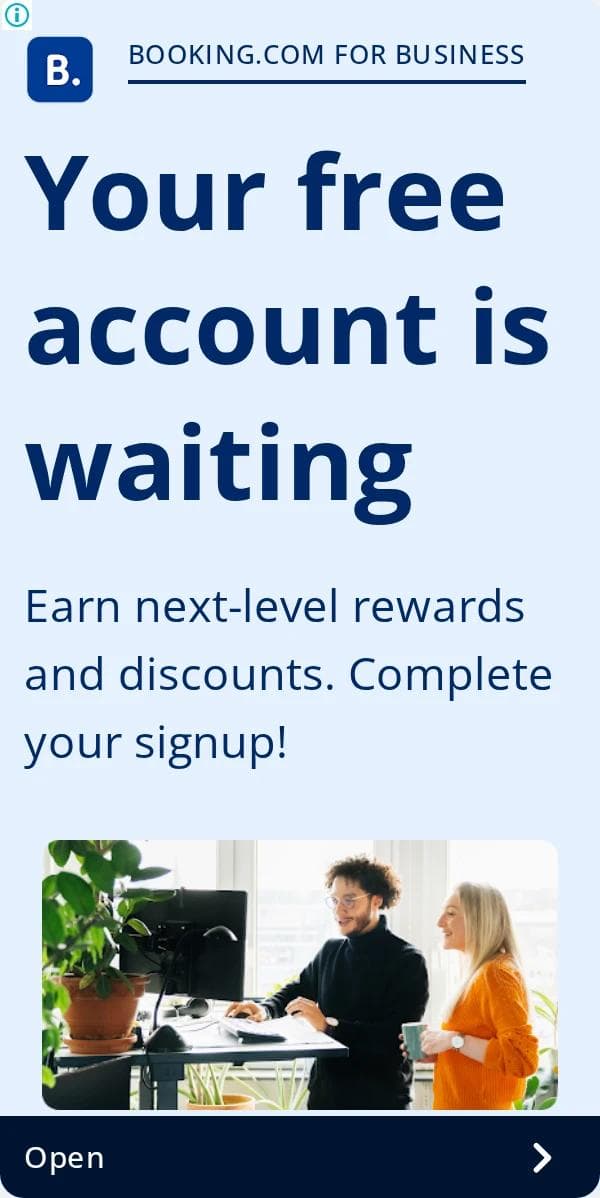
Layout. The same half-page stack as HelloFresh's, in blue: label, headline, description, photo, button. What the eye lands on. Your free account is waiting, then Complete your signup. What it asks you to believe. That you already started and only need to finish. This is retargeting language; it addresses someone who abandoned a form and reads strangely to anyone else. What transfers. The unfinished-task headline for any product with a signup funnel, and making the ad about the account rather than the hotel. The dates add a lesson: in Germany this ad ran November to May and stopped; in the United States it was still shown in late August. One creative, two lives. What does not. The copy, outside a retargeting list.
10. Coursera: headline first, certificate second

Layout. A 300 x 600 with a four-word headline taking half the height, one line of product name, a thumbnail of the course page, and the button. What the eye lands on. Learn At Your Own Pace, then Google Cybersecurity Professional Certificate; the partner brand is the proof and sits in the subhead. What it asks you to believe. That the barrier is time and the product removes it. What transfers. Benefit headline, proof subhead, product thumbnail: three slots for any course, tool, or service sold through a better-known partner. The dates say Coursera kept this one running through spring and summer while launching new certificate ads in August. What does not. The partner logo.
11. NerdWallet: the rate is the ad
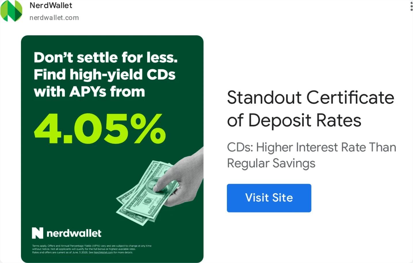
Layout. Responsive: a dark green tile carries the number, Google sets the headline and a Visit Site button beside it. What the eye lands on. 4.05%, the largest thing on the ad by a wide margin, then the hand with cash, then Standout Certificate of Deposit Rates. What it asks you to believe. That a better rate than yours exists and this page lists it. What transfers. For anything sold on a number, make the number the image and let the headline explain it; the sibling in the same listing does the same with 4.1% and a $400 bonus. What does not. The number changes with the market, which is why the ad has run nine months while the copy around it rotates.
12. Shopify Editions: a launch campaign with a start and an end
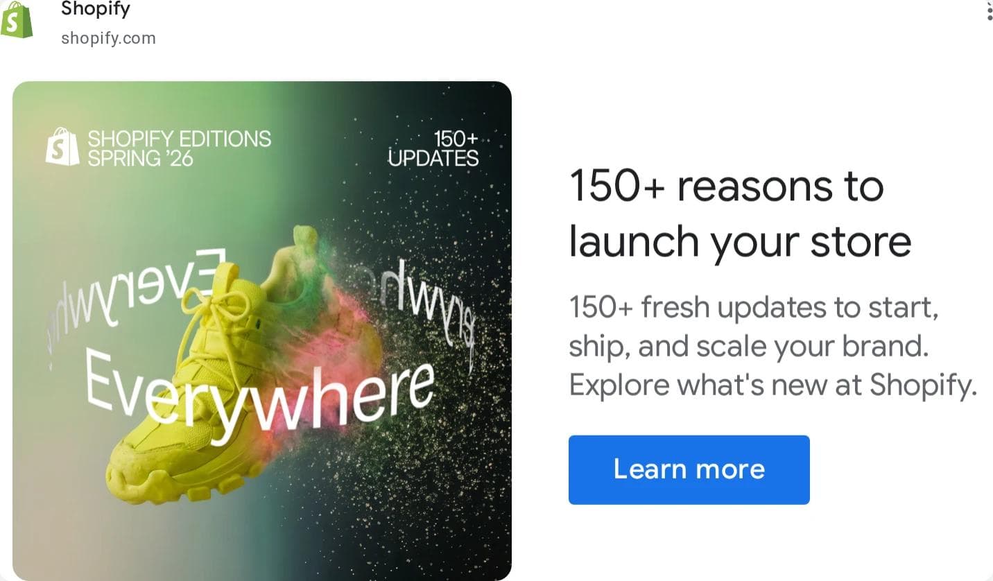
Layout. Responsive, with a campaign key visual (a sneaker through the word Everywhere) as the image and a numbered headline beside it. What the eye lands on. The shoe, then 150+ reasons to launch your store. What it asks you to believe. That the platform just shipped a lot, and that a count of updates is a reason to start. What transfers. The launch template: key visual, a count in the headline, the campaign label in the image. And the cleanest campaign shape in the sample: first shown June 17, last shown August 15, one variation, in both markets. Set it beside Shopify's evergreen Start your store free ad, still running with three variations: one is a moment, the other a machine. What does not. The visual, and the count, which has to be true on the day the ad runs.
What the 12 have in common, by size and layout
The decisions cluster by shape more than by category.
| Shape as rendered | Ads in the set | What the layout does | What varies |
|---|---|---|---|
| 300 x 250 rectangle | Warby Parker | One grid or image, the brand as a wordmark, no headline | Feed-generated versus designed; badge style |
| 300 x 600 half page | Casper, HelloFresh, Booking.com, Coursera | A stack: headline or photo, proof or description, thumbnail, button; the headline takes a third to a half of the height | Photo on top (Casper) versus headline on top; proof line versus friction-removed line |
| Responsive landscape | HubSpot, Shopify (both), Grammarly, NerdWallet | Google's layout: image asset left, a 30-character headline, a description, and a button right | Whether the image is a photo, a screenshot, or a designed tile with its own text and button |
| Responsive square-ish | Glossier, Allbirds | Image on top, one description line and the Ad label under it, no separate headline shown | Product lineup versus lifestyle photo; the offer as the first words of the description |
Four things the set shares:
- The image carries the argument in seven of twelve. HubSpot, Grammarly, NerdWallet, Shopify Editions, Glossier, Casper, and Warby Parker put the headline, the number, or the badge inside the image asset. Google's guidelines discourage overlaid text; most of these advertisers do it anyway with a designed tile rather than text on a photo.
- The button is Google's in nine of twelve. Learn More, Sign Up, Open, Visit Site, Apply now. Only HubSpot, Grammarly, and Glossier ship a button inside the image, and two of those end up with two buttons on the rendered ad.
- Offers are numbers. -20% to -25%, 100,000+ sleepers, 4.05%, 150+ reasons, 100-night trial, free. None is an adjective.
- Three variations is the default. Eleven of twelve show 3 variations, Google's assembly of the advertiser's headlines and images. The one with a single variation, Shopify Editions, is also the one with clean campaign start and end dates, and in the wider sample every monday.com ad had one variation and a campaign end in January.
What did not transfer
- Dynamic product cards. HelloFresh's twelve US image ads were one template: meal-kit photo, product name, price placeholder, brand. Shopify's listing carried Shop app product cards (a hoodie, a ceiling fan, sneakers) with a price. These come from a feed; the only decision was to have a feed. Warby Parker's grid made the set because the badge treatment is a decision; a single product card is not.
- Error boxes and placeholders. Several Warby Parker, Allbirds, Casper, and Glossier cards rendered as a Google error page in our headless browser, and one Warby Parker ad first shown March 22, 2025 (529 days by capture) never rendered on its detail page either. A run length without a creative is a data point, not an example.
- Agency and partner accounts. The hubspot.com, monday.com, and shopify.com domain listings mixed in partners and unrelated advertisers whose ads point at those domains. The sample and the twelve use each brand's own verified account.
- Ended campaigns on the first screen. monday.com's US image listing led with ads last shown in January and February 2026. The listing is not sorted; set the date filter to Last 7 days before reading it as live.
- Other languages. Booking.com's and HelloFresh's German listings are the same layouts in German, Polish, Dutch, and Italian. Useful for run dates, not for copy.
The sample: 14 advertisers, measured
On September 2 and 3, 2026 we searched 14 advertisers, set the format filter to Image, and opened the first twelve image ads of each listing twice: once with the United States selected, once with Germany, using the brand's own verified account where the domain listing mixed in agencies. Two returned nothing usable: notion.so listed three ads and no image ads, and wise.com's only image ad belonged to an unrelated account. The other twelve:
| Advertiser (verified account) | US ads, all formats | US image ads | First 12 US image ads last shown within 3 days | With variations | Germany: image ads with a first-shown date | Median days shown, Germany | Over 30 days | Over a year |
|---|---|---|---|---|---|---|---|---|
| HubSpot (Hubspot, Inc.) | ~700 | 41 | 8 of 8 | 8 | 5 of 7 | 696 | 4 | 3 |
| monday.com (monday.com LTD) | ~900 | ~900 | 0 of 8 | 0 | 12 of 12 | 66 | 11 | 0 |
| Shopify (Shopify Inc.) | ~10K | ~2K | 12 of 12 | 12 | 12 of 12 | 113 | 12 | 0 |
| Grammarly (Superhuman Platform Inc.) | ~20K | ~500 | 12 of 12 | 10 | 12 of 12 | 17 | 4 | 1 |
| Warby Parker (Warby Parker Inc.) | ~6K | ~300 | 12 of 12 | 12 | 11 of 12 | 26 | 2 | 2 |
| Allbirds (Allbirds Inc) | ~2K | ~400 | 12 of 12 | 11 | no ads in Germany | |||
| Casper (Casper Sleep Inc.) | ~800 | ~200 | 12 of 12 | 12 | 6 ads, none image | |||
| Glossier (Glossier Inc.) | ~800 | ~200 | 12 of 12 | 11 | 15 ads, none image | |||
| HelloFresh (hellofresh.com) | ~2K | ~400 | 12 of 12 | 12 | 6 of 6 | 182 | 3 | 0 |
| Booking.com (booking.com) | ~500K | 79 | 0 of 12 | 10 | 12 of 12 | 202 | 11 | 0 |
| Coursera (Coursera, Inc.) | ~4K | ~400 | 12 of 12 | 12 | 12 of 12 | 120 | 8 | 1 |
| NerdWallet (NerdWallet, Inc.) | ~10K | ~500 | 12 of 12 | 11 | 12 of 12 | 127 | 9 | 0 |
Pooled, the German view gave a first-shown date for 94 of the 97 image ads opened there: median 66 days shown, 64 over 30 days, 46 over 90, 7 over a year. The share still running after 30 days varies more by advertiser than the medians suggest.
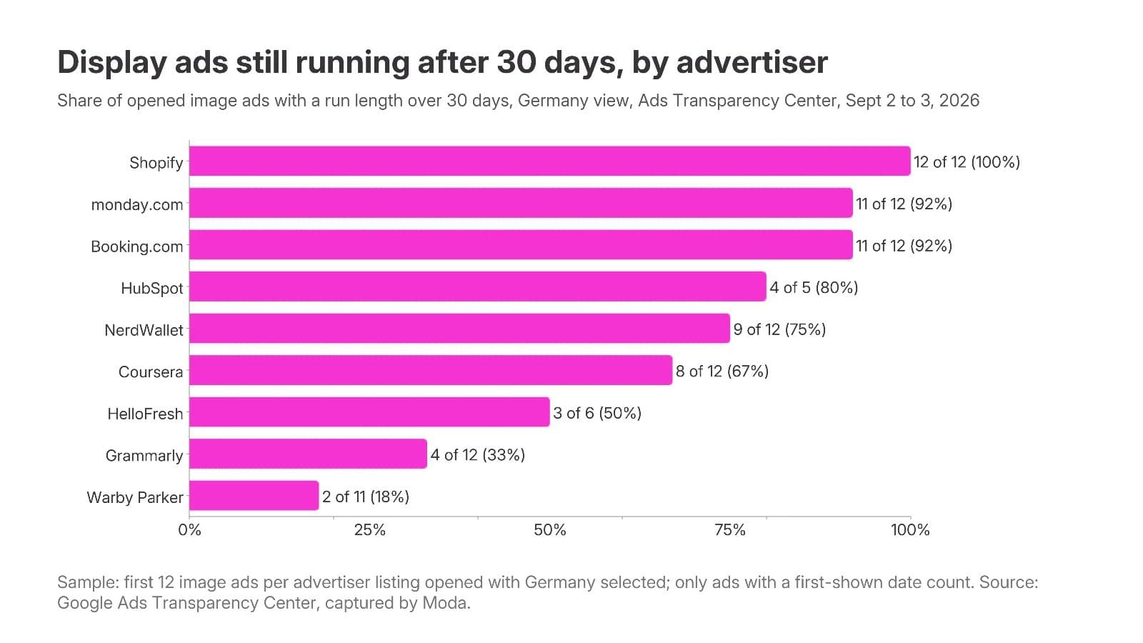
Three things in the numbers worth carrying into your own set:
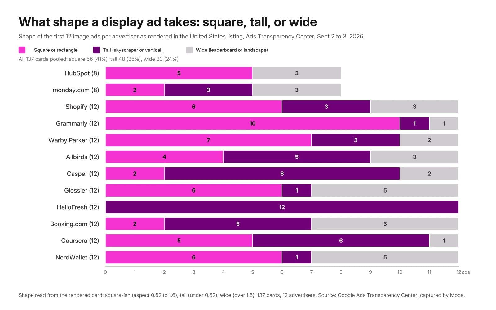
- Shape follows the advertiser, not the category. Across the 137 first-screen cards in the US listings, 56 rendered square or rectangle, 48 tall, and 33 wide. But HelloFresh's twelve were all tall dynamic product cards, Grammarly's were ten of twelve square, and Booking.com and Glossier split between wide and tall. An advertiser's shape mix is its media plan showing through; read a competitor's before choosing which sizes to build.
- The long runners are brand and catalog ads, not offers. The seven ads over a year: HubSpot's three free-CRM ads, two of them in Spanish and first shown in March 2023; one Grammarly ad first shown February 2025 with a 400K to 450K times-shown range; two Warby Parker ads; one Coursera certificate ad first shown May 2025 with 150K to 175K. Offers rotate: NerdWallet's rate ads and Booking.com's summer leisure ads carried July and August last-shown dates with a new batch underneath.
- Times-shown ranges are mostly tiny. Of the 94 dated ads, 25 were too new to carry a range and 48 sat in the 0 to 1K band for Germany, which is what a US-first campaign's spillover looks like. The exceptions are the ones to study: two Booking.com business-account ads at 80K to 125K, Coursera's certificate ad at 150K to 175K, HelloFresh's recruiting ad at 7K to 8K, one monday.com ad at 7K to 8K.
None of that says which ad performs. A first-shown date says the advertiser kept paying; a times-shown range says Google kept serving it in one country. Both are hypotheses to test against your own product.
Build a reference set of your own
The twelve are a starting point, not your set. Yours should come from the advertisers your buyers already see, and the Transparency Center guide covers the tool in full: advertiser-or-website search, no keywords, the card and detail page, the URL parameters. The short version:
- Start from domains, not names. Type competitors' websites and the websites of brands in adjacent categories; the domain view collapses agency and parent accounts. Set the format filter to Image and click See all ads.
- Open each ad with an EEA region selected. With the United States selected a detail page shows last shown, format, and variations. With Germany, France, or Ireland selected, an ad that was shown there adds a first-shown date and a times-shown range. US-only advertisers give you nothing extra; write that down rather than guessing.
- Record the ID, not just the screenshot. The detail URL holds the advertiser and creative IDs. Save it with first shown, last shown, variations, and the size or aspect, and reopen it in a month to see whether the ad survived.
- Vary the set on decisions. Product on a field, offer led, proof led, brand led, retargeting language, and one of each shape. Take a third from categories next to yours; the structures that survive there transfer, and your ad will not sit beside a rival's.
- Write the three-question record for each ad. The last answer, what transfers if the product changes, is the only one you will use next week.
The creative belongs to the advertiser. Saving it to study is ordinary competitive research; reusing its photograph, product shot, mascot, or copy is not. Adapt the structure and supply your own product, people, and claims.
For static ads on Meta and LinkedIn, the same method with keyword search and a longevity sample is in Static ads: what still works, and the feed version of this swipe file is Facebook ad examples.
Turn references into on-brand banners in Moda
A display set is one layout pushed through several shapes, and the work is in the pushing: the 300 x 250 has room for an image and a line, the 728 x 90 for the line and a button, and the 1200 x 628 responsive asset has to survive Google's crops. Rebuilding a reference in your colors, type, photography, and claims is a design task, and an AI design agent handles it well when you give it references instead of adjectives.
In Moda, attach two or three saved ads to a message, name the brand kit, and say what stays and what changes:
Use these three display ads as layout references, not as artwork. Build a display set for our meal-kit brand with the Greenline brand kit: a 300 x 250, a 728 x 90, and a 1200 x 628 responsive image, all from one layout. Keep the structure of the first reference: product on a plain brand-color field, one benefit headline under 30 characters, an offer badge, logo bottom left. In the 728 x 90 drop the badge and put the headline and button side by side. Use our product photos only, write three alternative headlines, and do not reuse any reference copy.The result lands on an editable canvas, so the headline, product image, badge, and logo stay separate objects in every size, and changing the offer means editing text, not regenerating the set.
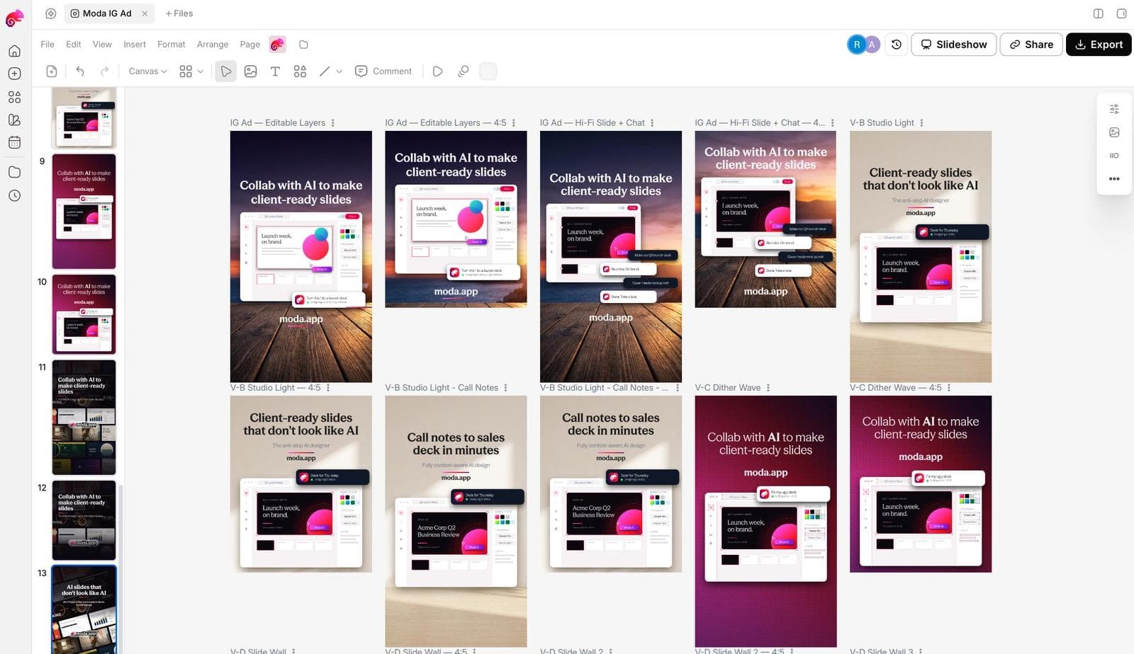
Before the set ships: the claims are yours and true, the product is recognizable at 300 x 250 on a phone, the headline fits 30 characters, the image has no overlaid text or logo if it is going into a responsive ad, and you have two headlines against the same layout so the first test measures the message. If the brand side is not set up yet, how AI design tools build a brand kit from your website covers what gets extracted.
Frequently asked questions
What is an example of a display ad?
A display ad is an image, animated, or responsive ad shown on a website or app rather than in search results. A 300 x 250 rectangle in a news site's sidebar with a product photo, a headline, and a button is the common case; the Warby Parker and Casper ads above are display ads as Google rendered them.
Where can I see display ads that are actually running?
The Google Ads Transparency Center at adstransparency.google.com shows the image, text, and video ads a verified advertiser has run in the last year. Search by advertiser name or website, set the format filter to Image, and open a card. Select an EEA country to see first-shown dates and times-shown ranges for ads shown there.
What are the standard display ad sizes?
Google's uploaded display ad specifications list 300 x 250, 336 x 280, 728 x 90, 970 x 250, 160 x 600, 300 x 600, 320 x 50, and 320 x 100 among accepted sizes, with a 150 KB limit. Responsive display ads instead take a 1200 x 628 landscape image, a 1200 x 1200 square, and an optional 900 x 1600 vertical.
What is the difference between a display ad and a banner ad?
A banner ad is one shape of display ad, historically the horizontal strip across the top of a page. Display ad is the broader term and covers rectangles, skyscrapers, mobile banners, and responsive ads assembled from assets. In practice the words are used interchangeably.
Does a long-running display ad mean it performs well?
Not by itself. A first-shown date a year back says the advertiser kept paying, which is a hypothesis about performance, not a measurement; brand campaigns and low-budget catalog ads run for years. Compare run lengths within one advertiser's set, weight ads with several variations and a recent last-shown date, and treat the result as a test list.
Can I use these ads in my own campaign?
No. The creatives belong to their advertisers. Use them to learn the structure, hierarchy, and offer type, then build your own with your product, your photography, and claims you can support.

Real editable visuals. Real canvas. Full control.
Fly through design work