Facebook Ad Examples: 12 Ads Running Right Now, Torn Down (2026)
Twelve Facebook ads that were live in the Meta Ad Library on September 3, 2026, each with its Library ID, start date, and days running, torn down for what you can reuse in your own feed ads.
 Anvisha Pai, Co-founder & CEO, Moda
Most Facebook ad examples you can find online are screenshots somebody took years ago; the page that ranks fourth for this query was published in 2016. You cannot tell whether an ad ran for a week or is still running. This post is different in one way: every one of the twelve ads below was live in the Meta Ad Library on September 3, 2026, and each comes with its Library ID, start date, days running, and versions flag. Paste any Library ID into the library and check for yourself.
The twelve were chosen from six keyword searches (skincare, meal kit, mattress, running shoes, language app, dentist) with the library's Platform filter set to Facebook, then picked so that they make different decisions: image versus video, a product hook versus a person hook, a price versus a promise, a national brand versus a local one. Four of the six searches share a buyer (skincare, meal kits, mattresses, and running shoes all sell a better daily routine to the same phone), which is the point: the structures transfer between them, the claims do not.
The method is the one in our Meta Ad Library guide; our Instagram Stories examples apply it to one placement, and this post applies it to the Facebook feed.
How the twelve were chosen
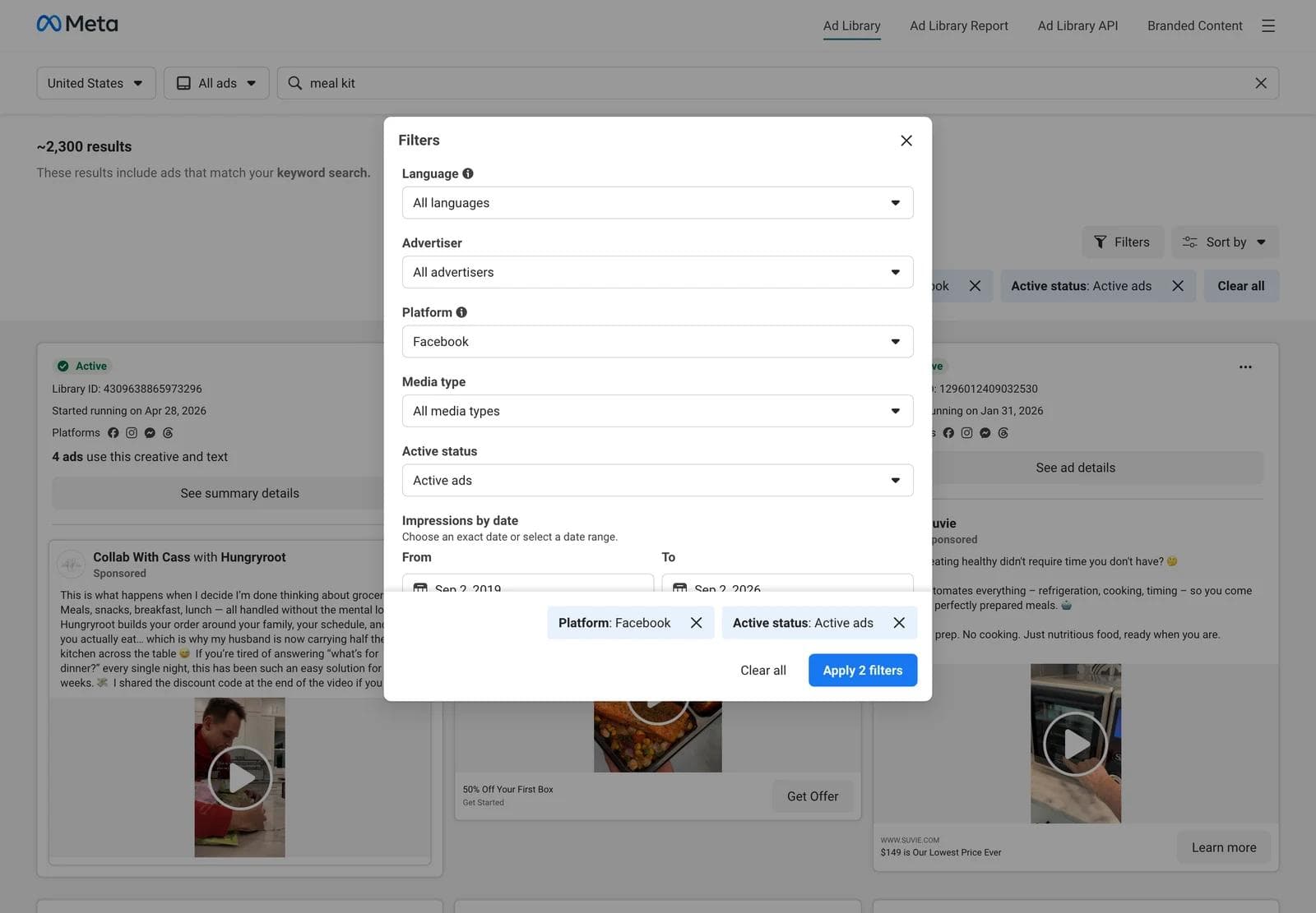
The Meta Ad Library cannot filter by placement. Ad Details shows the platforms an ad runs on (Facebook, Instagram, Messenger, Threads, WhatsApp, Audience Network) but not whether it appeared in the feed, in Stories, or in Reels. So "Facebook ad" has to be inferred, and here is how:
- Platform filter set to Facebook. In the Filters panel, Platform offers each of Meta's apps. Choosing Facebook adds
publisher_platforms[0]=facebookto the URL and a "Platform: Facebook" chip to the results. Media type was left on All media types, Active status on Active ads, country United States. - Six searches, first 84 to 99 cards each. Keyword searches are unordered, so "skincare" matches any ad whose text contains the word: the first three skincare results were TikTok's own app-install ads. A keyword search is a slice of the library, not a category, and the slice needs sorting by hand.
- Feed-shaped creative preferred, not required. Square, 4:5, and landscape assets are built for the feed; 9:16 assets are built for Stories and Reels and get served in the feed cropped. Six of the twelve are feed-shaped and six are vertical, because vertical creative is now more than half of what a Facebook-filtered search returns.
- Two per search, chosen on decisions, not on quality. We do not know which of these ads make money. We know when each started, where it runs, and whether it has versions, which are the only signals the library gives you for a commercial ad. The longest-running ad in the set (a local dentist, 1,624 days) is in it partly to show what a start date cannot tell you.
What a Facebook feed ad has to do
Before the examples, the constraints. These come from Meta's Ads Guide and Business Help Center pages for the Facebook Feed placement, read on September 3, 2026.
- The frame is 4:5 or 1:1. The Ads Guide recommends 4:5 at 1440 x 1800 pixels for Facebook Feed image ads, JPG or PNG, minimum width 600 pixels, 30 MB. The best-practices page says 1:1 or 4:5 both work in Facebook Feed and recommends 4:5 for single-image ads. A 9:16 asset is served in the feed cropped, which is why the vertical ads below keep their text in the middle of the frame. Source: Meta Ads Guide, Awareness Image Ad Specs on Facebook Feed; Meta Business Help Center, Best practices for image ads.
- Video gets the same frame. MP4, MOV, or GIF, 4:5 at 1440 x 1800, 1 second to 241 minutes, 4 GB, captions and sound recommended. Source: Meta Ads Guide, Awareness Video Ad Specs on Facebook Feed.
- The text fields are short. Meta recommends 50 to 150 characters of primary text and a 27-character headline for Facebook Feed. Most of the twelve ignore the first number, and the card hides everything past the first few lines behind "See more", which makes the first line of primary text a second headline.
- There is no text-in-image limit any more. The best-practices page states there is no longer a limit on text in an ad image and that the text overlay tool is gone. The 20 percent rule that older galleries still mention is history; the current guidance is that text should not obstruct the visual and should be clean, large, and contrasting.
- The footer is changing under you. The same page says that from March 2026 single-media ads in Facebook Feed no longer show a URL in the footer, and that the "Sponsored" label is becoming "Ad". The library's cards still showed both on the capture date, so treat them as the library's rendering, not a pixel-accurate feed.
- Meta's own creative advice for feed images is to focus on the product, show the brand or logo, show people using the product, and crop tightly. Every ad below does at least three of the four.
The 12 teardowns
Each entry records what the eye lands on first, what the ad asks you to believe, and what would transfer if you swapped in your own product. Every caption carries the advertiser, Library ID, start date, days running on September 3, 2026, and the versions flag. Video ads show the library card on the left and one frame on the right.
1. Dot & Key: a landscape catalog ad at 492 days
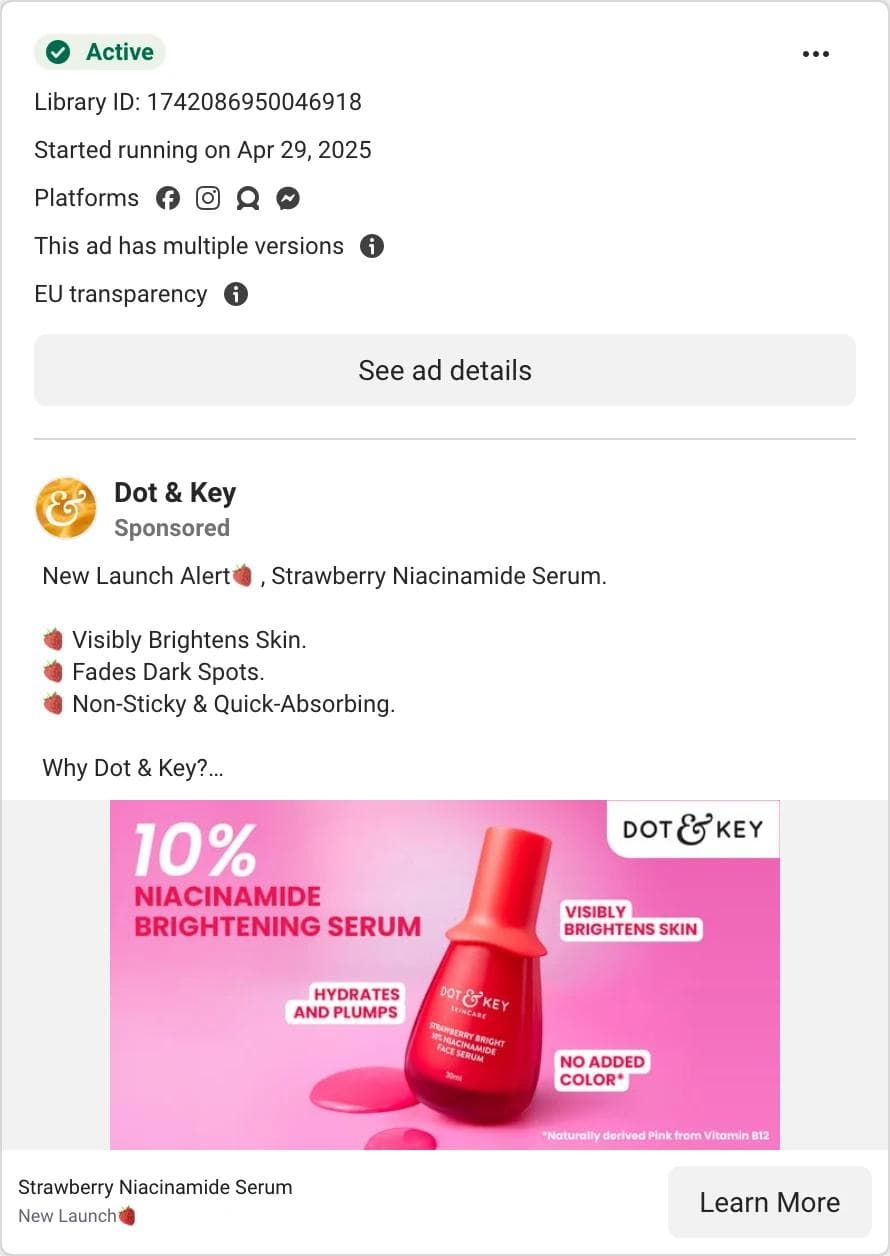
The eye lands on a red bottle on a hot pink field, in a landscape frame wider than anything else in the feed. The product name and its one number, "10% Niacinamide", are the only words in the image. What the ad asks you to believe: the list. The primary text is seven emoji bullets, three benefits and four proof points ("Clinically Proven", "Dermatologically Tested"). What transfers: the split of jobs. The image carries one product and one number; the text carries every claim. That split is what lets an ad run for 492 days with versions: the image is a template and the bullets can be rewritten for any launch. The landscape frame does not transfer; the spec pages no longer recommend it and it reads small on a phone.
2. Solawave: the offer as a button drawn into the image
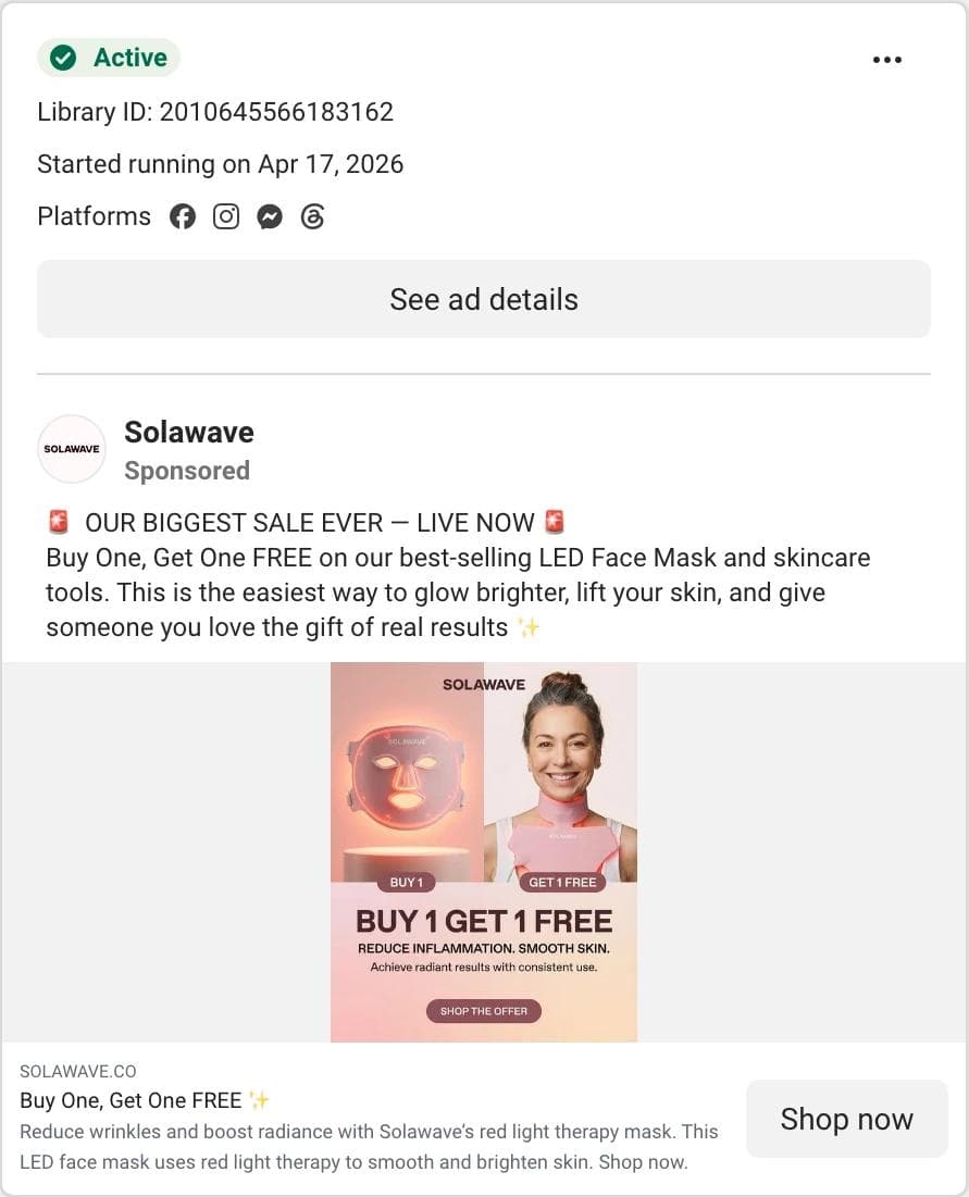
The eye lands on a woman in a glowing red LED mask, then "BUY 1 GET 1 FREE" in the bottom third, then a button drawn into the image ("Shop Offer") above the real Shop now button. What the ad asks you to believe: the sale is the biggest it has ever run ("OUR BIGGEST SALE EVER, LIVE NOW", with a siren emoji) and the device works. What transfers: the stack. Person using the product at the top, the offer as the largest text, a fake button as the last thing the eye reaches. The fake button is the most copied trick in direct-response feed ads because Facebook's real button sits below the image where it looks like chrome. What does not transfer: "biggest sale ever" if it is not, and an offer that has been "live now" for 139 days.
3. Factor: the number is the hook
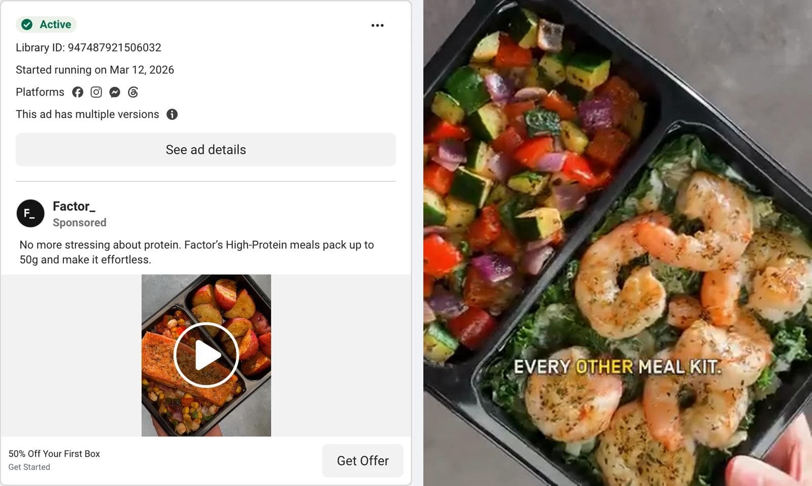
The eye lands on food, filmed from above in a black tray, in a 4:5 frame that fills the card. No person, no logo; a second later the tray is labelled "EVERY OTHER MEAL KIT", setting up a comparison the rest of the 27 seconds pays off. What the ad asks you to believe: one number, "up to 50g" of protein, and one promise, "no more stressing about protein", both in the primary text. The offer, 50 percent off the first box, sits in the headline field rather than on screen. What transfers: a video that is really a product photograph with motion, a them-versus-us label as the first on-screen text, and a single specification as the whole argument. The number goes in the copy; the discount goes in the headline where it does not compete with it.
4. HelloFresh: the creator caption on a brand account
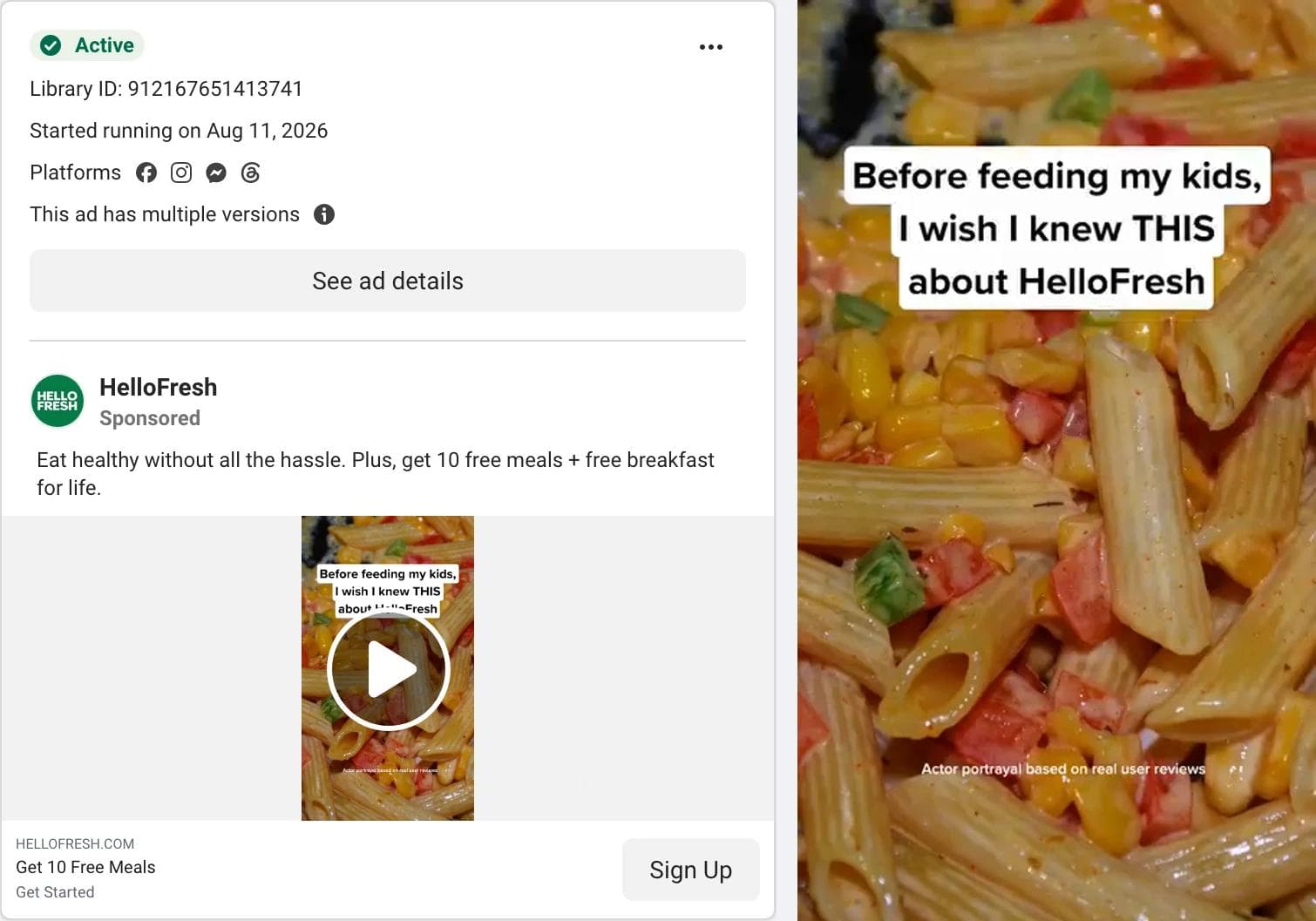
The eye lands on a caption box in the top third of a vertical frame: "Before feeding my kids, I wish I knew THIS about fresh meals." The footage is a close-up of a plate of pasta, shot to look like a phone video, and a small line at the bottom of the frame reads "Actor portrayal based on real user reviews". What the ad asks you to believe: a parent found something and is telling you. The account is HelloFresh's own, not a creator's, the parent is an actor by the ad's own admission, and the copy underneath is pure brand offer: "Get 10 free meals" as the headline, "free breakfast for life" in the text, Sign Up as the button. What transfers: the seam between a creator-style hook and a brand-style offer. The video borrows the grammar of a personal post and the card supplies the deal. At 23 days with versions it is a test in progress, not a proven ad; it is here because that seam is now the default shape of a big-brand feed video.
5. Consumer Reports: selling the decision, not the mattress
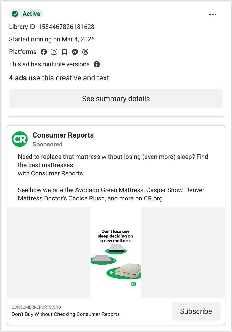
The eye lands on a cartoon stack of mattresses in Consumer Reports green with one line above it: "Don't lose any sleep deciding on a new mattress." What the ad asks you to believe: you are about to buy the wrong one. The primary text names three mattresses it rates, the headline is a warning ("Don't Buy Without Checking Consumer Reports"), and the button is Subscribe. What transfers: the decision-stage ad. It ran in a mattress search alongside the mattress brands and targets the same buyer at the moment before purchase. A comparison site, a marketplace, a broker, or any brand with a buying guide can run the same structure: name the competitors, promise the answer, sell the answer. It is also the only ad in the twelve without a photograph or footage.
6. Nectar Sleep: the price anchor in the first line
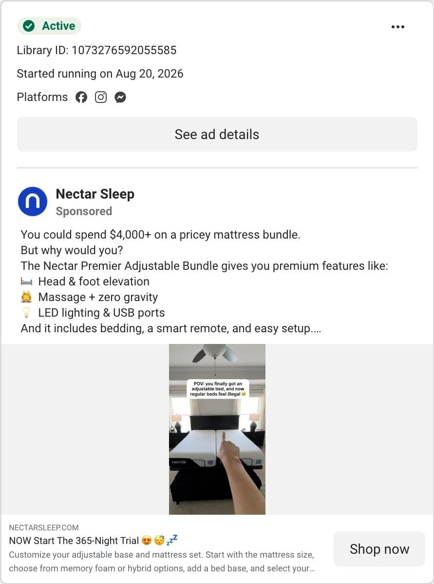
The eye lands on the first line of the primary text, because the image is a vertical lifestyle shot with small overlaid text and the copy opens with a number: "You could spend $4,000+ on a pricey mattress bundle. But why would you?" What the ad asks you to believe: the comparison. Feature bullets follow (elevation, massage, LED lighting, USB ports), then "Save up to 66%", then the headline: "NOW Start The 365-Night Trial". What transfers: the anchor. Name the expensive alternative in the first sentence, list what the reader gets anyway, put the risk reversal in the headline. Fourteen days is too young to read anything into the date; the structure is why it is here.
7. KURU Footwear: a genre borrowed for a foot-pain product
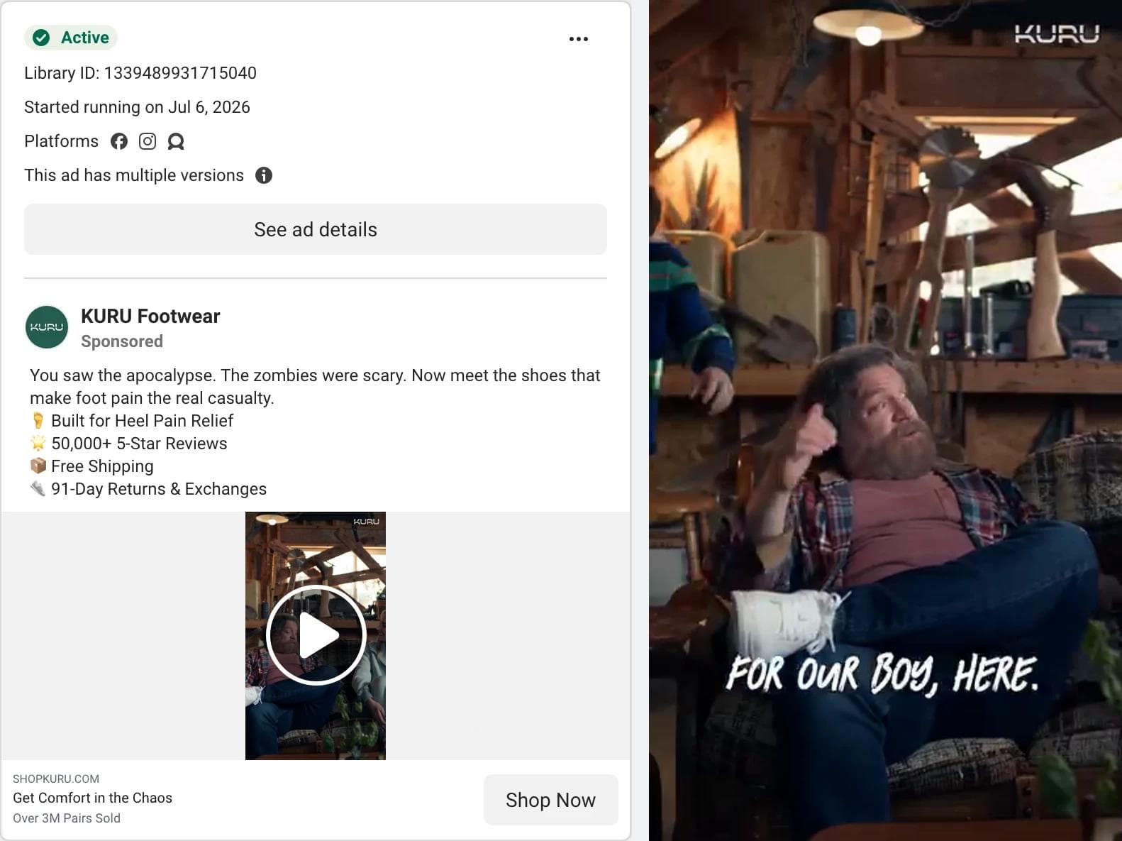
The eye lands on a dark cabin with two men on a sofa, one with a bandaged leg, under a KURU watermark. It does not look like a shoe ad, because it is staged as the aftermath of a zombie movie. The copy explains: "You saw the apocalypse. The zombies were scary. Now meet the shoes that make foot pain the real casualty." What the ad asks you to believe: the proof under the joke. Four bullets follow the setup: built for heel pain relief, "50,000+ 5-Star Reviews", free shipping, 91-day returns. The description under the headline says "Over 3M Pairs Sold". What transfers: the pairing of a borrowed genre with a plain proof list. The genre buys the first three seconds, the bullets do the selling, and the review count and return window remove the objection. A brand in a boring category with a real review count can do this with any genre it can afford to shoot.
8. HOKA: a brand line, no offer, no button
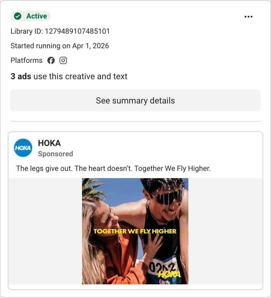
The eye lands on a face: a runner in mirrored sunglasses and a yellow cap, framed tight against a blue sky, with "TOGETHER WE FLY HIGHER" across the image in yellow. What the ad asks you to believe: a feeling. The whole primary text is "The legs give out. The heart doesn't. Together We Fly Higher." There is no headline, no price, no product name, and the call to action is a menu rather than a button. What transfers: the reminder that a square photo of a person with one line of type is still a complete Facebook ad, if the brand is recognized. What does not transfer: the absence of an offer. A brand nobody knows yet needs the product in the frame.
9. Umi: an app-install video at 625 days
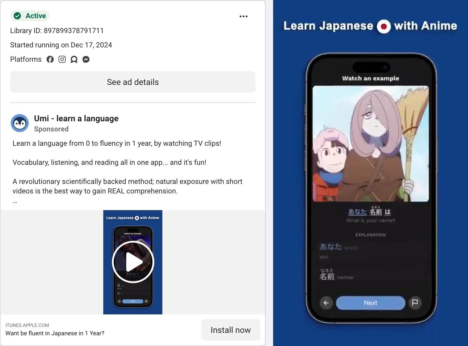
The eye lands on a phone screen in the middle of a dark vertical frame, playing an anime clip with Japanese subtitles, under a caption: "Learn Japanese with Anime". What the ad asks you to believe: the mechanism. "Learn a language from 0 to fluency in 1 year, by watching TV clips" is the first line, and the headline is a question, "Want be fluent in Japanese in 1 Year?" (the typo is in the ad). What transfers: show the product doing the thing, on a phone, in the first frame, with the promise as a caption above it. This is the oldest product-brand ad in the set, and it shares the shape of most of the language app search (82 videos out of 88 cards): a screen recording, a caption, a Download button. The 625 days says the advertiser has kept paying for it, not why.
10. Ling: naming the competitor in the first line
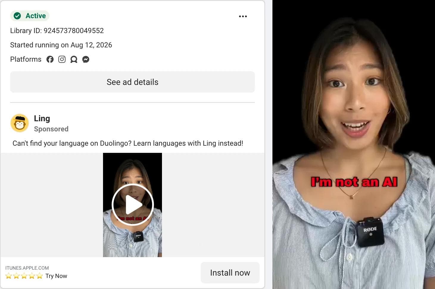
The eye lands on a woman talking to camera against a black background, with a lapel microphone clipped to her shirt and a red caption: "I'm not an AI". The app's translation exercise appears a second later with her shrunk into the corner. What the ad asks you to believe: on screen, that a real person is recommending this; in the copy, the gap in the market leader. The entire primary text is "Can't find your language on Duolingo? Learn languages with Ling instead!" and the headline is five star emoji and "Try Now". What transfers: the competitor-conditional hook. It does not say Ling is better than Duolingo; it names the one case where Duolingo does not serve you and offers itself for that case. A challenger in any category can write that sentence. The "I'm not an AI" caption is a 2026 detail: a talking-head ad now has to establish that the head is real, and this one does it in four words.
11. Zocdoc: the objection as the opening line
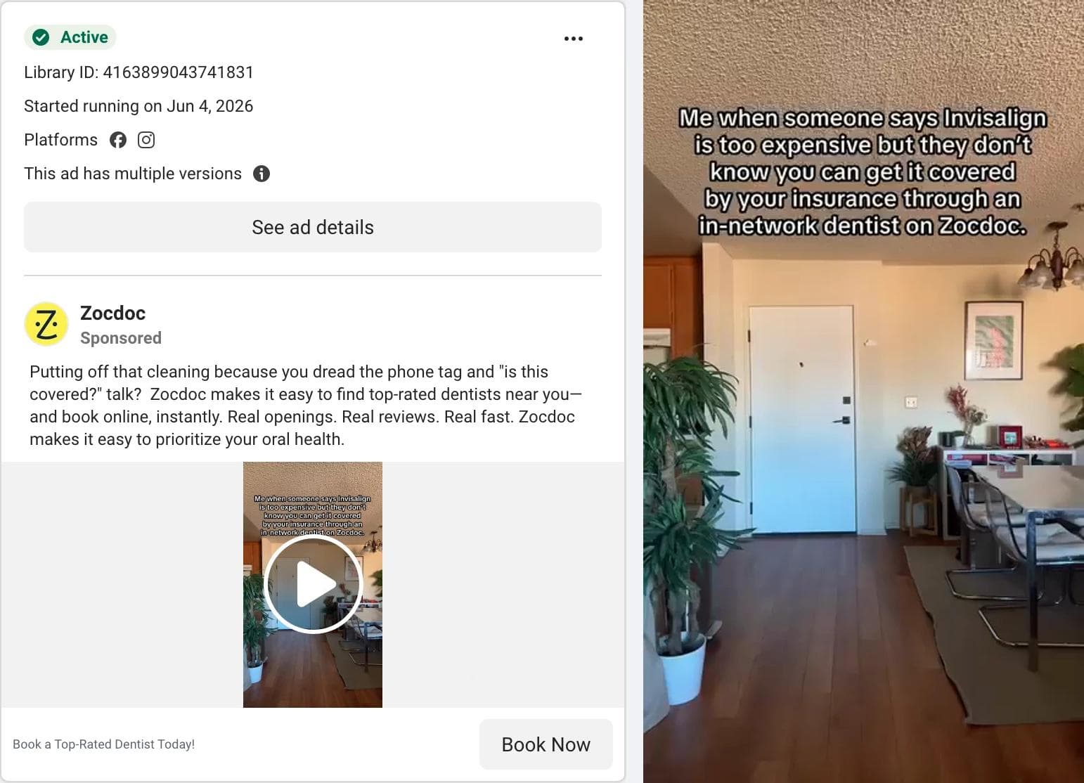
The eye lands on a caption in the meme format, "Me when someone says Invisalign is too expensive but they don't know you can get it covered by your insurance through an in-network dentist on Zocdoc", over an empty living room that a person is about to walk into. What the ad asks you to believe: that the reason you have not booked is a fear about cost and phone calls, not the dentist. The primary text opens with the objection ("Putting off that cleaning because you dread the phone tag and the 'is this covered?' talk?") and answers it in three two-word sentences: "Real openings. Real reviews. Real fast." The button is Book Now. The video and the text carry different objections (cost, phone tag) for the same answer, which is what the versions flag usually means in practice. What transfers: the objection-first opening and the three-beat answer, for any business whose real competitor is the reader's procrastination. Eleven seconds is the shortest video in the set; it fits because the ad does not try to explain what Zocdoc is.
12. Coastal Dental: the local ad that has run since 2022
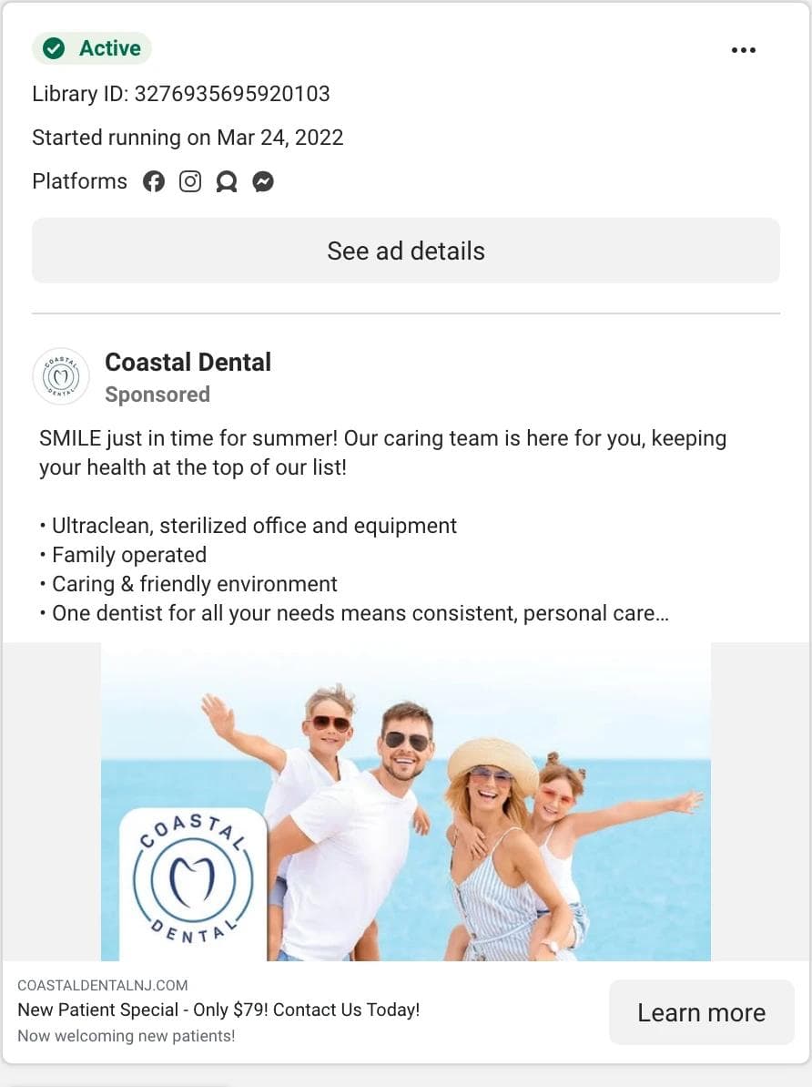
The eye lands on the headline under the image, "New Patient Special - Only $79! Contact Us Today!", because the image is a landscape stock-style photograph of a family of four at the beach with the practice's logo laid over it, and carries no other text. What the ad asks you to believe: that a family dentist in Point Pleasant is safe to try. The primary text is five trust bullets: sterilized office, family operated, friendly, one dentist for everything, sixteen years in town. What transfers: the local-service formula: one price as the headline, the reasons to trust as bullets, a photo (a better one would show the office or the dentist). And one lesson about the date: 1,624 days means a small budget has been left on, not that the ad has been tested against anything. Three other local dentists in the same search had run for more than 1,900 days.
Patterns across the twelve
Counting what the twelve actually do:
| Decision | Options seen | Count of 12 |
|---|---|---|
| Format | Video / static image | 6 / 6 |
| Creative shape | Vertical 9:16 / 4:5 / square / landscape | 6 / 2 / 2 / 2 |
| First thing in the frame | Product or food / a person / typography or illustration / a place | 4 / 5 / 2 / 1 |
| Hook location | First line of primary text / in the image or first frame / in the headline field | 6 / 5 / 1 |
| Hook type | Offer or price / claim or number / question or objection / borrowed genre or creator voice | 3 / 3 / 3 / 3 |
| Proof type | Review count or rating / third-party or expert / a specification / none stated | 3 / 3 / 3 / 3 |
| Text in the image or first frame | Yes / no | 9 / 3 |
| Primary text length | Over Meta's 150-character recommendation / within it | 8 / 4 |
| CTA button | Shop Now or Get Offer / Learn More or See Details / Install, Sign Up, Subscribe, or Book / menu | 3 / 2 / 6 / 1 |
| Versions flag | Multiple versions / single | 7 / 5 |
Four things stand out.
The first line of primary text is a headline. In six of the twelve the hook lives there, not in the image: "You could spend $4,000+", "Can't find your language on Duolingo?", "You saw the apocalypse." The card shows two or three lines before "See more", and advertisers who know this write the first sentence as if it were the only one.
The headline field carries the offer or the proof, not the hook. "Get 10 Free Meals", "50% Off Your First Box", "New Patient Special - Only $79!", "Don't Buy Without Checking Consumer Reports". When the image has the hook, the field under it has the reason to click. Only HOKA leaves it empty, and HOKA is the only ad with no offer.
Bullets are the standard proof format. Eight of the twelve carry a bulleted list in the primary text, usually with emoji as bullets, and that is where the review counts, return windows, and clinical claims live. It is not pretty, and it is what survives.
Vertical creative is half the set and it is not a mistake. Six of the twelve are 9:16, and every one keeps its caption in the top third and its product in the middle so that a 4:5 feed crop and a full-screen Reels view both work. One vertical asset with a feed-safe middle is now the common approach for video; static images in the sample still lean square and 4:5.
What did not transfer
Four things in the sample looked like Facebook ads to learn from and were not useful as references.
Persona-page story ads. The running shoes search returned "Cholesterol Relief Community", "Arthritis Support Community", "Nerve Support Community", and "The Blood Pressure Journal", all running the same 4:5 stock photo under "Feel Like Yourself Again" or "Natural Relief in Weeks", each with a first-person illness narrative as the primary text. That is one advertiser wearing several names, and a copy format, not a layout.
Marketplace catalog cards. Temu, SHEIN, Amazon Fashion, and JD Sports held 19 of the 99 running shoes cards, each a product photo with the SKU name as the headline. They are generated from a catalog, and there is no creative decision in them to borrow.
Age-gated cards. Sensodyne and Pronamel appeared five times in the dentist search as a grey card asking the viewer to log in and confirm their age. Nothing to see, nothing to learn.
Local businesses at four and five years. The dentist search had practices at 2,349, 1,989, and 1,946 days: a "Get directions" button, a photo of the office, no versions. The library shows these as active because they are; it does not know that nobody has looked at them since they were set up.
The sample, with dates
All six searches, quoted as captured, so the numbers can be checked. Each is the first cards of a keyword search with the Platform filter set to Facebook, Active status set to Active ads, Media type set to All, United States, on September 3, 2026. A keyword search is a slice of the library, not the category, and one advertiser can hold many cards: Temu held nine of the running shoes cards.
| Facebook-filtered search, US, 2026-09-03 | skincare | meal kit | mattress | running shoes | language app | dentist |
|---|---|---|---|---|---|---|
| Cards captured | 86 | 84 | 87 | 99 | 88 | 87 |
| Distinct advertisers | 58 | 51 | 37 | 54 | 55 | 62 |
| Video / image cards | 44 / 41 | 51 / 33 | 42 / 37 | 42 / 57 | 82 / 6 | 43 / 35 |
| Image cards that are square / 4:5 / 9:16 / landscape | 21 / 11 / 7 / 1 | 11 / 4 / 11 / 4 | 16 / 3 / 17 / 0 | 28 / 20 / 0 / 4 | 5 / 0 / 0 / 0 | 11 / 7 / 3 / 11 |
| Video cards that are 9:16 | 41 | 41 | 31 | 37 | 76 | 35 |
| Median days running | 131 | 84 | 69 | 66 | 67 | 137 |
| Running over 90 days | 54 | 38 | 36 | 39 | 35 | 52 |
| Running over a year | 8 | 6 | 19 | 3 | 7 | 23 |
| Marked as having multiple versions | 33 | 25 | 42 | 45 | 9 | 27 |
| Partnership ads ("X with Y") | 9 | 16 | 7 | 7 | 8 | 8 |
| Most common button | Shop now (47) | Shop now (25) | Shop now (64) | Shop now (62) | Download (25) | Learn more (25) |
Three readings. Dentist and skincare are the long-lived searches (medians of 137 and 131 days) for opposite reasons: skincare because product brands keep proven ads on, dentist because local practices never turn theirs off (23 of 87 dentist cards were over a year old). Language app is a different platform: 82 of 88 cards are video, 76 of them vertical, only 9 flagged with versions, and the button is Download or Install. Running shoes and mattress are the testing categories, with 45 and 42 cards flagged with versions, which reads like a few large advertisers rotating creative rather than a settled set of winners.
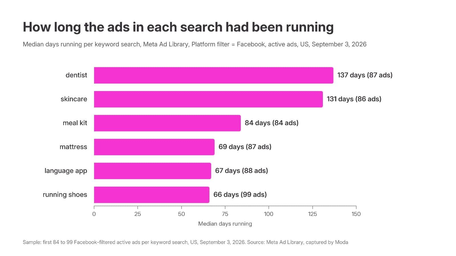
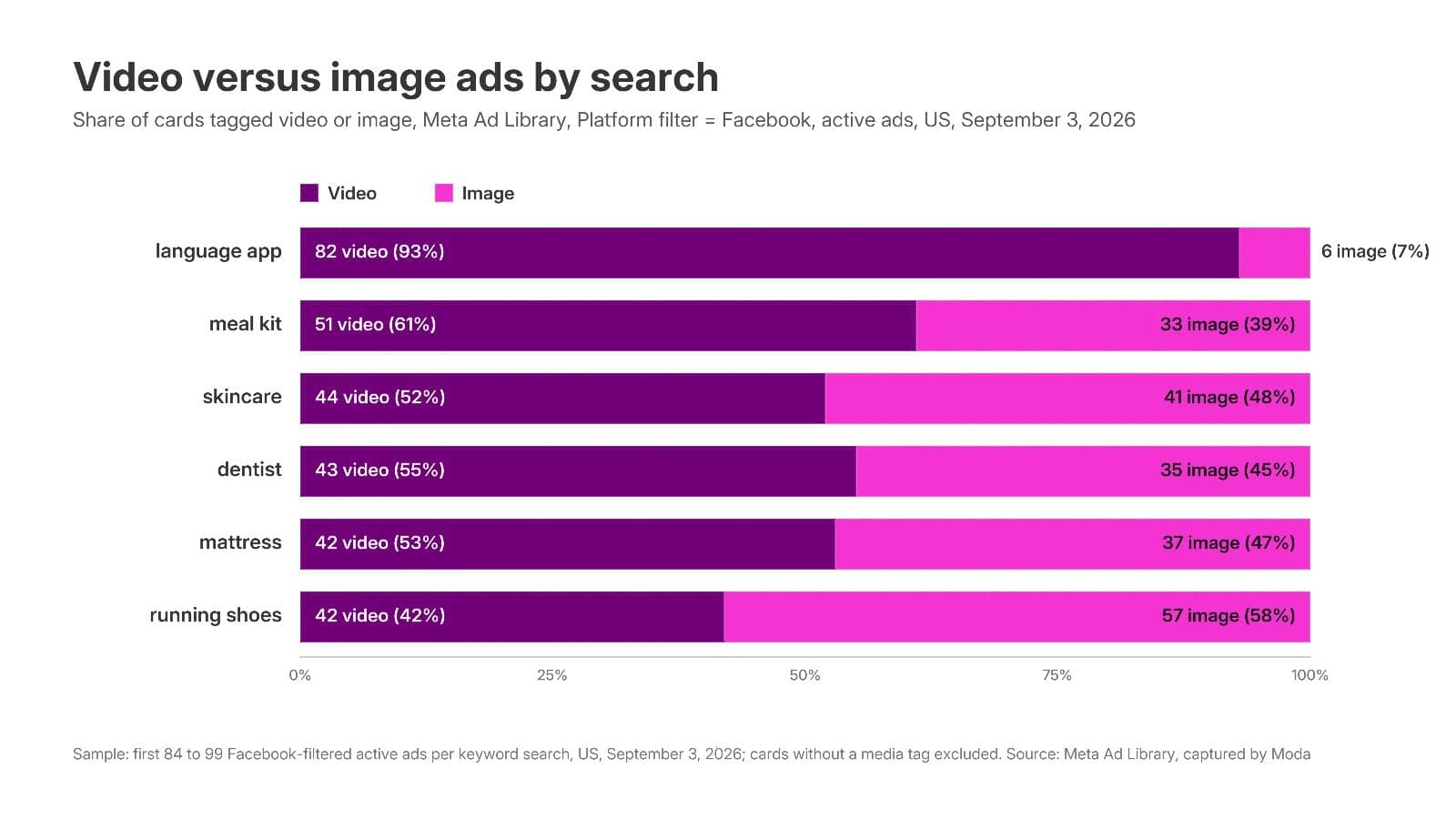
One correction to the usual advice. "Old ads are winners" is weaker on Facebook than anywhere, because Facebook is where the local budgets live. The oldest ads in these six searches were three dental offices at 2,349, 1,989, and 1,946 days, an Australian mattress launch post at 1,859, and a Pacific Northwest meal kit at 1,412; none had versions and most had a "Get directions" or "Send message" button. The oldest ads with versions and a Shop now button were Leesa at 519 days and Dot & Key at 492, and that is the kind of longevity worth studying. Compare within an advertiser, weight the versions flag, and prefer a Shop Now, Sign Up, or Install destination over directions or a page like.
Build a reference set
The library cannot save anything, so the set lives in a folder you keep. For each Facebook ad you want to reuse, record:
- Library ID and advertiser, so you can find it again (
facebook.com/ads/library/?id=plus the ID). - Start date, versions flag, and platforms, the three signals the card gives you.
- The creative's shape: square, 4:5, landscape, or vertical.
- Where the hook is: the first line of primary text, the image, or the headline field. Galleries never record this, and on Facebook it matters most.
- What the ad asks you to believe, and where the proof lives (text bullets, a number in the image, a third party, a review count).
- What you would keep and what you would change for your brand.
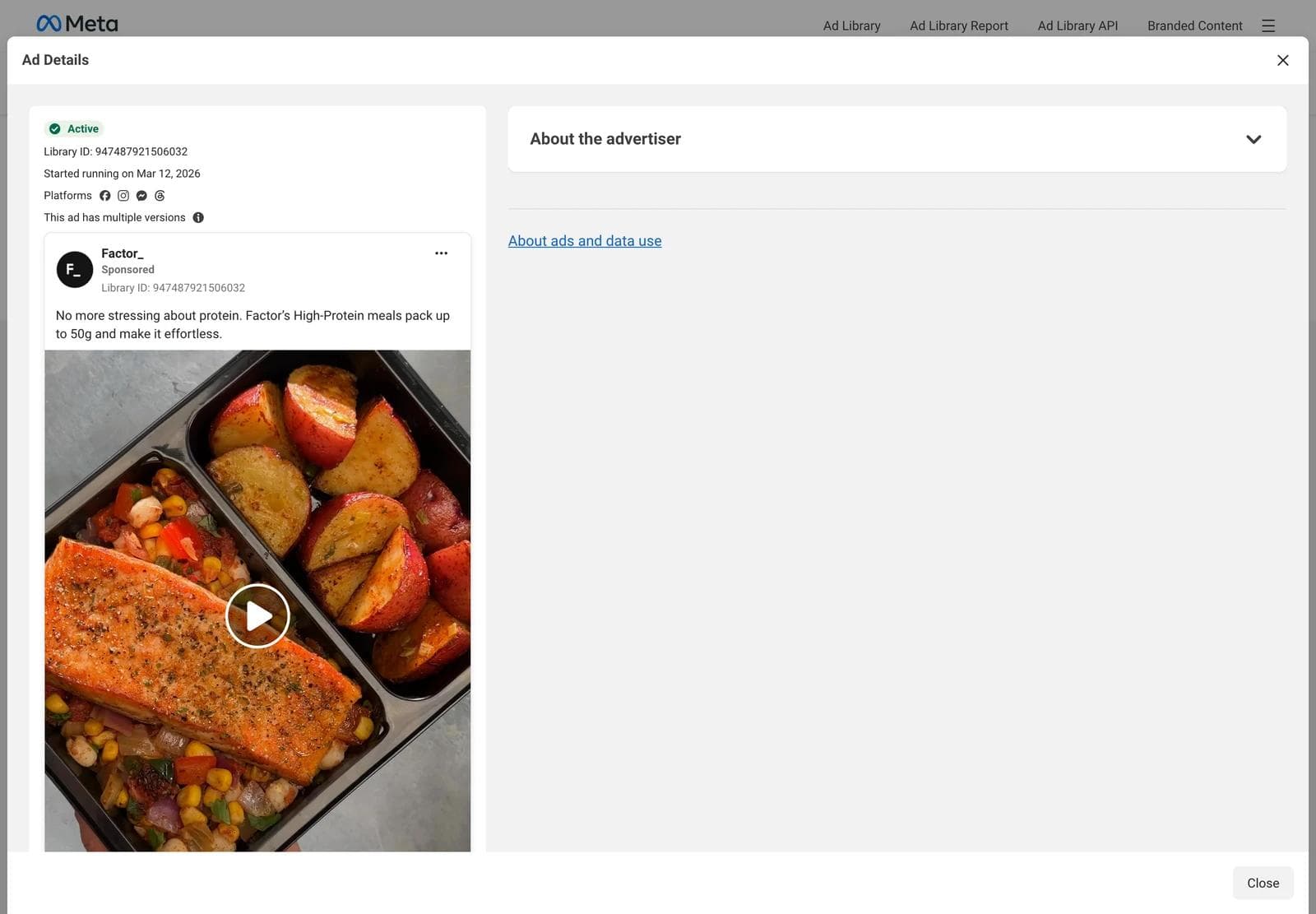
Ad Details shows the full primary text without the "See more" cut, the full creative, and every platform the ad runs on. It does not show placement, spend, or results.
The creative is the advertiser's property. Saving a card for reference and analysis is ordinary competitive research; reusing their photography, their footage, their people, or their copy in your own ad is not. Adapt the structure, then supply your own product, people, and claims.
Turn references into on-brand Facebook ads in Moda
A reference set is a list of structures: a product on a plain field with one number, a person plus an offer plus a drawn button, a price anchor in the first line, an objection answered in three beats. Rebuilding one with your own brand kit and product is a design task, and one an AI design agent handles well when you give it references instead of adjectives.
In Moda, attach two to four saved cards to a message, name the brand kit to apply, and describe what stays and what changes. A prompt that works:
Use the attached three ads as layout references. Make four Facebook feed ads for our sleep tracking ring using the Northwind brand kit, each at 1080 x 1350 and 1080 x 1080. Keep the structure of the first reference: product on a flat brand-color field, one number as the only text in the image (our number: 7 nights of battery). Write the primary text as a first line that anchors against a $300 smartwatch, then four benefit bullets, then a 30-night trial line. Headline: the trial. Do not reuse any reference copy, photography, or people.The agent builds the ads on an editable canvas, so the result is not a flat image. The headline, product image, number, color field, and button-shaped element stay as separate objects you can move, restyle, or swap, and the same layout can be pushed from 4:5 to 1:1 or to a 1080 x 1920 Reels cut without rebuilding it. Attached images go through the agent's vision, so it reads the reference's hierarchy, not just its colors.
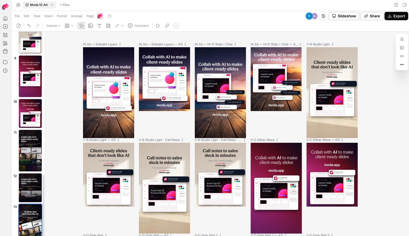
What to check before any of these ships:
- The claims are yours and true. A reference ad's "50,000+ 5-star reviews" does not come with it.
- The first line of primary text works on its own, because that is all most readers see before "See more".
- The headline field carries the offer or the proof, not a repeat of the hook.
- The product is recognizable at 4:5 on a phone.
- You have at least two hooks against the same layout, so the first test says something about the message and not just the design.
To set up the brand side first, how AI design tools build a brand kit from your website covers what gets extracted and what to correct. For the anatomy of a static feed ad across Meta and LinkedIn, see what still works in static ads.
Frequently asked questions
What should a Facebook ad look like in 2026?
A 4:5 or square image or video with one clear subject, a first line of primary text that works as a headline, and a headline field that carries the offer or the proof. Meta's current recommendation for Facebook Feed is 4:5 at 1440 x 1800 pixels, 50 to 150 characters of primary text, and a 27-character headline.
What size should a Facebook feed ad be?
Meta's Ads Guide recommends 4:5 at 1440 x 1800 pixels for image and video ads in Facebook Feed, with 1:1 also supported. A 9:16 asset built for Stories or Reels is served in the feed cropped, so keep the important elements in the middle of a vertical frame. Working at 1080 x 1350 and 1080 x 1080 is common and clears the 600-pixel minimum width.
Is the 20 percent text rule still a thing?
No. Meta's best-practices page for image ads states that there is no longer a limit on the amount of text in an ad image and that the text overlay tool has been removed. The current guidance is to keep text from obstructing the visual, in a clean font at a readable size with contrast.
What type of Facebook ad is most effective?
The library cannot tell you; it shows no spend, reach, clicks, or results for commercial ads. What it shows is what advertisers keep paying for: in our six searches, the long-running ads with versions and a Shop Now button were mostly product images with a bulleted proof list, and the videos were mostly vertical with a caption in the top third. Treat those as hypotheses to test.
How do I find Facebook ad examples in my own industry?
Open facebook.com/ads/library, set the country, search a product keyword rather than a brand name, and set Platform to Facebook and Active status to Active ads in Filters. Then search the categories next to yours that sell to the same buyer; their structures transfer without putting your ad next to a direct rival's.
Can I copy an ad I found in the Ad Library?
You can copy its structure: the layout, the hierarchy, where the hook sits, how the proof is formatted. You cannot reuse its photography, footage, people, or copy, and you cannot borrow its claims without your own evidence.

Real editable visuals. Real canvas. Full control.
Fly through design work