LinkedIn Ad Examples: 12 B2B Ads With Run Dates and Impressions (2026)
12 LinkedIn ad examples torn down with the data most galleries cannot show: run dates, whether each ad is still live, impressions bands, US share, format, and targeting from the Ad Library.
 Anvisha Pai, Co-founder & CEO, Moda
The best LinkedIn ad examples are the ones you can check. Every ad below was pulled from the LinkedIn Ad Library on September 2, 2026 with its ad ID, the dates it ran, whether it was still running that day, its estimated impressions band, the share of impressions that landed in the United States, the format label LinkedIn assigns, and the targeting categories the advertiser used. Twelve ads, six formats, five B2B categories, chosen because they make different decisions rather than because they look nice.
That is the difference from most galleries of LinkedIn ads examples. A screenshot from someone's feed tells you an ad existed. The library tells you an ad started on June 29, was still live ten weeks later, reached 10k to 20k people, a third of them in the US, and was targeted by job and audience list. Those are the facts that separate a creative test that lost from a layout worth adapting.
How the 12 were chosen
We ran five keyword searches through the library with Germany as the country and a custom date range, so each search returned a start cohort: ads that began in June 2026 (CRM, payroll, cybersecurity) or July 2026 (recruiting software, analytics). The German search matters because LinkedIn only shows run dates, impressions, and targeting for ads whose targeting includes the EU, and a July start cohort seen in September tells you which ads survived. The LinkedIn Ad Library guide explains both tricks in full; the cohort numbers are at the end of this post.
From 146 detail pages we kept 12 that vary on the decisions that matter: format (single image, carousel, document, video, event, Thought Leader), what the eye lands on first (a stat, a logo pair, a person, a document cover, a provocation), whether the ad is gated or open, and whether it survived. At least three are carousel or document ads because those formats get their own searches, and two are Thought Leader ads because that format did something unusual in the data.
Nothing here is a performance claim. "Ran from June 29 and still running on September 2" is observable. "Converts" is not, and you will not read it below.
LinkedIn ad formats and specs, in one table
The library labels every ad with its format, and the specs below are from LinkedIn's ads guide and specification pages, read September 3, 2026. Recheck before you build; LinkedIn changes these without notice.
| Format | What the library shows | Spec (LinkedIn, read 2026-09-03) |
|---|---|---|
| Single Image Ad | Intro text, one image, headline, CTA button | 1.91:1 at 1200 x 628 recommended (the ads guide rounds it to 1200 x 627), 1:1 at 1200 x 1200, vertical 1:1.91 for mobile only; JPG or PNG under 5 MB; headline 70 characters, intro 150 |
| Carousel Ad | Cards with a right arrow, each with its own headline | 2 to 10 cards, 1:1, at least 1080 x 1080, 10 MB per card, card headline 45 characters, intro 255 |
| Document Ad | "Preview N of M pages" over a scrollable PDF | PDF, DOC, DOCX, PPT, or PPTX up to 100 MB; vertical, horizontal, or square; under 10 pages recommended, 300 maximum |
| Video Ad | A play button; the poster often does not render in the library | MP4, 75 KB to 500 MB, 3 seconds to 30 minutes, 4:5, 9:16, 16:9, or 1:1 |
| Event Ad | Event date, name, "Event by", and a View event button | Promotes a LinkedIn Event page; the 4:1 image is pulled from the event; intro 600 characters |
| Thought Leader Ad | A person's name and title as the advertiser, "Promoted by" a company | The creative is the member's existing post; no headline, no intro edits, no CTA button; posts with multiple images, polls, or documents cannot be promoted |
Two consequences for anyone designing ads. Most of the platform runs on the single image at 1.91:1 or 1:1, so a layout that works in one B2B category is directly reusable in another. And the two formats readers ask about most, carousel and document, are the ones where the first card or page does all the work, because that is what shows in the feed.
The 12 LinkedIn ad examples
Each record answers three questions: what the eye lands on first, what the ad asks you to believe, and what transfers if you swap in your own product. The caption carries the library data.
1. Deel: a stat on the first card, the product on the second
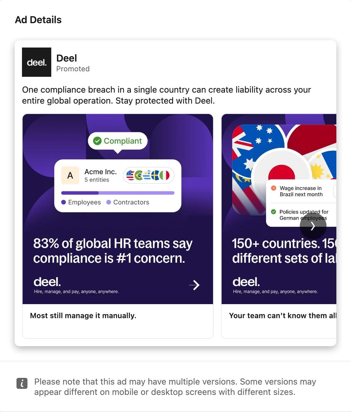
The eye lands on "83%", set large on a dark purple field, with a small product illustration above it showing one company marked compliant. Card two starts "150+ countries" and shows a phone with wage-change alerts. The card headlines carry the argument: "Most still manage it manually", then "Your team can't know them all".
What the ad asks you to believe: the problem is common, it is yours, and it has a product-shaped answer. Targeting was by company and job, with audience, company, job, and interest exclusions, which reads like an account list minus existing customers.
What transfers: the carousel as a two-beat argument, stat then product, with each card headline doing the sentence the image cannot. Deel ran this alongside single image variants of the same compliance message, and all were still live after ten weeks. The stat is Deel's; yours has to be your own.
2. Metaview: a provocation with logos in the intro text
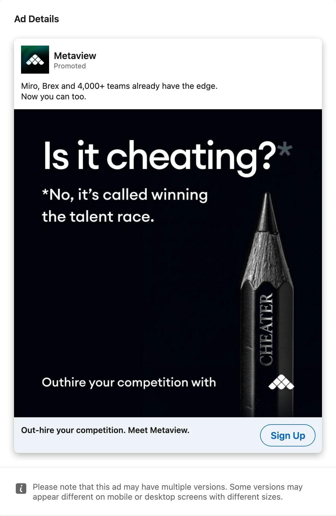
The eye lands on "Is it cheating?*" and then on the footnote answer. The image carries no product at all, only a pencil engraved CHEATER and a logo. The proof sits in the intro text, "Miro, Brex and 4,000+ teams already have the edge", and the headline turns it into a dare: "Out-hire your competition."
What the ad asks you to believe: the tool is an unfair advantage that your peers already use. The impressions band is under 1k, which with a 38 percent US share suggests a small, targeted audience rather than a weak ad. Metaview held 9 of the 28 ads we opened in this cohort, each a different hook on the same black layout, and all 9 were still running.
What transfers: one question as the whole image, with proof pushed into the intro text where it costs no pixels. Also the practice itself: nine hooks against one layout is a test design, not a gallery.
3. CREST: a discount inside a seven-page document
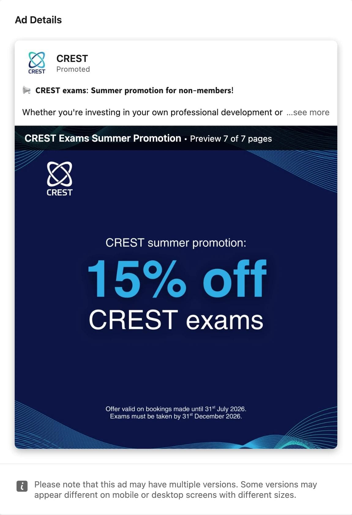
The eye lands on "15% off" in light blue on navy, then on the fine print with the booking deadline. The rest of the seven pages explain who the exams are for. The intro text is the same offer in bold Unicode.
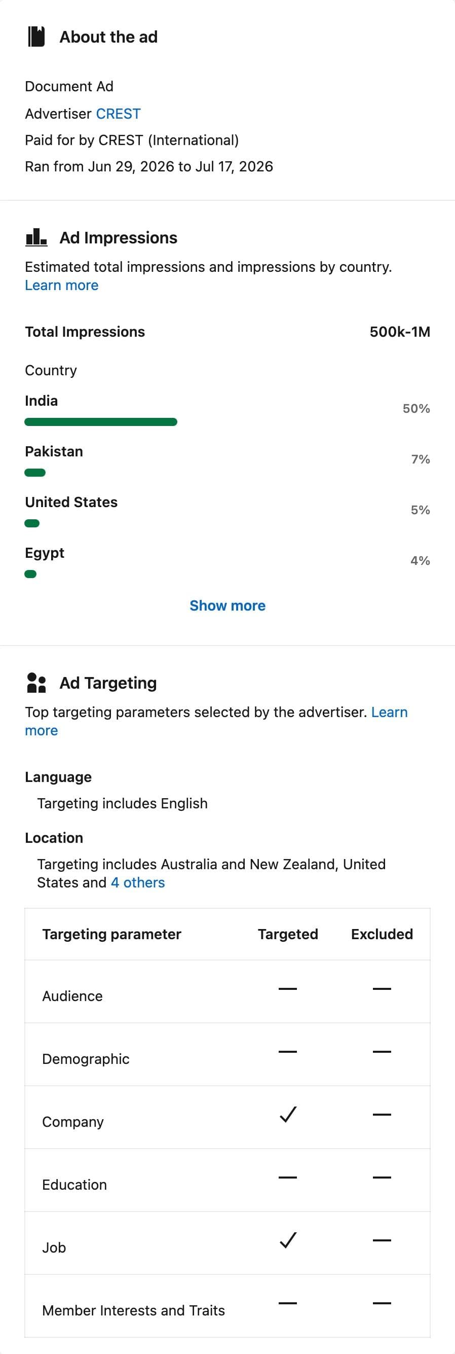
What the ad asks you to believe: the deadline is real and the price is the only thing between you and a certification you already wanted. Targeting was by company and job across Australia, New Zealand, the United States, and four other regions, and the country split shows where the audience actually is: half of the impressions were in India.
What transfers: a document ad used as a dated offer rather than a whitepaper. The first page is the ad; the remaining pages are the landing page, and nobody has to leave the feed. The 500k to 1M band is the largest in our June cohorts and is a budget signal, not a creative one.
4. CUBE: a five-page regulatory read with a swipe cue
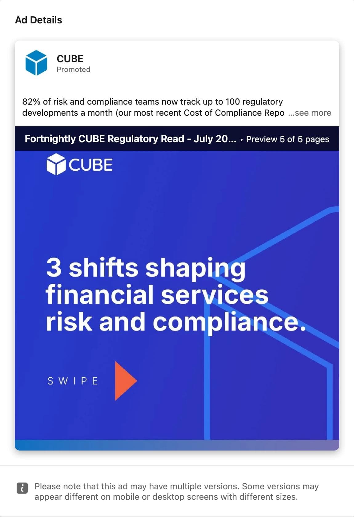
The eye lands on a three-line title, "3 shifts shaping financial services risk and compliance", then on the SWIPE arrow that tells you the number is a list. The intro text opens with a stat from CUBE's own report, 82 percent of risk and compliance teams track up to 100 regulatory developments a month.
What the ad asks you to believe: the vendor reads the regulation so you do not have to, and the proof is a fortnightly edition, which the document title names. Targeting was by company and job across the United States, Canada, and two other regions.
What transfers: the numbered-list cover with a swipe cue, which turns a document ad into a carousel the reader controls. It ran nine days, consistent with a fortnightly edition being replaced by the next one rather than a test that lost.
5. TRECCERT: a carousel that sells a date first and a course second
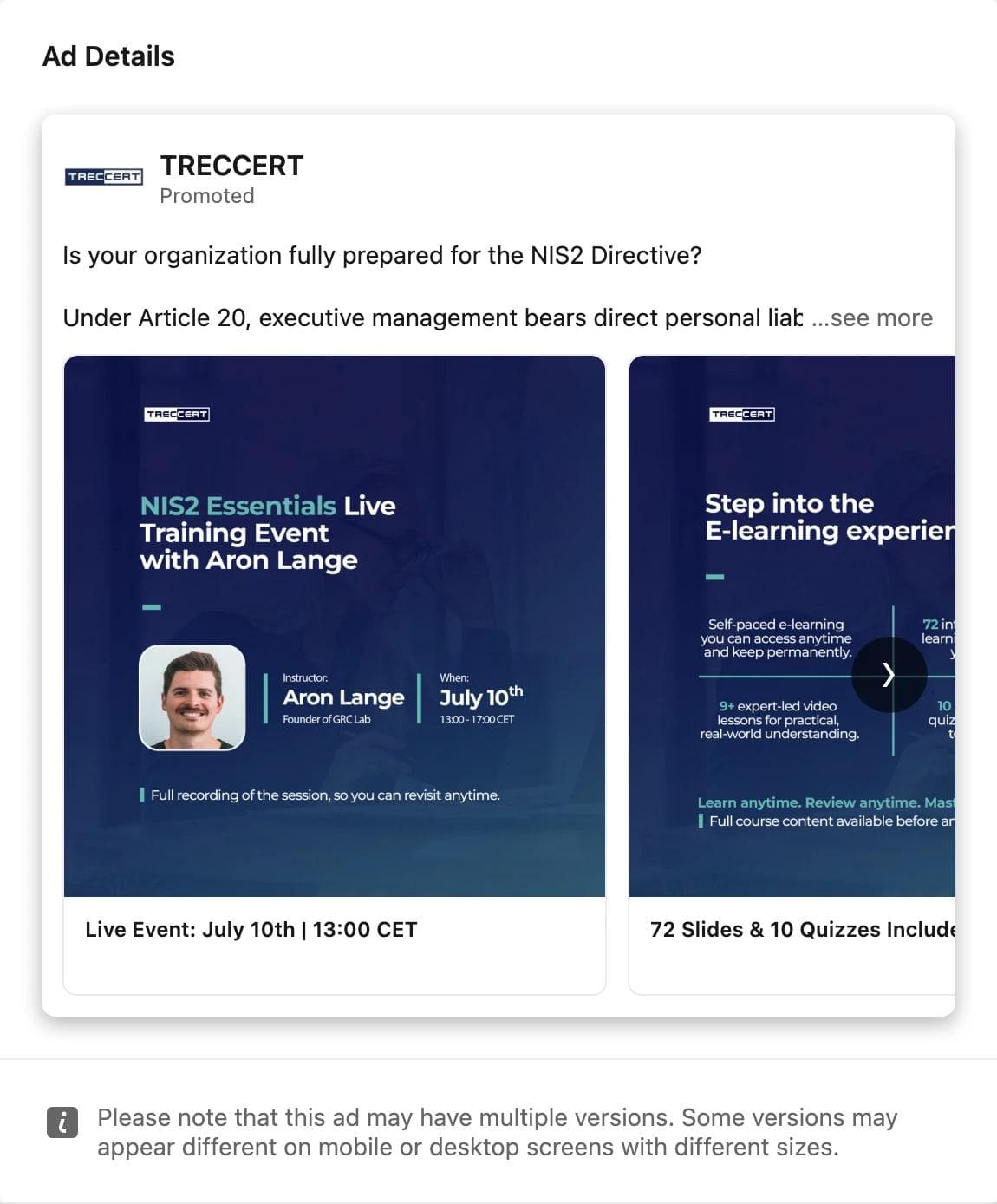
The eye lands on "NIS2 Essentials Live Training Event", then on the instructor's photo, name, and the date block beside it. Card two is the self-paced product, "72 Slides & 10 Quizzes", for anyone who cannot make the date. The intro text opens with a question about the NIS2 Directive and a line about personal liability under Article 20.
What the ad asks you to believe: a named regulation makes this urgent, a named instructor makes it credible, and there is a version of the offer for you either way. Targeting was by company and job across the United States, the UAE, and two other regions.
What transfers: the live-then-recorded pairing across two cards, and a card headline that is a date and time. It ran ten days and stopped two days before the event, which is what an event ad's run should look like.
6. Stefanini: six carousels of the same corporate story
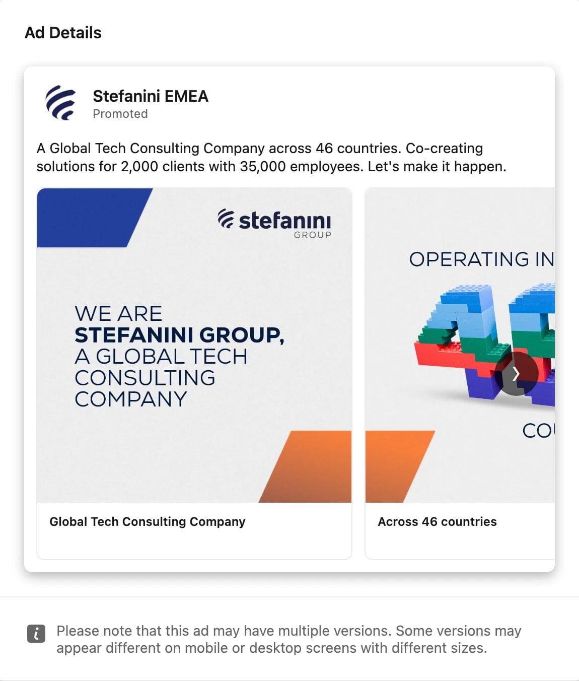
The eye lands on the group logo and a plain statement of what the company is. Card two turns "46 countries" into a toy-brick sculpture. The intro text is a fact sheet: 46 countries, 2,000 clients, 35,000 employees.
What the ad asks you to believe: this is a large, real company you have not heard of. Stefanini ran six carousel variants in this cohort, each with a different opening card, in the 10k to 50k bands, all ending on August 31. Targeting was by company and job with audience, company, and job exclusions.
What transfers: the awareness carousel as a company fact sheet, with one number per card. It is the least clever ad in this set and the one with the most reach in its cohort, which is a reminder that the impressions band follows budget and audience size, not creative quality.
7. Quantum Security Defence: an event ad that ran for six weeks
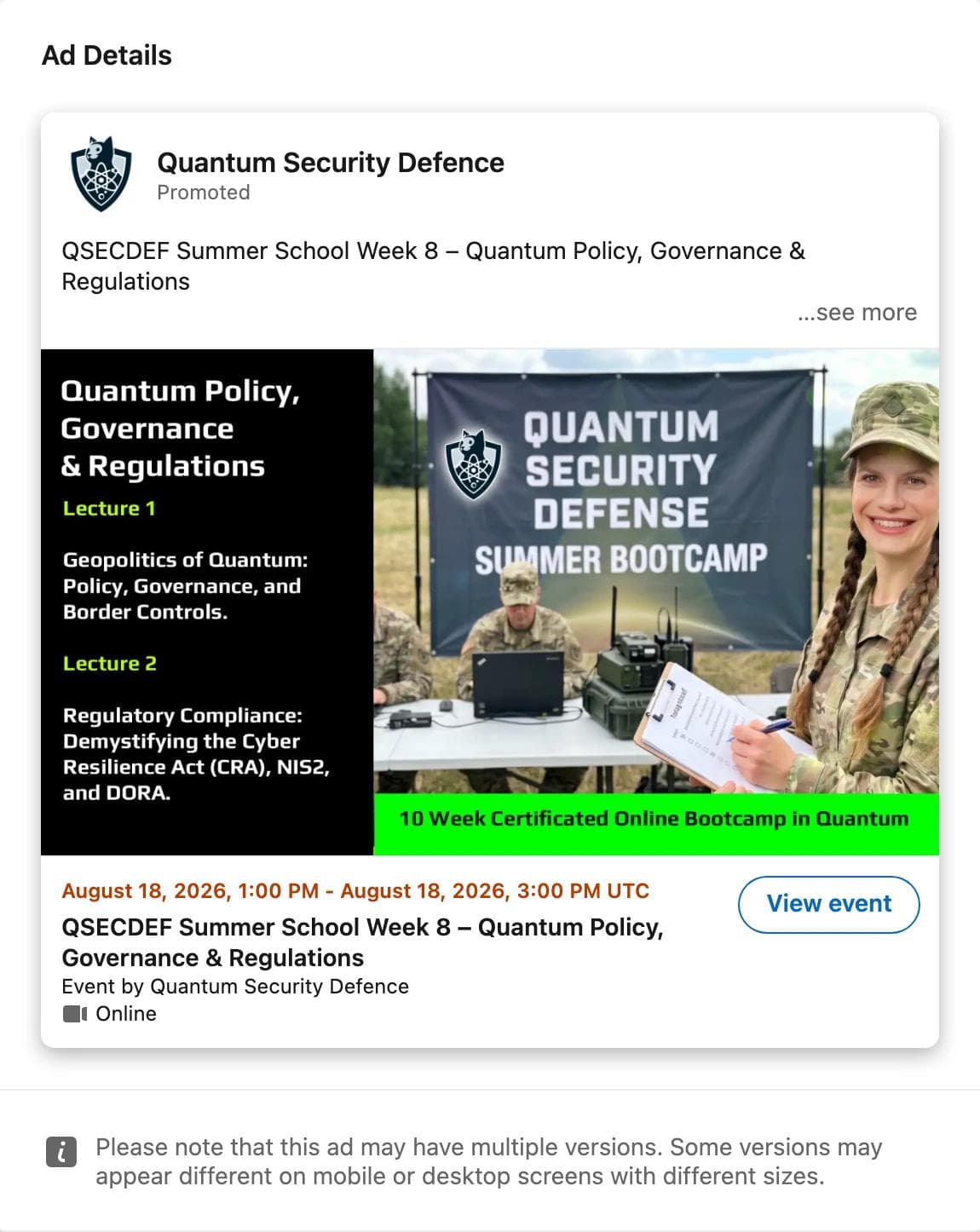
The eye lands on the photo, a printed banner in a field with people in uniform, then on the black panel listing two lectures. Below the image, the format does the work: the date in orange, the event name, "Event by", "Online", and a View event button that LinkedIn adds.
What the ad asks you to believe: a session with a date and a syllabus is happening, and registering is one click. Under 1k impressions over 41 days with EEA-only targeting means a tiny budget kept on for six weeks, not an ad that worked; read that together with the run length or you will misread it.
What transfers: the event format itself. The date, the registration button, and the "Event by" line are supplied by LinkedIn, so the image only has to say what the session covers. Note the 4:1 image ratio in the spec table; this advertiser used a wider composite with the lecture list on the left.
8. Dev Basu, promoted by Powered by Search: a person's roadmap as the ad
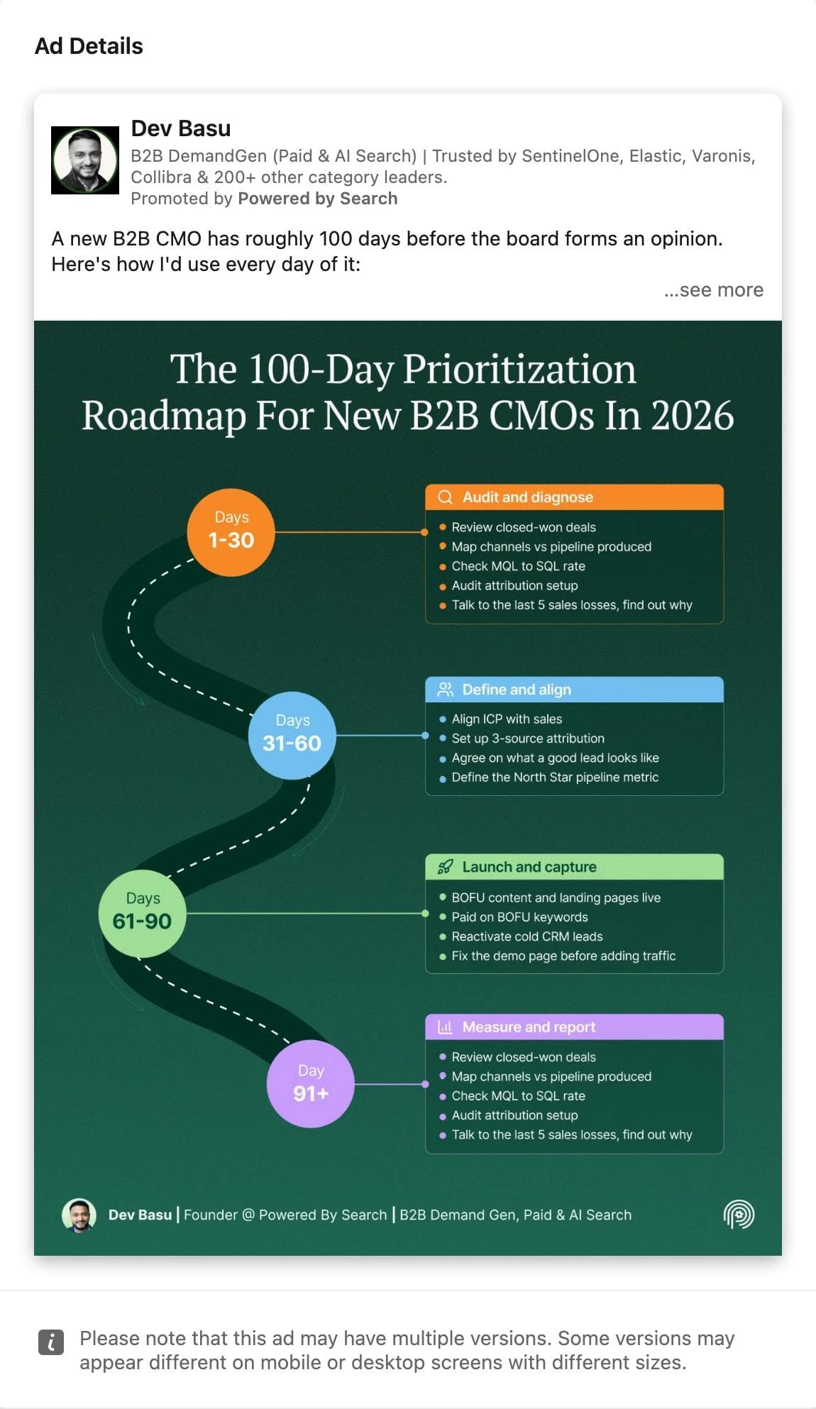
The eye lands on the infographic title, then walks the roadmap in 30-day blocks. The advertiser line is a person with a job title and "Promoted by" the agency underneath. There is no headline, no button, and no product, because the format does not allow them.
What the ad asks you to believe: the author knows the job of a new CMO, and by extension so does the agency paying. In the June CRM cohort, every one of the six ads still running ten weeks later was a Thought Leader ad, although those were 15 of the 40 opened. In the July cohorts, 5 of 8 Thought Leader ads in recruiting software and 3 of 7 in analytics were still running.
What transfers: the format decision and the infographic layout. What does not transfer is the content; a Thought Leader ad is only as good as the post, and the post has to be written by a person at your company.
9. David Connors, promoted by The Swarm: a founder talking to camera
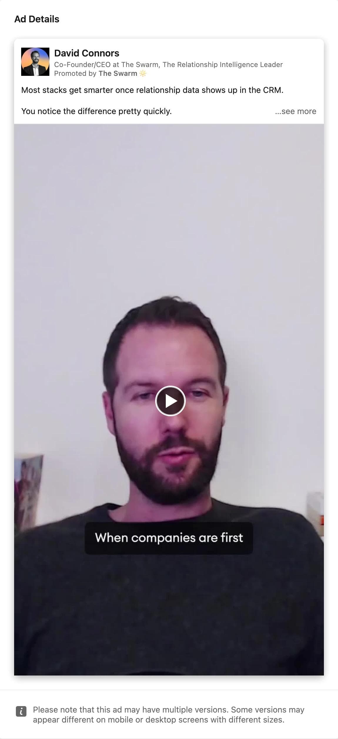
The eye lands on a face, framed close in a vertical video with burned-in captions. The post text above it reads like a post, not an ad: "Most stacks get smarter once relationship data shows up in the CRM." No button, no headline.
What the ad asks you to believe: the founder is explaining something he knows, and you happened to see it. The 57 percent US share is the highest in this set, so the German search found an ad that mostly ran in America.
What transfers: the format, the vertical framing, and the captions, which the spec table allows at 4:5 or 9:16. Also the pairing: The Swarm ran a single image Thought Leader post from the same founder in the same cohort, and both were still live in September.
10. Loxo: two logos and a customer story headline
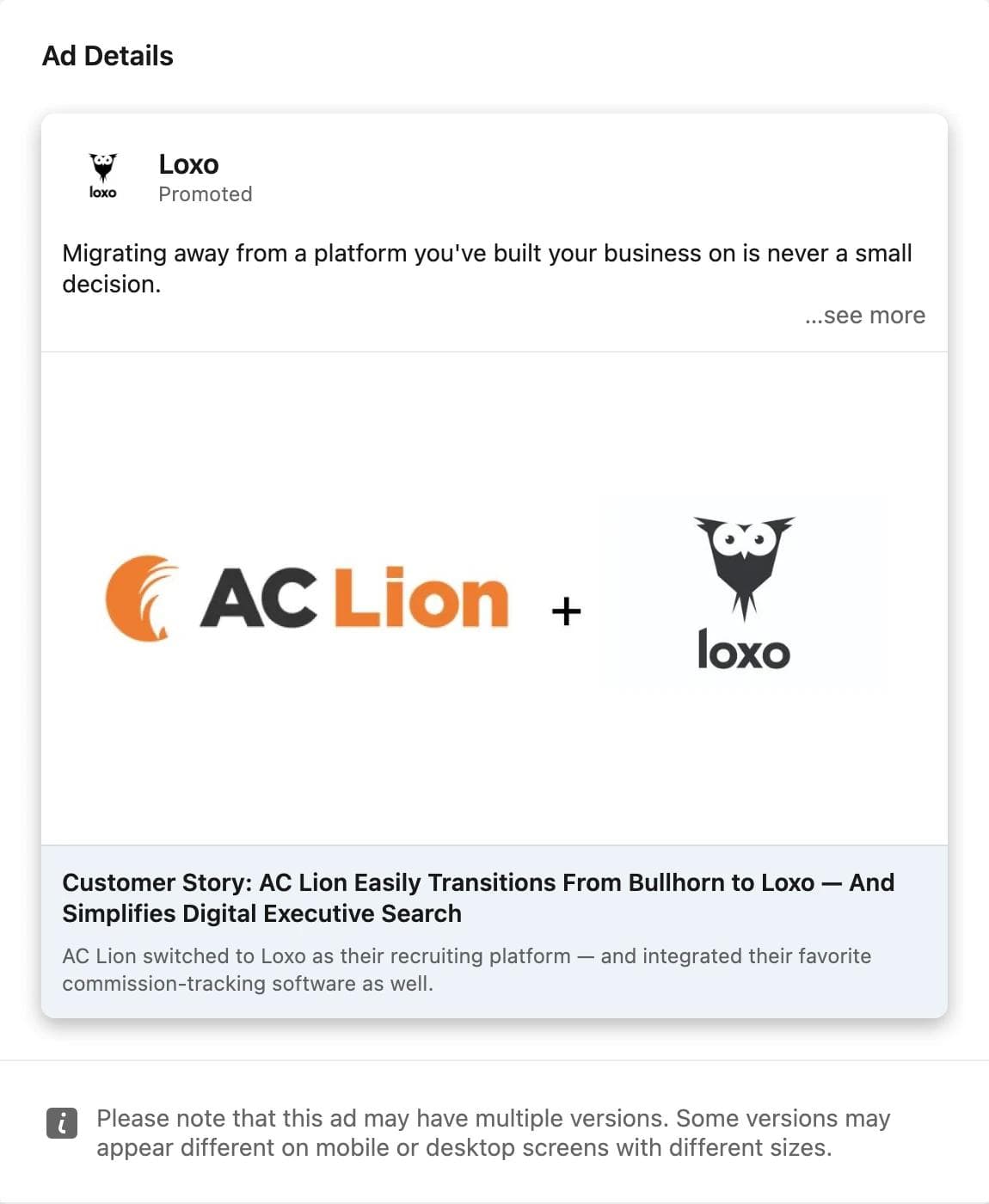
The eye lands on the customer's logo, not the advertiser's. The image is two logos and a plus sign on white. The headline names the customer, the competitor they left, and what they did after. The intro text opens on the objection: "Migrating away from a platform you've built your business on is never a small decision."
What the ad asks you to believe: someone like you already made the switch and it was easy. Targeting used audience, company, and job, with the same three excluded, which is the shape of a retargeting or account-based campaign.
What transfers: the logo-pair layout, which any company with a named customer can build in an hour, and a headline that names the incumbent. Naming a competitor's product is the decision here, and it belongs to your legal team as much as your designer.
11. One Model: a product diagram as the whole image
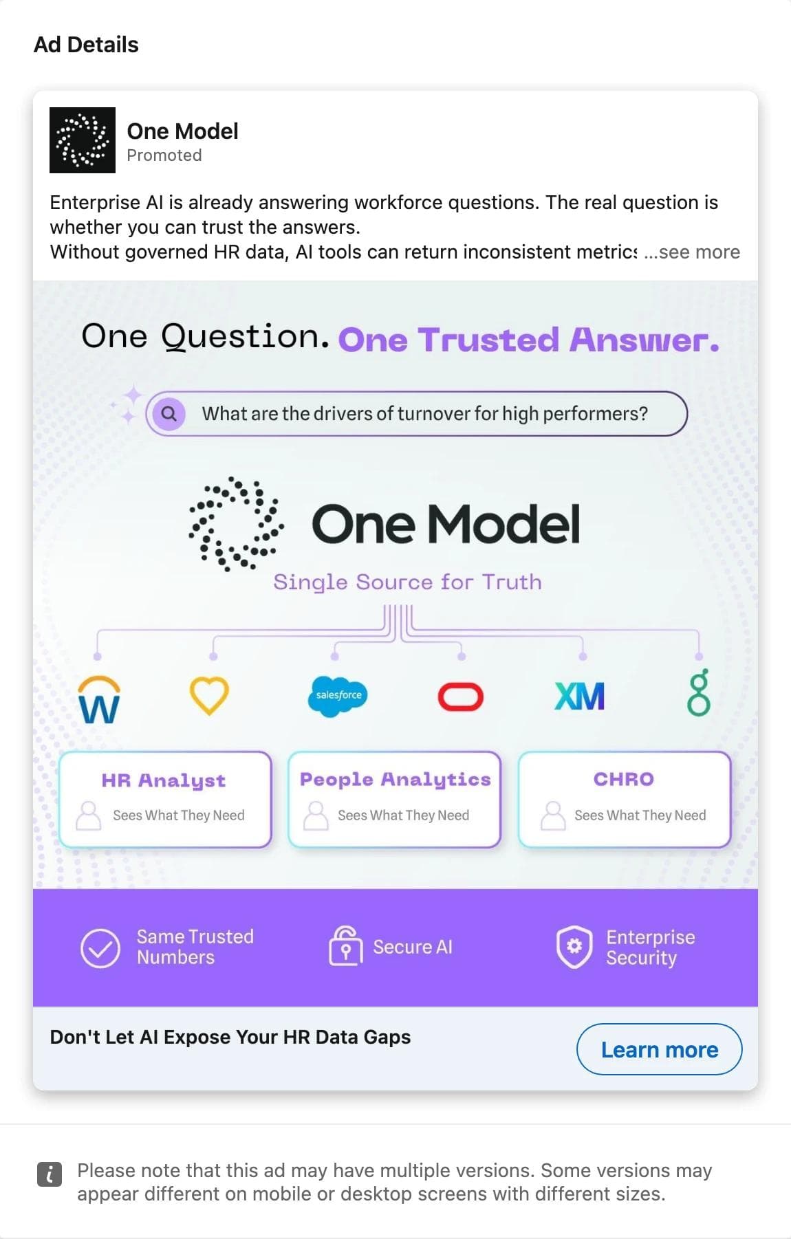
The eye lands on "One Question. One Trusted Answer." and then on a diagram: a search bar with a real question, the product in the middle, six recognisable HR system logos feeding it, three roles beneath. A purple strip lists three trust claims.
What the ad asks you to believe: the product sits between the systems you already own and the questions your executives ask. The headline is the fear version of the same idea: "Don't Let AI Expose Your HR Data Gaps."
What transfers: the hub-and-spoke diagram with partner logos, drawn as a diagram rather than a screenshot, and the pairing of a calm image with an anxious headline. Job-only targeting is the broadest in this set, which fits a 1k to 5k band over five weeks.
12. MinIO: a video ad with the largest band in the July cohorts
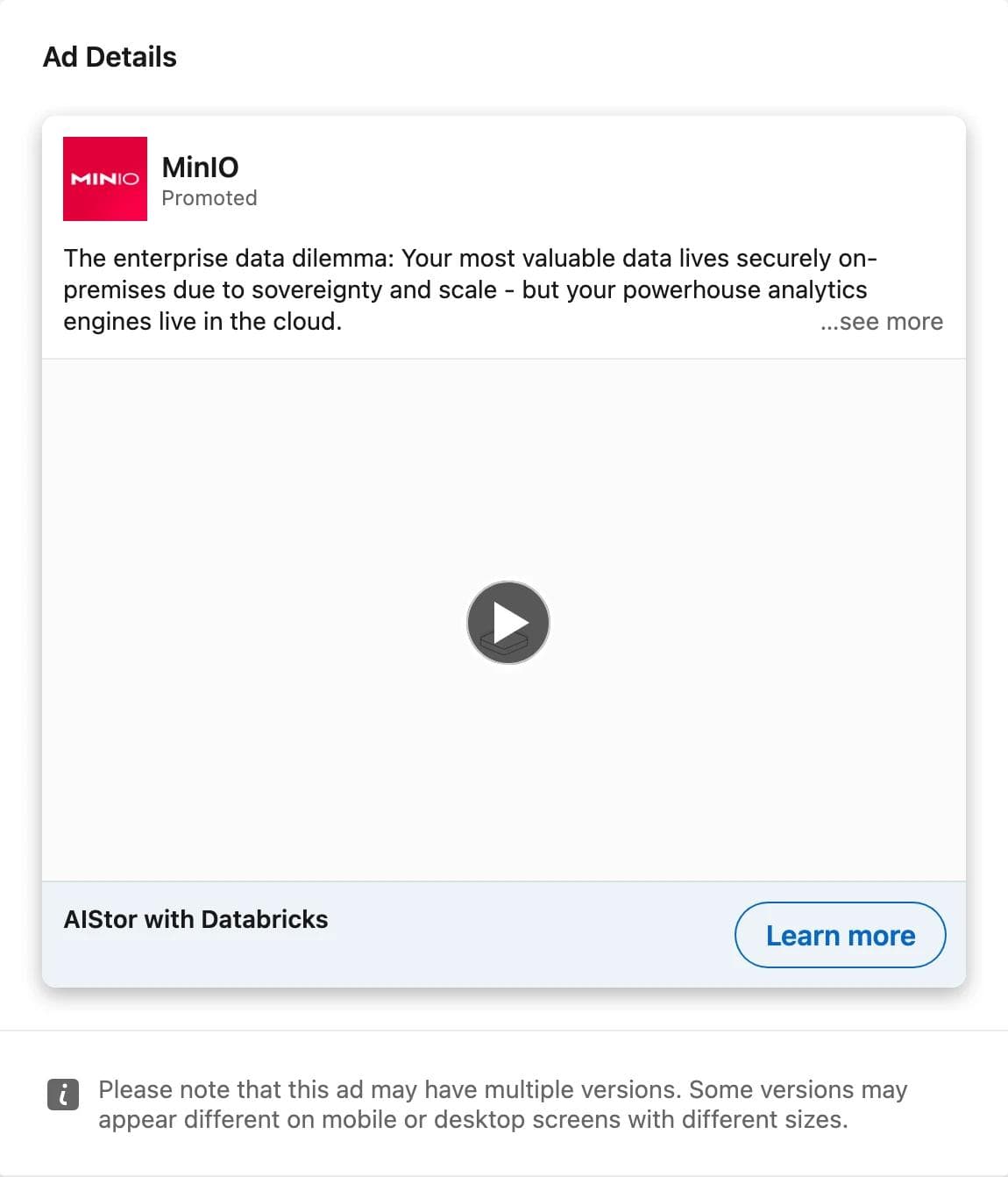
The eye lands on the intro text, because the library did not render a poster frame: "The enterprise data dilemma: Your most valuable data lives securely on-premises due to sovereignty and scale, but your powerhouse analytics engines live in the cloud." The headline is a product pairing, "AIStor with Databricks", with a Learn more button.
What the ad asks you to believe: there is a named integration for a tension you recognise. Targeting was by audience, company, and job across APAC, the United States, and two other regions, and the country split says where the budget went: 76 percent of impressions in India, 2 percent in the US.
What transfers: the problem-statement intro that could stand alone as a text ad, and the lesson in the panel. A 500k to 1M band looks like the biggest ad in the cohort until the country split shows it was mostly one market. Read the split before the band.
Patterns across the set
| Decision | Ads that made it | What the library adds |
|---|---|---|
| Stat first, product second | Deel, CUBE | Both used a stat from the advertiser's own research; Deel's ran ten weeks and counting, CUBE's was a fortnightly edition |
| Proof in the intro text, not the image | Metaview, Stefanini | Logos and counts cost no pixels; Metaview's nine hooks shared one layout |
| Gated or dated offer | CREST, TRECCERT | Both stopped on schedule: CREST at the offer deadline, TRECCERT two days before the event |
| A person as the advertiser | Dev Basu, David Connors | Both still running after ten weeks; in the CRM cohort all six survivors were this format |
| A customer or partner logo as the image | Loxo, One Model | Retargeting-shaped targeting on Loxo; job-only on One Model |
| Format supplied by LinkedIn | Quantum Security Defence, MinIO | The event card and the video player add the date, button, and player; the image only has to explain |
Three things the data says that a screenshot cannot.
Run length reads differently by format. Content offers with a date (CREST, TRECCERT, CUBE) ran 9 to 19 days and stopped when the date passed. Awareness and Thought Leader ads ran until the budget did. Comparing the two on run length alone would call the offers failures, and they were not.
Job was a targeting category on all 12. Company joined it on 8, and an audience list on 5 (the two Thought Leader ads, Metaview, Loxo, MinIO). Only One Model used job alone. Exclusions appeared on 8 of 12, most often audience, company, and job together, which usually means existing customers or open opportunities kept out.
The US share is uneven. Seven of the twelve reported a US share, from 2 percent (MinIO) to 57 percent (The Swarm). An ad found through a German search can be an American campaign that happened to include Europe, or a global campaign whose budget went to India. The band means little until you know which.
What did not transfer
Three things in the cohorts that we left out on purpose.
Recruitment ads for jobs, not for software. The recruiting software search returned Geely ECRI's job posts for vehicle engineers, in the 100k to 150k band, because the keyword matched the intro text. A job ad is a different format with a different reader, and its reach says nothing about a software ad.
Persons promoting their own posts. Several cards in every cohort were individuals paying to promote their own content, with no "Promoted by" company. Those are Thought Leader ads in form but not in economics, and they ran two to nine days.
Ads whose whole creative is copy in a language the reader will not use. The German-language Tellent Recruitee posts and Magic Software's German single images were among the survivors in the July cohorts, and their structure is fine, but a layout you cannot read is a layout you will misjudge.
The cohort numbers
Five keyword cohorts through a German search, opened on September 2, 2026. The June cohorts are the same ones quoted in the LinkedIn Ad Library guide; the July cohorts were added for this post. Each is the first 25 to 40 ads of the search, not the category, and the ads in each cohort started within the last few days of its month because the sort is newest first.
| Start cohort, seen in Germany | Ads opened | Advertisers | Ran 3 days or less | Ran over 30 days | Still running Sep 2 | Median days |
|---|---|---|---|---|---|---|
| CRM, June | 40 | 23 | 14 | 10 | 6 | 8 |
| payroll, June | 25 | 9 | 3 | 8 | 5 | 14 |
| cybersecurity, June | 25 | 16 | 5 | 2 | 0 | 14 |
| recruiting software, July | 28 | 13 | 0 | 21 | 17 | 36 |
| analytics, July | 28 | 19 | 1 | 22 | 12 | 33 |
The July cohorts look healthier than the June ones, and most of that is the calendar. A June ad had about 66 days in which to be switched off; a July ad had about 35, and many of the July ads that ended did so on August 30 or 31, which looks like month-end budget flights rather than tests. The two groups should be read separately.
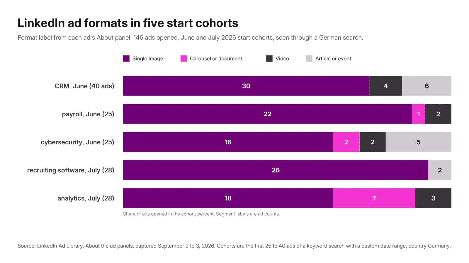
Single image ads were 112 of 146. Carousel and document ads were 10, and 6 of those were one advertiser's variants. Video was 11, article or event ads 13. If you searched the library hoping to fill a swipe file with carousel ads, that is why it takes several keywords.
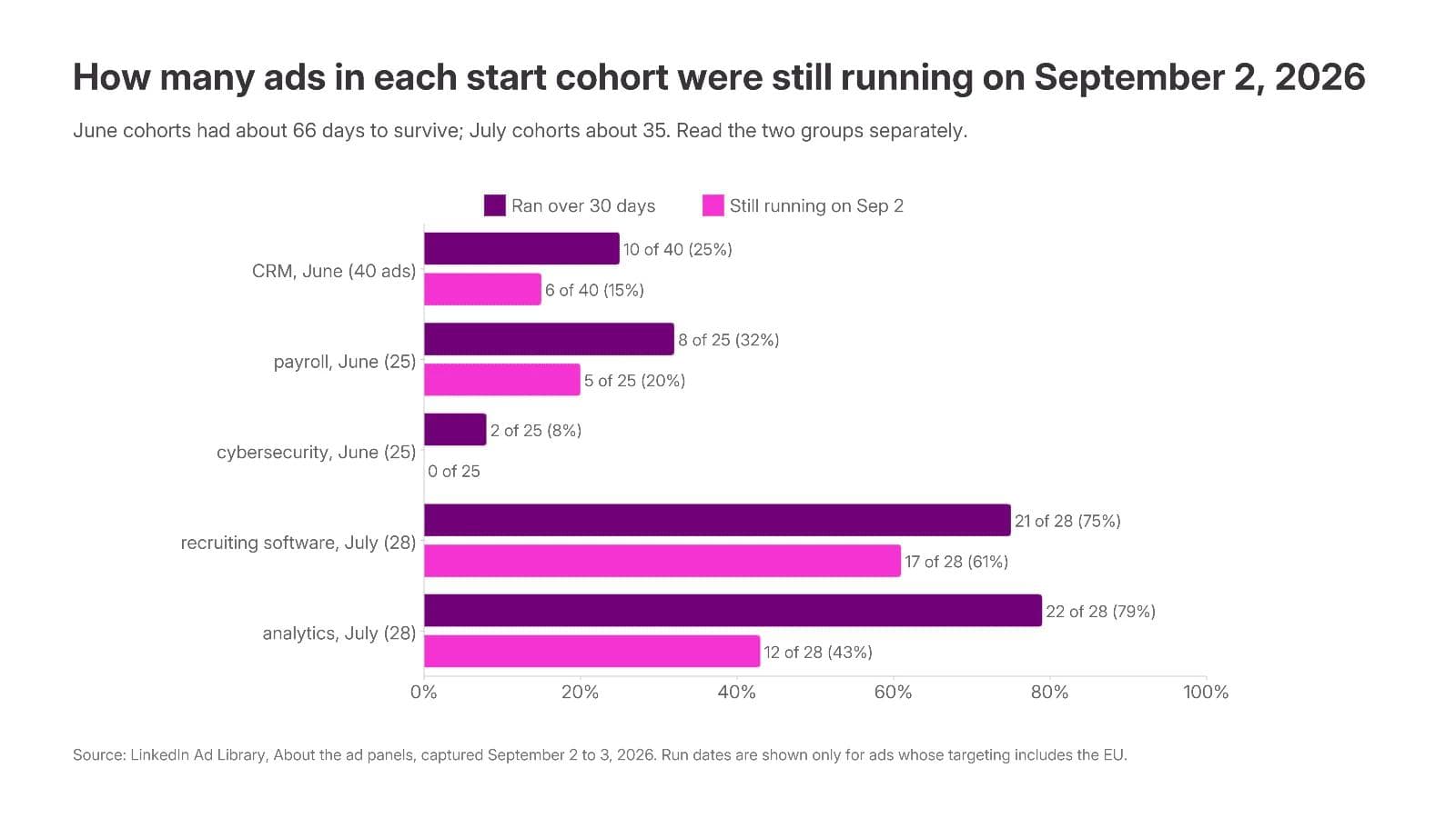
Two corrections to the "old ads are winners" rule, both visible above. Keyword results are uneven by advertiser: Metaview held 9 of 28 recruiting software ads, Stefanini 6 of 28 analytics ads, Papaya Global 14 of 25 payroll ads. Dedupe before you quote a share; by advertiser, 6 of 13 recruiting software advertisers and 10 of 19 analytics advertisers had at least one ad still running. And an impressions band is a budget and audience-size signal. The two largest bands in this post, CREST and MinIO, both reported most of their impressions in India.
Build a reference set from the library
A reference set is six to ten ads with a note on why each is there. The library has no save feature, so keep a document with the ad ID, advertiser, format, run dates and still-running status, impressions band and country split, targeting categories, and three lines: what the eye lands on, what the ad asks you to believe, what you would keep and change.
To reproduce the search behind this post, open the library with a keyword, Germany as the country, and a custom date range two or three months back:
https://www.linkedin.com/ad-library/search?keyword=recruiting%20software&countries=DE&dateOption=custom-date-range&startdate=2026-07-01&enddate=2026-07-31Open each detail page at a human pace. LinkedIn sits behind bot protection and blocks bursts. Paste an ad ID after /ad-library/detail/ to reopen any ad in this post.
The creative belongs to the advertiser. Saving it to study is ordinary competitive research; reusing its screenshot, photography, or copy is not. Adapt the structure and supply your own product, people, and claims.
The static ads post covers the anatomy of the single image in detail, and the Instagram Stories ads examples post does the same exercise for a consumer placement, where video dominates and the library shows a different set of fields.
Turn references into on-brand LinkedIn ads in Moda
Ten of the twelve ads above are static: a single image, a carousel of images, or a document. The structure you saved is a layout, a hierarchy, and an argument, and rebuilding it with your own brand kit, screenshots, and claims is a design task, not a copying task.
In Moda, attach two to four saved ads to a message, name the brand kit, and describe what stays and what changes. Two prompts that match the formats in this post:
Use these three LinkedIn ads as layout references. Make four single image ads at 1200 x 627 for our people-analytics product using the Northwind brand kit. Keep the structure of the first reference: one stat as the headline, a product diagram reduced to one state below it, logo bottom left. Replace every screenshot and logo with ours, write four different headlines, and do not reuse any reference copy.Turn the second reference into a five-page document ad. Page one is a numbered title, "3 shifts shaping ...", with a swipe cue; pages two to four take one shift each with a one-line proof; page five is the offer and a QR code. Square pages, Northwind brand kit, our own numbers only.The result is built on an editable canvas, so the headline, the diagram, the logo row, and the document pages stay separate objects. The same layout can then be pushed to a 1080 x 1080 square for a carousel card or a 1200 x 1200 feed variant without rebuilding it.
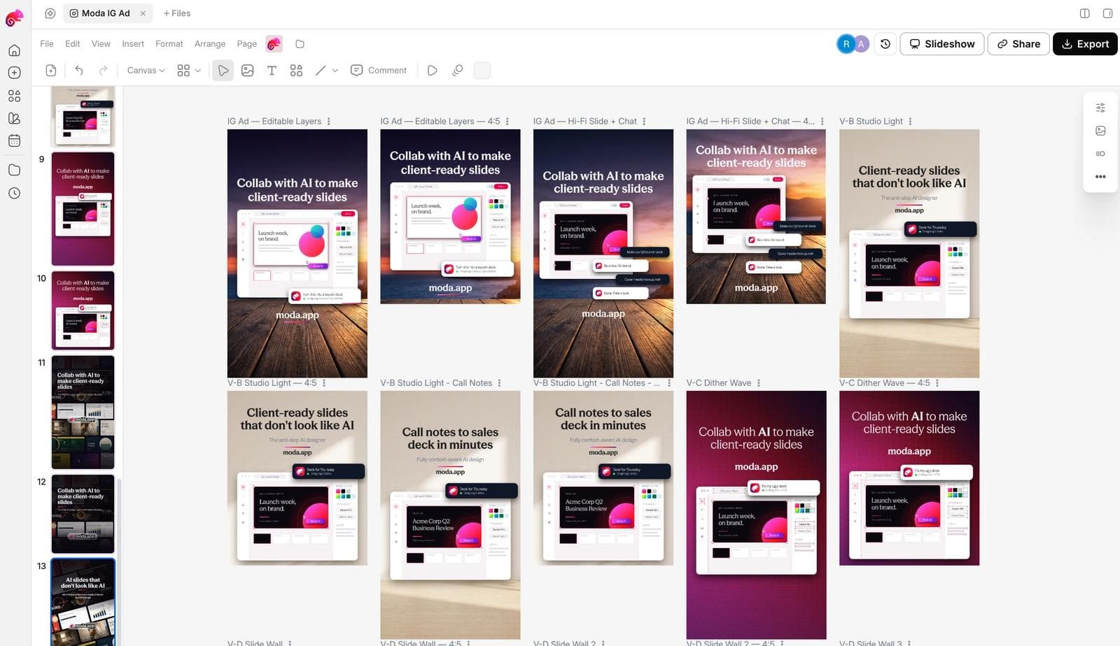
Before any of these ships: the claims are yours and true, the diagram is legible at feed size, the first card or page works alone because it is all most people will see, and there are at least two hooks against the same layout so the first test measures the message rather than the design. If you have not set up the brand side yet, how AI design tools build a brand kit from your website covers what gets extracted.
Frequently asked questions
Where do these LinkedIn ad examples come from, and can I check them?
Every ad is from the public LinkedIn Ad Library, which needs no login. Paste the ad ID from the caption after linkedin.com/ad-library/detail/ to open it. Run dates, impressions bands, country splits, and targeting appear only for ads whose targeting includes the EU, which is why each was found through a search with Germany selected.
What does a LinkedIn ad look like?
In the feed it is a post with "Promoted" under the advertiser's name: intro text, then a single image, a swipeable carousel, a scrollable document, a video, or an event card, then a headline and a call-to-action button. Thought Leader ads look like a person's post with "Promoted by" a company underneath, and they have no headline or button.
What are the LinkedIn carousel ad specs?
Two to ten cards, 1:1, at least 1080 x 1080 pixels, up to 10 MB per card, a 45-character headline per card, and 255 characters of intro text, per LinkedIn's carousel ad specifications page read on September 3, 2026. Only the first card shows in full in the feed, so it has to work alone.
Does a long run mean the ad performed well?
No. A run length is a budget decision you can observe; performance is not shown anywhere in the library. Dated offers stop on schedule regardless of results, tiny budgets can run for months, and awareness campaigns end at month boundaries. Compare run lengths within one advertiser's set and read the impressions band with the targeting and the country split.
Why do impressions bands in this post look so different from each other?
The band estimates total impressions and follows budget and audience size. Two ads here sit in the 500k to 1M band and both delivered mostly in India; several ads under 1k were tightly targeted and still running. A band is not a score.
Can I reuse one of these ads for my own campaign?
Adapt the structure, not the assets. The layouts, the stat-first or logo-pair or numbered-list patterns, and the format choices transfer. The photography, screenshots, statistics, and copy belong to the advertisers and should be replaced with your own.

Real editable visuals. Real canvas. Full control.
Fly through design work