How to Make AI-Generated Presentations Match Your Brand
A practical system for turning brand guidelines into AI-generated presentations that survive fonts, layouts, collaboration, and export.
 Anvisha Pai, Co-founder & CEO, Moda
If an AI-generated deck has your logo and brand colors but still does not feel like your company, the problem is usually not a missing prompt. A human brand guide describes judgment: when to use each logo, how much whitespace feels right, which layouts suit which messages, and where the system may bend. A presentation tool needs those decisions translated into assets, roles, layouts, examples, and limits it can actually use.
There is no universal “apply brand” switch. A theme supplies reusable colors and fonts. A template or slide master supplies structure. A brand kit centralizes approved ingredients. An AI system may interpret those ingredients while composing new slides. The reliable workflow combines the right level of control with a small, deliberate test before anyone generates a full deck.
The useful distinction: brand ingredients versus brand rules
Most brand drift starts because a team uploads ingredients and assumes it uploaded rules. A folder of logos, a palette, and two font files tells a tool what is available. It does not say which logo belongs on a dark background, which accent color is reserved for calls to action, how dense an executive slide may be, or whether the footer must appear on every external deck.
For presentations, an operational brand system usually needs six layers:
- Identity assets: primary, compact, monochrome, and reversed logos, with minimum size and clear-space guidance.
- Typography roles: heading, body, caption, number, and data-label styles, plus approved fallbacks when a recipient lacks the licensed font.
- Color roles: not just hex values, but named uses such as canvas, text, muted text, accent, warning, and chart series.
- Composition rules: margins, grid, text density, alignment, corner treatment, and the layouts used for recurring content types.
- Visual direction: examples of acceptable photography, illustration, icons, diagrams, and charts, including what to avoid.
- Editorial rules: voice, terminology, capitalization, number formatting, and any claims or phrases that require review.
If those layers exist only as prose in a long PDF, keep the PDF for people but create a shorter implementation package for the software. The implementation package should separate non-negotiable rules from preferences. “Never distort the logo” is a rule. “Prefer generous whitespace” is a preference that may yield when a data-heavy slide needs another treatment.
Four control models, from flexible to deterministic
Presentation products use similar marketing language for controls that behave very differently. Before choosing a tool, decide how much freedom the creator should have.
| Control model | What it reliably supplies | Best use | Main limitation |
|---|---|---|---|
| Theme | Reusable fonts, colors, backgrounds, and effects | A consistent visual baseline | Usually does not control composition or logo use |
| Template or slide master | Approved layouts, placeholders, recurring elements, and theme settings | Corporate, regulated, or repeatable deck types | Can become rigid when content does not fit the anticipated layouts |
| Brand kit or shared library | Approved assets, fonts, colors, templates, and sometimes written guidance | Teams producing many related assets | Availability does not always mean enforcement |
| AI interpretation | Adaptive composition based on prompts, references, examples, and brand context | New slide types and fast first drafts | Requires review unless paired with deterministic constraints |
PowerPoint illustrates why this distinction matters. Microsoft defines a theme around coordinated colors, fonts, and effects, while a reusable PowerPoint template adds a slide master and a set of layouts. Its current Copilot Brand Kit goes further: brand managers can enable Strict brand adherence so Copilot must reuse approved layouts instead of inventing new ones.
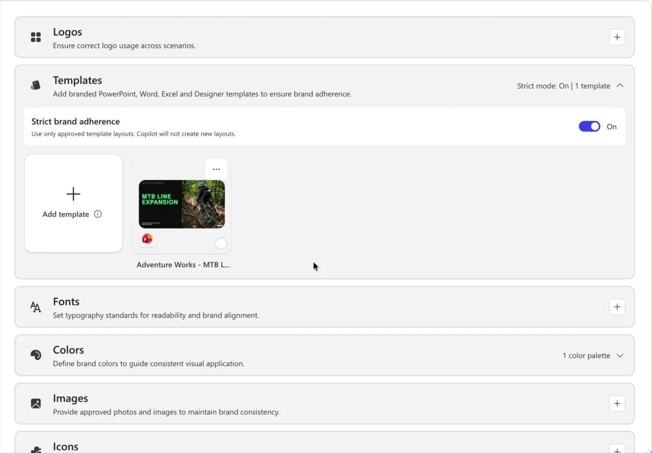
That is a materially stronger promise than “we know your colors.” It is also a tradeoff. Strict layouts improve predictability, but they reduce the system’s freedom when the content needs a composition the template does not contain.
Why AI slides drift even after you add a brand guide
The input is descriptive, not operational
A sentence such as “our brand is confident, warm, and modern” may help with direction, but it cannot choose a heading weight, chart palette, or logo variant. Convert subjective language into observable examples and reusable roles wherever possible.
The layout was built before the real font was applied
Fonts are geometry. A different family or weight changes line length, line breaks, vertical rhythm, and how much content fits. Applying the brand font after generation can turn a balanced two-line heading into three lines and push the body into a footer. Define the font stack before layout, and document fallbacks. Our guide to keeping fonts and colors consistent across slides covers this layer in more detail.
A palette was supplied without semantic roles
When a tool receives six colors with no instructions, any color may become a background, accent, chart series, or text color. Name the role and contrast requirements of each color. The primary brand color does not have to appear on most of every slide to make the deck recognizable.
Reference slides show too little range
A beautiful title slide teaches very little about a dense table, a customer quote, or a product screenshot. Include examples across the content shapes your team actually makes. Good references show both the recurring system and the acceptable variation inside it.
The destination changes the result
A deck may be editable and visually correct in its native tool, then change in PowerPoint or Google Slides. Fonts can substitute, effects can simplify, and some elements may become images. Test the actual handoff your team uses. “Editable export” does not mean every effect will translate exactly.
Build an AI-ready brand package
Do not begin with the full deck. Assemble a small package that a colleague and a tool can both understand:
- Choose the source of truth. Name the current owner, version date, and location. Archive older assets so they cannot be selected by accident.
- Separate logo variants. Provide SVG where supported and transparent PNG fallbacks. Label intended background and usage instead of leaving the tool to infer it.
- Map design tokens to roles. List exact color values, font files, weights, fallbacks, spacing conventions, border styles, and chart colors with their intended jobs.
- Add representative layouts. Include approved examples for a cover, section divider, text-and-image slide, chart, comparison, quote, and closing slide if those patterns recur.
- Distinguish rules from preferences. State what may never change, what may adapt, and who can approve an exception.
- Show visual yes and no examples. A small set of approved and rejected image, icon, chart, and layout examples often communicates faster than another page of adjectives.
- Define the handoff. Decide whether the maintained artifact is a PowerPoint file, a Google Slides URL, a browser-native deck, or a PDF. That decision determines which kinds of editability matter.
A website can be a useful starting point for extracting colors, fonts, and logos, but it is evidence, not authority. Sites often contain campaign colors, fallback web fonts, or outdated assets. Review anything extracted from a URL before treating it as the brand system. See our explanation of how tools build a brand kit from a website for the practical tradeoffs.
Run a three-slide stress test before generating the deck
A brand workflow should pass difficult, representative cases, not just produce one attractive cover. Build these three slides first:
1. A section divider or image-led slide
This tests logo contrast, image direction, cropping, headline hierarchy, and the amount of whitespace the system considers acceptable.
2. A dense chart or table slide
This tests font metrics, chart colors, labels, footnotes, alignment, and whether the template can handle real information without shrinking everything into unreadable text.
3. A mixed-content slide
Use a slide with a short argument, a product screenshot or photo, and one key number. This exposes whether the system understands hierarchy or merely pours content into equal boxes.
Review the three slides against the same checklist:
- Is the correct logo variant used at an acceptable size, contrast, and distance from other elements?
- Are fonts, weights, line breaks, and fallbacks correct on another teammate’s machine?
- Are colors used by role rather than distributed randomly?
- Do charts and icons belong to the same visual system as the rest of the deck?
- Can a non-designer make the expected edits without breaking the layout?
- Does the destination file preserve the elements that must remain editable?
- Are notes, links, alt text, and any required legal or confidentiality text still present?
If a repeated failure appears in all three slides, fix the theme, template, kit, or instructions before generating more. Correcting the system once is more reliable than repairing the same symptom across 30 slides.
What current presentation tools actually control
PowerPoint and Copilot
PowerPoint remains the clearest option when a mature corporate template is the source of truth. Slide masters and placeholders provide deterministic structure. Microsoft now documents Copilot Brand Kits that use approved templates, colors, fonts, and assets, plus strict adherence and plain-language instructions in slide notes. Those controls are especially relevant when compliance matters more than layout invention. Availability depends on the Microsoft 365 environment and administrator setup.
Google Slides and Gemini
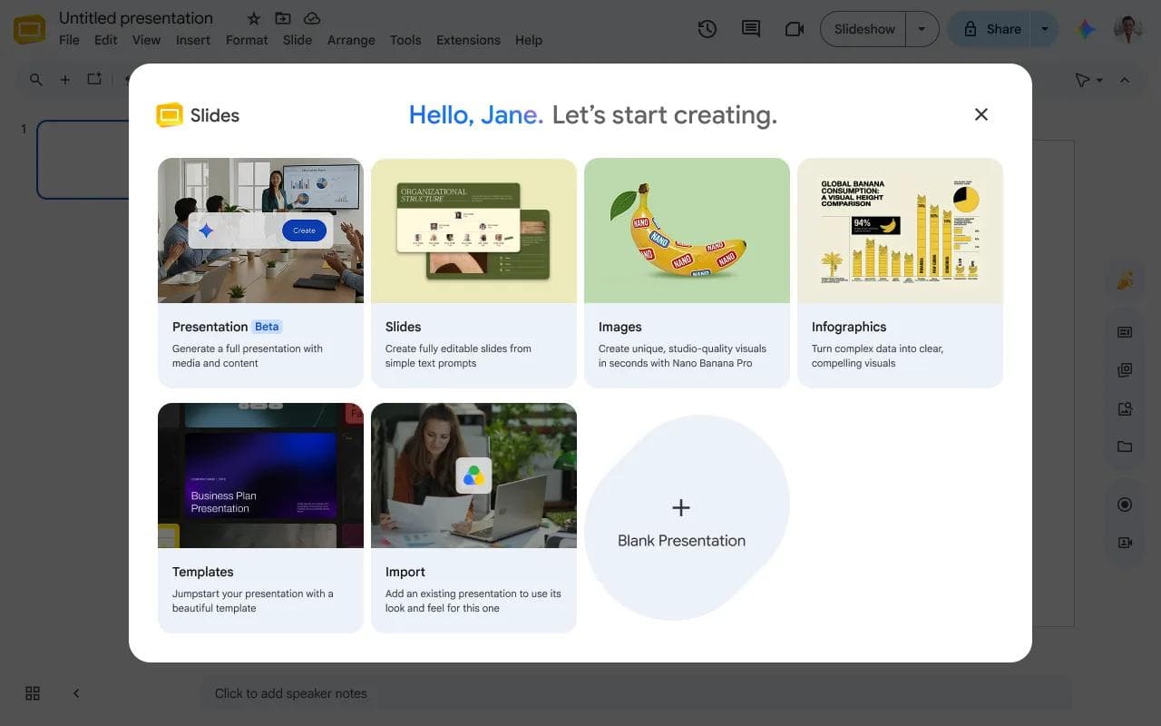
Google Slides themes combine colors, fonts, backgrounds, and layouts, and Google documents how to import and edit a theme. Its current Gemini presentation workflow can generate a full editable deck and lets the user add an existing deck to match presentation style. Style matching is useful context, but teams should still inspect whether brand rules and destination-specific details survived.
Canva
Canva’s Brand Hub centralizes logos, colors, fonts, imagery, written guidelines, and brand templates. Canva also documents Brand Controls and contextual guidelines for guiding a larger team. The specific controls depend on the plan and organization setup, so evaluate the workflow teammates will actually receive rather than the broadest product description.
Beautiful.ai
Beautiful.ai combines layout guardrails with shared team resources. Its Team Themes can be locked and updated centrally, which is useful when consistency matters more than freeform composition. Its export documentation also notes important boundaries: transitions and animations do not transfer to external platforms, and missing fonts can change editable PowerPoint output. That is a good example of why brand QA must include the destination.
Gamma
Gamma’s custom themes can define colors, fonts, logos, design treatments, and AI image-style keywords, and can be imported from PowerPoint or Google Drive. It is a strong fit when the maintained presentation will stay web-native. If the deliverable must be a conventional slide file, test that export early rather than designing the full deck first.
Where Moda fits
Moda uses a saved brand kit as context while an AI agent creates and revises presentations on an editable canvas. A kit can be assembled from a website or supplied material, then corrected by the team. That is useful when the main bottleneck is creating or redesigning a visually developed first draft, not merely filling a locked template.
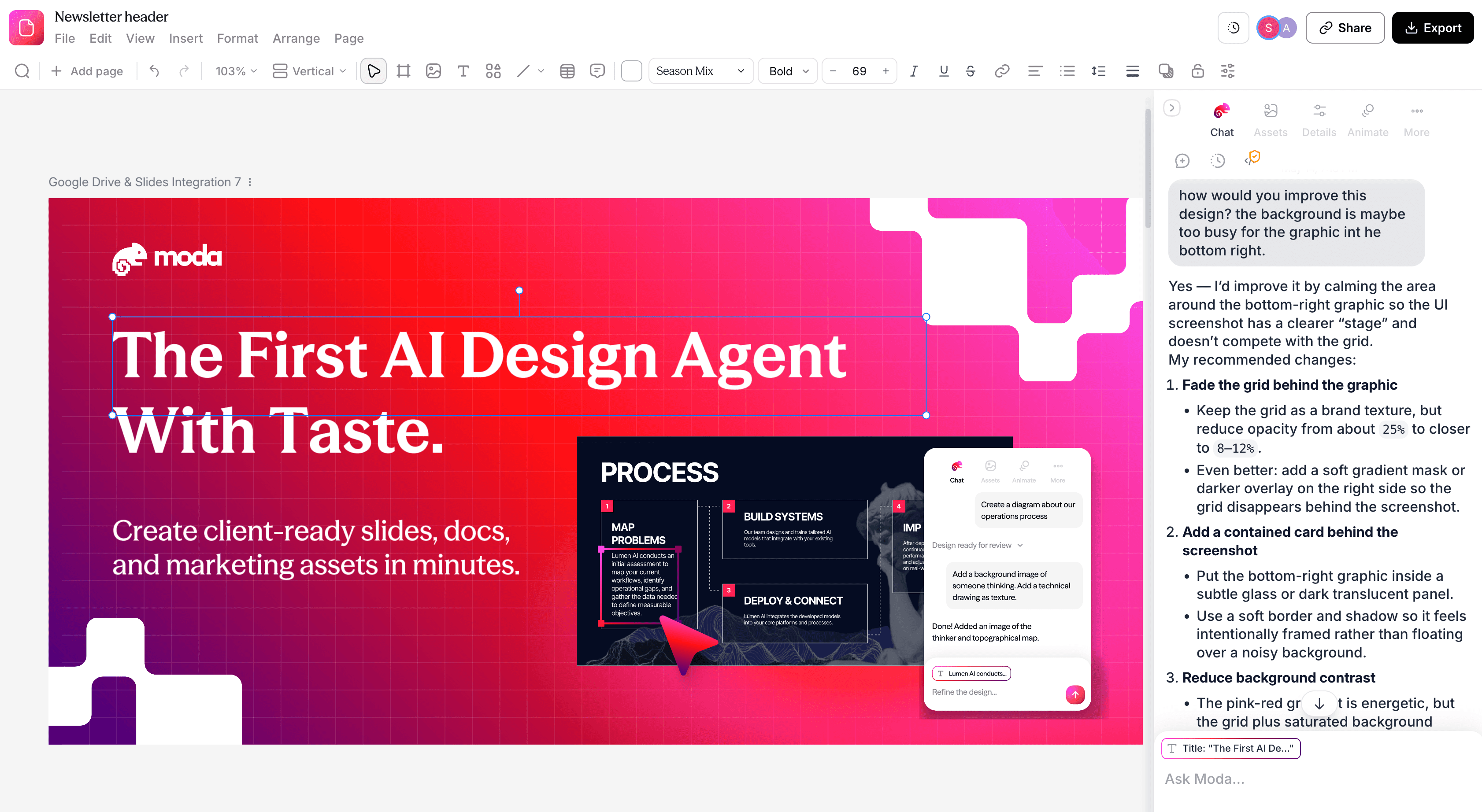
Moda is not the best answer for every brand workflow. PowerPoint is a better default when a locked corporate master and native PPTX maintenance are non-negotiable. Google Slides has the more mature Workspace-native permission and collaboration model. Canva has the broader general-purpose template and asset ecosystem. Beautiful.ai provides stronger template-driven layout guardrails.
Moda can export editable PowerPoint files and publish to Google Slides, but those are best-effort conversions. Complex effects or unsupported elements may be simplified or rasterized, and animations do not transfer as native PowerPoint or Google Slides animation. Inspect the destination deck. Our presentation export guide explains what to test.
Treat brand setup as maintained infrastructure
Brand automation becomes unreliable when no one owns it. Give the kit or template a named owner, visible version date, and a small change log. When the brand changes, update the source first, then test the new version before making it the default. Keep older assets in a clearly labeled archive for historical decks, but remove them from everyday selection.
For agencies or multi-brand companies, isolate each client or identity in its own kit, template set, library, or workspace. Use naming and permissions that make the correct choice obvious. A sophisticated generator pointed at the wrong client kit will produce the wrong answer very efficiently.
Finally, decide what should update automatically. A centrally managed theme can be powerful, but changing it may affect many existing presentations. Beautiful.ai, for example, documents real-time updates to presentations using a shared team theme. That may be desirable for a current sales library and undesirable for an archived board deck. Governance is part of the design system.
Bottom line
The goal is not to persuade an AI to “be more on-brand.” The goal is to give people and software the same usable system: approved ingredients, explicit roles, representative layouts, clear constraints, and a known destination.
Use a template or master when variation is risky. Use a brand kit when teams need reusable assets and defaults. Use AI interpretation when the content changes too much for a fixed layout, but pair it with examples and review. Test three difficult slides before generating the rest. If the same problem repeats, fix the system instead of polishing every slide by hand.
Frequently asked questions
Can an AI presentation tool follow a PDF brand guide?
A PDF can provide useful context, but it rarely acts as an enforceable design system by itself. Extract the important assets, font and color roles, hard rules, and representative layouts into the product’s theme, template, brand kit, or reference workflow.
What is the difference between a brand kit and a presentation template?
A brand kit usually centralizes approved logos, fonts, colors, imagery, and guidance. A presentation template adds concrete slide structures, placeholders, and recurring elements. Teams often need both: the kit supplies the identity, while the template constrains recurring deck layouts.
What is the best way to keep AI-generated PowerPoint slides on-brand?
Start from an approved PowerPoint template with correctly configured theme colors, theme fonts, slide masters, layouts, and placeholders. If your Microsoft 365 setup includes Copilot Brand Kits, strict brand adherence can restrict Copilot to approved layouts. Review the final PPTX on a recipient machine.
Can I make an existing AI-generated deck on-brand without regenerating it?
Usually, yes. Apply the correct theme or layouts, replace fonts and colors at the system level, standardize logos and imagery, and then repair exceptions. Regeneration is useful when the information architecture is wrong, but it is not the first fix for every visual inconsistency.
How many slides should I test before rolling out a branded AI workflow?
Three well-chosen slides are a useful minimum: an image-led or section slide, a dense chart or table, and a mixed-content slide. They expose more failure modes than several easy title-and-bullet slides. Add any specialized slide type your organization uses frequently.

Real editable visuals. Real canvas. Full control.
Fly through design work