Coral color guide
HEX
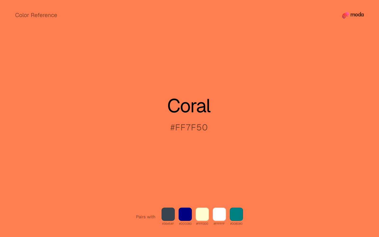
#FF7F50
RGB
255, 127, 80
HSL
16°, 100%, 66%
HSV
16°, 69%, 100%
Coral (#FF7F50) sits between peach softness and orange heat, with enough pink in it to feel sunlit rather than loud. It is one of the easiest warm accents to use on screens because it pops without turning fully neon or fully red.
Best for
Mobile app interfaces, onboarding screens, and light-mode UI themes.
Accessibility
Check contrast before using coral for text-heavy layouts, especially on low-contrast backgrounds.
How does coral compare to nearby colors?
What is the difference between coral and salmon?
Coral (#FF7F50) and Salmon (#FA8072) may look neighboring at first glance, yet their surface character diverges once they sit next to whites, charcoals, and other real layout neutrals. Coral and Salmon can fill many of the same slots, but one steers the palette toward citrus-bright and the other toward peach-wash. Choose coral when the surrounding system aligns better with food, promotion, and social-first graphics, and move to salmon when the stronger contextual fit is beauty, lifestyle, and soft campaign backgrounds.
What color is coral?
The name comes from marine coral skeletons, though digital “coral” is usually cleaner and brighter than natural reef tones. On screens it often functions as a friendly retail accent: warmer than salmon, less sugary than pink, and less blunt than pure orange.
Also known as: Living Coral. Some sources cite: #FF6F61.
What is the hex code for coral?
| Format | Value |
|---|---|
| HEX | #FF7F50 |
| RGB | rgb(255, 127, 80) |
| HSL | hsl(16°, 100%, 66%) |
| HSV / HSB | hsv(16°, 69%, 100%) |
| CMYK (approx.) | cmyk(0%, 50%, 69%, 0%) |
Convert Coral to other color formats
Open the color converter with Coral (#FF7F50) prefilled to copy RGB, HSL, HSV, CMYK, or OKLCH values.
Convert Coral in the color converter →What does coral mean in design?
Coral is often associated with warmth, sociability, and forward motion. Compared with red it feels less urgent; compared with orange it feels more human and less industrial. That balance makes it useful when a brand wants energy without coming across as aggressive.
How do I use coral in code?
| CSS (hex) | color: #FF7F50; |
| CSS (rgb) | color: rgb(255, 127, 80); |
| CSS (hsl) | color: hsl(16, 100%, 66%); |
| RGB % | rgb(100%, 50%, 31%) |
| Tailwind | text-[#FF7F50] |
| SwiftUI | Color(red: 1.000, green: 0.498, blue: 0.314) |
| UIKit | UIColor(red: 1.000, green: 0.498, blue: 0.314, alpha: 1.0) |
| Android | Color.rgb(255, 127, 80) |
| Compose | Color(0xFFFF7F50) |
| Web Safe | #FF6666 |
Is coral accessible?
| Combination | Ratio | AA | AA lg | AAA | AAA lg | UI |
|---|---|---|---|---|---|---|
| AaWhite text on this color | 2.5:1 | ✗ | ✗ | ✗ | ✗ | ✗ |
| AaBlack text on this color | 8.4:1 | ✓ | ✓ | ✓ | ✓ | ✓ |
| AaThis color as text on white | 2.5:1 | ✗ | ✗ | ✗ | ✗ | ✗ |
| AaThis color as text on black | 8.4:1 | ✓ | ✓ | ✓ | ✓ | ✓ |
WCAG 2.1: AA normal ≥ 4.5:1, AA large text ≥ 3:1, AAA normal ≥ 7:1, AAA large ≥ 4.5:1, UI components ≥ 3:1.
How does coral look with color blindness?
Simulated appearance for common types of color vision deficiency. Actual perception varies by individual.
What colors go with coral
Charcoal balances coral by turning the palette into a usable light-dark system rather than a field of soft midtones.
Navy blue keeps coral energetic without letting the whole palette slide into campaign-only color.
With a vivid coral, cream is gentler than white, so the palette keeps warmth and avoids looking overlit.
What colors clash with coral
Neon Green competes with coral so aggressively that the palette never really settles into a clear primary-secondary relationship.
Magenta remaps coral too aggressively, dragging it away from food, promotion, and social-first graphics and into a brighter, more performative palette.
How should I use coral in design?
- •Coral is one of the best accent colors for dark-background presentations — it pops against navy and charcoal without feeling aggressive.
- •Use coral for CTAs, highlighted metrics, and key takeaways in pitch decks.
- •Pair coral with teal for a complementary warm-cool contrast, or with navy for a more corporate feel.
What are good coral palettes?
Daylight
Mobile app interfaces, onboarding screens, and light-mode UI themes.
Golden hour
Workshop handouts, training guides, and presentation templates.
Design with coral in Moda
Create a presentation or document using coralas your accent color. Moda's AI applies your color palette automatically.
Create a design with coral →What are the shades and tints of coral?
Shades (darker)
Tints (lighter)
Tones (desaturated)
Hue variations
What are the color harmonies for coral?
Harmonies are calculated from the base swatch. When a harmony matches a named color page, it links there; otherwise it appears here as a computed reference swatch.
Similar colors
Mango
Mango is near enough to coral to swap into the same palette, yet the undertone shift still decides whether the family reads warmer or cooler overall.
Tangerine
Tangerine is near enough to coral to swap into the same palette, yet the undertone shift still decides whether the family reads warmer or cooler overall.
Salmon
Salmon sits close to coral on the wheel, but it carries less chroma, which makes it better for steadier surfaces and calmer long-form use than for sharper emphasis and quicker visual pickup.
Terracotta
Terracotta is nearly adjacent to coral in hue; what separates them is intensity, with terracotta reading dustier and easier to extend across a layout.
Pumpkin
Pumpkin stays very close to coral in hue, but it lands darker, which makes it better for headlines, anchors, and darker sections than for lighter surfaces and more open applications.
Frequently asked questions
What is the hex code for coral?
The hex code for coral is #FF7F50. In RGB, that's 255 red, 127 green, and 80 blue. The approximate CMYK equivalent is 0% cyan, 50% magenta, 69% yellow, and 0% key (black).
Is coral a warm or cool color?
Coral reads as warm. It feels most natural with creams, golds, rusts, and other warm accents, while cooler partners like navy or teal create sharper contrast.
Is coral better as an accent or a full-palette color?
Coral is usually best when it leads in short bursts rather than covering everything. It can headline a palette, but most layouts work better when the color handles accents, highlights, or one main hero role instead of every surface.
How should I use coral in a design?
Coral is vivid enough to work best in controlled doses such as CTAs, highlighted metrics, chart accents, or a single hero element. Surround it with quieter neutrals so it does not exhaust the layout.
Can I use coral for text or backgrounds?
Coral works better with dark text than white text. Black text reaches 8.4:1 contrast on the swatch, which makes the color more usable as a background or highlight surface than as a dark panel.
More orange colors
Keep exploring color resources
All color pages
Browse the full library of color references, pairings, and palettes.
Orange colors
Compare coral with other orange tones.
Brown colors
Explore nearby color families to build stronger palettes and contrasts.
Neutral colors
Explore nearby color families to build stronger palettes and contrasts.
Red colors
Explore nearby color families to build stronger palettes and contrasts.
Last updated April 6, 2026
Color values are computed from the listed hex code using standard conversion formulas. RGB, HSL, and HSV are exact screen-ready conversions. CMYK is an approximate on-screen reference, not a press-ready print specification. Pairings, palettes, and use-case guidance are heuristic recommendations derived from color relationships, contrast behavior, and common presentation, document, and UI patterns.