Where Cream works best
HEX
#FFFDD0
RGB
255, 253, 208
HSL
57°, 100%, 91%
HSV
57°, 18%, 100%
Cream (#FFFDD0) is a warm off-white with subtle yellow undertones. It provides a softer, more inviting alternative to pure white as a background color, reducing harshness while maintaining readability.
Best for
Brand guidelines, annual reports, and editorial layouts for premium brands.
Accessibility
Check contrast before using cream for text-heavy layouts, especially on low-contrast backgrounds.
How does cream compare to nearby colors?
What is the difference between cream and champagne?
Cream (#FFFDD0) looks cleaner and more charged than Champagne (#F7E7CE) when the two are shown together. Cream reads faster on screen, so it changes the palette from steady to attention-seeking more quickly than Champagne does. Reach for cream when the palette can tolerate a louder note; stay with champagne when the work calls for longer-running color.
What color is cream?
Cream sits in the family of off-whites designers reach for when pure white feels too clinical. It shows up often in editorial layouts, stationery systems, packaging, and presentation themes that need warmth without a visible beige cast.
Also known as: Crème. Some sources cite: #FFFCE0.
What is the hex code for cream?
| Format | Value |
|---|---|
| HEX | #FFFDD0 |
| RGB | rgb(255, 253, 208) |
| HSL | hsl(57°, 100%, 91%) |
| HSV / HSB | hsv(57°, 18%, 100%) |
| CMYK (approx.) | cmyk(0%, 1%, 18%, 0%) |
Convert Cream to other color formats
Open the color converter with Cream (#FFFDD0) prefilled to copy RGB, HSL, HSV, CMYK, or OKLCH values.
Convert Cream in the color converter →What does cream mean in design?
Cream signals warmth, openness, and editorial softness. Compared with pure white, it feels more human and less clinical, which is why it is so effective for decks, long-form documents, and premium brand materials that need a gentler tone.
How do I use cream in code?
| CSS (hex) | color: #FFFDD0; |
| CSS (rgb) | color: rgb(255, 253, 208); |
| CSS (hsl) | color: hsl(57, 100%, 91%); |
| RGB % | rgb(100%, 99%, 82%) |
| Tailwind | text-[#FFFDD0] |
| SwiftUI | Color(red: 1.000, green: 0.992, blue: 0.816) |
| UIKit | UIColor(red: 1.000, green: 0.992, blue: 0.816, alpha: 1.0) |
| Android | Color.rgb(255, 253, 208) |
| Compose | Color(0xFFFFFDD0) |
| Web Safe | #FFFFCC |
Is cream accessible?
| Combination | Ratio | AA | AA lg | AAA | AAA lg | UI |
|---|---|---|---|---|---|---|
| AaWhite text on this color | 1.04:1 | ✗ | ✗ | ✗ | ✗ | ✗ |
| AaBlack text on this color | 20.21:1 | ✓ | ✓ | ✓ | ✓ | ✓ |
| AaThis color as text on white | 1.04:1 | ✗ | ✗ | ✗ | ✗ | ✗ |
| AaThis color as text on black | 20.21:1 | ✓ | ✓ | ✓ | ✓ | ✓ |
WCAG 2.1: AA normal ≥ 4.5:1, AA large text ≥ 3:1, AAA normal ≥ 7:1, AAA large ≥ 4.5:1, UI components ≥ 3:1.
How does cream look with color blindness?
Simulated appearance for common types of color vision deficiency. Actual perception varies by individual.
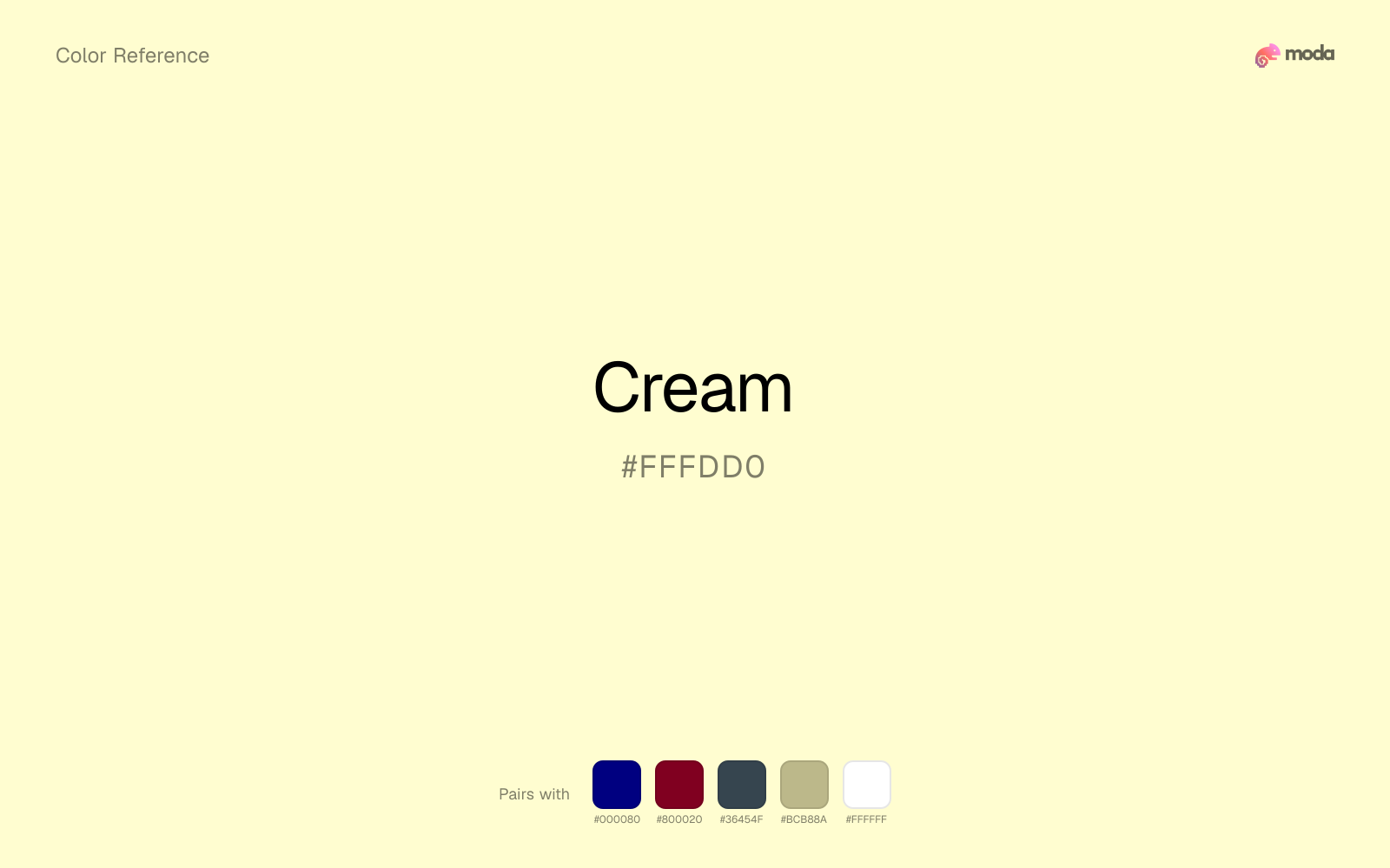
What colors go with cream
Navy blue reins in cream without deadening it, which is useful when you want warmth to stay present but not dominate every part of the page.
Burgundy helps cream form a real light-dark system, which is useful when the palette needs both atmosphere and readable structure.
Because cream behaves like a tint, charcoal supplies the typography, dividers, and anchors that make the palette feel finished.
Sage Green helps cream feel more complete in practice because the pairing combines paper, plaster, and interface chrome qualities with sage and moss support instead of leaving the source color to do every job alone.
What colors clash with cream
Yellow can strip grounding away from cream by putting a much brighter note beside it before the layout has any darker structure.
Light Gray sits too close to cream in value, so the palette can wash out before it ever establishes a clear hierarchy.
Against cream, Neon Green introduces a fluorescent sports-drink brightness that overwhelms any quieter, tactile palette intention.
How should I use cream in design?
- •Use cream instead of white for slide backgrounds when you want a warmer, more editorial feel.
- •Cream works as a text color on dark backgrounds (navy, charcoal, burgundy) for a softer look than pure white.
- •Pair cream with one bold accent color and one dark neutral for a sophisticated three-color palette.
What are good cream palettes?
Warm editorial
Brand guidelines, annual reports, and editorial layouts for premium brands.
Morning palette
Email templates, blog headers, and content marketing visuals.
Design with cream in Moda
Create a presentation or document using creamas your accent color. Moda's AI applies your color palette automatically.
Create a design with cream →What are the shades and tints of cream?
Shades (darker)
Tints (lighter)
Tones (desaturated)
Hue variations
What are the color harmonies for cream?
Harmonies are calculated from the base swatch. When a harmony matches a named color page, it links there; otherwise it appears here as a computed reference swatch.
Similar colors
Ivory
Ivory stays very close to cream in hue, but it lands lighter, which makes it better for backgrounds, tints, and softer supporting areas than for accents, stronger hierarchy, and firmer structure.
Champagne
Champagne is useful when cream is the right weight but the wrong mood: the swap changes temperature and finish more than contrast.
Off-White
Off-White stays very close to cream in hue, but it lands lighter, which makes it better for backgrounds, tints, and softer supporting areas than for accents, stronger hierarchy, and firmer structure.
Beige
Beige is nearly adjacent to cream in hue; what separates them is intensity, with beige reading dustier and easier to extend across a layout.
Frequently asked questions
What is the hex code for cream?
The hex code for cream is #FFFDD0. In RGB, that's 255 red, 253 green, and 208 blue. The approximate CMYK equivalent is 0% cyan, 1% magenta, 18% yellow, and 0% key (black).
Is cream a warm or cool color?
Cream sits on the warm side of the palette, so it pairs easily with other warm tones and becomes more energetic when you place it against cooler blues or blue-grays.
Should cream be used as a surface color or an accent?
Cream belongs more naturally on surfaces than in tiny accent moments. Use it to open space, soften sections, or tint large areas, then let darker colors carry the emphasis.
Where does cream work best in a layout?
Cream is very light, so it works best as a background, card fill, or table tint in slides, documents, and landing pages. Pair it with dark text such as charcoal or navy for readability.
Is cream accessible?
Cream works better with dark text than white text. Black text reaches 20.21:1 contrast on the swatch, which makes the color more usable as a background or highlight surface than as a dark panel.
More neutral colors
Keep exploring color resources
All color pages
Browse the full library of color references, pairings, and palettes.
Neutral colors
Compare cream with other neutral tones.
Blue colors
Explore nearby color families to build stronger palettes and contrasts.
Brown colors
Explore nearby color families to build stronger palettes and contrasts.
Green colors
Explore nearby color families to build stronger palettes and contrasts.
Last updated April 6, 2026
Color values are computed from the listed hex code using standard conversion formulas. RGB, HSL, and HSV are exact screen-ready conversions. CMYK is an approximate on-screen reference, not a press-ready print specification. Pairings, palettes, and use-case guidance are heuristic recommendations derived from color relationships, contrast behavior, and common presentation, document, and UI patterns.