Where Slate Gray works best
HEX
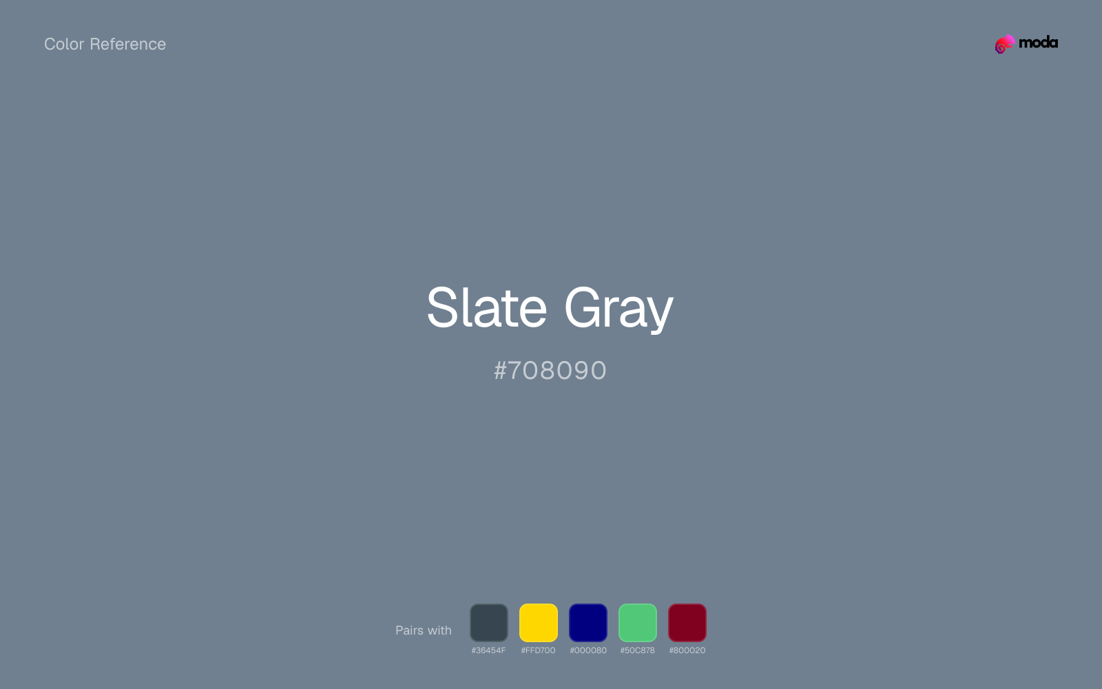
#708090
RGB
112, 128, 144
HSL
210°, 13%, 50%
HSV
210°, 22%, 56%
A faint coastal chill clings to slate gray — stone after rain, not concrete in sun. #708090 has a subtle blue cast that keeps edges feeling crisp even when values soften. Choose it when you want seriousness without sliding into charcoal severity.
Best for
Trade show graphics, signage, and booth displays.
Compare with
Accessibility
Check contrast before using slate gray for text-heavy layouts, especially on low-contrast backgrounds.
How does slate gray compare to nearby colors?
What is the difference between slate gray and steel blue?
Slate Gray (#708090) feels more softened on screen, while Steel Blue (#4682B4) pushes the family in the opposite direction. Slate Gray is easier to live with across large areas, because it carries less chroma pressure than Steel Blue. Use slate gray for the more restrained version of the idea, and move to steel blue when the palette needs a brighter front-facing accent.
What color is slate gray?
The name references slate roofing and chalkboard stone, materials valued for fine grain and cool undertone. In fashion and interiors, "slate" commonly denotes blue-gray neutrals.
What is the hex code for slate gray?
| Format | Value |
|---|---|
| HEX | #708090 |
| RGB | rgb(112, 128, 144) |
| HSL | hsl(210°, 13%, 50%) |
| HSV / HSB | hsv(210°, 22%, 56%) |
| CMYK (approx.) | cmyk(22%, 11%, 0%, 44%) |
Convert Slate Gray to other color formats
Open the color converter with Slate Gray (#708090) prefilled to copy RGB, HSL, HSV, CMYK, or OKLCH values.
Convert Slate Gray in the color converter →What does slate gray mean in design?
Slate gray is often associated with composure, precision, and a quietly professional mood. It tends to read as cooler and more "designed" than a true mid gray, and less utilitarian than green-leaning pewter.
How do I use slate gray in code?
| CSS (hex) | color: #708090; |
| CSS (rgb) | color: rgb(112, 128, 144); |
| CSS (hsl) | color: hsl(210, 13%, 50%); |
| RGB % | rgb(44%, 50%, 56%) |
| Tailwind | text-[#708090] |
| SwiftUI | Color(red: 0.439, green: 0.502, blue: 0.565) |
| UIKit | UIColor(red: 0.439, green: 0.502, blue: 0.565, alpha: 1.0) |
| Android | Color.rgb(112, 128, 144) |
| Compose | Color(0xFF708090) |
| Web Safe | #669999 |
Is slate gray accessible?
| Combination | Ratio | AA | AA lg | AAA | AAA lg | UI |
|---|---|---|---|---|---|---|
| AaWhite text on this color | 4.05:1 | ✗ | ✓ | ✗ | ✗ | ✓ |
| AaBlack text on this color | 5.18:1 | ✓ | ✓ | ✗ | ✓ | ✓ |
| AaThis color as text on white | 4.05:1 | ✗ | ✓ | ✗ | ✗ | ✓ |
| AaThis color as text on black | 5.18:1 | ✓ | ✓ | ✗ | ✓ | ✓ |
WCAG 2.1: AA normal ≥ 4.5:1, AA large text ≥ 3:1, AAA normal ≥ 7:1, AAA large ≥ 4.5:1, UI components ≥ 3:1.
How does slate gray look with color blindness?
Simulated appearance for common types of color vision deficiency. Actual perception varies by individual.
What colors go with slate gray
Charcoal helps slate gray feel grounded and architectural, especially when the design needs a darker value that still reads refined.
With a cooler color like slate gray, gold adds richness and turns the system toward premium packaging, hospitality, or ceremonial branding.
Navy blue gives slate gray a cooler anchor, which helps the palette feel settled enough for documents, decks, and interface work.
What colors clash with slate gray
Magenta pushes slate gray toward a nightclub or cosmetic register that is hard to square with calmer editorial or product work.
Orange lands abruptly next to slate gray and can make the palette feel more promo-coded or team-coded than intended.
Light Gray is gentle enough that slate gray loses some of its structure beside it; the pair can feel underbuilt rather than intentionally quiet.
How should I use slate gray in design?
- •Try slate gray for section backgrounds, card fills, or brand-secondary roles where you want color without overpowering the content.
- •Warm touches like gold or coral bring out slate gray's cooler character by contrast, while staying with cool neighbors creates a calmer, more unified feel.
- •Slate Gray's muted quality makes it versatile for large areas — slide backgrounds, card fills, and entire brand systems where louder colors would fatigue.
What are good slate gray palettes?
Design with slate gray in Moda
Create a presentation or document using slate grayas your accent color. Moda's AI applies your color palette automatically.
Create a design with slate gray →What are the shades and tints of slate gray?
Shades (darker)
Tints (lighter)
Tones (desaturated)
Hue variations
What are the color harmonies for slate gray?
Harmonies are calculated from the base swatch. When a harmony matches a named color page, it links there; otherwise it appears here as a computed reference swatch.
Similar colors
Steel Blue
Steel Blue sits close to slate gray on the wheel, but it carries more pigment pressure, which makes it better for faster emphasis and brighter accent work than for broader coverage and quieter supporting roles.
Cool Gray
Cool Gray is useful when slate gray is the right weight but the wrong mood: the swap changes temperature and finish more than contrast.
Charcoal
Charcoal stays in the same color family as slate gray, but the change in value moves it into different layout jobs, especially once backgrounds, charts, or section dividers enter the system.
Denim
Denim stays very close to slate gray in hue, but it lands darker, which makes it better for headlines, anchors, and darker sections than for lighter surfaces and more open applications.
Heather
Heather stays in the same color family as slate gray, but the change in value moves it into different layout jobs, especially once backgrounds, charts, or section dividers enter the system.
Frequently asked questions
What is the hex code for slate gray?
The hex code for slate gray is #708090. In RGB, that's 112 red, 128 green, and 144 blue. The approximate CMYK equivalent is 22% cyan, 11% magenta, 0% yellow, and 44% key (black).
Is slate gray a warm or cool color?
Slate Gray falls on the cool side of the palette, so warm companions create the clearest contrast while other cool tones keep the system more restrained.
Can slate gray carry a full palette without feeling too loud?
Slate Gray is restrained enough to carry larger areas without becoming exhausting. That makes it useful for document systems, presentation themes, and site sections where louder colors would wear out their welcome.
Where does slate gray work best in a layout?
Slate Gray is muted and versatile. It can carry a full presentation theme, document system, or website section without overwhelming the layout, and it pairs flexibly with both warm and cool accents.
Is slate gray accessible?
Slate Gray works better with dark text than white text. Black text reaches 5.18:1 contrast on the swatch, which makes the color more usable as a background or highlight surface than as a dark panel.
More neutral colors
Keep exploring color resources
All color pages
Browse the full library of color references, pairings, and palettes.
Neutral colors
Compare slate gray with other neutral tones.
Blue colors
Explore nearby color families to build stronger palettes and contrasts.
Brown colors
Explore nearby color families to build stronger palettes and contrasts.
Green colors
Explore nearby color families to build stronger palettes and contrasts.
Last updated April 6, 2026
Color values are computed from the listed hex code using standard conversion formulas. RGB, HSL, and HSV are exact screen-ready conversions. CMYK is an approximate on-screen reference, not a press-ready print specification. Pairings, palettes, and use-case guidance are heuristic recommendations derived from color relationships, contrast behavior, and common presentation, document, and UI patterns.