Cool Gray design guide
HEX
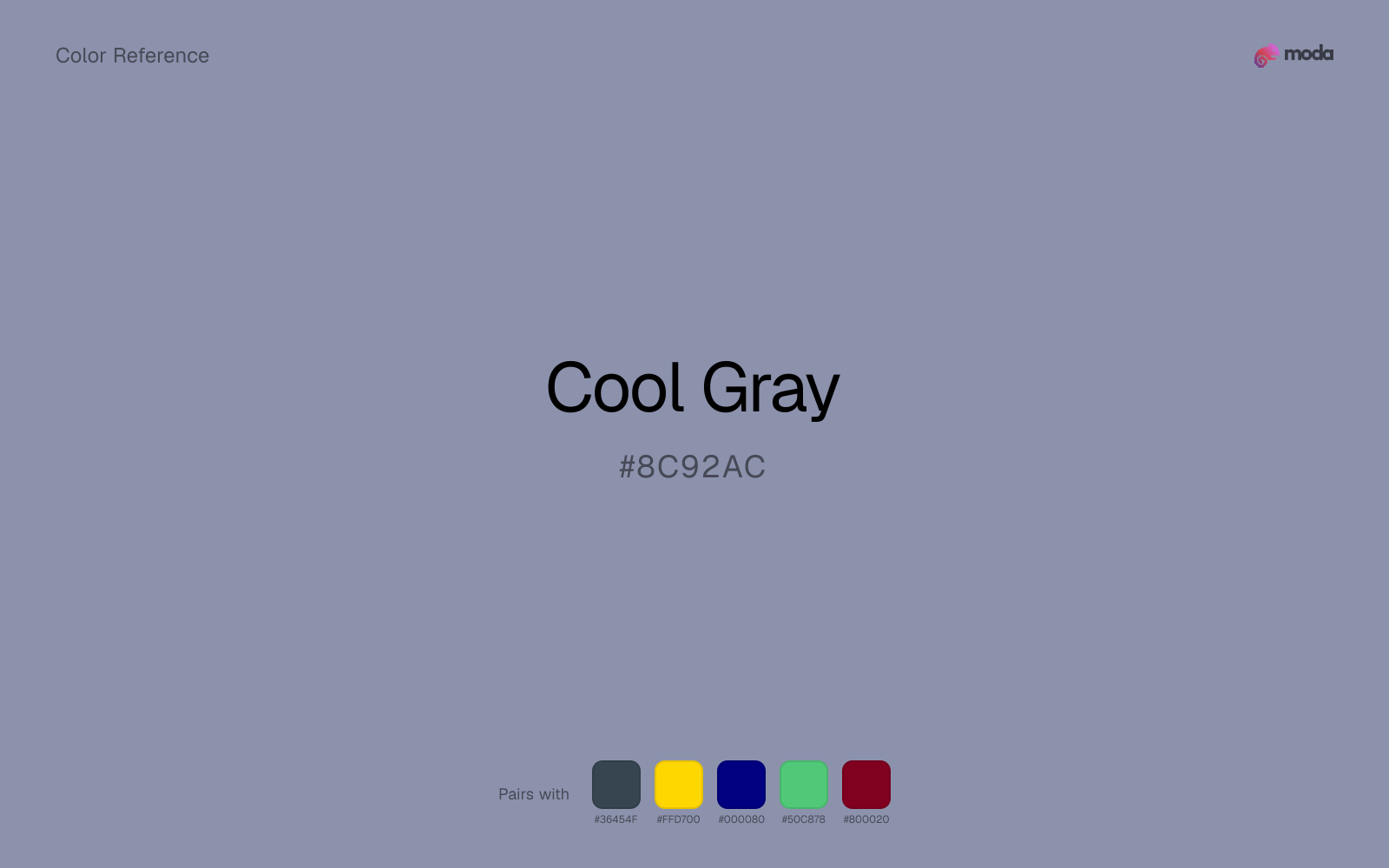
#8C92AC
RGB
140, 146, 172
HSL
229°, 16%, 61%
HSV
229°, 19%, 67%
A violet-blue breeze runs through cool gray, like shadow on brushed steel. #8C92AC can make adjacent colors feel truer by comparison. Especially useful when warm wood or cream would otherwise pull everything yellow.
Best for
Email templates, blog headers, and content marketing visuals.
Compare with
Accessibility
Check contrast before using cool gray for text-heavy layouts, especially on low-contrast backgrounds.
How does cool gray compare to nearby colors?
What is the difference between cool gray and slate gray?
The main visual split is undertone: Cool Gray (#8C92AC) feels more cool, while Slate Gray (#708090) pulls in a different direction. Cool Gray shifts the system toward paper, tint, and background behavior more than Slate Gray does. Start with cool gray when the palette wants more lighter handling; switch to slate gray when the better fit is darker handling.
What color is cool gray?
Cool gray appears frequently in corporate identity systems, tech product finishes, and architectural metals. The undertone is often described as periwinkle-leaning.
What is the hex code for cool gray?
| Format | Value |
|---|---|
| HEX | #8C92AC |
| RGB | rgb(140, 146, 172) |
| HSL | hsl(229°, 16%, 61%) |
| HSV / HSB | hsv(229°, 19%, 67%) |
| CMYK (approx.) | cmyk(19%, 15%, 0%, 33%) |
Convert Cool Gray to other color formats
Open the color converter with Cool Gray (#8C92AC) prefilled to copy RGB, HSL, HSV, CMYK, or OKLCH values.
Convert Cool Gray in the color converter →What does cool gray mean in design?
Cool gray is often associated with clarity, distance, and a composed contemporary tone. Compared with slate gray it may feel slightly more lavender; versus warm gray it reads as cleaner and more "studio-lit."
How do I use cool gray in code?
| CSS (hex) | color: #8C92AC; |
| CSS (rgb) | color: rgb(140, 146, 172); |
| CSS (hsl) | color: hsl(229, 16%, 61%); |
| RGB % | rgb(55%, 57%, 67%) |
| Tailwind | text-[#8C92AC] |
| SwiftUI | Color(red: 0.549, green: 0.573, blue: 0.675) |
| UIKit | UIColor(red: 0.549, green: 0.573, blue: 0.675, alpha: 1.0) |
| Android | Color.rgb(140, 146, 172) |
| Compose | Color(0xFF8C92AC) |
| Web Safe | #999999 |
Is cool gray accessible?
| Combination | Ratio | AA | AA lg | AAA | AAA lg | UI |
|---|---|---|---|---|---|---|
| AaWhite text on this color | 3.08:1 | ✗ | ✓ | ✗ | ✗ | ✓ |
| AaBlack text on this color | 6.82:1 | ✓ | ✓ | ✗ | ✓ | ✓ |
| AaThis color as text on white | 3.08:1 | ✗ | ✓ | ✗ | ✗ | ✓ |
| AaThis color as text on black | 6.82:1 | ✓ | ✓ | ✗ | ✓ | ✓ |
WCAG 2.1: AA normal ≥ 4.5:1, AA large text ≥ 3:1, AAA normal ≥ 7:1, AAA large ≥ 4.5:1, UI components ≥ 3:1.
How does cool gray look with color blindness?
Simulated appearance for common types of color vision deficiency. Actual perception varies by individual.
What colors go with cool gray
Charcoal lets cool gray stay light and atmospheric while still giving the layout a readable dark value for text and hierarchy.
Gold gives cool gray a warmer highlight, which helps the palette feel more tactile and less screen-native than it would with only neutrals.
Navy blue makes cool gray easier to organize in real layouts by separating the bright surface role from the dark-value role.
What colors clash with cool gray
With cool gray, magenta introduces a second emotional story instead of reinforcing the first one, so the palette can feel internally split.
With cool gray, orange creates a warm-cool collision that announces itself before it earns a compositional reason to exist.
Light Gray is gentle enough that cool gray loses some of its structure beside it; the pair can feel underbuilt rather than intentionally quiet.
How should I use cool gray in design?
- •Use cool gray for buttons, badges, and chart accents where it can stand out. Test text contrast with WCAG tools before using it for body copy on light backgrounds.
- •Cool Gray leans cool, so warm accents like gold, coral, or rust add the most energy. For a calm, professional palette, stay with other cool tones and use value contrast instead.
- •Cool Gray's muted quality makes it versatile for large areas — slide backgrounds, card fills, and entire brand systems where louder colors would fatigue.
What are good cool gray palettes?
Design with cool gray in Moda
Create a presentation or document using cool grayas your accent color. Moda's AI applies your color palette automatically.
Create a design with cool gray →What are the shades and tints of cool gray?
Shades (darker)
Tints (lighter)
Tones (desaturated)
Hue variations
What are the color harmonies for cool gray?
Harmonies are calculated from the base swatch. When a harmony matches a named color page, it links there; otherwise it appears here as a computed reference swatch.
Similar colors
Slate Gray
Slate Gray is useful when cool gray is the right weight but the wrong mood: the swap changes temperature and finish more than contrast.
Silver Metallic
Silver Metallic keeps roughly the same visual weight as cool gray but changes the undertone story, which is often enough to move a palette from warmer and tactile to cooler and more technical, or the reverse.
Slate Blue
Slate Blue keeps roughly the same visual weight as cool gray but changes the undertone story, which is often enough to move a palette from warmer and tactile to cooler and more technical, or the reverse.
Cornflower
Cornflower sits close to cool gray on the wheel, but it carries more pigment pressure, which makes it better for faster emphasis and brighter accent work than for broader coverage and quieter supporting roles.
Heather
Heather is close enough to cool gray to keep the palette cohesive, yet the lighter-darker shift still decides whether the family behaves more like atmosphere or more like structure.
Frequently asked questions
What is the hex code for cool gray?
The hex code for cool gray is #8C92AC. In RGB, that's 140 red, 146 green, and 172 blue. The approximate CMYK equivalent is 19% cyan, 15% magenta, 0% yellow, and 33% key (black).
Is cool gray a warm or cool color?
Cool Gray falls on the cool side of the palette, so warm companions create the clearest contrast while other cool tones keep the system more restrained.
Can cool gray carry a full palette without feeling too loud?
Cool Gray is restrained enough to carry larger areas without becoming exhausting. That makes it useful for document systems, presentation themes, and site sections where louder colors would wear out their welcome.
Where does cool gray work best in a layout?
Cool Gray is muted and versatile. It can carry a full presentation theme, document system, or website section without overwhelming the layout, and it pairs flexibly with both warm and cool accents.
Is cool gray accessible?
Cool Gray works better with dark text than white text. Black text reaches 6.82:1 contrast on the swatch, which makes the color more usable as a background or highlight surface than as a dark panel.
More neutral colors
Keep exploring color resources
All color pages
Browse the full library of color references, pairings, and palettes.
Neutral colors
Compare cool gray with other neutral tones.
Blue colors
Explore nearby color families to build stronger palettes and contrasts.
Brown colors
Explore nearby color families to build stronger palettes and contrasts.
Green colors
Explore nearby color families to build stronger palettes and contrasts.
Last updated April 6, 2026
Color values are computed from the listed hex code using standard conversion formulas. RGB, HSL, and HSV are exact screen-ready conversions. CMYK is an approximate on-screen reference, not a press-ready print specification. Pairings, palettes, and use-case guidance are heuristic recommendations derived from color relationships, contrast behavior, and common presentation, document, and UI patterns.