Navy Blue color guide
HEX
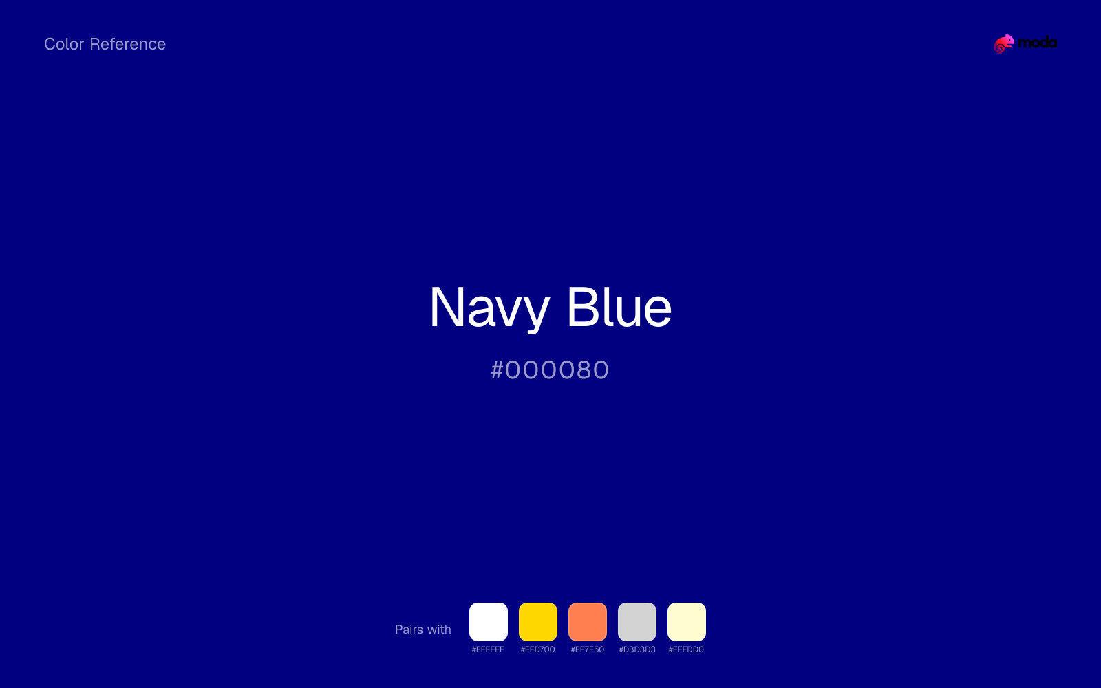
#000080
RGB
0, 0, 128
HSL
240°, 100%, 25%
HSV
240°, 100%, 50%
Navy blue (#000080) is the classic “serious blue” of uniforms, binders, and business decks: darker than royal blue, softer than black, and steady enough to carry whole layouts without drama. It earns its keep when a design needs authority without looking severe.
Best for
The default corporate palette — works for investor decks, board presentations, and client proposals across any industry.
Compare with
Accessibility
White text on navy blue passes AAA at 16.01:1, so it is safe for dark backgrounds and section headers.
How does navy blue compare to nearby colors?
What is the difference between navy blue and cobalt?
The main visual split is undertone: Navy Blue (#000080) feels more cool, while Cobalt (#0047AB) pulls in a different direction. Navy Blue brings more shadow to the system, so it handles contrast-heavy jobs more naturally than Cobalt. Start with navy blue when the palette wants more darker handling; switch to cobalt when the better fit is lighter handling.
What color is navy blue?
The name comes from naval uniforms, where dark blue offered formality while staying more forgiving than black in fabric and low light. In digital work it has become a default dark brand color because it preserves contrast and structure without feeling as stark as pure black.
Also known as: Navy.
What is the hex code for navy blue?
| Format | Value |
|---|---|
| HEX | #000080 |
| RGB | rgb(0, 0, 128) |
| HSL | hsl(240°, 100%, 25%) |
| HSV / HSB | hsv(240°, 100%, 50%) |
| CMYK (approx.) | cmyk(100%, 100%, 0%, 50%) |
Convert Navy Blue to other color formats
Open the color converter with Navy Blue (#000080) prefilled to copy RGB, HSL, HSV, CMYK, or OKLCH values.
Convert Navy Blue in the color converter →What does navy blue mean in design?
Navy blue is often associated with trust, discipline, and institutional calm. It feels less severe than black and less performative than brighter blues, which is why it works so well for reports, interfaces, and decks that need to read as dependable before they read as expressive.
How do I use navy blue in code?
| CSS (hex) | color: #000080; |
| CSS (rgb) | color: rgb(0, 0, 128); |
| CSS (hsl) | color: hsl(240, 100%, 25%); |
| RGB % | rgb(0%, 0%, 50%) |
| Tailwind | text-[#000080] |
| SwiftUI | Color(red: 0.000, green: 0.000, blue: 0.502) |
| UIKit | UIColor(red: 0.000, green: 0.000, blue: 0.502, alpha: 1.0) |
| Android | Color.rgb(0, 0, 128) |
| Compose | Color(0xFF000080) |
| Web Safe | #000099 |
Is navy blue accessible?
| Combination | Ratio | AA | AA lg | AAA | AAA lg | UI |
|---|---|---|---|---|---|---|
| AaWhite text on this color | 16.01:1 | ✓ | ✓ | ✓ | ✓ | ✓ |
| AaBlack text on this color | 1.31:1 | ✗ | ✗ | ✗ | ✗ | ✗ |
| AaThis color as text on white | 16.01:1 | ✓ | ✓ | ✓ | ✓ | ✓ |
| AaThis color as text on black | 1.31:1 | ✗ | ✗ | ✗ | ✗ | ✗ |
WCAG 2.1: AA normal ≥ 4.5:1, AA large text ≥ 3:1, AAA normal ≥ 7:1, AAA large ≥ 4.5:1, UI components ≥ 3:1.
How does navy blue look with color blindness?
Simulated appearance for common types of color vision deficiency. Actual perception varies by individual.
What colors go with navy blue
Pairing navy blue with white preserves readable hierarchy while keeping the swatch itself as the clear focal color.
Gold warms navy blue enough to keep the palette from feeling chilly or overly technical, while still reading intentional rather than decorative-for-its-own-sake.
Coral sits far enough away from navy blue in lightness that the pair reads cleanly at presentation distance instead of collapsing into one band.
Light Gray helps navy blue feel more complete in practice because the pairing combines navy ink qualities with paper, plaster, and interface chrome support instead of leaving the source color to do every job alone.
What colors clash with navy blue
Black pushes navy blue toward a more technical structure mood, which can fight the enterprise, finance, and tailored corporate systems role the source color usually handles best.
Dark Green sits too close to navy blue in both value and intensity, so the pair struggles to create clean separation for hierarchy.
Neon Green turns navy blue into something closer to screen glow than surface color, which is a mismatch for most editorial, product, or deck work.
How should I use navy blue in design?
- •Navy blue is the safest dark color for professional slides — it reads as authoritative without the starkness of black.
- •Use navy as your primary dark value and reserve black for text only. This adds warmth and sophistication to layouts.
- •Navy + white + one accent color (gold, coral, or sage) is a reliable three-color formula for any business presentation.
What are good navy blue palettes?
Corporate standard
The default corporate palette — works for investor decks, board presentations, and client proposals across any industry.
Modern professional
A warmer take on corporate — good for startups, consumer brands, and creative agencies presenting to enterprise clients.
Design with navy blue in Moda
Create a presentation or document using navy blueas your accent color. Moda's AI applies your color palette automatically.
Create a design with navy blue →What are the shades and tints of navy blue?
Shades (darker)
Tints (lighter)
Tones (desaturated)
Hue variations
What are the color harmonies for navy blue?
Harmonies are calculated from the base swatch. When a harmony matches a named color page, it links there; otherwise it appears here as a computed reference swatch.
Similar colors
Midnight Blue
Midnight Blue is nearly adjacent to navy blue in hue; what separates them is intensity, with midnight blue reading dustier and easier to extend across a layout.
Cobalt
Cobalt is useful when navy blue is the right weight but the wrong mood: the swap changes temperature and finish more than contrast.
Sapphire
Sapphire tracks close to navy blue in hue, but the value shift changes where each one earns its place: sapphire is easier to use for backgrounds, tints, and softer supporting areas, while navy blue holds onto accents, stronger hierarchy, and firmer structure.
Denim
Denim tracks close to navy blue in hue, but the value shift changes where each one earns its place: denim is easier to use for backgrounds, tints, and softer supporting areas, while navy blue holds onto accents, stronger hierarchy, and firmer structure.
Royal Blue
Royal Blue tracks close to navy blue in hue, but the value shift changes where each one earns its place: royal blue is easier to use for backgrounds, tints, and softer supporting areas, while navy blue holds onto accents, stronger hierarchy, and firmer structure.
Frequently asked questions
What is the hex code for navy blue?
The hex code for navy blue is #000080. In RGB, that's 0 red, 0 green, and 128 blue. The approximate CMYK equivalent is 100% cyan, 100% magenta, 0% yellow, and 50% key (black).
Is navy blue a warm or cool color?
Navy Blue falls on the cool side of the palette, so warm companions create the clearest contrast while other cool tones keep the system more restrained.
Should navy blue lead the palette or stay in supporting roles?
Navy Blue has enough chroma to take the lead, but it usually performs best when the surrounding system stays quieter. Treat it as the voice of emphasis, not the answer to every layout need.
Where does navy blue work best in a layout?
Navy Blue has enough depth to anchor a layout while still reading as a color, which makes it useful for dark section blocks, headlines, and heavier accents.
Is navy blue accessible?
Navy Blue is strong enough for white text at 16.01:1 contrast, so it can handle dark panels, tags, and section headers without much trouble. As text on white, though, it is usually better reserved for larger headings or short accents than for long paragraphs.
More blue colors
Keep exploring color resources
All color pages
Browse the full library of color references, pairings, and palettes.
Blue colors
Compare navy blue with other blue tones.
Green colors
Explore nearby color families to build stronger palettes and contrasts.
Neutral colors
Explore nearby color families to build stronger palettes and contrasts.
Purple colors
Explore nearby color families to build stronger palettes and contrasts.
Last updated April 6, 2026
Color values are computed from the listed hex code using standard conversion formulas. RGB, HSL, and HSV are exact screen-ready conversions. CMYK is an approximate on-screen reference, not a press-ready print specification. Pairings, palettes, and use-case guidance are heuristic recommendations derived from color relationships, contrast behavior, and common presentation, document, and UI patterns.