Magenta color guide
HEX
#FF00FF
RGB
255, 0, 255
HSL
300°, 100%, 50%
HSV
300°, 100%, 100%
Magenta is the synthetic shout between red and blue — so pure on RGB displays that it can feel like a primary color of light. #FF00FF does not pretend to be natural foliage; it is ink, LED, and printer calibration. Small doses read as accent, large fields can vibrate.
Best for
Product launches, promotional banners, and e-commerce storefronts.
Accessibility
Check contrast before using magenta for text-heavy layouts, especially on low-contrast backgrounds.
How does magenta compare to nearby colors?
What is the difference between magenta and orchid?
Orchid (#DA70D6) carries less pigment punch than Magenta (#FF00FF), so the pair separates by finish as much as hue. Magenta reads faster on screen, so it changes the palette from steady to attention-seeking more quickly than Orchid does. Choose magenta when the color needs to register quickly and act like the headline accent; keep orchid when the rest of the layout needs a quieter companion.
What color is magenta?
An extra-spectral color in additive systems. CMYK printing uses process magenta. It anchors neon signage, club lighting, and bold brand identities in tech and entertainment.
Also known as: Fuchsia. Some sources cite: #FF0090.
What is the hex code for magenta?
| Format | Value |
|---|---|
| HEX | #FF00FF |
| RGB | rgb(255, 0, 255) |
| HSL | hsl(300°, 100%, 50%) |
| HSV / HSB | hsv(300°, 100%, 100%) |
| CMYK (approx.) | cmyk(0%, 100%, 0%, 0%) |
Convert Magenta to other color formats
Open the color converter with Magenta (#FF00FF) prefilled to copy RGB, HSL, HSV, CMYK, or OKLCH values.
Convert Magenta in the color converter →What does magenta mean in design?
Magenta is often associated with boldness, futurism, and high visibility. Compared with orchid or violet, magenta tends to read harder-edged and more digital; compared with iris, it is less blue and more red-hot.
How do I use magenta in code?
| CSS (hex) | color: #FF00FF; |
| CSS (rgb) | color: rgb(255, 0, 255); |
| CSS (hsl) | color: hsl(300, 100%, 50%); |
| RGB % | rgb(100%, 0%, 100%) |
| Tailwind | text-[#FF00FF] |
| SwiftUI | Color(red: 1.000, green: 0.000, blue: 1.000) |
| UIKit | UIColor(red: 1.000, green: 0.000, blue: 1.000, alpha: 1.0) |
| Android | Color.rgb(255, 0, 255) |
| Compose | Color(0xFFFF00FF) |
| Web Safe | #FF00FF |
Is magenta accessible?
| Combination | Ratio | AA | AA lg | AAA | AAA lg | UI |
|---|---|---|---|---|---|---|
| AaWhite text on this color | 3.14:1 | ✗ | ✓ | ✗ | ✗ | ✓ |
| AaBlack text on this color | 6.7:1 | ✓ | ✓ | ✗ | ✓ | ✓ |
| AaThis color as text on white | 3.14:1 | ✗ | ✓ | ✗ | ✗ | ✓ |
| AaThis color as text on black | 6.7:1 | ✓ | ✓ | ✗ | ✓ | ✓ |
WCAG 2.1: AA normal ≥ 4.5:1, AA large text ≥ 3:1, AAA normal ≥ 7:1, AAA large ≥ 4.5:1, UI components ≥ 3:1.
How does magenta look with color blindness?
Simulated appearance for common types of color vision deficiency. Actual perception varies by individual.
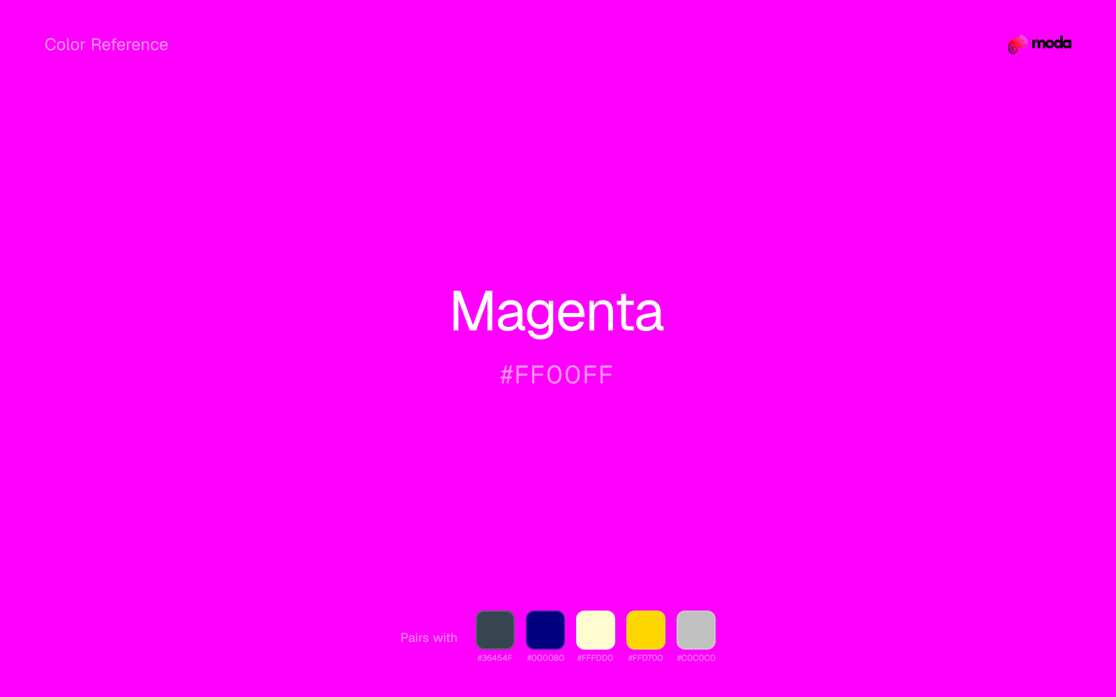
What colors go with magenta
Charcoal gives magenta a darker, quieter partner, which helps vivid accents look deliberate instead of loud for their own sake.
Navy blue reins in magenta without deadening it, which is useful when you want warmth to stay present but not dominate every part of the page.
Cream takes the hard digital edge off magenta and makes the color feel more printed, paper-backed, and approachable.
What colors clash with magenta
Neon Green beside magenta tends to vibrate on bright displays, so the pair reads more like a HUD effect than a considered brand palette.
Cyan redirects magenta toward a more technical, backlit interpretation, which is risky when the goal is warmth, polish, or print-minded editorial work.
How should I use magenta in design?
- •Magenta has the saturation to lead a brand palette — strong enough for buttons, headers, and packaging without drifting into pastel or dark territory.
- •Pair magenta with cool accents (navy, sage, steel blue) for sharp contrast, or keep it with other warm tones (cream, gold, tan) for a cohesive, editorial feel.
- •Vivid colors like magenta work best as punctuation in a layout: CTAs, key metrics, or a single hero element. Surrounding neutrals keep it from fatiguing the viewer.
What are good magenta palettes?
Design with magenta in Moda
Create a presentation or document using magentaas your accent color. Moda's AI applies your color palette automatically.
Create a design with magenta →What are the shades and tints of magenta?
Shades (darker)
Tints (lighter)
Tones (desaturated)
Hue variations
What are the color harmonies for magenta?
Harmonies are calculated from the base swatch. When a harmony matches a named color page, it links there; otherwise it appears here as a computed reference swatch.
Similar colors
Orchid
Orchid tracks close to magenta in hue, but the value shift changes where each one earns its place: orchid is easier to use for backgrounds, tints, and softer supporting areas, while magenta holds onto accents, stronger hierarchy, and firmer structure.
Violet
Violet occupies a similar depth to magenta, though it pushes the family toward a more cool-leaning reading and a different material feel.
Rose
Rose keeps roughly the same visual weight as magenta but changes the undertone story, which is often enough to move a palette from warmer and tactile to cooler and more technical, or the reverse.
Purple
Purple tracks close to magenta in hue, but the value shift changes where each one earns its place: purple is easier to use for headlines, anchors, and darker sections, while magenta holds onto lighter surfaces and more open applications.
Hot Pink
Hot Pink stays in the same color family as magenta, but the change in value moves it into different layout jobs, especially once backgrounds, charts, or section dividers enter the system.
Frequently asked questions
What is the hex code for magenta?
The hex code for magenta is #FF00FF. In RGB, that's 255 red, 0 green, and 255 blue. The approximate CMYK equivalent is 0% cyan, 100% magenta, 0% yellow, and 0% key (black).
Is magenta a warm or cool color?
Magenta sits near the warm-cool boundary but tips warm, which makes the surrounding neutrals especially important in deciding how the palette finally reads.
Is magenta better as an accent or a full-palette color?
Magenta is usually best when it leads in short bursts rather than covering everything. It can headline a palette, but most layouts work better when the color handles accents, highlights, or one main hero role instead of every surface.
How should I use magenta in a design?
Magenta is vivid enough to work best in controlled doses such as CTAs, highlighted metrics, chart accents, or a single hero element. Surround it with quieter neutrals so it does not exhaust the layout.
Can I use magenta for text or backgrounds?
Magenta works better with dark text than white text. Black text reaches 6.7:1 contrast on the swatch, which makes the color more usable as a background or highlight surface than as a dark panel.
More purple colors
Keep exploring color resources
All color pages
Browse the full library of color references, pairings, and palettes.
Purple colors
Compare magenta with other purple tones.
Blue colors
Explore nearby color families to build stronger palettes and contrasts.
Neutral colors
Explore nearby color families to build stronger palettes and contrasts.
Pink colors
Explore nearby color families to build stronger palettes and contrasts.
Last updated April 6, 2026
Color values are computed from the listed hex code using standard conversion formulas. RGB, HSL, and HSV are exact screen-ready conversions. CMYK is an approximate on-screen reference, not a press-ready print specification. Pairings, palettes, and use-case guidance are heuristic recommendations derived from color relationships, contrast behavior, and common presentation, document, and UI patterns.