Orchid meaning and palette guide
HEX
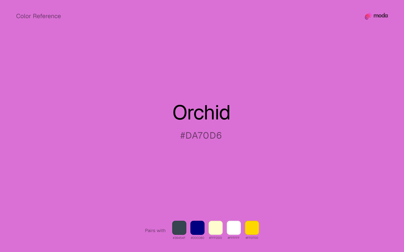
#DA70D6
RGB
218, 112, 214
HSL
302°, 59%, 65%
HSV
302°, 49%, 85%
Orchid is a garden-party purple — bright, pink-leaning, and unmistakably floral on a screen. #DA70D6 has enough saturation to compete with magentas but usually feels a touch softer and more botanical. It is a go-to when a palette needs "fun purple" without full neon.
Best for
Trade show graphics, signage, and booth displays.
Accessibility
Check contrast before using orchid for text-heavy layouts, especially on low-contrast backgrounds.
How does orchid compare to nearby colors?
What is the difference between orchid and lilac?
Orchid (#DA70D6) feels more signal-like on screen, while Lilac (#C8A2C8) pushes the family in the opposite direction. Orchid is more useful when the color itself needs to do some signaling; Lilac is easier to keep in longer-running surfaces. Use orchid when you want more pigment and immediate screen energy, and lilac when the same family should feel calmer or more spreadable.
What color is orchid?
Named after orchid flowers. Frequent in tropical resort branding, cosmetics, and event design.
What is the hex code for orchid?
| Format | Value |
|---|---|
| HEX | #DA70D6 |
| RGB | rgb(218, 112, 214) |
| HSL | hsl(302°, 59%, 65%) |
| HSV / HSB | hsv(302°, 49%, 85%) |
| CMYK (approx.) | cmyk(0%, 49%, 2%, 15%) |
Convert Orchid to other color formats
Open the color converter with Orchid (#DA70D6) prefilled to copy RGB, HSL, HSV, CMYK, or OKLCH values.
Convert Orchid in the color converter →What does orchid mean in design?
Orchid is often associated with celebration, flirtation, and exotic appeal. Compared with violet, orchid tends to read punchier and more tropical; compared with magenta, it often feels slightly rounder and less purely synthetic.
How do I use orchid in code?
| CSS (hex) | color: #DA70D6; |
| CSS (rgb) | color: rgb(218, 112, 214); |
| CSS (hsl) | color: hsl(302, 59%, 65%); |
| RGB % | rgb(85%, 44%, 84%) |
| Tailwind | text-[#DA70D6] |
| SwiftUI | Color(red: 0.855, green: 0.439, blue: 0.839) |
| UIKit | UIColor(red: 0.855, green: 0.439, blue: 0.839, alpha: 1.0) |
| Android | Color.rgb(218, 112, 214) |
| Compose | Color(0xFFDA70D6) |
| Web Safe | #CC66CC |
Is orchid accessible?
| Combination | Ratio | AA | AA lg | AAA | AAA lg | UI |
|---|---|---|---|---|---|---|
| AaWhite text on this color | 2.89:1 | ✗ | ✗ | ✗ | ✗ | ✗ |
| AaBlack text on this color | 7.27:1 | ✓ | ✓ | ✓ | ✓ | ✓ |
| AaThis color as text on white | 2.89:1 | ✗ | ✗ | ✗ | ✗ | ✗ |
| AaThis color as text on black | 7.27:1 | ✓ | ✓ | ✓ | ✓ | ✓ |
WCAG 2.1: AA normal ≥ 4.5:1, AA large text ≥ 3:1, AAA normal ≥ 7:1, AAA large ≥ 4.5:1, UI components ≥ 3:1.
How does orchid look with color blindness?
Simulated appearance for common types of color vision deficiency. Actual perception varies by individual.
What colors go with orchid
Charcoal lets orchid stay light and atmospheric while still giving the layout a readable dark value for text and hierarchy.
Navy blue reins in orchid without deadening it, which is useful when you want warmth to stay present but not dominate every part of the page.
Pairing orchid with cream keeps the palette relaxed and material, which is useful when a bright white would feel too crisp.
What colors clash with orchid
Neon Green beside orchid tends to vibrate on bright displays, so the pair reads more like a HUD effect than a considered brand palette.
Magenta pushes orchid toward a nightclub or cosmetic register that is hard to square with calmer editorial or product work.
How should I use orchid in design?
- •Use orchid for buttons, badges, and chart accents where it can stand out. Test text contrast with WCAG tools before using it for body copy on light backgrounds.
- •Orchid leans warm, so cool counterparts like navy, teal, or slate create the cleanest contrast. For a softer, tonal look, stay within neighboring warm hues and let value differences do the work.
- •Orchid works in beauty, creative-agency, and premium-product contexts where the brand wants to feel distinctive without resorting to standard corporate blue.
What are good orchid palettes?
Design with orchid in Moda
Create a presentation or document using orchidas your accent color. Moda's AI applies your color palette automatically.
Create a design with orchid →What are the shades and tints of orchid?
Shades (darker)
Tints (lighter)
Tones (desaturated)
Hue variations
What are the color harmonies for orchid?
Harmonies are calculated from the base swatch. When a harmony matches a named color page, it links there; otherwise it appears here as a computed reference swatch.
Similar colors
Lilac
Lilac is almost the same hue as orchid; the real difference is value, with lilac feeling more open and surface-friendly.
Wisteria
Wisteria occupies a similar depth to orchid, though it pushes the family toward a more warm-leaning reading and a different material feel.
Amethyst
Amethyst occupies a similar depth to orchid, though it pushes the family toward a more cool-leaning reading and a different material feel.
Hot Pink
Hot Pink is useful when orchid is the right weight but the wrong mood: the swap changes temperature and finish more than contrast.
Mulberry
Mulberry tracks close to orchid in hue, but the value shift changes where each one earns its place: mulberry is easier to use for headlines, anchors, and darker sections, while orchid holds onto lighter surfaces and more open applications.
Frequently asked questions
What is the hex code for orchid?
The hex code for orchid is #DA70D6. In RGB, that's 218 red, 112 green, and 214 blue. The approximate CMYK equivalent is 0% cyan, 49% magenta, 2% yellow, and 15% key (black).
Is orchid a warm or cool color?
Orchid reads as warm. It feels most natural with creams, golds, rusts, and other warm accents, while cooler partners like navy or teal create sharper contrast.
Where does orchid work best in a layout?
Orchid is flexible enough to move between accents, section blocks, and supporting roles depending on the contrast around it. It works best when the rest of the palette gives it a clear job instead of asking it to do everything at once.
How should I use orchid in a design?
Orchid is versatile enough for headlines, accent bars, buttons, charts, or section backgrounds depending on the contrast around it. It works as either a primary or supporting color in decks, documents, and brand systems.
Can I use orchid for text or backgrounds?
Orchid works better with dark text than white text. Black text reaches 7.27:1 contrast on the swatch, which makes the color more usable as a background or highlight surface than as a dark panel.
More purple colors
Keep exploring color resources
All color pages
Browse the full library of color references, pairings, and palettes.
Purple colors
Compare orchid with other purple tones.
Blue colors
Explore nearby color families to build stronger palettes and contrasts.
Neutral colors
Explore nearby color families to build stronger palettes and contrasts.
Pink colors
Explore nearby color families to build stronger palettes and contrasts.
Last updated April 6, 2026
Color values are computed from the listed hex code using standard conversion formulas. RGB, HSL, and HSV are exact screen-ready conversions. CMYK is an approximate on-screen reference, not a press-ready print specification. Pairings, palettes, and use-case guidance are heuristic recommendations derived from color relationships, contrast behavior, and common presentation, document, and UI patterns.