Wisteria meaning and palette guide
HEX
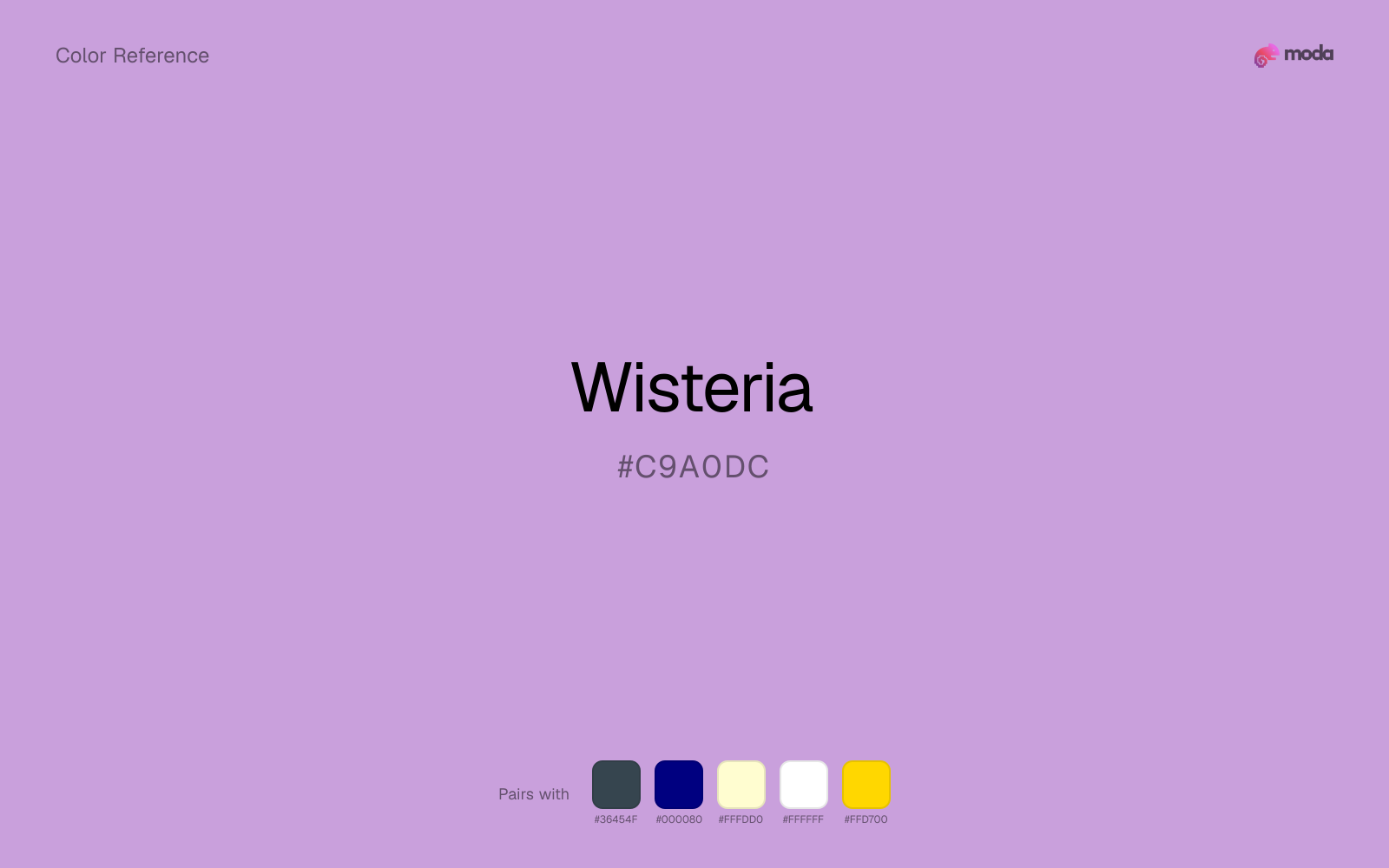
#C9A0DC
RGB
201, 160, 220
HSL
281°, 46%, 75%
HSV
281°, 27%, 86%
Wisteria hangs in soft cascades as a color idea — light purple with a cool, slightly gray veil. #C9A0DC suggests pergolas and late spring light more than nightclub glow. Large UI surfaces in wisteria stay calm because the chroma stays restrained.
Best for
Mobile app interfaces, onboarding screens, and light-mode UI themes.
Accessibility
Check contrast before using wisteria for text-heavy layouts, especially on low-contrast backgrounds.
How does wisteria compare to nearby colors?
What is the difference between wisteria and lilac?
Wisteria (#C9A0DC) feels more signal-like on screen, while Lilac (#C8A2C8) pushes the family in the opposite direction. Wisteria and Lilac can fill many of the same slots, but one steers the palette toward working chroma and the other toward muted chroma. Choose wisteria when the surrounding system aligns better with working chroma, and move to lilac when the stronger contextual fit is muted chroma.
What color is wisteria?
Named for Wisteria vines. Popular in wedding florals, stationery, and interior trends pairing pale purples with neutrals.
What is the hex code for wisteria?
| Format | Value |
|---|---|
| HEX | #C9A0DC |
| RGB | rgb(201, 160, 220) |
| HSL | hsl(281°, 46%, 75%) |
| HSV / HSB | hsv(281°, 27%, 86%) |
| CMYK (approx.) | cmyk(9%, 27%, 0%, 14%) |
Convert Wisteria to other color formats
Open the color converter with Wisteria (#C9A0DC) prefilled to copy RGB, HSL, HSV, CMYK, or OKLCH values.
Convert Wisteria in the color converter →What does wisteria mean in design?
Wisteria is often associated with romance, ease, and airy elegance. Versus lilac, wisteria tends to read a shade cooler and more misted; versus mauve, it is often less dusty-rose and more lavender-leaning.
How do I use wisteria in code?
| CSS (hex) | color: #C9A0DC; |
| CSS (rgb) | color: rgb(201, 160, 220); |
| CSS (hsl) | color: hsl(281, 46%, 75%); |
| RGB % | rgb(79%, 63%, 86%) |
| Tailwind | text-[#C9A0DC] |
| SwiftUI | Color(red: 0.788, green: 0.627, blue: 0.863) |
| UIKit | UIColor(red: 0.788, green: 0.627, blue: 0.863, alpha: 1.0) |
| Android | Color.rgb(201, 160, 220) |
| Compose | Color(0xFFC9A0DC) |
| Web Safe | #CC99CC |
Is wisteria accessible?
| Combination | Ratio | AA | AA lg | AAA | AAA lg | UI |
|---|---|---|---|---|---|---|
| AaWhite text on this color | 2.2:1 | ✗ | ✗ | ✗ | ✗ | ✗ |
| AaBlack text on this color | 9.55:1 | ✓ | ✓ | ✓ | ✓ | ✓ |
| AaThis color as text on white | 2.2:1 | ✗ | ✗ | ✗ | ✗ | ✗ |
| AaThis color as text on black | 9.55:1 | ✓ | ✓ | ✓ | ✓ | ✓ |
WCAG 2.1: AA normal ≥ 4.5:1, AA large text ≥ 3:1, AAA normal ≥ 7:1, AAA large ≥ 4.5:1, UI components ≥ 3:1.
How does wisteria look with color blindness?
Simulated appearance for common types of color vision deficiency. Actual perception varies by individual.
What colors go with wisteria
Charcoal balances wisteria by turning the palette into a usable light-dark system rather than a field of soft midtones.
Because wisteria already carries warmth, navy blue gives the pair a steadier backbone and keeps it closer to editorial systems than to one-note seasonal color.
Pairing wisteria with cream keeps the palette relaxed and material, which is useful when a bright white would feel too crisp.
What colors clash with wisteria
Neon Green beside wisteria tends to vibrate on bright displays, so the pair reads more like a HUD effect than a considered brand palette.
Magenta pushes wisteria toward a nightclub or cosmetic register that is hard to square with calmer editorial or product work.
How should I use wisteria in design?
- •Use wisteria for soft backgrounds and supporting surfaces rather than foreground text — it creates a gentle atmosphere while keeping the layout open and readable.
- •Wisteria leans warm, so cool counterparts like navy, teal, or slate create the cleanest contrast. For a softer, tonal look, stay within neighboring warm hues and let value differences do the work.
- •Wisteria works in beauty, creative-agency, and premium-product contexts where the brand wants to feel distinctive without resorting to standard corporate blue.
What are good wisteria palettes?
Vivid clarity
Mobile app interfaces, onboarding screens, and light-mode UI themes.
Design with wisteria in Moda
Create a presentation or document using wisteriaas your accent color. Moda's AI applies your color palette automatically.
Create a design with wisteria →What are the shades and tints of wisteria?
Shades (darker)
Tints (lighter)
Tones (desaturated)
Hue variations
What are the color harmonies for wisteria?
Harmonies are calculated from the base swatch. When a harmony matches a named color page, it links there; otherwise it appears here as a computed reference swatch.
Similar colors
Lilac
Lilac occupies a similar depth to wisteria, though it pushes the family toward a more warm-leaning reading and a different material feel.
Mauve
Mauve is almost the same hue as wisteria; the real difference is value, with mauve feeling more open and surface-friendly.
Orchid
Orchid keeps roughly the same visual weight as wisteria but changes the undertone story, which is often enough to move a palette from warmer and tactile to cooler and more technical, or the reverse.
Amethyst
Amethyst tracks close to wisteria in hue, but the value shift changes where each one earns its place: amethyst is easier to use for headlines, anchors, and darker sections, while wisteria holds onto lighter surfaces and more open applications.
Royal Purple
Royal Purple is close enough to wisteria to keep the palette cohesive, yet the lighter-darker shift still decides whether the family behaves more like atmosphere or more like structure.
Frequently asked questions
What is the hex code for wisteria?
The hex code for wisteria is #C9A0DC. In RGB, that's 201 red, 160 green, and 220 blue. The approximate CMYK equivalent is 9% cyan, 27% magenta, 0% yellow, and 14% key (black).
Is wisteria a warm or cool color?
Wisteria leans warm without feeling fully heat-driven, so you can push it warmer with cream, tan, or gold or balance it with cooler blues and slates.
Is wisteria better for accents, structure, or surfaces?
Wisteria sits in the usable middle: strong enough to anchor a section or call attention to a key moment, but calm enough to support a broader system when the surrounding values are well managed.
Where does wisteria work best in a layout?
Wisteria is better on broad surfaces than in tiny details, so treat it as a background or support color and let darker accents carry the sharp hierarchy.
Is wisteria accessible?
Wisteria works better with dark text than white text. Black text reaches 9.55:1 contrast on the swatch, which makes the color more usable as a background or highlight surface than as a dark panel.
More purple colors
Keep exploring color resources
All color pages
Browse the full library of color references, pairings, and palettes.
Purple colors
Compare wisteria with other purple tones.
Blue colors
Explore nearby color families to build stronger palettes and contrasts.
Neutral colors
Explore nearby color families to build stronger palettes and contrasts.
Pink colors
Explore nearby color families to build stronger palettes and contrasts.
Last updated April 6, 2026
Color values are computed from the listed hex code using standard conversion formulas. RGB, HSL, and HSV are exact screen-ready conversions. CMYK is an approximate on-screen reference, not a press-ready print specification. Pairings, palettes, and use-case guidance are heuristic recommendations derived from color relationships, contrast behavior, and common presentation, document, and UI patterns.