Amethyst color guide
HEX
#9966CC
RGB
153, 102, 204
HSL
270°, 50%, 60%
HSV
270°, 50%, 80%
Amethyst carries the cool gleam of cut quartz — purple with a mineral clarity rather than a candy sheen. #9966CC feels "designed" in the sense of faceted jewelry and luxury packaging. As a mid-tone, it bridges accent blocks and body copy backgrounds better than neon magentas.
Best for
Event branding, newsletters, and customer-facing web pages.
Accessibility
Check contrast before using amethyst for text-heavy layouts, especially on low-contrast backgrounds.
How does amethyst compare to nearby colors?
What is the difference between amethyst and slate blue?
The main visual split is undertone: Amethyst (#9966CC) feels more cool, while Slate Blue (#6A5ACD) pulls in a different direction. Amethyst and Slate Blue are close enough to substitute for each other, but they do not create the same supporting cast once typography, photography, and neutrals are added. Start with amethyst when the palette wants more dusky violet; switch to slate blue when the better fit is denim or slate.
What color is amethyst?
Named for the violet variety of quartz. Widely used in jewelry marketing, wellness branding, and premium cosmetics.
What is the hex code for amethyst?
| Format | Value |
|---|---|
| HEX | #9966CC |
| RGB | rgb(153, 102, 204) |
| HSL | hsl(270°, 50%, 60%) |
| HSV / HSB | hsv(270°, 50%, 80%) |
| CMYK (approx.) | cmyk(25%, 50%, 0%, 20%) |
Convert Amethyst to other color formats
Open the color converter with Amethyst (#9966CC) prefilled to copy RGB, HSL, HSV, CMYK, or OKLCH values.
Convert Amethyst in the color converter →What does amethyst mean in design?
Amethyst is often associated with refinement, introspection, and a composed luxury. It tends to read cooler and more crystalline than royal purple, and less sugary than orchid or violet.
How do I use amethyst in code?
| CSS (hex) | color: #9966CC; |
| CSS (rgb) | color: rgb(153, 102, 204); |
| CSS (hsl) | color: hsl(270, 50%, 60%); |
| RGB % | rgb(60%, 40%, 80%) |
| Tailwind | text-[#9966CC] |
| SwiftUI | Color(red: 0.600, green: 0.400, blue: 0.800) |
| UIKit | UIColor(red: 0.600, green: 0.400, blue: 0.800, alpha: 1.0) |
| Android | Color.rgb(153, 102, 204) |
| Compose | Color(0xFF9966CC) |
| Web Safe | #9966CC |
Is amethyst accessible?
| Combination | Ratio | AA | AA lg | AAA | AAA lg | UI |
|---|---|---|---|---|---|---|
| AaWhite text on this color | 4.1:1 | ✗ | ✓ | ✗ | ✗ | ✓ |
| AaBlack text on this color | 5.13:1 | ✓ | ✓ | ✗ | ✓ | ✓ |
| AaThis color as text on white | 4.1:1 | ✗ | ✓ | ✗ | ✗ | ✓ |
| AaThis color as text on black | 5.13:1 | ✓ | ✓ | ✗ | ✓ | ✓ |
WCAG 2.1: AA normal ≥ 4.5:1, AA large text ≥ 3:1, AAA normal ≥ 7:1, AAA large ≥ 4.5:1, UI components ≥ 3:1.
How does amethyst look with color blindness?
Simulated appearance for common types of color vision deficiency. Actual perception varies by individual.
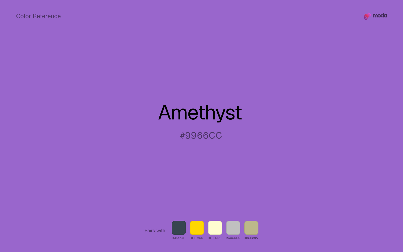
What colors go with amethyst
Pairing amethyst with charcoal adds useful depth while keeping the palette flexible for interfaces, decks, and editorial layouts.
Gold gives amethyst a warmer highlight, which helps the palette feel more tactile and less screen-native than it would with only neutrals.
Cream gives amethyst a quieter backdrop and preserves a more natural editorial feel than a colder off-white would.
Silver acts more like structure than spectacle beside amethyst, which is often exactly what a stronger source color needs.
Sage Green shifts amethyst away from a purely cool read and makes the combination feel more considered in real layouts.
What colors clash with amethyst
With amethyst, Neon Green pulls the palette toward LED signage and away from the dusky violet quality that makes the source color usable.
Magenta remaps amethyst too aggressively, dragging it away from vintage editorial and art-school palettes and into a brighter, more performative palette.
How should I use amethyst in design?
- •Use amethyst for buttons, badges, and chart accents where it can stand out. Test text contrast with WCAG tools before using it for body copy on light backgrounds.
- •Pair amethyst with warm accents (gold, rust, amber) when you need more energy, or stay in cool territory (navy, silver, sage) for a composed, professional look.
- •Amethyst works in beauty, creative-agency, and premium-product contexts where the brand wants to feel distinctive without resorting to standard corporate blue.
What are good amethyst palettes?
Morning palette
Event branding, newsletters, and customer-facing web pages.
Design with amethyst in Moda
Create a presentation or document using amethystas your accent color. Moda's AI applies your color palette automatically.
Create a design with amethyst →What are the shades and tints of amethyst?
Shades (darker)
Tints (lighter)
Tones (desaturated)
Hue variations
What are the color harmonies for amethyst?
Harmonies are calculated from the base swatch. When a harmony matches a named color page, it links there; otherwise it appears here as a computed reference swatch.
Similar colors
Royal Purple
Royal Purple is almost the same hue as amethyst; the real difference is value, with royal purple feeling more grounded and anchor-ready.
Slate Blue
Slate Blue keeps roughly the same visual weight as amethyst but changes the undertone story, which is often enough to move a palette from warmer and tactile to cooler and more technical, or the reverse.
Grape
Grape stays in the same color family as amethyst, but the change in value moves it into different layout jobs, especially once backgrounds, charts, or section dividers enter the system.
Wisteria
Wisteria is close enough to amethyst to keep the palette cohesive, yet the lighter-darker shift still decides whether the family behaves more like atmosphere or more like structure.
Iris
Iris occupies a similar depth to amethyst, though it pushes the family toward a more cool reading and a different material feel.
Frequently asked questions
What is the hex code for amethyst?
The hex code for amethyst is #9966CC. In RGB, that's 153 red, 102 green, and 204 blue. The approximate CMYK equivalent is 25% cyan, 50% magenta, 0% yellow, and 20% key (black).
Is amethyst a warm or cool color?
Amethyst sits near the center of the temperature scale but tips cool, which gives you room to steer the palette warmer or cooler with the surrounding accents.
Where does amethyst work best in a layout?
Amethyst is flexible enough to move between accents, section blocks, and supporting roles depending on the contrast around it. It works best when the rest of the palette gives it a clear job instead of asking it to do everything at once.
How should I use amethyst in a design?
Amethyst is versatile enough for headlines, accent bars, buttons, charts, or section backgrounds depending on the contrast around it. It works as either a primary or supporting color in decks, documents, and brand systems.
Can I use amethyst for text or backgrounds?
Amethyst works better with dark text than white text. Black text reaches 5.13:1 contrast on the swatch, which makes the color more usable as a background or highlight surface than as a dark panel.
More purple colors
Keep exploring color resources
All color pages
Browse the full library of color references, pairings, and palettes.
Purple colors
Compare amethyst with other purple tones.
Blue colors
Explore nearby color families to build stronger palettes and contrasts.
Neutral colors
Explore nearby color families to build stronger palettes and contrasts.
Pink colors
Explore nearby color families to build stronger palettes and contrasts.
Last updated April 6, 2026
Color values are computed from the listed hex code using standard conversion formulas. RGB, HSL, and HSV are exact screen-ready conversions. CMYK is an approximate on-screen reference, not a press-ready print specification. Pairings, palettes, and use-case guidance are heuristic recommendations derived from color relationships, contrast behavior, and common presentation, document, and UI patterns.