Grape color guide
HEX
#6F2DA8
RGB
111, 45, 168
HSL
272°, 58%, 42%
HSV
272°, 73%, 66%
Grape is the juicy mid-deep purple people imagine on a cluster — vivid enough to pop, deep enough to feel indulgent. #6F2DA8 telegraphs flavor and fruit before it telegraphs royalty. In sports and youth branding it reads energetic rather than ceremonial.
Best for
SaaS dashboards, admin panels, and professional UI themes.
Accessibility
White text on grape passes AAA at 8.03:1, so it is safe for dark backgrounds and section headers.
How does grape compare to nearby colors?
What is the difference between grape and royal purple?
Royal Purple (#7851A9) carries less pigment punch than Grape (#6F2DA8), so the pair separates by finish as much as hue. Grape reads faster on screen, so it changes the palette from steady to attention-seeking more quickly than Royal Purple does. Start with grape when the palette wants more darker handling; switch to royal purple when the better fit is lighter handling.
What color is grape?
Common in food and beverage labeling, candy, athletic apparel, and children's products. "Grape flavor" in industry often maps to artificial purple-violet hues rather than natural fruit color.
What is the hex code for grape?
| Format | Value |
|---|---|
| HEX | #6F2DA8 |
| RGB | rgb(111, 45, 168) |
| HSL | hsl(272°, 58%, 42%) |
| HSV / HSB | hsv(272°, 73%, 66%) |
| CMYK (approx.) | cmyk(34%, 73%, 0%, 34%) |
Convert Grape to other color formats
Open the color converter with Grape (#6F2DA8) prefilled to copy RGB, HSL, HSV, CMYK, or OKLCH values.
Convert Grape in the color converter →What does grape mean in design?
Grape is often associated with playfulness, appetite, and high-energy fun. Versus royal purple, grape tends to read more casual and saturated; versus eggplant, it is brighter and less brown.
How do I use grape in code?
| CSS (hex) | color: #6F2DA8; |
| CSS (rgb) | color: rgb(111, 45, 168); |
| CSS (hsl) | color: hsl(272, 58%, 42%); |
| RGB % | rgb(44%, 18%, 66%) |
| Tailwind | text-[#6F2DA8] |
| SwiftUI | Color(red: 0.435, green: 0.176, blue: 0.659) |
| UIKit | UIColor(red: 0.435, green: 0.176, blue: 0.659, alpha: 1.0) |
| Android | Color.rgb(111, 45, 168) |
| Compose | Color(0xFF6F2DA8) |
| Web Safe | #663399 |
Is grape accessible?
| Combination | Ratio | AA | AA lg | AAA | AAA lg | UI |
|---|---|---|---|---|---|---|
| AaWhite text on this color | 8.03:1 | ✓ | ✓ | ✓ | ✓ | ✓ |
| AaBlack text on this color | 2.62:1 | ✗ | ✗ | ✗ | ✗ | ✗ |
| AaThis color as text on white | 8.03:1 | ✓ | ✓ | ✓ | ✓ | ✓ |
| AaThis color as text on black | 2.62:1 | ✗ | ✗ | ✗ | ✗ | ✗ |
WCAG 2.1: AA normal ≥ 4.5:1, AA large text ≥ 3:1, AAA normal ≥ 7:1, AAA large ≥ 4.5:1, UI components ≥ 3:1.
How does grape look with color blindness?
Simulated appearance for common types of color vision deficiency. Actual perception varies by individual.
What colors go with grape
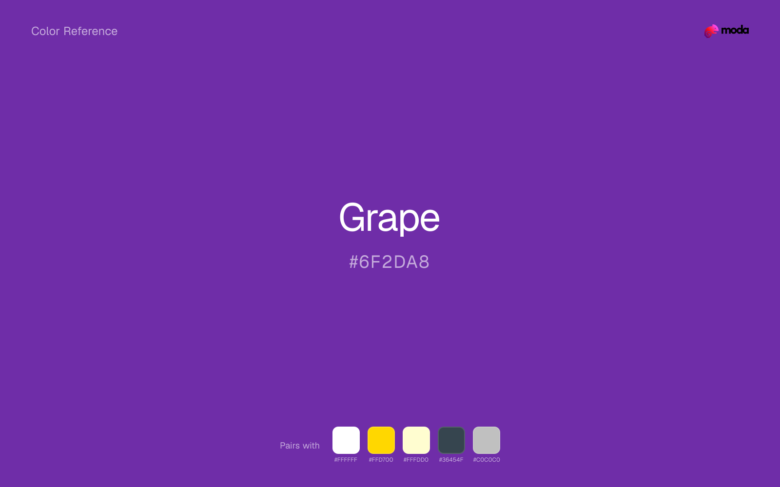
White sharpens grape without cooling it off, which is useful when you need a clean interface or slide layout around the color.
With a cooler color like grape, gold adds richness and turns the system toward premium packaging, hospitality, or ceremonial branding.
Pairing grape with cream keeps the palette relaxed and material, which is useful when a bright white would feel too crisp.
What colors clash with grape
Neon Green turns grape into something closer to screen glow than surface color, which is a mismatch for most editorial, product, or deck work.
With grape, magenta introduces a second emotional story instead of reinforcing the first one, so the palette can feel internally split.
How should I use grape in design?
- •Use grape for headlines, sidebar accents, and key data points where you need strong presence without going full dark-mode.
- •Warm touches like gold or coral bring out grape's cooler character by contrast, while staying with cool neighbors creates a calmer, more unified feel.
- •Grape works in beauty, creative-agency, and premium-product contexts where the brand wants to feel distinctive without resorting to standard corporate blue.
What are good grape palettes?
Dark precision
SaaS dashboards, admin panels, and professional UI themes.
Design with grape in Moda
Create a presentation or document using grapeas your accent color. Moda's AI applies your color palette automatically.
Create a design with grape →What are the shades and tints of grape?
Shades (darker)
Tints (lighter)
Tones (desaturated)
Hue variations
What are the color harmonies for grape?
Harmonies are calculated from the base swatch. When a harmony matches a named color page, it links there; otherwise it appears here as a computed reference swatch.
Similar colors
Royal Purple
Royal Purple is almost the same hue as grape; the real difference is value, with royal purple feeling more open and surface-friendly.
Amethyst
Amethyst is close enough to grape to keep the palette cohesive, yet the lighter-darker shift still decides whether the family behaves more like atmosphere or more like structure.
Indigo
Indigo stays in the same color family as grape, but the change in value moves it into different layout jobs, especially once backgrounds, charts, or section dividers enter the system.
Iris
Iris stays in the same color family as grape, but the change in value moves it into different layout jobs, especially once backgrounds, charts, or section dividers enter the system.
Plum
Plum is a nearby alternative to grape when the palette needs a different undertone or material cue more than a dramatic contrast change.
Frequently asked questions
What is the hex code for grape?
The hex code for grape is #6F2DA8. In RGB, that's 111 red, 45 green, and 168 blue. The approximate CMYK equivalent is 34% cyan, 73% magenta, 0% yellow, and 34% key (black).
Is grape a warm or cool color?
Grape sits near the center of the temperature scale but tips cool, which gives you room to steer the palette warmer or cooler with the surrounding accents.
Where does grape work best in a layout?
Grape is flexible enough to move between accents, section blocks, and supporting roles depending on the contrast around it. It works best when the rest of the palette gives it a clear job instead of asking it to do everything at once.
How should I use grape in a design?
Grape is versatile enough for headlines, accent bars, buttons, charts, or section backgrounds depending on the contrast around it. It works as either a primary or supporting color in decks, documents, and brand systems.
Can I use grape for text or backgrounds?
Grape is strong enough for white text at 8.03:1 contrast, so it can handle dark panels, tags, and section headers without much trouble. As text on white, though, it is usually better reserved for larger headings or short accents than for long paragraphs.
More purple colors
Keep exploring color resources
All color pages
Browse the full library of color references, pairings, and palettes.
Purple colors
Compare grape with other purple tones.
Blue colors
Explore nearby color families to build stronger palettes and contrasts.
Neutral colors
Explore nearby color families to build stronger palettes and contrasts.
Pink colors
Explore nearby color families to build stronger palettes and contrasts.
Last updated April 6, 2026
Color values are computed from the listed hex code using standard conversion formulas. RGB, HSL, and HSV are exact screen-ready conversions. CMYK is an approximate on-screen reference, not a press-ready print specification. Pairings, palettes, and use-case guidance are heuristic recommendations derived from color relationships, contrast behavior, and common presentation, document, and UI patterns.