Plum color guide
HEX
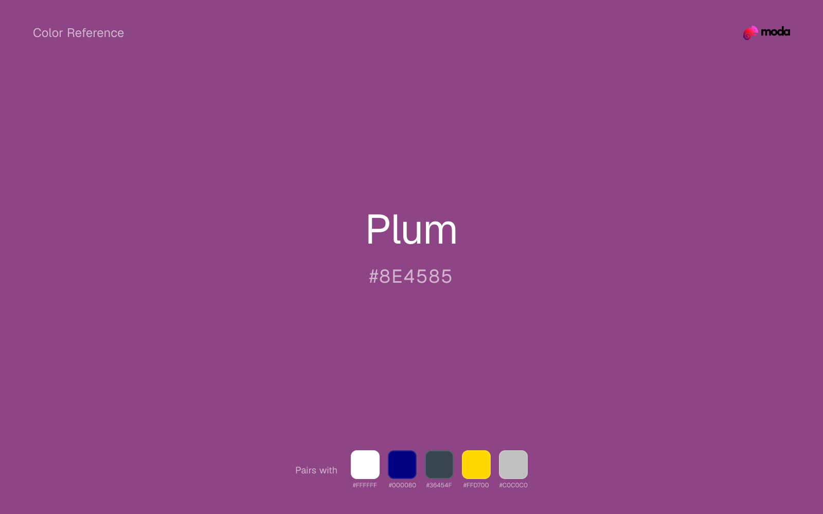
#8E4585
RGB
142, 69, 133
HSL
307°, 35%, 41%
HSV
307°, 51%, 56%
Plum (#8B008B) is a rich, dark purple that communicates luxury, creativity, and sophistication. It works as a bold alternative to burgundy or navy for brands seeking distinction.
Best for
Consulting deliverables, strategy documents, and data-driven layouts.
Accessibility
Plum text on white passes AA at 6.29:1, which makes it usable for headings and short labels.
How does plum compare to nearby colors?
What is the difference between plum and mulberry?
The main visual split is undertone: Plum (#8E4585) feels more warm, while Mulberry (#C54B8C) pulls in a different direction. Plum brings more shadow to the system, so it handles contrast-heavy jobs more naturally than Mulberry. Start with plum when the palette wants more violet-blue undertones; switch to mulberry when the better fit is berry-magenta undertones.
What color is plum?
Plum is a rich, dark purple associated with luxury, sophistication, and autumnal elegance. Named after the fruit, it sits between purple and burgundy on the spectrum and is frequently used in premium packaging, fashion, and upscale interior design.
What is the hex code for plum?
| Format | Value |
|---|---|
| HEX | #8E4585 |
| RGB | rgb(142, 69, 133) |
| HSL | hsl(307°, 35%, 41%) |
| HSV / HSB | hsv(307°, 51%, 56%) |
| CMYK (approx.) | cmyk(0%, 51%, 6%, 44%) |
Convert Plum to other color formats
Open the color converter with Plum (#8E4585) prefilled to copy RGB, HSL, HSV, CMYK, or OKLCH values.
Convert Plum in the color converter →What does plum mean in design?
Plum carries associations of royalty, wealth, and artistic sophistication. It is more grounded than brighter purples and more creative than dark reds, occupying a unique position for brands that want to feel premium and distinctive.
How do I use plum in code?
| CSS (hex) | color: #8E4585; |
| CSS (rgb) | color: rgb(142, 69, 133); |
| CSS (hsl) | color: hsl(307, 35%, 41%); |
| RGB % | rgb(56%, 27%, 52%) |
| Tailwind | text-[#8E4585] |
| SwiftUI | Color(red: 0.557, green: 0.271, blue: 0.522) |
| UIKit | UIColor(red: 0.557, green: 0.271, blue: 0.522, alpha: 1.0) |
| Android | Color.rgb(142, 69, 133) |
| Compose | Color(0xFF8E4585) |
| Web Safe | #993399 |
Is plum accessible?
| Combination | Ratio | AA | AA lg | AAA | AAA lg | UI |
|---|---|---|---|---|---|---|
| AaWhite text on this color | 6.29:1 | ✓ | ✓ | ✗ | ✓ | ✓ |
| AaBlack text on this color | 3.34:1 | ✗ | ✓ | ✗ | ✗ | ✓ |
| AaThis color as text on white | 6.29:1 | ✓ | ✓ | ✗ | ✓ | ✓ |
| AaThis color as text on black | 3.34:1 | ✗ | ✓ | ✗ | ✗ | ✓ |
WCAG 2.1: AA normal ≥ 4.5:1, AA large text ≥ 3:1, AAA normal ≥ 7:1, AAA large ≥ 4.5:1, UI components ≥ 3:1.
How does plum look with color blindness?
Simulated appearance for common types of color vision deficiency. Actual perception varies by individual.
What colors go with plum
White sharpens plum without cooling it off, which is useful when you need a clean interface or slide layout around the color.
Because plum already carries warmth, navy blue gives the pair a steadier backbone and keeps it closer to editorial systems than to one-note seasonal color.
Pairing plum with charcoal adds useful depth while keeping the palette flexible for interfaces, decks, and editorial layouts.
What colors clash with plum
Neon Green beside plum tends to vibrate on bright displays, so the pair reads more like a HUD effect than a considered brand palette.
Magenta remaps plum too aggressively, dragging it away from vintage editorial and art-school palettes and into a brighter, more performative palette.
How should I use plum in design?
- •Plum makes an excellent alternative to navy or burgundy for dark backgrounds — pair with gold or cream text.
- •Use plum as a primary color for creative and luxury brands that want to stand out from the blue-dominated corporate landscape.
- •Combine plum with blush and charcoal for a contemporary, gender-neutral palette.
What are good plum palettes?
Executive edge
Consulting deliverables, strategy documents, and data-driven layouts.
Design with plum in Moda
Create a presentation or document using plumas your accent color. Moda's AI applies your color palette automatically.
Create a design with plum →What are the shades and tints of plum?
Shades (darker)
Tints (lighter)
Tones (desaturated)
Hue variations
What are the color harmonies for plum?
Harmonies are calculated from the base swatch. When a harmony matches a named color page, it links there; otherwise it appears here as a computed reference swatch.
Similar colors
Mulberry
Mulberry tracks close to plum in hue, but the value shift changes where each one earns its place: mulberry is easier to use for backgrounds, tints, and softer supporting areas, while plum holds onto accents, stronger hierarchy, and firmer structure.
Eggplant
Eggplant is useful when plum is the right weight but the wrong mood: the swap changes temperature and finish more than contrast.
Grape
Grape is a nearby alternative to plum when the palette needs a different undertone or material cue more than a dramatic contrast change.
Royal Purple
Royal Purple is a nearby alternative to plum when the palette needs a different undertone or material cue more than a dramatic contrast change.
Purple
Purple stays in the same color family as plum, but the change in value moves it into different layout jobs, especially once backgrounds, charts, or section dividers enter the system.
Frequently asked questions
What is the hex code for plum?
The hex code for plum is #8E4585. In RGB, that's 142 red, 69 green, and 133 blue. The approximate CMYK equivalent is 0% cyan, 51% magenta, 6% yellow, and 44% key (black).
Is plum a warm or cool color?
Plum sits on the warm side of the palette, so it pairs easily with other warm tones and becomes more energetic when you place it against cooler blues or blue-grays.
Is plum better for accents, structure, or surfaces?
Plum sits in the usable middle: strong enough to anchor a section or call attention to a key moment, but calm enough to support a broader system when the surrounding values are well managed.
Where does plum work best in a layout?
Plum sits in the middle of the spectrum in a useful way: strong enough for emphasis, but controlled enough to support a broader brand or presentation system when the contrast is handled well.
Is plum accessible?
Plum can work as text on white at 6.29:1 contrast, but it is usually safest in headings, labels, and accent moments rather than long body copy.
More purple colors
Keep exploring color resources
All color pages
Browse the full library of color references, pairings, and palettes.
Purple colors
Compare plum with other purple tones.
Blue colors
Explore nearby color families to build stronger palettes and contrasts.
Neutral colors
Explore nearby color families to build stronger palettes and contrasts.
Pink colors
Explore nearby color families to build stronger palettes and contrasts.
Last updated April 6, 2026
Color values are computed from the listed hex code using standard conversion formulas. RGB, HSL, and HSV are exact screen-ready conversions. CMYK is an approximate on-screen reference, not a press-ready print specification. Pairings, palettes, and use-case guidance are heuristic recommendations derived from color relationships, contrast behavior, and common presentation, document, and UI patterns.