Using Silver in design
HEX
#C0C0C0
RGB
192, 192, 192
HSL
0°, 0%, 75%
HSV
0°, 0%, 75%
Silver glints the way polished metal does in diffuse light — bright but not quite paper-white. #C0C0C0 has a hint of sheen that makes it feel slightly celebratory without tipping into jewelry territory. On screens, it reads as "clean chrome" more than flat plaster.
Best for
Product launches, promotional banners, and e-commerce storefronts.
Accessibility
Check contrast before using silver for text-heavy layouts, especially on low-contrast backgrounds.
How does silver compare to nearby colors?
What is the difference between silver and dark gray?
Silver (#C0C0C0) and Dark Gray (#A9A9A9) are close enough that the split is more about finish than headline contrast: Silver feels more paper, plaster, and interface chrome, while Dark Gray reads more brushed gray. Silver makes the composition feel less compact, which is useful when the darker alternative starts to dominate too early. Begin with silver when the family needs its current undertone and surface character; keep dark gray for the nearby alternative that shifts the mood without leaving the same hue neighborhood.
What color is silver?
The name ties to elemental silver and historic coinage. Widely used in automotive, jewelry, and consumer electronics naming.
What is the hex code for silver?
| Format | Value |
|---|---|
| HEX | #C0C0C0 |
| RGB | rgb(192, 192, 192) |
| HSL | hsl(0°, 0%, 75%) |
| HSV / HSB | hsv(0°, 0%, 75%) |
| CMYK (approx.) | cmyk(0%, 0%, 0%, 25%) |
Convert Silver to other color formats
Open the color converter with Silver (#C0C0C0) prefilled to copy RGB, HSL, HSV, CMYK, or OKLCH values.
Convert Silver in the color converter →What does silver mean in design?
Silver is often associated with modernity, refinement, and a sleek sensibility. Next to light gray it tends to read as cooler and more metallic; compared with platinum it is typically less airy.
How do I use silver in code?
| CSS (hex) | color: #C0C0C0; |
| CSS (rgb) | color: rgb(192, 192, 192); |
| CSS (hsl) | color: hsl(0, 0%, 75%); |
| RGB % | rgb(75%, 75%, 75%) |
| Tailwind | text-[#C0C0C0] |
| SwiftUI | Color(red: 0.753, green: 0.753, blue: 0.753) |
| UIKit | UIColor(red: 0.753, green: 0.753, blue: 0.753, alpha: 1.0) |
| Android | Color.rgb(192, 192, 192) |
| Compose | Color(0xFFC0C0C0) |
| Web Safe | #CCCCCC |
Is silver accessible?
| Combination | Ratio | AA | AA lg | AAA | AAA lg | UI |
|---|---|---|---|---|---|---|
| AaWhite text on this color | 1.82:1 | ✗ | ✗ | ✗ | ✗ | ✗ |
| AaBlack text on this color | 11.54:1 | ✓ | ✓ | ✓ | ✓ | ✓ |
| AaThis color as text on white | 1.82:1 | ✗ | ✗ | ✗ | ✗ | ✗ |
| AaThis color as text on black | 11.54:1 | ✓ | ✓ | ✓ | ✓ | ✓ |
WCAG 2.1: AA normal ≥ 4.5:1, AA large text ≥ 3:1, AAA normal ≥ 7:1, AAA large ≥ 4.5:1, UI components ≥ 3:1.
How does silver look with color blindness?
Simulated appearance for common types of color vision deficiency. Actual perception varies by individual.
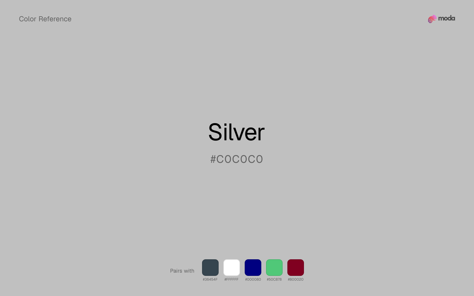
What colors go with silver
With silver on broader surfaces, charcoal adds enough depth to keep the system legible without the harsher edge of pure black.
White makes silver feel clearer and more breathable without pulling it warmer or cooler than it already is.
Navy blue gives bright silver the dark counterpart it needs for headings, controls, and chart labels to read cleanly.
What colors clash with silver
With a quiet color like silver, magenta rarely reads as a helpful accent; it overwhelms the base mood and makes the system feel less composed.
Light Gray sits too close to silver in value, so the palette can wash out before it ever establishes a clear hierarchy.
How should I use silver in design?
- •Use silver for soft backgrounds and supporting surfaces rather than foreground text — it creates a gentle atmosphere while keeping the layout open and readable.
- •Silver is versatile enough to support any palette direction. Pair it with one saturated accent for emphasis and one lighter neutral for breathing room.
- •Use silver where you need structure without personality: table borders, input fields, disabled states, and background scaffolding.
What are good silver palettes?
Clear signal
Product launches, promotional banners, and e-commerce storefronts.
Autumn light
Workshop handouts, training guides, and presentation templates.
Design with silver in Moda
Create a presentation or document using silveras your accent color. Moda's AI applies your color palette automatically.
Create a design with silver →What are the shades and tints of silver?
Shades (darker)
Tints (lighter)
Tones (desaturated)
Similar colors
Light Gray
Light Gray and silver do nearly the same structural job, so the decision comes down to whether the neutral should feel more paper-white or more smoky gray.
Dark Gray
Dark Gray and silver do nearly the same structural job, so the decision comes down to whether the neutral should feel more smoky gray or more smoky gray.
Pewter
Pewter stays neutral like silver, yet the lighter-or-darker move changes how much hierarchy the palette gets before any accent color enters.
White
White stays neutral like silver, yet the lighter-or-darker move changes how much hierarchy the palette gets before any accent color enters.
Gray
Gray stays neutral like silver, yet the lighter-or-darker move changes how much hierarchy the palette gets before any accent color enters.
Frequently asked questions
What is the hex code for silver?
The hex code for silver is #C0C0C0. In RGB, that's 192 red, 192 green, and 192 blue. The approximate CMYK equivalent is 0% cyan, 0% magenta, 0% yellow, and 25% key (black).
Is silver a warm or cool color?
Silver behaves like a neutral with very little chromatic push, so surrounding colors do more to set the palette temperature than the swatch itself.
Is silver suitable for broader surfaces and long-form layouts?
Silver can hold broader surfaces comfortably because it does not demand attention on every glance. It is a better candidate for full-theme use than a brighter or more electric neighbor would be.
How should I use silver in a design?
Silver works as a soft background or supporting color for slide canvases, section panels, and marketing surfaces. Use dark text for readability and reserve stronger accents for buttons, charts, and key takeaways.
Can I use silver for text or backgrounds?
Silver works better with dark text than white text. Black text reaches 11.54:1 contrast on the swatch, which makes the color more usable as a background or highlight surface than as a dark panel.
More neutral colors
Keep exploring color resources
All color pages
Browse the full library of color references, pairings, and palettes.
Neutral colors
Compare silver with other neutral tones.
Blue colors
Explore nearby color families to build stronger palettes and contrasts.
Brown colors
Explore nearby color families to build stronger palettes and contrasts.
Green colors
Explore nearby color families to build stronger palettes and contrasts.
Last updated April 6, 2026
Color values are computed from the listed hex code using standard conversion formulas. RGB, HSL, and HSV are exact screen-ready conversions. CMYK is an approximate on-screen reference, not a press-ready print specification. Pairings, palettes, and use-case guidance are heuristic recommendations derived from color relationships, contrast behavior, and common presentation, document, and UI patterns.