Where Light Gray works best
HEX
#D3D3D3
RGB
211, 211, 211
HSL
0°, 0%, 83%
HSV
0°, 0%, 83%
Light gray behaves like mist on glass — present but rarely the subject. #D3D3D3 lets highlights stay gentle and shadows avoid harsh jumps. In product UI, it is frequently the scaffolding that keeps white from feeling empty.
Best for
Event branding, newsletters, and customer-facing web pages.
Accessibility
Check contrast before using light gray for text-heavy layouts, especially on low-contrast backgrounds.
How does light gray compare to nearby colors?
What is the difference between light gray and dark gray?
Light Gray (#D3D3D3) lands higher on the value scale than Dark Gray (#A9A9A9), so the first impression is about darkness before hue. Light Gray opens more space around content, while Dark Gray can still carry clearer emphasis and stronger edges. Choose light gray for backgrounds, tints, and lighter editorial surfaces; keep dark gray when you need stronger emphasis or a more grounded center.
What color is light gray?
In CSS, "lightgray" maps to #D3D3D3, a widely recognized pale neutral in web defaults. Common as a paint and textile label for pale neutrals used as wall bases and paper stocks.
What is the hex code for light gray?
| Format | Value |
|---|---|
| HEX | #D3D3D3 |
| RGB | rgb(211, 211, 211) |
| HSL | hsl(0°, 0%, 83%) |
| HSV / HSB | hsv(0°, 0%, 83%) |
| CMYK (approx.) | cmyk(0%, 0%, 0%, 17%) |
Convert Light Gray to other color formats
Open the color converter with Light Gray (#D3D3D3) prefilled to copy RGB, HSL, HSV, CMYK, or OKLCH values.
Convert Light Gray in the color converter →What does light gray mean in design?
Light gray is often associated with softness, spaciousness, and low visual friction. Compared with off-white or alabaster, it reads as more clearly "gray" and slightly more industrial; beside silver it usually feels less lustrous.
How do I use light gray in code?
| CSS (hex) | color: #D3D3D3; |
| CSS (rgb) | color: rgb(211, 211, 211); |
| CSS (hsl) | color: hsl(0, 0%, 83%); |
| RGB % | rgb(83%, 83%, 83%) |
| Tailwind | text-[#D3D3D3] |
| SwiftUI | Color(red: 0.827, green: 0.827, blue: 0.827) |
| UIKit | UIColor(red: 0.827, green: 0.827, blue: 0.827, alpha: 1.0) |
| Android | Color.rgb(211, 211, 211) |
| Compose | Color(0xFFD3D3D3) |
| Web Safe | #CCCCCC |
Is light gray accessible?
| Combination | Ratio | AA | AA lg | AAA | AAA lg | UI |
|---|---|---|---|---|---|---|
| AaWhite text on this color | 1.5:1 | ✗ | ✗ | ✗ | ✗ | ✗ |
| AaBlack text on this color | 14.03:1 | ✓ | ✓ | ✓ | ✓ | ✓ |
| AaThis color as text on white | 1.5:1 | ✗ | ✗ | ✗ | ✗ | ✗ |
| AaThis color as text on black | 14.03:1 | ✓ | ✓ | ✓ | ✓ | ✓ |
WCAG 2.1: AA normal ≥ 4.5:1, AA large text ≥ 3:1, AAA normal ≥ 7:1, AAA large ≥ 4.5:1, UI components ≥ 3:1.
How does light gray look with color blindness?
Simulated appearance for common types of color vision deficiency. Actual perception varies by individual.
What colors go with light gray
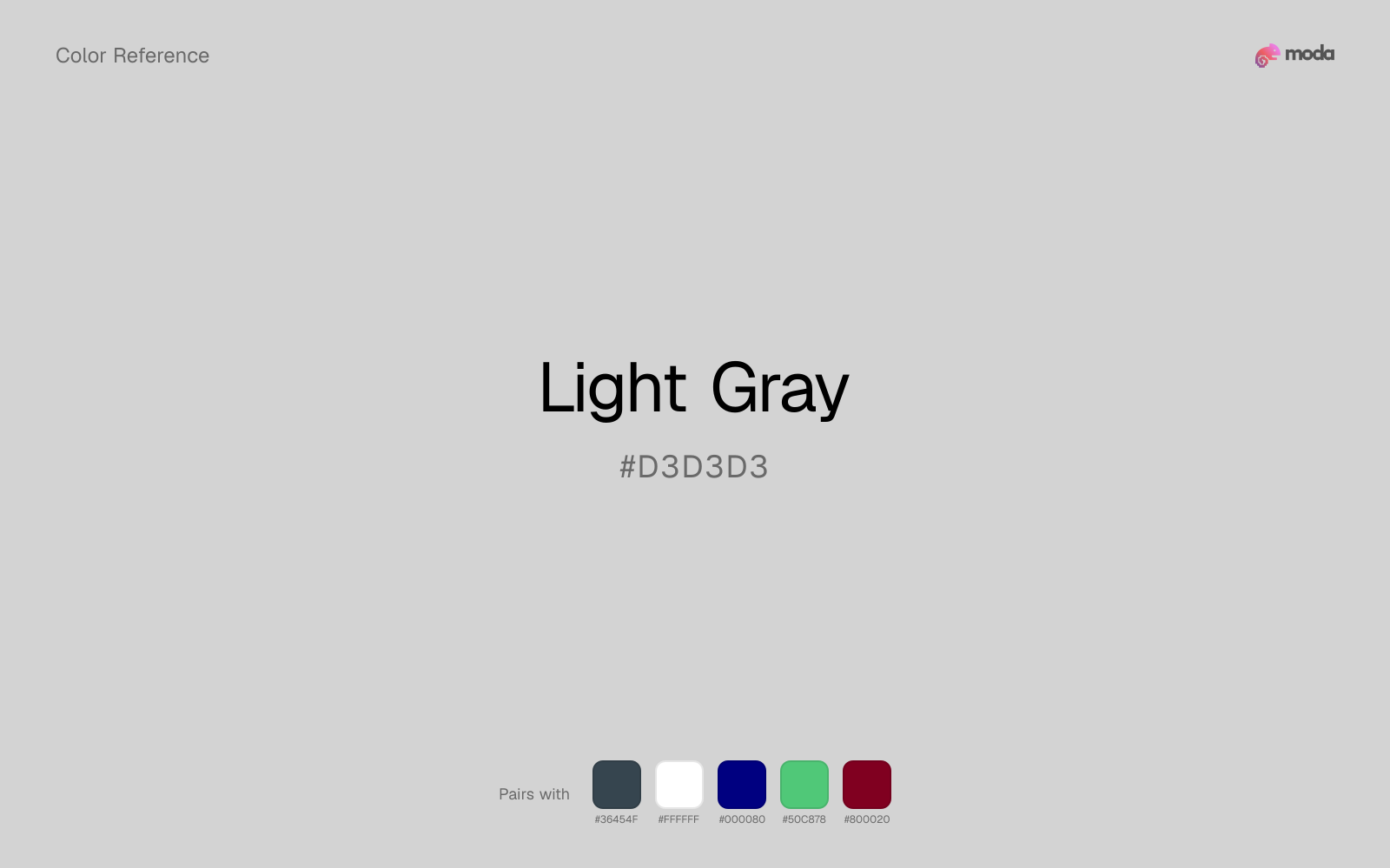
Charcoal gives light gray the dark frame it is missing, so pale surfaces do not drift into a washed-out page.
White is a reliable partner for light gray when the goal is clarity: it adds separation, preserves brightness, and avoids extra mood-shifting.
Navy blue makes light gray easier to organize in real layouts by separating the bright surface role from the dark-value role.
What colors clash with light gray
How should I use light gray in design?
- •Light Gray works best as a background tint, card fill, or section divider — it adds warmth without competing with foreground content. Pair with dark text for readability.
- •Light Gray is versatile enough to support any palette direction. Pair it with one saturated accent for emphasis and one lighter neutral for breathing room.
- •Light neutrals like light gray are ideal for document backgrounds, card surfaces, and anywhere you want a gentler alternative to pure white.
What are good light gray palettes?
Design with light gray in Moda
Create a presentation or document using light grayas your accent color. Moda's AI applies your color palette automatically.
Create a design with light gray →What are the shades and tints of light gray?
Shades (darker)
Tints (lighter)
Tones (desaturated)
Similar colors
Silver
Silver and light gray do nearly the same structural job, so the decision comes down to whether the neutral should feel more smoky gray or more paper-white.
Dark Gray
Dark Gray stays neutral like light gray, yet the lighter-or-darker move changes how much hierarchy the palette gets before any accent color enters.
White
White stays neutral like light gray, yet the lighter-or-darker move changes how much hierarchy the palette gets before any accent color enters.
Platinum
Platinum lives in almost the same neutral band as light gray, but its paper-white lean can make woods, metals, and off-whites read differently around it.
Snow
Snow does what light gray cannot: it nudges the palette toward a warm mood while still behaving like a supporting color.
Frequently asked questions
What is the hex code for light gray?
The hex code for light gray is #D3D3D3. In RGB, that's 211 red, 211 green, and 211 blue. The approximate CMYK equivalent is 0% cyan, 0% magenta, 0% yellow, and 17% key (black).
Is light gray a warm or cool color?
Light Gray behaves like a neutral with very little chromatic push, so surrounding colors do more to set the palette temperature than the swatch itself.
Is light gray better for backgrounds or accents?
Light Gray is usually stronger as a background, card tint, or section surface than as a sharp accent. It works best when darker typography or controls can sit on top and do the hierarchy work.
How should I use light gray in a design?
Light Gray is light enough that it belongs on surfaces rather than in small text. Use it for backgrounds, soft section breaks, or gentle table shading and keep dark typography on top.
Can I use light gray for text or backgrounds?
Light Gray works better with dark text than white text. Black text reaches 14.03:1 contrast on the swatch, which makes the color more usable as a background or highlight surface than as a dark panel.
More neutral colors
Keep exploring color resources
All color pages
Browse the full library of color references, pairings, and palettes.
Neutral colors
Compare light gray with other neutral tones.
Blue colors
Explore nearby color families to build stronger palettes and contrasts.
Brown colors
Explore nearby color families to build stronger palettes and contrasts.
Green colors
Explore nearby color families to build stronger palettes and contrasts.
Last updated April 6, 2026
Color values are computed from the listed hex code using standard conversion formulas. RGB, HSL, and HSV are exact screen-ready conversions. CMYK is an approximate on-screen reference, not a press-ready print specification. Pairings, palettes, and use-case guidance are heuristic recommendations derived from color relationships, contrast behavior, and common presentation, document, and UI patterns.