Platinum color guide
HEX
#E5E4E2
RGB
229, 228, 226
HSL
40°, 5%, 89%
HSV
40°, 1%, 90%
Metal translated into morning fog — pale, cool, and expensive in whispers. #E5E4E2 has highlights that feel like misted chrome rather than yellow coin. The metallic you pick when you want prestige without royal pageantry.
Best for
Event branding, newsletters, and customer-facing web pages.
Accessibility
Check contrast before using platinum for text-heavy layouts, especially on low-contrast backgrounds.
How does platinum compare to nearby colors?
What is the difference between platinum and alabaster?
Platinum (#E5E4E2) and Alabaster (#F2F0EB) are close enough that the split is more about finish than headline contrast: Platinum feels more foil warmth, while Alabaster reads more paper, plaster, and interface chrome. Platinum and Alabaster can fill many of the same slots, but one steers the palette toward foil warmth and the other toward paper, plaster, and interface chrome. Begin with platinum when the family needs its current undertone and surface character; keep alabaster for the nearby alternative that shifts the mood without leaving the same hue neighborhood.
What color is platinum?
Platinum is a dense precious metal used in fine jewelry and industrial catalysts. As a marketing tier, "platinum" denotes the highest level above gold.
What is the hex code for platinum?
| Format | Value |
|---|---|
| HEX | #E5E4E2 |
| RGB | rgb(229, 228, 226) |
| HSL | hsl(40°, 5%, 89%) |
| HSV / HSB | hsv(40°, 1%, 90%) |
| CMYK (approx.) | cmyk(0%, 0%, 1%, 10%) |
Convert Platinum to other color formats
Open the color converter with Platinum (#E5E4E2) prefilled to copy RGB, HSL, HSV, CMYK, or OKLCH values.
Convert Platinum in the color converter →What does platinum mean in design?
Platinum is often associated with elite status, rarity, and cool modern luxury. It reads as lighter and more porcelain-metallic than silver metallic, and far less warm than champagne gold.
How do I use platinum in code?
| CSS (hex) | color: #E5E4E2; |
| CSS (rgb) | color: rgb(229, 228, 226); |
| CSS (hsl) | color: hsl(40, 5%, 89%); |
| RGB % | rgb(90%, 89%, 89%) |
| Tailwind | text-[#E5E4E2] |
| SwiftUI | Color(red: 0.898, green: 0.894, blue: 0.886) |
| UIKit | UIColor(red: 0.898, green: 0.894, blue: 0.886, alpha: 1.0) |
| Android | Color.rgb(229, 228, 226) |
| Compose | Color(0xFFE5E4E2) |
| Web Safe | #CCCCCC |
Is platinum accessible?
| Combination | Ratio | AA | AA lg | AAA | AAA lg | UI |
|---|---|---|---|---|---|---|
| AaWhite text on this color | 1.27:1 | ✗ | ✗ | ✗ | ✗ | ✗ |
| AaBlack text on this color | 16.53:1 | ✓ | ✓ | ✓ | ✓ | ✓ |
| AaThis color as text on white | 1.27:1 | ✗ | ✗ | ✗ | ✗ | ✗ |
| AaThis color as text on black | 16.53:1 | ✓ | ✓ | ✓ | ✓ | ✓ |
WCAG 2.1: AA normal ≥ 4.5:1, AA large text ≥ 3:1, AAA normal ≥ 7:1, AAA large ≥ 4.5:1, UI components ≥ 3:1.
How does platinum look with color blindness?
Simulated appearance for common types of color vision deficiency. Actual perception varies by individual.
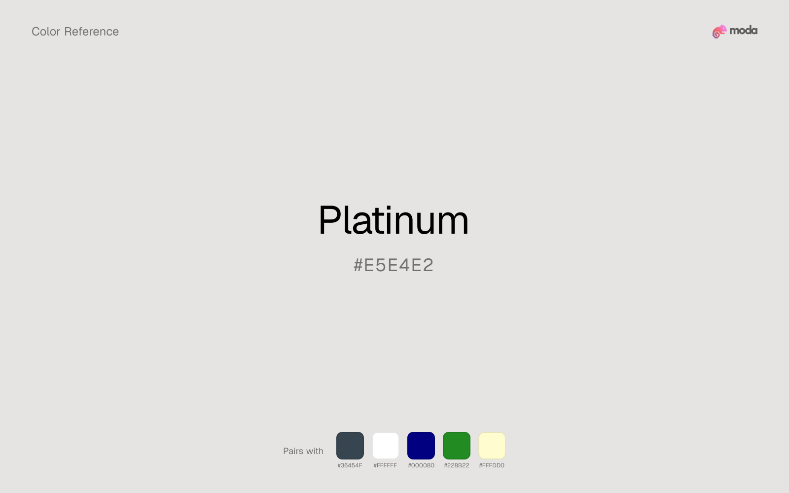
What colors go with platinum
Charcoal keeps very light platinum from disappearing into the canvas and adds the structure needed for documents, interfaces, and tables.
Pairing platinum with white keeps the layout open and lets the color's paper-white cast stay easy to read.
Navy blue makes platinum easier to organize in real layouts by separating the bright surface role from the dark-value role.
Forest Green gives platinum a second note that is different enough to feel intentional but not so different that the palette loses coherence.
What colors clash with platinum
Magenta injects more cosmetic or nightlife energy than platinum can comfortably absorb, so restrained neutral palettes start to feel accidental.
Light Gray sits too close to platinum in value, so the palette can wash out before it ever establishes a clear hierarchy.
With platinum, cyan introduces a colder display-driven cast that strips away some of the source color's tactile character.
Pastel Pink can undercut platinum's authority by turning the combination more decorative than decisive.
How should I use platinum in design?
- •Use platinum for soft backgrounds and supporting surfaces rather than foreground text — it creates a gentle atmosphere while keeping the layout open and readable.
- •Platinum is versatile enough to support any palette direction. Pair it with one saturated accent for emphasis and one lighter neutral for breathing room.
- •Light neutrals like platinum are ideal for document backgrounds, card surfaces, and anywhere you want a gentler alternative to pure white.
What are good platinum palettes?
Bright horizon
Event branding, newsletters, and customer-facing web pages.
Warm hearth
Brand guidelines, design systems, and visual identity documents.
Design with platinum in Moda
Create a presentation or document using platinumas your accent color. Moda's AI applies your color palette automatically.
Create a design with platinum →What are the shades and tints of platinum?
Shades (darker)
Tints (lighter)
Tones (desaturated)
Hue variations
What are the color harmonies for platinum?
Harmonies are calculated from the base swatch. When a harmony matches a named color page, it links there; otherwise it appears here as a computed reference swatch.
Similar colors
Alabaster
Alabaster introduces a tint where platinum stays achromatic, which is useful when the neutral layer needs more personality without becoming a full accent.
Champagne
Champagne does what platinum cannot: it nudges the palette toward a warm mood while still behaving like a supporting color.
Off-White
Off-White introduces a tint where platinum stays achromatic, which is useful when the neutral layer needs more personality without becoming a full accent.
Champagne Gold
Champagne Gold does what platinum cannot: it nudges the palette toward a warm mood while still behaving like a supporting color.
Beige
Beige does what platinum cannot: it nudges the palette toward a warm-leaning mood while still behaving like a supporting color.
Frequently asked questions
What is the hex code for platinum?
The hex code for platinum is #E5E4E2. In RGB, that's 229 red, 228 green, and 226 blue. The approximate CMYK equivalent is 0% cyan, 0% magenta, 1% yellow, and 10% key (black).
Is platinum a warm or cool color?
Platinum sits close to neutral, which means it can support either warm or cool accents without forcing the palette hard in one direction.
Should platinum be used as a surface color or an accent?
Platinum belongs more naturally on surfaces than in tiny accent moments. Use it to open space, soften sections, or tint large areas, then let darker colors carry the emphasis.
Where does platinum work best in a layout?
Platinum is very light, so it works best as a background, card fill, or table tint in slides, documents, and landing pages. Pair it with dark text such as charcoal or navy for readability.
Is platinum accessible?
Platinum works better with dark text than white text. Black text reaches 16.53:1 contrast on the swatch, which makes the color more usable as a background or highlight surface than as a dark panel.
More metallic colors
Keep exploring color resources
All color pages
Browse the full library of color references, pairings, and palettes.
Metallic colors
Compare platinum with other metallic tones.
Brown colors
Explore nearby color families to build stronger palettes and contrasts.
Neutral colors
Explore nearby color families to build stronger palettes and contrasts.
Orange colors
Explore nearby color families to build stronger palettes and contrasts.
Last updated April 6, 2026
Color values are computed from the listed hex code using standard conversion formulas. RGB, HSL, and HSV are exact screen-ready conversions. CMYK is an approximate on-screen reference, not a press-ready print specification. Pairings, palettes, and use-case guidance are heuristic recommendations derived from color relationships, contrast behavior, and common presentation, document, and UI patterns.