Pastel Pink for backgrounds and palettes
HEX
#FFD1DC
RGB
255, 209, 220
HSL
346°, 100%, 91%
HSV
346°, 18%, 100%
A pink that almost disappears into paper — airy, bridal, and careful with contrast. #FFD1DC behaves like a wash rather than a statement, which can feel luxurious in print and tricky on screens. Its power is restraint: softness without shouting.
Best for
Mobile app interfaces, onboarding screens, and light-mode UI themes.
Accessibility
Check contrast before using pastel pink for text-heavy layouts, especially on low-contrast backgrounds.
How does pastel pink compare to nearby colors?
What is the difference between pastel pink and millennial pink?
Millennial Pink (#F3CFC6) carries less pigment punch than Pastel Pink (#FFD1DC), so the pair separates by finish as much as hue. Pastel Pink reads faster on screen, so it changes the palette from steady to attention-seeking more quickly than Millennial Pink does. Choose pastel pink when the color needs to register quickly and act like the headline accent; keep millennial pink when the rest of the layout needs a quieter companion.
What color is pastel pink?
Pastel pinks are staples in wedding stationery, bakery branding, skincare packaging, and spring fashion lookbooks where delicacy is the brief.
What is the hex code for pastel pink?
| Format | Value |
|---|---|
| HEX | #FFD1DC |
| RGB | rgb(255, 209, 220) |
| HSL | hsl(346°, 100%, 91%) |
| HSV / HSB | hsv(346°, 18%, 100%) |
| CMYK (approx.) | cmyk(0%, 18%, 14%, 0%) |
Convert Pastel Pink to other color formats
Open the color converter with Pastel Pink (#FFD1DC) prefilled to copy RGB, HSL, HSV, CMYK, or OKLCH values.
Convert Pastel Pink in the color converter →What does pastel pink mean in design?
Pastel pink is often associated with calm care, innocence, and refined sweetness. Next to millennial pink it is typically cooler and less peachy; next to bubblegum it feels far less saturated and more spa-day.
How do I use pastel pink in code?
| CSS (hex) | color: #FFD1DC; |
| CSS (rgb) | color: rgb(255, 209, 220); |
| CSS (hsl) | color: hsl(346, 100%, 91%); |
| RGB % | rgb(100%, 82%, 86%) |
| Tailwind | text-[#FFD1DC] |
| SwiftUI | Color(red: 1.000, green: 0.820, blue: 0.863) |
| UIKit | UIColor(red: 1.000, green: 0.820, blue: 0.863, alpha: 1.0) |
| Android | Color.rgb(255, 209, 220) |
| Compose | Color(0xFFFFD1DC) |
| Web Safe | #FFCCCC |
Is pastel pink accessible?
| Combination | Ratio | AA | AA lg | AAA | AAA lg | UI |
|---|---|---|---|---|---|---|
| AaWhite text on this color | 1.36:1 | ✗ | ✗ | ✗ | ✗ | ✗ |
| AaBlack text on this color | 15.41:1 | ✓ | ✓ | ✓ | ✓ | ✓ |
| AaThis color as text on white | 1.36:1 | ✗ | ✗ | ✗ | ✗ | ✗ |
| AaThis color as text on black | 15.41:1 | ✓ | ✓ | ✓ | ✓ | ✓ |
WCAG 2.1: AA normal ≥ 4.5:1, AA large text ≥ 3:1, AAA normal ≥ 7:1, AAA large ≥ 4.5:1, UI components ≥ 3:1.
How does pastel pink look with color blindness?
Simulated appearance for common types of color vision deficiency. Actual perception varies by individual.
What colors go with pastel pink
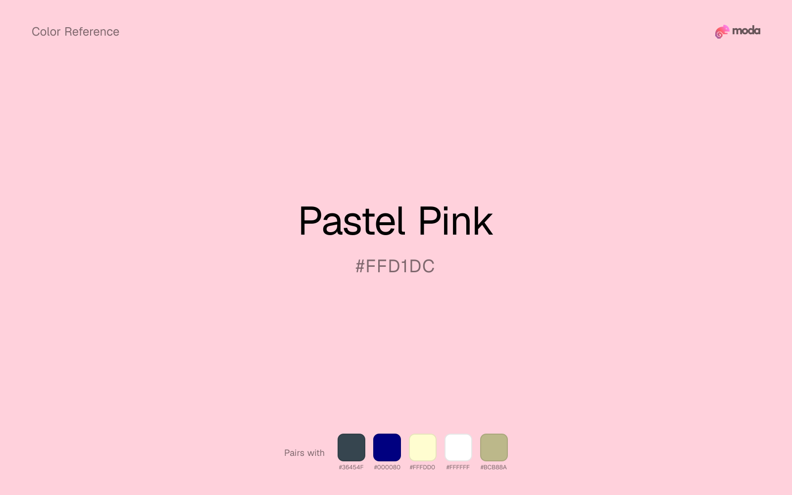
Because pastel pink behaves like a tint, charcoal supplies the typography, dividers, and anchors that make the palette feel finished.
Navy blue gives pastel pink a cooler frame, which makes the pair easier to use outside explicitly playful or beauty-coded contexts.
Cream takes the hard digital edge off pastel pink and makes the color feel more printed, paper-backed, and approachable.
White keeps pastel pink poster-clean instead of crowded, which is especially useful when the color already arrives with a strong screen presence.
Sage Green helps pastel pink feel more complete in practice because the pairing combines powder blush qualities with sage and moss support instead of leaving the source color to do every job alone.
What colors clash with pastel pink
Neon Green changes the meaning of pastel pink too abruptly, replacing the source color's beauty packaging, weddings, and soft UI cues with something much louder and less stable.
With pastel pink, magenta introduces a second emotional story instead of reinforcing the first one, so the palette can feel internally split.
Cyan redirects pastel pink toward a more technical, backlit interpretation, which is risky when the goal is warmth, polish, or print-minded editorial work.
Light Gray sits too close to pastel pink in value, so the palette can wash out before it ever establishes a clear hierarchy.
How should I use pastel pink in design?
- •Pastel Pink is subtle enough for full-page backgrounds, hover states, and delicate tinting effects — reserve it for atmosphere rather than emphasis.
- •Pastel Pink leans warm, so cool counterparts like navy, teal, or slate create the cleanest contrast. For a softer, tonal look, stay within neighboring warm hues and let value differences do the work.
- •Pastel Pink's lightness makes it a good candidate for email backgrounds, slide canvases, and page sections where you want atmosphere, not distraction.
What are good pastel pink palettes?
Clear signal
Mobile app interfaces, onboarding screens, and light-mode UI themes.
Design with pastel pink in Moda
Create a presentation or document using pastel pinkas your accent color. Moda's AI applies your color palette automatically.
Create a design with pastel pink →What are the shades and tints of pastel pink?
Shades (darker)
Tints (lighter)
Tones (desaturated)
Hue variations
What are the color harmonies for pastel pink?
Harmonies are calculated from the base swatch. When a harmony matches a named color page, it links there; otherwise it appears here as a computed reference swatch.
Similar colors
Bubblegum
Bubblegum lives in the same neighborhood as pastel pink, but the finish shift is enough to make one feel better for beauty packaging, weddings, and soft UI and the other for a different visual context.
Pink
Pink sits close to pastel pink in hue, but its red-hot cast changes the mood of the palette even when the contrast shift is small.
Blush
Blush is near enough to pastel pink to swap into the same palette, yet the undertone shift still decides whether the family reads warmer or cooler overall.
Carnation
Carnation is almost the same hue as pastel pink; the real difference is value, with carnation feeling more grounded and anchor-ready.
Millennial Pink
Millennial Pink is useful when pastel pink is the right weight but the wrong mood: the swap changes temperature and finish more than contrast.
Frequently asked questions
What is the hex code for pastel pink?
The hex code for pastel pink is #FFD1DC. In RGB, that's 255 red, 209 green, and 220 blue. The approximate CMYK equivalent is 0% cyan, 18% magenta, 14% yellow, and 0% key (black).
Is pastel pink a warm or cool color?
Pastel Pink reads as warm. It feels most natural with creams, golds, rusts, and other warm accents, while cooler partners like navy or teal create sharper contrast.
Is pastel pink better for backgrounds or accents?
Pastel Pink is usually stronger as a background, card tint, or section surface than as a sharp accent. It works best when darker typography or controls can sit on top and do the hierarchy work.
How should I use pastel pink in a design?
Pastel Pink is light enough that it belongs on surfaces rather than in small text. Use it for backgrounds, soft section breaks, or gentle table shading and keep dark typography on top.
Can I use pastel pink for text or backgrounds?
Pastel Pink works better with dark text than white text. Black text reaches 15.41:1 contrast on the swatch, which makes the color more usable as a background or highlight surface than as a dark panel.
More pink colors
Keep exploring color resources
All color pages
Browse the full library of color references, pairings, and palettes.
Pink colors
Compare pastel pink with other pink tones.
Neutral colors
Explore nearby color families to build stronger palettes and contrasts.
Orange colors
Explore nearby color families to build stronger palettes and contrasts.
Purple colors
Explore nearby color families to build stronger palettes and contrasts.
Last updated April 6, 2026
Color values are computed from the listed hex code using standard conversion formulas. RGB, HSL, and HSV are exact screen-ready conversions. CMYK is an approximate on-screen reference, not a press-ready print specification. Pairings, palettes, and use-case guidance are heuristic recommendations derived from color relationships, contrast behavior, and common presentation, document, and UI patterns.