Pink palettes and pairings
HEX
#FFC0CB
RGB
255, 192, 203
HSL
350°, 100%, 88%
HSV
350°, 25%, 100%
HTML/CSS pink (#FFC0CB) is a light tint of red with high lightness and moderate saturation — the archetypal "baby pink" or ballet-slipper pink in many default palettes. It is softer than hot pink and less beige than blush, staying clearly in the pink family on both calibrated and uncalibrated displays. Large surfaces of #FFC0CB can feel sweet or nostalgic, making it useful for gentle emphasis in beauty, confectionery, or maternity-adjacent contexts. Against millennial pink's dusty rose tones, #FFC0CB reads cleaner and more textbook-cotton-candy.
Best for
Email templates, blog headers, and content marketing visuals.
Accessibility
Check contrast before using pink for text-heavy layouts, especially on low-contrast backgrounds.
How does pink compare to nearby colors?
What color is pink?
The named web color pink (#FFC0CB) comes from the same X11-derived set as other CSS keywords. The English word originally referred to flowers (Dianthus species) and later generalized to the pale red tint; the hex is a simplified screen approximation, not a textile or Pantone specification.
What is the hex code for pink?
| Format | Value |
|---|---|
| HEX | #FFC0CB |
| RGB | rgb(255, 192, 203) |
| HSL | hsl(350°, 100%, 88%) |
| HSV / HSB | hsv(350°, 25%, 100%) |
| CMYK (approx.) | cmyk(0%, 25%, 20%, 0%) |
Convert Pink to other color formats
Open the color converter with Pink (#FFC0CB) prefilled to copy RGB, HSL, HSV, CMYK, or OKLCH values.
Convert Pink in the color converter →What does pink mean in design?
In Western retail contexts, #FFC0CB is often associated with softness, playfulness, or femininity when used with conventional imagery, though context and typography can steer it toward irony or retro pastels. It tends to read as gentle rather than aggressive compared with magenta-heavy pinks. Beside purple, it usually feels daylight and nursery-bright rather than nocturnal.
How do I use pink in code?
| CSS (hex) | color: #FFC0CB; |
| CSS (rgb) | color: rgb(255, 192, 203); |
| CSS (hsl) | color: hsl(350, 100%, 88%); |
| RGB % | rgb(100%, 75%, 80%) |
| Tailwind | text-[#FFC0CB] |
| SwiftUI | Color(red: 1.000, green: 0.753, blue: 0.796) |
| UIKit | UIColor(red: 1.000, green: 0.753, blue: 0.796, alpha: 1.0) |
| Android | Color.rgb(255, 192, 203) |
| Compose | Color(0xFFFFC0CB) |
| Web Safe | #FFCCCC |
Is pink accessible?
| Combination | Ratio | AA | AA lg | AAA | AAA lg | UI |
|---|---|---|---|---|---|---|
| AaWhite text on this color | 1.54:1 | ✗ | ✗ | ✗ | ✗ | ✗ |
| AaBlack text on this color | 13.65:1 | ✓ | ✓ | ✓ | ✓ | ✓ |
| AaThis color as text on white | 1.54:1 | ✗ | ✗ | ✗ | ✗ | ✗ |
| AaThis color as text on black | 13.65:1 | ✓ | ✓ | ✓ | ✓ | ✓ |
WCAG 2.1: AA normal ≥ 4.5:1, AA large text ≥ 3:1, AAA normal ≥ 7:1, AAA large ≥ 4.5:1, UI components ≥ 3:1.
How does pink look with color blindness?
Simulated appearance for common types of color vision deficiency. Actual perception varies by individual.
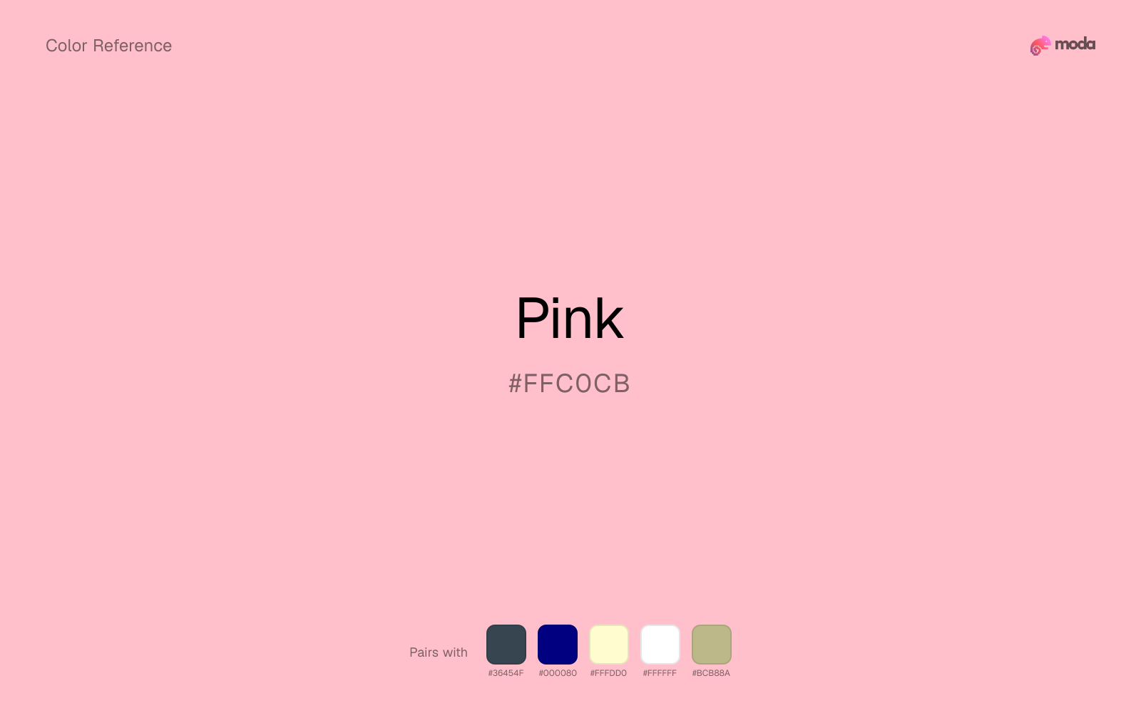
What colors go with pink
Because pink behaves like a tint, charcoal supplies the typography, dividers, and anchors that make the palette feel finished.
Beside pink, navy blue shifts the palette away from novelty sweetness and toward something more composed.
With a vivid pink, cream is gentler than white, so the palette keeps warmth and avoids looking overlit.
White gives pink enough open space that the color can feel vivid without turning the whole palette noisy.
Sage Green changes how pink comes across: more wellness, botanical, and lifestyle palettes in mood, and less likely to feel isolated or unfinished.
What colors clash with pink
Neon Green competes with pink so aggressively that the palette never really settles into a clear primary-secondary relationship.
Magenta remaps pink too aggressively, dragging it away from beauty packaging, weddings, and soft UI and into a brighter, more performative palette.
Cyan redirects pink toward a more technical, backlit interpretation, which is risky when the goal is warmth, polish, or print-minded editorial work.
Light Gray sits too close to pink in value, so the palette can wash out before it ever establishes a clear hierarchy.
How should I use pink in design?
- •For packaging mockups, print #FFC0CB swatches on both coated and uncoated proofs — on newsprint it often loses chroma and drifts toward warm gray faster than deeper pinks.
- •In UI, reserve pink for secondary chips, tags, or empty-state illustrations rather than primary actions, because its low contrast against white can fail WCAG expectations for small text.
- •When pairing pink with greens for seasonal campaigns, desaturate one of the two or introduce plenty of white space so the combination does not read as unintentional holiday theming.
What are good pink palettes?
Fresh canvas
Email templates, blog headers, and content marketing visuals.
Sunlit warmth
Workshop handouts, training guides, and presentation templates.
Design with pink in Moda
Create a presentation or document using pinkas your accent color. Moda's AI applies your color palette automatically.
Create a design with pink →What are the shades and tints of pink?
Shades (darker)
Tints (lighter)
Tones (desaturated)
Hue variations
What are the color harmonies for pink?
Harmonies are calculated from the base swatch. When a harmony matches a named color page, it links there; otherwise it appears here as a computed reference swatch.
Similar colors
Bubblegum
Bubblegum sits close to pink in hue, but its red-hot cast changes the mood of the palette even when the contrast shift is small.
Blush
Blush is near enough to pink to swap into the same palette, yet the undertone shift still decides whether the family reads warmer or cooler overall.
Pastel Pink
Pastel Pink sits close to pink in hue, but its red-hot cast changes the mood of the palette even when the contrast shift is small.
Carnation
Carnation lives in the same neighborhood as pink, but the finish shift is enough to make one feel better for beauty packaging, weddings, and soft UI and the other for a different visual context.
Salmon Pink
Salmon Pink is almost the same hue as pink; the real difference is value, with salmon pink feeling more grounded and anchor-ready.
Frequently asked questions
What is the hex code for pink?
The hex code for pink is #FFC0CB. In RGB, that's 255 red, 192 green, and 203 blue. The approximate CMYK equivalent is 0% cyan, 25% magenta, 20% yellow, and 0% key (black).
Is pink a warm or cool color?
Pink sits on the warm side of the palette, so it pairs easily with other warm tones and becomes more energetic when you place it against cooler blues or blue-grays.
Should pink be used as a surface color or an accent?
Pink belongs more naturally on surfaces than in tiny accent moments. Use it to open space, soften sections, or tint large areas, then let darker colors carry the emphasis.
Where does pink work best in a layout?
Pink is very light, so it works best as a background, card fill, or table tint in slides, documents, and landing pages. Pair it with dark text such as charcoal or navy for readability.
Is pink accessible?
Pink works better with dark text than white text. Black text reaches 13.65:1 contrast on the swatch, which makes the color more usable as a background or highlight surface than as a dark panel.
More pink colors
Keep exploring color resources
All color pages
Browse the full library of color references, pairings, and palettes.
Pink colors
Compare pink with other pink tones.
Neutral colors
Explore nearby color families to build stronger palettes and contrasts.
Orange colors
Explore nearby color families to build stronger palettes and contrasts.
Purple colors
Explore nearby color families to build stronger palettes and contrasts.
Last updated April 6, 2026
Color values are computed from the listed hex code using standard conversion formulas. RGB, HSL, and HSV are exact screen-ready conversions. CMYK is an approximate on-screen reference, not a press-ready print specification. Pairings, palettes, and use-case guidance are heuristic recommendations derived from color relationships, contrast behavior, and common presentation, document, and UI patterns.