Bubblegum palettes and pairings
HEX
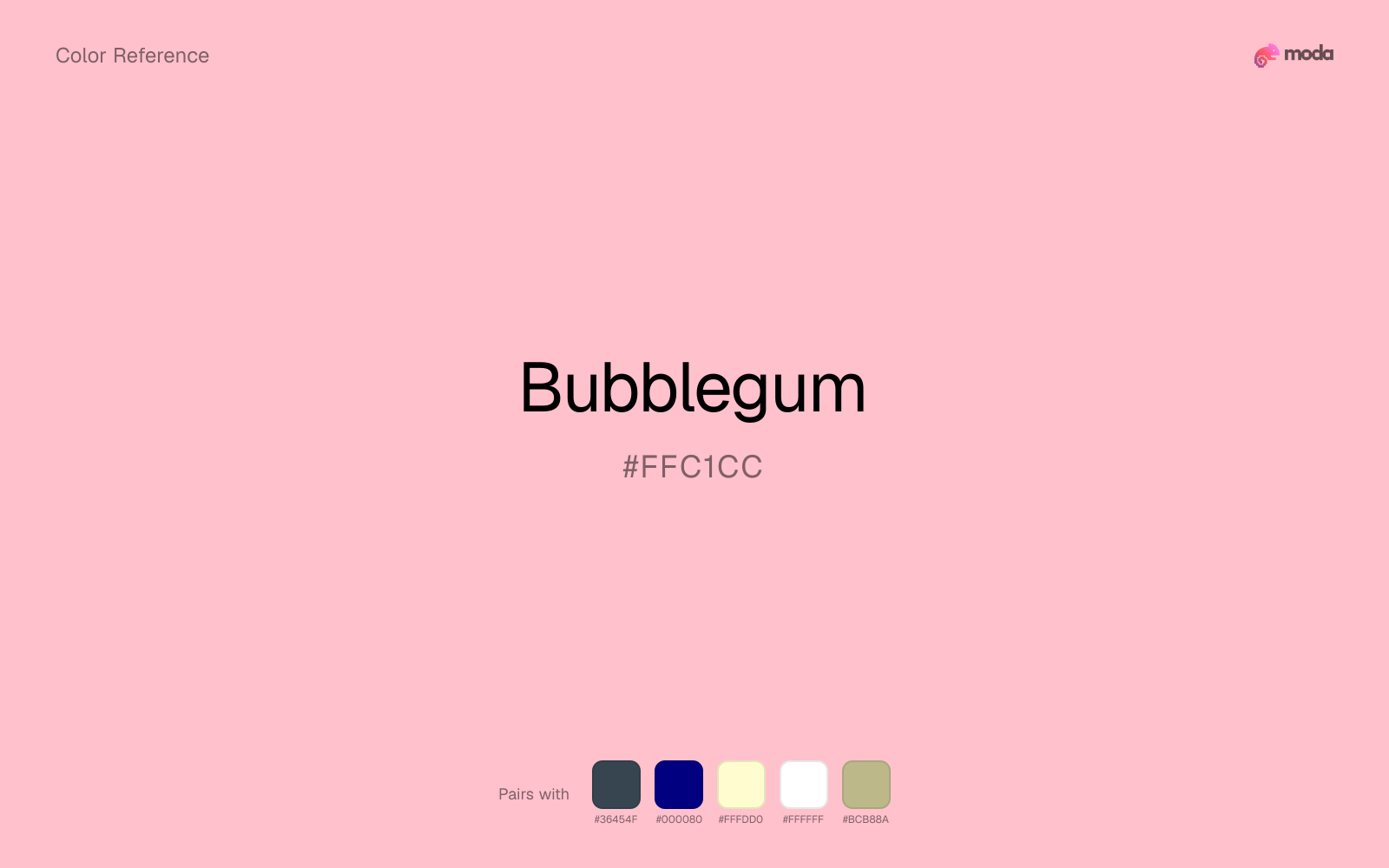
#FFC1CC
RGB
255, 193, 204
HSL
349°, 100%, 88%
HSV
349°, 24%, 100%
The pink that tastes like sugar even when you only see it — playful, slightly plastic, and cheerfully artificial in the best way. #FFC1CC suggests chewable color: round, bouncy, and a little glossy. It is the shorthand for "fun" before "luxury."
Best for
Trade show graphics, signage, and booth displays.
Accessibility
Check contrast before using bubblegum for text-heavy layouts, especially on low-contrast backgrounds.
How does bubblegum compare to nearby colors?
What color is bubblegum?
Bubblegum pink is cultural shorthand tied to candy packaging, toy aisles, and Y2K-era graphic design revivals. It commonly appears in party supplies, nail polish ranges, and playful app themes.
What is the hex code for bubblegum?
| Format | Value |
|---|---|
| HEX | #FFC1CC |
| RGB | rgb(255, 193, 204) |
| HSL | hsl(349°, 100%, 88%) |
| HSV / HSB | hsv(349°, 24%, 100%) |
| CMYK (approx.) | cmyk(0%, 24%, 20%, 0%) |
Convert Bubblegum to other color formats
Open the color converter with Bubblegum (#FFC1CC) prefilled to copy RGB, HSL, HSV, CMYK, or OKLCH values.
Convert Bubblegum in the color converter →What does bubblegum mean in design?
Bubblegum is often associated with nostalgia, whimsy, and low-stakes joy. Compared with hot pink it is usually lighter and less aggressive; compared with pastel pink it is often a bit brighter and more "toy aisle."
How do I use bubblegum in code?
| CSS (hex) | color: #FFC1CC; |
| CSS (rgb) | color: rgb(255, 193, 204); |
| CSS (hsl) | color: hsl(349, 100%, 88%); |
| RGB % | rgb(100%, 76%, 80%) |
| Tailwind | text-[#FFC1CC] |
| SwiftUI | Color(red: 1.000, green: 0.757, blue: 0.800) |
| UIKit | UIColor(red: 1.000, green: 0.757, blue: 0.800, alpha: 1.0) |
| Android | Color.rgb(255, 193, 204) |
| Compose | Color(0xFFFFC1CC) |
| Web Safe | #FFCCCC |
Is bubblegum accessible?
| Combination | Ratio | AA | AA lg | AAA | AAA lg | UI |
|---|---|---|---|---|---|---|
| AaWhite text on this color | 1.53:1 | ✗ | ✗ | ✗ | ✗ | ✗ |
| AaBlack text on this color | 13.75:1 | ✓ | ✓ | ✓ | ✓ | ✓ |
| AaThis color as text on white | 1.53:1 | ✗ | ✗ | ✗ | ✗ | ✗ |
| AaThis color as text on black | 13.75:1 | ✓ | ✓ | ✓ | ✓ | ✓ |
WCAG 2.1: AA normal ≥ 4.5:1, AA large text ≥ 3:1, AAA normal ≥ 7:1, AAA large ≥ 4.5:1, UI components ≥ 3:1.
How does bubblegum look with color blindness?
Simulated appearance for common types of color vision deficiency. Actual perception varies by individual.
What colors go with bubblegum
Charcoal gives bubblegum the dark frame it is missing, so pale surfaces do not drift into a washed-out page.
Beside bubblegum, navy blue shifts the palette away from novelty sweetness and toward something more composed.
Cream lets bubblegum stay expressive without turning the whole composition stark; the result feels closer to editorial or packaging work than to raw UI default.
White keeps bubblegum poster-clean instead of crowded, which is especially useful when the color already arrives with a strong screen presence.
Sage Green changes how bubblegum comes across: more wellness, botanical, and lifestyle palettes in mood, and less likely to feel isolated or unfinished.
What colors clash with bubblegum
With bubblegum, Neon Green pushes the work toward novelty or screen-effect territory faster than most brand or editorial systems can tolerate.
Magenta pushes bubblegum toward a nightclub or cosmetic register that is hard to square with calmer editorial or product work.
With bubblegum, cyan introduces a colder display-driven cast that strips away some of the source color's tactile character.
Light Gray sits too close to bubblegum in value, so the palette can wash out before it ever establishes a clear hierarchy.
How should I use bubblegum in design?
- •Use bubblegum for soft backgrounds and supporting surfaces rather than foreground text — it creates a gentle atmosphere while keeping the layout open and readable.
- •Bubblegum leans warm, so cool counterparts like navy, teal, or slate create the cleanest contrast. For a softer, tonal look, stay within neighboring warm hues and let value differences do the work.
- •Bubblegum's lightness makes it a good candidate for email backgrounds, slide canvases, and page sections where you want atmosphere, not distraction.
What are good bubblegum palettes?
Design with bubblegum in Moda
Create a presentation or document using bubblegumas your accent color. Moda's AI applies your color palette automatically.
Create a design with bubblegum →What are the shades and tints of bubblegum?
Shades (darker)
Tints (lighter)
Tones (desaturated)
Hue variations
What are the color harmonies for bubblegum?
Harmonies are calculated from the base swatch. When a harmony matches a named color page, it links there; otherwise it appears here as a computed reference swatch.
Similar colors
Pink
Pink sits close to bubblegum in hue, but its red-hot cast changes the mood of the palette even when the contrast shift is small.
Blush
Blush sits close to bubblegum in hue, but its red-hot cast changes the mood of the palette even when the contrast shift is small.
Pastel Pink
Pastel Pink lives in the same neighborhood as bubblegum, but the finish shift is enough to make one feel better for beauty packaging, weddings, and soft UI and the other for a different visual context.
Carnation
Carnation sits close to bubblegum in hue, but its berry-magenta cast changes the mood of the palette even when the contrast shift is small.
Salmon Pink
Salmon Pink stays very close to bubblegum in hue, but it lands darker, which makes it better for headlines, anchors, and darker sections than for lighter surfaces and more open applications.
Frequently asked questions
What is the hex code for bubblegum?
The hex code for bubblegum is #FFC1CC. In RGB, that's 255 red, 193 green, and 204 blue. The approximate CMYK equivalent is 0% cyan, 24% magenta, 20% yellow, and 0% key (black).
Is bubblegum a warm or cool color?
Bubblegum reads as warm. It feels most natural with creams, golds, rusts, and other warm accents, while cooler partners like navy or teal create sharper contrast.
Is bubblegum better for backgrounds or accents?
Bubblegum is usually stronger as a background, card tint, or section surface than as a sharp accent. It works best when darker typography or controls can sit on top and do the hierarchy work.
How should I use bubblegum in a design?
Bubblegum is light enough that it belongs on surfaces rather than in small text. Use it for backgrounds, soft section breaks, or gentle table shading and keep dark typography on top.
Can I use bubblegum for text or backgrounds?
Bubblegum works better with dark text than white text. Black text reaches 13.75:1 contrast on the swatch, which makes the color more usable as a background or highlight surface than as a dark panel.
More pink colors
Keep exploring color resources
All color pages
Browse the full library of color references, pairings, and palettes.
Pink colors
Compare bubblegum with other pink tones.
Neutral colors
Explore nearby color families to build stronger palettes and contrasts.
Orange colors
Explore nearby color families to build stronger palettes and contrasts.
Purple colors
Explore nearby color families to build stronger palettes and contrasts.
Last updated April 6, 2026
Color values are computed from the listed hex code using standard conversion formulas. RGB, HSL, and HSV are exact screen-ready conversions. CMYK is an approximate on-screen reference, not a press-ready print specification. Pairings, palettes, and use-case guidance are heuristic recommendations derived from color relationships, contrast behavior, and common presentation, document, and UI patterns.