Using Charcoal in design
HEX
#36454F
RGB
54, 69, 79
HSL
204°, 19%, 26%
HSV
204°, 32%, 31%
Charcoal (#36454F) is a soot-dark blue-gray that keeps the authority of black while feeling less absolute on screen. It is the dark neutral people often want when pure black feels too stark, especially in typography, UI chrome, and polished presentation themes.
Best for
Startup pitch decks, media kits, and brand guidelines where you want a polished, contemporary look.
Accessibility
White text on charcoal passes AAA at 9.9:1, so it is safe for dark backgrounds and section headers.
How does charcoal compare to nearby colors?
What is the difference between charcoal and graphite?
Charcoal (#36454F) and Graphite (#383838) are close in strength, but they point the eye toward different undertones and material cues. Graphite has more of the heavy-lifting, dark-surface role, while Charcoal is freer to move around the layout. Choose charcoal when the surrounding system aligns better with muted chroma, and move to graphite when the stronger contextual fit is near-neutral chroma.
What color is charcoal?
The name comes from partially burned wood, and that material reference still matters: charcoal reads softer and dustier than a laboratory black. In digital palettes it often functions as the first “not quite black” step that still gives strong contrast.
Also known as: Charcoal Gray, Charcoal Grey.
What is the hex code for charcoal?
| Format | Value |
|---|---|
| HEX | #36454F |
| RGB | rgb(54, 69, 79) |
| HSL | hsl(204°, 19%, 26%) |
| HSV / HSB | hsv(204°, 32%, 31%) |
| CMYK (approx.) | cmyk(32%, 13%, 0%, 69%) |
Convert Charcoal to other color formats
Open the color converter with Charcoal (#36454F) prefilled to copy RGB, HSL, HSV, CMYK, or OKLCH values.
Convert Charcoal in the color converter →What does charcoal mean in design?
Charcoal is often associated with authority, restraint, and polish. It preserves the structure of black while introducing a little more tactility, which is why it works well in minimal layouts that need to feel refined rather than severe.
How do I use charcoal in code?
| CSS (hex) | color: #36454F; |
| CSS (rgb) | color: rgb(54, 69, 79); |
| CSS (hsl) | color: hsl(204, 19%, 26%); |
| RGB % | rgb(21%, 27%, 31%) |
| Tailwind | text-[#36454F] |
| SwiftUI | Color(red: 0.212, green: 0.271, blue: 0.310) |
| UIKit | UIColor(red: 0.212, green: 0.271, blue: 0.310, alpha: 1.0) |
| Android | Color.rgb(54, 69, 79) |
| Compose | Color(0xFF36454F) |
| Web Safe | #333366 |
Is charcoal accessible?
| Combination | Ratio | AA | AA lg | AAA | AAA lg | UI |
|---|---|---|---|---|---|---|
| AaWhite text on this color | 9.9:1 | ✓ | ✓ | ✓ | ✓ | ✓ |
| AaBlack text on this color | 2.12:1 | ✗ | ✗ | ✗ | ✗ | ✗ |
| AaThis color as text on white | 9.9:1 | ✓ | ✓ | ✓ | ✓ | ✓ |
| AaThis color as text on black | 2.12:1 | ✗ | ✗ | ✗ | ✗ | ✗ |
WCAG 2.1: AA normal ≥ 4.5:1, AA large text ≥ 3:1, AAA normal ≥ 7:1, AAA large ≥ 4.5:1, UI components ≥ 3:1.
How does charcoal look with color blindness?
Simulated appearance for common types of color vision deficiency. Actual perception varies by individual.
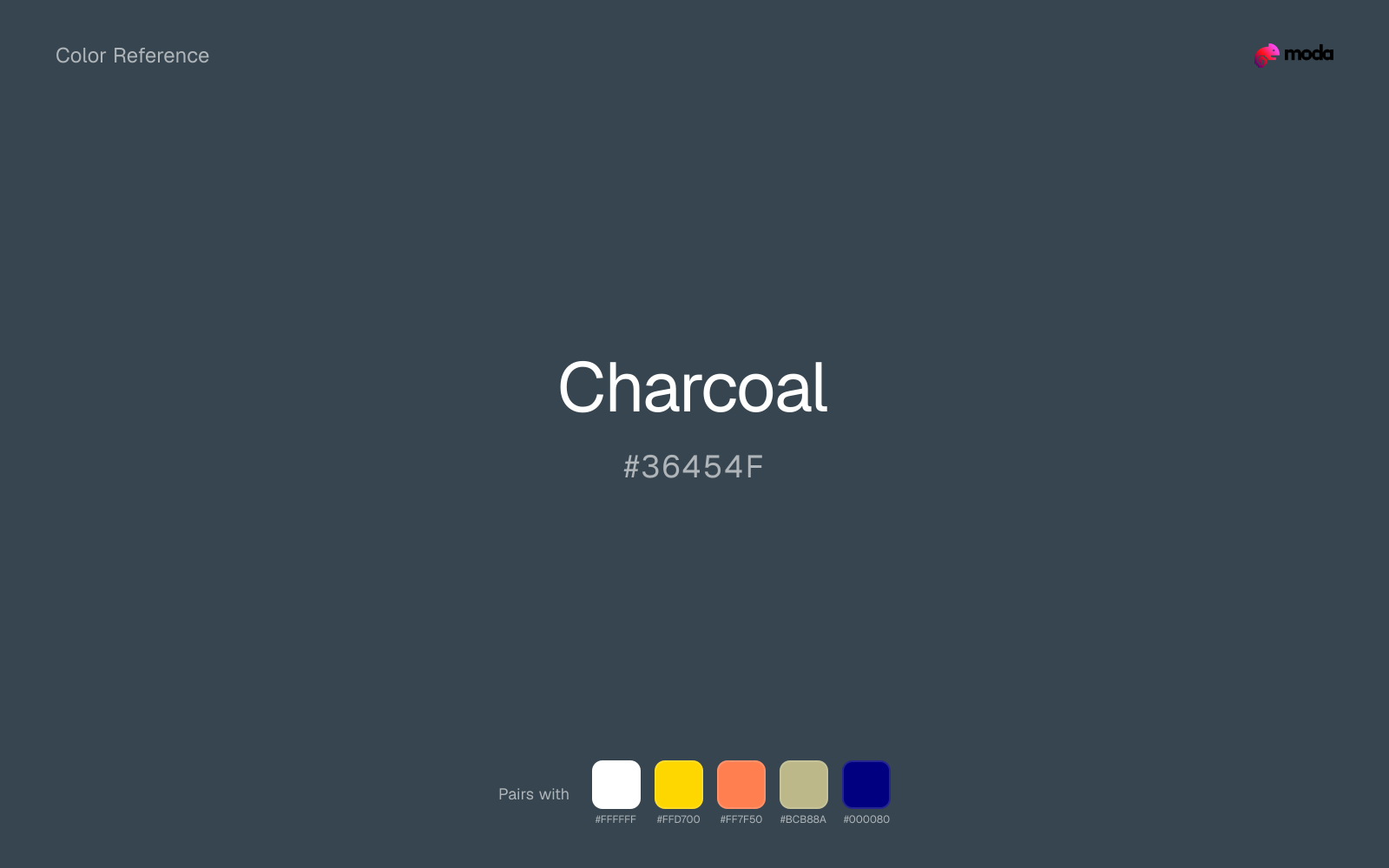
What colors go with charcoal
White sharpens charcoal without cooling it off, which is useful when you need a clean interface or slide layout around the color.
Gold gives charcoal a warmer highlight, which helps the palette feel more tactile and less screen-native than it would with only neutrals.
Coral changes how charcoal comes across: more food, promotion, and social-first graphics in mood, and less likely to feel isolated or unfinished.
Sage Green changes how charcoal comes across: more wellness, botanical, and lifestyle palettes in mood, and less likely to feel isolated or unfinished.
What colors clash with charcoal
Dark Gray pushes charcoal toward a more system design and layout structure mood, which can fight the technical structure role the source color usually handles best.
Black pushes charcoal toward a more technical structure mood, which can fight the technical structure role the source color usually handles best.
How should I use charcoal in design?
- •Replace pure black with charcoal as your darkest value — it looks more refined on screen and in print.
- •Charcoal works as both a background color and a text color. On dark slides, pair with white or cream text.
- •Use charcoal for body text instead of black — it reduces eye strain and feels more contemporary.
What are good charcoal palettes?
Modern minimal
Startup pitch decks, media kits, and brand guidelines where you want a polished, contemporary look.
Carbon elegance
Financial services branding and client-facing digital experiences.
Design with charcoal in Moda
Create a presentation or document using charcoalas your accent color. Moda's AI applies your color palette automatically.
Create a design with charcoal →What are the shades and tints of charcoal?
Shades (darker)
Tints (lighter)
Tones (desaturated)
Hue variations
What are the color harmonies for charcoal?
Harmonies are calculated from the base swatch. When a harmony matches a named color page, it links there; otherwise it appears here as a computed reference swatch.
Similar colors
Graphite
Graphite is a nearby alternative to charcoal when the palette needs a different undertone or material cue more than a dramatic contrast change.
Onyx
Onyx sits close to charcoal on the wheel, but it carries less chroma, which makes it better for steadier surfaces and calmer long-form use than for sharper emphasis and quicker visual pickup.
Slate Gray
Slate Gray tracks close to charcoal in hue, but the value shift changes where each one earns its place: slate gray is easier to use for backgrounds, tints, and softer supporting areas, while charcoal holds onto accents, stronger hierarchy, and firmer structure.
Dark Gray
Dark Gray keeps a family resemblance to charcoal, but it behaves more like atmosphere than emphasis once the value climbs this far.
Frequently asked questions
What is the hex code for charcoal?
The hex code for charcoal is #36454F. In RGB, that's 54 red, 69 green, and 79 blue. The approximate CMYK equivalent is 32% cyan, 13% magenta, 0% yellow, and 69% key (black).
Is charcoal a warm or cool color?
Charcoal reads as cool. It settles naturally beside blues, greens, silver, and charcoal, and feels more animated when paired with warm accents like gold, coral, or rust.
Is charcoal suitable for broader surfaces and long-form layouts?
Charcoal can hold broader surfaces comfortably because it does not demand attention on every glance. It is a better candidate for full-theme use than a brighter or more electric neighbor would be.
How should I use charcoal in a design?
Charcoal works well as a dark background with light text, or as a bold accent for headlines, callout bars, and key visuals. It adds weight and authority without the starkness of pure black.
Can I use charcoal for text or backgrounds?
Charcoal is strong enough for white text at 9.9:1 contrast, so it can handle dark panels, tags, and section headers without much trouble. As text on white, though, it is usually better reserved for larger headings or short accents than for long paragraphs.
More neutral colors
Keep exploring color resources
All color pages
Browse the full library of color references, pairings, and palettes.
Neutral colors
Compare charcoal with other neutral tones.
Blue colors
Explore nearby color families to build stronger palettes and contrasts.
Brown colors
Explore nearby color families to build stronger palettes and contrasts.
Green colors
Explore nearby color families to build stronger palettes and contrasts.
Last updated April 6, 2026
Color values are computed from the listed hex code using standard conversion formulas. RGB, HSL, and HSV are exact screen-ready conversions. CMYK is an approximate on-screen reference, not a press-ready print specification. Pairings, palettes, and use-case guidance are heuristic recommendations derived from color relationships, contrast behavior, and common presentation, document, and UI patterns.