Where Graphite works best
HEX
#383838
RGB
56, 56, 56
HSL
0°, 0%, 22%
HSV
0°, 0%, 22%
The color of pencil lead pressed hard — dense, matte, and serious. #383838 absorbs attention and hands it to whatever sits beside it. Use it when you want depth without the absolute blackout of onyx.
Best for
Investor materials, annual reports, and financial dashboards.
Accessibility
White text on graphite passes AAA at 11.73:1, so it is safe for dark backgrounds and section headers.
How does graphite compare to nearby colors?
What is the difference between graphite and taupe?
The main visual split is undertone: Graphite (#383838) feels more neutral, while Taupe (#483C32) pulls in a different direction. Graphite and Taupe can fill many of the same slots, but one steers the palette toward ink, graphite, and architectural shadow and the other toward coffee, leather, and wood. Start with graphite when the palette wants more ink, graphite, and architectural shadow; switch to taupe when the better fit is coffee, leather, and wood.
What color is graphite?
Graphite refers to crystalline carbon used in pencils, electrodes, and industrial lubricants. In automotive and product design, "graphite" often denotes dark metallic or satin dark gray finishes.
What is the hex code for graphite?
| Format | Value |
|---|---|
| HEX | #383838 |
| RGB | rgb(56, 56, 56) |
| HSL | hsl(0°, 0%, 22%) |
| HSV / HSB | hsv(0°, 0%, 22%) |
| CMYK (approx.) | cmyk(0%, 0%, 0%, 78%) |
Convert Graphite to other color formats
Open the color converter with Graphite (#383838) prefilled to copy RGB, HSL, HSV, CMYK, or OKLCH values.
Convert Graphite in the color converter →What does graphite mean in design?
Graphite is often associated with focus, authority, and technical rigor. It reads as slightly softer and more material than onyx, and far more commanding than mid grays.
How do I use graphite in code?
| CSS (hex) | color: #383838; |
| CSS (rgb) | color: rgb(56, 56, 56); |
| CSS (hsl) | color: hsl(0, 0%, 22%); |
| RGB % | rgb(22%, 22%, 22%) |
| Tailwind | text-[#383838] |
| SwiftUI | Color(red: 0.220, green: 0.220, blue: 0.220) |
| UIKit | UIColor(red: 0.220, green: 0.220, blue: 0.220, alpha: 1.0) |
| Android | Color.rgb(56, 56, 56) |
| Compose | Color(0xFF383838) |
| Web Safe | #333333 |
Is graphite accessible?
| Combination | Ratio | AA | AA lg | AAA | AAA lg | UI |
|---|---|---|---|---|---|---|
| AaWhite text on this color | 11.73:1 | ✓ | ✓ | ✓ | ✓ | ✓ |
| AaBlack text on this color | 1.79:1 | ✗ | ✗ | ✗ | ✗ | ✗ |
| AaThis color as text on white | 11.73:1 | ✓ | ✓ | ✓ | ✓ | ✓ |
| AaThis color as text on black | 1.79:1 | ✗ | ✗ | ✗ | ✗ | ✗ |
WCAG 2.1: AA normal ≥ 4.5:1, AA large text ≥ 3:1, AAA normal ≥ 7:1, AAA large ≥ 4.5:1, UI components ≥ 3:1.
How does graphite look with color blindness?
Simulated appearance for common types of color vision deficiency. Actual perception varies by individual.
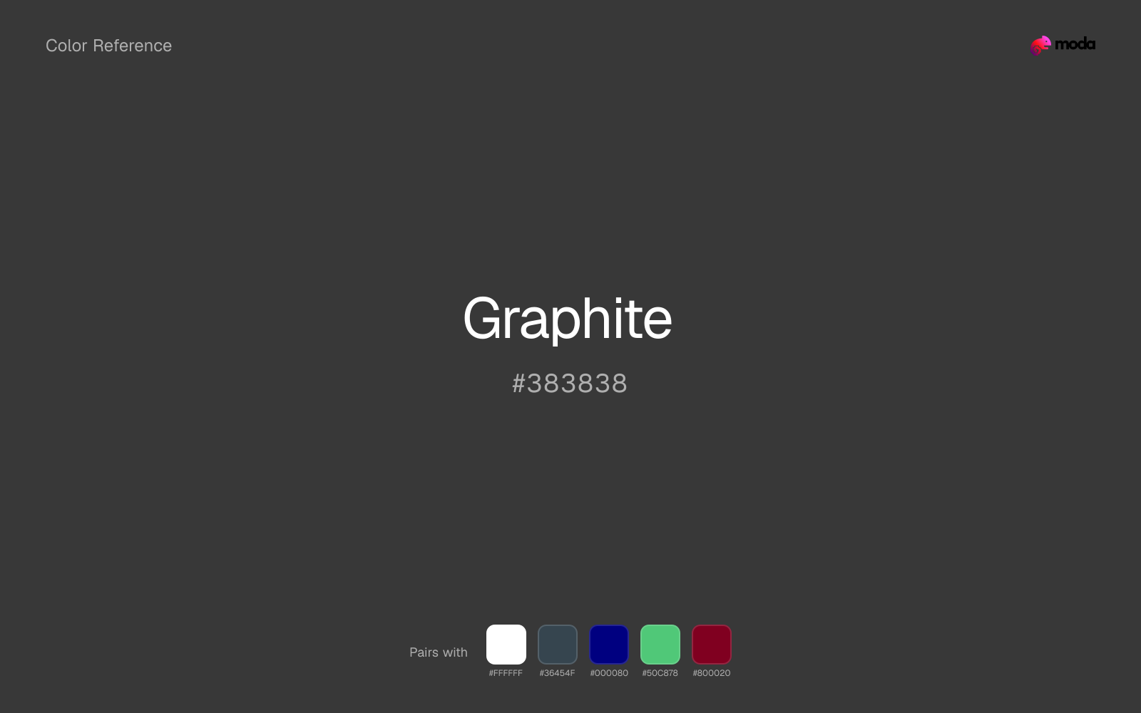
What colors go with graphite
White gives graphite the clean edge contrast it needs, so dark panels, labels, and type stay readable instead of sinking into the color.
Charcoal gives graphite a modern dark partner that feels softer and more material than default black.
Navy blue keeps graphite recognizable while adding the kind of depth that makes a palette easier to trust in longer-form use.
What colors clash with graphite
Magenta injects more cosmetic or nightlife energy than graphite can comfortably absorb, so restrained neutral palettes start to feel accidental.
With graphite, Pastel Pink often steers the system toward nursery or confectionery cues instead of the more grounded mood the source color supports.
Light Gray sits too close to graphite in value, so the palette can wash out before it ever establishes a clear hierarchy.
How should I use graphite in design?
- •Try graphite as your primary dark value instead of black — it adds character and warmth while still providing strong contrast for readability.
- •As a neutral, graphite pairs with virtually any accent color — add one warm and one cool accent to build visual interest around it.
- •Dark neutrals like graphite are workhorses for text-heavy layouts, dashboards, and professional UI themes where readability and structure matter most.
What are good graphite palettes?
Onyx foundation
Investor materials, annual reports, and financial dashboards.
Design with graphite in Moda
Create a presentation or document using graphiteas your accent color. Moda's AI applies your color palette automatically.
Create a design with graphite →What are the shades and tints of graphite?
Shades (darker)
Tints (lighter)
Tones (desaturated)
Similar colors
Taupe
Taupe introduces a tint where graphite stays achromatic, which is useful when the neutral layer needs more personality without becoming a full accent.
Black
Black keeps the neutral character of graphite but shifts the value enough to change the job, moving it toward headlines, anchors, and darker sections.
Umber
Umber introduces a tint where graphite stays achromatic, which is useful when the neutral layer needs more personality without becoming a full accent.
Coffee
Coffee does what graphite cannot: it nudges the palette toward a warm mood while still behaving like a supporting color.
Gray
Gray keeps the neutral character of graphite but shifts the value enough to change the job, moving it toward backgrounds, tints, and softer supporting areas.
Frequently asked questions
What is the hex code for graphite?
The hex code for graphite is #383838. In RGB, that's 56 red, 56 green, and 56 blue. The approximate CMYK equivalent is 0% cyan, 0% magenta, 0% yellow, and 78% key (black).
Is graphite a warm or cool color?
Graphite sits close to neutral, which means it can support either warm or cool accents without forcing the palette hard in one direction.
Is graphite strong enough for dark panels and covers?
Graphite is dark enough to anchor sections, hero blocks, and darker editorial surfaces. It is usually more convincing in that role than in tiny accent-only applications.
Where does graphite work best in a layout?
Graphite has enough depth to anchor a layout while still reading as a color, which makes it useful for dark section blocks, headlines, and heavier accents.
Is graphite accessible?
Graphite is strong enough for white text at 11.73:1 contrast, so it can handle dark panels, tags, and section headers without much trouble. As text on white, though, it is usually better reserved for larger headings or short accents than for long paragraphs.
More neutral colors
Keep exploring color resources
All color pages
Browse the full library of color references, pairings, and palettes.
Neutral colors
Compare graphite with other neutral tones.
Blue colors
Explore nearby color families to build stronger palettes and contrasts.
Brown colors
Explore nearby color families to build stronger palettes and contrasts.
Green colors
Explore nearby color families to build stronger palettes and contrasts.
Last updated April 6, 2026
Color values are computed from the listed hex code using standard conversion formulas. RGB, HSL, and HSV are exact screen-ready conversions. CMYK is an approximate on-screen reference, not a press-ready print specification. Pairings, palettes, and use-case guidance are heuristic recommendations derived from color relationships, contrast behavior, and common presentation, document, and UI patterns.