Gold color guide
HEX
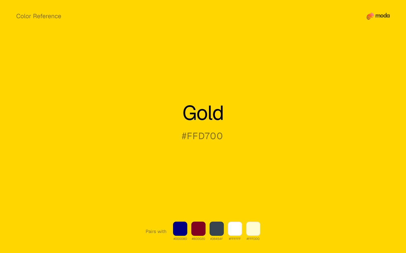
#FFD700
RGB
255, 215, 0
HSL
51°, 100%, 50%
HSV
51°, 100%, 100%
Gold (#FFD700) is a warm, saturated yellow that conveys premium positioning and prestige. It works best as an accent color in presentations and branded materials — a gold headline or divider line signals confidence without overwhelming the layout.
Best for
Pitch decks, investor presentations, and annual reports targeting enterprise or finance audiences.
Accessibility
Check contrast before using gold for text-heavy layouts, especially on low-contrast backgrounds.
How does gold compare to nearby colors?
What is the difference between gold and goldenrod?
Gold (#FFD700) feels more signal-like on screen, while Goldenrod (#DAA520) pushes the family in the opposite direction. Gold pushes the palette toward sharper emphasis, while Goldenrod leaves more room for typography, photography, or adjacent accents. Use gold when you want more pigment and immediate screen energy, and goldenrod when the same family should feel calmer or more spreadable.
What color is gold?
Gold has long been used to mark ceremony, wealth, and hierarchy, but in digital design it behaves less like literal metal and more like a prestige accent. It is strongest when paired with dark neutrals or used sparingly in type, rules, badges, and highlights.
Also known as: Golden. Some sources cite: #D4AF37.
What is the hex code for gold?
| Format | Value |
|---|---|
| HEX | #FFD700 |
| RGB | rgb(255, 215, 0) |
| HSL | hsl(51°, 100%, 50%) |
| HSV / HSB | hsv(51°, 100%, 100%) |
| CMYK (approx.) | cmyk(0%, 16%, 100%, 0%) |
Convert Gold to other color formats
Open the color converter with Gold (#FFD700) prefilled to copy RGB, HSL, HSV, CMYK, or OKLCH values.
Convert Gold in the color converter →What does gold mean in design?
Gold signals reward, prestige, and selective emphasis. In design, it works best when it marks hierarchy rather than carrying whole layouts on its own, which is why gold is so effective for headlines, divider rules, badges, and premium accent moments.
How do I use gold in code?
| CSS (hex) | color: #FFD700; |
| CSS (rgb) | color: rgb(255, 215, 0); |
| CSS (hsl) | color: hsl(51, 100%, 50%); |
| RGB % | rgb(100%, 84%, 0%) |
| Tailwind | text-[#FFD700] |
| SwiftUI | Color(red: 1.000, green: 0.843, blue: 0.000) |
| UIKit | UIColor(red: 1.000, green: 0.843, blue: 0.000, alpha: 1.0) |
| Android | Color.rgb(255, 215, 0) |
| Compose | Color(0xFFFFD700) |
| Web Safe | #FFCC00 |
Is gold accessible?
| Combination | Ratio | AA | AA lg | AAA | AAA lg | UI |
|---|---|---|---|---|---|---|
| AaWhite text on this color | 1.4:1 | ✗ | ✗ | ✗ | ✗ | ✗ |
| AaBlack text on this color | 14.97:1 | ✓ | ✓ | ✓ | ✓ | ✓ |
| AaThis color as text on white | 1.4:1 | ✗ | ✗ | ✗ | ✗ | ✗ |
| AaThis color as text on black | 14.97:1 | ✓ | ✓ | ✓ | ✓ | ✓ |
WCAG 2.1: AA normal ≥ 4.5:1, AA large text ≥ 3:1, AAA normal ≥ 7:1, AAA large ≥ 4.5:1, UI components ≥ 3:1.
How does gold look with color blindness?
Simulated appearance for common types of color vision deficiency. Actual perception varies by individual.
What colors go with gold
With gold, navy blue adds enough shadow that the yellow family can feel purposeful rather than simply loud.
Burgundy helps gold feel more complete in practice because the pairing combines highlighter-bright qualities with lacquered and formal support instead of leaving the source color to do every job alone.
Charcoal turns gold from purely energetic into something more adult and controlled by adding depth without another hue fight.
What colors clash with gold
With gold, red often reads more blunt than layered; the palette loses subtlety because both colors want the foreground role.
Neon Green competes with gold so aggressively that the palette never really settles into a clear primary-secondary relationship.
How should I use gold in design?
- •Use gold as an accent, not a background — a gold rule line, icon, or headline on a dark slide reads as premium.
- •Pair gold with navy or charcoal for a corporate pitch deck. Gold + white + one dark neutral is the classic high-end palette.
- •Avoid using gold for body text — it lacks contrast on both light and dark backgrounds.
What are good gold palettes?
Corporate premium
Pitch decks, investor presentations, and annual reports targeting enterprise or finance audiences.
Warm luxury
Brand guidelines, product brochures, and one-pagers for premium consumer products.
Design with gold in Moda
Create a presentation or document using goldas your accent color. Moda's AI applies your color palette automatically.
Create a design with gold →What are the shades and tints of gold?
Shades (darker)
Tints (lighter)
Tones (desaturated)
Hue variations
What are the color harmonies for gold?
Harmonies are calculated from the base swatch. When a harmony matches a named color page, it links there; otherwise it appears here as a computed reference swatch.
Similar colors
Amber
Amber lives in the same neighborhood as gold, but the finish shift is enough to make one feel better for alerts, signage, and data callouts and the other for a different visual context.
Mustard Yellow
Mustard Yellow tracks close to gold in hue, but the value shift changes where each one earns its place: mustard yellow is easier to use for backgrounds, tints, and softer supporting areas, while gold holds onto accents, stronger hierarchy, and firmer structure.
Goldenrod
Goldenrod is nearly adjacent to gold in hue; what separates them is intensity, with goldenrod reading dustier and easier to extend across a layout.
Champagne
Champagne is close enough to gold to keep the palette cohesive, yet the lighter-darker shift still decides whether the family behaves more like atmosphere or more like structure.
Saffron
Saffron stays very close to gold in hue, but it lands lighter, which makes it better for backgrounds, tints, and softer supporting areas than for accents, stronger hierarchy, and firmer structure.
Frequently asked questions
What is the hex code for gold?
The hex code for gold is #FFD700. In RGB, that's 255 red, 215 green, and 0 blue. The approximate CMYK equivalent is 0% cyan, 16% magenta, 100% yellow, and 0% key (black).
Is gold a warm or cool color?
Gold sits on the warm side of the palette, so it pairs easily with other warm tones and becomes more energetic when you place it against cooler blues or blue-grays.
Should gold lead the palette or stay in supporting roles?
Gold has enough chroma to take the lead, but it usually performs best when the surrounding system stays quieter. Treat it as the voice of emphasis, not the answer to every layout need.
Where does gold work best in a layout?
Gold carries a lot of chroma, so it is usually strongest as punctuation rather than wallpaper. Use it for focal accents and let low-saturation surfaces do the balancing.
Is gold accessible?
Gold works better with dark text than white text. Black text reaches 14.97:1 contrast on the swatch, which makes the color more usable as a background or highlight surface than as a dark panel.
More yellow colors
Keep exploring color resources
All color pages
Browse the full library of color references, pairings, and palettes.
Yellow colors
Compare gold with other yellow tones.
Brown colors
Explore nearby color families to build stronger palettes and contrasts.
Green colors
Explore nearby color families to build stronger palettes and contrasts.
Neutral colors
Explore nearby color families to build stronger palettes and contrasts.
Last updated April 6, 2026
Color values are computed from the listed hex code using standard conversion formulas. RGB, HSL, and HSV are exact screen-ready conversions. CMYK is an approximate on-screen reference, not a press-ready print specification. Pairings, palettes, and use-case guidance are heuristic recommendations derived from color relationships, contrast behavior, and common presentation, document, and UI patterns.