Canary palettes and pairings
HEX
#FFEF00
RGB
255, 239, 0
HSL
56°, 100%, 50%
HSV
56°, 100%, 100%
Canary (#FFEF00) is a warm, high-chroma yellow that still feels like sunshine rather than safety tape. It has enough red influence to glow against cool grays and blues, making it a strong accent for sports, music, and youth-oriented brands. It stays vivid at small sizes, helping icons and call-to-action chips pop.
Best for
Marketing websites, social media graphics, and campaign landing pages.
Accessibility
Check contrast before using canary for text-heavy layouts, especially on low-contrast backgrounds.
How does canary compare to nearby colors?
What color is canary?
The name references canary birds prized for bright yellow plumage. The hue shows up in athletic gear, school colors, and tropical tourism graphics.
What is the hex code for canary?
| Format | Value |
|---|---|
| HEX | #FFEF00 |
| RGB | rgb(255, 239, 0) |
| HSL | hsl(56°, 100%, 50%) |
| HSV / HSB | hsv(56°, 100%, 100%) |
| CMYK (approx.) | cmyk(0%, 6%, 100%, 0%) |
Convert Canary to other color formats
Open the color converter with Canary (#FFEF00) prefilled to copy RGB, HSL, HSV, CMYK, or OKLCH values.
Convert Canary in the color converter →What does canary mean in design?
Canary is often read as optimistic, celebratory, and high-energy. Compared with lemon's slight green cast, canary typically feels warmer and more golden-sun; compared with pure yellow, it is often perceived as a touch richer and less clinical.
How do I use canary in code?
| CSS (hex) | color: #FFEF00; |
| CSS (rgb) | color: rgb(255, 239, 0); |
| CSS (hsl) | color: hsl(56, 100%, 50%); |
| RGB % | rgb(100%, 94%, 0%) |
| Tailwind | text-[#FFEF00] |
| SwiftUI | Color(red: 1.000, green: 0.937, blue: 0.000) |
| UIKit | UIColor(red: 1.000, green: 0.937, blue: 0.000, alpha: 1.0) |
| Android | Color.rgb(255, 239, 0) |
| Compose | Color(0xFFFFEF00) |
| Web Safe | #FFFF00 |
Is canary accessible?
| Combination | Ratio | AA | AA lg | AAA | AAA lg | UI |
|---|---|---|---|---|---|---|
| AaWhite text on this color | 1.19:1 | ✗ | ✗ | ✗ | ✗ | ✗ |
| AaBlack text on this color | 17.6:1 | ✓ | ✓ | ✓ | ✓ | ✓ |
| AaThis color as text on white | 1.19:1 | ✗ | ✗ | ✗ | ✗ | ✗ |
| AaThis color as text on black | 17.6:1 | ✓ | ✓ | ✓ | ✓ | ✓ |
WCAG 2.1: AA normal ≥ 4.5:1, AA large text ≥ 3:1, AAA normal ≥ 7:1, AAA large ≥ 4.5:1, UI components ≥ 3:1.
How does canary look with color blindness?
Simulated appearance for common types of color vision deficiency. Actual perception varies by individual.
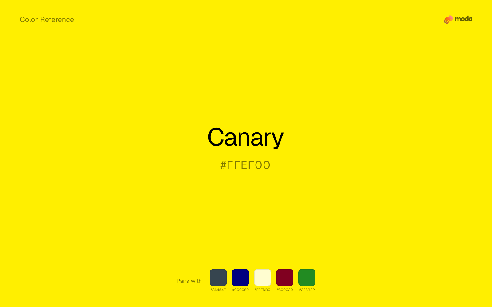
What colors go with canary
Charcoal turns canary from purely energetic into something more adult and controlled by adding depth without another hue fight.
Navy blue reins in canary without deadening it, which is useful when you want warmth to stay present but not dominate every part of the page.
With a vivid canary, cream is gentler than white, so the palette keeps warmth and avoids looking overlit.
Burgundy gives canary a second note that is different enough to feel intentional but not so different that the palette loses coherence.
Forest Green gives canary a second note that is different enough to feel intentional but not so different that the palette loses coherence.
What colors clash with canary
With canary, Neon Green pushes the work toward novelty or screen-effect territory faster than most brand or editorial systems can tolerate.
Magenta pushes canary toward a nightclub or cosmetic register that is hard to square with calmer editorial or product work.
Cyan can make canary feel more software-default than designed, especially when the rest of the palette is trying to hold onto material nuance.
Light Gray is gentle enough that canary loses some of its structure beside it; the pair can feel underbuilt rather than intentionally quiet.
How should I use canary in design?
- •Use canary where you need a clear, ownable color — logos, primary CTAs, and hero sections where it carries the visual identity.
- •Canary leans warm, so cool counterparts like navy, teal, or slate create the cleanest contrast. For a softer, tonal look, stay within neighboring warm hues and let value differences do the work.
- •Canary's high saturation makes it most effective in small doses — buttons, chart highlights, notification badges, and social media accents.
What are good canary palettes?
Light touch
Marketing websites, social media graphics, and campaign landing pages.
Fireside
Brand guidelines, design systems, and visual identity documents.
Design with canary in Moda
Create a presentation or document using canaryas your accent color. Moda's AI applies your color palette automatically.
Create a design with canary →What are the shades and tints of canary?
Shades (darker)
Tints (lighter)
Tones (desaturated)
Hue variations
What are the color harmonies for canary?
Harmonies are calculated from the base swatch. When a harmony matches a named color page, it links there; otherwise it appears here as a computed reference swatch.
Similar colors
Yellow
Yellow lives in the same neighborhood as canary, but the finish shift is enough to make one feel better for alerts, signage, and data callouts and the other for a different visual context.
Gold
Gold is near enough to canary to swap into the same palette, yet the undertone shift still decides whether the family reads warmer or cooler overall.
Amber
Amber is near enough to canary to swap into the same palette, yet the undertone shift still decides whether the family reads warmer or cooler overall.
Dandelion
Dandelion is almost the same hue as canary; the real difference is value, with dandelion feeling more open and surface-friendly.
Lemon
Lemon tracks close to canary in hue, but the value shift changes where each one earns its place: lemon is easier to use for backgrounds, tints, and softer supporting areas, while canary holds onto accents, stronger hierarchy, and firmer structure.
Frequently asked questions
What is the hex code for canary?
The hex code for canary is #FFEF00. In RGB, that's 255 red, 239 green, and 0 blue. The approximate CMYK equivalent is 0% cyan, 6% magenta, 100% yellow, and 0% key (black).
Is canary a warm or cool color?
Canary sits on the warm side of the palette, so it pairs easily with other warm tones and becomes more energetic when you place it against cooler blues or blue-grays.
Should canary lead the palette or stay in supporting roles?
Canary has enough chroma to take the lead, but it usually performs best when the surrounding system stays quieter. Treat it as the voice of emphasis, not the answer to every layout need.
Where does canary work best in a layout?
Canary carries a lot of chroma, so it is usually strongest as punctuation rather than wallpaper. Use it for focal accents and let low-saturation surfaces do the balancing.
Is canary accessible?
Canary works better with dark text than white text. Black text reaches 17.6:1 contrast on the swatch, which makes the color more usable as a background or highlight surface than as a dark panel.
More yellow colors
Keep exploring color resources
All color pages
Browse the full library of color references, pairings, and palettes.
Yellow colors
Compare canary with other yellow tones.
Brown colors
Explore nearby color families to build stronger palettes and contrasts.
Green colors
Explore nearby color families to build stronger palettes and contrasts.
Neutral colors
Explore nearby color families to build stronger palettes and contrasts.
Last updated April 6, 2026
Color values are computed from the listed hex code using standard conversion formulas. RGB, HSL, and HSV are exact screen-ready conversions. CMYK is an approximate on-screen reference, not a press-ready print specification. Pairings, palettes, and use-case guidance are heuristic recommendations derived from color relationships, contrast behavior, and common presentation, document, and UI patterns.