Dandelion color guide
HEX
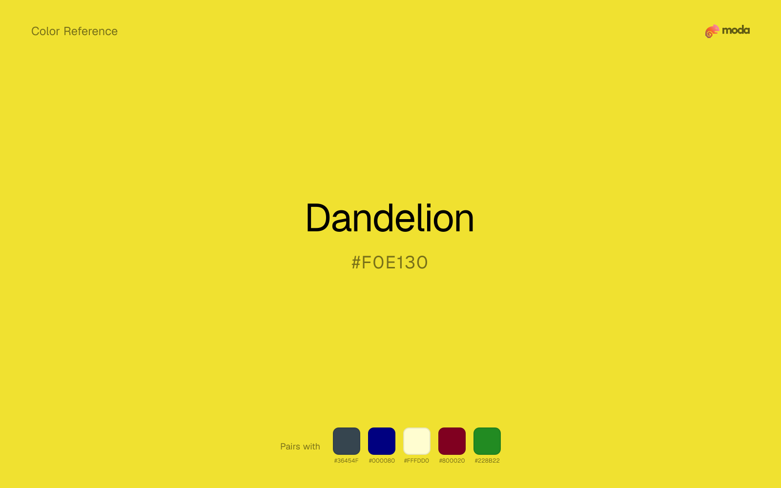
#F0E130
RGB
240, 225, 48
HSL
55°, 86%, 56%
HSV
55°, 80%, 94%
Dandelion (#F0E130) is a playground-bright yellow with a subtle vegetal lean — like the flat faces of lawn flowers in noon light. It feels hand-drawn and cheerful, useful for children's products, spring campaigns, and illustration-first interfaces. The slight green keeps it from collapsing into pure warm yellow.
Best for
Email templates, blog headers, and content marketing visuals.
Accessibility
Check contrast before using dandelion for text-heavy layouts, especially on low-contrast backgrounds.
How does dandelion compare to nearby colors?
What color is dandelion?
Named for Taraxacum blooms common in temperate yards and roadsides. Appears in crayon sets, nature education materials, and informal spring/summer seasonal graphics.
What is the hex code for dandelion?
| Format | Value |
|---|---|
| HEX | #F0E130 |
| RGB | rgb(240, 225, 48) |
| HSL | hsl(55°, 86%, 56%) |
| HSV / HSB | hsv(55°, 80%, 94%) |
| CMYK (approx.) | cmyk(0%, 6%, 80%, 6%) |
Convert Dandelion to other color formats
Open the color converter with Dandelion (#F0E130) prefilled to copy RGB, HSL, HSV, CMYK, or OKLCH values.
Convert Dandelion in the color converter →What does dandelion mean in design?
Dandelion may read as youthful spontaneity or outdoor freshness. Next to lemon, dandelion can feel a touch earthier and less citrus-clean; next to canary, it is often a bit cooler and less red-warm.
How do I use dandelion in code?
| CSS (hex) | color: #F0E130; |
| CSS (rgb) | color: rgb(240, 225, 48); |
| CSS (hsl) | color: hsl(55, 86%, 56%); |
| RGB % | rgb(94%, 88%, 19%) |
| Tailwind | text-[#F0E130] |
| SwiftUI | Color(red: 0.941, green: 0.882, blue: 0.188) |
| UIKit | UIColor(red: 0.941, green: 0.882, blue: 0.188, alpha: 1.0) |
| Android | Color.rgb(240, 225, 48) |
| Compose | Color(0xFFF0E130) |
| Web Safe | #FFCC33 |
Is dandelion accessible?
| Combination | Ratio | AA | AA lg | AAA | AAA lg | UI |
|---|---|---|---|---|---|---|
| AaWhite text on this color | 1.35:1 | ✗ | ✗ | ✗ | ✗ | ✗ |
| AaBlack text on this color | 15.52:1 | ✓ | ✓ | ✓ | ✓ | ✓ |
| AaThis color as text on white | 1.35:1 | ✗ | ✗ | ✗ | ✗ | ✗ |
| AaThis color as text on black | 15.52:1 | ✓ | ✓ | ✓ | ✓ | ✓ |
WCAG 2.1: AA normal ≥ 4.5:1, AA large text ≥ 3:1, AAA normal ≥ 7:1, AAA large ≥ 4.5:1, UI components ≥ 3:1.
How does dandelion look with color blindness?
Simulated appearance for common types of color vision deficiency. Actual perception varies by individual.
What colors go with dandelion
Charcoal gives dandelion a darker, quieter partner, which helps vivid accents look deliberate instead of loud for their own sake.
With dandelion, navy blue adds enough shadow that the yellow family can feel purposeful rather than simply loud.
Cream takes the hard digital edge off dandelion and makes the color feel more printed, paper-backed, and approachable.
Burgundy changes how dandelion comes across: more premium retail and sport in mood, and less likely to feel isolated or unfinished.
Forest Green changes the temperature story around dandelion: sunlit yellow on its own, more finance, outdoors, and institutional systems once the cooler or warmer partner is introduced.
What colors clash with dandelion
Neon Green competes with dandelion so aggressively that the palette never really settles into a clear primary-secondary relationship.
Magenta pushes dandelion toward a nightclub or cosmetic register that is hard to square with calmer editorial or product work.
Cyan redirects dandelion toward a more technical, backlit interpretation, which is risky when the goal is warmth, polish, or print-minded editorial work.
Light Gray makes dandelion feel softer, but often softer in the wrong way: less defined, not more refined.
How should I use dandelion in design?
- •Dandelion has the saturation to lead a brand palette — strong enough for buttons, headers, and packaging without drifting into pastel or dark territory.
- •Cool neutrals like charcoal and slate sharpen dandelion's warm character, while warm companions like cream and gold amplify its inviting quality.
- •Dandelion's high saturation makes it most effective in small doses — buttons, chart highlights, notification badges, and social media accents.
What are good dandelion palettes?
Design with dandelion in Moda
Create a presentation or document using dandelionas your accent color. Moda's AI applies your color palette automatically.
Create a design with dandelion →What are the shades and tints of dandelion?
Shades (darker)
Tints (lighter)
Tones (desaturated)
Hue variations
What are the color harmonies for dandelion?
Harmonies are calculated from the base swatch. When a harmony matches a named color page, it links there; otherwise it appears here as a computed reference swatch.
Similar colors
Saffron
Saffron is near enough to dandelion to swap into the same palette, yet the undertone shift still decides whether the family reads warmer or cooler overall.
Lemon
Lemon stays very close to dandelion in hue, but it lands lighter, which makes it better for backgrounds, tints, and softer supporting areas than for accents, stronger hierarchy, and firmer structure.
Canary
Canary is almost the same hue as dandelion; the real difference is value, with canary feeling more grounded and anchor-ready.
Maize
Maize is almost the same hue as dandelion; the real difference is value, with maize feeling more open and surface-friendly.
Gold
Gold is almost the same hue as dandelion; the real difference is value, with gold feeling more grounded and anchor-ready.
Frequently asked questions
What is the hex code for dandelion?
The hex code for dandelion is #F0E130. In RGB, that's 240 red, 225 green, and 48 blue. The approximate CMYK equivalent is 0% cyan, 6% magenta, 80% yellow, and 6% key (black).
Is dandelion a warm or cool color?
Dandelion sits on the warm side of the palette, so it pairs easily with other warm tones and becomes more energetic when you place it against cooler blues or blue-grays.
Should dandelion lead the palette or stay in supporting roles?
Dandelion has enough chroma to take the lead, but it usually performs best when the surrounding system stays quieter. Treat it as the voice of emphasis, not the answer to every layout need.
Where does dandelion work best in a layout?
Dandelion carries a lot of chroma, so it is usually strongest as punctuation rather than wallpaper. Use it for focal accents and let low-saturation surfaces do the balancing.
Is dandelion accessible?
Dandelion works better with dark text than white text. Black text reaches 15.52:1 contrast on the swatch, which makes the color more usable as a background or highlight surface than as a dark panel.
More yellow colors
Keep exploring color resources
All color pages
Browse the full library of color references, pairings, and palettes.
Yellow colors
Compare dandelion with other yellow tones.
Brown colors
Explore nearby color families to build stronger palettes and contrasts.
Green colors
Explore nearby color families to build stronger palettes and contrasts.
Neutral colors
Explore nearby color families to build stronger palettes and contrasts.
Last updated April 6, 2026
Color values are computed from the listed hex code using standard conversion formulas. RGB, HSL, and HSV are exact screen-ready conversions. CMYK is an approximate on-screen reference, not a press-ready print specification. Pairings, palettes, and use-case guidance are heuristic recommendations derived from color relationships, contrast behavior, and common presentation, document, and UI patterns.