Butter palettes and pairings
HEX
#FFFF99
RGB
255, 255, 153
HSL
60°, 100%, 80%
HSV
60°, 40%, 100%
Butter (#FFFF99) is a whisper of yellow — soft, creamy, and easy on the eyes for large surfaces. It reads as tinted white rather than a saturated hue, so it works for backgrounds, paper simulations, and gentle highlights. You get warmth without the vibration risk of full-strength yellows.
Best for
Mobile app interfaces, onboarding screens, and light-mode UI themes.
Accessibility
Check contrast before using butter for text-heavy layouts, especially on low-contrast backgrounds.
How does butter compare to nearby colors?
What is the difference between butter and maize?
The visible difference between Butter (#FFFF99) and Maize (#FBEC5D) is subtle, but it still nudges the family from butter-paper toward highlighter-bright. Butter opens more space around content, while Maize can still carry clearer emphasis and stronger edges. Start with butter when the palette wants more butter-paper; switch to maize when the better fit is highlighter-bright.
What color is butter?
The metaphor is churned dairy fat at room temperature. Common in nursery aesthetics, recipe blogs, stationery, and interfaces that aim for calm, approachable whitespace alternatives.
What is the hex code for butter?
| Format | Value |
|---|---|
| HEX | #FFFF99 |
| RGB | rgb(255, 255, 153) |
| HSL | hsl(60°, 100%, 80%) |
| HSV / HSB | hsv(60°, 40%, 100%) |
| CMYK (approx.) | cmyk(0%, 0%, 40%, 0%) |
Convert Butter to other color formats
Open the color converter with Butter (#FFFF99) prefilled to copy RGB, HSL, HSV, CMYK, or OKLCH values.
Convert Butter in the color converter →What does butter mean in design?
Butter can imply comfort, simplicity, or domestic ease. Against lemon, canary, or pure yellow, butter is clearly calmer and less alerting; beside maize, it is paler and less sunlit.
How do I use butter in code?
| CSS (hex) | color: #FFFF99; |
| CSS (rgb) | color: rgb(255, 255, 153); |
| CSS (hsl) | color: hsl(60, 100%, 80%); |
| RGB % | rgb(100%, 100%, 60%) |
| Tailwind | text-[#FFFF99] |
| SwiftUI | Color(red: 1.000, green: 1.000, blue: 0.600) |
| UIKit | UIColor(red: 1.000, green: 1.000, blue: 0.600, alpha: 1.0) |
| Android | Color.rgb(255, 255, 153) |
| Compose | Color(0xFFFFFF99) |
| Web Safe | #FFFF99 |
Is butter accessible?
| Combination | Ratio | AA | AA lg | AAA | AAA lg | UI |
|---|---|---|---|---|---|---|
| AaWhite text on this color | 1.05:1 | ✗ | ✗ | ✗ | ✗ | ✗ |
| AaBlack text on this color | 20.02:1 | ✓ | ✓ | ✓ | ✓ | ✓ |
| AaThis color as text on white | 1.05:1 | ✗ | ✗ | ✗ | ✗ | ✗ |
| AaThis color as text on black | 20.02:1 | ✓ | ✓ | ✓ | ✓ | ✓ |
WCAG 2.1: AA normal ≥ 4.5:1, AA large text ≥ 3:1, AAA normal ≥ 7:1, AAA large ≥ 4.5:1, UI components ≥ 3:1.
How does butter look with color blindness?
Simulated appearance for common types of color vision deficiency. Actual perception varies by individual.
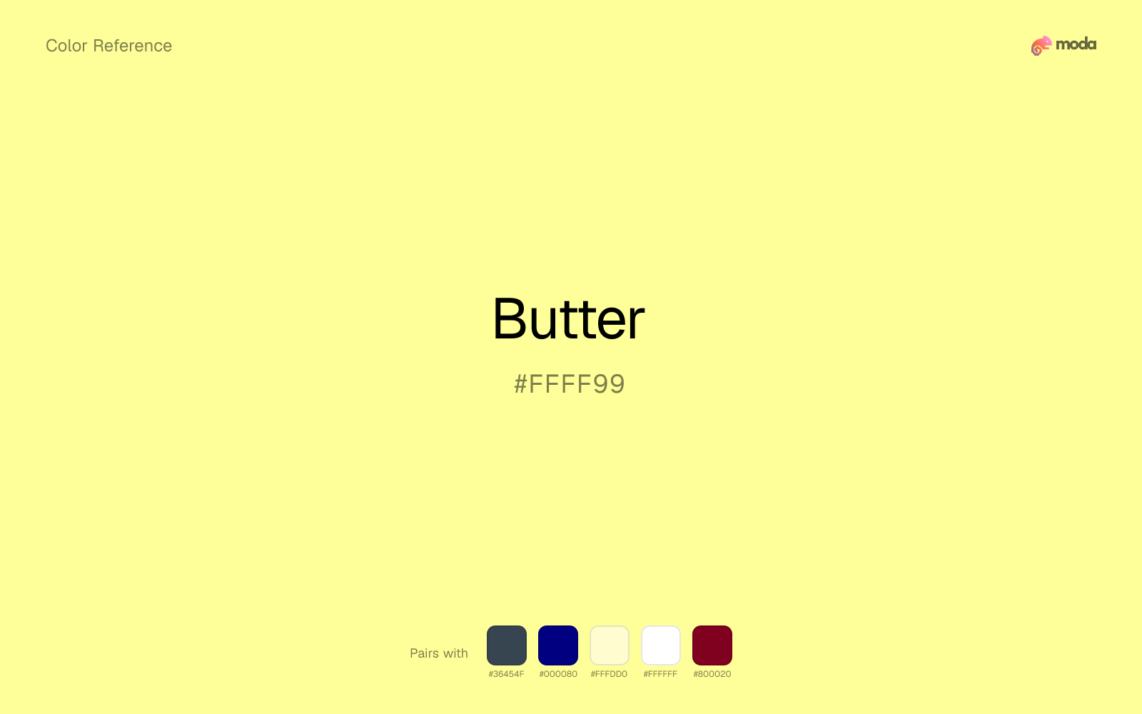
What colors go with butter
Charcoal lets butter stay light and atmospheric while still giving the layout a readable dark value for text and hierarchy.
With butter, navy blue adds enough shadow that the yellow family can feel purposeful rather than simply loud.
Cream lets butter stay expressive without turning the whole composition stark; the result feels closer to editorial or packaging work than to raw UI default.
What colors clash with butter
With butter, Neon Green pushes the work toward novelty or screen-effect territory faster than most brand or editorial systems can tolerate.
Magenta pushes butter toward a nightclub or cosmetic register that is hard to square with calmer editorial or product work.
Cyan can make butter feel more software-default than designed, especially when the rest of the palette is trying to hold onto material nuance.
Light Gray sits too close to butter in value, so the palette can wash out before it ever establishes a clear hierarchy.
How should I use butter in design?
- •Butter works best as a background tint, card fill, or section divider — it adds warmth without competing with foreground content. Pair with dark text for readability.
- •Butter leans warm, so cool counterparts like navy, teal, or slate create the cleanest contrast. For a softer, tonal look, stay within neighboring warm hues and let value differences do the work.
- •Light tones like butter work best for card backgrounds, section tints, and gentle emphasis — they add color without competing with the content.
What are good butter palettes?
Daylight
Mobile app interfaces, onboarding screens, and light-mode UI themes.
Autumn light
Nonprofit campaigns, fundraising pages, and grant materials.
Design with butter in Moda
Create a presentation or document using butteras your accent color. Moda's AI applies your color palette automatically.
Create a design with butter →What are the shades and tints of butter?
Shades (darker)
Tints (lighter)
Tones (desaturated)
Hue variations
What are the color harmonies for butter?
Harmonies are calculated from the base swatch. When a harmony matches a named color page, it links there; otherwise it appears here as a computed reference swatch.
Similar colors
Maize
Maize tracks close to butter in hue, but the value shift changes where each one earns its place: maize is easier to use for headlines, anchors, and darker sections, while butter holds onto lighter surfaces and more open applications.
Caramel
Caramel occupies a similar depth to butter, though it pushes the family toward a more warm reading and a different material feel.
Lemon
Lemon tracks close to butter in hue, but the value shift changes where each one earns its place: lemon is easier to use for headlines, anchors, and darker sections, while butter holds onto lighter surfaces and more open applications.
Beige
Beige is almost the same hue as butter; the real difference is value, with beige feeling more open and surface-friendly.
Mustard Yellow
Mustard Yellow stays in the same color family as butter, but the change in value moves it into different layout jobs, especially once backgrounds, charts, or section dividers enter the system.
Frequently asked questions
What is the hex code for butter?
The hex code for butter is #FFFF99. In RGB, that's 255 red, 255 green, and 153 blue. The approximate CMYK equivalent is 0% cyan, 0% magenta, 40% yellow, and 0% key (black).
Is butter a warm or cool color?
Butter leans warm without feeling fully heat-driven, so you can push it warmer with cream, tan, or gold or balance it with cooler blues and slates.
Should butter lead the palette or stay in supporting roles?
Butter has enough chroma to take the lead, but it usually performs best when the surrounding system stays quieter. Treat it as the voice of emphasis, not the answer to every layout need.
Where does butter work best in a layout?
Butter is better on broad surfaces than in tiny details, so treat it as a background or support color and let darker accents carry the sharp hierarchy.
Is butter accessible?
Butter works better with dark text than white text. Black text reaches 20.02:1 contrast on the swatch, which makes the color more usable as a background or highlight surface than as a dark panel.
More yellow colors
Keep exploring color resources
All color pages
Browse the full library of color references, pairings, and palettes.
Yellow colors
Compare butter with other yellow tones.
Brown colors
Explore nearby color families to build stronger palettes and contrasts.
Green colors
Explore nearby color families to build stronger palettes and contrasts.
Neutral colors
Explore nearby color families to build stronger palettes and contrasts.
Last updated April 6, 2026
Color values are computed from the listed hex code using standard conversion formulas. RGB, HSL, and HSV are exact screen-ready conversions. CMYK is an approximate on-screen reference, not a press-ready print specification. Pairings, palettes, and use-case guidance are heuristic recommendations derived from color relationships, contrast behavior, and common presentation, document, and UI patterns.